CSS Transitions & State Animations
Reviewed & published by Brayan K
A CSS transition smoothly animates a property between its old and new value over a set duration, so changes triggered by states like :hover or :focus ease in gradually instead of snapping instantly.
Part of the free HTML & CSS course at LearnCodingFast — hands-on lessons with examples you run in your browser, plus practice exercises and a quick quiz.
💡 Think of It Like This
A light switch is instant — on or off. A dimmer switch is a transition: it smoothly changes brightness over time. CSS transitions work the same way — instead of jumping between states (hover, focus), properties glide smoothly. The timing function is like choosing how the dimmer moves: quickly at first, slowly at the end, or at a constant speed.
Understanding CSS Transitions
Without transitions, CSS state changes are instant. Hover a button and its color jumps from blue to dark blue in a single frame. With transition, the browser smoothly interpolates between the old and new values over a specified duration, creating a professional, polished feel.
Transitions require three things: a property to animate (like background-color), a duration (like 0.3s), and a trigger (like :hover or :focus). The transition declaration goes on the base state, not the triggered state — this ensures the animation plays both ways (on hover and on un-hover).
Performance tip: Not all properties animate efficiently. transform and opacity are composited by the GPU and run at 60fps. Properties like width, height, and top trigger layout recalculation (reflow) on every frame and can cause jank.
Transition Syntax Reference
| Property | Example | Description | Default |
|---|---|---|---|
| transition-property | transform | Which CSS property to animate | all |
| transition-duration | 0.3s | How long the transition takes | 0s |
| transition-timing-function | ease-in-out | The acceleration curve | ease |
| transition-delay | 0.1s | Wait before starting | 0s |
| transition | all 0.3s ease | Shorthand for all above | — |
Worked Example: Where the transition Declaration Has to Live
Nearly every broken transition a beginner writes has the same cause, and it is not the syntax — it is the rule the declaration is sitting in. Put transition in the :hover block and the element glides out beautifully and then teleports back.
The reason is simple once you see it. A :hover rule only applies while the pointer is over the element. The instant you move away, that whole rule stops applying — including the instruction to animate. The base rule is the one the element always has, so that is where the transition belongs.
<!DOCTYPE html>
<html>
<head>
  <title>Where the transition declaration goes</title>
  <style>
    body { padding: 30px; background: #0f172a; color: #e5e7eb; font-family: system-ui, sans-serif; }
    h3 { font-size: 14px; color: #22c55e; margin: 24px 0 6px; }
    .note { font-size: 13px; color: #94a3b8; margin: 6px 0 0; }

    .btn {
      display: block;
      padding: 12px 20px;
      border: 0;
      border-radius: 8px;
      background: #3b82f6;
      color: white;
      font-size: 14px;
      cursor: pointer;
    }

    /* ✅ RIGHT — the transition lives on the BASE rule.
       The base rule is what the element goes back to, so the browser
       has a transition to obey in BOTH directions. */
    .right { transition: transform 0.6s ease; }
    .right:hover { transform: translateX(80px); }

    /* ❌ WRONG — the transition lives inside :hover.
       While you are hovering, the rule applies and the button glides out.
       The moment you leave, the :hover rule stops applying - and the
       transition declaration disappears with it, so the button teleports
       back to the start. */
    .wrong:hover {
      transition: transform 0.6s ease;
      transform: translateX(80px);
    }
  </style>
</head>
<body>
  <h1>Hover each button, then move away</h1>

  <h3>Transition on the base rule</h3>
  <button class="btn right">glides both ways</button>
  <p class="note">Out AND back are smooth.</p>

  <h3>Transition inside :hover only</h3>
  <button class="btn wrong">glides out, snaps back</button>
  <p class="note">Going out looks fine. Coming back is instant - that is the bug.</p>
  <!-- ✅ Expected result, measured in a real browser:
     .btn -> display: block
     h3 -> margin-top: 24px
     .btn -> count: 2
  -->
</body>
</html>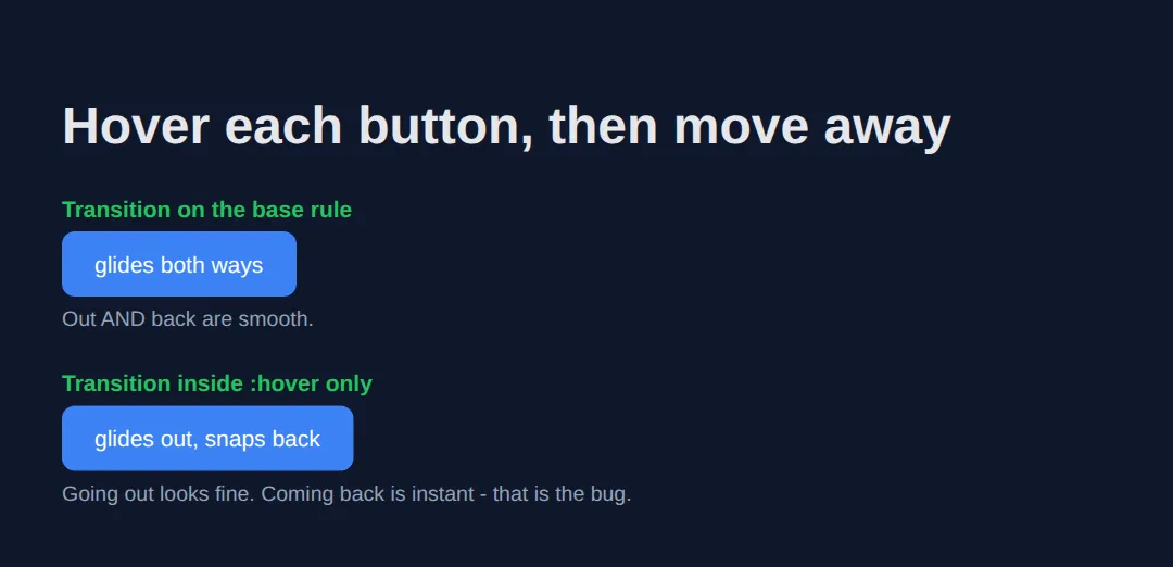
Both buttons reach translateX(80px) on hover. Measured 150ms after the pointer leaves, the correct button is still mid-flight at about translateX(47px) — you can watch it come back. The broken one already reads transform: none: it never animated back at all.
Basic Transitions
The simplest transition is transition: all 0.3s ease. This animates every property that changes. The example below shows a box that morphs on hover and a bar chart with bouncy easing. Try changing the duration and easing values in the editor.
<!DOCTYPE html>
<html>
<head>
    <style>
        body { font-family: system-ui, sans-serif; padding: 24px; }
        .box {
            width: 120px;
            height: 120px;
            background: #1976D2;
            border-radius: 8px;
            display: flex;
            align-items: center;
            justify-content: center;
            color: white;
            font-weight: bold;
            cursor: pointer;
            transition: all 0.3s ease;
            margin: 16px 0;
        }
        .box:hover {
            background: #E91E63;
            transform: scale(1.15) rotate(5deg);
            border-radius: 50%;
            box-shadow: 0 8px 25px rgba(233, 30, 99, 0.4);
        }
        .bars { display: flex; gap: 8px; align-items: flex-end; margin: 24px 0; }
        .bar {
            width: 40px;
            background: #42A5F5;
            border-radius: 4px 4px 0 0;
            transition: height 0.5s cubic-bezier(0.34, 1.56, 0.64, 1);
            cursor: pointer;
        }
        .bar:hover { background: #1565C0; }
        .bar:nth-child(1) { height: 60px; }
        .bar:nth-child(2) { height: 100px; }
        .bar:nth-child(3) { height: 80px; }
        .bar:nth-child(4) { height: 140px; }
        .bar:nth-child(5) { height: 50px; }
        .bars:hover .bar:nth-child(1) { height: 120px; }
        .bars:hover .bar:nth-child(2) { height: 60px; }
        .bars:hover .bar:nth-child(3) { height: 150px; }
        .bars:hover .bar:nth-child(4) { height: 90px; }
        .bars:hover .bar:nth-child(5) { height: 130px; }
        h2 { color: #1565C0; }
    </style>
</head>
<body>
    <h1>CSS Transitions Basics</h1>
    <h2>Hover the Box</h2>
    <div class="box">Hover me</div>
    <h2>Animated Bar Chart</h2>
    <p>Hover over the chart to see values transition with a bouncy easing.</p>
    <div class="bars">
        <div class="bar"></div>
        <div class="bar"></div>
        <div class="bar"></div>
        <div class="bar"></div>
        <div class="bar"></div>
    </div>
  <!-- ✅ Expected result, measured in a real browser:
     .box -> display: flex
     .bars -> display: flex
     .bar -> cursor: pointer
     .bar -> count: 5
  -->
</body>
</html>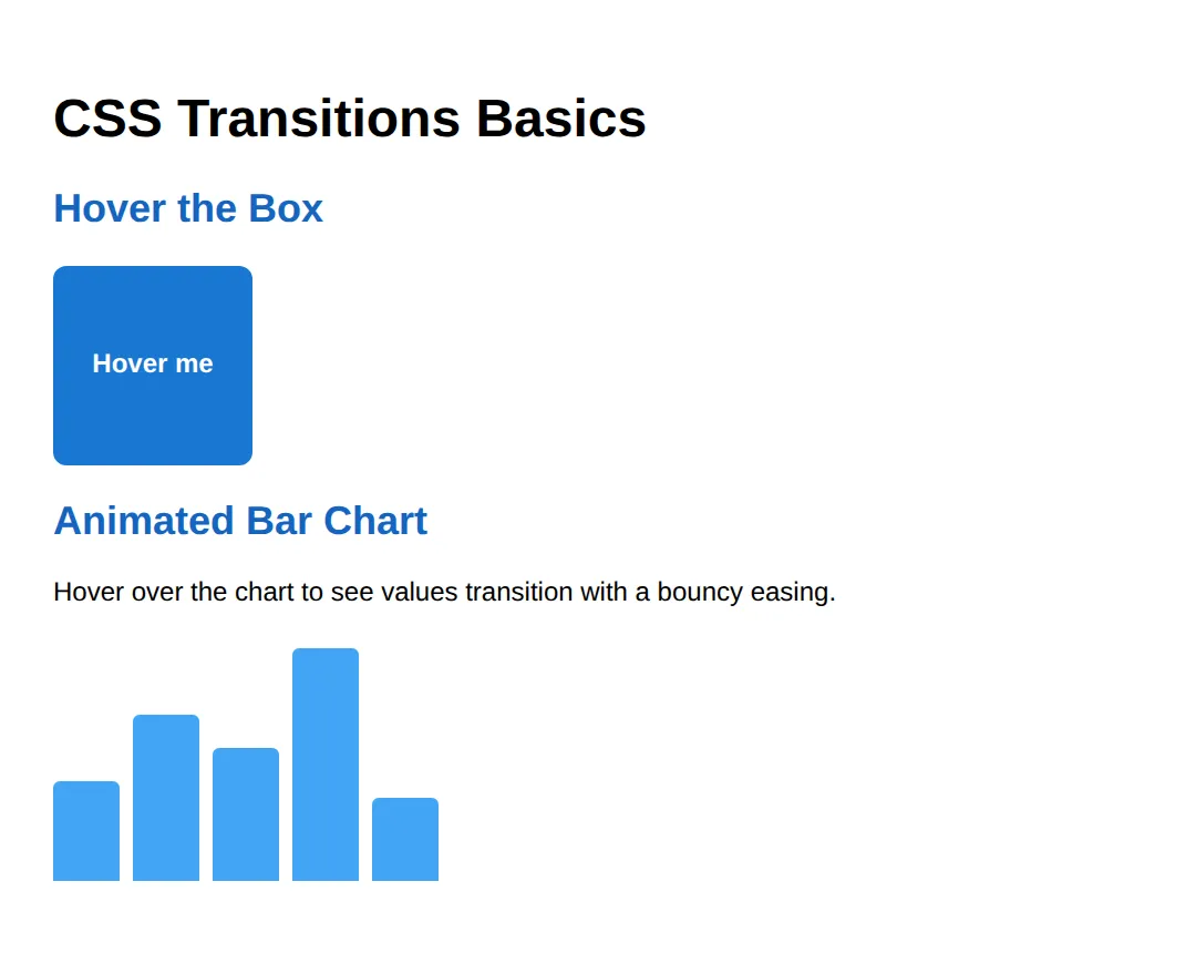
Timing Functions — The Feel of Motion
The transition-timing-function controls how the transition accelerates. ease starts fast and decelerates. linear moves at constant speed. cubic-bezier() lets you define custom curves — the "bounce" example below overshoots and settles back, creating a playful feel.
<!DOCTYPE html>
<html>
<head>
    <style>
        body { font-family: system-ui, sans-serif; padding: 24px; }
        .track {
            position: relative;
            height: 40px;
            background: #f0f0f0;
            border-radius: 20px;
            margin: 12px 0;
            overflow: hidden;
        }
        .ball {
            position: absolute;
            left: 0;
            top: 4px;
            width: 32px;
            height: 32px;
            border-radius: 50%;
            transition: left 1.5s;
        }
        .track:hover .ball { left: calc(100% - 32px); }
        .ease        .ball { background: #F44336; transition-timing-function: ease; }
        .linear      .ball { background: #FF9800; transition-timing-function: linear; }
        .ease-in     .ball { background: #4CAF50; transition-timing-function: ease-in; }
        .ease-out    .ball { background: #2196F3; transition-timing-function: ease-out; }
        .ease-in-out .ball { background: #9C27B0; transition-timing-function: ease-in-out; }
        .bounce      .ball { background: #E91E63; transition-timing-function: cubic-bezier(0.68, -0.55, 0.27, 1.55); }
        label { font-family: monospace; font-size: 0.85rem; color: #555; }
        h2 { color: #1565C0; }
    </style>
</head>
<body>
    <h1>Timing Functions Comparison</h1>
    <p>Hover each track to see the ball move with a different easing curve.</p>
    <label>ease (default)</label>
    <div class="track ease"><div class="ball"></div></div>
    <label>linear</label>
    <div class="track linear"><div class="ball"></div></div>
    <label>ease-in</label>
    <div class="track ease-in"><div class="ball"></div></div>
    <label>ease-out</label>
    <div class="track ease-out"><div class="ball"></div></div>
    <label>ease-in-out</label>
    <div class="track ease-in-out"><div class="ball"></div></div>
    <label>cubic-bezier (bounce)</label>
    <div class="track bounce"><div class="ball"></div></div>
  <!-- ✅ Expected result, measured in a real browser:
     .track -> position: relative
     .ball -> position: absolute
     .track -> count: 6
  -->
</body>
</html>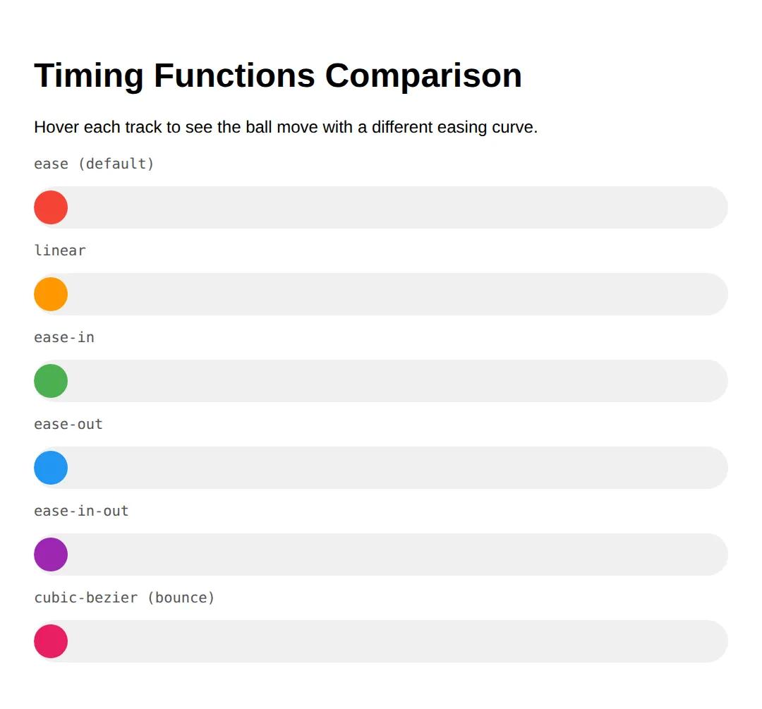
Multi-Property & Staggered Transitions
Real-world UIs often animate multiple properties simultaneously, each with its own timing. A card might lift (transform: 0.3s), grow a shadow (box-shadow: 0.4s), and change border color (border-color: 0.2s). Using transition-delay on child elements creates staggered "wave" effects.
<!DOCTYPE html>
<html>
<head>
    <style>
        body { font-family: system-ui, sans-serif; padding: 24px; }
        .card {
            max-width: 300px;
            background: white;
            border: 1px solid #e0e0e0;
            border-radius: 12px;
            padding: 24px;
            margin: 16px 0;
            transition:
                transform 0.3s ease,
                box-shadow 0.4s ease,
                border-color 0.2s ease;
        }
        .card:hover {
            transform: translateY(-8px);
            box-shadow: 0 12px 30px rgba(0,0,0,0.15);
            border-color: #1976D2;
        }
        .card h3 { margin-top: 0; color: #1976D2; }
        .card p { color: #666; margin-bottom: 0; }
        .btn-group { display: flex; gap: 0; margin: 24px 0; }
        .btn-group button {
            padding: 12px 24px;
            border: 2px solid #1976D2;
            background: white;
            color: #1976D2;
            font-size: 1rem;
            cursor: pointer;
            transition: background 0.3s, color 0.3s, transform 0.2s;
        }
        .btn-group button:first-child { border-radius: 8px 0 0 8px; }
        .btn-group button:last-child  { border-radius: 0 8px 8px 0; }
        .btn-group button:not(:first-child) { border-left: none; }
        .btn-group button:hover {
            background: #1976D2;
            color: white;
            transform: scale(1.05);
            z-index: 1;
        }
        .stagger { display: flex; gap: 8px; margin: 24px 0; }
        .stagger div {
            width: 50px; height: 50px;
            background: #E3F2FD;
            border-radius: 8px;
            transition: transform 0.3s ease, background 0.3s ease;
        }
        .stagger:hover div { transform: translateY(-12px); background: #1976D2; }
        .stagger div:nth-child(1) { transition-delay: 0s; }
        .stagger div:nth-child(2) { transition-delay: 0.05s; }
        .stagger div:nth-child(3) { transition-delay: 0.1s; }
        .stagger div:nth-child(4) { transition-delay: 0.15s; }
        .stagger div:nth-child(5) { transition-delay: 0.2s; }
        .stagger div:nth-child(6) { transition-delay: 0.25s; }
        h2 { color: #1565C0; }
    </style>
</head>
<body>
    <h1>Multi-Property Transitions</h1>
    <h2>Card Lift Effect</h2>
    <div class="card">
        <h3>Hover Card</h3>
        <p>Transform, shadow, and border each transition at different speeds for a polished feel.</p>
    </div>
    <h2>Button Group</h2>
    <div class="btn-group">
        <button>Day</button>
        <button>Week</button>
        <button>Month</button>
        <button>Year</button>
    </div>
    <h2>Staggered Delay</h2>
    <p>Hover the row — each box lifts with a slight delay.</p>
    <div class="stagger">
        <div></div><div></div><div></div><div></div><div></div><div></div>
    </div>
  <!-- ✅ Expected result, measured in a real browser:
     .btn-group -> display: flex
     .btn-group button -> cursor: pointer
     .stagger -> display: flex
  -->
</body>
</html>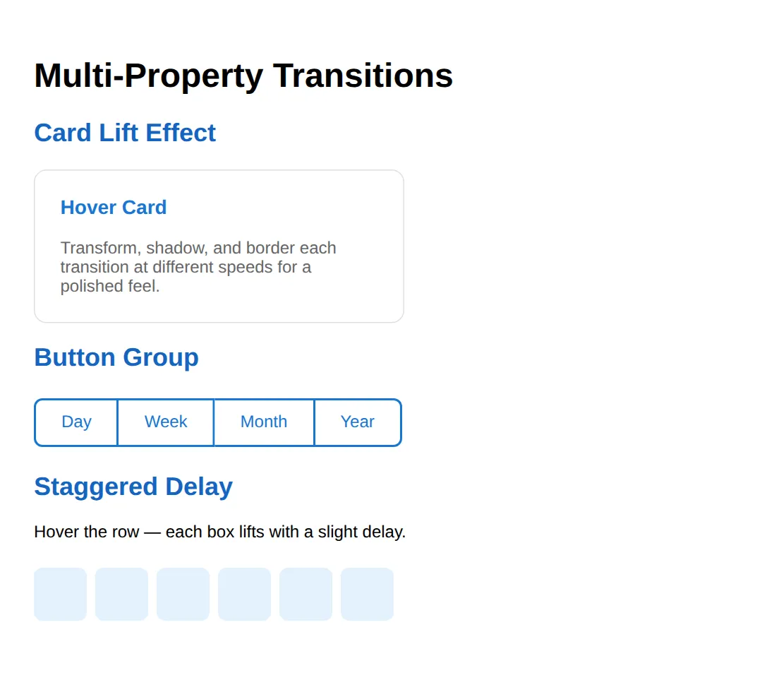
Focus States & Accessibility
Transitions aren't just for hover effects — they're essential for focus states too. Animated focus rings make keyboard navigation feel polished and professional. The example below shows input focus transitions, animated nav underlines, and a CSS-only toggle switch. Note the @media (prefers-reduced-motion: reduce) query that disables transitions for users who prefer it.
<!DOCTYPE html>
<html>
<head>
    <style>
        body { font-family: system-ui, sans-serif; padding: 24px; max-width: 500px; }

        h2 { color: #1565C0; margin-top: 32px; }

        /* Input with focus transition */
        .form-input {
            width: 100%;
            padding: 12px 16px;
            border: 2px solid #e0e0e0;
            border-radius: 8px;
            font-size: 1rem;
            outline: none;
            box-sizing: border-box;
            transition: border-color 0.3s ease, box-shadow 0.3s ease;
            margin: 8px 0;
        }
        .form-input:focus {
            border-color: #1976D2;
            box-shadow: 0 0 0 3px rgba(25, 118, 210, 0.15);
        }
        .form-input:focus:invalid {
            border-color: #F44336;
            box-shadow: 0 0 0 3px rgba(244, 67, 54, 0.15);
        }

        /* Nav links with underline transition */
        .nav-demo { display: flex; gap: 24px; margin: 16px 0; }
        .nav-link {
            text-decoration: none;
            color: #333;
            font-weight: 600;
            position: relative;
            padding-bottom: 4px;
        }
        .nav-link::after {
            content: '';
            position: absolute;
            bottom: 0;
            left: 0;
            width: 0;
            height: 2px;
            background: #1976D2;
            transition: width 0.3s ease;
        }
        .nav-link:hover::after,
        .nav-link:focus::after {
            width: 100%;
        }

        /* Toggle switch */
        .toggle-track {
            width: 52px;
            height: 28px;
            background: #ccc;
            border-radius: 14px;
            position: relative;
            cursor: pointer;
            transition: background 0.3s ease;
            display: inline-block;
            vertical-align: middle;
            margin: 16px 8px 16px 0;
        }
        .toggle-track::after {
            content: '';
            position: absolute;
            top: 2px;
            left: 2px;
            width: 24px;
            height: 24px;
            background: white;
            border-radius: 50%;
            transition: transform 0.3s cubic-bezier(0.68, -0.55, 0.27, 1.55);
            box-shadow: 0 1px 3px rgba(0,0,0,0.2);
        }
        input[type="checkbox"] { display: none; }
        input[type="checkbox"]:checked + .toggle-track {
            background: #4CAF50;
        }
        input[type="checkbox"]:checked + .toggle-track::after {
            transform: translateX(24px);
        }

        /* Reduce motion */
        @media (prefers-reduced-motion: reduce) {
            * {
                transition-duration: 0.01ms !important;
            }
        }

        .note { background: #E8F5E9; padding: 12px; border-radius: 8px; font-size: 0.9rem; margin-top: 24px; border-left: 4px solid #4CAF50; }
    </style>
</head>
<body>
    <h1>Transitions for Focus & Accessibility</h1>

    <h2>Focus Transitions on Inputs</h2>
    <input class="form-input" type="email" placeholder="Enter your email" required>
    <input class="form-input" type="text" placeholder="Your name">
    <p style="font-size: 0.85rem; color: #666;">Tab through the inputs — focus ring animates smoothly. Invalid email gets a red ring.</p>

    <h2>Animated Underline Nav</h2>
    <nav class="nav-demo">
        <a href="#" class="nav-link">Home</a>
        <a href="#" class="nav-link">About</a>
        <a href="#" class="nav-link">Contact</a>
    </nav>

    <h2>Toggle Switch</h2>
    <label>
        <input type="checkbox">
        <span class="toggle-track"></span>
        Enable notifications
    </label>

    <div class="note">
        <strong>♿ Accessibility:</strong> The <code>@media (prefers-reduced-motion: reduce)</code> query at the bottom disables all transitions for users who prefer reduced motion. Always include this!
    </div>
  <!-- ✅ Expected result, measured in a real browser:
     .form-input -> box-sizing: border-box
     .nav-demo -> display: flex
     .nav-link -> position: relative
     .toggle-track -> display: inline-block
     .nav-link -> count: 3
  -->
</body>
</html>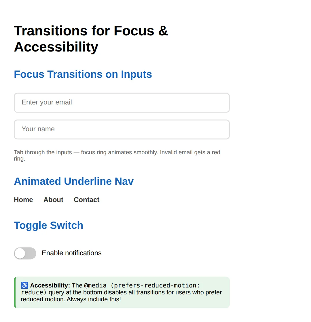
🎯 Your Turn: A Button That Works for Mouse and Keyboard
Now write one. The button below is styled and the reduced-motion guard is already in place; three ___ gaps are left, one per idea in this lesson: naming the properties you transition, moving with transform, and giving keyboard users a visible focus ring.
:focus-visible is the modern, well-behaved cousin of :focus: the browser shows the ring when someone tabs to the button, and keeps it out of the way when they simply click it. Test it by clicking an empty part of the page and then pressing Tab.
<!DOCTYPE html>
<html>
<head>
  <title>Your Turn: Subscribe Button</title>
  <style>
    body { padding: 40px; background: #0f172a; color: #e5e7eb; font-family: system-ui, sans-serif; }

    /* 🎯 YOUR TURN — replace each ___ below. Everything else already works. */

    .btn {
      padding: 12px 22px;
      border: 0;
      border-radius: 8px;
      background: #1d4ed8;
      color: #fff;
      font-size: 15px;
      cursor: pointer;

      /* 👉 1) Transition TWO named properties - background-color and
             transform - each over 0.25s with ease. Do NOT use "all":
             naming them is the habit this lesson is building.
             Separate the two with a comma. */
      transition: ___;
    }

    .btn:hover {
      background: #2563eb;

      /* 👉 2) Nudge the button 2px UP. Up is a negative Y. */
      transform: ___;
    }

    .btn:focus-visible {
      /* 👉 3) Keyboard users need to SEE where they are. Draw a 3px solid
             green (#22c55e) ring. One shorthand property does this, and
             it is not "border" - borders change the layout. */
      outline: ___;
      outline-offset: 3px;
    }

    @media (prefers-reduced-motion: reduce) {
      .btn { transition: none; }
    }

    /* ✅ Expected result, measured in Chrome:
       - At rest: background rgb(29, 78, 216), transform none, top edge y=48.
       - Hovering: background eases to rgb(37, 99, 235) and the transform
         becomes translateY(-2px), so the top edge moves to y=46.
       - Pressing Tab (not clicking): a solid 3px rgb(34, 197, 94) outline
         appears, sitting 3px clear of the button.
       - The computed transition-property should read
         "background-color, transform" - if it reads "all", blank 1 is
         still the lazy version. */
  </style>
</head>
<body>
  <button class="btn">Subscribe</button>

  <p style="color:#94a3b8;font-size:13px;">
    Click somewhere empty first, then press Tab - that is how you test :focus-visible.
  </p>
</body>
</html>
transition: background-color 0.25s ease, transform 0.25s ease;
transform: translateY(-2px);
outline: 3px solid #22c55e;Measured with the correct answers: at rest the background is rgb(29, 78, 216) and the button's top edge sits at y=48. On hover the background eases to rgb(37, 99, 235) and the top edge moves to y=46. Pressing Tab paints a 3px solid rgb(34, 197, 94) ring around it.
🏆 Mini-Challenge: A Panel That Fades Both Ways
No blanks and no answers. Build a details panel that fades in on hover and fades back out on leave — and works for someone using only a keyboard. The interesting constraint is that display cannot be transitioned: it has no in-between values, so there is nothing for the browser to animate through. The classic solution pairs opacity with visibility.
<!DOCTYPE html>
<html>
<head>
  <title>Mini-Challenge: Fading Panel</title>
  <style>
    body { padding: 40px; background: #0f172a; color: #e5e7eb; font-family: system-ui, sans-serif; }
    .wrap { position: relative; max-width: 320px; }
    .trigger { padding: 10px 16px; border: 0; border-radius: 8px; background: #1d4ed8; color: #fff; cursor: pointer; }
    .panel-content { background: #1e293b; border: 1px solid #334155; border-radius: 8px; padding: 16px; margin-top: 8px; font-size: 14px; }

    /* 🎯 MINI-CHALLENGE — write the rules yourself. No answers below.

       Build a panel that fades in when you hover the wrapper, and fades
       out again when you leave. The catch is the one in Common Mistakes:
       display cannot be transitioned, so you cannot use display: none.

       1. .panel -> the hidden state. Use THREE properties together:
            opacity: 0;
            visibility: hidden;   (removes it from the tab order and from
                                   screen readers while it is hidden)
            transition: opacity 0.3s ease, visibility 0.3s;
          Remember where that transition line has to live - see the worked
          example at the top of this lesson.

       2. .wrap:hover .panel -> the shown state:
            opacity: 1;
            visibility: visible;

       3. Also show it on keyboard focus, not just mouse hover:
            .wrap:focus-within .panel -> the same shown state.

       4. @media (prefers-reduced-motion: reduce)
            .panel -> transition: none;

       ✅ Check yourself:
          - Hover on and then off. BOTH directions must fade. If it fades
            in and vanishes instantly, your transition is in the wrong rule.
          - Press Tab to move focus onto the button. The panel must appear
            for keyboard users too - that is what :focus-within is for.
          - Swap visibility for display: none and reload. The fade will
            stop working entirely, because display has no in-between
            values to animate through.
    */
  </style>
</head>
<body>
  <div class="wrap">
    <button class="trigger">Shipping details</button>

    <div class="panel">
      <div class="panel-content">
        Free delivery on orders over £40. Everything else is £3.95.
      </div>
    </div>
  </div>
  <!-- ✅ Expected result, measured in a real browser:
     .wrap -> position: relative
     .trigger -> cursor: pointer
  -->
</body>
</html>
When to Use Transitions
- Hover/focus feedback — Buttons, links, cards, inputs — every interactive element benefits from smooth state changes.
- Reveal effects — Expanding panels, dropdown menus, tooltip appearances.
- Data visualization — Bar charts, progress bars, gauge indicators.
- Use @keyframes instead when: You need multi-step sequences, looping, or entrance animations — transitions only handle A → B.
⚠️ Common Mistakes
- Transitioning "all" — transition: all 0.3s can cause unexpected animations on properties you didn't intend. Be explicit: transition: transform 0.3s, opacity 0.3s.
- Non-animatable properties — display cannot be transitioned. Use opacity + visibility instead for show/hide effects.
- Forgetting the initial state — The transition must be on the base state, not the :hover state, or it won't animate back when the user un-hovers.
- Animating layout properties — Transitioning width, height, or margin causes reflow on every frame. Use transform: scale() instead.
- Ignoring prefers-reduced-motion — Always wrap transitions in @media (prefers-reduced-motion: reduce) to respect accessibility preferences.
- Too-long durations — Transitions over 0.5s feel sluggish. Keep hover effects at 0.2-0.3s for responsiveness. Reserve longer durations for dramatic reveals.
🎉 Lesson Complete
- ✅ transition smoothly animates between CSS states (hover, focus, class toggle)
- ✅ Timing functions control acceleration — ease, linear, and custom cubic-bezier curves
- ✅ Multiple properties can each have unique durations and delays
- ✅ Always define transitions on the base selector, not the trigger state
- ✅ Use transition-delay with nth-child for staggered wave effects
- ✅ Only transform and opacity are GPU-optimized for 60fps
- ✅ Apply transitions to focus states for polished keyboard navigation
- ✅ Always include @media (prefers-reduced-motion: reduce) for accessibility
Practice quiz
What does a CSS transition do?
- Defines a multi-step looping sequence
- Removes an element from layout
- Smoothly interpolates a property between its old and new value over a duration
- Changes the HTML structure
Answer: Smoothly interpolates a property between its old and new value over a duration. A transition animates the change of a property from one value to another over a set duration, instead of snapping instantly.
What three things does a transition require?
- A property to animate, a duration, and a trigger such as :hover or :focus
- A keyframe, a delay, and a loop
- A class, an id, and a script
- Only a duration
Answer: A property to animate, a duration, and a trigger such as :hover or :focus. You need a property (e.g. background-color), a duration (e.g. 0.3s), and a state change/trigger (like :hover or :focus) to start it.
On which state should the transition declaration be placed?
- On the :hover state
- On the body element only
- It doesn't matter
- On the base (default) state
Answer: On the base (default) state. Putting transition on the base state ensures the animation plays both ways — on hover and on un-hover. On :hover alone it won't animate back.
In the shorthand 'transition: transform 0.3s ease 0.1s', which value is the delay?
- transform
- 0.1s
- 0.3s
- ease
Answer: 0.1s. The shorthand order is property, duration, timing-function, delay — so 0.3s is the duration and 0.1s is the delay.
How does the 'linear' timing function move?
- At a constant speed throughout
- Fast then slow
- Slow then fast
- It overshoots and bounces
Answer: At a constant speed throughout. linear moves at a constant rate. ease (the default) starts fast and decelerates; ease-in starts slow; ease-out ends slow.
What lets you define a custom easing curve, including a bounce that overshoots?
- ease-in-out
- linear
- cubic-bezier()
- steps()
Answer: cubic-bezier(). cubic-bezier() defines a custom acceleration curve; control points outside 0-1 can make it overshoot and settle for a playful 'bounce'.
Which property cannot be transitioned?
- opacity
- display
- transform
- background-color
Answer: display. display is not animatable. For show/hide effects, transition opacity (and toggle visibility) instead.
Which properties are GPU-composited and run smoothly at 60fps?
- width and height
- top and left
- margin and padding
- transform and opacity
Answer: transform and opacity. transform and opacity are composited by the GPU. Animating width, height, top, or margin triggers layout reflow every frame and can cause jank.
What does transition-delay combined with nth-child enable?
- Looping animations
- Staggered 'wave' effects where each child starts slightly later
- Disabling transitions
- Random durations
Answer: Staggered 'wave' effects where each child starts slightly later. Giving each nth-child an increasing transition-delay makes them animate one after another, producing a staggered wave effect.
Why wrap transitions in @media (prefers-reduced-motion: reduce)?
- To speed up rendering
- Because transitions are otherwise invalid
- To respect users who prefer reduced motion for accessibility reasons
- To enable them only on mobile
Answer: To respect users who prefer reduced motion for accessibility reasons. Some users are sensitive to motion; the prefers-reduced-motion media query lets you disable or shorten transitions to honour that accessibility preference.
Continue this course
- Previous: Responsive Images: srcset, sizes, picture, art direction
- Next: CSS Keyframe Animations & Motion Design — Build complex, looping animations with @keyframes and timing functions
- Quick reference: HTML & CSS cheat sheet