CSS Architecture: BEM, Layers & Scalable CSS
Reviewed & published by Brayan K
After this lesson you'll structure CSS that scales — naming components with BEM, theming with variables, and controlling the cascade with layers — instead of fighting specificity wars.
Part of the free HTML & CSS course at LearnCodingFast — hands-on lessons with examples you run in your browser, plus practice exercises and a quick quiz.
What You'll Learn
- Why the cascade and specificity break down at scale
- Name components with BEM (Block__Element--Modifier)
- Choose between utility-first and component CSS (incl. Tailwind)
- Organise CSS into files that stay maintainable
- Theme with CSS custom properties (variables)
- Control specificity with @layer cascade layers
Prerequisites: You should be comfortable with selectors and the cascade from CSS Basics & Selectors. This lesson is about organising that knowledge so it scales to real projects.
💡 Real-World Analogy
CSS architecture is like organising a warehouse. One stylesheet with no system is a pile of boxes on the floor — you can find things while it's small, but at scale you're digging for hours and knocking over stacks (breaking other pages) every time you move something.
BEM is a clear label on every box (which block, which part, which variant). Custom properties are the warehouse's master settings — change the "brand colour" tag once and every shelf updates. @layer is the rule that says "the picking team's instructions always override the default layout" — a deliberate order, so nobody fights over which note wins.
1. Why CSS Breaks Down at Scale
CSS has no built-in scoping. Every rule is global, and conflicts are settled by two things: the cascade (later rules win) and specificity (more specific selectors win). In a small project that's fine. In a large one it turns into chaos: a deeply nested selector like .sidebar .widget .card div h3 styles things you didn't mean to, and is so specific that the only way to override it later is to be even more specific — or reach for !important.
The fix is an architecture: naming conventions and organisation rules that keep selectors flat and predictable, so you always know where a style lives and how to change it safely. Below is the same card written the messy way and the organised way — run it and read the comments.
<!DOCTYPE html>
<html>
<head>
  <style>
    body { font-family: system-ui, sans-serif; padding: 24px; background: #fafafa; }
    h2 { color: #1565C0; }
    pre { background: #263238; color: #EEFFFF; padding: 14px; border-radius: 8px;
          font-size: 0.8rem; overflow-x: auto; line-height: 1.5; }

    /* ❌ THE MESSY WAY — deep nesting + tag selectors.
       Specificity is (0,3,3): almost impossible to override later,
       and these rules silently style EVERY div/h3/p inside .sidebar. */
    .sidebar .widget .card div h3 { color: #1976D2; }   /* fragile + leaky */
    .sidebar .widget .card div p  { color: red !important; }  /* !important war */

    /* ✅ THE ORGANISED WAY — flat BEM classes.
       Block__Element--Modifier. Every selector is ONE class = specificity (0,1,0).
       Self-documenting, no leakage, trivially overridable. */
    .card { background: white; border-radius: 12px; box-shadow: 0 2px 8px rgba(0,0,0,.08);
            max-width: 340px; overflow: hidden; }
    .card__title { margin: 0; padding: 18px 18px 0; font-size: 1.2rem; color: #1a1a1a; }
    .card__body  { padding: 10px 18px 18px; color: #555; line-height: 1.6; }
    .card--featured { border-top: 4px solid #1976D2; }   /* a modifier */
  </style>
</head>
<body>
  <h2>Messy selector (avoid)</h2>
  <pre>.sidebar .widget .card div h3 { color: blue; }   /* specificity 0,3,3 — a trap */</pre>

  <h2>Organised with BEM (do this)</h2>
  <div class="card card--featured">
    <h3 class="card__title">Project Update</h3>
    <p class="card__body">Every class reads like a sentence: a "title" element of the
       "card" block, plus a "featured" modifier. No nesting, no conflicts.</p>
  </div>
  <!-- ✅ Expected result, measured in a real browser:
     .card -> overflow: hidden
     h2 -> color: rgb(21, 101, 192)
  -->
</body>
</html>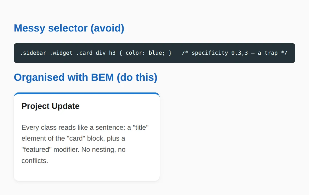
2. BEM: Block__Element--Modifier
BEM is a naming convention that keeps every selector to a single class. A Block is a standalone component (.card). An Element is a part of it, joined with two underscores (.card__title). A Modifier is a variant, joined with two hyphens (.card--featured). Because every selector is one class, specificity stays flat at (0,1,0) — no nesting, no leakage, easy to override.
BEM golden rule: never chain more than one element level. Write .card__title, not .card__header__title. If an element feels too deeply nested, it should probably be its own block.
3. Theming with Variables & Controlling the Cascade with @layer
CSS custom properties (variables) let you define your theme once on :root — colours, spacing, radii — and reference them everywhere with var(--color-accent). Change one value and the whole site updates; a dark theme is just the same components reading a different set of variables.
@layer (cascade layers) lets you decide which rules win on purpose. You declare an order — @layer base, components, utilities; — and later layers beat earlier ones regardless of specificity. That means your utilities reliably override base styles without an !important arms race. Run this to see both in action.
<!DOCTYPE html>
<html>
<head>
  <style>
    /* 1) CSS CUSTOM PROPERTIES (variables) — define your theme ONCE on :root.
          Change one value here and every component updates. */
    :root {
      --color-bg:      #f4f6fb;
      --color-surface: #ffffff;
      --color-accent:  #1976D2;
      --color-text:    #1a1a1a;
      --radius:        10px;
      --space:         16px;
    }
    /* A theme override is just a different set of the SAME variables. */
    .theme-dark {
      --color-bg:      #121212;
      --color-surface: #1e1e1e;
      --color-text:    #e0e0e0;
    }

    /* 2) @layer — CASCADE LAYERS let YOU decide which rules win, regardless of
          source order or specificity. Layers declared later beat earlier ones.
          So "components" overrides "base", and "utilities" beats everything. */
    @layer base, components, utilities;

    @layer base {
      body { font-family: system-ui, sans-serif; margin: 0; padding: var(--space);
             background: var(--color-bg); color: var(--color-text); }
      h1 { color: var(--color-accent); }
    }
    @layer components {
      .panel { background: var(--color-surface); border-radius: var(--radius);
               padding: var(--space); box-shadow: 0 2px 8px rgba(0,0,0,.1);
               margin-bottom: var(--space); }
      /* Even though this is just one class, the utilities layer below wins. */
      .panel { color: var(--color-accent); }
    }
    @layer utilities {
      .text-muted { color: #888; }   /* utilities layer beats components */
    }
  </style>
</head>
<body class="theme-dark">
  <div class="panel">
    <h1>Themed with variables</h1>
    <p>This whole panel is styled with <code>var(--...)</code> values from <code>:root</code>.</p>
    <p class="text-muted">This line is grey because the <strong>utilities</strong> layer
       beats the <strong>components</strong> layer — order of @layer wins, not specificity.</p>
  </div>
  <!-- ✅ Expected result, measured in a real browser:
     h1 -> color: rgb(25, 118, 210)
     .panel -> padding-top: 16px
  -->
</body>
</html>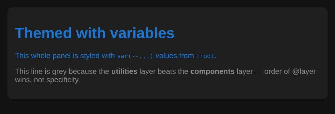
4. Utility-First vs Component CSS
There are two ways to ship styles. Component CSS puts all the styling behind one semantic class (.btn) — clean HTML, but you invent and maintain names. Utility-first composes styling from tiny single-purpose classes (.flex, .gap-2, .text-sm) right in the markup — no naming, no collisions, but busier HTML. Tailwind CSS took the utility-first approach mainstream.
You don't have to pick one. Most production codebases are a hybrid: component classes for patterns that repeat, utilities for one-off spacing and layout.
<!DOCTYPE html>
<html>
<head>
  <style>
    body { font-family: system-ui, sans-serif; padding: 24px; background: #fafafa; }
    h2 { color: #1565C0; }

    /* COMPONENT CSS — one semantic class carries all the styling. */
    .btn { padding: 8px 18px; border: none; border-radius: 8px; font-weight: 600;
           cursor: pointer; background: #1976D2; color: white; }

    /* UTILITY-FIRST — tiny single-purpose classes you compose in the HTML.
       This is the idea Tailwind CSS made mainstream. */
    .flex        { display: flex; }
    .items-center{ align-items: center; }
    .gap-2       { gap: 8px; }
    .p-4         { padding: 16px; }
    .rounded     { border-radius: 8px; }
    .bg-white    { background: #fff; }
    .shadow      { box-shadow: 0 2px 8px rgba(0,0,0,.08); }
    .text-sm     { font-size: .85rem; }
    .text-muted  { color: #666; }
    .font-bold   { font-weight: 700; }
  </style>
</head>
<body>
  <h2>Component class</h2>
  <button class="btn">Save</button>   <!-- styling hidden in the stylesheet -->

  <h2>Utility-first (Tailwind style)</h2>
  <div class="flex items-center gap-2 p-4 rounded bg-white shadow">
    <span class="font-bold">Utilities</span>
    <span class="text-sm text-muted">— styling lives in the markup; no new CSS to write.</span>
  </div>
  <!-- Trade-off: utilities are fast and conflict-free, but the HTML gets verbose.
       Most teams use a HYBRID: components for repeated patterns, utilities for one-offs. -->
  <!-- ✅ Expected result, measured in a real browser:
     .btn -> cursor: pointer
     .flex -> display: flex
     .items-center -> align-items: center
     .gap-2 -> gap: 8px
  -->
</body>
</html>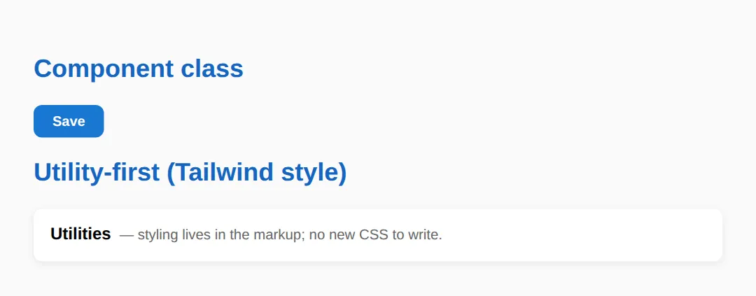
5. Organising Your CSS Files
As a project grows, one giant styles.css becomes the bottleneck. Split it into small files by role and import them in a predictable order, so anyone can guess where a style lives:
The same order maps cleanly onto cascade layers: @layer base, components, utilities;. In component frameworks (React, Vue, Svelte), CSS Modules or scoped styles solve naming at the build level — class names are made unique for you, so collisions can't happen.
🎯 Your Turn 1 — Rename to BEM
Fill in the blanks so this profile card uses proper BEM naming. The block is profile; you need a name element, a role element, and a --vip modifier. The expected result is in the comments.
<!DOCTYPE html>
<html>
<head>
  <style>
    body { font-family: system-ui, sans-serif; padding: 24px; }

    /* 🎯 YOUR TURN — rename these random classes to proper BEM.
       Block = "profile". Fill in the blanks marked ___ */

    .profile         { max-width: 320px; border: 1px solid #ddd; border-radius: 12px; padding: 16px; }
    .___             { font-size: 1.2rem; font-weight: 700; }   /* 👉 the name element: .profile__name */
    .___             { color: #666; font-size: .9rem; }         /* 👉 the role element: .profile__role */
    .___             { border-color: #1976D2; border-width: 2px; }  /* 👉 a modifier: .profile--vip */

    /* ✅ Expected: a card whose blue border (the --vip modifier) is thicker,
          with a bold name and a grey role line. */
  </style>
</head>
<body>
  <!-- Update these class names to match the BEM classes you wrote above -->
  <div class="profile ___">                <!-- 👉 add the .profile--vip modifier -->
    <p class="___">Ada Lovelace</p>         <!-- 👉 .profile__name -->
    <p class="___">Lead Engineer</p>        <!-- 👉 .profile__role -->
  </div>
</body>
</html>
🎯 Your Turn 2 — Refactor a Specificity War
A high-specificity selector with !important is a trap. Refactor it into a single flat BEM class so it's easy to override later. Fill in the two blanks.
<!DOCTYPE html>
<html>
<head>
  <style>
    body { font-family: system-ui, sans-serif; padding: 24px; }

    /* 🎯 YOUR TURN — this selector is a specificity war waiting to happen.
       Refactor it into a single flat BEM class. */

    /* ❌ Before (specificity 0,2,2, plus an !important hack):
       #page .content ul li a { color: red !important; } */

    .nav__link { color: ___; }   /* 👉 set the colour to #1976D2 (no !important needed) */

    /* ✅ Expected: the link is blue. One class (specificity 0,1,0) does the job,
          so you can override it anywhere later without an arms race. */
  </style>
</head>
<body>
  <nav id="page">
    <div class="content">
      <ul>
        <!-- 👉 give this link the flat class you defined above -->
        <li><a class="___" href="#">Home</a></li>
      </ul>
    </div>
  </nav>
</body>
</html>
🧩 Mini-Challenge — Themeable Alert
Now without the blanks. Build a themeable alert component where the success and error variants share all structural CSS and differ only by two custom properties. The brief and expected result are in the comments — write it from scratch.
<!DOCTYPE html>
<html>
<head>
  <style>
    body { font-family: system-ui, sans-serif; padding: 24px; }

    /* 🎯 MINI-CHALLENGE: a themeable "alert" component, BEM + variables
       1. On :root, define --alert-bg and --alert-text custom properties
       2. Create a block:    .alert  (uses var(--alert-bg) and var(--alert-text), padded, rounded)
       3. Create an element:  .alert__title  (bold)
       4. Create two modifiers: .alert--success and .alert--error
          — each just RE-DEFINES --alert-bg and --alert-text (no other rules!)
       5. In the body, show one success alert and one error alert

       ✅ Expected: a green success box and a red error box that share the
          exact same structural CSS — only the two variables differ. */

    /* your CSS here */
  </style>
</head>
<body>
  <!-- your two alert blocks here -->
</body>
</html>
When to Use What
- BEM: vanilla CSS with a team — everyone follows one predictable naming system.
- Custom properties: any project that needs theming, dark mode, or design tokens.
- @layer: when you want utilities/overrides to win without specificity hacks.
- Utility-first (Tailwind): rapid prototyping and one-off layout where speed beats naming.
- CSS Modules / scoped CSS: React, Vue, or Svelte apps where build tools handle scoping.
Common Errors
- Specificity wars. Symptom: "my style won't apply unless I make the selector longer." Cause: an existing high-specificity selector (IDs, long chains). Fix: flatten both to single BEM classes so they sit at (0,1,0), or move overrides into a later @layer.
- Overly nested selectors. Symptom: .sidebar .widget .card div p styles elements you never intended, and breaks when the HTML changes. Fix: replace the chain with one BEM class like .card__text — flat, scoped, and stable.
- !important abuse. Symptom: a rule only works with !important, then the next one needs !important too. Cause: you're patching a specificity problem. Fix: remove the high-specificity selector you're fighting, or use cascade layers to decide the winner intentionally.
- Global leakage. Symptom: styling one component changes another page. Cause: bare tag selectors (div, p) or generic class names applied globally. Fix: scope styles to a block (.card p → .card__text), or use CSS Modules so names are unique.
📋 Quick Reference — BEM Naming
| Part | Syntax | Meaning | Example |
|---|---|---|---|
| Block | .block | Standalone component | .card |
| Element | .block__element | A part of the block | .card__title |
| Modifier | .block--modifier | A variant of the block | .card--featured |
| Element + Modifier | .block__element--modifier | A variant of an element | .card__btn--disabled |
| Layer order | @layer base, components, utilities; | Later layer wins | utilities > components |
💡 Rule of thumb: one class per selector keeps specificity flat at (0,1,0) — predictable and easy to override.
🎉 Lesson Complete
- ✅ CSS has no native scoping — cascade + specificity cause conflicts at scale
- ✅ BEM keeps selectors flat: Block__Element--Modifier, specificity (0,1,0)
- ✅ Custom properties theme your site from one place on :root
- ✅ @layer lets later layers win on purpose — no !important arms race
- ✅ Utility-first (Tailwind) vs component CSS — most teams use a hybrid
- ✅ Split files by role (base, tokens, components, utilities) for maintainability
- ✅ Avoid specificity wars, deep nesting, !important abuse, and global leakage
Practice quiz
What does BEM stand for?
- Base, Element, Module
- Box, Edge, Margin
- Block, Element, Modifier
- Better, Easier, Maintainable
Answer: Block, Element, Modifier. BEM is Block__Element--Modifier — a naming convention that keeps selectors flat and self-documenting.
In BEM, how is an Element joined to its Block in a class name?
- With two underscores, like .card__title
- With a single hyphen, like .card-title
- With two hyphens, like .card--title
- With a dot, like .card.title
Answer: With two underscores, like .card__title. An element uses two underscores: .card__title. A modifier uses two hyphens: .card--featured.
In BEM, how is a Modifier written?
- Two underscores, like .card__featured
- A hash, like .card#featured
- A space, like .card featured
- Two hyphens, like .card--featured
Answer: Two hyphens, like .card--featured. A modifier (a variant) is joined with two hyphens, e.g. .card--featured or .card__btn--disabled.
Why does keeping every selector to a single class help?
- It makes the file smaller
- It keeps specificity flat at (0,1,0), so rules are easy to override
- It runs faster on the GPU
- It removes the need for the cascade
Answer: It keeps specificity flat at (0,1,0), so rules are easy to override. One class per selector keeps specificity at (0,1,0) — predictable, no leakage, and trivial to override later.
What is a 'specificity war'?
- Escalating selector specificity to override an already-specific rule
- Two stylesheets loading at once
- A conflict between media queries
- Animating too many elements
Answer: Escalating selector specificity to override an already-specific rule. A high-specificity selector forces you to write something even more specific to override it — an escalating arms race. BEM avoids it by staying flat.
Where do you typically define CSS custom properties (variables) for a whole-site theme?
- On every individual element
- Inside a media query only
- On the :root selector
- In the HTML head as attributes
Answer: On the :root selector. Defining variables once on :root (e.g. --color-accent) means a theme change is a single edit that cascades everywhere.
How do you reference a CSS custom property in a declaration?
- use(--color-accent)
- var(--color-accent)
- $color-accent
- @color-accent
Answer: var(--color-accent). You read a custom property with var(), e.g. color: var(--color-accent).
With @layer, which rule wins when layers conflict?
- The most specific selector, regardless of layer
- The rule with !important always
- The first rule written
- The rule in the layer declared later in the layer order
Answer: The rule in the layer declared later in the layer order. Cascade layers declared later beat earlier ones regardless of specificity. In @layer base, components, utilities; utilities wins.
What is the main trade-off of utility-first CSS (Tailwind-style)?
- It cannot be themed
- The HTML becomes verbose because styling lives in many small classes in the markup
- It has very high specificity
- It only works with IDs
Answer: The HTML becomes verbose because styling lives in many small classes in the markup. Utility-first composes styles from tiny classes (flex, gap-2, text-sm) in the markup — fast and conflict-free, but the HTML gets busy.
In React, Vue or Svelte apps, what solves class-name collisions at the build level?
- Inline styles only
- Using IDs everywhere
- CSS Modules or scoped styles, which make class names unique
- Disabling the cascade
Answer: CSS Modules or scoped styles, which make class names unique. CSS Modules / scoped styles make class names unique automatically, so collisions can't happen.
Continue this course
- Previous: Filters, Blend Modes & Modern Visual Effects
- Next: Building Reusable UI Components in Pure CSS — Cards, modals, navbars, accordions — built and documented for reuse
- Quick reference: HTML & CSS cheat sheet
Frequently asked questions
Do I have to use BEM, or is it just one option?
BEM is a convention, not a requirement — the browser does not care about your class names. Its value is for humans: Block__Element--Modifier makes class names predictable and self-documenting, so a flat .card__title is easier to reason about than a nested .sidebar .card h3. Pick a system and stay consistent; consistency matters more than which system you choose.
What is specificity and why does it cause 'wars'?
Specificity is the score the browser uses to decide which rule wins when two rules target the same element: roughly (inline, IDs, classes, elements). A selector like #page .content ul li a scores high, so to override it later you must write something even more specific — that escalation is a specificity war. BEM avoids it by keeping almost every selector at a single class (0,1,0).
When should I reach for utility-first CSS like Tailwind?
Utility-first shines when you want to move fast and avoid naming things — you compose styles from tiny classes (flex, gap-2, text-sm) right in the markup, so there is no new CSS to write and no class collisions. The trade-off is verbose HTML. Most teams use a hybrid: utilities for one-off layout, semantic component classes for patterns that repeat.
What do CSS custom properties (variables) give me that BEM does not?
BEM organises selectors; custom properties organise values. Defining --color-accent or --radius once on :root means a theme change is a single edit, and a dark theme is just the same component reading a different set of variables. They are complementary: BEM names the components, variables theme them.
How do @layer cascade layers help control specificity?
@layer lets you group rules into named layers and declare their priority order up front (e.g. @layer base, components, utilities). Later layers beat earlier ones regardless of selector specificity, so your utilities always win over base styles without !important. It is the modern, intentional way to settle 'which rule wins' instead of fighting the cascade by hand.