Custom Properties for Themes & Dynamic UI
Reviewed & published by Brayan K
Build a token-driven theme system, then switch light and dark at runtime by flipping a single attribute.
Part of the free HTML & CSS course at LearnCodingFast — hands-on lessons with examples you run in your browser, plus practice exercises and a quick quiz.
What You'll Learn
- ✓ Model your UI as design tokens instead of scattered hex codes
- ✓ Layer semantic tokens (--color-bg) over a primitive palette
- ✓ Define light and dark theme sets that share token names
- ✓ Switch themes at runtime with [data-theme] on <html>
- ✓ Use color-scheme so native widgets match your theme
- ✓ Avoid the dreaded theme flash on first paint
💡 Think of It Like This
A theme system is like a stage lighting board. The primitive layer is the rack of physical bulbs — fixed, named colours sitting in storage. The semantic layer is the labelled channels on the board: "key light", "background", "spotlight" — roles, not bulbs. Your scenery (the components) is wired to the channels, never to a specific bulb. To switch from a "day" scene to a "night" scene, you don't rewire the stage — you push one master fader and every channel re-points at different bulbs at once. That master fader is your data-theme attribute.
1. Two layers: primitives and semantics
A design token is just a named value you reuse everywhere. The trick that makes theming easy is splitting tokens into two layers. The primitive layer holds raw, colour-named values like --blue-600. The semantic layer holds role-named tokens like --color-bg and --color-text that point at primitives.
Your components read only the semantic layer. That single rule is what lets you re-theme an entire app by editing a handful of variables — never the components themselves.
2. A theme set is the semantic layer, redefined
A "theme" is nothing more than a second copy of the semantic layer with the same token names but different values. You scope each copy behind a selector on the <html> element — commonly [data-theme="dark"] or a .dark class. When that selector matches, its token values win, and every component that reads var(--color-bg) instantly updates.
Add color-scheme to each theme set so the browser styles native bits — scrollbars, form controls, the default page background — to match. Without it, your dark page keeps light scrollbars.
Worked example: a themeable card + runtime toggle
Read every comment, then press Toggle theme. Notice the card never names a colour, and the toggle only sets or removes one attribute on <html>.
<!DOCTYPE html>
<html lang="en">
<head>
<meta charset="UTF-8">
<style>
  /* ── PRIMITIVE LAYER: raw, named colours. These never appear in components. ──
     Think of these as the paint tins on the shelf — fixed values you mix from. */
  :root {
    --blue-100: #e3f2fd;
    --blue-600: #1565c0;
    --slate-50:  #f8fafc;
    --slate-900: #0f172a;
    --white:     #ffffff;
  }

  /* ── SEMANTIC LAYER (light theme): tokens named by ROLE, not colour. ──
     Components only ever read these. To re-theme, you swap THIS layer. */
  :root {
    color-scheme: light;          /* tells the browser this UI is light */
    --color-bg:      var(--slate-50);
    --color-surface: var(--white);
    --color-text:    var(--slate-900);
    --color-primary: var(--blue-600);
    --color-accent:  var(--blue-100);
  }

  /* ── Dark theme set: same token NAMES, different values. ──
     [data-theme="dark"] on <html> flips every token at once. */
  [data-theme="dark"] {
    color-scheme: dark;           /* native scrollbars/inputs go dark too */
    --color-bg:      #0b1220;
    --color-surface: #1e293b;
    --color-text:    #e2e8f0;
    --color-primary: #60a5fa;
    --color-accent:  #1e3a5f;
  }

  body {
    background: var(--color-bg);          /* reads the SEMANTIC token */
    color: var(--color-text);
    font-family: system-ui, sans-serif;
    padding: 24px;
    transition: background .25s, color .25s;  /* smooth theme swap */
  }

  /* The card hardcodes NOTHING — every colour is a token. */
  .card {
    background: var(--color-surface);
    border: 1px solid var(--color-accent);
    border-left: 4px solid var(--color-primary);
    border-radius: 12px;
    padding: 20px;
    max-width: 420px;
    box-shadow: 0 2px 10px rgba(0,0,0,0.08);
  }
  .card h3 { color: var(--color-primary); margin-top: 0; }

  .toggle {
    background: var(--color-primary);
    color: var(--color-surface);
    border: none;
    padding: 10px 18px;
    border-radius: 8px;
    font-weight: 600;
    cursor: pointer;
    margin-bottom: 20px;
  }
</style>
</head>
<body>
  <button class="toggle" onclick="toggleTheme()">Toggle theme</button>

  <div class="card">
    <h3>Themeable card</h3>
    <p>This card never names a colour. It reads --color-surface, --color-text
       and --color-primary, so swapping the theme set restyles it for free.</p>
  </div>

  <script>
    // Switching at runtime = set/remove one attribute on the <html> element.
    function toggleTheme() {
      var root = document.documentElement;          // the <html> tag
      var isDark = root.getAttribute('data-theme') === 'dark';
      if (isDark) {
        root.removeAttribute('data-theme');         // back to the :root light set
      } else {
        root.setAttribute('data-theme', 'dark');    // activate the dark set
      }
    }
  </script>
  <!-- ✅ Expected result, measured in a real browser:
     .toggle -> cursor: pointer
     .card -> max-width: 420px
  -->
</body>
</html>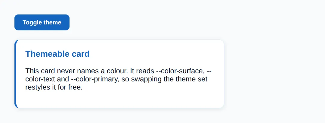
🎯 Your Turn 1: finish the semantic tokens
The theme set is wired up except for one token in each theme. Fill in the two ___ blanks so --color-primary has a value in both light and dark.
<!DOCTYPE html>
<html lang="en">
<head>
<meta charset="UTF-8">
<style>
  /* 🎯 YOUR TURN — fill in the blanks marked with ___ */

  :root {
    /* Primitive layer (already done for you) */
    --green-50:  #ecfdf5;
    --green-600: #16a34a;

    /* Semantic layer — light theme */
    color-scheme: light;
    --color-bg:      #ffffff;
    --color-text:    #14532d;
    /* 1) Add a semantic token for the button colour.       */
    /*    👉 replace ___ so --color-primary points at the green primitive */
    --color-primary: ___;
  }

  /* Dark theme set */
  [data-theme="dark"] {
    color-scheme: dark;
    --color-bg:   #052e16;
    --color-text: #dcfce7;
    /* 2) Dark theme needs its OWN value for the SAME token name.  */
    /*    👉 replace ___ with a lighter green like #4ade80          */
    --color-primary: ___;
  }

  body { background: var(--color-bg); color: var(--color-text);
         font-family: system-ui, sans-serif; padding: 24px;
         transition: background .25s, color .25s; }
  button { background: var(--color-primary); color: #fff; border: none;
           padding: 10px 18px; border-radius: 8px; font-weight: 600; cursor: pointer; }
</style>
</head>
<body>
  <button onclick="document.documentElement.toggleAttribute('data-theme')
                   || document.documentElement.setAttribute('data-theme','dark')">
    Toggle theme
  </button>
  <p>The button reads --color-primary, so it recolours when the theme flips.</p>

  <!-- ✅ Expected: a green button on white; after toggle, a brighter green on dark green.
       If the button is invisible, your --color-primary blank is still ___. -->
</body>
</html>
🎯 Your Turn 2: add a third theme
Light and dark are done. Add a "sepia" theme set behind its own [data-theme] selector, then wire the Sepia button to activate it. The selector name and the JavaScript name must match.
<!DOCTYPE html>
<html lang="en">
<head>
<meta charset="UTF-8">
<style>
  /* 🎯 YOUR TURN — add a THIRD theme set, then point the button at it */

  :root {                       /* light (default) */
    color-scheme: light;
    --color-bg: #ffffff; --color-text: #1e293b; --color-primary: #2563eb;
  }
  [data-theme="dark"] {         /* dark */
    color-scheme: dark;
    --color-bg: #0f172a; --color-text: #e2e8f0; --color-primary: #60a5fa;
  }

  /* 1) Add a "sepia" theme set below. Copy the shape above and give it warm values. */
  /*    👉 replace ___ with the selector for the sepia theme                        */
  ___ {
    color-scheme: light;
    --color-bg: #f4ecd8; --color-text: #5b4636; --color-primary: #a0522d;
  }

  body { background: var(--color-bg); color: var(--color-text);
         font-family: system-ui, sans-serif; padding: 24px;
         transition: background .25s, color .25s; }
  button { margin-right: 8px; background: var(--color-primary); color: #fff;
           border: none; padding: 8px 14px; border-radius: 8px; cursor: pointer; }
</style>
</head>
<body>
  <button onclick="document.documentElement.removeAttribute('data-theme')">Light</button>
  <button onclick="document.documentElement.setAttribute('data-theme','dark')">Dark</button>
  <!-- 2) Make this button activate your new theme.  */
       👉 replace ___ with the theme name you chose above -->
  <button onclick="document.documentElement.setAttribute('data-theme','___')">Sepia</button>

  <p>Three buttons, three themes — every page colour swaps with one attribute.</p>

  <!-- ✅ Expected: Sepia button shows a warm cream page with brown text.
       If Sepia does nothing, the selector and the JS name don't match. -->
</body>
</html>
Avoiding the theme flash: if you set the theme in a React effect, the browser paints the default theme first and the user sees a flash. The fix is a tiny blocking script in <head> that reads the saved preference and sets data-theme on <html> before the body renders, so the first paint is already correct.
🧗 Mini-Challenge: a two-theme pricing card
No blanks this time — just a comment outline. Build a primitive layer, a semantic layer, a dark theme set, a card that reads only tokens, and a toggle button. The card rules must not change when the theme flips.
<!DOCTYPE html>
<html lang="en">
<head>
<meta charset="UTF-8">
<style>
  /* 🎯 MINI-CHALLENGE: a two-theme pricing card
     1. Build a PRIMITIVE layer with 2-3 raw colours.
     2. Build a SEMANTIC layer on :root: --color-bg, --color-surface,
        --color-text, --color-primary  (set color-scheme: light).
     3. Add a [data-theme="dark"] set that redefines the SAME four tokens
        (set color-scheme: dark).
     4. Style a .price-card that reads ONLY semantic tokens — no hex codes.
     5. Add a button whose onclick toggles data-theme="dark" on <html>.

     ✅ Expected: one card whose background, text and accent all flip
        when you press the button — and you changed no .price-card rules to do it. */

  :root {
    /* your primitive + semantic tokens here */
  }

  /* your [data-theme="dark"] set here */

  body { font-family: system-ui, sans-serif; padding: 24px; }

  .price-card {
    /* read your semantic tokens here — no hardcoded colours */
  }
</style>
</head>
<body>
  <!-- your toggle button + .price-card here -->
</body>
</html>
When to Use This
- Light/dark mode: the canonical case — two theme sets, one toggle.
- Brand or white-label theming: ship the same components, swap the semantic layer per client.
- Design systems: a primitive + semantic token split keeps colour decisions in one place.
- User preferences: persist the choice and respect the OS prefers-color-scheme.
⚠️ Common Errors
- Hardcoding colours instead of tokens. Writing color: #0f172a in a component means that element ignores every theme. Fix: read a semantic token — color: var(--color-text) — so the theme controls it.
- Duplicating the same value across themes. If you paste #1565c0 into five rules, changing the brand colour means five edits and one you'll miss. Fix: define it once as a token and reference it everywhere.
- The theme flash (FOUC). Setting the theme after first paint flashes the wrong colours. Fix: set data-theme on <html> in a blocking <head> script before the body renders.
- Mismatched token names between themes. If light defines --color-bg but dark defines --bg-color, the dark page falls back to nothing. Fix: keep token names identical across every theme set.
- Forgetting color-scheme. A dark theme with light scrollbars and white form fields looks broken. Fix: add color-scheme: dark to the dark theme set.
📋 Quick Reference
| Concept | Syntax | Purpose |
|---|---|---|
| Primitive token | --blue-600: #1565c0 | Raw, colour-named value |
| Semantic token | --color-bg: var(--blue-600) | Role-named; components read these |
| Theme set | [data-theme="dark"] { … } | Redefine tokens for one theme |
| Switch at runtime | html.setAttribute('data-theme','dark') | Activate a theme set in JS |
| Native UI match | color-scheme: dark | Theme scrollbars/controls too |
| Persist choice | localStorage.setItem('theme', t) | Remember across visits |
🎉 Lesson Complete
- ✅ Design tokens are named values; splitting them into primitive and semantic layers makes theming trivial
- ✅ Components read only the semantic layer (--color-bg, --color-text)
- ✅ A theme is the semantic layer redefined behind [data-theme] or a class
- ✅ Switching themes at runtime = setting one attribute on <html>
- ✅ color-scheme makes native widgets match each theme
- ✅ A blocking head script prevents the theme flash on first paint
Practice quiz
What is a primitive design token?
- A token named by role, like --color-primary
- A JavaScript variable
- A token naming a raw value, like --blue-600: #1565c0
- A media query
Answer: A token naming a raw value, like --blue-600: #1565c0. A primitive token names a raw value (--blue-600: #1565c0); semantic tokens point at primitives by role.
What should your components read directly?
- Only semantic tokens
- Only primitive tokens
- Hardcoded hex values
- JavaScript variables
Answer: Only semantic tokens. Components read only semantic tokens, so swapping the semantic layer re-themes everything at once.
What is a 'theme' in this token-based system?
- A new set of components
- A separate CSS file
- A JavaScript function
- The semantic layer redefined with the same names but different values
Answer: The semantic layer redefined with the same names but different values. A theme is a second copy of the semantic layer: same token names, different values.
How do you typically activate a dark theme at runtime?
- Reload the page
- Set [data-theme="dark"] (or a class) on <html>
- Edit the CSS file
- Call a server API
Answer: Set [data-theme="dark"] (or a class) on <html>. Setting data-theme="dark" (or a .dark class) on <html> makes the dark token values win.
What does the color-scheme property do?
- Tells the browser which native UI (controls, scrollbars) to render
- Sets the page background color
- Defines custom properties
- Enables dark mode automatically
Answer: Tells the browser which native UI (controls, scrollbars) to render. color-scheme tells the browser to render native widgets like form controls and scrollbars to match the theme.
Why should each theme set declare its own color-scheme?
- So animations work
- To improve performance
- So native widgets like scrollbars match the theme instead of staying light
- It is required by CSS syntax
Answer: So native widgets like scrollbars match the theme instead of staying light. Without color-scheme, a dark page can keep light scrollbars and white form fields.
What causes the 'theme flash' (FOUC) on page load?
- Too many CSS variables
- Setting the theme after the first paint, e.g. in a React effect
- Using semantic tokens
- A missing caption element
Answer: Setting the theme after the first paint, e.g. in a React effect. The flash happens when JS sets the theme after the body has already painted in the default theme.
How do you prevent the theme flash on load?
- Use !important on every rule
- Avoid dark mode
- Set color-scheme to none
- Run a tiny blocking script in <head> that sets data-theme before the body renders
Answer: Run a tiny blocking script in <head> that sets data-theme before the body renders. An inline blocking <head> script sets data-theme before the first paint so it's already correct.
How would you persist a user's chosen theme across visits?
- sessionStorage only
- localStorage.setItem('theme', 'dark')
- A cookie set by CSS
- It cannot be saved
Answer: localStorage.setItem('theme', 'dark'). localStorage.setItem('theme', value) saves the choice; read it back on load to re-apply it.
If light defines --color-bg but dark defines --bg-color, what goes wrong?
- Nothing, they are aliases
- The page errors out
- The dark theme's background falls back to nothing because the names don't match
- Both backgrounds merge
Answer: The dark theme's background falls back to nothing because the names don't match. Token names must be identical across themes; a mismatch means the component finds no value in that theme.
Continue this course
- Previous: Scroll-based Animations (scroll-behavior, scroll-timeline)
- Next: Dark Mode Design with prefers-color-scheme — Implement dark mode that respects system preferences automatically
- Quick reference: HTML & CSS cheat sheet › CSS Custom Properties
Frequently asked questions
What is the difference between a primitive token and a semantic token?
A primitive token names a raw value (--blue-600: #1565c0). A semantic token names a role and points at a primitive (--color-primary: var(--blue-600)). Components only read semantic tokens, so to re-theme you swap the semantic layer once instead of editing every component.
Should I switch themes with [data-theme] or a class?
Both work the same way — you put a selector on <html> that redefines your tokens. [data-theme="dark"] reads cleanly when a theme is one of several named options; a .dark class is common when you only have light and dark. Pick one convention and use it everywhere so your token sets line up.
What does color-scheme actually do?
color-scheme: light dark (or a single value) tells the browser which native UI to render — form controls, scrollbars and the default canvas colour. Setting it per theme means built-in widgets match your custom theme instead of staying light while everything else goes dark.
How do I stop the page flashing the wrong theme on load?
The flash happens when React/JS sets the theme after the first paint. Fix it with a tiny inline script in <head> that reads the saved preference and sets data-theme on <html> before the body renders, so the very first paint is already correct.
Can I read and persist the user's chosen theme?
Yes. Save the choice with localStorage.setItem('theme', 'dark') when they toggle, and on load read it back and apply it to <html>. To respect the OS preference, fall back to matchMedia('(prefers-color-scheme: dark)') when nothing is saved.