Scroll-Based Animations
Reviewed & published by Brayan K
Scroll-based animations tie an element's movement, fade, or progress to the user's scroll position, using tools like CSS scroll snapping, scroll-driven animations, and the JavaScript IntersectionObserver to reveal content as it enters the viewport.
Part of the free HTML & CSS course at LearnCodingFast — hands-on lessons with examples you run in your browser, plus practice exercises and a quick quiz.
By the end of this lesson you'll be able to snap a gallery to each image, grow a reading-progress bar with pure CSS, reveal cards as they scroll into view with both modern CSS and JavaScript, and switch every effect off cleanly for people who prefer reduced motion.
💡 Think of It Like This
A normal CSS animation plays on a clock; a scroll-driven animation plays on a flipbook. With a flipbook, nothing moves until you turn the pages — flip fast and it races, flip slowly and it crawls, stop and it freezes. Scroll-driven animations work the same way: the scrollbar becomes the play head, so the animation's progress is whatever fraction of the page you've scrolled.
IntersectionObserver is a different tool — think of it as a motion sensor above a doorway. It doesn't track a smooth percentage; it just fires once when something crosses the threshold, and you flip a switch (add a CSS class) in response. Knowing which tool is a flipbook and which is a doorbell is half of this lesson.
1. Scroll Snap — Lock Onto Each Item
Scroll snapping makes a scroll container come to rest neatly on each child instead of stopping mid-item. You set it up with two properties: put scroll-snap-type on the scrolling container (the parent), and scroll-snap-align on each child that should be a snap point.
scroll-snap-type: x mandatory means "snap along the x axis, and you must land on a snap point". Use y for vertical galleries, and proximity instead of mandatory if you only want it to snap when the user lets go near an item. This is pure CSS — no JavaScript, and it works in every modern browser.
Run the worked example and drag the gallery sideways. Let go anywhere and it glides to centre the nearest card.
<!DOCTYPE html>
<html lang="en">
<head>
  <meta charset="UTF-8">
  <title>Scroll snap gallery</title>
  <style>
    body { font-family: system-ui, sans-serif; background:#0f172a; color:#e5e7eb; padding:24px; }

    .gallery {
      display: flex;
      gap: 16px;
      overflow-x: auto;                 /* the container that scrolls */
      scroll-snap-type: x mandatory;    /* snap on the x axis; MUST land on a point */
      padding-bottom: 12px;             /* room for the scrollbar */
    }

    .slide {
      flex: 0 0 80%;                     /* each card is 80% wide, never shrinks */
      height: 180px;
      border-radius: 12px;
      display: flex; align-items: center; justify-content: center;
      font-size: 2rem; font-weight: 700; color: white;
      scroll-snap-align: center;        /* snap point = the centre of each card */
    }
    .slide:nth-child(1) { background: linear-gradient(135deg,#2563eb,#1e40af); }
    .slide:nth-child(2) { background: linear-gradient(135deg,#16a34a,#15803d); }
    .slide:nth-child(3) { background: linear-gradient(135deg,#db2777,#9d174d); }
    .slide:nth-child(4) { background: linear-gradient(135deg,#d97706,#92400e); }
  </style>
</head>
<body>
  <h2>Drag sideways and let go</h2>
  <div class="gallery">
    <div class="slide">1</div>
    <div class="slide">2</div>
    <div class="slide">3</div>
    <div class="slide">4</div>
  </div>

  <!-- ✅ Try it: scroll the row a little, then release. It glides to centre
       the nearest card instead of resting half-way. Change "center" to
       "start" and the cards snap to the left edge instead. -->
  <!-- ✅ Expected result, measured in a real browser:
     .gallery -> display: flex
     .slide -> display: flex
     .slide -> count: 4
  -->
</body>
</html>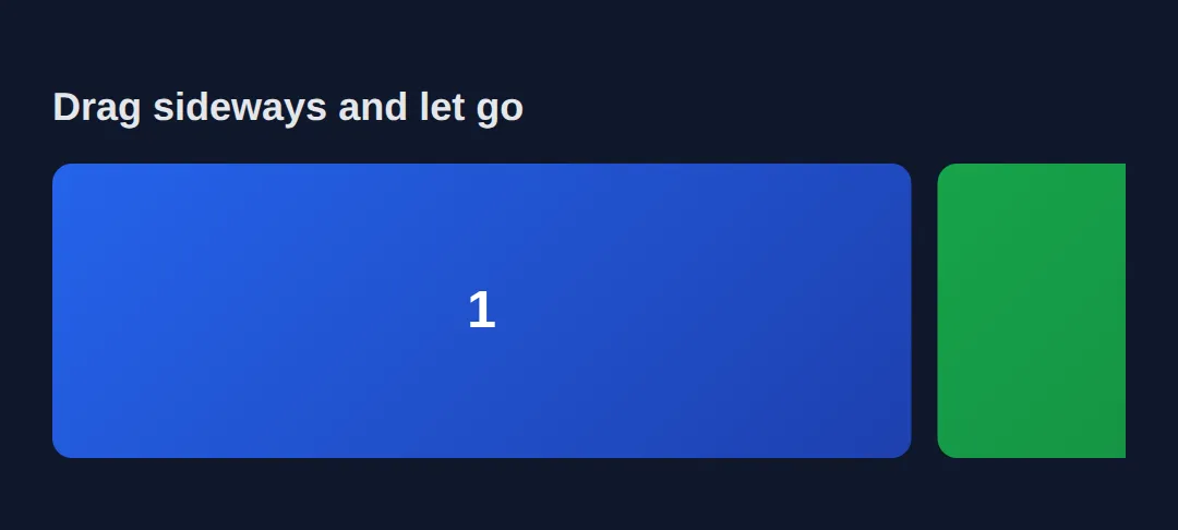
2. Scroll-Driven Animations — animation-timeline: scroll()
A normal CSS animation runs on a clock set by animation-duration. A scroll-driven animation throws that clock away and uses the scrollbar instead. You write the same @keyframes as always, then add animation-timeline: scroll() and set the duration to auto (the duration is meaningless when scroll drives it).
At 0% scrolled the animation is at its from state; at 100% scrolled it's at to. That maps perfectly to a reading progress bar that fills as you move down the page. These animations run on the compositor thread, so they stay smooth — but as of 2026 only Chromium browsers support them, which is why section 5 adds a cross-browser fallback.
Scroll the preview and watch the rainbow bar at the top grow from empty to full.
<!DOCTYPE html>
<html lang="en">
<head>
  <meta charset="UTF-8">
  <title>Scroll progress bar</title>
  <style>
    body { font-family: system-ui, sans-serif; margin:0; color:#e5e7eb; background:#0f172a; }

    .progress-bar {
      position: fixed; top:0; left:0; height:5px; width:100%;
      transform-origin: left;                 /* scale grows from the left edge */
      background: linear-gradient(90deg,#ef4444,#f59e0b,#22c55e,#3b82f6);
      z-index: 1000;
      animation: grow auto linear;            /* duration is AUTO — scroll drives it */
      animation-timeline: scroll();           /* the page scrollbar is the play head */
    }
    @keyframes grow {
      from { transform: scaleX(0); }          /* 0% scrolled => bar is empty */
      to   { transform: scaleX(1); }          /* 100% scrolled => bar is full */
    }

    .hero { height:60vh; display:flex; align-items:center; justify-content:center;
            background: linear-gradient(135deg,#1a1a2e,#16213e); }
    .hero h1 { font-size:2rem; }
    section { max-width:640px; margin:48px auto; padding:24px; border-radius:12px;
              background:#1e293b; line-height:1.8; }
    h2 { color:#60a5fa; margin-top:0; }

    /* Always provide a reduced-motion fallback. */
    @media (prefers-reduced-motion: reduce) {
      .progress-bar { animation: none; transform: scaleX(1); }  /* show full, no motion */
    }
  </style>
</head>
<body>
  <div class="progress-bar"></div>
  <div class="hero"><h1>Scroll down ↓</h1></div>
  <section><h2>Section 1</h2><p>The bar at the very top grows as you scroll — driven only by CSS animation-timeline: scroll().</p></section>
  <section><h2>Section 2</h2><p>The animation-duration is auto because scroll position, not time, controls the progress.</p></section>
  <section><h2>Section 3</h2><p>Animating transform: scaleX keeps it on the GPU compositor, so it never stutters.</p></section>

  <!-- ✅ Expected: the rainbow bar is empty at the top and exactly full when
       you reach the bottom. With OS "reduce motion" on, it just shows full. -->
  <!-- ✅ Expected result, measured in a real browser:
     .progress-bar -> position: fixed
     .hero -> display: flex
  -->
</body>
</html>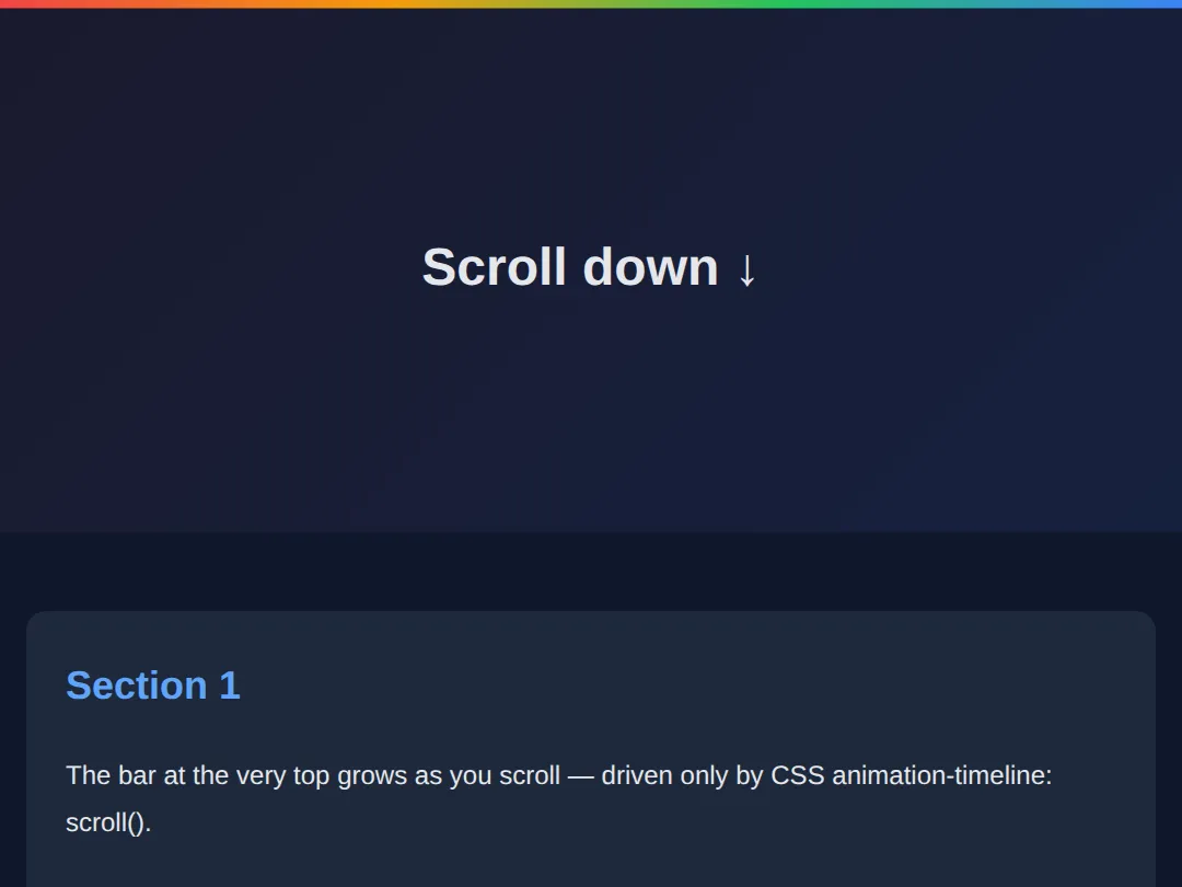
3. Per-Element Reveals — animation-timeline: view()
scroll() tracks the whole page; sometimes you want an animation tied to one element's trip through the screen. That's animation-timeline: view(). The animation starts as the element enters the viewport and finishes as it leaves, so each card animates itself with no class to toggle.
animation-range fine-tunes when within that journey it plays. animation-range: entry 0% entry 100% means "run from the moment the element starts entering until it has fully entered" — so the card has finished animating by the time you can see all of it.
<!DOCTYPE html>
<html lang="en">
<head>
  <meta charset="UTF-8">
  <title>view() timeline reveals</title>
  <style>
    body { font-family: system-ui, sans-serif; margin:0; background:#0f172a; color:#e5e7eb; }
    .spacer { height:80vh; display:flex; align-items:center; justify-content:center; color:#64748b; }

    .card {
      max-width:480px; margin:60px auto; padding:28px; border-radius:16px;
      background:#1e293b; box-shadow:0 4px 20px rgba(0,0,0,0.3);
      animation: rise auto ease-out both;     /* "both" keeps the end state after */
      animation-timeline: view();             /* THIS element's view is the timeline */
      animation-range: entry 0% entry 100%;   /* play only while it is entering */
    }
    @keyframes rise {
      from { opacity:0; transform: translateY(60px) scale(0.95); }  /* hidden, low */
      to   { opacity:1; transform: translateY(0)    scale(1);    }  /* shown, in place */
    }
    h3 { color:#60a5fa; margin-top:0; }

    /* Accessibility: no movement for reduced-motion users — show finished state. */
    @media (prefers-reduced-motion: reduce) {
      .card { animation: none; opacity:1; transform:none; }
    }
  </style>
</head>
<body>
  <div class="spacer">↓ Scroll to reveal the cards ↓</div>
  <div class="card"><h3>I animate myself</h3><p>animation-timeline: view() ties this card's animation to its own entry into the viewport — no JavaScript, no shared class.</p></div>
  <div class="card"><h3>So do I</h3><p>Each card has an independent view() timeline, so they reveal one after another as you scroll.</p></div>
  <div class="card"><h3>And me</h3><p>animation-range: entry 0% entry 100% means each card finishes rising by the time it is fully on screen.</p></div>
  <div class="spacer">— End —</div>

  <!-- ✅ Expected: each card fades and rises into place as it scrolls in.
       With OS "reduce motion" on, every card is simply shown, no movement. -->
  <!-- ✅ Expected result, measured in a real browser:
     .spacer -> display: flex
     .card -> count: 3
  -->
</body>
</html>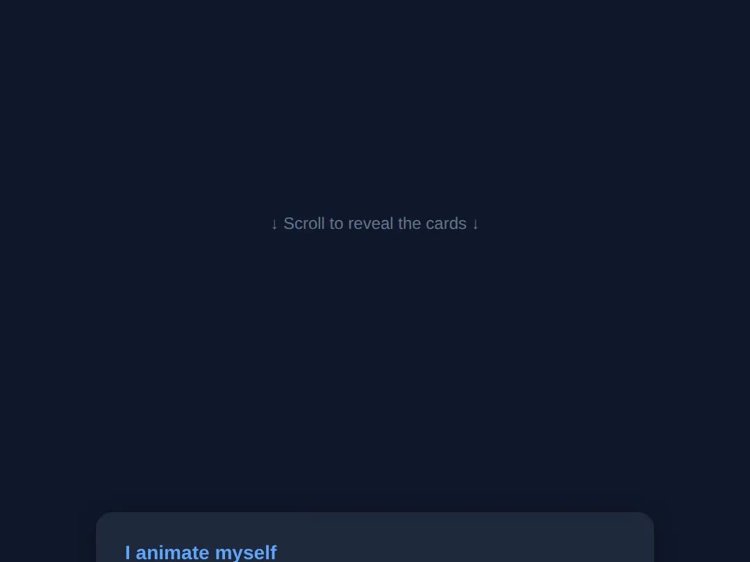
4. Sticky Reveals — position: sticky
position: sticky is the third scroll trick, and it needs no animation at all. A sticky element scrolls normally until it reaches the offset you set (e.g. top: 0), then it pins in place while the rest of its section scrolls past — and unpins when the section ends. It's how section headings stay visible and how "scrollytelling" layouts hold an image while text scrolls beside it.
The two rules to remember: a sticky element sticks within its parent (it never escapes the parent's box), and you must give it an offset like top: 0 or it has nothing to stick to.
<!DOCTYPE html>
<html lang="en">
<head>
  <meta charset="UTF-8">
  <title>Sticky headings</title>
  <style>
    body { font-family: system-ui, sans-serif; margin:0; background:#0f172a; color:#e5e7eb; }

    section { padding-bottom:40px; }

    .sticky-head {
      position: sticky;          /* scrolls, then pins... */
      top: 0;                    /* ...when it reaches the top of the viewport */
      background:#2563eb; color:white;
      padding:14px 20px; margin:0; font-size:1.2rem;
      box-shadow:0 2px 8px rgba(0,0,0,0.4);
    }
    .body-copy { padding:20px; line-height:1.9; color:#cbd5e1; }
    .body-copy p { margin:0 0 18px; }
  </style>
</head>
<body>
  <section>
    <h2 class="sticky-head">Chapter 1 (stays pinned)</h2>
    <div class="body-copy">
      <p>Scroll down. This heading sticks to the top of the screen while Chapter 1's text scrolls underneath it.</p>
      <p>It stays put only within its own section — once Chapter 2 arrives, Chapter 1's heading is pushed away.</p>
      <p>More copy so there is something to scroll. A sticky element needs an offset (top: 0) to know where to stick.</p>
      <p>Even more copy here to give the chapter some height.</p>
    </div>
  </section>
  <section>
    <h2 class="sticky-head">Chapter 2 (its turn now)</h2>
    <div class="body-copy">
      <p>Now Chapter 2's heading takes over the pin position as you scroll through this section.</p>
      <p>This is the classic pattern for long articles and "scrollytelling" layouts.</p>
      <p>Filler line to add scroll height.</p>
      <p>And one more filler line for good measure.</p>
    </div>
  </section>

  <!-- ✅ Expected: each chapter heading pins to the top while its own section
       scrolls past, then yields to the next chapter's heading. -->
  <!-- ✅ Expected result, measured in a real browser:
     .sticky-head -> position: sticky
     .body-copy -> padding-top: 20px
     .sticky-head -> count: 2
  -->
</body>
</html>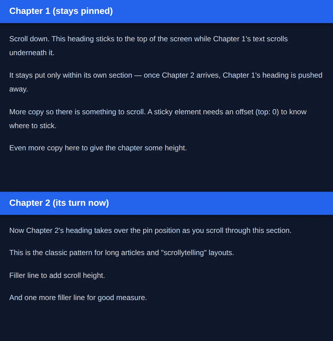
scroll() vs view() vs sticky: scroll() ties an animation to the whole page (0–100% scrolled). view() ties it to one element entering and leaving the screen. position: sticky isn't an animation at all — it just pins an element in place during part of the scroll. Reach for the simplest one that does the job.
5. The Cross-Browser Reveal — IntersectionObserver (JS)
CSS scroll-driven animations are lovely but Chromium-only today, so the workhorse for reveal-on-scroll is a tiny piece of JavaScript: IntersectionObserver. You give it a callback and a threshold (e.g. 0.15 = "fire when 15% of the element is visible"), then tell it which elements to observe. When one crosses the threshold the callback runs, and you add a CSS class — the CSS transition does the actual animating.
Why not a scroll event listener? Because that fires on every single pixel of movement and runs on the main thread. IntersectionObserver is asynchronous and only calls you at the moment that matters, so it's far smoother. For a one-time reveal, call observer.unobserve(entry.target) after revealing.
<!DOCTYPE html>
<html lang="en">
<head>
  <meta charset="UTF-8">
  <title>IntersectionObserver reveal</title>
  <style>
    body { font-family: system-ui, sans-serif; margin:0; background:#0f172a; color:#e5e7eb; }
    .spacer { height:60vh; display:flex; align-items:center; justify-content:center; color:#64748b; }

    /* Start hidden and shifted down. */
    .reveal {
      opacity:0; transform: translateY(40px);
      transition: opacity .6s ease, transform .6s ease;   /* CSS does the animating */
      max-width:560px; margin:40px auto; padding:24px; border-radius:12px;
      background:#1e293b; box-shadow:0 4px 15px rgba(0,0,0,0.3);
    }
    /* When JS adds .visible, slide to the final state. */
    .reveal.visible { opacity:1; transform: translateY(0); }
    h2 { color:#60a5fa; margin-top:0; }

    /* Reduced motion: no movement — JS still adds .visible, this just shows it instantly. */
    @media (prefers-reduced-motion: reduce) {
      .reveal { opacity:1; transform:none; transition:none; }
    }
  </style>
</head>
<body>
  <div class="spacer">↓ Scroll to reveal ↓</div>
  <div class="reveal"><h2>Fade in</h2><p>IntersectionObserver adds .visible when this card is 15% visible; the CSS transition animates it.</p></div>
  <div class="reveal"><h2>Reliable everywhere</h2><p>This pattern works in every modern browser, unlike animation-timeline.</p></div>
  <div class="reveal"><h2>One-time</h2><p>unobserve() after revealing stops the observer watching a card it is done with.</p></div>
  <div class="spacer">— End —</div>

  <script>
    // threshold: 0.15 => fire when 15% of the element is on screen.
    const observer = new IntersectionObserver((entries) => {
      entries.forEach(entry => {
        if (entry.isIntersecting) {          // the element crossed the threshold
          entry.target.classList.add('visible');   // CSS transition takes over
          observer.unobserve(entry.target);  // one-time reveal: stop watching it
        }
      });
    }, { threshold: 0.15 });

    // Tell the observer which elements to watch.
    document.querySelectorAll('.reveal').forEach(el => observer.observe(el));
  </script>

  <!-- ✅ Expected: each card fades and rises as it reaches 15% on screen, and
       does not re-animate if you scroll back up (thanks to unobserve). -->
  <!-- ✅ Expected result, measured in a real browser:
     .spacer -> display: flex
     .reveal -> opacity: 0
     .reveal -> count: 3
  -->
</body>
</html>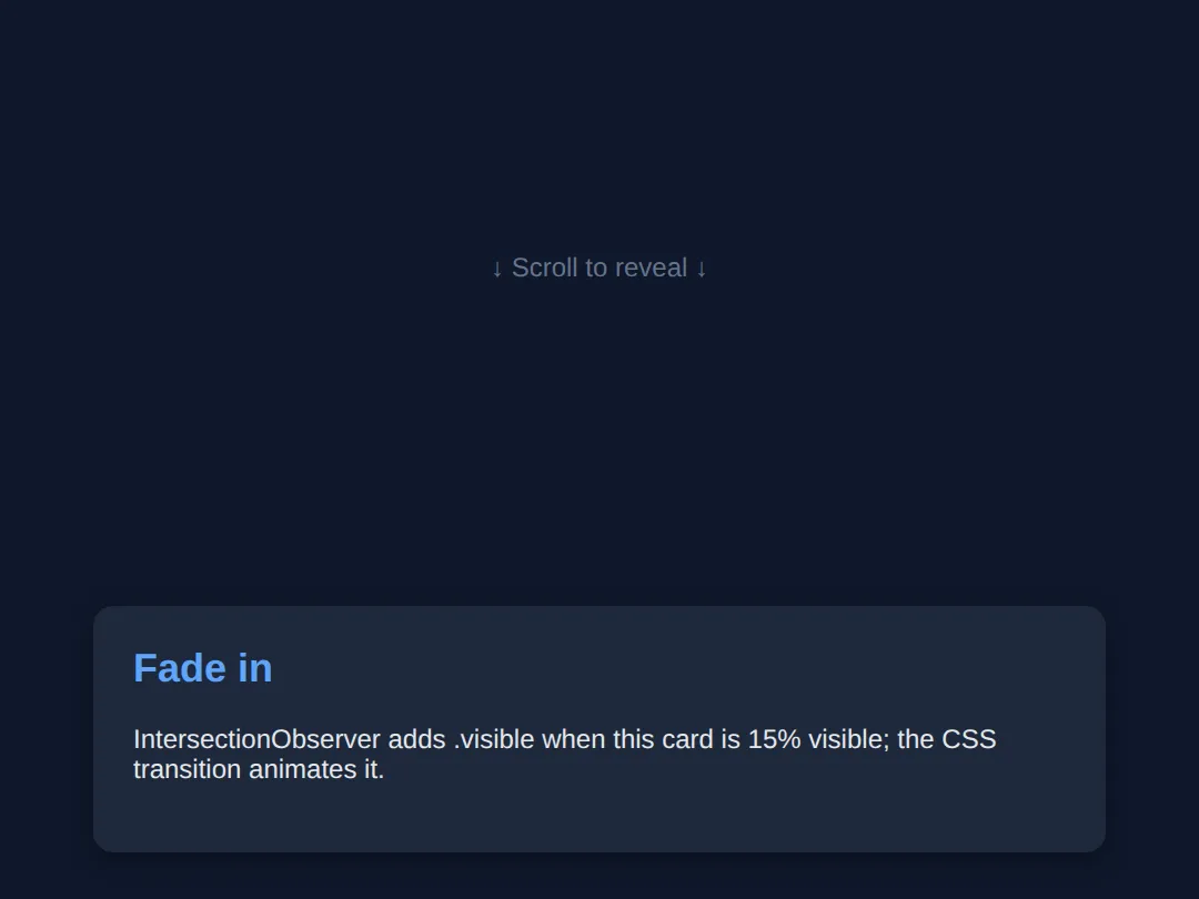
🎯 Your Turn #1 — Make a vertical snap gallery
The container below scrolls vertically but doesn't snap yet. Add the two scroll-snap properties so it locks onto each panel. Fill in the blanks marked ___, then run it and check the expected result in the comments.
<!DOCTYPE html>
<html lang="en">
<head>
  <meta charset="UTF-8">
  <title>Your Turn 1</title>
  <style>
    /* 🎯 YOUR TURN — fill in the blanks marked ___ */

    body { margin:0; font-family: system-ui, sans-serif; }

    .frame {
      height: 320px;
      overflow-y: auto;            /* this is the scrolling container */
      border: 2px solid #334155; border-radius: 12px;
      /* 1) Snap vertically, and require landing on a point. */
      ___                          /* 👉 add:  scroll-snap-type: y mandatory; */
    }

    .panel {
      height: 320px;
      display:flex; align-items:center; justify-content:center;
      color:white; font-size:2rem; font-weight:700;
      /* 2) Make the START of each panel a snap point. */
      ___                          /* 👉 add:  scroll-snap-align: start; */
    }
    .panel:nth-child(1){ background:#2563eb; }
    .panel:nth-child(2){ background:#16a34a; }
    .panel:nth-child(3){ background:#db2777; }
  </style>
</head>
<body>
  <div class="frame">
    <div class="panel">Panel A</div>
    <div class="panel">Panel B</div>
    <div class="panel">Panel C</div>
  </div>

  <!-- ✅ Expected: scrolling the box snaps cleanly to the top of each panel
       instead of stopping half-way between two of them. -->
</body>
</html>
🎯 Your Turn #2 — Wire up an IntersectionObserver reveal
The CSS for a fade-in is ready, but nothing adds the .visible class. Finish the observer so each card reveals as it scrolls in, then verify the expected behaviour in the comments.
<!DOCTYPE html>
<html lang="en">
<head>
  <meta charset="UTF-8">
  <title>Your Turn 2</title>
  <style>
    body { font-family: system-ui, sans-serif; margin:0; background:#0f172a; color:#e5e7eb; }
    .spacer { height:60vh; display:flex; align-items:center; justify-content:center; color:#64748b; }
    .reveal {
      opacity:0; transform: translateY(40px);
      transition: opacity .6s ease, transform .6s ease;
      max-width:520px; margin:40px auto; padding:24px; border-radius:12px; background:#1e293b;
    }
    .reveal.visible { opacity:1; transform: translateY(0); }
    h2 { color:#60a5fa; margin-top:0; }
    @media (prefers-reduced-motion: reduce) {
      .reveal { opacity:1; transform:none; transition:none; }
    }
  </style>
</head>
<body>
  <div class="spacer">↓ Scroll ↓</div>
  <div class="reveal"><h2>Card one</h2><p>Should fade and rise into view.</p></div>
  <div class="reveal"><h2>Card two</h2><p>Should do the same as it scrolls in.</p></div>
  <div class="spacer">— End —</div>

  <script>
    // 🎯 YOUR TURN — fill in the blanks marked ___

    const observer = new IntersectionObserver((entries) => {
      entries.forEach(entry => {
        if (entry.isIntersecting) {
          // 1) Reveal the card by adding the CSS class.
          ___                                  // 👉 entry.target.classList.add('visible');
        }
      });
    }, { threshold: 0.15 });

    // 2) Tell the observer to watch every .reveal element.
    document.querySelectorAll('.reveal').forEach(el => ___ );  // 👉 observer.observe(el)
  </script>

  <!-- ✅ Expected: each card fades and slides up as it reaches 15% on screen.
       If you change threshold to 0.6, cards reveal later (60% visible). -->
</body>
</html>
🧩 Mini-Challenge — A scroll progress bar from scratch
Support is faded now — only an outline is given. Build a page with a CSS scroll-driven progress bar, and remember the reduced-motion fallback. Use the worked example in section 2 as your reference if you get stuck.
<!DOCTYPE html>
<html lang="en">
<head>
  <meta charset="UTF-8">
  <title>Mini-Challenge</title>
  <style>
    /* 🧩 MINI-CHALLENGE: a reading-progress bar driven by scroll
       1. Make a .bar fixed to the top of the page (top:0, left:0,
            full width, a few px tall, a bright background, high z-index).
       2. Give it:  animation: grow auto linear;
                    animation-timeline: scroll();
          (note: duration is "auto" because scroll drives it, not time)
       3. Write @keyframes grow that goes from transform: scaleX(0)
            to transform: scaleX(1)  (set transform-origin: left on .bar).
       4. Add a @media (prefers-reduced-motion: reduce) block that sets
            .bar { animation: none; transform: scaleX(1); }  (or width:100%).
       5. Add enough tall content below so the page actually scrolls.

       ✅ Expected: the bar is empty at the top and exactly full at the
          bottom. With OS "reduce motion" on, it simply shows full with
          no animation. */

    body { margin:0; font-family: system-ui, sans-serif; }

    /* your CSS here */
  </style>
</head>
<body>

  <!-- your markup here: a .bar element + several tall sections to scroll -->

</body>
</html>
⚠️ Common Errors (and the fix)
- No reduced-motion fallback. Shipping scroll animations with no @media (prefers-reduced-motion: reduce) block can make motion-sensitive users feel ill and fails WCAG. Fix: add the media query and inside it set animation: none plus the element's final state, so the content is fully usable without movement.
- Jank from animating layout properties. Animating top, left, width, or margin forces layout and paint on every frame and stutters. Fix: animate transform and opacity only — they run on the GPU compositor.
- Expecting animation-timeline to work everywhere. As of 2026, animation-timeline: scroll() / view() are Chromium-only, so Safari and Firefox simply show no animation. Fix: treat it as progressive enhancement and provide an IntersectionObserver fallback for the effects that must work cross-browser.
- Forgetting animation-duration: auto. Leaving a real duration like 2s on a scroll-driven animation is a common confusion — the duration is ignored once a scroll timeline is attached. Fix: set the duration to auto so it reads clearly as scroll-controlled.
- Sticky element never sticks. position: sticky with no offset does nothing, and it can't escape an ancestor with overflow: hidden. Fix: add an offset like top: 0 and make sure no ancestor clips overflow.
- Re-firing reveals / scroll listeners for everything. Without unobserve() a reveal replays every time you scroll back, and a plain scroll listener fires on every pixel. Fix: use IntersectionObserver and call observer.unobserve(entry.target) after a one-time reveal.
📋 Quick Reference
| Goal | Use this |
|---|---|
| Snap a scroll container | scroll-snap-type: x mandatory; |
| Mark a snap point | scroll-snap-align: center; |
| Animate by page scroll | animation-timeline: scroll(); |
| Animate as an element enters | animation-timeline: view(); |
| Tune when it plays | animation-range: entry 0% entry 100%; |
| Pin while scrolling | position: sticky; top: 0; |
| Reveal-on-scroll (all browsers) | new IntersectionObserver(cb, { threshold: 0.15 }) |
| Stop watching after reveal | observer.unobserve(entry.target) |
| Respect motion preferences | @media (prefers-reduced-motion: reduce) { … } |
🎉 Lesson Complete
You can now build modern scroll-based effects and keep them accessible. The essentials:
- ✅ scroll-snap-type (parent) + scroll-snap-align (child) lock a gallery onto each item
- ✅ animation-timeline: scroll() binds an animation to page scroll (duration auto)
- ✅ animation-timeline: view() + animation-range animate an element as it enters the viewport
- ✅ position: sticky; top: 0 pins an element within its section while you scroll
- ✅ IntersectionObserver is the cross-browser reveal-on-scroll standard — toggle a class, let CSS transition
- ✅ Animate transform/opacity, not layout props, to stay jank-free
- ✅ Always add @media (prefers-reduced-motion: reduce) to switch motion off
Practice quiz
Which two properties set up CSS scroll snapping?
- scroll-behavior and scroll-margin
- overflow and snap-to
- scroll-snap-type on the container and scroll-snap-align on each child
- scroll-snap on both
Answer: scroll-snap-type on the container and scroll-snap-align on each child. Put scroll-snap-type (e.g. x mandatory) on the scrolling container and scroll-snap-align (e.g. center) on each child you want to be a snap point.
What does 'scroll-snap-type: x mandatory' mean?
- Snap along the x axis, and the scroll must land on a snap point
- Snap vertically, optionally
- Disable snapping on x
- Snap only on touch devices
Answer: Snap along the x axis, and the scroll must land on a snap point. x is the axis; mandatory forces the scroll to rest on a snap point (use proximity instead to only snap when released near one).
What binds a CSS animation to the page's scroll position?
- animation-delay: scroll
- scroll-animation: page
- animation-play-state: scroll
- animation-timeline: scroll()
Answer: animation-timeline: scroll(). animation-timeline: scroll() replaces the time-based clock with the scroll container's progress (0% at top, 100% at bottom).
Why is animation-duration set to 'auto' with a scroll timeline?
- To make it infinite
- Because scroll position, not elapsed time, drives the progress — duration is meaningless
- Because auto means 1 second
- It's a syntax requirement of @keyframes
Answer: Because scroll position, not elapsed time, drives the progress — duration is meaningless. Once a scroll timeline drives the animation, time no longer controls it, so the duration is set to auto — the scrollbar becomes the play head.
What does 'animation-timeline: view()' tie the animation to?
- A single element's journey through the viewport (enters and leaves)
- The whole page's scroll
- The browser zoom level
- A fixed 3-second timer
Answer: A single element's journey through the viewport (enters and leaves). view() maps the animation to one element's trip through the scrollport — starting as it enters and finishing as it leaves — ideal for per-element reveals.
Why animate transform and opacity rather than top, left, or width for scroll effects?
- They are easier to type
- Other properties are deprecated
- transform/opacity run on the GPU compositor and don't trigger layout or paint, so they stay smooth
- They animate slower on purpose
Answer: transform/opacity run on the GPU compositor and don't trigger layout or paint, so they stay smooth. Animating top/left/width/margin forces layout and paint every frame (jank). transform and opacity are composited on the GPU and stay smooth.
Why use IntersectionObserver instead of a scroll event listener for reveals?
- It is older
- It is asynchronous and only fires at the threshold moment, instead of on every pixel on the main thread
- It animates by itself
- Scroll events don't work on mobile
Answer: It is asynchronous and only fires at the threshold moment, instead of on every pixel on the main thread. A scroll listener fires on every pixel of movement on the main thread; IntersectionObserver is async and only calls you when an element crosses the threshold.
How do you make an IntersectionObserver reveal happen only once?
- Set threshold to 1
- Remove the element from the DOM
- Use a CSS animation instead
- Call observer.unobserve(entry.target) after adding the visible class
Answer: Call observer.unobserve(entry.target) after adding the visible class. Calling observer.unobserve(entry.target) after revealing stops the browser watching it, so it won't re-fire if the user scrolls back up.
What does position: sticky need in order to actually pin?
- A fixed parent
- An offset such as top: 0, and no ancestor that clips overflow
- display: sticky
- A high z-index only
Answer: An offset such as top: 0, and no ancestor that clips overflow. A sticky element needs a threshold like top: 0 to stick to, and it sticks within its parent; an ancestor with overflow: hidden/auto/scroll breaks it.
Why is a @media (prefers-reduced-motion: reduce) block required for scroll animations?
- It speeds up the page
- It is needed for the animation to run
- Some users get nausea or migraines from motion; honouring the setting is WCAG accessibility guidance
- It only affects print styles
Answer: Some users get nausea or migraines from motion; honouring the setting is WCAG accessibility guidance. Motion can make some users ill, so respecting the OS 'reduce motion' setting (disable animation, show the final state) is part of WCAG.
Continue this course
- Previous: CSS Keyframe Animations & Motion Design
- Next: Custom Properties (CSS Variables) for Themes & Dynamic UI — Build dark mode, themes, and dynamic UI changes with CSS variables
- Quick reference: HTML & CSS cheat sheet
Frequently asked questions
What is the difference between scroll() and view() timelines?
Both replace the default time-based clock that drives a CSS animation, but they measure different things. animation-timeline: scroll() maps the animation to how far a scroll container has been scrolled from 0% (top) to 100% (bottom) — perfect for a page-wide reading-progress bar. animation-timeline: view() maps the animation to a single element's journey through the scrollport: it starts as the element enters the viewport and finishes as it leaves. Use scroll() for whole-page effects and view() for per-element reveals.
Why does my animation-duration get ignored with a scroll timeline?
Because the timeline is no longer a clock. When you set animation-timeline: scroll() (or view()), the animation's progress is driven by scroll position, not elapsed time, so animation-duration has no meaning and you set it to auto. That is why scroll-driven keyframes use auto for the duration — the scroll bar itself becomes the play head.
Should I use CSS scroll-driven animations or IntersectionObserver?
Use whichever matches your browser-support needs. CSS scroll-driven animations (animation-timeline) are the simplest and smoothest — they run on the compositor thread — but as of 2026 they are only in Chromium browsers, so Safari and Firefox see no animation. IntersectionObserver is supported in every modern browser and is the reliable choice for reveal-on-scroll. A robust site does both: progressive-enhancement with CSS where supported, IntersectionObserver as the cross-browser baseline, and a static fallback for prefers-reduced-motion.
Why is my scroll animation janky / stuttering?
Almost always because you are animating a property that forces the browser to recalculate layout or repaint on every frame — like top, left, width, height, or margin. Animate transform and opacity instead: they run on the GPU compositor and never trigger layout or paint. translateY(40px) is smooth where top: 40px stutters. Reserve will-change for the few elements that genuinely need GPU promotion; adding it everywhere wastes memory.
How do I make a reveal happen only once?
Inside the IntersectionObserver callback, after you add the .visible class, call observer.unobserve(entry.target). That stops the browser watching an element you are done with, so it will not fire again if the user scrolls back up, and it frees resources. Without unobserve, the callback keeps running every time the element re-crosses the threshold.
Do I really need prefers-reduced-motion if the animations are subtle?
Yes. Some people experience nausea, dizziness, or migraines from motion, and the operating-system 'reduce motion' setting is how they ask sites to calm down. Honouring @media (prefers-reduced-motion: reduce) is part of WCAG accessibility guidance, not a nicety. The fix is tiny: in that media query, disable the animations and show the final state immediately, so the content is fully usable without any movement.