Building Design Systems with CSS Variables
Reviewed & published by Brayan K
A design system is a single source of truth for an interface's reusable design decisions — colours, spacing, typography, and component styles — and in CSS it is commonly built from design tokens stored as custom properties (var(--token)) so the whole product stays consistent and easy to re-theme.
Part of the free HTML & CSS course at LearnCodingFast — hands-on lessons with examples you run in your browser, plus practice exercises and a quick quiz.
💡 Think of It Like This
A design system is like a LEGO set — each brick (token) has a specific size, color, and shape. Instead of sculpting every element from scratch, you assemble consistent UIs by snapping tokens together. Changing a token is like swapping the color of a LEGO brick: every structure using it updates at once.
Understanding Design Systems
A design system is a collection of reusable decisions — colors, spacing, typography, component patterns — encoded as CSS custom properties (also called "design tokens"). Instead of scattering #1976D2 across 50 files, you define it once as --color-primary and reference it everywhere.
This approach has three major benefits: consistency (every button uses the same blue), maintainability (change the blue once, everything updates), and theming (swap all tokens at once for dark mode or branding).
Design tokens are organized in layers. Primitive tokens are raw values like --blue-500: #1976D2. Semantic tokens give them meaning: --color-primary: var(--blue-500). Component tokens scope to specific elements: --btn-bg: var(--color-primary). This layering makes large codebases manageable.
Token Naming Convention
| Layer | Example | Purpose | When to Use |
|---|---|---|---|
| Primitive | --blue-500 | Raw color value | Never directly in components |
| Semantic | --color-primary | Role-based reference | In most CSS rules |
| Component | --btn-bg | Scoped to a component | For complex component variants |
| Spacing | --space-4 | Consistent whitespace | All padding, margin, gap values |
Worked Example: One Token, Four Components
Before you write a token of your own, it is worth seeing exactly what you get back for the effort. The example below has four unrelated components — a button, a badge, a link and a progress bar — and not one of them names a colour. They all read the same --brand token.
The second panel is byte-for-byte the same markup and the same classes. The only difference is one attribute, which triggers a single line of CSS redefining --brand on that panel. Because custom properties inherit, every component inside it re-skins itself. This is the whole idea behind design systems, dark mode, and per-customer white-labelling.
<!DOCTYPE html>
<html>
<head>
  <title>One token, four components</title>
  <style>
    /* THE TOKENS. :root is the html element, so every rule below can see these. */
    :root {
      --brand: #1976D2;          /* the one value that decides the brand colour */
      --brand-contrast: #FFFFFF; /* text that sits ON the brand colour */
      --space-md: 16px;
      --radius-md: 8px;
    }

    body {
      font-family: system-ui, sans-serif;
      padding: 24px;
      background: #FAFAFA;
      color: #212121;
    }

    .panel {
      border: 1px solid #E0E0E0;
      border-radius: var(--radius-md);
      padding: var(--space-md);
      margin-bottom: var(--space-md);
      background: #FFFFFF;
    }

    /* Four completely different components. Not one of them names a colour.
       They all ask the same question: "what is --brand right now?" */
    .btn {
      background: var(--brand);
      color: var(--brand-contrast);
      border: 0;
      border-radius: var(--radius-md);
      padding: 10px 18px;
      font-size: 14px;
      cursor: pointer;
    }
    .badge {
      display: inline-block;
      background: var(--brand);
      color: var(--brand-contrast);
      border-radius: 999px;
      padding: 4px 10px;
      font-size: 12px;
    }
    .link { color: var(--brand); }
    .bar  { height: 6px; background: var(--brand); border-radius: 3px; margin-top: var(--space-md); }

    /* THE PAYOFF. Custom properties inherit, so redefining --brand on ONE
       element re-skins everything inside it. No component CSS is touched. */
    .panel[data-brand="mint"] { --brand: #0F766E; }

    h3 { font-size: 13px; color: #757575; margin: 0 0 8px; text-transform: uppercase; }
  </style>
</head>
<body>
  <h1>One token, four components</h1>

  <div class="panel">
    <h3>Default brand</h3>
    <button class="btn">Save</button>
    <span class="badge">New</span>
    <a class="link" href="#">Read more</a>
    <div class="bar"></div>
  </div>

  <!-- Same markup, same classes. One extra attribute. -->
  <div class="panel" data-brand="mint">
    <h3>Mint brand - one line changed</h3>
    <button class="btn">Save</button>
    <span class="badge">New</span>
    <a class="link" href="#">Read more</a>
    <div class="bar"></div>
  </div>
  <!-- ✅ Expected result, measured in a real browser:
     .btn -> cursor: pointer
     .badge -> display: inline-block
     h3 -> text-transform: uppercase
     .panel -> count: 2
  -->
</body>
</html>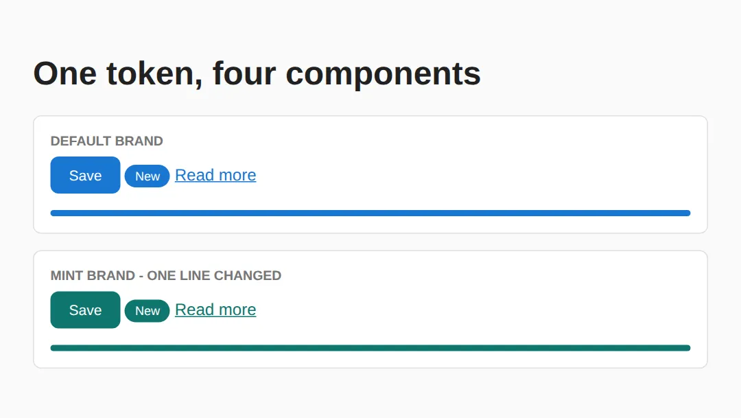
In the first panel the button background, badge background, link colour and bar background all compute to the identical rgb(25, 118, 210). In the second panel all four compute to rgb(15, 118, 110). Four components changed; one line of CSS was written.
Step 1: Define Your Tokens
Start by defining all your visual decisions in :root. This includes colors, spacing, typography, and border radii. The editor below shows a complete token set with a visual swatch grid.
<!DOCTYPE html>
<html>
<head>
    <style>
        :root {
            --color-primary: #1976D2;
            --color-primary-light: #BBDEFB;
            --color-primary-dark: #0D47A1;
            --color-success: #2E7D32;
            --color-danger: #C62828;
            --color-text: #212121;
            --color-text-muted: #757575;
            --color-bg: #FAFAFA;
            --color-surface: #FFFFFF;

            --space-xs: 4px;
            --space-sm: 8px;
            --space-md: 16px;
            --space-lg: 24px;
            --space-xl: 32px;

            --font-body: 'Segoe UI', system-ui, sans-serif;
            --font-mono: 'Consolas', monospace;
            --text-sm: 0.875rem;
            --text-base: 1rem;
            --text-lg: 1.25rem;
            --text-xl: 1.5rem;
            --text-2xl: 2rem;

            --radius-sm: 4px;
            --radius-md: 8px;
            --radius-lg: 16px;
            --radius-full: 9999px;
        }

        body {
            font-family: var(--font-body);
            color: var(--color-text);
            background: var(--color-bg);
            padding: var(--space-lg);
        }
        h1 { font-size: var(--text-2xl); margin-bottom: var(--space-md); }
        .token-grid {
            display: grid;
            grid-template-columns: repeat(auto-fill, minmax(140px, 1fr));
            gap: var(--space-md);
        }
        .swatch {
            padding: var(--space-md);
            border-radius: var(--radius-md);
            background: var(--color-surface);
            box-shadow: 0 1px 3px rgba(0,0,0,0.12);
            text-align: center;
        }
        .swatch-color {
            height: 48px;
            border-radius: var(--radius-sm);
            margin-bottom: var(--space-sm);
        }
        .swatch code { font-family: var(--font-mono); font-size: var(--text-sm); color: var(--color-text-muted); }
    </style>
</head>
<body>
    <h1>Design Tokens</h1>
    <p style="color: var(--color-text-muted); margin-bottom: var(--space-lg);">All colors, spacing, and typography defined as CSS custom properties.</p>

    <div class="token-grid">
        <div class="swatch">
            <div class="swatch-color" style="background: var(--color-primary);"></div>
            <code>--color-primary</code>
        </div>
        <div class="swatch">
            <div class="swatch-color" style="background: var(--color-primary-light);"></div>
            <code>--color-primary-light</code>
        </div>
        <div class="swatch">
            <div class="swatch-color" style="background: var(--color-success);"></div>
            <code>--color-success</code>
        </div>
        <div class="swatch">
            <div class="swatch-color" style="background: var(--color-danger);"></div>
            <code>--color-danger</code>
        </div>
    </div>
  <!-- ✅ Expected result, measured in a real browser:
     .token-grid -> display: grid
     h1 -> font-size: 32px
     .swatch -> count: 4
  -->
</body>
</html>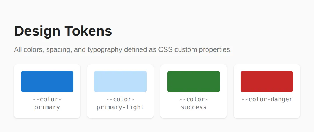
Step 2: Build Components with Tokens
Once tokens are defined, every component references them instead of hardcoded values. Notice how .btn-primary uses var(--color-primary) and .card uses var(--color-surface). If you change --color-primary from blue to purple, every button and accent updates automatically.
<!DOCTYPE html>
<html>
<head>
    <style>
        :root {
            --color-primary: #1976D2;
            --color-primary-hover: #1565C0;
            --color-surface: #FFFFFF;
            --color-text: #212121;
            --color-text-muted: #757575;
            --color-border: #E0E0E0;
            --space-sm: 8px;
            --space-md: 16px;
            --space-lg: 24px;
            --radius-md: 8px;
            --font-body: system-ui, sans-serif;
        }

        body { font-family: var(--font-body); padding: var(--space-lg); background: #F5F5F5; color: var(--color-text); }

        .btn {
            display: inline-flex;
            align-items: center;
            gap: var(--space-sm);
            padding: 10px 20px;
            border: none;
            border-radius: var(--radius-md);
            font-size: 1rem;
            font-weight: 600;
            cursor: pointer;
            transition: background 0.2s, transform 0.1s;
        }
        .btn:active { transform: scale(0.97); }
        .btn-primary { background: var(--color-primary); color: white; }
        .btn-primary:hover { background: var(--color-primary-hover); }
        .btn-outline { background: transparent; border: 2px solid var(--color-primary); color: var(--color-primary); }
        .btn-outline:hover { background: var(--color-primary); color: white; }

        .card {
            background: var(--color-surface);
            border: 1px solid var(--color-border);
            border-radius: var(--radius-md);
            padding: var(--space-lg);
            margin-bottom: var(--space-md);
        }
        .card h3 { margin: 0 0 var(--space-sm); }
        .card p { color: var(--color-text-muted); margin: 0 0 var(--space-md); }

        .badge {
            display: inline-block;
            padding: 2px 10px;
            font-size: 0.75rem;
            font-weight: 700;
            border-radius: 9999px;
            text-transform: uppercase;
        }
        .badge-info { background: #E3F2FD; color: #1565C0; }
        .badge-success { background: #E8F5E9; color: #2E7D32; }
    </style>
</head>
<body>
    <h1>Reusable Components</h1>

    <div class="card">
        <h3>Project Alpha <span class="badge badge-success">Active</span></h3>
        <p>A component library built entirely with CSS custom properties.</p>
        <button class="btn btn-primary">View Details</button>
        <button class="btn btn-outline" style="margin-left: 8px;">Edit</button>
    </div>

    <div class="card">
        <h3>Design Tokens <span class="badge badge-info">New</span></h3>
        <p>Centralized tokens make theming effortless.</p>
        <button class="btn btn-primary">Explore</button>
    </div>
  <!-- ✅ Expected result, measured in a real browser:
     .btn -> display: inline-flex
     .badge -> display: inline-block
     .btn -> count: 3
  -->
</body>
</html>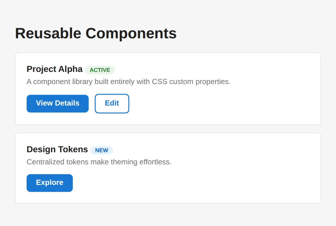
Step 3: Establish a Spacing Scale
A spacing scale eliminates "magic numbers" — those arbitrary pixel values like padding: 13px that creep into CSS. Instead, every spacing value comes from a predefined scale (4, 8, 12, 16, 24, 32, 48, 64px). This creates visual rhythm and makes your layouts feel cohesive.
<!DOCTYPE html>
<html>
<head>
    <style>
        :root {
            --space-1: 4px;
            --space-2: 8px;
            --space-3: 12px;
            --space-4: 16px;
            --space-5: 20px;
            --space-6: 24px;
            --space-8: 32px;
            --space-10: 40px;
            --space-12: 48px;
            --space-16: 64px;

            --color-primary: #1976D2;
            --color-surface: #fff;
            --color-border: #e0e0e0;
            --color-text: #212121;
            --color-muted: #757575;
            --radius-md: 8px;
        }

        body { font-family: system-ui, sans-serif; padding: var(--space-6); color: var(--color-text); }

        .scale-demo { max-width: 500px; }
        .scale-row {
            display: flex;
            align-items: center;
            gap: var(--space-4);
            margin: var(--space-2) 0;
        }
        .scale-label {
            width: 80px;
            font-family: monospace;
            font-size: 0.85rem;
            color: var(--color-muted);
        }
        .scale-bar {
            height: 24px;
            background: var(--color-primary);
            border-radius: 4px;
            opacity: 0.8;
        }
        .scale-value {
            font-size: 0.8rem;
            color: var(--color-muted);
        }

        /* Layout example using the scale */
        .layout-demo {
            border: 1px solid var(--color-border);
            border-radius: var(--radius-md);
            overflow: hidden;
            margin-top: var(--space-8);
        }
        .layout-header {
            background: var(--color-primary);
            color: white;
            padding: var(--space-4) var(--space-6);
            font-weight: 600;
        }
        .layout-body {
            padding: var(--space-6);
        }
        .layout-body p {
            margin: 0 0 var(--space-4);
            color: var(--color-muted);
        }
        .layout-footer {
            background: #f5f5f5;
            padding: var(--space-3) var(--space-6);
            font-size: 0.85rem;
            color: var(--color-muted);
            border-top: 1px solid var(--color-border);
        }

        h2 { color: var(--color-primary); }
    </style>
</head>
<body>
    <h1>Spacing Scale System</h1>
    <p>A consistent spacing scale prevents "magic numbers" in your CSS. Every spacing value references a token.</p>

    <h2>The Scale</h2>
    <div class="scale-demo">
        <div class="scale-row"><span class="scale-label">--space-1</span><div class="scale-bar" style="width: 4px;"></div><span class="scale-value">4px</span></div>
        <div class="scale-row"><span class="scale-label">--space-2</span><div class="scale-bar" style="width: 8px;"></div><span class="scale-value">8px</span></div>
        <div class="scale-row"><span class="scale-label">--space-4</span><div class="scale-bar" style="width: 16px;"></div><span class="scale-value">16px</span></div>
        <div class="scale-row"><span class="scale-label">--space-6</span><div class="scale-bar" style="width: 24px;"></div><span class="scale-value">24px</span></div>
        <div class="scale-row"><span class="scale-label">--space-8</span><div class="scale-bar" style="width: 32px;"></div><span class="scale-value">32px</span></div>
        <div class="scale-row"><span class="scale-label">--space-12</span><div class="scale-bar" style="width: 48px;"></div><span class="scale-value">48px</span></div>
        <div class="scale-row"><span class="scale-label">--space-16</span><div class="scale-bar" style="width: 64px;"></div><span class="scale-value">64px</span></div>
    </div>

    <h2>Applied to a Card Layout</h2>
    <div class="layout-demo">
        <div class="layout-header">Card Header (space-4 / space-6)</div>
        <div class="layout-body">
            <p>Body uses <code>padding: var(--space-6)</code> and paragraph gap is <code>var(--space-4)</code>.</p>
            <p>Every dimension comes from the scale — no arbitrary pixel values.</p>
        </div>
        <div class="layout-footer">Footer uses space-3 vertical, space-6 horizontal</div>
    </div>
  <!-- ✅ Expected result, measured in a real browser:
     .scale-row -> display: flex
     .scale-bar -> opacity: 0.8
     .layout-demo -> overflow: hidden
     .scale-row -> count: 7
  -->
</body>
</html>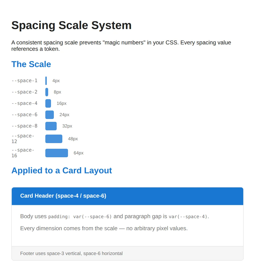
Step 4: Add Theme Switching
The ultimate payoff of a token-based system is effortless theming. By overriding tokens inside a [data-theme] attribute selector, you can switch every color in your UI with a single attribute change. No class toggling, no JavaScript manipulation of individual elements — just change the data attribute and the cascade does the rest.
<!DOCTYPE html>
<html>
<head>
    <style>
        :root {
            --bg: #FFFFFF;
            --text: #1a1a2e;
            --primary: #0f3460;
            --accent: #e94560;
            --surface: #f0f0f0;
        }

        [data-theme="dark"] {
            --bg: #1a1a2e;
            --text: #e0e0e0;
            --primary: #4fc3f7;
            --accent: #ff6b6b;
            --surface: #16213e;
        }

        [data-theme="forest"] {
            --bg: #f1f8e9;
            --text: #1b5e20;
            --primary: #2e7d32;
            --accent: #ff8f00;
            --surface: #c8e6c9;
        }

        body {
            background: var(--bg);
            color: var(--text);
            font-family: system-ui, sans-serif;
            padding: 24px;
            transition: background 0.3s, color 0.3s;
        }

        .theme-switcher { margin-bottom: 20px; }
        .theme-switcher button {
            padding: 8px 16px;
            margin: 4px;
            border: 2px solid var(--primary);
            background: transparent;
            color: var(--primary);
            border-radius: 6px;
            cursor: pointer;
            font-weight: 600;
        }
        .theme-switcher button:hover { background: var(--primary); color: var(--bg); }

        .demo-card {
            background: var(--surface);
            padding: 24px;
            border-radius: 12px;
            border-left: 4px solid var(--accent);
            margin: 16px 0;
        }
        .demo-card h3 { color: var(--primary); margin-top: 0; }

        a { color: var(--accent); }
    </style>
</head>
<body>
    <h1>Theme Switching with CSS Variables</h1>

    <div class="theme-switcher">
        <button onclick="document.body.removeAttribute('data-theme')">☀ Light</button>
        <button onclick="document.body.setAttribute('data-theme','dark')">🌙 Dark</button>
        <button onclick="document.body.setAttribute('data-theme','forest')">🌲 Forest</button>
    </div>

    <div class="demo-card">
        <h3>Dynamic Theming</h3>
        <p>Click the buttons above. All colors update instantly because every component uses CSS custom properties — no class swapping needed.</p>
        <p><a href="#">Learn more about theming →</a></p>
    </div>

    <div class="demo-card">
        <h3>How It Works</h3>
        <p>Define your default tokens in <code>:root</code>, then override them inside <code>[data-theme="dark"]</code>. Every element using <code>var(--token)</code> updates automatically.</p>
    </div>
  <!-- ✅ Expected result, measured in a real browser:
     .theme-switcher button -> cursor: pointer
     .demo-card -> padding-top: 24px
     .demo-card -> count: 2
  -->
</body>
</html>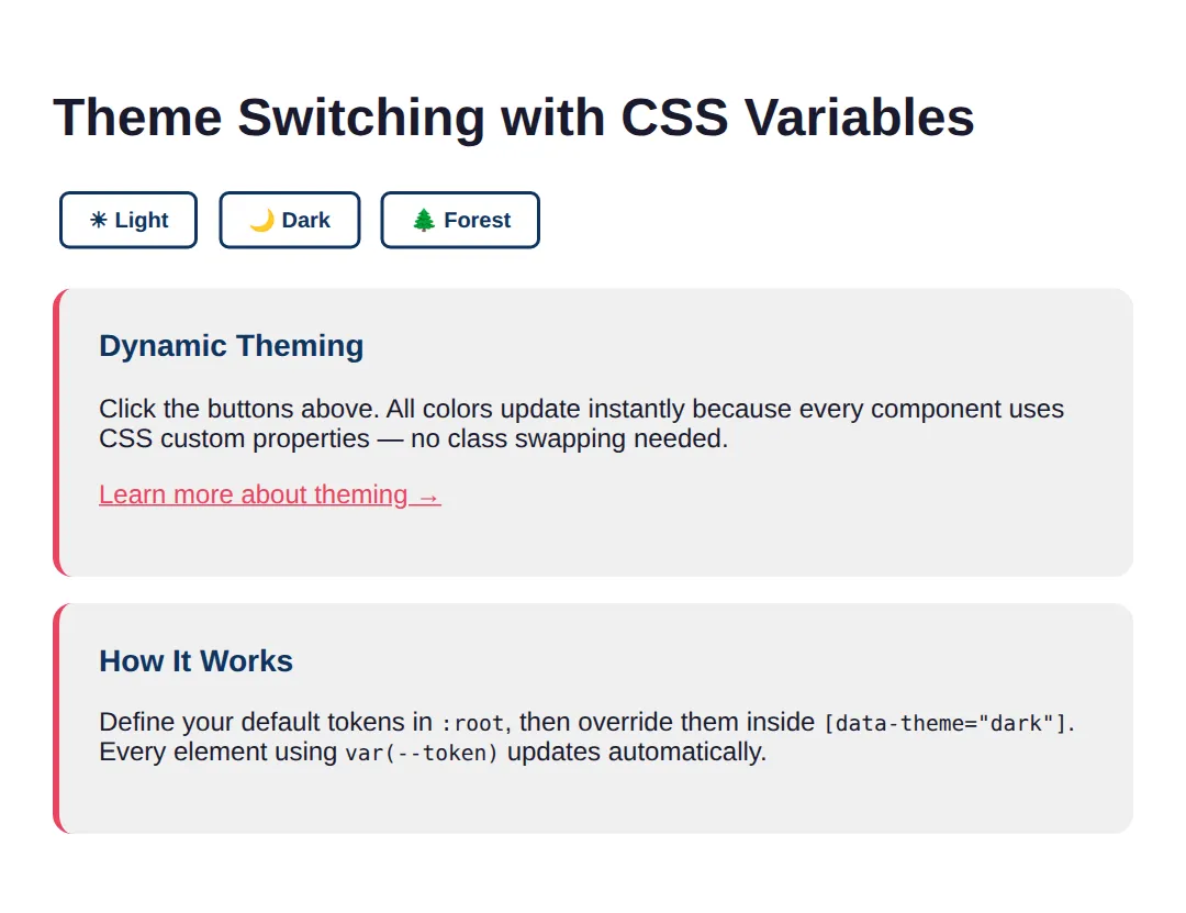
🎯 Your Turn: Wire Up Your Own Tokens
Your turn. Two cards are already built; three ___ gaps are left, one for each habit this lesson is trying to build: define a scale step, consume it with var(), and override a token instead of writing a new component rule.
<!DOCTYPE html>
<html>
<head>
  <title>Your Turn: Tokens</title>
  <style>
    /* 🎯 YOUR TURN — three ___ gaps are marked with 👉 below.
       Everything else on this page already works. */

    *, *::before, *::after { box-sizing: border-box; }

    :root {
      --brand: #1976D2;
      --on-brand: #FFFFFF;
      --space-sm: 8px;

      /* 👉 1) The medium step of the spacing scale. This lesson uses a
             4px base: xs 4, sm 8, md ?, lg 24, xl 32. Fill in md. */
      --space-md: ___;

      --radius-md: 8px;
    }

    body {
      font-family: system-ui, sans-serif;
      background: #FAFAFA;
      color: #212121;
      padding: 24px;
    }

    .card {
      background: #FFFFFF;
      border: 1px solid #E0E0E0;
      border-radius: var(--radius-md);

      /* 👉 2) Never type a raw pixel value in a component. Ask the scale
             for the medium step instead. Wrap the token name in var(). */
      padding: ___;

      margin-bottom: var(--space-md);
      max-width: 320px;
    }
    .card h2 { margin: 0 0 var(--space-sm); font-size: 1.1rem; }
    .card p  { margin: 0 0 var(--space-md); font-size: .9rem; color: #757575; }

    .btn {
      background: var(--brand);
      color: var(--on-brand);
      border: 0;
      border-radius: var(--radius-md);
      padding: var(--space-sm) var(--space-md);
      font-size: .9rem;
      cursor: pointer;
    }

    /* 👉 3) Re-skin the danger card WITHOUT writing a new .btn rule.
           Override the token instead. Use the red #C62828. */
    .card[data-tone="danger"] { --brand: ___; }

    /* ✅ Expected result, measured in Chrome:
       - Both cards render exactly 320px wide with 16px of padding.
       - The first button's background computes to rgb(25, 118, 210).
       - The second button's background computes to rgb(198, 40, 40),
         even though both buttons share the identical .btn rule.
       - If the second button stays blue, blank 3 is setting a normal
         property such as "background" instead of the --brand token. */
  </style>
</head>
<body>
  <div class="card">
    <h2>Save changes</h2>
    <p>Your edits are not saved yet.</p>
    <button class="btn">Save</button>
  </div>

  <div class="card" data-tone="danger">
    <h2>Delete project</h2>
    <p>This cannot be undone.</p>
    <button class="btn">Delete</button>
  </div>
</body>
</html>
--space-md: 16px;
padding: var(--space-md);
.card[data-tone="danger"] { --brand: #C62828; }Blank 3 is the one that matters. Writing .card[data-tone="danger"] .btn { background: #C62828; } would also turn the button red — and it is exactly the habit a design system exists to stop. One override per token scales; one override per component is how stylesheets end up with fourteen shades of red.
🏆 Mini-Challenge: A Three-Variant Alert
No blanks and no answers. Build an alert component with info, success and danger variants where each variant is a single line of CSS. The trick is a local token: the base rule declares its own --alert-accent with a default, uses it in several places, and each variant simply redefines that one value.
The self-check in the code is deliberately strict: no hex colours anywhere below :root, and adding a fourth variant must cost you two lines. If it costs more, the component is not really token-driven yet.
When to Use Design Systems
- Any project with more than one page — Even small sites benefit from centralized tokens for consistency.
- Team projects — Tokens are a shared vocabulary that prevents "which blue?" conversations.
- Products with theming needs — Dark mode, white-label branding, or seasonal themes become trivial.
- Not needed for: One-off prototypes or single-page experiments where speed matters more than maintainability.
⚠️ Common Mistakes
- Too many tokens too early — Start with 10–15 core tokens. Add more only when you notice repetition across 3+ places.
- Using raw values in components — Always reference tokens: color: var(--color-primary), never color: #1976D2.
- Forgetting fallbacks — var(--color-primary, blue) prevents breakage if a token is missing.
- Inconsistent naming — Pick one convention and stick with it. Don't mix --clr-primary and --color-main.
- Skipping the spacing scale — Without it, every developer invents their own padding values, creating visual inconsistency.
- Not documenting tokens — Create a reference page (like the swatch grid above) so the team knows what's available.
🎉 Lesson Complete
- ✅ Design tokens centralize all visual decisions in :root
- ✅ Primitive → Semantic → Component is the standard token layering
- ✅ A spacing scale (4, 8, 16, 24, 32…) eliminates magic numbers
- ✅ Components use only tokens, making themes a simple override
- ✅ [data-theme] attribute enables instant multi-theme switching
- ✅ Start small: 10-15 tokens cover most projects initially
- ✅ Always provide fallback values with var(--token, fallback)
- ✅ Document your tokens visually so the team has a shared reference
Practice quiz
What is a 'design token' in a CSS design system?
- A JavaScript function that styles elements
- A type of HTML element
- A reusable design decision (color, spacing, etc.) stored as a value, commonly a CSS custom property
- A licensing key for a CSS framework
Answer: A reusable design decision (color, spacing, etc.) stored as a value, commonly a CSS custom property. Design tokens are reusable design decisions, typically stored as CSS custom properties.
Where are global design tokens most commonly defined in CSS?
- In the :root pseudo-class
- Inside @media queries
- On the <body> tag's style attribute
- In a separate JSON file only
Answer: In the :root pseudo-class. Global custom properties are usually declared in :root so they are available document-wide.
How do you reference a CSS custom property named --color-primary?
- color: $color-primary;
- color: @color-primary;
- color: custom(color-primary);
- color: var(--color-primary);
Answer: color: var(--color-primary);. You read a custom property with the var() function: var(--color-primary).
What is the standard layering order for design tokens?
- Component → Semantic → Primitive
- Primitive → Semantic → Component
- Semantic → Primitive → Component
- Primitive → Component → Semantic
Answer: Primitive → Semantic → Component. Tokens layer from primitive (raw values) to semantic (role-based) to component (scoped).
Which is an example of a primitive token?
- --blue-500
- --color-primary
- --btn-bg
- --color-danger
Answer: --blue-500. A primitive token like --blue-500 holds a raw value, not a role.
How does var() let you provide a fallback value?
- var(--token || fallback)
- var(--token; fallback)
- var(--token, fallback)
- var(--token: fallback)
Answer: var(--token, fallback). var(--token, fallback) uses the fallback if the token is not defined.
What is the main benefit of a consistent spacing scale?
- It makes the page load faster
- It eliminates arbitrary 'magic number' spacing values and creates visual rhythm
- It forces all elements to the same size
- It removes the need for any CSS
Answer: It eliminates arbitrary 'magic number' spacing values and creates visual rhythm. A spacing scale replaces arbitrary pixel values with consistent tokens, creating visual rhythm.
How can token-based theming (e.g. dark mode) be implemented most easily?
- Rewrite every component's CSS for each theme
- Use a different HTML file per theme
- Add !important to every rule
- Override the token values inside a selector like [data-theme="dark"]
Answer: Override the token values inside a selector like [data-theme="dark"]. Overriding token values under [data-theme] re-themes everything that uses those tokens via the cascade.
What does a semantic token like --color-primary typically do?
- Hold a raw hex value used nowhere else
- Give a role-based name that usually references a primitive token
- Define a media query breakpoint
- Store a JavaScript event handler
Answer: Give a role-based name that usually references a primitive token. Semantic tokens give meaning (a role) and usually point to a primitive, e.g. --color-primary: var(--blue-500).
Which is a recommended starting point when building a design system?
- Define 100+ tokens immediately for every imaginable case
- Avoid tokens until the project is finished
- Start with around 10-15 core tokens and add more only when repetition appears
- Use only hardcoded hex values
Answer: Start with around 10-15 core tokens and add more only when repetition appears. Start small with ~10-15 core tokens and expand only when you notice real repetition.
Continue this course
- Previous: Advanced Selectors: :has(), :is(), :where(), nth-child mastery
- Next: Responsive Images: srcset, sizes, picture, art direction — Serve the right image at the right size for every device
- Quick reference: HTML & CSS cheat sheet