Final Project & Career Paths
Reviewed & published by Brayan K
Build your capstone portfolio website, explore front-end career paths, and discover real earning potential with HTML & CSS.
Part of the free HTML & CSS course at LearnCodingFast — hands-on lessons with examples you run in your browser, plus practice exercises and a quick quiz.
What You'll Learn in This Lesson
- Build a complete portfolio website from scratch
- Explore front-end developer career paths
- Understand salary ranges & earning potential
- Discover freelance & business opportunities
- Create a professional online presence
- Plan your next steps after this course
🎉 Welcome to the Final Step
Congratulations! You've reached the end of the LearnCodingFast HTML & CSS course. You now understand:
- ✔ Semantic HTML5 structure & accessibility
- ✔ CSS Flexbox, Grid, and modern layouts
- ✔ Responsive design & media queries
- ✔ Animations, transforms & transitions
- ✔ CSS custom properties & design systems
- ✔ Performance optimization & best practices
Now it's time to use all of it to:
- Build a real portfolio website
- Show employers & clients your capability
- Start freelancing or apply for jobs
- Launch your own web projects
What You Can Do with HTML & CSS
| Career Path | Typical Role | Core Skills | Average Salary (UK 2025) | Global Range (USD) |
|---|---|---|---|---|
| Front-End Developer | Build user interfaces & interactive sites | HTML, CSS, JS, React | £35,000 – £65,000 | $55,000 – $110,000 |
| UI/UX Designer | Design & prototype web experiences | CSS, Figma, Design Systems | £30,000 – £60,000 | $50,000 – $100,000 |
| Web Designer | Create visually stunning websites | HTML, CSS, WordPress | £25,000 – £50,000 | $40,000 – $80,000 |
| Email Developer | Build responsive email templates | HTML, CSS, Email clients | £30,000 – £55,000 | $45,000 – $90,000 |
| WordPress Developer | Build & customize WordPress sites | HTML, CSS, PHP basics | £28,000 – £55,000 | $40,000 – $85,000 |
| Freelancer | Build websites for clients | All of the above | £20 – £75 / hour | $25 – $100 / hour |
🪙 Business Opportunities You Can Build
- • Freelance web design agency — build sites for local businesses.
- • Template marketplace — sell HTML/CSS templates on ThemeForest or Gumroad.
- • Landing page service — create high-converting landing pages for startups.
- • Email template business — design responsive email templates for marketers.
- • Online courses & tutorials — teach others what you've learned.
Many successful web agencies started with just HTML & CSS skills — you have everything you need to begin.
Your Capstone Project: Portfolio Website
Build a complete, professional portfolio website that showcases your skills. This is your "proof of mastery" — something you can share with employers, clients, or on your GitHub profile.
Project Requirements
Required Pages & Sections
- Homepage / Hero Section — Eye-catching introduction with your name and tagline
- About Section — Your background, skills, and what you do
- Projects Section — Showcase 3–6 projects with images and descriptions
- Skills Section — Your technical skills organized visually
- Contact Section — Contact form and/or contact information
- Navigation — Sticky or fixed navigation bar
- Footer — Social media links, copyright, additional info
HTML Best Practices
- • Semantic elements (header, nav, main, section, footer)
- • Proper heading hierarchy (h1 → h2 → h3)
- • Descriptive alt text on all images
- • Valid, well-structured markup
CSS Best Practices
- • Flexbox or Grid for layouts
- • CSS custom properties for theming
- • Smooth transitions & animations
- • Mobile-first responsive design
Responsive Design
- • Works on mobile (320px+), tablet, desktop
- • Responsive images
- • Touch-friendly buttons (44×44px min)
Accessibility
- • Keyboard navigable
- • Color contrast 4.5:1 for text
- • Form labels and ARIA where needed
Starter Template
Copy this starter code into a file called index.html and start customizing it:
<!DOCTYPE html>
<html lang="en">
<head>
<meta charset="UTF-8">
<meta name="viewport" content="width=device-width, initial-scale=1.0">
<title>Your Name — Portfolio</title>
<style>
/* CSS Reset & Variables */
*, *::before, *::after { box-sizing: border-box; margin: 0; padding: 0; }
:root {
--primary: #2563eb;
--text: #1e293b;
--text-light: #64748b;
--bg: #ffffff;
--card-bg: #f8fafc;
--border: #e2e8f0;
}
body {
font-family: system-ui, -apple-system, sans-serif;
color: var(--text);
background: var(--bg);
line-height: 1.6;
}
/* Navigation */
nav {
position: sticky;
top: 0;
background: var(--bg);
border-bottom: 1px solid var(--border);
padding: 1rem 2rem;
display: flex;
justify-content: space-between;
align-items: center;
z-index: 100;
}
nav .logo { font-weight: 700; font-size: 1.25rem; }
nav .links { display: flex; gap: 1.5rem; }
nav a { text-decoration: none; color: var(--text); transition: color 0.2s; }
nav a:hover { color: var(--primary); }
/* Hero */
.hero {
text-align: center;
padding: 6rem 2rem;
background: linear-gradient(135deg, #eff6ff, #dbeafe);
}
.hero h1 { font-size: 2.5rem; margin-bottom: 1rem; }
.hero p { font-size: 1.2rem; color: var(--text-light); max-width: 600px; margin: 0 auto; }
/* Sections */
section { padding: 4rem 2rem; max-width: 900px; margin: 0 auto; }
section h2 { font-size: 2rem; margin-bottom: 1.5rem; text-align: center; }
/* Projects Grid */
.projects-grid {
display: grid;
grid-template-columns: repeat(auto-fit, minmax(250px, 1fr));
gap: 1.5rem;
}
.project-card {
border: 1px solid var(--border);
border-radius: 12px;
overflow: hidden;
transition: transform 0.3s, box-shadow 0.3s;
}
.project-card:hover { transform: translateY(-4px); box-shadow: 0 10px 25px rgba(0,0,0,0.1); }
.project-card img { width: 100%; height: 180px; object-fit: cover; }
.project-card .info { padding: 1rem; }
.project-card h3 { margin-bottom: 0.5rem; }
/* Skills */
.skills-list {
display: flex;
flex-wrap: wrap;
gap: 0.75rem;
justify-content: center;
}
.skill-tag {
background: var(--card-bg);
border: 1px solid var(--border);
padding: 0.5rem 1rem;
border-radius: 999px;
font-size: 0.9rem;
transition: background 0.2s;
}
.skill-tag:hover { background: #dbeafe; }
/* Footer */
footer {
text-align: center;
padding: 2rem;
border-top: 1px solid var(--border);
color: var(--text-light);
font-size: 0.9rem;
}
</style>
</head>
<body>
<nav>
<span class="logo">Your Name</span>
<div class="links">
<a href="#about">About</a>
<a href="#projects">Projects</a>
<a href="#skills">Skills</a>
<a href="#contact">Contact</a>
</div>
</nav>
<header class="hero">
<h1>Hi, I'm Your Name 👋</h1>
<p>A front-end developer who loves building beautiful, accessible websites.</p>
</header>
<section id="about">
<h2>About Me</h2>
<p style="text-align:center; max-width:600px; margin:0 auto;">
I'm a passionate web developer with skills in HTML, CSS, and responsive design.
I love creating clean, user-friendly interfaces.
</p>
</section>
<section id="projects">
<h2>My Projects</h2>
<div class="projects-grid">
<div class="project-card">
<img src="https://placehold.co/400x180/dbeafe/1e293b?text=Project+1" alt="Project 1">
<div class="info">
<h3>Landing Page</h3>
<p>A responsive landing page with modern CSS Grid layout.</p>
</div>
</div>
<div class="project-card">
<img src="https://placehold.co/400x180/dcfce7/1e293b?text=Project+2" alt="Project 2">
<div class="info">
<h3>Blog Layout</h3>
<p>A clean blog design with Flexbox and custom typography.</p>
</div>
</div>
<div class="project-card">
<img src="https://placehold.co/400x180/fef3c7/1e293b?text=Project+3" alt="Project 3">
<div class="info">
<h3>Dashboard UI</h3>
<p>An admin dashboard with CSS Grid and dark mode support.</p>
</div>
</div>
</div>
</section>
<section id="skills">
<h2>My Skills</h2>
<div class="skills-list">
<span class="skill-tag">HTML5</span>
<span class="skill-tag">CSS3</span>
<span class="skill-tag">Flexbox</span>
<span class="skill-tag">CSS Grid</span>
<span class="skill-tag">Responsive Design</span>
<span class="skill-tag">Accessibility</span>
<span class="skill-tag">Animations</span>
<span class="skill-tag">Git</span>
</div>
</section>
<section id="contact">
<h2>Get In Touch</h2>
<p style="text-align:center;">Email me at <a href="mailto:[email protected]">[email protected]</a></p>
</section>
<footer>
<p>© 2025 Your Name. All rights reserved.</p>
</footer>
<!-- ✅ Expected result, measured in a real browser:
nav -> display: flex
nav .links -> display: flex
nav a -> text-decoration-line: none
.projects-grid -> display: grid
.skill-tag -> count: 8
-->
</body>
</html>Worked Example: The One Line That Makes the Projects Grid Responsive
The starter template above contains a line most beginners copy without understanding: grid-template-columns: repeat(auto-fit, minmax(250px, 1fr)). It re-flows your project cards from three columns to two to one with no media query at all. Here is that grid on its own, with every part explained.
<!DOCTYPE html>
<html>
<head>
  <meta charset="UTF-8">
  <meta name="viewport" content="width=device-width, initial-scale=1.0">
  <title>Responsive Projects Grid</title>
  <style>
    *, *::before, *::after { box-sizing: border-box; margin: 0; padding: 0; }

    body { font-family: system-ui, sans-serif; color: #1e293b; line-height: 1.6; }

    /* The section is capped at 900px and centred, with 2rem (32px) of padding
       each side. So the grid itself is at most 900 - 64 = 836px wide. */
    section {
      padding: 4rem 2rem;
      max-width: 900px;
      margin: 0 auto;
    }

    .projects-grid {
      display: grid;

      /* Read this as: "fit as many columns as you can. Each one must be at
         least 250px, and any leftover space is shared out equally (1fr)."

         repeat(auto-fit, ...) = the browser decides the column COUNT
         minmax(250px, 1fr)    = never narrower than 250px, otherwise stretch

         That is the whole responsive behaviour. No media query needed. */
      grid-template-columns: repeat(auto-fit, minmax(250px, 1fr));

      gap: 1.5rem;              /* 24px between cards, rows and columns */
    }

    .project-card {
      border: 1px solid #e2e8f0;
      border-radius: 12px;
      overflow: hidden;         /* keeps the image corners rounded */
      transition: transform 0.3s, box-shadow 0.3s;
    }
    .project-card:hover {
      transform: translateY(-4px);
      box-shadow: 0 10px 25px rgba(0, 0, 0, 0.1);
    }
    .project-card .info { padding: 1rem; }
    .project-card h3 { margin-bottom: 0.5rem; font-size: 1.1rem; }
    .project-card p { font-size: 0.9rem; color: #64748b; }
    h2 { text-align: center; margin-bottom: 1.5rem; }
  </style>
</head>
<body>
  <section>
    <h2>My Projects</h2>
    <div class="projects-grid">
      <div class="project-card">
        <div class="info"><h3>Landing Page</h3><p>Responsive layout with CSS Grid.</p></div>
      </div>
      <div class="project-card">
        <div class="info"><h3>Blog Layout</h3><p>Flexbox and custom typography.</p></div>
      </div>
      <div class="project-card">
        <div class="info"><h3>Dashboard UI</h3><p>CSS Grid with dark mode support.</p></div>
      </div>
    </div>
  </section>
  <!-- ✅ Expected result, measured in a real browser:
     .projects-grid -> display: grid
     .project-card -> overflow: hidden
     .project-card -> count: 3
  -->
</body>
</html>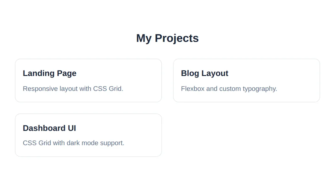
Measured in Chrome at four different window widths:
| Window width | Columns | Each card measures |
|---|---|---|
| 900px and up | 3 | 262.66px |
| 700px | 2 | 306px |
| 500px | 1 | 436px |
| 375px (phone) | 1 | 311px |
Why 3 columns at 900px? The grid is 836px wide. Three 250px columns plus two 24px gaps is 798px, which fits. Four columns would need 1,072px, which does not — so the browser settles on three and stretches each to 262.66px.
🎯 Your Turn: Make the Header Survive a Phone
Here is a real bug in the starter template: at phone width the logo and four nav links will not fit on one row, so the whole page scrolls sideways. Your job is the media query at the bottom — everything above it already works. Fill in the three ___ blanks, then narrow the preview to about 375px.
<!DOCTYPE html>
<html lang="en">
<head>
  <meta charset="UTF-8">
  <!-- Without this line, phones pretend to be 980px wide and your media
       query never fires. It is the #1 cause of "my site isn't responsive". -->
  <meta name="viewport" content="width=device-width, initial-scale=1.0">
  <title>Your Turn: Responsive Header</title>
  <style>
    *, *::before, *::after { box-sizing: border-box; margin: 0; padding: 0; }

    :root {
      --primary: #2563eb;
      --text: #1e293b;
      --text-light: #64748b;
      --bg: #ffffff;
      --border: #e2e8f0;
    }

    body { font-family: system-ui, sans-serif; color: var(--text); background: var(--bg); line-height: 1.6; }

    nav {
      position: sticky;
      top: 0;
      background: var(--bg);
      border-bottom: 1px solid var(--border);
      padding: 1rem 2rem;
      display: flex;                    /* logo on the left, links on the right */
      justify-content: space-between;
      align-items: center;
      z-index: 100;
    }
    nav .logo  { font-weight: 700; font-size: 1.25rem; white-space: nowrap; }
    nav .links { display: flex; gap: 1.5rem; }
    nav a      { text-decoration: none; color: var(--text); white-space: nowrap; }
    nav a:hover { color: var(--primary); }

    .hero {
      text-align: center;
      padding: 6rem 2rem;
      background: linear-gradient(135deg, #eff6ff, #dbeafe);
    }
    .hero h1 { font-size: 2.5rem; margin-bottom: 1rem; }
    .hero p  { font-size: 1.2rem; color: var(--text-light); max-width: 600px; margin: 0 auto; }

    /* 🎯 YOUR TURN — fill in the three ___ below. */

    /* 👉 1) This rule should switch on for phones only.
           A common breakpoint for "small screen" is 640px wide. */
    @media (max-width: ___) {

      nav {
        /* 👉 2) Stack the logo ABOVE the links instead of beside them.
               Flexbox has one property for the main axis direction. */
        flex-direction: ___;
        gap: 0.75rem;
      }

      nav .links { gap: 1rem; font-size: 0.9rem; }

      .hero { padding: 3rem 1rem; }

      .hero h1 {
        /* 👉 3) 2.5rem (40px) is too big on a phone. Use 1.75rem. */
        font-size: ___;
      }
    }

    /* ✅ Expected result, measured in Chrome at a 375px viewport:
       - BEFORE you fill the blanks, the page is 440px wide inside a 375px
         window: 65px of unwanted sideways scrolling.
       - AFTER, the page measures exactly 375px wide - the sideways scroll
         is gone.
       - The nav grows from 65px tall to 100.05px tall, because the links
         have moved onto their own row underneath the logo.
       - The h1 computes to 28px instead of 40px.
       - At 900px wide, nothing changes at all - the media query is asleep. */
  </style>
</head>
<body>
  <nav>
    <span class="logo">Your Name</span>
    <div class="links">
      <a href="#about">About</a>
      <a href="#projects">Projects</a>
      <a href="#skills">Skills</a>
      <a href="#contact">Contact</a>
    </div>
  </nav>

  <header class="hero">
    <h1>Hi, I'm Your Name</h1>
    <p>A front-end developer who loves building beautiful, accessible websites.</p>
  </header>
</body>
</html>
@media (max-width: 640px) {
nav { flex-direction: column; }
.hero h1 { font-size: 1.75rem; }
}Once this works, paste the same media query into your own capstone file. Horizontal scrolling on a phone is the single most common reason a portfolio looks unfinished to a hiring manager.
Features to Showcase Your Skill Level
🟢 Beginner Level
- • Hover effects on links and buttons
- • Image gallery with captions
- • Custom styled contact form
- • Consistent colour scheme
🔵 Intermediate Level
- • CSS Grid layout for projects section
- • Smooth scroll navigation
- • Animated skill bars or progress indicators
- • Card flip or reveal effects
- • Mobile hamburger menu (CSS only)
🟣 Expert Level
- • Dark/light theme toggle with CSS custom properties
- • 3D transform effects on project cards
- • Scroll-triggered animations
- • CSS-only modals and accordions
- • Custom cursor effects and blend modes
🏆 Mini-Challenge: Add a Testimonials Section
No blanks and no answers this time — just a brief and an outline. Add a Testimonials section to your portfolio that reuses the design tokens already in :root and re-flows on small screens exactly like the projects grid does. This is the whole course in one exercise: semantic HTML, custom properties, Grid, a transition, and accessible contrast.
<!DOCTYPE html>
<html lang="en">
<head>
  <meta charset="UTF-8">
  <meta name="viewport" content="width=device-width, initial-scale=1.0">
  <title>Mini-Challenge: Testimonials</title>
  <style>
    *, *::before, *::after { box-sizing: border-box; margin: 0; padding: 0; }

    /* These tokens come straight from your starter template. Use them -
       do not hard-code the same colours again further down. */
    :root {
      --primary: #2563eb;
      --text: #1e293b;
      --text-light: #64748b;
      --bg: #ffffff;
      --card-bg: #f8fafc;
      --border: #e2e8f0;
    }

    body { font-family: system-ui, sans-serif; color: var(--text); background: var(--bg); line-height: 1.6; }
    section { padding: 4rem 2rem; max-width: 900px; margin: 0 auto; }
    section h2 { font-size: 2rem; margin-bottom: 1.5rem; text-align: center; }

    /* 🎯 MINI-CHALLENGE — write the rules yourself. No answers below.

       1. .testimonials -> display: grid
                           grid-template-columns using repeat(auto-fit, minmax(...))
                           so it drops from 2 columns to 1 on a phone.
                           Pick your own minimum - 280px is a sensible choice.
                           gap: 1.5rem

       2. .testimonial  -> background var(--card-bg)
                           1px solid var(--border)
                           border-radius 12px
                           padding 1.5rem

       3. .testimonial blockquote -> italic, colour var(--text), margin 0
          .testimonial figcaption   -> smaller text, colour var(--text-light)

       4. Add a hover lift, the same idea as .project-card:
                           transition: transform 0.3s
                           :hover -> transform: translateY(-4px)

       5. Wrap the whole thing in @media (prefers-reduced-motion: reduce)
          and set transition: none for people who do not want movement.

       ✅ Check yourself:
          - Narrow the preview. The cards must go from 2 across to 1 across
            with no media query of your own - auto-fit does that job.
          - Every colour in your new rules should be a var(--...), not a
            hex code. If you typed #f8fafc anywhere, use var(--card-bg).
          - Leave the markup's <figure> / <blockquote> / <figcaption>
            structure alone. The HTML spec says the attribution must sit
            OUTSIDE the <blockquote>, because the blockquote is the quoted
            words only - the "who said it" is not part of the quote.
            <figure> is the wrapper that lets you keep them together.
    */
  </style>
</head>
<body>
  <section id="testimonials">
    <h2>What People Say</h2>

    <div class="testimonials">
      <figure class="testimonial">
        <blockquote><p>Delivered exactly what we asked for, a week early.</p></blockquote>
        <figcaption>— Sam Okonkwo, Project Manager</figcaption>
      </figure>

      <figure class="testimonial">
        <blockquote><p>The site works perfectly on every phone we tested.</p></blockquote>
        <figcaption>— Priya Raman, Small Business Owner</figcaption>
      </figure>

      <figure class="testimonial">
        <blockquote><p>Clean, readable code that our team could pick straight up.</p></blockquote>
        <figcaption>— Alex Dubois, Lead Developer</figcaption>
      </figure>
    </div>
  </section>
  <!-- ✅ Expected result, measured in a real browser:
     section -> max-width: 900px
     section h2 -> font-size: 32px
     .testimonial -> count: 3
  -->
</body>
</html>
When it works, drop the section into your capstone between Projects and Contact, and add a <a href="#testimonials"> link to the nav so it is reachable.
Development Tips
- 1. Start with structure — Build all your HTML first, then add CSS styling.
- 2. Mobile-first — Design for mobile screens first, then add desktop styles with media queries.
- 3. Use placeholders — Start with placeholder images and lorem ipsum text while building layout.
- 4. Test frequently — Check in Chrome, Firefox, Safari and on real mobile devices.
- 5. Use DevTools — Right-click → Inspect to debug CSS issues and test responsive breakpoints.
- 6. Deploy it — Use GitHub Pages or Netlify to put your site live for free!
Free Resources & Inspiration
🎨 Design Resources
- • Unsplash.com — Free high-quality images
- • Google Fonts — Free web fonts
- • Font Awesome — Free icons
- • Coolors.co — Colour palette generator
- • CSS Gradient — Gradient generator tool
🚀 Where to Deploy
- • GitHub Pages — Free hosting for static sites
- • Netlify — Drag-and-drop deployment
- • Vercel — Fast, free hosting
- • Cloudflare Pages — Free with custom domains
📘 Quick Reference — Portfolio Checklist
| Category | Requirement | Why It Matters |
|---|---|---|
| Structure | Semantic HTML5 tags | SEO & accessibility |
| Layout | Flexbox + Grid | Modern, flexible layouts |
| Responsive | Mobile-first design | 50%+ traffic is mobile |
| Typography | Custom fonts + hierarchy | Professional appearance |
| Interactivity | Hover effects & transitions | Polished user experience |
| Accessibility | Contrast, alt text, keyboard nav | Inclusive & professional |
| Performance | Optimized images, minimal CSS | Fast load times |
🎉 Congratulations — Course Complete!
You've completed the entire HTML & CSS course! You now have the skills to build beautiful, responsive, and accessible websites from scratch.
- Complete your portfolio — build it, deploy it, share it
- Learn JavaScript — add interactivity and dynamic features
- Build more projects — practice with real-world sites
- Start freelancing — offer your skills on Fiverr, Upwork, or locally
Keep building, keep learning, and never stop creating! 🚀
Practice quiz
Which set of elements reflects good semantic structure for a portfolio page?
- header, nav, main, section, footer
- div, div, div, div, div
- table, tr, td only
- span, b, i, font
Answer: header, nav, main, section, footer. Semantic landmarks (header, nav, main, section, footer) give the page structure for SEO and accessibility.
What does 'mobile-first' responsive design mean?
- Designing for mobile screens first, then enhancing for larger screens with media queries
- Only supporting mobile devices
- Building the desktop layout first and shrinking it
- Using a separate mobile-only website
Answer: Designing for mobile screens first, then enhancing for larger screens with media queries. Mobile-first starts with the small-screen layout and layers on desktop styles via media queries.
Which CSS feature is recommended for theming a portfolio (e.g. a dark/light toggle)?
- Inline styles on every element
- CSS custom properties (variables)
- Many duplicate stylesheets
- JavaScript only
Answer: CSS custom properties (variables). CSS custom properties centralize theme values so a toggle can swap them everywhere at once.
What is the recommended minimum touch target size for buttons on mobile?
- 10x10px
- 24x24px
- 44x44px
- 100x100px
Answer: 44x44px. The lesson recommends touch-friendly buttons of at least 44x44px.
What is the recommended minimum color contrast ratio for body text?
- 1:1
- 2:1
- 4.5:1
- 10:1
Answer: 4.5:1. A contrast ratio of at least 4.5:1 for text keeps content readable and accessible.
Which declaration creates a responsive projects grid without media queries?
- grid-template-columns: repeat(auto-fit, minmax(250px, 1fr));
- display: block;
- float: left; width: 33%;
- grid-template-columns: 250px 250px 250px;
Answer: grid-template-columns: repeat(auto-fit, minmax(250px, 1fr));. auto-fit with minmax lets the project cards reflow automatically as the viewport changes.
Why should every <img> include descriptive alt text?
- It speeds up image loading
- It supports accessibility (screen readers) and SEO
- It is required for the image to display
- It changes the image size
Answer: It supports accessibility (screen readers) and SEO. alt text helps screen-reader users and search engines understand the image.
Which free hosting options does the lesson suggest for deploying a static portfolio?
- GitHub Pages, Netlify, or Vercel
- A paid dedicated server only
- Email attachments
- A local file with no hosting
Answer: GitHub Pages, Netlify, or Vercel. The lesson recommends free static hosting like GitHub Pages, Netlify, and Vercel.
Which development workflow tip does the lesson recommend?
- Write all CSS before any HTML
- Build the HTML structure first, then add CSS styling
- Skip testing on real devices
- Avoid using browser DevTools
Answer: Build the HTML structure first, then add CSS styling. The lesson advises building structure (HTML) first and then styling it with CSS.
Which pair of layout tools is recommended for a modern portfolio's layouts?
- Tables and frames
- Flexbox and CSS Grid
- Only absolute positioning
- Inline-block hacks only
Answer: Flexbox and CSS Grid. Flexbox (one-dimensional) and Grid (two-dimensional) are the modern layout tools to combine.
Continue this course
- Previous: Building Full Responsive Pages Without Frameworks
- Quick reference: HTML & CSS cheat sheet