Responsive Pages Without Frameworks
Reviewed & published by Brayan K
Building responsive pages without a framework means creating fully adaptive layouts using only native CSS — fluid grids, fluid typography with clamp(), and a custom-property design token system — instead of relying on Bootstrap or Tailwind.
Part of the free HTML & CSS course at LearnCodingFast — hands-on lessons with examples you run in your browser, plus practice exercises and a quick quiz.
By the end of this lesson you'll be able to build a complete, production-quality responsive page with pure modern CSS — fluid grids, fluid type, and a token system — without ever loading Bootstrap or Tailwind.
💡 Think of It Like This
A CSS framework is like flat-pack furniture; building without one is custom carpentry. Flat-pack is quick, but every shelf is a fixed size and you live with the gaps. Custom carpentry means you measure each space and cut to fit.
Modern CSS hands you professional power tools so the custom approach is fast, not painful. A fluid auto-fit grid is a shelf that quietly adds or removes columns to fit the wall; clamp() is a leg that extends and retracts so the table is always the right height. You stop fighting fixed sizes and let the layout measure the room for you.
1. Fluid Grids with auto-fit & minmax()
A responsive grid is one that changes how many columns it shows based on the space available — not on a list of fixed breakpoints. The trick is one line: grid-template-columns: repeat(auto-fit, minmax(250px, 1fr));. Read it as: "make as many columns as fit, each at least 250px wide, sharing the leftover space equally."
minmax(250px, 1fr) sets a floor of 250px and a ceiling of 1fr (one share of free space). auto-fit packs in as many of those tracks as fit, then stretches the ones that exist to fill the row. Wrapping min(100%, 250px) as the floor stops the column overflowing on screens narrower than 250px. The result reflows from four columns to one as the window shrinks — with zero media queries.
<!DOCTYPE html>
<html lang="en">
<head>
  <meta charset="UTF-8">
  <!-- This meta tag is REQUIRED for any responsive page to work on phones. -->
  <meta name="viewport" content="width=device-width, initial-scale=1">
  <title>Fluid grid</title>
  <style>
    *, *::before, *::after { box-sizing: border-box; margin: 0; }
    body { font-family: system-ui, sans-serif; background: #0f172a; color: #e5e7eb; padding: 24px; }

    .grid {
      display: grid;
      /* "As many columns as fit, each >= 250px, sharing leftover space." */
      grid-template-columns: repeat(auto-fit, minmax(min(100%, 250px), 1fr));
      gap: 16px;                 /* space between cards, rows AND columns */
    }

    .card {
      background: #1e293b; border: 1px solid #334155;
      border-radius: 12px; padding: 20px;
    }
    .card h3 { color: #60a5fa; margin-bottom: 8px; }
    .card p  { color: #94a3b8; line-height: 1.6; }
  </style>
</head>
<body>
  <div class="grid">
    <div class="card"><h3>Card 1</h3><p>No media queries here at all.</p></div>
    <div class="card"><h3>Card 2</h3><p>The grid decides the column count.</p></div>
    <div class="card"><h3>Card 3</h3><p>Each track is at least 250px wide.</p></div>
    <div class="card"><h3>Card 4</h3><p>Drag the preview edge to see it reflow.</p></div>
  </div>

  <!-- ✅ Try it: widen the preview and the cards spread to 4 columns;
       narrow it and they drop to 3, then 2, then 1 — automatically. -->
  <!-- ✅ Expected result, measured in a real browser:
     .grid -> display: grid
     .card -> padding-top: 20px
     .card -> count: 4
  -->
</body>
</html>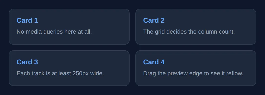
2. Flexible Bars with Flexbox
Grid is for two-dimensional layouts; flexbox shines for one-dimensional rows like nav bars, toolbars, and button groups. display: flex lays children in a row; justify-content: space-between pushes the first and last to the edges; align-items: center lines them up vertically.
The one property that makes a flex row responsive is flex-wrap: wrap. Without it, a row of items squashes and overflows on small screens. With it, items that no longer fit drop onto the next line on their own — a button group that becomes two rows on a phone, no media query required.
<!DOCTYPE html>
<html lang="en">
<head>
  <meta charset="UTF-8">
  <meta name="viewport" content="width=device-width, initial-scale=1">
  <title>Flexbox bar</title>
  <style>
    *, *::before, *::after { box-sizing: border-box; margin: 0; }
    body { font-family: system-ui, sans-serif; background: #0f172a; padding: 24px; }

    .nav {
      display: flex;                  /* lay the children out in a row */
      justify-content: space-between; /* brand on the left, links on the right */
      align-items: center;            /* vertically centre everything */
      flex-wrap: wrap;                /* let items drop to a new line if cramped */
      gap: 12px;
      background: #1976D2; color: white;
      padding: 14px 20px; border-radius: 10px;
    }
    .brand { font-weight: 800; font-size: 1.1rem; }

    .links {
      display: flex; gap: 16px;       /* the links are their own flex row */
      flex-wrap: wrap; list-style: none;
    }
    .links a { color: white; text-decoration: none; font-weight: 500; }
  </style>
</head>
<body>
  <nav class="nav">
    <span class="brand">SiteName</span>
    <ul class="links">
      <li><a href="#">Home</a></li>
      <li><a href="#">Features</a></li>
      <li><a href="#">Pricing</a></li>
      <li><a href="#">Contact</a></li>
    </ul>
  </nav>

  <!-- ✅ Expected: brand pinned left, links pinned right on a wide screen.
       Narrow the preview and the links wrap below the brand instead of
       overflowing off the edge. -->
  <!-- ✅ Expected result, measured in a real browser:
     .nav -> display: flex
     .links -> display: flex
     .links a -> text-decoration-line: none
  -->
</body>
</html>
3. Fluid Type & Spacing with clamp()
clamp(min, preferred, max) gives you a value that scales with the viewport but is locked between a floor and a ceiling. The browser uses the preferred value — usually something with a vw (viewport-width) unit so it grows with the screen — but never lets it drop below min or rise above max.
So font-size: clamp(1.5rem, 5vw, 3rem) is a heading that is 1.5rem on a tiny phone, grows smoothly as the screen widens, and stops at 3rem so it never becomes comically large. Use the same idea for padding, gaps, and margins to get spacing that breathes — without a single breakpoint. This is the "fluid" half of responsive design; the grid handles the structural half.
<!DOCTYPE html>
<html lang="en">
<head>
  <meta charset="UTF-8">
  <meta name="viewport" content="width=device-width, initial-scale=1">
  <title>clamp() fluid sizing</title>
  <style>
    *, *::before, *::after { box-sizing: border-box; margin: 0; }
    body {
      font-family: system-ui, sans-serif; background: #0f172a; color: #e5e7eb;
      /* Padding is tight on phones (16px), spacious on desktop (64px). */
      padding: clamp(16px, 5vw, 64px);
    }
    /* Floor 1.5rem, scales with 6vw, ceiling 3.5rem. */
    h1 { font-size: clamp(1.5rem, 6vw, 3.5rem); color: #60a5fa; line-height: 1.2;
         margin-bottom: clamp(8px, 2vw, 20px); }
    p  { font-size: clamp(1rem, 2vw, 1.2rem); line-height: 1.7;
         color: #94a3b8; max-width: 65ch; }
    .panel {
      background: #1e293b; border-radius: clamp(8px, 2vw, 18px);
      padding: clamp(16px, 4vw, 40px); margin-top: clamp(20px, 4vw, 48px);
    }
  </style>
</head>
<body>
  <h1>Fluid everything</h1>
  <p>Drag the preview wider and narrower. The heading, the body text, the
     padding, and even the panel's corner radius all scale smoothly — there
     is not a single media query on this page.</p>
  <div class="panel">
    <p>This panel's padding and rounded corners grow with the viewport too,
       between sensible minimums and maximums.</p>
  </div>

  <!-- ✅ Expected: text and spacing grow as the preview widens, then stop
       at their max so nothing gets oversized. -->
  <!-- ✅ Expected result, measured in a real browser:
     h1 -> color: rgb(96, 165, 250)
     p -> max-width: 661.68px
  -->
</body>
</html>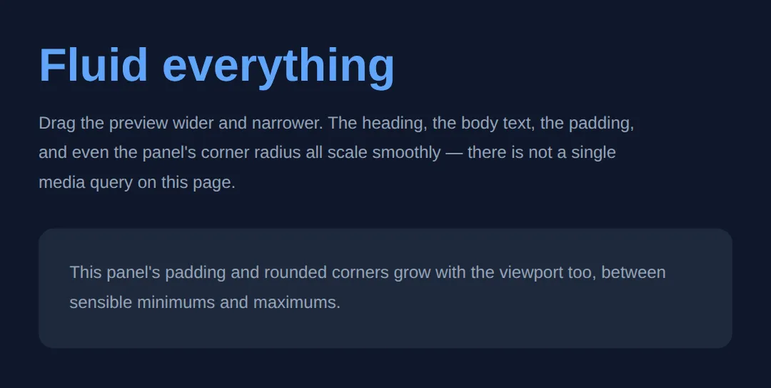
4. Media Queries vs Container Queries
When the layout must change shape — not just size — you need a query. A media query reacts to the viewport (the whole window): @media (min-width: 600px) { … } applies its rules only when the window is at least 600px wide. That is how a stacked layout becomes a sidebar layout on bigger screens.
A container query reacts to the size of a component's own container, not the window. Mark an ancestor with container-type: inline-size, then @container (min-width: 400px) { … } styles the child based on how much room it has. The same card can stack in a narrow sidebar and go side-by-side in a wide main column — on the same page. Use media queries for page structure, container queries for reusable components.
<!DOCTYPE html>
<html lang="en">
<head>
  <meta charset="UTF-8">
  <meta name="viewport" content="width=device-width, initial-scale=1">
  <title>Container queries</title>
  <style>
    *, *::before, *::after { box-sizing: border-box; margin: 0; }
    body { font-family: system-ui, sans-serif; background: #0f172a; color: #e5e7eb; padding: 24px; }

    /* The two columns are different widths on purpose. */
    .layout { display: grid; grid-template-columns: 1fr 2fr; gap: 20px; }

    /* Each column becomes a QUERY CONTAINER its card can measure. */
    .col { container-type: inline-size; }

    .card { background: #1e293b; border-radius: 12px; padding: 16px;
            display: grid; gap: 12px; }
    .card .thumb { background: #60a5fa; border-radius: 8px; height: 80px; }

    /* When the CARD'S CONTAINER is at least 320px wide, go side-by-side. */
    @container (min-width: 320px) {
      .card { grid-template-columns: 100px 1fr; align-items: center; }
    }
  </style>
</head>
<body>
  <div class="layout">
    <div class="col">
      <div class="card"><div class="thumb"></div>
        <p>Narrow column: I stay stacked.</p></div>
    </div>
    <div class="col">
      <div class="card"><div class="thumb"></div>
        <p>Wide column: same card markup, but I go side-by-side.</p></div>
    </div>
  </div>

  <!-- ✅ Expected: identical card HTML, two different layouts — driven by
       each column's width, not the window's width. -->
  <!-- ✅ Expected result, measured in a real browser:
     .layout -> display: grid
     .card -> display: grid
     .col -> count: 2
  -->
</body>
</html>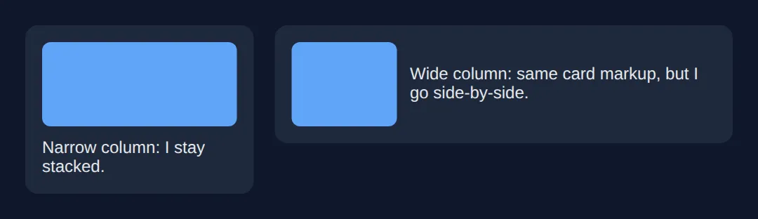
5. Mobile-First: A Complete Page
Mobile-first means your base CSS (everything outside a media query) describes the small-screen layout, and you add complexity for bigger screens with min-width queries. The base is the simplest case and always applies, so a phone gets a working single-column layout before any query runs. You layer on multi-column grids and a sidebar as the screen grows — never the other way round.
Here is the capstone: a full page that pulls every piece together — a flexbox nav, a hero with clamp() type, an auto-fit feature grid, :root design tokens, and one mobile-first media query for the sidebar. No Bootstrap, no Tailwind — just the platform.
<!DOCTYPE html>
<html lang="en">
<head>
  <meta charset="UTF-8">
  <meta name="viewport" content="width=device-width, initial-scale=1">
  <title>Framework-free page</title>
  <style>
    *, *::before, *::after { box-sizing: border-box; margin: 0; }

    /* DESIGN TOKENS: one source of truth for the whole page. */
    :root {
      --primary: #1976D2; --primary-dark: #1565C0;
      --text: #1a1a1a; --muted: #666;
      --bg: #fafafa; --surface: #fff; --border: #e0e0e0;
      --space: clamp(16px, 4vw, 40px);     /* fluid spacing token */
      --radius: 12px;
    }
    body { font-family: system-ui, sans-serif; color: var(--text); background: var(--bg); }

    /* FLEXBOX nav that wraps on small screens. */
    .nav { display: flex; justify-content: space-between; align-items: center;
           flex-wrap: wrap; gap: 12px;
           background: var(--primary); color: #fff; padding: 14px 20px; }
    .nav .brand { font-weight: 800; }
    .nav ul { display: flex; gap: 16px; list-style: none; flex-wrap: wrap; }
    .nav a { color: #fff; text-decoration: none; }

    /* clamp() HERO: fluid type and padding, no breakpoints. */
    .hero { text-align: center; color: #fff;
            background: linear-gradient(135deg, var(--primary-dark), var(--primary));
            padding: clamp(40px, 8vw, 100px) var(--space); }
    .hero h1 { font-size: clamp(1.8rem, 5vw, 3rem); margin-bottom: 12px; }
    .hero p  { font-size: clamp(1rem, 2vw, 1.2rem); opacity: .9;
               max-width: 600px; margin: 0 auto; }

    /* AUTO-FIT feature grid: responsive with no media query. */
    .features { display: grid; gap: var(--space);
                grid-template-columns: repeat(auto-fit, minmax(min(100%, 240px), 1fr));
                padding: var(--space); max-width: 1100px; margin: 0 auto; }
    .feature { background: var(--surface); border: 1px solid var(--border);
               border-radius: var(--radius); padding: 22px; }
    .feature h3 { color: var(--primary); margin-bottom: 6px; }
    .feature p  { color: var(--muted); line-height: 1.6; }

    /* MOBILE-FIRST: base layout is single column; add a sidebar at 900px. */
    .main { display: grid; gap: var(--space); padding: var(--space);
            max-width: 1100px; margin: 0 auto; }
    .aside { background: var(--surface); border: 1px solid var(--border);
             border-radius: var(--radius); padding: 18px; }
    @media (min-width: 900px) {
      .main { grid-template-columns: 1fr 280px; }   /* sidebar only on wide screens */
    }

    footer { background: #263238; color: #aaa; text-align: center;
             padding: 20px; font-size: .9rem; }
  </style>
</head>
<body>
  <nav class="nav">
    <span class="brand">SiteName</span>
    <ul><li><a href="#">Home</a></li><li><a href="#">Features</a></li><li><a href="#">Pricing</a></li></ul>
  </nav>

  <section class="hero">
    <h1>Build Without Frameworks</h1>
    <p>Grid, flexbox, clamp(), and custom properties — no Bootstrap, no Tailwind, just the platform.</p>
  </section>

  <section class="features">
    <div class="feature"><h3>Fluid Grid</h3><p>auto-fit + minmax() reflows columns with no breakpoints.</p></div>
    <div class="feature"><h3>Fluid Type</h3><p>clamp() scales text and spacing between sensible limits.</p></div>
    <div class="feature"><h3>Design Tokens</h3><p>Custom properties keep the whole page consistent.</p></div>
  </section>

  <div class="main">
    <article>
      <h2>Article body</h2>
      <p>One mobile-first media query gives this article a sidebar on wide screens, and a single column on phones.</p>
    </article>
    <aside class="aside"><strong>Sidebar</strong><p>Appears beside the article at 900px and up.</p></aside>
  </div>

  <footer>Built with zero frameworks</footer>

  <!-- ✅ Expected: resize the preview. Nav wraps, type and padding scale,
       feature cards reflow, and the sidebar drops below the article on
       narrow screens — all from this one file. -->
  <!-- ✅ Expected result, measured in a real browser:
     .nav -> display: flex
     .nav ul -> display: flex
     .nav a -> text-decoration-line: none
     .hero p -> opacity: 0.9
     .feature -> count: 3
  -->
</body>
</html>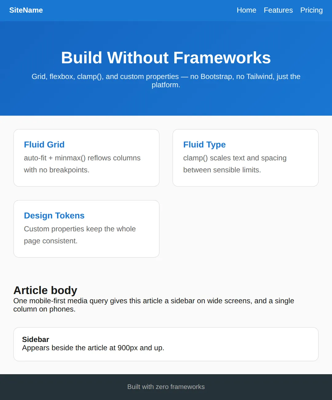
🎯 Your Turn #1 — A breakpoint-free card grid
This grid is fixed at three columns, so it overflows on a phone. Replace the fixed columns with an auto-fit / minmax() track so it reflows on its own. Fill in the blanks marked ___, then run it and check the comment.
<!DOCTYPE html>
<html lang="en">
<head>
  <meta charset="UTF-8">
  <meta name="viewport" content="width=device-width, initial-scale=1">
  <title>Your Turn 1</title>
  <style>
    /* 🎯 YOUR TURN — fill in the blanks marked ___ */
    *, *::before, *::after { box-sizing: border-box; margin: 0; }
    body { font-family: system-ui, sans-serif; background:#0f172a; color:#e5e7eb; padding:20px; }

    .grid {
      display: grid;
      gap: 16px;
      /* This is fixed at 3 columns and overflows on small screens.
         1) Replace it so the grid makes as many >=220px columns as fit. */
      grid-template-columns: ___;   /* 👉 use  repeat(auto-fit, minmax(min(100%, 220px), 1fr)) */
    }

    .card { background:#1e293b; border:1px solid #334155; border-radius:10px; padding:18px; }
    .card h3 { color:#60a5fa; margin-bottom:6px; }
  </style>
</head>
<body>
  <div class="grid">
    <div class="card"><h3>One</h3><p>Reflow me.</p></div>
    <div class="card"><h3>Two</h3><p>Reflow me.</p></div>
    <div class="card"><h3>Three</h3><p>Reflow me.</p></div>
    <div class="card"><h3>Four</h3><p>Reflow me.</p></div>
  </div>

  <!-- ✅ Expected: widen the preview for 3-4 columns, narrow it and the
       cards drop to 1 column with no overflow — and no media query. -->
</body>
</html>
🎯 Your Turn #2 — Fluid type + a mobile-first sidebar
Make the heading fluid with clamp(), then add one mobile-first media query that turns the single-column layout into a two-column sidebar layout on wide screens. Fill in the blanks and verify against the comment.
<!DOCTYPE html>
<html lang="en">
<head>
  <meta charset="UTF-8">
  <meta name="viewport" content="width=device-width, initial-scale=1">
  <title>Your Turn 2</title>
  <style>
    /* 🎯 YOUR TURN — fill in the blanks marked ___ */
    *, *::before, *::after { box-sizing: border-box; margin: 0; }
    body { font-family: system-ui, sans-serif; background:#0f172a; color:#e5e7eb; padding:20px; }

    /* 1) Make this heading fluid: min 1.4rem, scale at 5vw, max 2.8rem. */
    h1 { color:#60a5fa; margin-bottom:14px;
         font-size: ___; }            /* 👉 use  clamp(1.4rem, 5vw, 2.8rem) */

    /* MOBILE-FIRST base: one column. */
    .layout { display: grid; gap: 16px; }
    .main, .side { background:#1e293b; border:1px solid #334155;
                   border-radius:10px; padding:16px; }

    /* 2) On screens 800px and wider, make it two columns: 1fr and 260px. */
    @media (___) {                    /* 👉 use  min-width: 800px */
      .layout { grid-template-columns: 1fr 260px; }
    }
  </style>
</head>
<body>
  <h1>Mobile-first page</h1>
  <div class="layout">
    <div class="main"><p>Main content. I stack on phones, and sit beside the sidebar on wide screens.</p></div>
    <div class="side"><p>Sidebar. I appear below the content on mobile.</p></div>
  </div>

  <!-- ✅ Expected: heading text grows then stops; the sidebar is below the
       main content on narrow screens and beside it from 800px up. -->
</body>
</html>
🧩 Mini-Challenge — A responsive pricing section
Support is faded now — only an outline is given. Build a small pricing section from scratch using the techniques from this lesson. Lean on the worked examples in sections 1, 3, and 5 if you get stuck.
<!DOCTYPE html>
<html lang="en">
<head>
  <meta charset="UTF-8">
  <meta name="viewport" content="width=device-width, initial-scale=1">
  <title>Mini-Challenge</title>
  <style>
    /* 🧩 MINI-CHALLENGE: a responsive pricing section, no frameworks
       1. Reset: *, *::before, *::after { box-sizing: border-box; margin: 0; }
       2. In :root, declare tokens: --primary, --surface, --border,
            --radius, and a fluid --space using clamp(16px, 4vw, 40px)
       3. Give the <h1> a fluid font-size with clamp() and centre it
       4. Build a .plans grid with
            grid-template-columns: repeat(auto-fit, minmax(min(100%, 240px), 1fr))
            and gap: var(--space)   — so plans reflow with no media query
       5. Style a .plan card using var(--surface), var(--border), var(--radius)
            and padding: var(--space)

       ✅ Expected: three pricing cards side by side on desktop that reflow
          to one column on a phone, with type and spacing that scale via
          clamp() — and not a single media query or framework. */

    /* your code here */
  </style>
</head>
<body>

  <!-- your markup here: an <h1> title and a .plans container
       with at least three .plan cards inside it -->

</body>
</html>
⚠️ Common Errors (and the fix)
- Fixed widths instead of fluid tracks. grid-template-columns: 300px 300px 300px; overflows the moment the screen is narrower than 900px. Fix: use repeat(auto-fit, minmax(min(100%, 300px), 1fr)) so tracks shrink and reflow.
- px everywhere for type and spacing. Hard-coding font-size: 48px means tiny phones get the same giant heading as desktops. Fix: use clamp(min, vw, max) so sizing scales between limits.
- Desktop-first, then patching for mobile. Starting with a complex desktop layout and tearing it down with max-width queries is fragile. Fix: write the simple mobile layout as the base, then add with min-width queries.
- Missing the viewport meta tag. Without <meta name="viewport" content="width=device-width, initial-scale=1">, phones render at ~980px and shrink the page, so nothing looks right. Fix: add it to every page's <head>.
- Forgetting box-sizing: border-box. Padding then adds to the declared width and blows out your grid math. Fix: start every stylesheet with *, *::before, *::after { box-sizing: border-box; }.
📋 Quick Reference
| Goal | Use this |
|---|---|
| Responsive grid, no breakpoints | repeat(auto-fit, minmax(min(100%, 250px), 1fr)) |
| One-dimensional bar that wraps | display:flex; flex-wrap:wrap; justify-content:space-between |
| Fluid font / spacing | clamp(1.5rem, 5vw, 3rem) |
| Layout change by window size | @media (min-width: 900px) { … } |
| Layout change by component size | container-type:inline-size; @container (min-width:400px) |
| Centre a page container | max-width: 1100px; margin: 0 auto; |
| Make a page work on phones | <meta name="viewport" content="width=device-width, initial-scale=1"> |
| Stop padding breaking widths | *, *::before, *::after { box-sizing: border-box; } |
🎉 Lesson Complete
You can now build a fully responsive page with pure modern CSS. The essentials:
- ✅ repeat(auto-fit, minmax(…, 1fr)) makes grids reflow with no breakpoints
- ✅ display:flex + flex-wrap:wrap builds bars and button groups that wrap
- ✅ clamp(min, vw, max) gives fluid type and spacing between safe limits
- ✅ Media queries react to the viewport; container queries react to a component's own width
- ✅ Go mobile-first: a simple base layout, enhanced with min-width queries
- ✅ Always include the viewport meta tag and a box-sizing reset
Practice quiz
What does 'grid-template-columns: repeat(auto-fit, minmax(250px, 1fr))' do?
- Always makes exactly 4 columns
- Stacks all items in one column
- Makes as many columns as fit, each at least 250px, sharing leftover space — no media queries
- Creates fixed 250px columns that overflow
Answer: Makes as many columns as fit, each at least 250px, sharing leftover space — no media queries. auto-fit packs in as many minmax(250px, 1fr) tracks as fit, then stretches them to fill the row, so the grid reflows without breakpoints.
In repeat(), how does auto-fit differ from auto-fill when there are few items?
- auto-fit collapses empty tracks so items stretch to fill the row; auto-fill keeps empty tracks
- They are identical
- auto-fill is faster
- auto-fit only works vertically
Answer: auto-fit collapses empty tracks so items stretch to fill the row; auto-fill keeps empty tracks. auto-fit collapses empty column tracks to zero width so existing items expand; auto-fill keeps the empty tracks, leaving gaps.
Which single property makes a flexbox row wrap onto a new line when items no longer fit?
- flex-grow: 1
- justify-content: space-between
- align-items: stretch
- flex-wrap: wrap
Answer: flex-wrap: wrap. flex-wrap: wrap lets items that don't fit drop onto the next line instead of squashing or overflowing.
What does clamp(min, preferred, max) return?
- Always the min
- The preferred value, but never below min or above max
- The average of all three
- Always the max
Answer: The preferred value, but never below min or above max. clamp() uses the preferred (middle) value, clamped between the floor (min) and ceiling (max) — it equals max(min, min(preferred, max)).
Why is 'font-size: clamp(1.5rem, 5vw, 3rem)' useful for headings?
- It scales with the viewport but stays between 1.5rem and 3rem
- It disables zoom
- It forces a fixed pixel size
- It only works on mobile
Answer: It scales with the viewport but stays between 1.5rem and 3rem. The heading grows fluidly with 5vw but is locked between a 1.5rem floor and a 3rem ceiling, so it never becomes too small or comically large.
When should you use a media query instead of clamp() or auto-fit?
- For any color change
- Never — they are interchangeable
- When the layout must change shape — e.g. a sidebar stacking below content
- Only for font sizing
Answer: When the layout must change shape — e.g. a sidebar stacking below content. Use clamp/auto-fit for continuous sizing; use a media query when the layout structure itself must rearrange (stacking, collapsing nav, column count changes).
What does a container query react to, unlike a media query?
- The browser's zoom level
- The size of a component's own container, not the viewport
- The device's pixel density
- The page's scroll position
Answer: The size of a component's own container, not the viewport. A container query (container-type: inline-size + @container) adapts a component to the space its container gives it, so the same card can adapt differently in a sidebar vs a wide column.
What does the mobile-first base CSS (outside any media query) describe?
- The desktop layout
- Only print styles
- The largest possible layout
- The small-screen layout, enhanced later with min-width queries
Answer: The small-screen layout, enhanced later with min-width queries. Mobile-first puts the simplest small-screen layout in the base styles, then layers on complexity for bigger screens with min-width queries.
Which reset is recommended at the top of a framework-free stylesheet to keep grid math sane?
- * { margin: auto; }
- *, *::before, *::after { box-sizing: border-box; }
- * { display: flex; }
- html { font-size: 62.5%; }
Answer: *, *::before, *::after { box-sizing: border-box; }. box-sizing: border-box makes padding and borders count inside the declared width, so they don't blow out your grid and column math.
Why wrap the minmax floor as 'minmax(min(100%, 250px), 1fr)'?
- It centers the grid
- It adds a media query automatically
- It stops a column overflowing on screens narrower than 250px
- It doubles the column count
Answer: It stops a column overflowing on screens narrower than 250px. min(100%, 250px) caps the floor at 100% of the container, so on very narrow screens the column shrinks to fit instead of overflowing.
Continue this course
- Previous: CSS Logical Properties for International Layouts
- Next: Final Project: Portfolio Website — Build and deploy your own personal portfolio website from scratch
- Quick reference: HTML & CSS cheat sheet
Frequently asked questions
Do I still need media queries if I use clamp() and auto-fit grids?
Far fewer, but not zero. clamp() and auto-fit/minmax() handle continuous sizing — text and columns that grow smoothly as the viewport changes — so you no longer need a breakpoint just to bump a font up a few pixels. You still reach for a media query (or a container query) when the layout itself must change shape: a sidebar that should stack under the content on small screens, a nav that collapses to a hamburger, or a two-column grid that becomes one column. Rule of thumb: use clamp/auto-fit for sizing, media queries for structural rearrangement.
What is the difference between auto-fit and auto-fill in repeat()?
Both let the grid create as many columns as fit. The difference shows up when there are fewer items than would fill the row. auto-fill keeps the empty column tracks, so your items can leave gaps on the right. auto-fit collapses those empty tracks to zero width, so the existing items stretch to fill the whole row. For most responsive card layouts you want auto-fit, because a lone card expanding to full width usually looks better than one card sitting next to three empty slots.
Why is my mobile layout zoomed out and tiny?
You are almost certainly missing the viewport meta tag. Without <meta name="viewport" content="width=device-width, initial-scale=1">, mobile browsers assume the page was designed for desktop and render it at roughly 980px wide, then shrink the whole thing to fit the screen — so your media queries never fire and everything looks miniature. Add that one line to the <head> and the browser maps CSS pixels to the device width, which is what every other responsive technique assumes.
What is mobile-first and why does it use min-width?
Mobile-first means your base CSS — the rules outside any media query — describes the small-screen layout, and you layer on complexity for bigger screens using min-width queries. It is preferred over desktop-first (max-width) because the base styles are the simplest case and always apply, so a phone gets a working layout even before any media query is evaluated. You add columns, sidebars, and wider spacing as the screen grows, rather than building a complex desktop layout and trying to tear it back down for phones.
When should I use a container query instead of a media query?
Use a media query when the decision depends on the viewport — the whole browser window. Use a container query when the decision depends on the space available to a specific component, regardless of the window size. A card component that should switch from stacked to side-by-side whenever its own column is wide enough is the classic case: the same card might be narrow in a sidebar and wide in the main area on the same page, and only a container query can adapt to both. Container queries are supported in all current major browsers.
Do I really not need Bootstrap or Tailwind for this?
For most landing pages, marketing sites, portfolios, and content sites — correct, you do not. CSS Grid, flexbox, clamp(), and custom properties cover responsive layout, fluid sizing, and theming natively, with no bundle to download and no build step. Frameworks still earn their place on large teams that want a shared utility vocabulary, or when you need a big component library fast. The point of this lesson is that you should use a framework because you chose to, not because you assumed plain CSS could not do the job.