CSS Logical Properties
Reviewed & published by Brayan K
CSS logical properties describe spacing and sizing in terms of the content's flow direction — using terms like margin-inline and padding-block instead of left/right/top/bottom — so one stylesheet adapts automatically to left-to-right, right-to-left, and vertical writing modes.
Part of the free HTML & CSS course at LearnCodingFast — hands-on lessons with examples you run in your browser, plus practice exercises and a quick quiz.
By the end of this lesson you'll be able to write one set of spacing, border, and alignment rules that lays out correctly in English, Arabic, and vertical Japanese — no right-to-left overrides, no duplicated stylesheets.
💡 Think of It Like This
Physical properties are like telling someone "the light switch is on the left wall." That only works if they walk in facing the way you imagined. Turn them around — or stand them in a different room — and "left" now points at the wrong wall.
Logical properties are like saying "the switch is by the door you came in through." That instruction stays correct no matter which way the person faces. When you write margin-inline-start instead of margin-left, you're describing the side relative to how the text flows, so the browser points it at the right wall automatically — in English, in Arabic, or in vertical Japanese.
1. The Inline Axis and the Block Axis
Every logical property is named after one of two axes. The inline axis runs along the direction text flows — across the line. The block axis is perpendicular to it — the way new lines and paragraphs stack. Each axis has a start and an end, so every physical edge gets a flow-relative name.
In English (left-to-right), the inline axis is horizontal: inline-start = left, inline-end = right. The block axis is vertical: block-start = top, block-end = bottom. Change the language to Arabic and only the inline side flips; switch to vertical Japanese and the two axes rotate together. You write the names once and the browser resolves the physical edge at render time.
Run the worked example. The blue accent bar is on border-inline-start. The second card uses the identical CSS but sits in a direction: rtl container — and the bar moves to the other side by itself.
<!DOCTYPE html>
<html lang="en">
<head>
  <meta charset="UTF-8">
  <title>Logical axes</title>
  <style>
    body { font-family: system-ui, sans-serif; background:#0f172a; color:#e5e7eb; padding:24px; }

    .card {
      background:#1e293b;
      padding-block: 16px;            /* top + bottom (block axis) => 16px each */
      padding-inline: 20px;           /* start + end (inline axis) => 20px each */
      margin-block-end: 16px;         /* space BELOW the card in LTR */
      border-radius: 10px;
      border-inline-start: 4px solid #3b82f6;  /* accent bar on the START side */
    }
    .card h3 { margin-block-start: 0; color:#60a5fa; }

    /* Same .card CSS, but this container reads right-to-left. */
    .rtl { direction: rtl; }
    .rtl .card { border-inline-start-color:#f59e0b; } /* recolour to make the flip obvious */
  </style>
</head>
<body>
  <div class="card">
    <h3>Left-to-right (English)</h3>
    <p>inline-start = LEFT, so the blue accent bar is on the left.</p>
  </div>

  <div class="rtl">
    <div class="card">
      <h3>Right-to-left (Arabic-style)</h3>
      <p>Same border-inline-start rule — but inline-start is now the RIGHT side.</p>
    </div>
  </div>

  <!-- ✅ Expected: the accent bar is on the LEFT of the first card and on the
       RIGHT of the second — from one identical border-inline-start rule. -->
  <!-- ✅ Expected result, measured in a real browser:
     .card -> border-radius: 10px
     .card h3 -> color: rgb(96, 165, 250)
     .card -> count: 2
  -->
</body>
</html>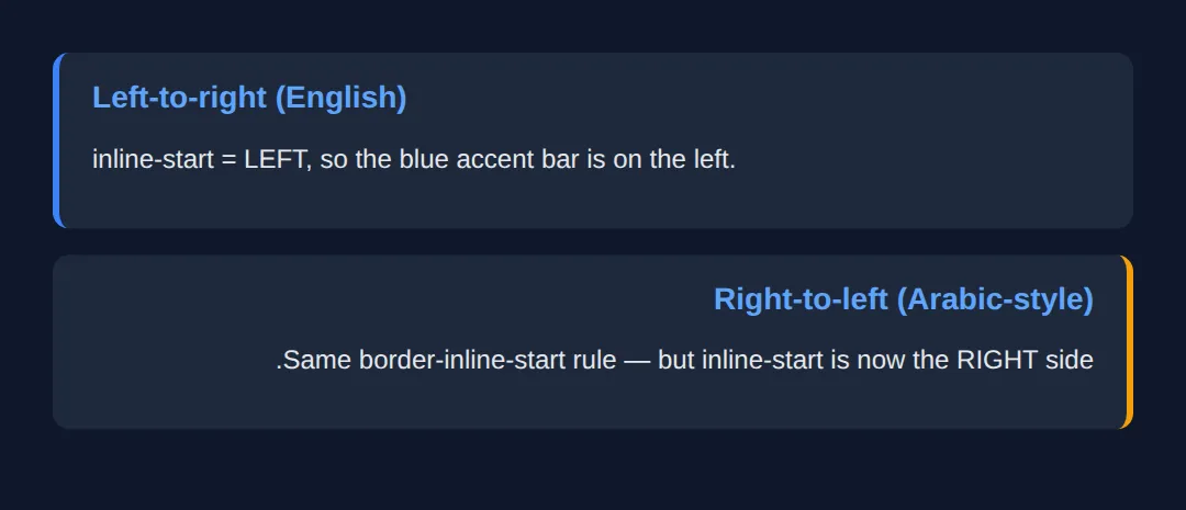
2. Margin, Padding & Border Shorthands
Just like margin: 10px 20px is shorthand for the four physical sides, logical properties have per-axis shorthands. margin-inline sets both inline edges at once; margin-block sets both block edges. Give two values to set start and end separately: padding-block: 12px 20px is 12px on top, 20px on the bottom (in LTR).
| Shorthand | Expands to | Example |
|---|---|---|
| margin-inline | inline-start + inline-end | margin-inline: 20px; |
| margin-block | block-start + block-end | margin-block: 8px 16px; |
| padding-inline | padding start + end (inline) | padding-inline: 24px; |
| border-inline | border on both inline edges | border-inline: 2px solid; |
<!DOCTYPE html>
<html lang="en">
<head>
  <meta charset="UTF-8">
  <title>Logical shorthands</title>
  <style>
    body { font-family: system-ui, sans-serif; background:#0f172a; color:#e5e7eb; padding:24px; }

    .panel {
      background:#1e293b; border-radius:10px;
      margin-inline: auto;        /* centre horizontally (auto on both inline sides) */
      max-inline-size: 420px;     /* like max-width, but flow-relative */
      padding-inline: 24px;       /* 24px left AND right in LTR */
      padding-block: 12px 28px;   /* 12px top, 28px bottom — two values = start, end */
      border-inline-start: 4px solid #22c55e;
      margin-block-end: 16px;     /* gap below each panel */
    }
    .panel h3 { margin-block: 0 8px; color:#4ade80; } /* 0 top, 8px bottom */
  </style>
</head>
<body>
  <div class="panel">
    <h3>Centred, padded, accented</h3>
    <p>margin-inline: auto centres it; padding-block: 12px 28px gives uneven
       top/bottom padding; the green bar sits on inline-start.</p>
  </div>

  <!-- ✅ Expected: a centred card with more padding at the bottom than the top
       and a green bar down its left edge (it would be the right edge in RTL). -->
  <!-- ✅ Expected result, measured in a real browser:
     .panel -> border-radius: 10px
     .panel h3 -> color: rgb(74, 222, 128)
  -->
</body>
</html>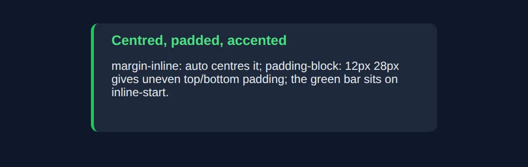
3. Logical Sizing & Positioning
The axes also rename width and height. inline-size is the measurement along the inline axis (width in normal text) and block-size is along the block axis (height). In a vertical writing mode these swap, which is exactly what you want — a "300px wide" column should stay 300px across the reading direction, not 300px across the screen.
For positioned elements, inset is the logical shorthand for the offset edges. inset: 0 pins all four sides (handy for a full-cover overlay), inset-inline targets the two inline edges, and inset-inline-start replaces left in LTR / right in RTL.
<!DOCTYPE html>
<html lang="en">
<head>
  <meta charset="UTF-8">
  <title>Sizing & inset</title>
  <style>
    body { font-family: system-ui, sans-serif; background:#0f172a; color:#e5e7eb; padding:24px; }

    .tile {
      position: relative;          /* makes inset-* on children resolve to this box */
      inline-size: 100%;           /* = width: 100% */
      max-inline-size: 360px;      /* = max-width: 360px */
      block-size: 140px;           /* = height: 140px */
      background:#1e293b; border-radius:12px; margin-inline:auto;
    }

    .badge {
      position: absolute;
      inset-block-start: 12px;     /* = top: 12px */
      inset-inline-end: 12px;      /* = right: 12px in LTR, left in RTL */
      background:#3b82f6; color:white; font-size:12px; font-weight:700;
      padding-inline: 10px; padding-block: 4px; border-radius:999px;
    }
  </style>
</head>
<body>
  <div class="tile">
    <span class="badge">NEW</span>
  </div>

  <!-- ✅ Expected: a fixed-size tile with a "NEW" pill tucked into its
       inline-END / block-START corner (top-right in English, top-left in RTL). -->
  <!-- ✅ Expected result, measured in a real browser:
     .tile -> position: relative
     .badge -> position: absolute
  -->
</body>
</html>
4. Text Alignment & Writing Modes
The smallest, highest-value swap is alignment. Replace text-align: left with text-align: start and your paragraphs align to the reading direction — left in English, right in Arabic — with no override. Pair it with direction (rtl/ltr) or writing-mode (e.g. vertical-rl for vertical CJK text) and the whole layout follows.
The example shows the same CSS rendered three ways: horizontal LTR, horizontal RTL, and vertical. Notice the accent bar and the text alignment land on the correct edge in every panel without a single direction-specific rule.
<!DOCTYPE html>
<html lang="en">
<head>
  <meta charset="UTF-8">
  <title>Writing modes</title>
  <style>
    body { font-family: system-ui, sans-serif; background:#0f172a; color:#e5e7eb; padding:24px; }
    .row { display:grid; grid-template-columns:1fr 1fr 1fr; gap:14px; }
    @media (max-width:640px){ .row { grid-template-columns:1fr; } }

    /* ONE set of rules, reused by all three panels below. */
    .panel {
      background:#1e293b; border-radius:10px; min-block-size:160px;
      padding-inline: 14px; padding-block: 12px;
      border-inline-start: 4px solid #60a5fa;  /* bar on the START edge */
      text-align: start;                        /* align to reading direction */
    }
    .panel h4 { margin-block: 0 8px; color:#93c5fd; font-size:13px; }

    .ltr { direction: ltr; }
    .rtl { direction: rtl; }
    .vert { writing-mode: vertical-rl; }        /* inline axis becomes vertical */
  </style>
</head>
<body>
  <div class="row">
    <div class="panel ltr"><h4>LTR</h4><p>start = left, so text and bar sit on the left.</p></div>
    <div class="panel rtl"><h4>RTL</h4><p>start = right, so the same rules flip to the right.</p></div>
    <div class="panel vert"><h4>VERTICAL</h4><p>The inline axis is now vertical; the bar moves to the top.</p></div>
  </div>

  <!-- ✅ Expected: three panels, identical CSS — the bar and text alignment land
       on the correct edge in each writing mode with no per-mode overrides. -->
  <!-- ✅ Expected result, measured in a real browser:
     .row -> display: grid
     .panel -> border-radius: 10px
     .panel -> count: 3
  -->
</body>
</html>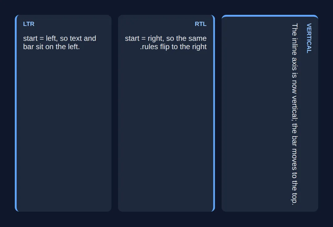
🎯 Your Turn #1 — Convert physical to logical
This card is styled with physical properties, so its accent bar stays on the left even in the RTL container below it. Swap the three marked lines to logical properties so the bar flips automatically. Fill in the blanks marked ___, then run it.
<!DOCTYPE html>
<html lang="en">
<head>
  <meta charset="UTF-8">
  <title>Your Turn 1</title>
  <style>
    /* 🎯 YOUR TURN — fill in the blanks marked ___ */

    body { font-family: system-ui, sans-serif; background:#0f172a; color:#e5e7eb; padding:24px; }

    .card {
      background:#1e293b; border-radius:10px; max-inline-size:360px; margin-block-end:16px;

      /* 1) Give equal left + right padding using ONE inline shorthand. */
      ___                          /* 👉 add:  padding-inline: 20px; */

      /* 2) Give equal top + bottom padding using ONE block shorthand. */
      ___                          /* 👉 add:  padding-block: 14px; */

      /* 3) Put the accent bar on the START edge so it flips for RTL. */
      ___                          /* 👉 add:  border-inline-start: 4px solid #3b82f6; */
    }
    .card h3 { margin-block-start:0; color:#60a5fa; }

    .rtl { direction: rtl; }
  </style>
</head>
<body>
  <div class="card"><h3>English (LTR)</h3><p>The bar should be on the LEFT here.</p></div>
  <div class="rtl">
    <div class="card"><h3>Arabic-style (RTL)</h3><p>The SAME card — the bar should move to the RIGHT.</p></div>
  </div>

  <!-- ✅ Expected: identical CSS gives a left bar in the first card and a right
       bar in the second. If both bars stay left, you used a physical property. -->
</body>
</html>
🎯 Your Turn #2 — Align text and pin a badge logically
The heading should align to the reading direction, and the badge should sit in the inline-end / block-start corner so it lands top-right in English but top-left in RTL. Fill in the two blanks, then check the expected result in the comments.
<!DOCTYPE html>
<html lang="en">
<head>
  <meta charset="UTF-8">
  <title>Your Turn 2</title>
  <style>
    /* 🎯 YOUR TURN — fill in the blanks marked ___ */

    body { font-family: system-ui, sans-serif; background:#0f172a; color:#e5e7eb; padding:24px; }
    .rtl { direction: rtl; }

    .tile {
      position: relative; inline-size:100%; max-inline-size:340px; min-block-size:120px;
      background:#1e293b; border-radius:12px; padding-inline:16px; padding-block:14px;
      margin-block-end:16px; border-inline-start:4px solid #22c55e;

      /* 1) Align the heading to the reading direction (NOT physical left). */
      ___                          /* 👉 add:  text-align: start; */
    }
    .tile h3 { margin-block:0 6px; color:#4ade80; }

    .badge {
      position:absolute; inset-block-start:12px;
      /* 2) Pin the badge to the inline-END edge (right in LTR, left in RTL). */
      ___                          /* 👉 add:  inset-inline-end: 12px; */
      background:#3b82f6; color:white; font-size:11px; font-weight:700;
      padding-inline:9px; padding-block:3px; border-radius:999px;
    }
  </style>
</head>
<body>
  <div class="tile"><span class="badge">NEW</span><h3>English</h3><p>Heading left, badge top-right.</p></div>
  <div class="rtl">
    <div class="tile"><span class="badge">جديد</span><h3>Arabic-style</h3><p>Heading right, badge top-left.</p></div>
  </div>

  <!-- ✅ Expected: in the LTR tile the heading is left-aligned and the badge is
       top-RIGHT; in the RTL tile the heading is right-aligned and the badge is
       top-LEFT — all from start + inset-inline-end. -->
</body>
</html>
🧩 Mini-Challenge — A fully bidirectional card
Support is faded now — only an outline is given. Build a notification card that lays out correctly in both LTR and RTL using only logical properties. Use the worked examples in sections 1–4 as your reference if you get stuck.
<!DOCTYPE html>
<html lang="en">
<head>
  <meta charset="UTF-8">
  <title>Mini-Challenge</title>
  <style>
    /* 🧩 MINI-CHALLENGE: a notification card with ZERO physical sides
       1. Style .note with: padding-inline + padding-block, a max-inline-size,
          margin-inline: auto to centre it, and border-inline-start for an accent bar
       2. Set text-align: start on .note so the text follows the reading direction
       3. Position the .x dismiss button absolutely in the inline-END / block-START
          corner using inset-block-start and inset-inline-end (.note needs position: relative)
       4. Add a .rtl wrapper (direction: rtl) around a SECOND copy of the card
          to prove your CSS flips with no changes

       ✅ Expected: the accent bar, text alignment, and dismiss button all sit on
          the correct edges in BOTH the LTR card and the RTL card — without writing
          a single left/right/top/bottom property. */

    body { font-family: system-ui, sans-serif; background:#0f172a; color:#e5e7eb; padding:24px; }

    /* your .note, .x and .rtl rules here */

  </style>
</head>
<body>

  <!-- your markup here: one .note in LTR, and one .note inside a .rtl wrapper.
       Each .note needs an .x dismiss button as its first child. -->

</body>
</html>
⚠️ Common Errors (and the fix)
- Mixing physical and logical on the same box. Using margin-left next to padding-inline means the layout half-flips in RTL — the worst of both worlds. Fix: pick logical for a component and convert every edge, so the whole thing flips together.
- Leaving text-align: left in. Logical spacing flips but the text stays jammed against the physical left edge in Arabic. Fix: use text-align: start (and end) for body text.
- Using left on a positioned element. An absolutely-positioned badge with left: 12px stays on the wrong side in RTL. Fix: use inset-inline-start / inset-inline-end.
- Forgetting the corner radius is physical too. border-top-left-radius won't follow the flow. Fix: use the logical corner — border-start-start-radius (block-start, inline-start).
- Assuming logical means "horizontal-only RTL". It also covers vertical writing modes, where physical width/height break entirely. Fix: use inline-size / block-size instead of width / height on flowing content.
📋 Quick Reference — Physical → Logical
| Physical | Logical | Axis (LTR meaning) |
|---|---|---|
| margin-left | margin-inline-start | Inline start (left) |
| margin-left + margin-right | margin-inline | Both inline edges |
| padding-top + padding-bottom | padding-block | Both block edges |
| border-left | border-inline-start | Inline start (left) |
| width / height | inline-size / block-size | Across / down the flow |
| max-width | max-inline-size | Inline axis cap |
| top / right / bottom / left | inset | All four offsets |
| left (positioned) | inset-inline-start | Inline start offset |
| text-align: left | text-align: start | Reading-direction start |
| border-top-left-radius | border-start-start-radius | Block-start, inline-start corner |
🎉 Lesson Complete
You can now write CSS that lays out correctly in any writing direction. The essentials:
- ✅ inline = the reading axis, block = perpendicular; each has a start and end
- ✅ Use margin-inline, padding-block, border-inline-start instead of left/right/top/bottom
- ✅ Size with inline-size / block-size and position with inset / inset-inline-start
- ✅ Align with text-align: start, not left
- ✅ One stylesheet then works in LTR, RTL, and vertical modes — the win for internationalisation
- ✅ Migrate incrementally: convert a component's every edge, don't mix physical and logical
Practice quiz
In a normal English (left-to-right) layout, the inline axis runs in which direction?
- Vertical (top to bottom)
- Diagonal
- Horizontal (the direction text flows)
- It has no direction
Answer: Horizontal (the direction text flows). The inline axis runs along the direction text flows — horizontal in English; the block axis is perpendicular to it.
Which physical property does `margin-inline-start` resolve to in a left-to-right context?
- margin-left
- margin-top
- margin-right
- margin-bottom
Answer: margin-left. In LTR the inline-start side is the left, so margin-inline-start resolves to margin-left (and to margin-right in RTL).
What does the `margin-inline` shorthand set?
- Top and bottom margins
- Only the left margin
- All four margins
- The two inline-axis margins (start and end)
Answer: The two inline-axis margins (start and end). margin-inline sets both inline-axis edges at once; margin-block sets both block-axis edges.
`padding-block: 12px 20px;` produces what in a normal LTR layout?
- 12px left, 20px right
- 12px top, 20px bottom
- 12px on all sides
- 20px top, 12px bottom
Answer: 12px top, 20px bottom. padding-block targets the block axis; two values are start then end, i.e. 12px top and 20px bottom in LTR.
Which logical property replaces `width` for flowing content?
- inline-size
- block-size
- main-size
- flow-width
Answer: inline-size. inline-size is the measurement along the inline axis (width in normal text); block-size replaces height.
Which value of `text-align` follows the reading direction instead of a fixed edge?
- left
- justify
- start
- inherit
Answer: start. text-align: start aligns to the start of the inline axis — left in LTR, right in RTL — unlike text-align: left.
Which logical property positions a badge on the inline-end edge of a positioned element?
- right
- inset-inline-end
- margin-inline-end
- end-offset
Answer: inset-inline-end. inset-inline-end replaces right in LTR / left in RTL for a positioned element.
What does `inset: 0` do?
- Removes all padding
- Centers the element
- Sets only the top offset
- Sets all four positioning offsets to 0
Answer: Sets all four positioning offsets to 0. inset is the logical shorthand for the four offsets; inset: 0 pins all four sides — a common full-cover pattern.
Which is the logical equivalent of `border-top-left-radius`?
- border-inline-radius
- border-start-start-radius
- border-block-left-radius
- border-corner-radius
Answer: border-start-start-radius. border-start-start-radius names the block-start, inline-start corner so it follows the writing direction.
Why prefer logical properties even in an English-only project?
- They render faster
- They are required by HTML5
- They make a component drop-in reusable and handle vertical writing modes
- They reduce file size
Answer: They make a component drop-in reusable and handle vertical writing modes. Logical properties make components reusable across writing directions and are the only way to handle vertical modes correctly.
Continue this course
- Previous: Building Accessible Modals, Dialogs & Overlays
- Next: Building Full Responsive Pages Without Frameworks — Build a complete, polished responsive page using only vanilla HTML and CSS
- Quick reference: HTML & CSS cheat sheet
Frequently asked questions
What is the difference between the inline axis and the block axis?
The inline axis runs along the direction text flows — left-to-right in English, right-to-left in Arabic, top-to-bottom in vertical Japanese. The block axis is perpendicular to it, the direction new lines and blocks stack. So in normal English the inline axis is horizontal and the block axis is vertical, but in a vertical writing mode those swap. Logical properties name sides by these axes (inline-start, block-end) instead of by fixed screen edges (left, bottom), which is exactly why they keep working when the writing direction changes.
Will margin-inline-start always mean margin-left?
No, and that is the whole point. In a left-to-right language inline-start resolves to left, but in a right-to-left language it resolves to right, and in a vertical-rl writing mode it resolves to top. The browser computes the physical side at render time from the element's direction and writing-mode. If you actually need 'always the left edge no matter the language' — which is rare — then a physical property like margin-left is the correct tool.
Do I need to support RTL languages to bother with logical properties?
It still pays off even if you ship in English only. Logical properties make a component drop-in reusable, so if your product is ever translated you change nothing. They are also the only way to handle vertical writing modes. And they read more clearly: padding-inline and padding-block describe intent (the two axes) rather than four separate physical edges. Modern frameworks like Tailwind now default to them (ms-4, ps-4), so you will meet them regardless.
Is text-align: start the same as text-align: left?
Only in a left-to-right context. text-align: start aligns text to the start of the inline axis, which is the left in LTR but the right in RTL. text-align: left always pins to the physical left edge, which looks wrong in Arabic or Hebrew. Use start and end for body text so paragraphs align naturally in every language; reserve left and right for the rare case where the physical edge truly matters regardless of language.
How does inset relate to top, right, bottom, and left?
inset is the logical shorthand for positioning offsets on a positioned element. inset: 0 sets all four offsets to 0 (a common full-cover pattern), and it respects writing direction. You can also target one axis with inset-inline (the two inline edges) and inset-block (the two block edges), or a single edge with inset-inline-start. So inset-inline-start replaces left in LTR and right in RTL, the same flip you get with margins and borders.
Are logical properties safe to use in production today?
Yes. margin-inline, padding-block, inset, inline-size and the rest have been supported across Chrome, Firefox, Safari and Edge for years and are safe in production. The newer logical corner radii (border-start-start-radius) are also broadly supported. Only very old browsers lack them, and in those the layout degrades to default spacing rather than breaking. For new code, defaulting to logical properties is the current best practice.