Accessible Modals & Dialogs
Reviewed & published by Brayan K
An accessible modal is a pop-up dialog that traps keyboard focus inside itself while open, closes on the Escape key, returns focus to the element that opened it, and announces itself to screen readers using the native <dialog> element or proper ARIA roles.
Part of the free HTML & CSS course at LearnCodingFast — hands-on lessons with examples you run in your browser, plus practice exercises and a quick quiz.
By the end of this lesson you'll build a real, keyboard-friendly modal with the native <dialog> element — focus trapped inside, Escape to close, focus returned to the trigger, and the page behind it locked.
What You'll Learn
- Open a true modal with the native <dialog> element and showModal()
- Trap keyboard focus inside the dialog so Tab never escapes to the page
- Wire up Escape-to-close and a visible, labelled close button
- Return focus to the trigger button when the dialog closes
- Add role/aria-modal/aria-labelledby so screen readers announce it correctly
- Style the ::backdrop and lock background scrolling while the modal is open
💡 Real-World Analogy
Think of a modal as the passport-control booth at an airport. While you're at the booth, you can't wander off — the queue behind you is roped off (that's the backdrop), you can only interact with the booth in front of you (focus trapping), and there's one clear way to leave (the officer waves you through, or you step back — that's Escape and the close button). When you're done, you walk back to exactly where you were standing (focus return). The native <dialog> element is a booth with all of that built in. Building a modal out of a plain <div> is roping off the area yourself with no officer, no rope, and no exit sign — you have to construct every safety feature by hand, and beginners always miss one.
Why the native <dialog> element wins
A modal is a window that appears on top of the page and demands attention before you can do anything else. For years, developers built them from a <div> and then had to hand-write four hard things: trapping focus (the highlighted element keyboard users act on), handling the Escape key, adding ARIA roles so screen readers announce it, and dimming the rest of the page. Miss any one and you've shipped an inaccessible modal.
The native <dialog> element does all four for you. When you open it with showModal() the browser traps focus (Tab cycles inside the dialog and never reaches the page), closes it on Escape, exposes role="dialog" and aria-modal="true" automatically, and paints a ::backdrop overlay while making the rest of the page inert (unclickable, untabbable). Your only jobs are to give it an accessible name with aria-labelledby, return focus to the trigger on close, and optionally lock scrolling.
One detail that trips everyone: show() and showModal() are not the same. show() opens a non-modal popup with no backdrop, no focus trap, and no Escape. showModal() is the one that gives you a real, accessible modal — use it every time you mean "modal".
1. The smallest correct modal
Read every comment, then run it. Click Open Modal, press Tab a few times (focus stays inside), and press Escape (it closes). All of that came from <dialog> + showModal() — you wrote almost no behaviour code.
<!DOCTYPE html>
<html lang="en">
<head>
<style>
body { font-family: system-ui, sans-serif; padding: 24px; }
.btn { padding: 10px 20px; background: #1976D2; color: white; border: none;
border-radius: 6px; font-weight: 600; cursor: pointer; }
.btn:hover { background: #1565C0; }
/* The <dialog> sits in the browser's "top layer" — above everything else. */
dialog { border: none; border-radius: 16px; padding: 0; max-width: 480px;
width: 90%; box-shadow: 0 20px 60px rgba(0,0,0,0.3); }
/* ::backdrop is the dim layer painted BEHIND the dialog by showModal(). */
dialog::backdrop { background: rgba(0,0,0,0.5); backdrop-filter: blur(4px); }
.dialog-header { padding: 20px 24px; border-bottom: 1px solid #eee;
display: flex; justify-content: space-between; align-items: center; }
.dialog-header h2 { margin: 0; font-size: 1.2rem; }
.dialog-close { background: none; border: none; font-size: 1.5rem; cursor: pointer;
color: #999; padding: 4px; }
.dialog-close:hover { color: #333; }
.dialog-body { padding: 24px; color: #555; line-height: 1.7; }
.dialog-footer { padding: 16px 24px; border-top: 1px solid #eee;
display: flex; gap: 8px; justify-content: flex-end; }
.btn-outline { background: transparent; border: 2px solid #ddd; color: #555;
padding: 8px 16px; border-radius: 6px; cursor: pointer; font-weight: 600; }
.btn-sm { padding: 8px 16px; font-size: 0.9rem; }
</style>
</head>
<body>
<h1>Native Dialog Modal</h1>
<!-- The trigger button. We grab a reference to it so we can return focus later. -->
<button class="btn" id="openBtn">Open Modal</button>
<!--
<dialog> gives you for FREE when opened with showModal():
• focus trapping (Tab cycles inside the dialog, never escapes to the page)
• Escape to close (no keydown handler needed)
• role="dialog" + aria-modal="true" (screen readers announce it as a dialog)
• ::backdrop overlay (the rest of the page is inert behind it)
aria-labelledby points at the heading so the dialog has an accessible name.
-->
<dialog id="myDialog" aria-labelledby="dialog-title">
<div class="dialog-header">
<h2 id="dialog-title">Confirm Action</h2>
<button class="dialog-close" id="closeX" aria-label="Close">×</button>
</div>
<div class="dialog-body">
<p>This is a real, accessible modal — try pressing <strong>Escape</strong> or
<strong>Tab</strong> and notice focus never leaves the dialog.</p>
</div>
<div class="dialog-footer">
<button class="btn-outline" id="cancelBtn">Cancel</button>
<button class="btn btn-sm" id="confirmBtn">Confirm</button>
</div>
</dialog>
<script>
const dialog = document.getElementById('myDialog');
const openBtn = document.getElementById('openBtn');
// showModal() — NOT show() — is what makes it a real modal.
openBtn.addEventListener('click', () => dialog.showModal());
// Three different ways to close it. close() fires the dialog's "close" event.
document.getElementById('closeX').addEventListener('click', () => dialog.close());
document.getElementById('cancelBtn').addEventListener('click', () => dialog.close());
document.getElementById('confirmBtn').addEventListener('click', () => dialog.close());
// Return focus to the button that opened the dialog (modern browsers do this
// automatically, but doing it explicitly is a safe, portable habit).
dialog.addEventListener('close', () => openBtn.focus());
</script>
<!-- ✅ Expected result, measured in a real browser:
.btn -> cursor: pointer
.dialog-header -> display: flex
.dialog-close -> cursor: pointer
.dialog-footer -> display: flex
.btn -> count: 2
-->
</body>
</html>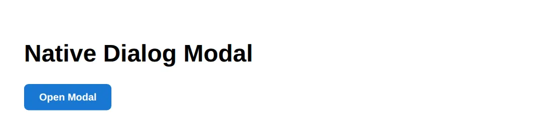
2. Returning focus and locking scroll
This adds the two things <dialog> leaves to you: returning focus to the trigger when the modal closes, and locking background scroll while it's open. Notice the single close event handler does the cleanup — so it runs whether the user clicked a button, clicked the backdrop, or pressed Escape.
<!DOCTYPE html>
<html lang="en">
<head>
<style>
  body { font-family: system-ui, sans-serif; padding: 24px; line-height: 1.7; }
  .btn { padding: 10px 20px; background: #2E7D32; color: white; border: none;
         border-radius: 6px; font-weight: 600; cursor: pointer; }
  dialog { border: none; border-radius: 14px; padding: 24px; max-width: 420px; width: 90%; }
  dialog::backdrop { background: rgba(0,0,0,0.5); }
  /* When this class is on <html>, the page behind the modal cannot scroll. */
  .modal-open { overflow: hidden; }
  .filler { color: #777; }
</style>
</head>
<body>
  <h1>Focus Return + Scroll Lock</h1>
  <button class="btn" id="trigger">Open Settings</button>

  <dialog id="settings" aria-labelledby="settings-title">
    <h2 id="settings-title" style="margin-top:0">Settings</h2>
    <p>Close me with Escape, the button, or click the dim backdrop.</p>
    <button class="btn" id="done">Done</button>
  </dialog>

  <p class="filler">Scroll down — then open the modal and notice the page can't scroll.</p>
  <div class="filler" style="height: 600px;">··· lots of page content ···</div>

  <script>
    const dialog = document.getElementById('settings');
    const trigger = document.getElementById('trigger');

    function openModal() {
      dialog.showModal();
      document.documentElement.classList.add('modal-open'); // lock scrolling
    }
    function closeModal() {
      dialog.close();
    }

    trigger.addEventListener('click', openModal);
    document.getElementById('done').addEventListener('click', closeModal);

    // Light-dismiss: close when the user clicks the backdrop (outside the box).
    dialog.addEventListener('click', (e) => {
      if (e.target === dialog) closeModal();
    });

    // One "close" listener cleans up no matter HOW it closed (Escape included).
    dialog.addEventListener('close', () => {
      document.documentElement.classList.remove('modal-open'); // unlock scrolling
      trigger.focus();                                         // restore focus
    });
  </script>
  <!-- ✅ Expected result, measured in a real browser:
     .btn -> cursor: pointer
     .btn -> count: 2
  -->
</body>
</html>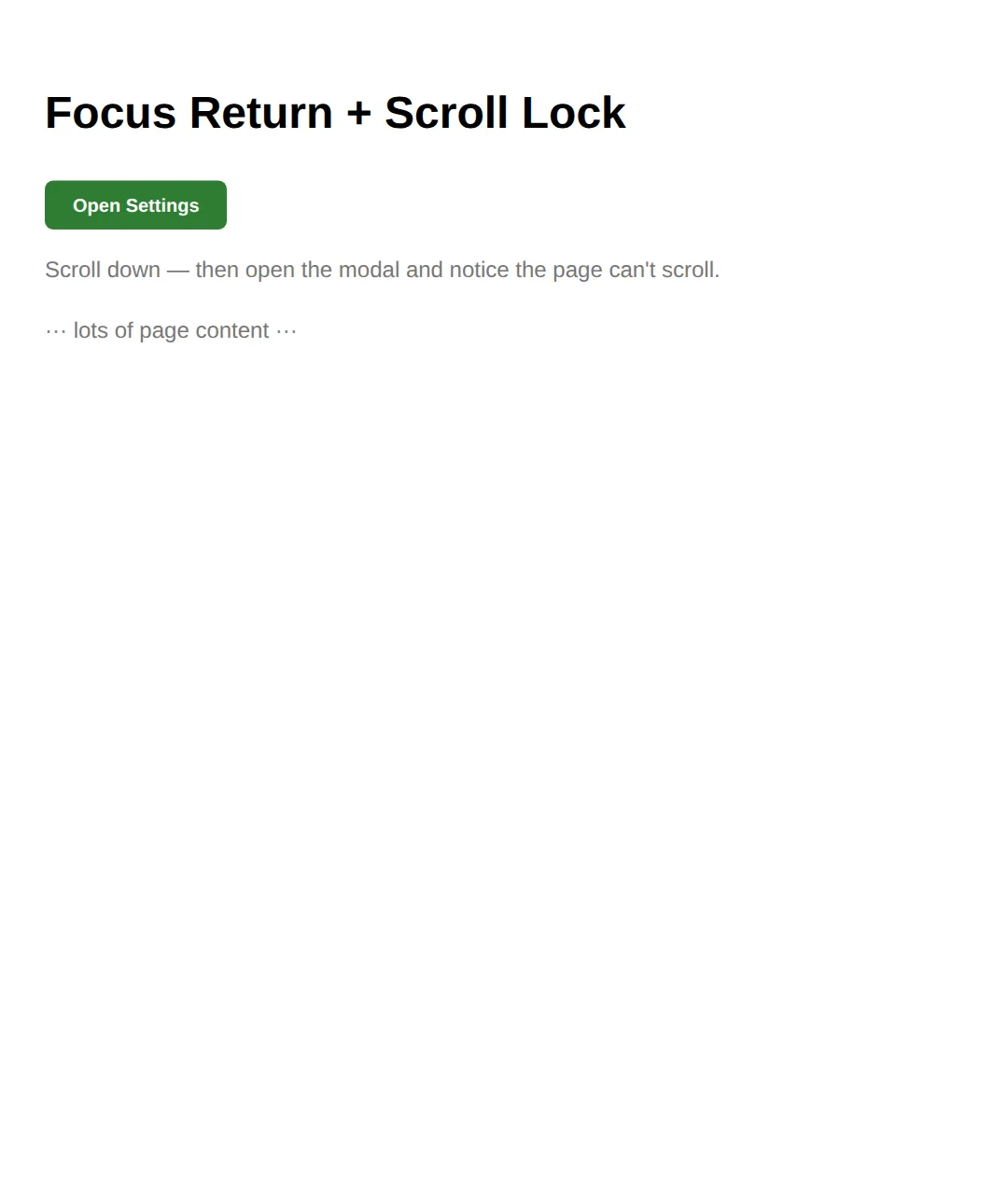
3. 🎯 Your turn: make it a real modal
Fill in the three blanks
Give the dialog an accessible name, open it as a true modal, and close it from the button. Each ___ has a 👉 hint right beside it, and the expected behaviour is in a comment at the bottom.
<!DOCTYPE html>
<html lang="en">
<head>
<style>
  body { font-family: system-ui, sans-serif; padding: 24px; }
  .btn { padding: 10px 20px; background: #6A1B9A; color: white; border: none;
         border-radius: 6px; font-weight: 600; cursor: pointer; }
  dialog { border: none; border-radius: 14px; padding: 24px; max-width: 420px; width: 90%; }
  dialog::backdrop { background: rgba(0,0,0,0.5); }
</style>
</head>
<body>
  <!-- 🎯 YOUR TURN — make this modal accessible. Replace each ___ -->

  <button class="btn" id="openBtn">Open</button>

  <!-- 1) Give the dialog an accessible name: point at the heading's id -->
  <dialog id="dlg" aria-labelledby="___">     <!-- 👉 use the id below: "dlg-title" -->
    <h2 id="dlg-title" style="margin-top:0">Welcome</h2>
    <p>You did it!</p>
    <button class="btn" id="closeBtn">Close</button>
  </dialog>

  <script>
    const dlg = document.getElementById('dlg');

    // 2) Open it as a TRUE modal (backdrop + focus trap), not a popup
    document.getElementById('openBtn').addEventListener('click', () => dlg.___());
    // 👉 the method is showModal  (NOT show)

    // 3) Close it from the Close button
    document.getElementById('closeBtn').addEventListener('click', () => dlg.___());
    // 👉 the method is close
  </script>

  <!-- ✅ Expected: clicking Open dims the page; Tab stays inside; Escape closes it. -->
</body>
</html>
4. 🎯 Your turn: focus return + form auto-close
Wire up two blanks
Make the form close the dialog on submit with method="dialog", then return focus to the trigger in the close handler. Check your work against the ✅ Expected comment.
<!DOCTYPE html>
<html lang="en">
<head>
<style>
  body { font-family: system-ui, sans-serif; padding: 24px; }
  .btn { padding: 10px 20px; background: #1976D2; color: white; border: none;
         border-radius: 6px; font-weight: 600; cursor: pointer; }
  dialog { border: none; border-radius: 14px; padding: 24px; max-width: 420px; width: 90%; }
  dialog::backdrop { background: rgba(0,0,0,0.45); }
  input { width: 100%; padding: 10px; border: 2px solid #e0e0e0; border-radius: 8px;
          box-sizing: border-box; margin-bottom: 12px; }
  #out { margin-top: 12px; color: #2E7D32; font-weight: 600; }
</style>
</head>
<body>
  <!-- 🎯 YOUR TURN — wire up focus return and auto-close-on-submit. Replace each ___ -->

  <button class="btn" id="add">Add Name</button>
  <p id="out"></p>

  <dialog id="dlg" aria-labelledby="t">
    <h2 id="t" style="margin-top:0">New Name</h2>

    <!-- 1) Make this form CLOSE the dialog when it submits -->
    <form method="___">      <!-- 👉 the value is "dialog" -->
      <input name="who" placeholder="Type a name..." required autofocus>
      <button class="btn" type="submit">Save</button>
    </form>
  </dialog>

  <script>
    const dlg = document.getElementById('dlg');
    const add = document.getElementById('add');

    add.addEventListener('click', () => dlg.showModal());

    dlg.querySelector('form').addEventListener('submit', (e) => {
      document.getElementById('out').textContent = 'Saved: ' + e.target.who.value;
    });

    // 2) When the dialog closes, send keyboard focus back to the Add button
    dlg.addEventListener('close', () => add.___());
    // 👉 the method is focus
  </script>

  <!-- ✅ Expected: submitting closes the modal, shows "Saved: ...", and the Add
       button is focused again (press Enter to reopen without touching the mouse). -->
</body>
</html>
5. Mini-challenge: a delete confirmation
Build it from the outline
No blanks this time — just a comment outline. Build a "Delete item?" modal from scratch: native <dialog>, showModal(), two buttons that close(), focus returned on close, and your own ::backdrop styling. The expected behaviour is listed in the comments.
<!DOCTYPE html>
<html lang="en">
<head>
<style>
  body { font-family: system-ui, sans-serif; padding: 24px; }
  .btn { padding: 10px 20px; background: #C62828; color: white; border: none;
         border-radius: 6px; font-weight: 600; cursor: pointer; }
  /* 🎯 MINI-CHALLENGE: style the dialog and its ::backdrop yourself. */
  dialog { /* your styles: border-radius, padding, max-width, box-shadow */ }
  dialog::backdrop { /* your overlay: a dim or blurred background */ }
</style>
</head>
<body>
  <!-- 🎯 MINI-CHALLENGE: a "Delete item?" confirmation modal.
       Build it with the native <dialog> from scratch:
       1. A "Delete" trigger button (give it an id).
       2. A <dialog aria-labelledby="..."> with a heading, a warning line,
          and two buttons: "Cancel" and "Delete forever".
       3. Open it with showModal(); close it from BOTH buttons with close().
       4. On the dialog's "close" event, return focus to the trigger button.
       5. Style dialog + ::backdrop in the CSS above.

       ✅ Expected: clicking Delete dims the page; Tab is trapped inside; Escape
          closes it; after closing, the Delete button is focused again. -->

  <!-- your HTML here -->

  <script>
    // your JavaScript here
  </script>
</body>
</html>
When to reach for a modal
- Confirmations: "Are you sure you want to delete?" — force users to acknowledge destructive actions.
- Quick forms: "Add item", "Edit profile" — keep users in context without a full page navigation.
- Media previews: image lightboxes and video players that overlay the current page.
- Don't use for: cookie consent (use a banner), routine notifications (use a toast), or content people browse casually.
Common Errors (and the fix)
- Focus escaping to the page. Symptom: pressing Tab moves the highlight onto links behind the modal. Cause: you opened it with show(), or you built it from a <div>. Fix: open a native <dialog> with showModal() — that is what installs the focus trap.
- No Escape handler / Escape does nothing. Symptom: pressing Escape doesn't close the modal. Cause: a custom <div> modal with no keydown listener (or, again, show()). Fix: use <dialog> + showModal() — Escape works automatically; don't reimplement it.
- Focus not restored on close. Symptom: closing the modal drops the user at the top of the page and they lose their place. Fix: in dialog.addEventListener('close', () => trigger.focus()), send focus back to the button that opened it.
- Missing accessible name (no aria). Symptom: a screen reader announces "dialog" with no idea what it's for. Cause: no aria-labelledby / aria-label. Fix: add aria-labelledby="heading-id" pointing at the dialog's heading so it has a name.
- Background still scrolls. Symptom: scrolling inside the modal scrolls the page behind it. Fix: add overflow: hidden to <html> on open and remove it on close.
📋 Quick Reference
| You want to… | Use |
|---|---|
| Open a true modal (backdrop + focus trap) | dialog.showModal() |
| Open a non-modal popup (no backdrop) | dialog.show() |
| Close it from code or a button | dialog.close() |
| Close it on a form submit | <form method="dialog"> |
| Give it an accessible name | aria-labelledby="title-id" |
| Style the dim overlay | dialog::backdrop { … } |
| Focus the first field on open | autofocus attribute |
| Restore focus / clean up on close | dialog.addEventListener('close', …) |
| Lock background scrolling | html { overflow: hidden } |
🎉 Lesson Complete
- ✅ A modal is a window that traps attention; the native <dialog> is the accessible way to build one
- ✅ showModal() gives you focus trapping, Escape-to-close, ARIA roles, and a ::backdrop for free
- ✅ show() is only a popup — for real modals always use showModal()
- ✅ Add aria-labelledby pointing at the heading so it has an accessible name
- ✅ Return focus to the trigger in the close event, and lock <html> scroll while open
- ✅ <form method="dialog"> closes the dialog automatically on submit
Practice quiz
Which method opens a native dialog as a true modal?
- dialog.show()
- dialog.open()
- dialog.showModal()
- dialog.toggle()
Answer: dialog.showModal(). showModal() gives a backdrop, focus trapping, Escape-to-close, and the top layer. show() opens a non-modal popup with none of those.
What is the difference between show() and showModal()?
- They are identical
- show() traps focus; showModal() does not
- showModal() adds a backdrop, focus trap and Escape; show() is a non-modal popup with none of those
- show() renders in the top layer; showModal() does not
Answer: showModal() adds a backdrop, focus trap and Escape; show() is a non-modal popup with none of those. showModal() opens a real modal (backdrop, focus trap, Escape, top layer). show() is only a non-modal popup.
Which features does a native dialog opened with showModal() provide for free?
- Focus trapping, Escape-to-close, role="dialog"/aria-modal, and a ::backdrop
- Background scroll locking
- Automatic form validation
- A close button
Answer: Focus trapping, Escape-to-close, role="dialog"/aria-modal, and a ::backdrop. showModal() installs the focus trap, Escape handling, the dialog ARIA role/aria-modal, and paints the ::backdrop overlay automatically.
Do you need to add role="dialog" and aria-modal="true" yourself on a native dialog?
- Yes, always
- No — a dialog opened with showModal() exposes them automatically
- Only role="dialog" is automatic
- Only in older browsers
Answer: No — a dialog opened with showModal() exposes them automatically. A native dialog opened with showModal() already exposes role="dialog" and aria-modal="true". You only add an accessible name.
How do you give a dialog an accessible name from its heading?
- aria-describedby pointing at the heading
- aria-labelledby pointing at the heading's id
- title attribute on the dialog
- role="heading" on the dialog
Answer: aria-labelledby pointing at the heading's id. Add aria-labelledby pointing at the heading's id (or aria-label if there is no visible heading) so the dialog has a name.
Why should focus return to the trigger button when a modal closes?
- To reset the page scroll position
- So keyboard and screen-reader users keep their place in the focus order
- To re-run the open animation
- To clear the form fields
Answer: So keyboard and screen-reader users keep their place in the focus order. Returning focus to the trigger keeps keyboard/screen-reader users exactly where they were instead of dropping them at the top of the page.
What closes a native dialog automatically when a form inside it submits?
- form action="close"
- form method="dialog"
- form type="modal"
- form onsubmit="close"
Answer: form method="dialog". A form with method="dialog" closes the dialog on submit and fires its close event.
Which CSS pseudo-element styles the dim layer behind a modal dialog?
- dialog::before
- dialog::backdrop
- dialog::overlay
- dialog::after
Answer: dialog::backdrop. ::backdrop is the layer painted behind a dialog opened with showModal(); you can dim or blur it.
How do you stop the page behind the modal from scrolling?
- Add overflow: hidden to html while the modal is open and remove it on close
- Set the dialog to position: fixed
- Add a high z-index to the dialog
- Use aria-modal="true"
Answer: Add overflow: hidden to html while the modal is open and remove it on close. Scroll locking is the one piece dialog leaves to you: add overflow: hidden to html on open and remove it on close.
Why does Escape not close a custom div-based modal by default?
- Divs cannot receive keyboard events
- A plain div has no built-in Escape handling — only a native dialog opened with showModal() gives it for free
- Escape only works with role="dialog"
- The browser blocks Escape inside divs
Answer: A plain div has no built-in Escape handling — only a native dialog opened with showModal() gives it for free. A custom div modal needs a manual keydown listener. A native dialog opened with showModal() closes on Escape with no extra code.
Continue this course
- Previous: Custom Scrollbars & UI Chrome Styling
- Next: CSS Logical Properties for International Layouts — Use logical properties for RTL-compatible, internationalisation-ready layouts
- Quick reference: HTML & CSS cheat sheet
Frequently asked questions
Do I still need JavaScript to use the <dialog> element?
Only a little. You need one line to open it — dialog.showModal() — because there is no HTML-only way to open a modal on demand. But focus trapping, the Escape key, the ::backdrop overlay, focus return, and the dialog ARIA role all work with no JavaScript at all.
What is the difference between show() and showModal()?
showModal() opens a true modal: it adds a ::backdrop, traps focus inside the dialog, closes on Escape, and renders in the browser's top layer above everything. show() opens a non-modal popup with none of those — no backdrop, no focus trap, no Escape. For confirmations and forms, always use showModal().
Do I need to add role="dialog" and aria-modal="true" myself?
No. A native <dialog> opened with showModal() already exposes role="dialog" and aria-modal="true" to assistive technology. You only need to give it an accessible name with aria-labelledby pointing at its heading (or aria-label if there is no visible heading).
Why does focus need to return to the button that opened the modal?
Keyboard and screen-reader users navigate in a single focus order. If focus is dropped to the top of the page when a modal closes, they lose their place. Returning focus to the trigger keeps them exactly where they were. Modern browsers do this automatically, but calling trigger.focus() in the close handler makes it reliable everywhere.
How do I stop the page behind the modal from scrolling?
Add overflow: hidden to <html> while the modal is open and remove it when it closes. Do it in the dialog's open/close handlers so it is undone no matter how the dialog was dismissed. The native dialog already makes the background inert for clicks and tabbing, but scroll locking is the one piece you add yourself.