HTML Elements & Attributes
Reviewed & published by Brayan K
Read this carefully. This is non-negotiable knowledge.
Part of the free HTML & CSS course at LearnCodingFast — hands-on lessons with examples you run in your browser, plus practice exercises and a quick quiz.
What You'll Learn
- ✓ What HTML elements are and how they work
- ✓ Void (self-closing) elements
- ✓ Divs vs Spans (block vs inline)
- ✓ Links, images, buttons, and forms
- ✓ HTML attributes (id, class, href, src)
- ✓ Building a complete product card
1) What Is an HTML Element?
An HTML element is the basic building block of every website. If you don't understand elements, you do not understand web development.
<!DOCTYPE html>
<html>
<head>
<title>Element Anatomy</title>
<style>
body {
font-family: system-ui, sans-serif;
background: #0f172a;
color: #e5e7eb;
padding: 20px;
}
.example {
background: #1e293b;
padding: 20px;
border-radius: 8px;
margin: 15px 0;
border-left: 4px solid #3b82f6;
}
code {
background: #334155;
padding: 2px 8px;
border-radius: 4px;
color: #22c55e;
}
</style>
</head>
<body>
<h1>HTML Element Structure</h1>
<div class="example">
<p>An element usually has:</p>
<ul>
<li><code><p></code> - Opening tag</li>
<li>Hello World - Content</li>
<li><code></p></code> - Closing tag</li>
</ul>
</div>
<div class="example">
<h3>Example:</h3>
<p>This is a paragraph element!</p>
<p>And this is another one!</p>
</div>
<!-- ✅ Expected result, measured in a real browser:
.example -> padding-top: 20px
code -> padding-top: 2px
.example -> count: 2
-->
</body>
</html>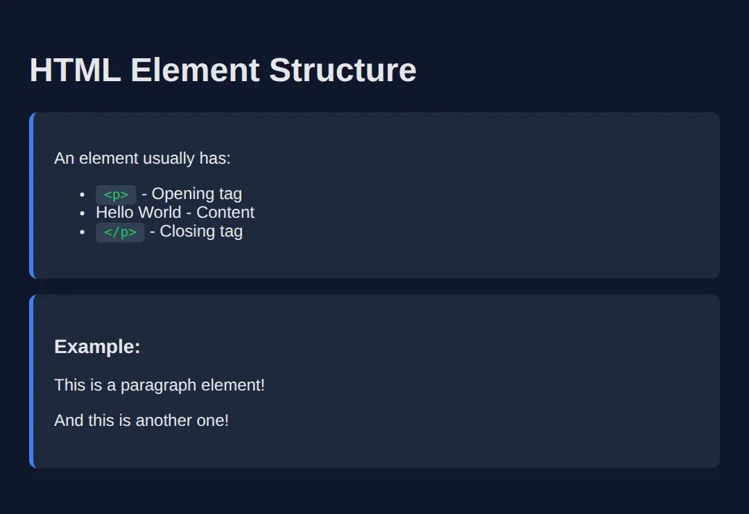
2) Void Elements (Self-Closing)
Some elements do not have closing tags. These are called void elements.
<!DOCTYPE html>
<html>
<head>
  <title>Void Elements</title>
  <style>
    body {
      font-family: system-ui, sans-serif;
      background: #0f172a;
      color: #e5e7eb;
      padding: 20px;
    }
    .demo {
      background: #1e293b;
      padding: 20px;
      border-radius: 8px;
      margin: 15px 0;
    }
    input {
      padding: 10px;
      border-radius: 6px;
      border: none;
      margin: 5px 0;
    }
    hr {
      border: none;
      height: 2px;
      background: #3b82f6;
      margin: 20px 0;
    }
  </style>
</head>
<body>
  <h1>Void Elements Demo</h1>

  <div class="demo">
    <h3>Image (img)</h3>
    <img src="https://via.placeholder.com/200x100/22c55e/ffffff?text=No+closing+tag!" alt="Demo image">
  </div>

  <div class="demo">
    <h3>Line Break (br)</h3>
    <p>Line one<br>Line two<br>Line three</p>
  </div>

  <div class="demo">
    <h3>Horizontal Rule (hr)</h3>
    <p>Content above</p>
    <hr>
    <p>Content below</p>
  </div>

  <div class="demo">
    <h3>Input (input)</h3>
    <input type="text" placeholder="Text input"><br>
    <input type="email" placeholder="Email input"><br>
    <input type="checkbox"> Checkbox
  </div>
  <!-- ✅ Expected result, measured in a real browser:
     .demo -> padding-top: 20px
     input -> padding-top: 10px
     .demo -> count: 4
  -->
</body>
</html>- • <img> - Images
- • <br> - Line breaks
- • <hr> - Horizontal rules
- • <input> - Form inputs
3) Divs and Spans (Containers)
<!DOCTYPE html>
<html>
<head>
  <title>Divs vs Spans</title>
  <style>
    body {
      font-family: system-ui, sans-serif;
      background: #0f172a;
      color: #e5e7eb;
      padding: 20px;
    }
    .card {
      background: #1e293b;
      padding: 20px;
      border-radius: 12px;
      margin: 15px 0;
      border: 2px solid #3b82f6;
    }
    .highlight {
      background: #22c55e;
      color: #0f172a;
      padding: 2px 8px;
      border-radius: 4px;
    }
    .warning {
      color: #ef4444;
      font-weight: bold;
    }
  </style>
</head>
<body>
  <h1>Divs vs Spans</h1>

  <h2>DIV - Block Container</h2>
  <div class="card">
    <h3>I'm inside a div!</h3>
    <p>Divs are block-level elements.</p>
    <p>They take up the full width available.</p>
  </div>
  <div class="card">
    <p>This is another div block.</p>
  </div>

  <h2>SPAN - Inline Container</h2>
  <p>
    This is a paragraph with a
    <span class="highlight">highlighted word</span>
    and a
    <span class="warning">warning</span>
    inside it.
  </p>
  <p>Spans don't break the line - they flow with text.</p>
  <!-- ✅ Expected result, measured in a real browser:
     .card -> padding-top: 20px
     .highlight -> padding-top: 2px
     .card -> count: 2
  -->
</body>
</html>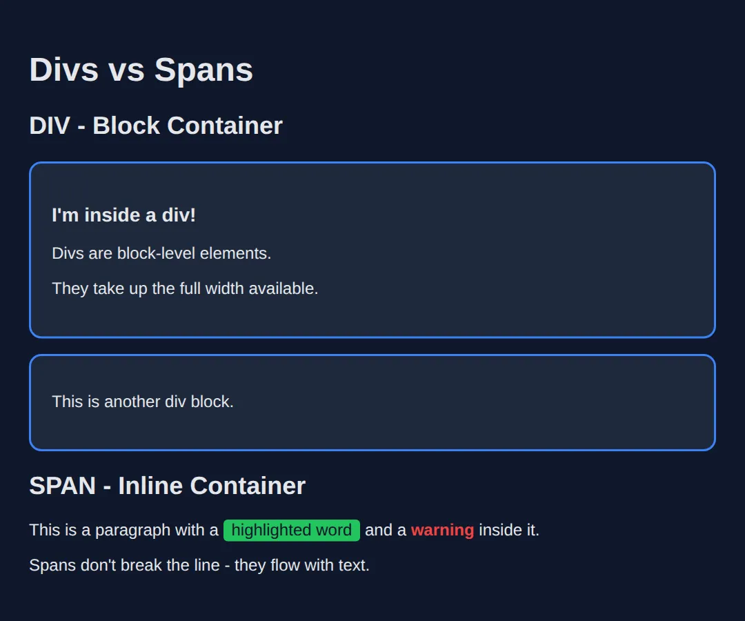
<div> means nothing by itself. It exists only to group other elements. If your page is 90% divs, you're doing it wrong.
4) Links (Navigation)
<!DOCTYPE html>
<html>
<head>
  <title>Links Demo</title>
  <style>
    body {
      font-family: system-ui, sans-serif;
      background: #0f172a;
      color: #e5e7eb;
      padding: 20px;
    }
    a {
      color: #3b82f6;
      text-decoration: none;
      padding: 8px 16px;
      display: inline-block;
      border-radius: 6px;
      transition: all 0.2s;
    }
    a:hover {
      background: #3b82f6;
      color: white;
    }
    .section {
      background: #1e293b;
      padding: 20px;
      border-radius: 8px;
      margin: 20px 0;
    }
    #target-section {
      border: 2px dashed #22c55e;
      margin-top: 100px;
    }
  </style>
</head>
<body>
  <h1>Link Types</h1>

  <div class="section">
    <h3>External Link</h3>
    <a href="https://google.com" target="_blank">
      Visit Google (new tab)
    </a>
  </div>

  <div class="section">
    <h3>Anchor Link (same page)</h3>
    <a href="#target-section">
      Jump to section below ↓
    </a>
  </div>

  <div class="section">
    <h3>Email Link</h3>
    <a href="mailto:[email protected]">
      Send Email
    </a>
  </div>

  <div class="section">
    <h3>Phone Link</h3>
    <a href="tel:+1234567890">
      Call Now
    </a>
  </div>

  <div class="section" id="target-section">
    <h3>🎯 You jumped here!</h3>
    <p>This section has id="target-section"</p>
    <a href="#">Back to top ↑</a>
  </div>
  <!-- ✅ Expected result, measured in a real browser:
     a -> display: inline-block
     .section -> padding-top: 20px
     .section -> count: 5
  -->
</body>
</html>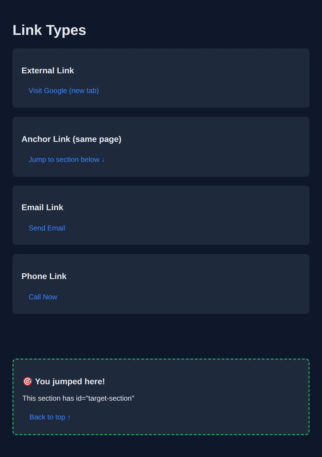
5) Images (Accessibility Is Mandatory)
<!DOCTYPE html>
<html>
<head>
  <title>Images</title>
  <style>
    body {
      font-family: system-ui, sans-serif;
      background: #0f172a;
      color: #e5e7eb;
      padding: 20px;
    }
    .image-card {
      background: #1e293b;
      padding: 20px;
      border-radius: 12px;
      margin: 20px 0;
    }
    img {
      border-radius: 8px;
      max-width: 100%;
    }
    .caption {
      color: #94a3b8;
      font-style: italic;
      margin-top: 10px;
    }
    .bad { border: 3px solid #ef4444; }
    .good { border: 3px solid #22c55e; }
  </style>
</head>
<body>
  <h1>Images in HTML</h1>

  <div class="image-card">
    <h3 style="color: #22c55e;">✅ Good: With Alt Text</h3>
    <img
      src="https://via.placeholder.com/300x150/22c55e/ffffff?text=Good+Image"
      alt="A green placeholder demonstrating proper alt text usage"
      class="good"
    >
    <p class="caption">Alt text helps screen readers and SEO!</p>
  </div>

  <div class="image-card">
    <h3 style="color: #ef4444;">❌ Bad: No Alt Text</h3>
    <img
      src="https://via.placeholder.com/300x150/ef4444/ffffff?text=Bad+Image"
      class="bad"
    >
    <p class="caption">Missing alt text breaks accessibility!</p>
  </div>

  <div class="image-card">
    <h3>Image Sizing</h3>
    <img
      src="https://via.placeholder.com/600x200/3b82f6/ffffff?text=Responsive+Image"
      alt="Wide responsive image"
      style="width: 100%; height: auto;"
    >
    <p class="caption">Use width: 100% for responsive images</p>
  </div>
  <!-- ✅ Expected result, measured in a real browser:
     .image-card -> padding-top: 20px
     img -> max-width: 100%
     .image-card -> count: 3
  -->
</body>
</html>- ✅ src = file path or URL
- ✅ alt = description for accessibility
- If you skip alt, you break accessibility and hurt SEO
6) Buttons (User Actions)
<!DOCTYPE html>
<html>
<head>
<title>Buttons</title>
<style>
body {
font-family: system-ui, sans-serif;
background: #0f172a;
color: #e5e7eb;
padding: 20px;
}
.button-group {
display: flex;
gap: 15px;
flex-wrap: wrap;
margin: 20px 0;
}
button {
padding: 12px 24px;
border: none;
border-radius: 8px;
font-size: 16px;
cursor: pointer;
transition: all 0.2s;
}
.primary {
background: #3b82f6;
color: white;
}
.primary:hover { background: #2563eb; }
.success {
background: #22c55e;
color: white;
}
.success:hover { background: #16a34a; }
.danger {
background: #ef4444;
color: white;
}
.danger:hover { background: #dc2626; }
.outline {
background: transparent;
border: 2px solid #3b82f6;
color: #3b82f6;
}
.outline:hover {
background: #3b82f6;
color: white;
}
</style>
</head>
<body>
<h1>Button Styles</h1>
<div class="button-group">
<button class="primary">Primary Button</button>
<button class="success">Success Button</button>
<button class="danger">Delete Button</button>
<button class="outline">Outline Button</button>
</div>
<h2>Button Types</h2>
<div class="button-group">
<button type="button">type="button"</button>
<button type="submit">type="submit"</button>
<button type="reset">type="reset"</button>
</div>
<p style="color: #94a3b8; margin-top: 20px;">
⚠️ Use <button> for actions. Never use <div> pretending to be a button!
</p>
<!-- ✅ Expected result, measured in a real browser:
.button-group -> display: flex
button -> cursor: pointer
.button-group -> count: 2
-->
</body>
</html>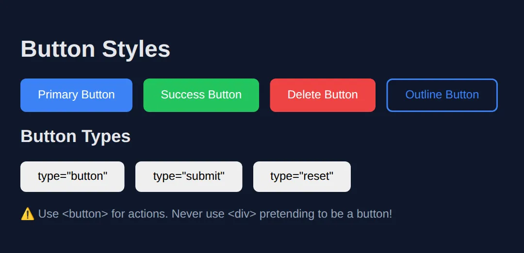
7) HTML Attributes (Extra Information)
Attributes give extra information to elements.
<!DOCTYPE html>
<html>
<head>
  <title>Attributes</title>
  <style>
    body {
      font-family: system-ui, sans-serif;
      background: #0f172a;
      color: #e5e7eb;
      padding: 20px;
    }
    .attr-demo {
      background: #1e293b;
      padding: 20px;
      border-radius: 8px;
      margin: 15px 0;
    }
    #unique-element {
      color: #ef4444;
      font-weight: bold;
    }
    .styled-class {
      background: #22c55e;
      color: #0f172a;
      padding: 8px 16px;
      border-radius: 6px;
      display: inline-block;
    }
    input, textarea {
      padding: 10px;
      border-radius: 6px;
      border: 2px solid #334155;
      background: #0f172a;
      color: white;
      margin: 5px 0;
      display: block;
      width: 100%;
      max-width: 300px;
    }
    input:focus, textarea:focus {
      border-color: #3b82f6;
      outline: none;
    }
  </style>
</head>
<body>
  <h1>HTML Attributes</h1>

  <div class="attr-demo">
    <h3>id Attribute (Unique)</h3>
    <p id="unique-element">This element has id="unique-element"</p>
    <p>IDs must be unique per page!</p>
  </div>

  <div class="attr-demo">
    <h3>class Attribute (Reusable)</h3>
    <span class="styled-class">Styled with class</span>
    <span class="styled-class">Same class, same style!</span>
  </div>

  <div class="attr-demo">
    <h3>type Attribute (Inputs)</h3>
    <input type="text" placeholder="type=text">
    <input type="email" placeholder="type=email">
    <input type="password" placeholder="type=password">
    <input type="number" placeholder="type=number">
  </div>

  <div class="attr-demo">
    <h3>placeholder & required</h3>
    <input type="text" placeholder="This is a placeholder" required>
    <p style="color: #94a3b8; font-size: 14px;">required makes the field mandatory</p>
  </div>

  <div class="attr-demo">
    <h3>disabled Attribute</h3>
    <button disabled style="opacity: 0.5; cursor: not-allowed; padding: 10px 20px;">
      Disabled Button
    </button>
  </div>
  <!-- ✅ Expected result, measured in a real browser:
     .styled-class -> display: inline-block
     .attr-demo -> padding-top: 20px
     .attr-demo -> count: 5
  -->
</body>
</html>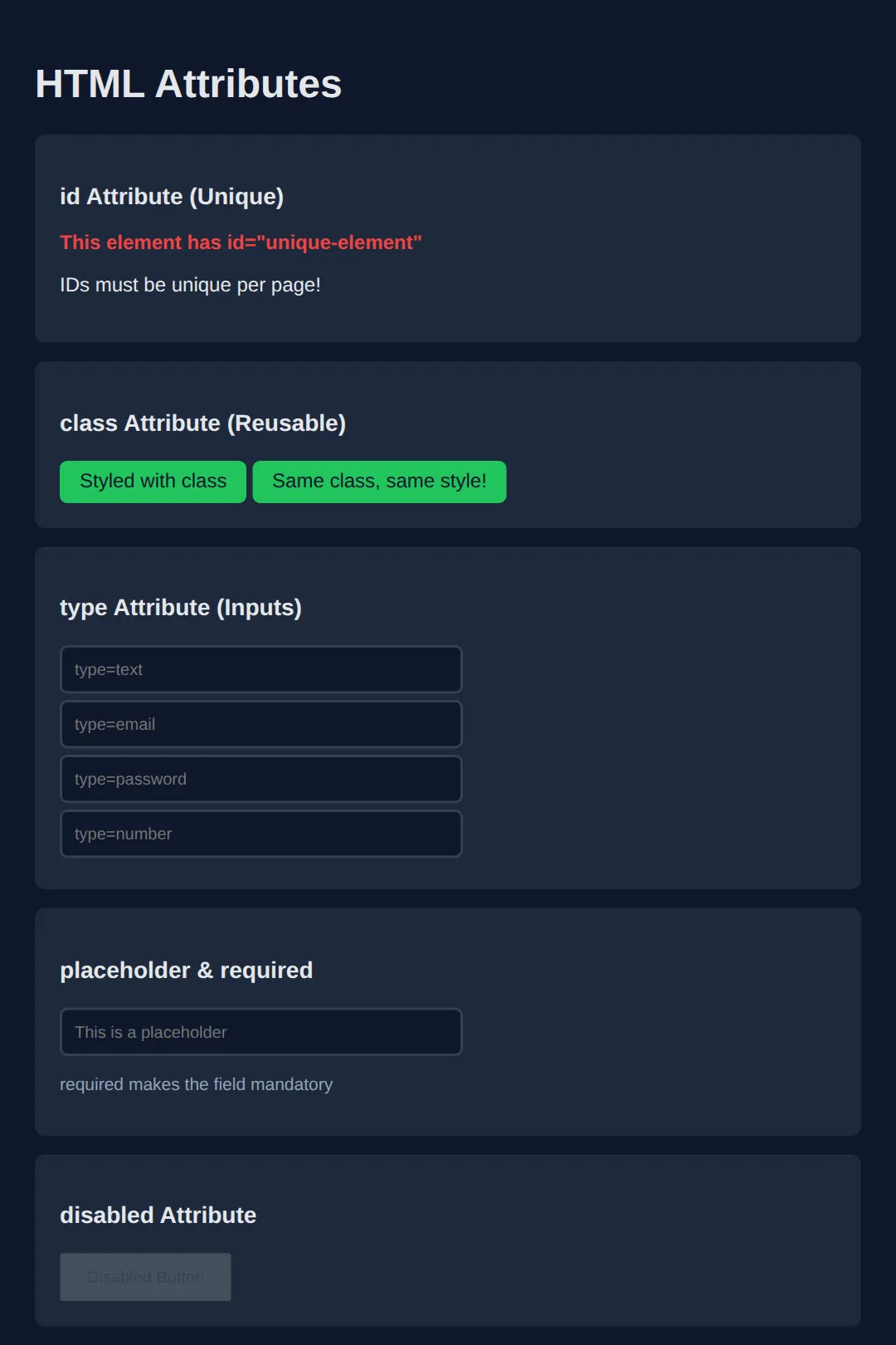
🧠 Worked Example — one card, eight elements
So far you have met the elements one at a time. Here they are doing a real job together. Read the comments before you run it — every attribute in this card is there for a reason, and three of them (alt, width/height, rel) are the ones beginners leave out.
<!DOCTYPE html>
<html lang="en">
<head>
<meta charset="UTF-8">
<title>Worked Example: One Card, Eight Elements</title>
<style>
* { box-sizing: border-box; margin: 0; padding: 0; }
body { background:#0f172a; color:#e5e7eb; font-family:system-ui,sans-serif; padding:24px; }
#product-card { max-width:320px; background:#1e293b; border-radius:12px; overflow:hidden; }
#product-card img { display:block; width:100%; height:auto; }
.body { padding:16px; }
.title { font-size:1.1rem; color:#60a5fa; margin-bottom:6px; }
.desc { font-size:.9rem; color:#94a3b8; margin-bottom:12px; }
.price { color:#22c55e; font-weight:700; font-size:1.25rem; }
.vat { color:#64748b; font-size:.75rem; }
.buy { display:block; width:100%; margin-top:14px; padding:10px; background:#3b82f6; color:#fff; border:none; border-radius:8px; font-size:15px; font-weight:700; cursor:pointer; }
.buy:hover { background:#2563eb; }
.more { display:inline-block; margin-top:10px; color:#93c5fd; font-size:.85rem; }
</style>
</head>
<body>
<!-- id="product-card" names THIS ONE element. An id must be unique on the page.
A class can be reused as often as you like; an id cannot. -->
<div id="product-card">
<!-- The <img> below carries three attributes worth understanding.
src - where the picture lives. Normally a file path like
"images/mug.jpg". This one is a tiny picture written straight
into the page so the example works with no files and no internet.
alt - what a screen reader reads out, and what shows on screen if the
image fails to load. Describe the picture; do not repeat the
filename and do not start with "image of".
width
height - the shape of the picture, so the browser can reserve the right
space BEFORE the file arrives and the page does not jump about
while it loads. The CSS above still controls the real size.
(Comments have to sit outside the tag like this — HTML does not allow a
comment in between an element's attributes.) -->
<img
src="data:image/svg+xml;utf8,<svg xmlns='http://www.w3.org/2000/svg' width='320' height='160'><rect width='320' height='160' fill='%233b82f6'/><text x='160' y='90' font-size='22' fill='white' text-anchor='middle' font-family='sans-serif'>Blue Mug</text></svg>"
alt="A plain blue ceramic mug seen from the side"
width="320"
height="160">
<div class="body">
<h2 class="title">Blue Mug</h2>
<p class="desc">Holds 350ml. Dishwasher safe. Chipped by exactly one flatmate.</p>
<!-- <p> is a BLOCK element: it takes a whole line to itself.
<span> is INLINE: it wraps part of a line so you can style just that bit.
Result: the price and "inc. VAT" sit on the same line, styled differently. -->
<p><span class="price">£12.00</span> <span class="vat">inc. VAT</span></p>
<!-- type="button" matters: inside a <form> a button with no type defaults to
type="submit" and will submit the form when clicked. -->
<button class="buy" type="button">Add to basket</button>
<!-- target="_blank" opens a new tab. rel="noopener noreferrer" goes WITH it:
without noopener the new page gets a JavaScript handle back to yours. -->
<a class="more" href="https://developer.mozilla.org/en-US/docs/Web/HTML/Element/img"
target="_blank" rel="noopener noreferrer">Read the docs for <img> ↗</a>
</div>
</div>
<!-- ✅ What you should see: a 320px-wide dark card. A blue banner reading
"Blue Mug" across the top, then the title, the description, then
"£12.00 inc. VAT" on ONE line with the price big and green and "inc. VAT"
small and grey, then a full-width blue "Add to basket" button, and a link
underneath. Swap the two <span>s for <div>s and the price and "inc. VAT"
break onto separate lines — that is the whole block-vs-inline difference. -->
<!-- ✅ Expected result, measured in a real browser:
#product-card -> overflow: hidden
#product-card img -> display: block
.buy -> display: block
.more -> display: inline-block
-->
</body>
</html>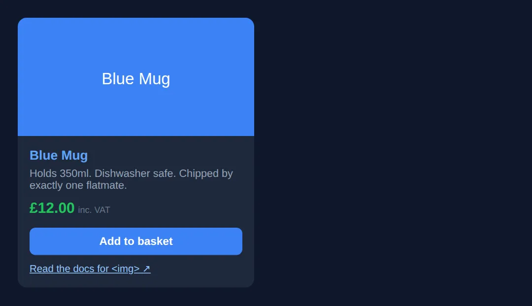
🎯 Your Turn — finish the card
Three blanks, marked ___. Everything else — the CSS, the layout, the wrapper elements — is already written. This one is self-checking: the image points at a file that does not exist on purpose, so whatever you type as the alt text appears on screen.
<!DOCTYPE html>
<html lang="en">
<head>
<meta charset="UTF-8">
<title>Your Turn: Elements and Attributes</title>
<style>
/* 🎯 YOUR TURN — fill in the three blanks marked ___ in the HTML below */
* { box-sizing:border-box; margin:0; padding:0; }
body { background:#0f172a; color:#e5e7eb; font-family:system-ui,sans-serif; padding:24px; }
.card { max-width:360px; background:#1e293b; padding:18px; border-radius:12px; }
.card h2 { color:#60a5fa; font-size:1.1rem; margin-bottom:8px; }
.card p { font-size:.92rem; color:#94a3b8; margin-bottom:12px; }
.highlight { color:#22c55e; font-weight:700; } /* this class already exists — use it */
.card img { display:block; width:100%; border:2px dashed #475569; border-radius:8px; color:#f59e0b; font-size:.85rem; padding:10px; margin-bottom:12px; }
.card a { color:#93c5fd; font-size:.9rem; }
</style>
</head>
<body>
<div class="card">
<!-- 1) team-photo.jpg does not exist, so the browser will print your alt text
instead. Describe what the photo would show — not "photo" or "image". -->
<img src="team-photo.jpg" alt="___">
<!-- 👉 replace ___ with a short description, e.g. Four people standing in front of a whiteboard -->
<h2>About the team</h2>
<!-- 2) Make ONLY the word "small" green and bold, without splitting the
sentence onto two lines. Wrap it in an inline element that carries
the .highlight class. -->
<p>We ship ___ changes, often.</p>
<!-- 👉 replace ___ with <span class="highlight">small</span> -->
<!-- 3) Point this link at any real page you like. -->
<a href="___" target="_blank" rel="noopener noreferrer">Read more ↗</a>
<!-- 👉 replace ___ with a full web address, e.g. https://developer.mozilla.org/en-US/docs/Web/HTML -->
</div>
<!-- ✅ Expected once all three blanks are filled:
- Inside the dashed box at the top, your alt text appears in orange next to
a small broken-image icon. That is exactly what a screen reader would say.
- The sentence stays on one line and only the word "small" is green and bold.
If you used a <div> instead of a <span>, "small" jumps onto its own line.
- "Read more" is a working link that opens in a new tab. -->
</body>
</html>8) Forms (User Input)
<!DOCTYPE html>
<html>
<head>
  <title>Forms</title>
  <style>
    body {
      font-family: system-ui, sans-serif;
      background: #0f172a;
      color: #e5e7eb;
      padding: 20px;
    }
    form {
      background: #1e293b;
      padding: 30px;
      border-radius: 12px;
      max-width: 400px;
    }
    label {
      display: block;
      margin-bottom: 5px;
      color: #94a3b8;
    }
    input, select, textarea {
      width: 100%;
      padding: 12px;
      border: 2px solid #334155;
      border-radius: 8px;
      background: #0f172a;
      color: white;
      margin-bottom: 20px;
      font-size: 16px;
    }
    input:focus, select:focus, textarea:focus {
      border-color: #3b82f6;
      outline: none;
    }
    button {
      background: #22c55e;
      color: white;
      border: none;
      padding: 12px 24px;
      border-radius: 8px;
      font-size: 16px;
      cursor: pointer;
      width: 100%;
    }
    button:hover { background: #16a34a; }
    .checkbox-group {
      display: flex;
      align-items: center;
      gap: 10px;
      margin-bottom: 20px;
    }
    .checkbox-group input { width: auto; margin: 0; }
  </style>
</head>
<body>
  <h1>Contact Form</h1>

  <form>
    <label for="name">Full Name</label>
    <input type="text" id="name" placeholder="John Doe" required>

    <label for="email">Email Address</label>
    <input type="email" id="email" placeholder="[email protected]" required>

    <label for="subject">Subject</label>
    <select id="subject">
      <option value="">Select a topic...</option>
      <option value="general">General Inquiry</option>
      <option value="support">Support</option>
      <option value="feedback">Feedback</option>
    </select>

    <label for="message">Message</label>
    <textarea id="message" rows="4" placeholder="Your message..."></textarea>

    <div class="checkbox-group">
      <input type="checkbox" id="newsletter">
      <label for="newsletter" style="margin: 0;">Subscribe to newsletter</label>
    </div>

    <button type="submit">Send Message</button>
  </form>
  <!-- ✅ Expected result, measured in a real browser:
     label -> display: block
     button -> cursor: pointer
     .checkbox-group -> display: flex
  -->
</body>
</html>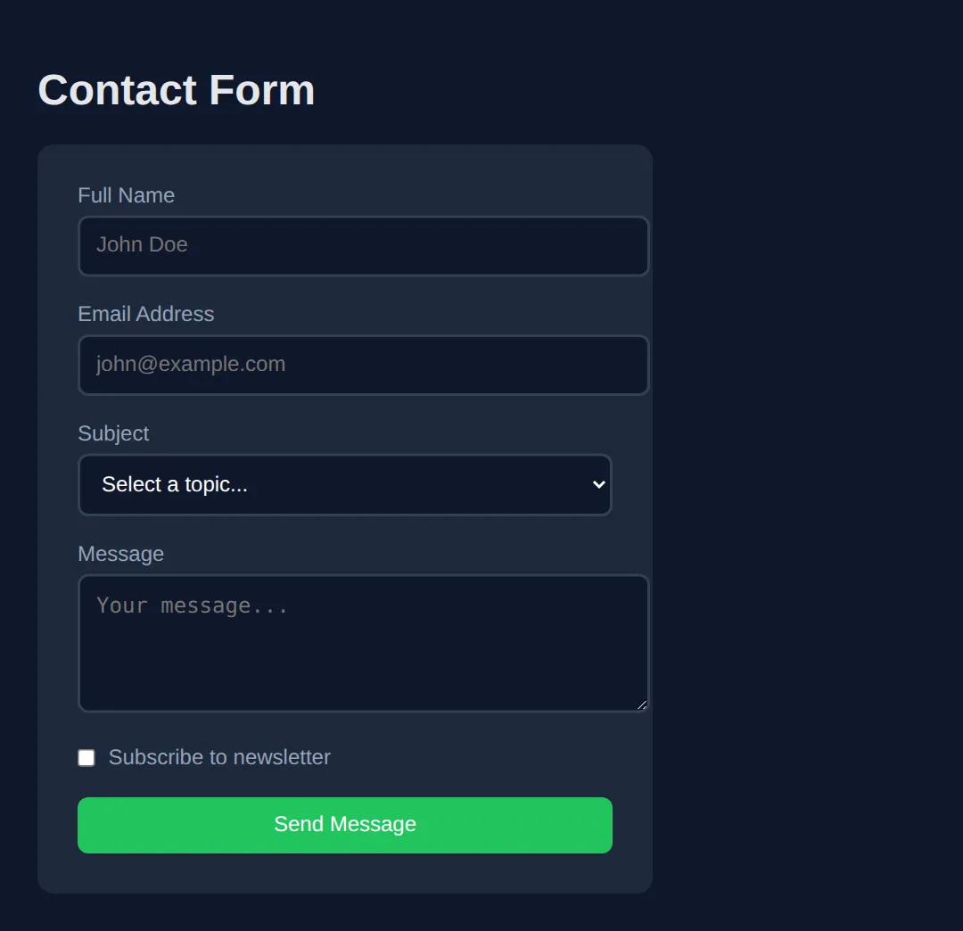
Practice Challenge
Build a product card with:
- An image with alt text
- A heading and description
- A price with a span for styling
- A "Add to Cart" button
🧩 Mini-Challenge — a recipe card, from an empty body
Last step: no blanks, no markup, just a brief. The CSS is written for you, so every class name you need is already listed below — your job is to write the HTML that uses them. Look back at the worked example whenever you get stuck; that is what worked examples are for.
Key Takeaways
- ✓ Elements have opening tags, content, and closing tags
- ✓ Void elements (img, br, hr, input) don't need closing tags
- ✓ Use div for block containers, span for inline
- ✓ Always include alt text on images
- ✓ Attributes provide extra information (id, class, href, src)
Practice quiz
What three parts make up a typical (non-void) HTML element?
- Opening tag, content, and closing tag
- A single self-closing tag only
- An id, a class, and a style
- A header, body, and footer
Answer: Opening tag, content, and closing tag. A typical element has an opening tag, its content, and a closing tag, e.g. <p>Hello</p>.
What is a void (self-closing) element?
- An element that has no closing tag, like <img> or <br>
- An element that is always invisible
- An element with no attributes
- An element that only contains text
Answer: An element that has no closing tag, like <img> or <br>. Void elements such as <img>, <br>, <hr>, and <input> have no closing tag.
Which of these is a void element?
- <p>
- <div>
- <input>
- <span>
Answer: <input>. <input> is a void element with no closing tag; <p>, <div>, and <span> all close.
What is the key difference between <div> and <span>?
- <div> is a block-level container; <span> is an inline container
- <span> is block-level; <div> is inline
- They are identical
- <div> can only hold text; <span> can only hold images
Answer: <div> is a block-level container; <span> is an inline container. <div> is block-level (takes full width), while <span> is inline and flows within text.
Which attribute on an <img> provides a text description for accessibility?
- src
- title
- alt
- name
Answer: alt. The alt attribute describes the image for screen readers and when the image fails to load.
Which attribute holds the destination URL of a link (<a>)?
- src
- href
- link
- url
Answer: href. The href attribute specifies the link's destination.
What is the difference between the id and class attributes?
- id must be unique on a page; class can be reused across many elements
- class must be unique; id can be reused
- They are interchangeable
- id is only for images; class is only for text
Answer: id must be unique on a page; class can be reused across many elements. An id should be unique per page, while a class can be applied to many elements.
Which is the semantically correct element for a clickable action?
- A <div> with a click handler
- <button>
- <span>
- <p>
Answer: <button>. Use <button> for actions; a div pretending to be a button loses built-in accessibility.
Which attribute opens a link in a new browser tab?
- target="_blank"
- rel="new"
- open="tab"
- href="_blank"
Answer: target="_blank". target="_blank" on an <a> opens the link in a new tab.
Which input-related attribute makes a form field mandatory?
- placeholder
- required
- disabled
- value
Answer: required. The required attribute makes a field mandatory before the form can submit.
Continue this course
- Previous: HTML Basics & Structure
- Next: CSS Basics & Selectors — Apply styles to HTML elements using selectors, classes, and IDs
- Quick reference: HTML & CSS cheat sheet › HTML Forms · HTML Tags & Elements cheat sheet › Forms