HTML Basics & Structure
Reviewed & published by Brayan K
HTML (HyperText Markup Language) is the standard language for building web pages, using elements written as tags to define the structure and content of a page, such as headings, paragraphs, links, lists, and images.
Part of the free HTML & CSS course at LearnCodingFast — hands-on lessons with examples you run in your browser, plus practice exercises and a quick quiz.
Master the foundation of every website - clean, correct HTML structure.
What You'll Learn
- ✓ The required HTML document skeleton
- ✓ DOCTYPE, html, head, and body tags
- ✓ Semantic HTML elements (header, nav, main, footer)
- ✓ Headings hierarchy (h1-h6)
- ✓ HTML comments for documentation
- ✓ Lists, links, and images
1) Why HTML Structure Matters
HTML structure is the foundation of every website. No matter how advanced the design, animations, or backend logic become, everything still rests on clean, correct HTML.
- ❌ Broken layouts
- ❌ Accessibility problems
- ❌ Hard-to-maintain code
- ✅ Faster websites
- ✅ Easier styling
- ✅ Easier JavaScript later
- ✅ Professional-quality projects
2) What HTML Really Does
HTML describes what exists on the page, not how it behaves.
HTML answers questions like:
- • What is a heading?
- • What is a paragraph?
- • What is a section?
- • What is navigation?
3) The Required HTML Page Skeleton
Every real HTML document must follow this structure:
<!DOCTYPE html>
<html lang="en">
  <head>
    <meta charset="UTF-8">
    <title>My Website</title>
  </head>
  <body>
    <h1>Welcome to My Website</h1>
    <p>This is the body where all visible content goes.</p>

    <!-- Try adding more content here! -->
    <h2>About Me</h2>
    <p>I'm learning HTML and CSS.</p>
  </body>
</html>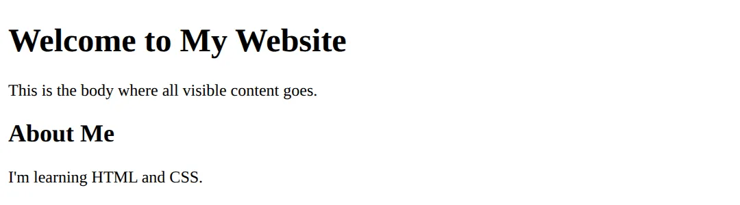
Every part has a specific purpose - let's explore each one.
4) <!DOCTYPE html>
This line tells the browser: "This is a modern HTML5 document."
- ❌ Browsers may switch to old compatibility modes
- ❌ Layout bugs can occur
- ❌ CSS may behave strangely
Always include it. No exceptions.
5) <html> and lang Attribute
The <html> tag wraps the entire page.
<!DOCTYPE html>
<html lang="en">
<head>
  <meta charset="UTF-8">
  <title>Language Demo</title>
</head>
<body style="font-family: sans-serif; padding: 20px; background: #0f172a; color: white;">
  <h1>English Content</h1>
  <p>The lang="en" attribute tells browsers and screen readers this page is in English.</p>

  <h2>Why It Matters:</h2>
  <ul>
    <li>✅ Screen readers pronounce words correctly</li>
    <li>✅ Search engines understand your content</li>
    <li>✅ Better accessibility for all users</li>
  </ul>

  <p><em>Other examples: lang="pl" for Polish, lang="fr" for French</em></p>
</body>
</html>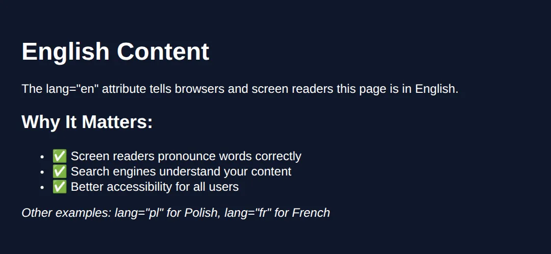
6) <head> Section (Invisible but Critical)
The <head> contains information about the page, not visible content.
<!DOCTYPE html>
<html lang="en">
<head>
  <!-- Character encoding -->
  <meta charset="UTF-8">

  <!-- Page title (shows in browser tab) -->
  <title>My Amazing Website</title>

  <!-- Viewport for mobile responsiveness -->
  <meta name="viewport" content="width=device-width, initial-scale=1.0">

  <!-- Page description for SEO -->
  <meta name="description" content="Learn HTML the right way">

  <!-- Internal CSS styles -->
  <style>
    body {
      font-family: system-ui, sans-serif;
      background: #0f172a;
      color: #e5e7eb;
      padding: 20px;
    }
    h1 { color: #3b82f6; }
  </style>
</head>
<body>
  <h1>Check the Browser Tab!</h1>
  <p>The title tag controls what shows in your browser tab.</p>
  <p>Meta tags provide information to search engines.</p>
  <!-- ✅ Expected result, measured in a real browser:
     body -> padding-top: 20px
     h1 -> color: rgb(59, 130, 246)
  -->
</body>
</html>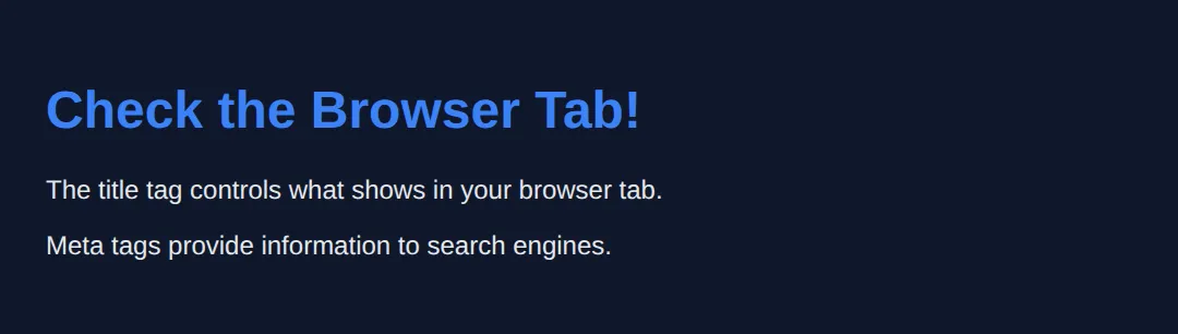
7) <body> Section
Everything visible on the page goes inside <body>.
<!DOCTYPE html>
<html lang="en">
<head>
  <meta charset="UTF-8">
  <title>Body Content Demo</title>
  <style>
    body {
      font-family: system-ui, sans-serif;
      background: linear-gradient(to bottom, #0f172a, #1e293b);
      color: #e5e7eb;
      padding: 40px;
      min-height: 100vh;
      margin: 0;
    }
    h1 { color: #22c55e; }
    .card {
      background: #334155;
      padding: 20px;
      border-radius: 12px;
      margin: 20px 0;
    }
  </style>
</head>
<body>
  <h1>Everything You See Is In The Body</h1>

  <div class="card">
    <h2>Text Content</h2>
    <p>Paragraphs, headings, and spans.</p>
  </div>

  <div class="card">
    <h2>Interactive Elements</h2>
    <button>Buttons</button>
    <input type="text" placeholder="Input fields">
  </div>

  <div class="card">
    <h2>Media</h2>
    <p>Images, videos, and audio all go here too!</p>
  </div>
  <!-- ✅ Expected result, measured in a real browser:
     h1 -> color: rgb(34, 197, 94)
     .card -> padding-top: 20px
     .card -> count: 3
  -->
</body>
</html>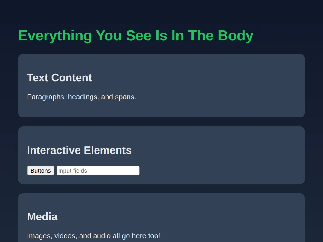
8) Headings (h1 - h6)
HTML has 6 heading levels for content hierarchy:
<!DOCTYPE html>
<html lang="en">
<head>
  <meta charset="UTF-8">
  <title>Headings Demo</title>
  <style>
    body {
      font-family: system-ui, sans-serif;
      background: #0f172a;
      color: #e5e7eb;
      padding: 20px;
    }
    h1 { color: #ef4444; border-bottom: 2px solid #ef4444; padding-bottom: 10px; }
    h2 { color: #f97316; }
    h3 { color: #eab308; }
    h4 { color: #22c55e; }
    h5 { color: #3b82f6; }
    h6 { color: #8b5cf6; }
  </style>
</head>
<body>
  <h1>H1 - Main Page Title</h1>
  <p>Use only ONE h1 per page. It's the most important heading.</p>

  <h2>H2 - Major Sections</h2>
  <p>Use for main content sections.</p>

  <h3>H3 - Subsections</h3>
  <p>Divide major sections into smaller parts.</p>

  <h4>H4 - Minor Headings</h4>
  <p>For less important divisions.</p>

  <h5>H5 - Small Headings</h5>
  <p>Rarely used, but available.</p>

  <h6>H6 - Smallest Heading</h6>
  <p>The least prominent heading level.</p>
  <!-- ✅ Expected result, measured in a real browser:
     h1 -> color: rgb(239, 68, 68)
     h2 -> color: rgb(249, 115, 22)
  -->
</body>
</html>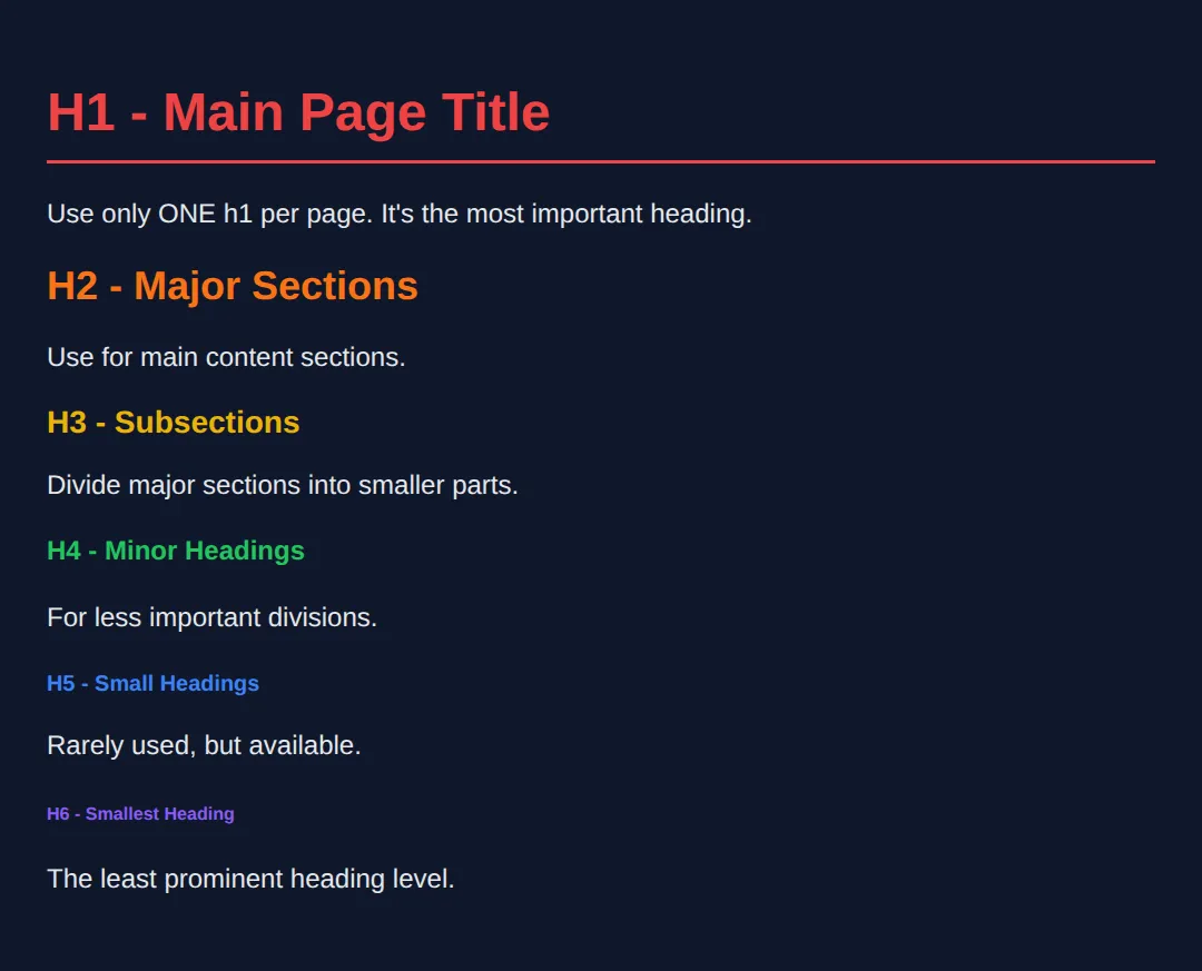
- ✅ Use one <h1> per page
- ✅ Headings should be hierarchical
- ❌ Do NOT skip levels randomly
9) Comments (For Humans, Not Browsers)
Comments help developers, not browsers.
<!DOCTYPE html>
<html lang="en">
<head>
  <meta charset="UTF-8">
  <title>Comments Demo</title>
  <style>
    body {
      font-family: system-ui, sans-serif;
      background: #0f172a;
      color: #e5e7eb;
      padding: 20px;
    }
    .note { color: #22c55e; font-style: italic; }
  </style>
</head>
<body>
  <!-- This is a comment - browsers ignore it! -->

  <h1>HTML Comments</h1>

  <!--
    Multi-line comments work too!
    Use them to explain complex sections.
  -->

  <p>Comments are invisible on the page.</p>
  <p class="note">But they're visible in the source code!</p>

  <!-- TODO: Add more content here later -->

  <!-- Use comments to:
       • Explain sections
       • Leave reminders
       • Temporarily disable code
  -->
  <!-- ✅ Expected result, measured in a real browser:
     body -> padding-top: 20px
     .note -> color: rgb(34, 197, 94)
  -->
</body>
</html>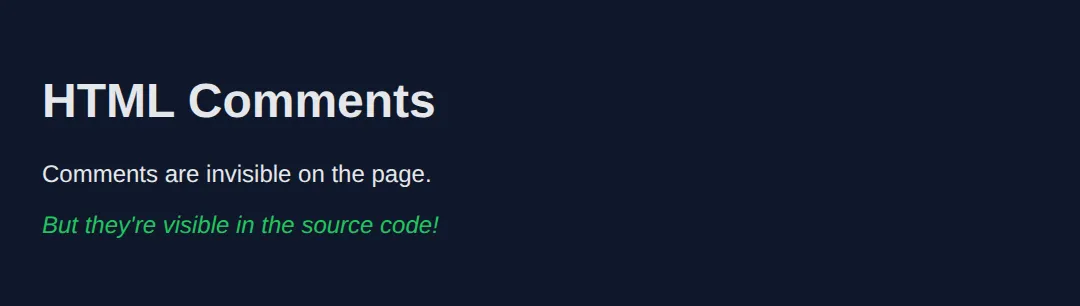
10) Semantic HTML (VERY IMPORTANT)
Semantic elements describe meaning, not appearance.
<!DOCTYPE html>
<html lang="en">
<head>
<meta charset="UTF-8">
<title>Semantic HTML</title>
<style>
body {
font-family: system-ui, sans-serif;
background: #0f172a;
color: #e5e7eb;
margin: 0;
}
header {
background: #1e293b;
padding: 20px;
border-bottom: 2px solid #3b82f6;
}
nav a {
color: #3b82f6;
margin-right: 15px;
text-decoration: none;
}
main {
padding: 20px;
max-width: 800px;
}
section {
background: #334155;
padding: 20px;
border-radius: 8px;
margin: 20px 0;
}
article {
border-left: 3px solid #22c55e;
padding-left: 15px;
margin: 15px 0;
}
footer {
background: #1e293b;
padding: 20px;
text-align: center;
color: #94a3b8;
}
</style>
</head>
<body>
<header>
<h1>My Website</h1>
<nav>
<a href="#">Home</a>
<a href="#">About</a>
<a href="#">Contact</a>
</nav>
</header>
<main>
<section>
<h2>Welcome Section</h2>
<p>This is the main content area.</p>
<article>
<h3>Blog Post Title</h3>
<p>Articles are for self-contained content like blog posts.</p>
</article>
</section>
</main>
<footer>
<p>© 2025 My Website. All rights reserved.</p>
</footer>
<!-- ✅ Expected result, measured in a real browser:
nav a -> text-decoration-line: none
header -> padding-top: 20px
-->
</body>
</html>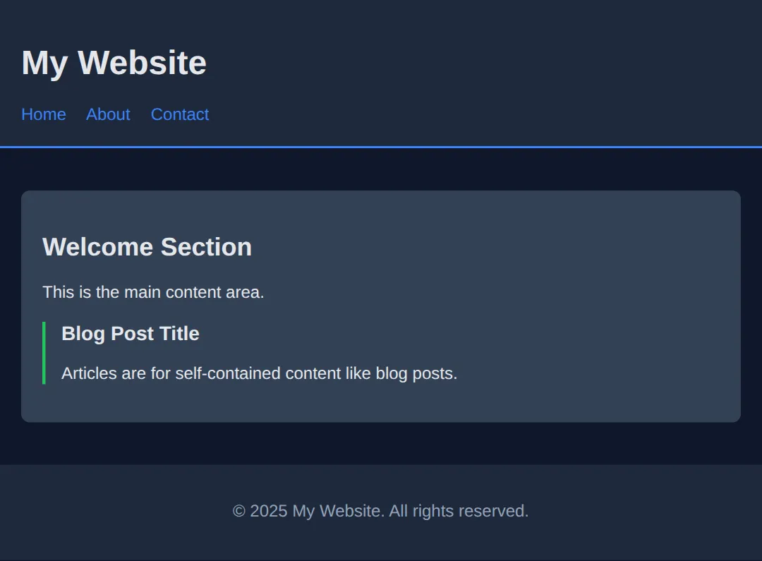
Benefits of Semantic HTML:
- ✅ Better SEO
- ✅ Better accessibility
- ✅ Easier to style
- ✅ Cleaner code
11) Lists (Ordered & Unordered)
<!DOCTYPE html>
<html lang="en">
<head>
  <meta charset="UTF-8">
  <title>Lists Demo</title>
  <style>
    body {
      font-family: system-ui, sans-serif;
      background: #0f172a;
      color: #e5e7eb;
      padding: 20px;
    }
    .container { display: flex; gap: 40px; flex-wrap: wrap; }
    .list-box {
      background: #1e293b;
      padding: 20px;
      border-radius: 8px;
      flex: 1;
      min-width: 200px;
    }
    h2 { color: #3b82f6; margin-top: 0; }
    ul { list-style-type: disc; }
    ol { list-style-type: decimal; }
    li { margin: 8px 0; }
  </style>
</head>
<body>
  <h1>HTML Lists</h1>

  <div class="container">
    <div class="list-box">
      <h2>Unordered List (ul)</h2>
      <p>For items without a specific order:</p>
      <ul>
        <li>Apples</li>
        <li>Bananas</li>
        <li>Oranges</li>
        <li>Grapes</li>
      </ul>
    </div>

    <div class="list-box">
      <h2>Ordered List (ol)</h2>
      <p>For steps or ranked items:</p>
      <ol>
        <li>Open your editor</li>
        <li>Write HTML code</li>
        <li>Save the file</li>
        <li>Open in browser</li>
      </ol>
    </div>
  </div>
  <!-- ✅ Expected result, measured in a real browser:
     .container -> display: flex
     .list-box -> flex-grow: 1
     ul -> list-style-type: disc
     ol -> list-style-type: decimal
     .list-box -> count: 2
  -->
</body>
</html>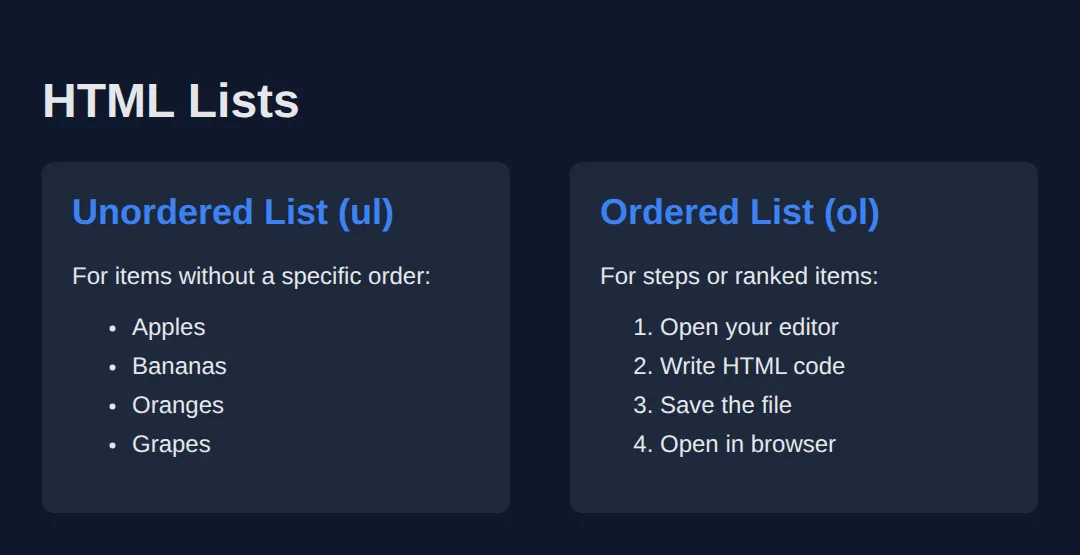
12) Links and Images
<!DOCTYPE html>
<html lang="en">
<head>
  <meta charset="UTF-8">
  <title>Links & Images</title>
  <style>
    body {
      font-family: system-ui, sans-serif;
      background: #0f172a;
      color: #e5e7eb;
      padding: 20px;
    }
    a {
      color: #3b82f6;
      text-decoration: none;
    }
    a:hover { text-decoration: underline; }
    .card {
      background: #1e293b;
      padding: 20px;
      border-radius: 8px;
      margin: 20px 0;
    }
    img {
      border-radius: 8px;
      max-width: 100%;
    }
  </style>
</head>
<body>
  <h1>Links & Images</h1>

  <div class="card">
    <h2>Links</h2>
    <p>
      <a href="https://google.com">Visit Google</a>
    </p>
    <p>
      <a href="https://google.com" target="_blank">
        Open Google in new tab
      </a>
    </p>
    <p>
      <a href="#section2">Jump to section below</a>
    </p>
  </div>

  <div class="card">
    <h2>Images</h2>
    <img
      src="https://via.placeholder.com/300x150/3b82f6/ffffff?text=Image+Example"
      alt="A blue placeholder image"
    >
    <p><em>Always include alt text for accessibility!</em></p>
  </div>

  <div class="card" id="section2">
    <h2>You jumped here!</h2>
    <p>The link above uses an anchor (#section2) to jump to this element's ID.</p>
  </div>
  <!-- ✅ Expected result, measured in a real browser:
     a -> text-decoration-line: none
     .card -> padding-top: 20px
     .card -> count: 3
  -->
</body>
</html>
🧠 Worked Example — one real page, every part explained
You have now met every piece separately. This is all of them in one working page — a small portfolio site. Read it top to bottom with the comments; there is nothing in here you have not been taught, and nothing in here that is decoration. This is roughly the shape of the first page you will write for real.
<!DOCTYPE html>
<!-- ^ Not an element and not optional. It tells the browser "use modern standards
mode". Leave it out and browsers fall back to a 1990s compatibility mode
where several CSS box measurements behave differently. -->
<html lang="en">
<!-- ^ lang="en" tells screen readers which language to pronounce, tells browsers
which dictionary to spell-check against, and tells translation tools what
they are starting from. One attribute, three jobs. -->
<head>
<!-- Nothing in <head> is drawn on the page. It is information ABOUT the page. -->
<meta charset="UTF-8">
<!-- ^ Says the file is written in UTF-8, the encoding that covers £, é, — and
every emoji. Modern browsers usually guess correctly, but guessing can be
wrong; declaring it removes the guess. It must appear in the first 1024
bytes of the file, which is why it goes first. -->
<meta name="viewport" content="width=device-width, initial-scale=1.0">
<!-- ^ Tells a phone "the page is as wide as this screen". Without it, phones
pretend to be about 980px wide and shrink everything down. -->
<title>Priya Sharma — Junior Front-End Developer</title>
<!-- ^ The browser tab, the bookmark name, and the blue clickable line in Google
results. Not shown on the page itself. -->
<meta name="description" content="Portfolio of Priya Sharma, a junior front-end developer based in Leeds.">
<!-- ^ The grey summary line under the title in search results. -->
<style>
* { box-sizing:border-box; margin:0; padding:0; }
body { font-family:system-ui,sans-serif; background:#0f172a; color:#e5e7eb; line-height:1.55; }
header { background:#1e293b; padding:18px 24px; border-bottom:3px solid #3b82f6; }
header h1 { font-size:1.4rem; color:#60a5fa; }
nav { margin-top:8px; }
nav a { color:#93c5fd; margin-right:14px; text-decoration:none; font-size:.9rem; }
main { padding:24px; max-width:720px; }
main h2 { font-size:1.15rem; color:#93c5fd; margin:20px 0 8px; }
main h3 { font-size:1rem; color:#cbd5e1; margin:14px 0 6px; }
p { margin-bottom:10px; font-size:.95rem; color:#cbd5e1; }
ul, ol { margin:0 0 12px 22px; font-size:.95rem; color:#cbd5e1; }
footer { background:#1e293b; padding:16px 24px; font-size:.85rem; color:#94a3b8; }
</style>
</head>
<body>
<!-- <header> is the introductory block at the top of the page. -->
<header>
<!-- One <h1> per page: the page's real title. Not "the biggest text". -->
<h1>Priya Sharma</h1>
<!-- <nav> marks a block of navigation links, so assistive tech can offer
"skip to navigation". A <div> here would look the same and mean nothing. -->
<nav>
<a href="#work">Work</a>
<!-- href="#work" jumps to the element with id="work" on this page. -->
<a href="#skills">Skills</a>
<a href="mailto:[email protected]">Email me</a>
<!-- mailto: opens the visitor's email app instead of loading a page. -->
</nav>
</header>
<!-- <main> is the one block of content unique to this page. Exactly one per
page, and it must not contain the header, nav or footer. -->
<main>
<section id="work">
<!-- Headings step DOWN one level at a time: h1 -> h2 -> h3. Skipping from
h1 straight to h3 breaks the outline screen readers build. -->
<h2>Recent work</h2>
<!-- <article> = a piece of content that would still make sense on its own,
lifted out of this page. A project entry qualifies. -->
<article>
<h3>Bakery site rebuild</h3>
<p>Rebuilt a 12-page site as semantic HTML with a single stylesheet.</p>
</article>
<article>
<h3>Charity donation form</h3>
<p>An accessible donation form that works without JavaScript.</p>
</article>
</section>
<section id="skills">
<h2>Skills</h2>
<!-- <ul> when the order does not matter. -->
<ul>
<li>Semantic HTML</li>
<li>CSS layout</li>
</ul>
<h3>Currently learning, in order</h3>
<!-- <ol> when it does. The browser writes the numbers, so reordering the
items never leaves you with a wrong "3." -->
<ol>
<li>Accessibility testing</li>
<li>JavaScript</li>
</ol>
</section>
</main>
<footer>
<p>© 2026 Priya Sharma</p>
<!-- © is a character reference: the browser draws © . -->
</footer>
<!-- ✅ What you should see: a dark blue header bar with "Priya Sharma" and three
links under it, a blue rule beneath the bar, then the page body with
"Recent work" and "Skills" as the larger blue-grey headings and the project
names smaller beneath them, a bulleted list, a numbered 1. 2. list, and a
darker footer strip at the bottom.
Then try this: change the <h3> inside the first article to <h1>. It gets
bigger, and the page now claims to have two different titles — which is the
exact mistake heading levels exist to prevent. -->
<!-- ✅ Expected result, measured in a real browser:
nav a -> text-decoration-line: none
header -> padding-top: 18px
-->
</body>
</html>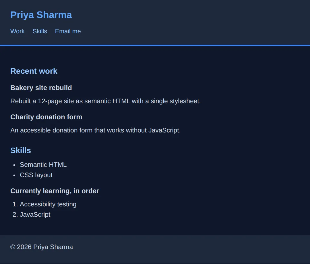
🎯 Your Turn — finish the skeleton
This page has all its content but four missing pieces. It is deliberately self-checking: the CSS targets header, nav, main and footer by element name, so if you put the wrong tag in, that part of the page simply will not be styled.
<!DOCTYPE html>
<!-- 🎯 YOUR TURN — fill in the four blanks marked ___ -->

<!-- 1) Declare the page language so screen readers pronounce it correctly. -->
<html lang="___">
<!-- 👉 replace ___ with  en  -->

<head>
  <!-- 2) Declare the character encoding that covers £, é and — . -->
  <meta charset="___">
  <!-- 👉 replace ___ with  UTF-8  -->

  <meta name="viewport" content="width=device-width, initial-scale=1.0">
  <title>Leeds Reading Club</title>

  <style>
    * { box-sizing:border-box; margin:0; padding:0; }
    body { font-family:system-ui,sans-serif; background:#0f172a; color:#e5e7eb; line-height:1.55; }
    header { background:#1e293b; padding:18px 24px; border-bottom:3px solid #3b82f6; }
    header h1 { font-size:1.4rem; color:#60a5fa; }
    nav { margin-top:8px; }
    nav a { color:#93c5fd; margin-right:14px; text-decoration:none; font-size:.9rem; }
    main { padding:24px; max-width:640px; }
    main h2 { font-size:1.15rem; color:#93c5fd; margin-bottom:8px; }
    p { margin-bottom:10px; font-size:.95rem; color:#cbd5e1; }
    ol { margin-left:22px; font-size:.95rem; color:#cbd5e1; }
    footer { background:#1e293b; padding:16px 24px; font-size:.85rem; color:#94a3b8; }
  </style>
</head>

<body>
  <header>
    <h1>Leeds Reading Club</h1>

    <!-- 3) Wrap these two links in the element that means "navigation". -->
    <___>
      <a href="#next">Next book</a>
      <a href="https://example.com">Join us</a>
    </___>
    <!-- 👉 replace both ___ with  nav  -->
  </header>

  <!-- 4) Wrap the page's unique content in the element that means "the main
         content of this page" — the one there should be exactly one of. -->
  <___>
    <h2 id="next">How it works</h2>
    <p>We meet on the first Thursday of every month.</p>
    <ol>
      <li>Pick up this month's book.</li>
      <li>Read it (or most of it).</li>
      <li>Turn up and argue about it.</li>
    </ol>
  </___>
  <!-- 👉 replace both ___ with  main  -->

  <footer>
    <p>Run by volunteers since 2019.</p>
  </footer>

  <!-- ✅ Expected once all four blanks are filled: a dark header bar with the club
       name in blue, the two links sitting under it in light blue with a gap
       between them, a blue rule under the bar, then the content indented from the
       edge with a numbered 1. 2. 3. list, then a darker footer strip.
       If you used <div> instead of <nav> and <main>, everything still shows but
       completely unstyled — no bars, no padding, the text jammed against the left
       edge. That is the CSS telling you the tag is wrong. -->
</body>
</html>
Practice Challenge
Build a complete personal profile page with:
- Proper HTML structure (DOCTYPE, html, head, body)
- Semantic elements (header, main, footer)
- Headings, paragraphs, and lists
- At least one link and one image
<!DOCTYPE html>
<html lang="en">
<head>
<meta charset="UTF-8">
<title>My Profile</title>
<style>
* { box-sizing: border-box; margin: 0; padding: 0; }
body {
font-family: system-ui, sans-serif;
background: linear-gradient(135deg, #0f172a 0%, #1e293b 100%);
color: #e5e7eb;
min-height: 100vh;
}
header {
background: #1e293b;
padding: 30px;
text-align: center;
border-bottom: 3px solid #3b82f6;
}
header img {
width: 120px;
height: 120px;
border-radius: 50%;
border: 4px solid #3b82f6;
margin-bottom: 15px;
}
header h1 { color: #3b82f6; }
main {
max-width: 600px;
margin: 0 auto;
padding: 30px 20px;
}
section {
background: #334155;
padding: 25px;
border-radius: 12px;
margin-bottom: 20px;
}
h2 { color: #22c55e; margin-bottom: 15px; }
ul { margin-left: 20px; }
li { margin: 8px 0; }
a { color: #3b82f6; }
footer {
text-align: center;
padding: 20px;
color: #64748b;
}
</style>
</head>
<body>
<header>
<img src="https://via.placeholder.com/120" alt="Profile photo">
<h1>Your Name Here</h1>
<p>Web Developer in Training</p>
</header>
<main>
<section>
<h2>About Me</h2>
<p>I'm learning HTML and CSS to become a web developer. I love building things and solving problems!</p>
</section>
<section>
<h2>My Skills</h2>
<ul>
<li>HTML5</li>
<li>CSS3</li>
<li>Learning JavaScript</li>
</ul>
</section>
<section>
<h2>Connect With Me</h2>
<p>Find me on <a href="#">GitHub</a> or <a href="#">LinkedIn</a></p>
</section>
</main>
<footer>
<p>© 2025 My Profile. Built with HTML & CSS.</p>
</footer>
<!-- ✅ Expected result, measured in a real browser:
header -> padding-top: 30px
header img -> width: 124.984px
-->
</body>
</html>🧩 Mini-Challenge — write a whole page from a brief
Last one, and this time the <body> is empty. The CSS is finished and, as before, it targets elements by name — so the page styling itself correctly is your proof that you picked the right tags. Work down the brief one line at a time.
Key Takeaways
- ✓ Every HTML page needs DOCTYPE, html, head, and body
- ✓ The head contains meta info; the body contains visible content
- ✓ Use semantic elements (header, nav, main, section, footer)
- ✓ Headings create hierarchy - use one h1 per page
- ✓ Always include alt text on images for accessibility
Practice quiz
What does the <!DOCTYPE html> declaration tell the browser?
- That the document is a modern HTML5 document
- Where to find the CSS file
- The language of the page
- To run the page in compatibility mode
Answer: That the document is a modern HTML5 document. <!DOCTYPE html> declares a modern HTML5 document and helps browsers avoid old quirks modes.
Which four parts make up the required HTML page skeleton?
- DOCTYPE, html, head, body
- html, style, script, footer
- head, body, main, footer
- DOCTYPE, header, section, footer
Answer: DOCTYPE, html, head, body. Every page needs the DOCTYPE plus the html, head, and body elements.
What kind of content goes inside the <head> element?
- Visible page content like paragraphs and images
- Information about the page (meta, title, links) that is not directly visible
- Only JavaScript
- The page footer
Answer: Information about the page (meta, title, links) that is not directly visible. The <head> holds metadata such as the title, charset, and meta tags — not visible body content.
Where does all visible page content belong?
- Inside <head>
- Inside <body>
- Inside <title>
- Inside <meta>
Answer: Inside <body>. Everything the user sees lives inside the <body> element.
What does the lang attribute on <html> (e.g. lang="en") do?
- Sets the page font
- Tells browsers and screen readers the page's language
- Loads a translation automatically
- Changes the text direction to right-to-left
Answer: Tells browsers and screen readers the page's language. lang declares the document language, helping screen readers and search engines.
How many <h1> elements should a page typically have?
- One main h1 per page
- Exactly six
- One per paragraph
- As many as possible for SEO
Answer: One main h1 per page. Use a single h1 as the main page title and keep the heading hierarchy meaningful.
Which is correct about HTML heading levels?
- There are 6 levels (h1-h6) and you should not skip levels randomly
- There are 3 levels (h1-h3)
- Headings have no order and can be used freely
- h6 is the most important heading
Answer: There are 6 levels (h1-h6) and you should not skip levels randomly. HTML has h1-h6; headings form a hierarchy and you should avoid skipping levels arbitrarily.
What is the correct syntax for an HTML comment?
- // comment
- /* comment */
- <!-- comment -->
- # comment
Answer: <!-- comment -->. HTML comments are written as <!-- comment --> and are ignored by the browser.
Which meta tag is essential for mobile responsiveness?
- <meta charset="UTF-8">
- <meta name="viewport" content="width=device-width, initial-scale=1.0">
- <meta name="description" content="...">
- <meta name="author" content="...">
Answer: <meta name="viewport" content="width=device-width, initial-scale=1.0">. The viewport meta tag makes the page scale correctly on mobile devices.
Why are semantic elements like <header> and <main> preferred over generic <div>s?
- They load faster than divs
- They describe meaning, improving SEO and accessibility
- They are required by the browser
- They automatically add colorful styling
Answer: They describe meaning, improving SEO and accessibility. Semantic elements convey meaning, which benefits accessibility and SEO; divs are meaningless wrappers.
Continue this course
- Previous: Introduction to Web Development
- Next: HTML Elements & Attributes — Links, images, lists, buttons — the building blocks of every webpage
- Quick reference: HTML & CSS cheat sheet › HTML Structure · HTML Tags & Elements cheat sheet › Document Structure