CSS Custom Properties
Reviewed & published by Brayan K
CSS custom properties (also called CSS variables) are reusable, named values you define with a --name prefix and read back with var(); they cascade and inherit like normal CSS, so changing one value can re-theme an entire page.
Part of the free HTML & CSS course at LearnCodingFast — hands-on lessons with examples you run in your browser, plus practice exercises and a quick quiz.
By the end of this lesson you'll be able to define live CSS variables, theme a whole page by changing one value, and read or update those variables from JavaScript — the foundation every modern design system is built on.
💡 Think of It Like This
A custom property is like a paint swatch labelled at the hardware store. Instead of writing "Pantone 2728 C" on every wall in the plans, you label one swatch --brand-blue and point at that label everywhere.
When the client changes their mind, you repaint one swatch and every room updates by itself — no hunting through forty walls. That single point of change is the whole idea, and because the swatch is a live label (not a one-time copy), you can even swap it while the paint is still wet: that is what lets JavaScript and themes change your colours after the page has loaded.
1. Declaring & Using a Variable
A custom property (the official name for a "CSS variable") is any property whose name starts with two dashes: --name: value;. You read it back anywhere a value is expected with the var(--name) function. The name is case-sensitive, so --Primary and --primary are two different properties.
| Concept | Syntax | Example |
|---|---|---|
| Declare (global) | :root { --name: value; } | --primary: #3b82f6; |
| Declare (scoped) | .card { --pad: 20px; } | Only inside .card |
| Use | var(--name) | color: var(--primary); |
| Use with fallback | var(--name, fallback) | var(--accent, #f59e0b) |
Run the worked example. Every colour, radius, and spacing value comes from one block of variables at the top. Change a single value there and watch the whole design move with it.
<!DOCTYPE html>
<html lang="en">
<head>
  <meta charset="UTF-8">
  <title>CSS Variables</title>
  <style>
    :root {
      /* Declare design tokens once. Change any line to retheme everything. */
      --primary: #3b82f6;        /* brand colour, reused everywhere below */
      --primary-dark: #2563eb;   /* a darker shade for hover states */
      --bg: #0f172a;             /* page background */
      --surface: #1e293b;        /* card background */
      --text: #e5e7eb;           /* body text */
      --radius: 12px;            /* one corner radius for the whole UI */
      --space: 20px;             /* one spacing unit */
    }

    * { box-sizing: border-box; margin: 0; padding: 0; }

    body {
      background: var(--bg);                 /* reads --bg => #0f172a */
      color: var(--text);
      font-family: system-ui, sans-serif;
      padding: var(--space);                 /* reads --space => 20px */
    }

    .card {
      background: var(--surface);
      padding: var(--space);
      border-radius: var(--radius);          /* same radius as the button */
      margin: var(--space) 0;
      border-left: 4px solid var(--primary); /* same brand colour as h2/button */
    }

    .card h2 { color: var(--primary); margin-bottom: 8px; }

    .btn {
      background: var(--primary);
      color: white;
      border: none;
      padding: 12px 24px;
      border-radius: var(--radius);
      font-weight: 600;
      cursor: pointer;
    }
    .btn:hover { background: var(--primary-dark); } /* swaps to the darker shade */
  </style>
</head>
<body>
  <div class="card">
    <h2>One change re-themes all of this</h2>
    <p>The border, the heading, and the button below all read --primary.</p>
    <br>
    <button class="btn">Get started</button>
  </div>

  <!-- ✅ Try it: change --primary: #3b82f6 to #ef4444 in :root.
       The border, heading colour, and button ALL turn red at once —
       you touched one line, not five. -->
  <!-- ✅ Expected result, measured in a real browser:
     .btn -> cursor: pointer
     .card -> padding-top: 20px
  -->
</body>
</html>
2. Fallbacks — A Safety Net for var()
var() takes an optional second argument: a value to use when the variable is undefined or out of scope. So color: var(--accent, #f59e0b); means "use --accent if it exists, otherwise fall back to amber." This is what stops a typo or a missing variable from leaving an element completely unstyled.
It matters because a var() that resolves to nothing makes the whole declaration invalid — the browser throws it away, and your element loses that style entirely. A fallback turns a silent disappearance into a sensible default.
<!DOCTYPE html>
<html lang="en">
<head>
  <meta charset="UTF-8">
  <title>var() fallbacks</title>
  <style>
    :root {
      --text: #e5e7eb;
      --primary: #3b82f6;
      /* NOTE: --accent is deliberately NOT declared anywhere. */
    }

    body { background:#0f172a; color: var(--text); font-family: system-ui, sans-serif; padding:20px; }
    .box { padding:16px; border-radius:10px; margin:12px 0; background:#1e293b; }

    /* No fallback: --accent is undefined, so this declaration is INVALID
       and the browser ignores it. The text stays the inherited colour. */
    .no-fallback { color: var(--accent); }

    /* With fallback: --accent is still undefined, so #f59e0b (amber) is used.
       The element is styled instead of silently unstyled. */
    .with-fallback { color: var(--accent, #f59e0b); }

    /* A declared variable always wins over the fallback. */
    .declared { color: var(--primary, #999); }   /* => #3b82f6, not #999 */
  </style>
</head>
<body>
  <div class="box no-fallback">No fallback: --accent is undefined, so this text stays grey (ignored rule).</div>
  <div class="box with-fallback">With fallback: --accent is undefined, so this text turns AMBER.</div>
  <div class="box declared">Declared wins: --primary exists, so this text is BLUE (the fallback #999 is unused).</div>

  <!-- ✅ Expected: line 1 grey, line 2 amber, line 3 blue. -->
  <!-- ✅ Expected result, measured in a real browser:
     .box -> padding-top: 16px
     .no-fallback -> color: rgb(229, 231, 235)
     .box -> count: 3
  -->
</body>
</html>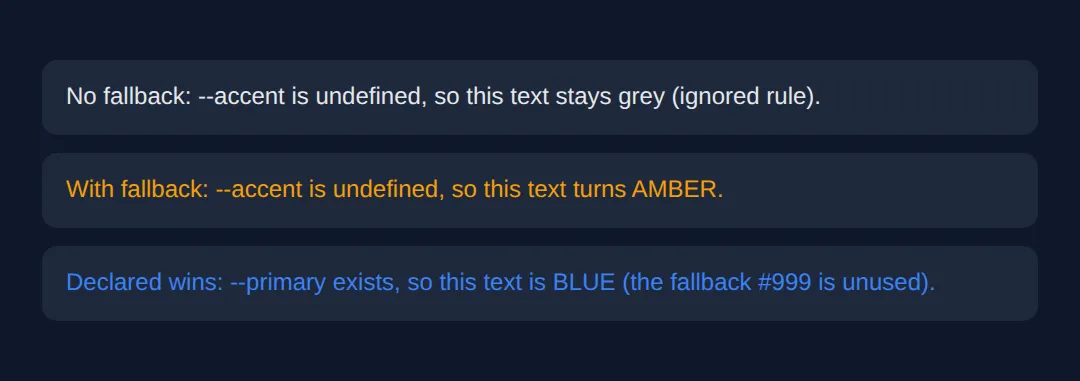
3. Scope, Inheritance & the Cascade
Custom properties are not magic globals — they obey the same rules as every other CSS property. A variable is scoped to the selector it's declared on and inherits down to that element's descendants. Declare it on :root (which matches <html>) and it's available to the whole page. Declare it on .card and only .card and what's inside it can see that value.
Because they follow the cascade, you can override a variable lower down the tree: a component can redefine --primary for itself without touching the global one. The value is resolved where it's used, so the same var(--primary) can produce different results in different parts of the page.
<!DOCTYPE html>
<html lang="en">
<head>
  <meta charset="UTF-8">
  <title>Scope & inheritance</title>
  <style>
    :root {
      --accent: #3b82f6;   /* GLOBAL accent: blue, inherited by the whole page */
    }

    body { background:#0f172a; color:#e5e7eb; font-family: system-ui, sans-serif; padding:20px; }

    .panel {
      background:#1e293b; border-left:5px solid var(--accent);
      padding:16px; border-radius:10px; margin:12px 0;
    }
    .panel h3 { color: var(--accent); }   /* resolves to whatever --accent is HERE */

    /* This panel REDECLARES --accent for itself and its children only.
       The cascade lets a local value override the inherited one. */
    .panel.danger { --accent: #ef4444; }  /* red, scoped to .danger */

    /* A nested element can scope yet again. */
    .panel.success { --accent: #22c55e; } /* green, scoped to .success */
  </style>
</head>
<body>
  <div class="panel">
    <h3>Default panel</h3>
    <p>No local --accent, so it inherits the global BLUE.</p>
  </div>

  <div class="panel danger">
    <h3>Danger panel</h3>
    <p>--accent is redeclared as red here, so the bar and heading are RED.</p>
  </div>

  <div class="panel success">
    <h3>Success panel</h3>
    <p>Same var(--accent), but this scope makes it GREEN.</p>
  </div>

  <!-- ✅ Expected: three panels, identical CSS rules, three different colours
       (blue, red, green) — proof that var() resolves per scope, not globally. -->
  <!-- ✅ Expected result, measured in a real browser:
     .panel -> padding-top: 16px
     .panel h3 -> color: rgb(59, 130, 246)
     .panel -> count: 3
  -->
</body>
</html>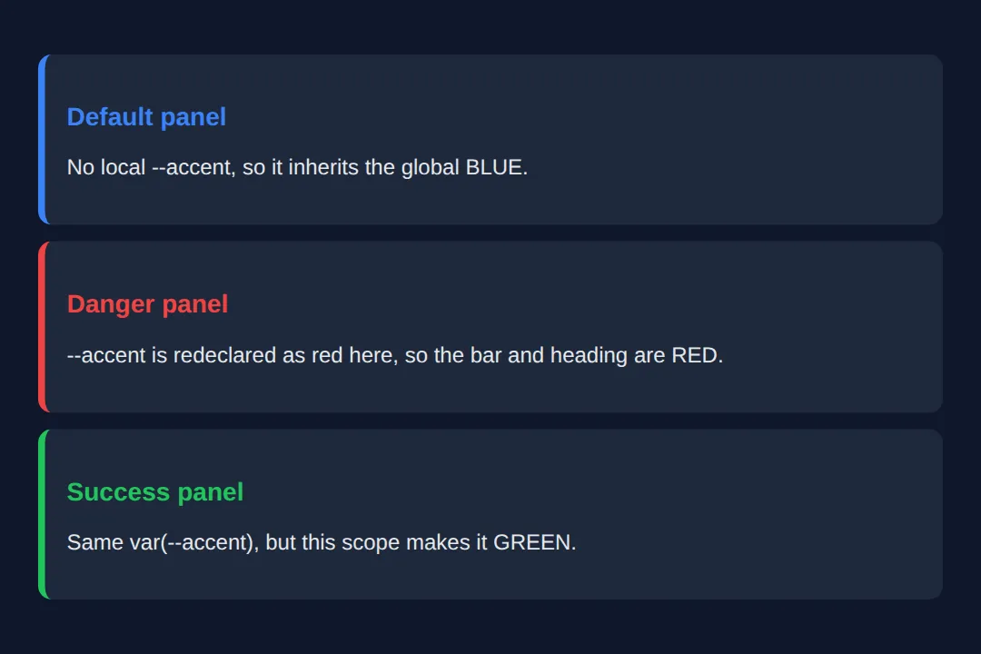
4. Theming — Swap One Attribute
Theming is the payoff. Define one set of variables for the light theme and another for the dark theme, keyed off an attribute like data-theme on the <html> element. Every component already reads var(--bg), var(--text) and friends, so flipping that one attribute re-themes the entire page — no per-element JavaScript, no duplicated rules.
<!DOCTYPE html>
<html lang="en" data-theme="light">
<head>
  <meta charset="UTF-8">
  <title>Theme switcher</title>
  <style>
    /* LIGHT theme (default): variables defined for the light data-theme. */
    [data-theme="light"] {
      --bg: #f8fafc; --surface: #ffffff; --text: #1e293b;
      --muted: #64748b; --primary: #3b82f6; --border: #e2e8f0;
    }
    /* DARK theme: same variable NAMES, different values. */
    [data-theme="dark"] {
      --bg: #0f172a; --surface: #1e293b; --text: #e5e7eb;
      --muted: #94a3b8; --primary: #60a5fa; --border: #334155;
    }

    * { box-sizing: border-box; margin: 0; padding: 0; }
    body {
      background: var(--bg); color: var(--text);
      font-family: system-ui, sans-serif; padding:30px;
      transition: background 0.3s, color 0.3s;   /* smooth the swap */
    }
    .toggle {
      background: var(--primary); color: white; border:none;
      padding:10px 20px; border-radius:8px; cursor:pointer; font-weight:600;
    }
    .card {
      background: var(--surface); border:1px solid var(--border);
      padding:20px; border-radius:12px; margin-top:20px;
    }
    .card h3 { color: var(--primary); margin-bottom:8px; }
    .card p { color: var(--muted); line-height:1.6; }
  </style>
</head>
<body>
  <!-- The button only flips data-theme; CSS variables do all the visual work. -->
  <button class="toggle" onclick="
    var html = document.documentElement;
    var next = html.getAttribute('data-theme') === 'dark' ? 'light' : 'dark';
    html.setAttribute('data-theme', next);
    this.textContent = next === 'dark' ? 'Switch to light' : 'Switch to dark';
  ">Switch to dark</button>

  <div class="card">
    <h3>I adapt to the theme</h3>
    <p>Background, text, border and accent all come from variables, so one
       attribute change repaints everything.</p>
  </div>

  <!-- ✅ Expected: clicking the button flips the whole page between
       light and dark — and not a single colour is hard-coded on the card. -->
  <!-- ✅ Expected result, measured in a real browser:
     .toggle -> cursor: pointer
     .card -> padding-top: 20px
  -->
</body>
</html>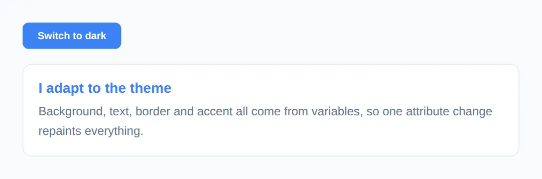
5. Reading & Setting Variables in JavaScript
Because custom properties are live, JavaScript can read and change them at runtime — something Sass variables can never do. To set one: element.style.setProperty('--name', value). To read the resolved value: getComputedStyle(el).getPropertyValue('--name').
Set the variable on document.documentElement (the <html> element, i.e. :root) and it changes globally, because :root variables inherit everywhere. Every rule that uses var(--name) updates the instant you set it.
<!DOCTYPE html>
<html lang="en">
<head>
  <meta charset="UTF-8">
  <title>JS + CSS variables</title>
  <style>
    :root { --hue: 210; }   /* a number JavaScript will change */
    body { background:#0f172a; color:#e5e7eb; font-family: system-ui, sans-serif; padding:24px; }

    /* hsl() reads --hue, so changing one number re-tints everything. */
    .swatch {
      height:120px; border-radius:12px; margin:16px 0;
      background: hsl(var(--hue), 80%, 55%);
    }
    .label { font-size:14px; color:#94a3b8; }
    input[type="range"] { width:100%; }
  </style>
</head>
<body>
  <h2>Live CSS variable</h2>
  <div class="swatch"></div>
  <input type="range" min="0" max="360" value="210"
         oninput="
           /* setProperty writes the variable on :root; CSS repaints instantly. */
           document.documentElement.style.setProperty('--hue', this.value);
           /* getPropertyValue reads the current resolved value back. */
           var now = getComputedStyle(document.documentElement).getPropertyValue('--hue');
           document.getElementById('out').textContent = now.trim();
         ">
  <p class="label">--hue is currently: <span id="out">210</span></p>

  <!-- ✅ Expected: drag the slider and the swatch hue + the number both
       update live. JavaScript only sets ONE variable — CSS does the rest. -->
  <!-- ✅ Expected result, measured in a real browser:
     .swatch -> height: 120px
     .label -> color: rgb(148, 163, 184)
  -->
</body>
</html>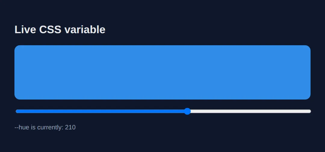
🎯 Your Turn #1 — Declare and use a variable
The colours below are hard-coded three times. Pull them into a variable so a single change re-themes the card. Fill in the blanks marked ___, then run it and check the expected result in the comments.
<!DOCTYPE html>
<html lang="en">
<head>
  <meta charset="UTF-8">
  <title>Your Turn 1</title>
  <style>
    /* 🎯 YOUR TURN — fill in the blanks marked ___ */

    :root {
      /* 1) Declare a variable called --brand set to #8b5cf6 (purple). */
      ___                        /* 👉 add:  --brand: #8b5cf6; */
    }

    body { background:#0f172a; color:#e5e7eb; font-family: system-ui, sans-serif; padding:20px; }

    .card {
      background:#1e293b; padding:20px; border-radius:12px; max-width:360px;
      /* 2) Use the variable for the left border colour. */
      border-left: 5px solid ___;   /* 👉 replace ___ with  var(--brand) */
    }

    /* 3) Use the same variable for the heading colour. */
    .card h3 { color: ___; }         /* 👉 replace ___ with  var(--brand) */
  </style>
</head>
<body>
  <div class="card">
    <h3>Branded card</h3>
    <p>The border bar and the heading should both be purple from one variable.</p>
  </div>

  <!-- ✅ Expected: the left border and the heading are BOTH purple (#8b5cf6).
       Bonus check: change --brand to #22c55e and both turn green together. -->
</body>
</html>
🎯 Your Turn #2 — Add a fallback and scope an override
One element uses a variable that was never declared, and one component needs its own colour. Add a var() fallback and a scoped override to fix both, then verify the expected colours in the comments.
<!DOCTYPE html>
<html lang="en">
<head>
  <meta charset="UTF-8">
  <title>Your Turn 2</title>
  <style>
    /* 🎯 YOUR TURN — fill in the blanks marked ___ */

    :root {
      --text: #e5e7eb;
      --accent: #3b82f6;   /* global accent = blue */
      /* --warn is NOT declared on purpose. */
    }

    body { background:#0f172a; color: var(--text); font-family: system-ui, sans-serif; padding:20px; }
    .box { background:#1e293b; padding:16px; border-radius:10px; margin:12px 0; border-left:5px solid; }

    /* 1) --warn is undefined. Add a fallback of #f59e0b (amber) so this works. */
    .warning { border-color: var(___); }   /* 👉 use  var(--warn, #f59e0b) */

    /* 2) This box should be GREEN, but only here — give it its own --accent. */
    .featured {
      ___                                    /* 👉 add:  --accent: #22c55e; */
      border-color: var(--accent);
    }

    /* This box has no override, so it keeps the global blue --accent. */
    .normal { border-color: var(--accent); }
  </style>
</head>
<body>
  <div class="box warning">Warning box — should be AMBER via the fallback.</div>
  <div class="box featured">Featured box — should be GREEN via a scoped --accent.</div>
  <div class="box normal">Normal box — stays the global BLUE accent.</div>

  <!-- ✅ Expected left borders, top to bottom: amber, green, blue. -->
</body>
</html>
🧩 Mini-Challenge — Theme tokens from scratch
Support is faded now — only an outline is given. Build a small page that uses a variable design system, with one scoped override. Use the worked examples in sections 1 and 3 as your reference if you get stuck.
<!DOCTYPE html>
<html lang="en">
<head>
  <meta charset="UTF-8">
  <title>Mini-Challenge</title>
  <style>
    /* 🧩 MINI-CHALLENGE: a tiny variable-driven design system
       1. In :root, declare these tokens:
            --bg (a dark colour), --surface (a card colour),
            --text (light), --primary (a brand colour), --radius (e.g. 12px)
       2. Style <body> using var(--bg) and var(--text)
       3. Style a .card using var(--surface), var(--radius), and a
            border-left in var(--primary)
       4. Add a .card.alt that REDECLARES --primary to a different colour,
            so that one card's border is a different colour from the rest
       5. Give .card h3 color: var(--primary) so it tracks each card's accent

       ✅ Expected: two cards share the same CSS rules, but the .alt card's
          border and heading are a different colour — proof your scoped
          override works. Changing --primary in :root re-themes every
          NON-alt card at once. */

    /* your code here */
  </style>
</head>
<body>

  <!-- your markup here: at least two .card elements, one with class="card alt" -->

</body>
</html>
⚠️ Common Errors (and the fix)
- No fallback, variable undefined. color: var(--accent); when --accent doesn't exist makes the whole declaration invalid, so the element loses that style silently. Fix: give it a fallback — var(--accent, #f59e0b).
- Expecting Sass-style compile-time behaviour. Custom properties are not find-and-replace like $blue in Sass — you can't use them in a selector, a media-query condition, or do @media (--mobile). Fix: use var() only inside a property's value; for conditional logic, write real media queries.
- Scope confusion. Declaring --gap on .card and then using it on a sibling outside .card resolves to nothing — the variable only inherits to descendants. Fix: declare site-wide tokens on :root so every element can see them.
- Typo / wrong case. var(--Primary) won't find --primary — names are case-sensitive and must match exactly. Fix: keep names lowercase-with-dashes and copy them carefully.
- Missing the double dash. Writing primary: #3b82f6; (one or no dash) declares an unknown property that the browser ignores. Fix: custom properties must start with two dashes: --primary.
📋 Quick Reference
| Goal | Use this |
|---|---|
| Declare a global variable | :root { --primary: #3b82f6; } |
| Declare a scoped variable | .card { --pad: 20px; } |
| Use a variable | color: var(--primary); |
| Use with a fallback | var(--accent, #f59e0b) |
| Override per-component | .danger { --primary: #ef4444; } |
| Theme by attribute | [data-theme="dark"] { --bg: #0f172a; } |
| Set from JavaScript | el.style.setProperty('--hue', '120') |
| Read from JavaScript | getComputedStyle(el).getPropertyValue('--hue') |
🎉 Lesson Complete
You can now build maintainable, themeable CSS with custom properties. The essentials:
- ✅ Declare with --name: value; and read with var(--name)
- ✅ Always add a fallback — var(--name, fallback) — so a missing variable can't break a rule
- ✅ :root = global; a selector = scoped, inheriting only to descendants
- ✅ Variables are live — they follow the cascade and can be overridden per-component
- ✅ Swap one data-theme attribute to re-theme the whole page
- ✅ Read and set them at runtime with getPropertyValue / setProperty
Practice quiz
How do you declare a CSS custom property?
- $name: value;
- @name: value;
- --name: value;
- var-name: value;
Answer: --name: value;. Custom properties start with two dashes: --name: value;
How do you read back a custom property's value?
- var(--name)
- get(--name)
- value(--name)
- $(--name)
Answer: var(--name). The var() function substitutes a custom property's value: var(--name).
What does the second argument in var(--accent, #f59e0b) do?
- Sets the variable
- Defines a second variable
- Specifies the unit
- Acts as a fallback if --accent is undefined
Answer: Acts as a fallback if --accent is undefined. The second argument is a fallback used when the variable is undefined or out of scope.
Where should you declare site-wide global variables?
- body
- :root
- *
- @global
Answer: :root. :root matches the <html> element, so variables declared there inherit across the whole document.
What happens if var(--accent) resolves to nothing and has no fallback?
- The whole declaration becomes invalid and is ignored
- The element uses black
- The browser throws an error
- It uses the parent's value
Answer: The whole declaration becomes invalid and is ignored. A var() that resolves to nothing makes the declaration invalid, so the browser discards that style.
Are custom property names case-sensitive?
- No, --Primary equals --primary
- Only in Firefox
- Yes, --Primary and --primary are different
- Only inside :root
Answer: Yes, --Primary and --primary are different. Custom property names are case-sensitive: --Primary and --primary are two distinct properties.
If you declare --pad on .card, where is that variable available?
- The whole document
- Only .card and its descendants
- Only the .card element itself
- Every sibling of .card
Answer: Only .card and its descendants. A variable is scoped to its selector and inherits down to that element's descendants only.
How do you set a custom property from JavaScript?
- element.setVar('--name', value)
- element.css('--name', value)
- element.variable('--name', value)
- element.style.setProperty('--name', value)
Answer: element.style.setProperty('--name', value). element.style.setProperty('--name', value) sets a custom property at runtime.
What is a key difference between a CSS custom property and a Sass variable?
- Sass variables inherit; CSS ones don't
- CSS custom properties are live and changeable at runtime
- They are identical
- Sass variables work in JavaScript
Answer: CSS custom properties are live and changeable at runtime. CSS custom properties are live values the browser keeps and JS can change; Sass variables are compiled away.
Which is a valid use of a custom property?
- @media (--mobile)
- var(--selector) { ... }
- margin: var(--space-md)
- --name as a property name
Answer: margin: var(--space-md). var() only substitutes inside a property's value, so margin: var(--space-md) is valid.
Continue this course
- Previous: CSS Transforms & 3D
- Next: Web Accessibility (A11y) — Make your websites usable by everyone, including screen reader users
- Quick reference: HTML & CSS cheat sheet › CSS Custom Properties
Frequently asked questions
What is the difference between a CSS custom property and a Sass variable?
A Sass (or Less) variable is compiled away before the browser ever sees it — by the time your stylesheet loads, $blue has been replaced by a fixed colour, and nothing can change it at runtime. A CSS custom property is a real, live value the browser keeps around: it follows the cascade, it inherits, it responds to media queries, and JavaScript can read or change it on the fly. If you need a value that changes after the page loads — themes, user settings, animation — you need a custom property, not a Sass variable.
Why does my var() do nothing — the element just looks unstyled?
Almost always one of three things: (1) you misspelled the name, and names are case-sensitive — --Primary and --primary are different properties; (2) the variable was declared on an element that is not an ancestor of the one using it, so it is out of scope and resolves to nothing; or (3) the resolved value is invalid for that property (e.g. a colour variable used where a length is expected). Add a fallback — var(--primary, #3b82f6) — so a typo or out-of-scope reference degrades gracefully instead of vanishing.
Where should I declare global variables?
Put site-wide design tokens (brand colours, spacing scale, fonts) in the :root selector. :root matches the <html> element, the top of the document, so every other element inherits those variables and can use them with var(). Declare a variable on a more specific selector only when you deliberately want it to apply to that element and its descendants — that is scoping, and it is a feature, not a bug.
Can I use a custom property for any value, like a media query or a property name?
You can store almost any value — colours, lengths, numbers, even whole shorthand strings — and substitute it with var(). What you cannot do is use a custom property as a selector, a media-query condition, or a property name; var() only substitutes inside a property's value. So @media (--mobile) is invalid, but margin: var(--space-md) is fine.
How do I change a CSS variable from JavaScript?
Read it with getComputedStyle(element).getPropertyValue('--name') and set it with element.style.setProperty('--name', value). Setting it on document.documentElement (the <html> element) changes it globally because :root variables inherit everywhere. Because the variable is live, every rule that uses var(--name) updates the instant you set it — no need to touch any other style.
Are CSS custom properties widely supported?
Yes. Custom properties have been supported in every modern browser (Chrome, Firefox, Safari, Edge) for years and are safe to use in production today. Only very old browsers like Internet Explorer 11 lack support, and the fallback argument in var() plus a plain CSS declaration before it covers those edge cases.