Web Accessibility (A11y)
Reviewed & published by Brayan K
Web accessibility (often shortened to "a11y") is the practice of building pages that everyone can use, including people who rely on keyboards, screen readers, or magnification, by using semantic HTML, descriptive text alternatives, and sufficient colour contrast.
Part of the free HTML & CSS course at LearnCodingFast — hands-on lessons with examples you run in your browser, plus practice exercises and a quick quiz.
By the end of this lesson you'll be able to build pages that work for keyboard users, screen-reader users, and people with low vision — and you'll be able to spot and fix inaccessible markup on sight.
💡 Think of It Like This
Accessibility is like a building with ramps, lifts, and braille signs. A staircase works fine if you can walk — but a ramp lets everyone in, including the person in a wheelchair, the parent with a pushchair, and the courier with a heavy trolley.
Your webpage is the building. A screen reader is a blind visitor who can only "see" the page through the labels and structure you provide. If your "button" is really a styled <div>, it's like a door with no handle — some visitors simply can't open it. Over 1 billion people worldwide live with a disability, so these ramps are not an edge case.
1. Why Accessibility Matters
Accessibility (often shortened to a11y — "a", then 11 letters, then "y") means building pages that work for people who use assistive technology: screen readers, keyboard-only navigation, screen magnifiers, and more. It is not a nice-to-have bolted on at the end; it is part of writing correct HTML.
| Reason | Why you should care |
|---|---|
| 🧑🤝🧑 Ethical | Around 15% of the world lives with a disability. The web should work for them too. |
| ⚖️ Legal | Many countries require WCAG compliance (ADA in the US, EAA in the EU). Lawsuits are real. |
| 📈 SEO | Semantic HTML and alt text are exactly what search engines read to rank you. |
| 👥 UX | Accessible sites are clearer and faster for everyone, not just disabled users. |
2. Semantic HTML — The Foundation
The single most important thing for accessibility is to use the right HTML element for the job. A screen reader knows that <button> is clickable, that <nav> is navigation, and that <main> is the main content — but a <div> is meaningless furniture it has to skip past. "Semantic" just means the tag describes what the thing is, not how it looks.
| ❌ Inaccessible | ✅ Accessible |
|---|---|
| <div onclick="..."> | <button> |
| <div class="nav"> | <nav> |
| <div class="header"> | <header> |
| <b>Title</b> | <h1>Title</h1> |
Run the worked example below. The same visual layout is built twice — once from <div>s and once from real elements. They look identical, but only the second one tells a screen reader what each part is.
<!DOCTYPE html>
<html lang="en">
<head>
  <meta charset="UTF-8">
  <title>Semantic HTML</title>
  <style>
    body { font-family: system-ui, sans-serif; background:#0f172a; color:#e5e7eb; padding:20px; }
    .panel { background:#1e293b; border-radius:10px; padding:16px; margin:14px 0; }
    .fake-btn, .real-btn {
      display:inline-block; background:#3b82f6; color:white;
      padding:10px 18px; border-radius:8px; border:none;
      font:inherit; cursor:pointer; margin-top:8px;
    }
    h2 { color:#22c55e; }
  </style>
</head>
<body>

  <!-- ❌ INACCESSIBLE VERSION -->
  <!-- A screen reader announces: "Menu" (plain text), then a
       clickable div it cannot describe and the keyboard cannot reach. -->
  <div class="panel">
    <div style="font-size:1.4rem;font-weight:700">Menu</div>   <!-- looks like a heading, isn't one -->
    <div class="nav">Home  ·  Pricing  ·  Contact</div>        <!-- not real navigation -->
    <div class="fake-btn" onclick="alert('clicked')">Buy now</div> <!-- a div, not a button -->
  </div>

  <!-- ✅ ACCESSIBLE VERSION (looks the same, means something) -->
  <!-- Screen reader announces: "heading level 2, Menu",
       "navigation", and "Buy now, button" — and Tab can reach the button. -->
  <section class="panel">
    <h2>Menu</h2>                              <!-- a real heading -->
    <nav aria-label="Main">                    <!-- a real navigation landmark -->
      <a href="#">Home</a> · <a href="#">Pricing</a> · <a href="#">Contact</a>
    </nav>
    <button class="real-btn">Buy now</button>  <!-- a real button: focusable + Enter/Space work -->
  </section>

  <!-- ✅ Expected result, measured in a real browser:
     .panel -> padding-top: 16px
     h2 -> color: rgb(34, 197, 94)
     .panel -> count: 2
  -->
</body>
</html>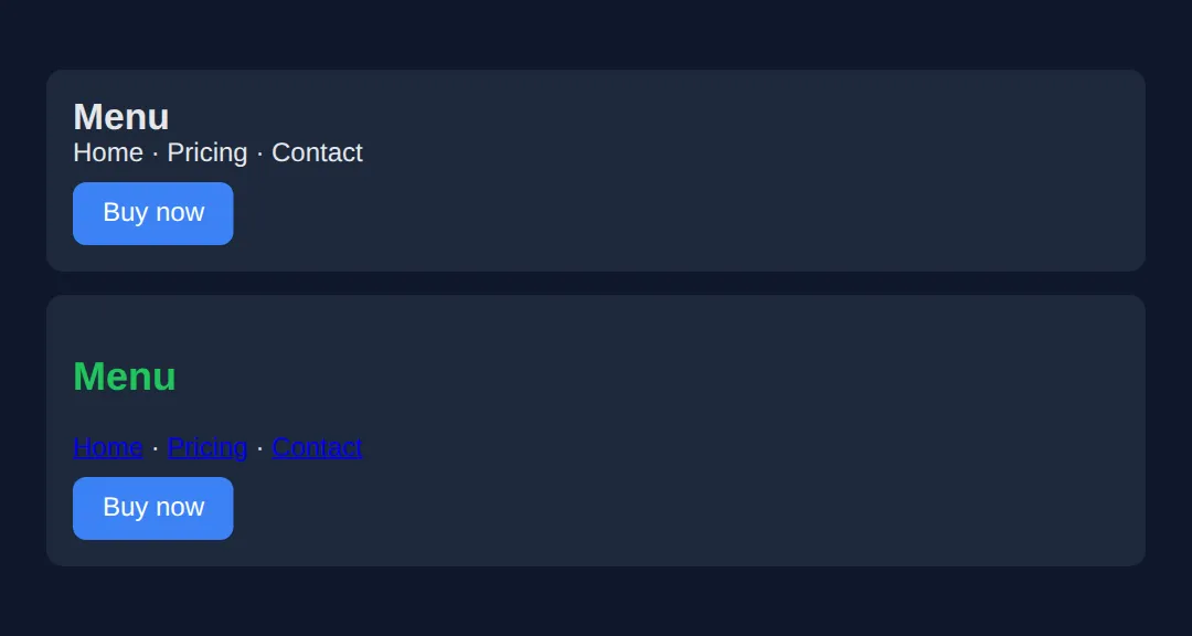
3. Heading Order & Alt Text
Screen-reader users often jump heading to heading to scan a page, the way a sighted reader skims bold titles. That only works if your headings form a logical outline: one <h1> per page, then <h2> for each section, then <h3> under those. Never skip a level just to get a smaller font — that's a job for CSS, not for picking the wrong tag.
For images, the alt attribute is the text a screen reader speaks in place of the picture. Get it right by image type:
| Image type | Rule | Example |
|---|---|---|
| Informative | Describe what it shows | alt="Golden retriever catching a ball" |
| Decorative | Empty alt (present, not missing!) | alt="" |
| Functional (logo/icon link) | Describe the action/destination | alt="Acme home page" |
<!DOCTYPE html>
<html lang="en">
<head>
  <meta charset="UTF-8">
  <title>Headings & alt text</title>
  <style>
    body { font-family: system-ui, sans-serif; background:#0f172a; color:#e5e7eb; padding:20px; }
    img { border-radius:8px; background:#334155; }
    h1 { color:#3b82f6; }
    h2 { color:#22c55e; }
    h3 { color:#f59e0b; }
  </style>
</head>
<body>

  <!-- One h1 = the page title. Screen reader: "heading level 1". -->
  <h1>Dog Breeds</h1>

  <!-- h2 = a section under the h1. Outline stays in order: 1 -> 2 -->
  <h2>Retrievers</h2>

    <!-- h3 = a sub-section under the h2. Order: 1 -> 2 -> 3. Never skip to h4 here. -->
    <h3>Golden Retriever</h3>

    <!-- Informative image: alt describes the content. -->
    <img src="dog.png" width="120" height="80"
         alt="Golden retriever catching a ball in a park">

    <!-- Decorative divider: alt="" so the screen reader stays silent. -->
    <img src="line.png" width="120" height="6" alt="">

    <!-- Functional image inside a link: alt = where the link goes. -->
    <a href="/"><img src="logo.png" width="40" height="40" alt="Acme home page"></a>

  <!-- ✅ Expected result, measured in a real browser:
     img -> border-radius: 8px
     h1 -> color: rgb(59, 130, 246)
  -->
</body>
</html>
4. Keyboard Navigation & Visible Focus
Many people never touch a mouse. They move through a page with Tab (next control), Shift+Tab (previous), Enter/Space (activate), and Escape (close). For this to work, every interactive element must be reachable and must show a visible focus indicator — the ring that tells you where you are. Native elements (<a>, <button>, <input>) are focusable for free; that's another reason to use them.
The demo below is a full accessible page: a skip link, semantic landmarks, a labelled form, and a bright focus ring. Open it and press Tab repeatedly — watch the skip link appear first, then the focus ring jump from control to control.
<!DOCTYPE html>
<html lang="en">
<head>
<meta charset="UTF-8">
<meta name="viewport" content="width=device-width, initial-scale=1.0">
<title>Accessible Page</title>
<style>
* { box-sizing: border-box; margin: 0; padding: 0; }
body { font-family: system-ui, sans-serif; background:#0f172a; color:#e5e7eb; }
/* Skip link: hidden off-screen until it receives focus, then slides in. */
.skip-link {
position:absolute; top:-60px; left:10px; z-index:100;
background:#3b82f6; color:white; padding:12px 20px;
border-radius:8px; text-decoration:none; font-weight:600;
transition: top 0.2s;
}
.skip-link:focus { top:10px; } /* appears for keyboard users */
/* The all-important visible focus ring. */
:focus-visible { outline:3px solid #3b82f6; outline-offset:2px; border-radius:4px; }
header { background:#1e293b; padding:15px 30px; display:flex;
justify-content:space-between; align-items:center; }
header h1 { color:#3b82f6; font-size:1.2rem; }
nav ul { list-style:none; display:flex; gap:20px; }
nav a { color:#94a3b8; text-decoration:none; padding:5px; }
main { max-width:700px; margin:30px auto; padding:0 20px; }
h2 { color:#22c55e; margin:25px 0 10px; }
label { display:block; margin:12px 0 4px; font-size:14px; color:#cbd5e1; }
input, textarea {
width:100%; padding:10px; background:#1e293b; border:2px solid #334155;
color:white; border-radius:6px; font-size:14px;
}
button {
background:#3b82f6; color:white; border:none; padding:12px 24px;
border-radius:8px; font-weight:600; cursor:pointer; margin-top:15px;
min-height:44px; /* big enough to tap on touch */
}
</style>
</head>
<body>
<!-- First focusable element: lets keyboard users jump past the nav. -->
<a href="#main-content" class="skip-link">Skip to main content</a>
<header>
<h1>♿ Accessible Site</h1>
<nav aria-label="Main navigation"> <!-- landmark + a readable name -->
<ul>
<li><a href="#">Home</a></li>
<li><a href="#">About</a></li>
<li><a href="#">Contact</a></li>
</ul>
</nav>
</header>
<main id="main-content"> <!-- where the skip link lands -->
<h2>Press Tab to explore ⌨️</h2>
<p>The skip link appears first, then the blue ring moves control to control.</p>
<h2>Contact form</h2>
<form>
<!-- Every input is tied to a <label> via matching for/id. -->
<label for="name">Full name</label>
<input type="text" id="name" required>
<label for="email">Email address</label>
<input type="email" id="email" required aria-describedby="email-help">
<p id="email-help" style="font-size:12px;color:#94a3b8;">We'll never share your email.</p>
<label for="message">Message</label>
<textarea id="message" rows="3"></textarea>
<button type="submit">Send message</button>
</form>
</main>
<footer style="text-align:center;padding:20px;color:#64748b;font-size:13px;">
<p>© 2026 Accessible Website — built with semantic HTML</p>
</footer>
<!-- ✅ Expected result, measured in a real browser:
.skip-link -> position: absolute
header -> display: flex
nav ul -> display: flex
nav a -> text-decoration-line: none
-->
</body>
</html>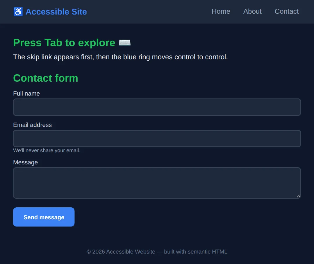
5. Colour Contrast (WCAG AA)
Low-contrast text — pale grey on white, light blue on teal — is hard to read for everyone and impossible for many people with low vision. WCAG sets a measurable target called a contrast ratio, from 1:1 (invisible) to 21:1 (black on white). To pass AA, the level most laws require, hit these numbers:
| Level | Normal text | Large text (18pt+/24px) |
|---|---|---|
| AA (required) | 4.5:1 | 3:1 |
| AAA (best practice) | 7:1 | 4.5:1 |
💡 Pro tip: Don't guess. Open browser DevTools, inspect a text element, and the colour picker shows the live contrast ratio with a pass/fail tick against AA and AAA.
And never rely on colour alone to convey meaning — a red/green status dot is invisible to colour-blind users. Add an icon, a word, or a shape as well.
🎯 Your Turn #1 — Fix the fake button
This "card" uses a <div> as a button and an image with no alt text. Replace the blanks so it becomes accessible, then run it and check the expected screen-reader behaviour written in the comments.
<!DOCTYPE html>
<html lang="en">
<head>
  <meta charset="UTF-8">
  <title>Your Turn 1</title>
  <style>
    body { font-family: system-ui, sans-serif; background:#0f172a; color:#e5e7eb; padding:20px; }
    .card { background:#1e293b; border-radius:10px; padding:16px; max-width:340px; }
    .buy {
      display:inline-block; background:#22c55e; color:#0f172a;
      padding:10px 18px; border-radius:8px; border:none;
      font:inherit; font-weight:700; cursor:pointer; margin-top:10px;
    }
    :focus-visible { outline:3px solid #3b82f6; outline-offset:2px; }
    img { border-radius:8px; background:#334155; }
  </style>
</head>
<body>
  <!-- 🎯 YOUR TURN — fix the two problems marked ___ -->
  <div class="card">

    <!-- 1) This image has NO alt attribute. Add one that describes it. -->
    <img src="headphones.png" width="120" height="80" ___>
    <!-- 👉 add:  alt="Wireless over-ear headphones in black" -->

    <h2>Wireless Headphones</h2>

    <!-- 2) This is a <div>, so the keyboard can't reach it and a screen
            reader won't call it a button. Turn it into a real button. -->
    <div class="buy" onclick="alert('Added!')">Add to cart</div>
    <!-- 👉 change the line above to:
            <button class="buy" onclick="alert('Added!')">Add to cart</button> -->

  </div>

  <!-- ✅ Expected screen-reader behaviour once fixed:
       - On the image it announces: "Wireless over-ear headphones in black, image"
         (instead of reading the file name "headphones.png").
       - Tab reaches the control and it announces: "Add to cart, button",
         and Enter or Space activates it. -->
</body>
</html>
🎯 Your Turn #2 — Label the form
These inputs only have placeholder text — which vanishes when you type and is not a label. Connect each input to a <label> using matching for / id values, then verify the expected screen-reader behaviour in the comments.
<!DOCTYPE html>
<html lang="en">
<head>
  <meta charset="UTF-8">
  <title>Your Turn 2</title>
  <style>
    body { font-family: system-ui, sans-serif; background:#0f172a; color:#e5e7eb; padding:20px; }
    label { display:block; margin:12px 0 4px; color:#cbd5e1; font-size:14px; }
    input { width:100%; max-width:320px; padding:10px; border-radius:6px;
            border:2px solid #334155; background:#1e293b; color:white; }
    :focus-visible { outline:3px solid #3b82f6; outline-offset:2px; }
  </style>
</head>
<body>
  <form>
    <!-- 🎯 YOUR TURN — give each label a "for" that matches the input's "id" -->

    <!-- 1) Connect this label to the username input. -->
    <label ___>Username</label>            <!-- 👉 add:  for="username" -->
    <input type="text" ___ placeholder="Type your username">
    <!-- 👉 add:  id="username" -->

    <!-- 2) Connect this label to the password input. -->
    <label ___>Password</label>            <!-- 👉 add:  for="password" -->
    <input type="password" ___ placeholder="Type your password">
    <!-- 👉 add:  id="password" -->
  </form>

  <!-- ✅ Expected screen-reader behaviour once fixed:
       - Tab to the first field announces: "Username, edit text".
       - Tab to the second announces: "Password, edit text, protected".
       Before the fix it only said "edit text" with no name, leaving the
       user with no idea what to type. Clicking a label now also focuses
       its input. -->
</body>
</html>
🧩 Mini-Challenge — Build an accessible mini-page
Support is faded now — only an outline is given. Build a small page from scratch that ties the whole lesson together. Use the worked page in section 4 as your reference if you get stuck.
<!DOCTYPE html>
<html lang="en">
<head>
  <meta charset="UTF-8">
  <title>Mini-Challenge</title>
  <style>
    body { font-family: system-ui, sans-serif; background:#0f172a; color:#e5e7eb; padding:20px; }
    /* 🧩 add a :focus-visible rule with a 3px outline */
  </style>
</head>
<body>

  <!-- 🧩 MINI-CHALLENGE: build a tiny but fully accessible newsletter page
       1. First link on the page = a skip link pointing to #main
       2. A <header> with an <h1> title and a <nav aria-label="Main">
       3. A <main id="main"> containing:
            - one <h2>
            - a <label for="..."> tied to a matching <input id="...">
            - a real <button> (not a div) to subscribe
       4. A :focus-visible rule so every control shows a blue outline ring
       5. A <footer> with a copyright line

       ✅ Expected when you Tab through it:
          skip link -> nav links -> input (announced "..., edit text")
          -> "Subscribe, button" — every stop shows the focus ring. -->

  <!-- your code here -->

</body>
</html>
⚠️ Common Errors (and the fix)
- Missing alt text. Screen reader reads the file name out loud: "headphones-final-v2.png". Fix: add alt="..." describing the image, or alt="" if it's purely decorative.
- Div-buttons. <div onclick="..."> can't be reached by Tab, doesn't respond to Enter/Space, and isn't announced as a button. Fix: use <button> (or <a> if it navigates).
- Low contrast. Pale grey text on white reads at ~1.6:1 and fails WCAG AA. Fix: darken the text (or lighten the background) until DevTools shows at least 4.5:1 for normal text.
- No labels. Inputs with only placeholder text are announced as an unnamed "edit text". Fix: add a <label> with for matching the input's id.
- outline: none. Removing the focus ring with no replacement leaves keyboard users unable to see where they are. Fix: style :focus-visible with a high-contrast outline instead.
📋 Quick Reference
| Goal | Use this |
|---|---|
| A clickable action | <button>…</button> |
| Navigation region | <nav aria-label="Main"> |
| Main content landmark | <main id="main"> |
| Informative image | <img src="…" alt="what it shows"> |
| Decorative image | <img src="…" alt=""> |
| Labelled input | <label for="x">…</label><input id="x"> |
| Skip link | <a href="#main">Skip to main content</a> |
| Visible focus ring | :focus-visible { outline: 3px solid #3b82f6 } |
| Contrast (AA, normal text) | at least 4.5:1 |
🎉 Lesson Complete
You can now build pages that work for everyone. The essentials:
- ✅ Reach for semantic HTML first — it's the #1 accessibility win
- ✅ Give images real alt text (or alt="" when decorative)
- ✅ Keep headings in order — one h1, then h2, then h3
- ✅ Make every control keyboard-operable with a visible focus ring
- ✅ Meet WCAG AA contrast — 4.5:1 for normal text
- ✅ Label every form control and add a skip link
Practice quiz
What is the single most important thing you can do for accessibility?
- Add ARIA roles to every element
- Set a high z-index on focusable elements
- Use semantic HTML — the right element for the job
- Use only inline styles
Answer: Use semantic HTML — the right element for the job. Semantic elements like button, nav and h1–h6 give screen readers, keyboards and search engines built-in meaning for free.
What contrast ratio does WCAG AA require for normal-size text?
- 4.5:1
- 3:1
- 7:1
- 1:1
Answer: 4.5:1. AA requires at least 4.5:1 for normal text and 3:1 for large text (18pt/24px, or 14pt/18.66px bold).
When is it appropriate to give an image an empty alt attribute (alt="")?
- When the image is informative
- Whenever you forget what the image shows
- Never — alt must always have text
- When the image is purely decorative and adds no information
Answer: When the image is purely decorative and adds no information. alt="" tells the screen reader to skip a purely decorative image. Leaving alt off entirely makes it read the file name instead.
How do you correctly connect a label to a form input?
- Use placeholder text as the label
- Match the label's for attribute to the input's id
- Wrap the input in a div
- Add a title attribute to the input
Answer: Match the label's for attribute to the input's id. A label's for must match the input's id. The screen reader then announces the label, and clicking the label focuses the input.
Why should you never write outline: none on :focus without a replacement?
- Keyboard users can no longer see where they are on the page
- It slows down the page
- It disables hover styles
- It removes the element from the DOM
Answer: Keyboard users can no longer see where they are on the page. Removing the focus ring with nothing in its place makes the page unusable by keyboard. Style :focus-visible with a high-contrast outline instead.
What is a skip link?
- A link that skips loading images
- A link that opens in a new tab
- The first focusable link that jumps past the header/nav straight to main content
- A link with aria-hidden set
Answer: The first focusable link that jumps past the header/nav straight to main content. A skip link ('Skip to main content') lets keyboard and screen-reader users bypass repeated navigation. It is usually hidden until focused.
What is the correct heading structure for a page?
- Multiple h1 elements per page
- One h1, then h2 for sections, then h3 under those — never skipping levels
- Pick heading levels by the font size you want
- Only use h3 and h4
Answer: One h1, then h2 for sections, then h3 under those — never skipping levels. Use one h1, then a logical outline of h2, h3 and so on. Font size is a job for CSS, not for choosing the wrong heading level.
Which native elements are keyboard-focusable for free?
- div and span
- p and section
- header and footer
- a, button and input
Answer: a, button and input. Native interactive elements like a, button and input are focusable and keyboard-operable automatically — another reason to use them.
Why is using a div with onclick instead of a button an accessibility problem?
- A div cannot have a background colour
- A div onclick can't be reached by Tab, ignores Enter/Space, and isn't announced as a button
- A div onclick is slower to render
- A div onclick breaks the box model
Answer: A div onclick can't be reached by Tab, ignores Enter/Space, and isn't announced as a button. A div is not focusable or announced as a control. A real button is reachable by Tab, responds to Enter/Space, and is announced as a button.
Besides colour, what should convey status like success or error?
- Nothing else is needed
- A louder colour
- An icon, a word, or a shape as well — never colour alone
- Only animation
Answer: An icon, a word, or a shape as well — never colour alone. Colour alone is invisible to colour-blind users. Add an icon, text label, or shape so the meaning does not depend on colour.
Continue this course
- Previous: CSS Custom Properties
- Next: Advanced HTML5 Semantic Architecture — Use header, main, article, section, aside correctly for SEO and a11y
- Quick reference: HTML & CSS cheat sheet › CSS Motion & State
- From the blog: Building Forms with HTML5 and Validation
Frequently asked questions
What is the single most important thing I can do for accessibility?
Use semantic HTML. Choosing the right element for the job — <button> for actions, <nav> for navigation, <h1>–<h6> for headings, <main> for the main content — gives screen readers, keyboards, and search engines built-in meaning for free. Most accessibility problems come from <div> and <span> used where a real element belongs.
What does WCAG AA mean and which contrast ratio do I need?
WCAG (Web Content Accessibility Guidelines) defines levels A, AA, and AAA. AA is the level most laws require. For AA, normal text needs a contrast ratio of at least 4.5:1 against its background, and large text (18pt/24px, or 14pt/18.66px bold) needs at least 3:1.
Is it ever OK to write outline: none on focus?
Only if you immediately provide a clearly visible replacement focus style. Removing the outline with nothing in its place makes the page impossible to use with a keyboard, because the user can no longer see where they are. The safe pattern is to style :focus-visible with a high-contrast outline instead.
When should an image have an empty alt attribute (alt="")?
Use alt="" for purely decorative images that add no information — background flourishes, spacer images, icons sitting next to text that already says the same thing. The empty alt tells the screen reader to skip the image. This is different from leaving alt off entirely, which makes the screen reader announce the file name, which is a real bug.
How do I connect a label to a form input?
Give the input an id and point a <label> at it with a matching for attribute: <label for="email">Email</label><input id="email">. The screen reader then announces the label when the field is focused, and clicking the label focuses the input. Placeholder text is not a label and disappears as soon as the user types.
What is a skip link and why do I need one?
A skip link is the first focusable link on the page ("Skip to main content") that jumps past the repeated header and navigation straight to <main>. Keyboard and screen-reader users would otherwise have to Tab through every nav link on every page. It is usually hidden until it receives focus.