Advanced HTML5 Semantic Architecture
Reviewed & published by Brayan K
Semantic HTML5 elements such as <header>, <nav>, <main>, <article>, and <footer> describe the meaning of each region of a page, giving browsers, search engines, and screen readers a real document structure instead of anonymous <div> wrappers.
Part of the free HTML & CSS course at LearnCodingFast — hands-on lessons with examples you run in your browser, plus practice exercises and a quick quiz.
By the end of this lesson you'll be able to replace generic <div> soup with meaningful HTML5 elements that give your page a real document outline — making it easier for search engines to index and for screen-reader users to navigate.
💡 Think of It Like This
A web page is like a newspaper. It has a masthead at the top (<header>), a table of contents linking sections (<nav>), the main story area (<main>) full of individual articles (<article>), a sidebar of related snippets (<aside>), and the fine print at the bottom (<footer>).
Now imagine a newspaper printed entirely in one font, with no headlines, columns, or boxes — just an undifferentiated wall of text. That is what a page of nothing but <div>s looks like to a screen reader or a search engine: every box says "I am a box" and nothing more. Semantic elements are the headlines and column rules that let a machine read your page the way a person reads a paper.
1. The Landmark Elements
A semantic element is a tag whose name describes the meaning of its content, not how it looks. Most of them render as a plain block box — visually identical to a <div> — but each one carries a built-in landmark role that browsers, search engines, and screen readers can act on. Here is the core set you will reach for on almost every page.
| Element | Meaning / when to use | Screen-reader role |
|---|---|---|
| <header> | Intro area for a page or section (logo, title) | banner |
| <nav> | A block of major navigation links | navigation |
| <main> | The unique primary content (exactly one!) | main |
| <article> | Self-contained, syndicatable content | article |
| <section> | A thematic grouping with a heading | region |
| <aside> | Tangential content: sidebar, related links, ads | complementary |
| <footer> | Closing info: copyright, links, byline | contentinfo |
Run the worked example below. Notice that every landmark is just a labelled box — but a screen-reader user can jump straight to "main" or "navigation" because of those labels, something impossible with bare <div>s.
<!DOCTYPE html>
<html lang="en">
<head>
<meta charset="UTF-8">
<title>Semantic Page</title>
<style>
* { box-sizing: border-box; margin: 0; padding: 0; }
body { background: #0f172a; font-family: system-ui, sans-serif; color: #e5e7eb; }
/* Every rule below targets a SEMANTIC element directly --
no .header or .sidebar classes needed. */
header { background: #1e293b; padding: 20px 30px; border-bottom: 2px solid #3b82f6; }
header h1 { color: #3b82f6; font-size: 1.5rem; }
nav { background: #1e293b; padding: 10px 30px; display: flex; gap: 20px; border-bottom: 1px solid #334155; }
nav a { color: #94a3b8; text-decoration: none; font-size: 14px; }
nav a:hover { color: #3b82f6; }
.layout { display: grid; grid-template-columns: 1fr 280px; gap: 30px; max-width: 1000px; margin: 30px auto; padding: 0 20px; }
main { min-width: 0; }
article { background: #1e293b; padding: 25px; border-radius: 8px; margin-bottom: 20px; }
article h2 { color: #22c55e; margin-bottom: 6px; }
article time { font-size: 12px; color: #64748b; } /* the date, machine-readable */
article p { line-height: 1.7; color: #cbd5e1; margin-top: 10px; }
section { background: #1e293b; padding: 25px; border-radius: 8px; }
section h2 { color: #8b5cf6; margin-bottom: 8px; }
aside { background: #1e293b; padding: 20px; border-radius: 8px; height: fit-content; }
aside h3 { color: #f97316; margin-bottom: 10px; font-size: 1rem; }
aside ul { list-style: none; }
aside li { padding: 6px 0; border-bottom: 1px solid #334155; }
aside a { color: #94a3b8; text-decoration: none; font-size: 14px; }
footer { background: #1e293b; text-align: center; padding: 20px; color: #64748b; font-size: 13px; border-top: 1px solid #334155; margin-top: 40px; }
</style>
</head>
<body>
<!-- banner landmark: site title lives here -->
<header>
<h1>🌐 TechBlog</h1>
</header>
<!-- navigation landmark: the main menu -->
<nav>
<a href="#">Home</a>
<a href="#">Articles</a>
<a href="#">Tutorials</a>
<a href="#">About</a>
</nav>
<div class="layout">
<!-- main landmark: the unique content of THIS page (only one per page) -->
<main>
<!-- article: self-contained, could be syndicated on its own -->
<article>
<h2>Understanding Semantic HTML</h2>
<time datetime="2026-01-15">15 January 2026</time>
<p>Semantic elements describe what they contain. A screen reader can list
every landmark on this page and jump straight to the part the user wants.</p>
</article>
<!-- section: a thematic grouping WITH a heading, not independently publishable -->
<section>
<h2>Newsletter</h2>
<p>Subscribe to get the latest web development tips in your inbox.</p>
</section>
</main>
<!-- complementary landmark: related, tangential content -->
<aside>
<h3>📌 Popular Posts</h3>
<ul>
<li><a href="#">CSS Grid vs Flexbox</a></li>
<li><a href="#">10 JavaScript Tips</a></li>
<li><a href="#">Web Accessibility Guide</a></li>
</ul>
</aside>
</div>
<!-- contentinfo landmark -->
<footer>
<p>© 2026 TechBlog. Built with semantic HTML5.</p>
</footer>
<!-- ✅ Try it: visually it looks like any styled page, but the structure is
fully described. Landmarks (banner, navigation, main, complementary,
contentinfo) let assistive tech navigate it in seconds. -->
<!-- ✅ Expected result, measured in a real browser:
nav -> display: flex
nav a -> text-decoration-line: none
.layout -> display: grid
aside ul -> list-style-type: none
-->
</body>
</html>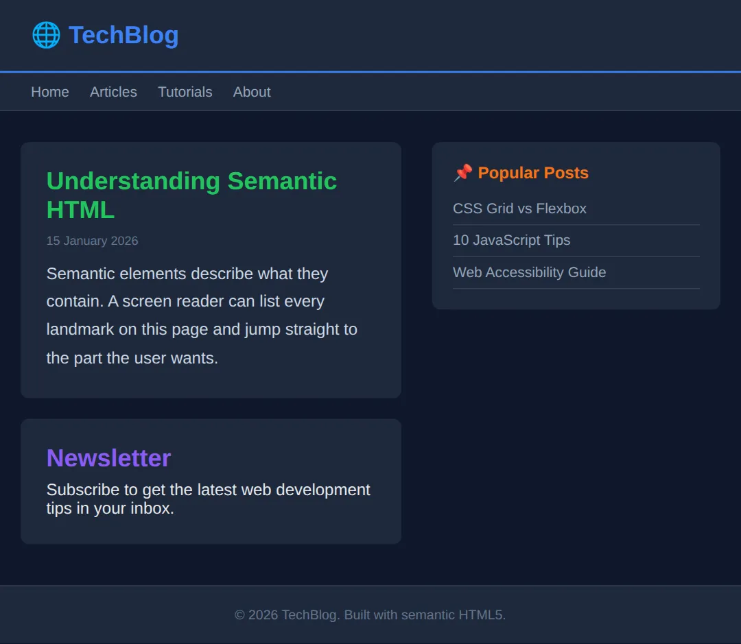
2. <article> vs <section> — the one test
This is the pairing that trips everyone up. The deciding question is simple: would this content still make sense lifted out of the page and published on its own? If yes — a blog post, a news item, a product card, a comment — it is an <article>. If it is just one labelled part of a bigger whole — a chapter, a "Features" block, a tab panel — it is a <section>.
A second rule helps too: a <section> should always have a heading (h2–h6). If a chunk has no natural heading and is only there for layout, you probably want a plain <div> instead. They can also nest: an <article> can contain <section>s, and a <section> can contain <article>s.
<!DOCTYPE html>
<html lang="en">
<head>
  <meta charset="UTF-8">
  <title>article vs section</title>
  <style>
    body { background:#0f172a; color:#e5e7eb; font-family: system-ui, sans-serif; padding:24px; }
    section { border:1px solid #334155; border-radius:10px; padding:20px; max-width:560px; }
    section > h2 { color:#8b5cf6; margin-bottom:14px; }   /* the section's own heading */
    article { background:#1e293b; padding:16px; border-radius:8px; margin-bottom:14px; }
    article:last-child { margin-bottom:0; }
    article h3 { color:#22c55e; }
    article time { font-size:12px; color:#64748b; }
    article p { color:#cbd5e1; line-height:1.6; margin-top:8px; }
  </style>
</head>
<body>
  <!-- The SECTION is a thematic group on this page: "Latest Posts".
       It has a heading, but it is not something you'd syndicate alone. -->
  <section>
    <h2>Latest Posts</h2>

    <!-- Each ARTICLE is self-contained: it would still make sense on its own
         in an RSS feed or shared as a single link. -->
    <article>
      <h3>Flexbox in 5 minutes</h3>
      <time datetime="2026-02-01">1 February 2026</time>
      <p>A whirlwind tour of the flex container and its main axis.</p>
    </article>

    <article>
      <h3>Grid template areas</h3>
      <time datetime="2026-02-08">8 February 2026</time>
      <p>Name your layout regions and place items by name.</p>
    </article>
  </section>

  <!-- ✅ Expected: one purple section heading, two green-titled article cards.
       Test yourself: each article would read fine pulled out alone (=> article);
       "Latest Posts" only means something in context (=> section). -->
  <!-- ✅ Expected result, measured in a real browser:
     section -> max-width: 560px
     section > h2 -> color: rgb(139, 92, 246)
  -->
</body>
</html>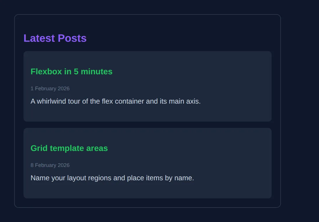
3. Content-level semantics: <figure>, <time>, <mark>
Semantics are not only about page-level landmarks; smaller elements add meaning inside your content too:
- <figure> wraps a self-contained illustration — an image, chart, code block, or quote — and <figcaption> gives it a caption that is programmatically linked to it (better than a loose paragraph underneath).
- <time datetime="..."> marks up a date or time in a machine-readable format. The visible text can read "last Tuesday" while datetime="2026-06-09" tells machines the exact value.
- <mark> highlights text for relevance — like the yellow highlighting of your search term in results. It means "noteworthy here", not just "make it yellow".
<!DOCTYPE html>
<html lang="en">
<head>
  <meta charset="UTF-8">
  <title>figure / time / mark</title>
  <style>
    body { background:#0f172a; color:#e5e7eb; font-family: system-ui, sans-serif; padding:24px; line-height:1.7; }
    article { max-width:560px; }
    h2 { color:#3b82f6; margin-bottom:6px; }
    time { color:#64748b; font-size:13px; }

    /* <figure> has default left/right margins -- reset them. */
    figure { margin: 20px 0; background:#1e293b; padding:16px; border-radius:10px; }
    figure div { height:120px; border-radius:8px; background: linear-gradient(135deg,#3b82f6,#8b5cf6); }
    figcaption { margin-top:10px; font-size:13px; color:#94a3b8; text-align:center; }

    /* <mark> is highlighted text -- restyle it to fit a dark theme. */
    mark { background:#fde047; color:#0f172a; padding:0 4px; border-radius:3px; }
  </style>
</head>
<body>
  <article>
    <h2>Colour gradients explained</h2>

    <!-- datetime is machine-readable; the visible text can be friendlier. -->
    <p>Published <time datetime="2026-06-09">last Tuesday</time>.</p>

    <p>A <mark>linear gradient</mark> blends two or more colours along a line.
       The highlighted term is what this article is really about.</p>

    <!-- figure + figcaption: the caption is tied to the illustration. -->
    <figure>
      <div></div>
      <figcaption>Figure 1: a blue-to-purple linear gradient.</figcaption>
    </figure>
  </article>

  <!-- ✅ Expected: a heading, a friendly date, a sentence with "linear gradient"
       highlighted yellow, and a gradient box with a centred caption. -->
  <!-- ✅ Expected result, measured in a real browser:
     article -> max-width: 560px
     h2 -> color: rgb(59, 130, 246)
  -->
</body>
</html>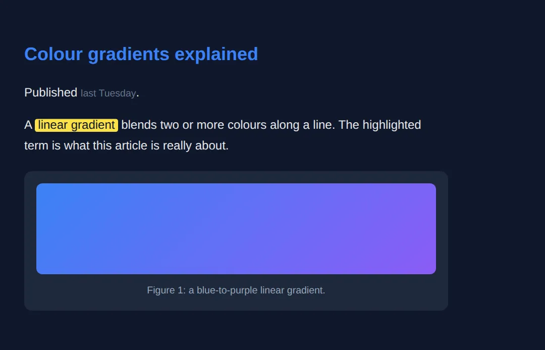
4. Div Soup vs Semantic HTML
"Div soup" is markup where every region is a <div> with a class — <div class="header">, <div class="nav"> — that looks right but means nothing to a machine. The classes are for you; the elements should be for everyone else. Swapping each wrapper for the matching landmark is usually a one-for-one rename, and it instantly gives you the document outline below.
<!DOCTYPE html>
<html lang="en">
<head>
<meta charset="UTF-8">
<title>Div Soup Fix</title>
<style>
* { box-sizing: border-box; margin: 0; padding: 0; }
body { background:#0f172a; color:#e5e7eb; font-family: system-ui, sans-serif; padding:20px; }
h1 { margin-bottom:16px; }
.comparison { display:grid; grid-template-columns:1fr 1fr; gap:20px; }
.bad, .good { padding:20px; border-radius:8px; }
.bad { background:#7f1d1d; border:2px solid #ef4444; }
.good { background:#14532d; border:2px solid #22c55e; }
.bad h2 { color:#fca5a5; margin-bottom:12px; }
.good h2 { color:#86efac; margin-bottom:12px; }
pre { background:rgba(0,0,0,0.3); padding:14px; border-radius:6px; font-size:13px; overflow-x:auto; line-height:1.6; }
.semantic { color:#22c55e; font-weight:bold; }
</style>
</head>
<body>
<h1>🔄 Div Soup → Semantic HTML</h1>
<div class="comparison">
<div class="bad">
<h2>❌ Div soup (no meaning)</h2>
<pre><div class="header">
<div class="nav">...</div>
</div>
<div class="main">
<div class="post">...</div>
<div class="sidebar">...</div>
</div>
<div class="footer">...</div></pre>
</div>
<div class="good">
<h2>✅ Semantic (self-describing)</h2>
<pre><<span class="semantic">header</span>>
<<span class="semantic">nav</span>>...</nav>
</header>
<<span class="semantic">main</span>>
<<span class="semantic">article</span>>...</article>
<<span class="semantic">aside</span>>...</aside>
</main>
<<span class="semantic">footer</span>>...</footer></pre>
</div>
</div>
<!-- ✅ Same boxes, same layout -- but only the right-hand version exposes
landmarks (banner, navigation, main, complementary, contentinfo) and a
real outline. The refactor was a one-for-one rename. -->
<!-- ✅ Expected result, measured in a real browser:
.comparison -> display: grid
.bad -> border-top-width: 2px
.semantic -> count: 6
-->
</body>
</html>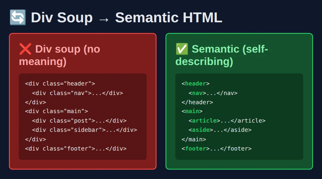
<div class="header">
  <div class="nav">...</div>
</div>
<div class="main">
  <div class="post">...</div>
  <div class="sidebar">...</div>
</div>
<div class="footer">...</div>
🎯 Your Turn #1 — Refactor div soup into landmarks
The page below works visually but is pure div soup. Replace each labelled <div> with the matching semantic element. Fill in the blanks marked ___, then run it and check the comments.
<!DOCTYPE html>
<html lang="en">
<head>
<meta charset="UTF-8">
<title>Your Turn 1</title>
<style>
body { background:#0f172a; color:#e5e7eb; font-family: system-ui, sans-serif; }
header { background:#1e293b; padding:18px 24px; border-bottom:2px solid #3b82f6; }
header h1 { color:#3b82f6; font-size:1.3rem; }
nav { background:#1e293b; padding:10px 24px; display:flex; gap:18px; }
nav a { color:#94a3b8; text-decoration:none; font-size:14px; }
main { padding:24px; }
main p { color:#cbd5e1; line-height:1.7; }
footer { background:#1e293b; text-align:center; padding:16px; color:#64748b; font-size:13px; }
</style>
</head>
<body>
<!-- 🎯 YOUR TURN — replace each ___ with the right semantic tag (open AND close) -->
<!-- 1) The banner area -->
<___> <!-- 👉 use header -->
<h1>My Site</h1>
</___> <!-- 👉 close it: /header -->
<!-- 2) The navigation links -->
<___> <!-- 👉 use nav -->
<a href="#">Home</a>
<a href="#">Blog</a>
</___> <!-- 👉 close it: /nav -->
<!-- 3) The unique primary content -->
<___> <!-- 👉 use main -->
<p>Welcome! This paragraph is the main content of the page.</p>
</___> <!-- 👉 close it: /main -->
<!-- 4) The closing info -->
<___> <!-- 👉 use footer -->
<p>© 2026 My Site</p>
</___> <!-- 👉 close it: /footer -->
<!-- ✅ Expected: the page looks identical to before, but it now exposes the
banner, navigation, main, and contentinfo landmarks. The CSS already
targets header/nav/main/footer, so styling "lights up" once the tags
are correct. -->
</body>
</html>🎯 Your Turn #2 — article, figure, time and mark
Finish this blog post so it uses content-level semantics: wrap it in an <article>, add a machine-readable date, highlight a key term, and caption the image. Fill in the blanks and verify against the comments.
<!DOCTYPE html>
<html lang="en">
<head>
  <meta charset="UTF-8">
  <title>Your Turn 2</title>
  <style>
    body { background:#0f172a; color:#e5e7eb; font-family: system-ui, sans-serif; padding:24px; line-height:1.7; }
    article { max-width:560px; }
    h2 { color:#3b82f6; margin-bottom:6px; }
    time { color:#64748b; font-size:13px; }
    figure { margin:18px 0; background:#1e293b; padding:14px; border-radius:10px; }
    figure div { height:110px; border-radius:8px; background:linear-gradient(135deg,#22c55e,#3b82f6); }
    figcaption { margin-top:8px; font-size:13px; color:#94a3b8; text-align:center; }
    mark { background:#fde047; color:#0f172a; padding:0 4px; border-radius:3px; }
  </style>
</head>
<body>
  <!-- 🎯 YOUR TURN — fill in the blanks marked ___ -->

  <!-- 1) Wrap the whole post in the self-contained element. -->
  <___>                                    <!-- 👉 use  article -->
    <h2>Why accessibility wins</h2>

    <!-- 2) Make the date machine-readable. -->
    <p>Posted <time datetime="___">today</time>.</p>   <!-- 👉 use  2026-06-16 -->

    <!-- 3) Highlight the key phrase "screen readers". -->
    <p>Good markup helps <___>screen readers</___> navigate fast.</p>  <!-- 👉 use  mark -->

    <!-- 4) Caption the illustration. -->
    <figure>
      <div></div>
      <___>Figure 1: a friendly gradient.</___>        <!-- 👉 use  figcaption -->
    </figure>
  </___>                                   <!-- 👉 close the article: /article -->

  <!-- ✅ Expected: a heading, "today" as a real <time>, "screen readers"
       highlighted yellow, and a gradient box with a caption underneath. -->
</body>
</html>
🧩 Mini-Challenge — Build a semantic page from scratch
Support is faded now — only an outline is given. Build a small but complete semantic page. Use the worked examples in sections 1 and 2 as your reference if you get stuck.
<!DOCTYPE html>
<html lang="en">
<head>
  <meta charset="UTF-8">
  <title>Mini-Challenge</title>
  <style>
    /* Optional: style the semantic elements however you like.
       (Targeting header, nav, main, article, aside, footer by name.) */
    body { background:#0f172a; color:#e5e7eb; font-family: system-ui, sans-serif; padding:20px; line-height:1.6; }
  </style>
</head>
<body>

  <!-- 🧩 MINI-CHALLENGE: a complete semantic page for a "Recipes" blog
       1. A <header> containing an <h1> site title
       2. A <nav> with 3 links
       3. A <main> containing TWO <article>s; each article has:
            - an <h2> title
            - a <time datetime="..."> publish date
            - a <p> with one word wrapped in <mark>
       4. An <aside> with an <h3> and a short list of related links
       5. A <footer> with a copyright line

       ✅ Expected: a page whose structure a screen reader can navigate by
          landmark (banner, navigation, main, complementary, contentinfo) and
          whose two articles would each make sense on their own. No <div>
          should be needed except possibly a layout wrapper. -->

  <!-- your markup here -->

</body>
</html>
⚠️ Common Errors (and the fix)
- More than one <main>. A page must have exactly one main landmark; a second one confuses assistive tech and is invalid HTML. Fix: keep a single <main> and use <section>s inside it for sub-areas.
- <section> with no heading. A section is meant to be a titled region; one with no h2–h6 adds an empty entry to the outline. Fix: give it a heading, or use a plain <div> if it is only a styling wrapper.
- Wrapping everything in <article>. Article is for self-contained, syndicatable content — not a generic box. Fix: apply the "would it make sense published alone?" test; if no, use <section> or <div>.
- <time> without datetime. If the visible text is not a valid machine format ("last Tuesday"), machines get nothing. Fix: add datetime="2026-06-09" in ISO format.
- Using <mark> just to colour text. Mark means "relevant / noteworthy here", and screen readers may announce it. Fix: for purely visual styling with no meaning, use a <span> with a class instead.
📋 Quick Reference
| Element | What it means |
|---|---|
| <header> | Intro area for a page or section (banner landmark at page level) |
| <nav> | A block of major navigation links (navigation landmark) |
| <main> | The unique primary content — exactly one per page (main landmark) |
| <article> | Self-contained, syndicatable content (blog post, card, comment) |
| <section> | A thematic grouping that has a heading (region landmark) |
| <aside> | Tangential content: sidebar, related links (complementary landmark) |
| <footer> | Closing info: copyright, byline (contentinfo landmark) |
| <figure> | A self-contained illustration, chart, code, or quote |
| <figcaption> | A caption tied to its parent <figure> |
| <time datetime> | A machine-readable date or time |
| <mark> | Text highlighted for relevance / noteworthiness |
🎉 Lesson Complete
You can now architect pages with semantic HTML5 instead of div soup. The essentials:
- ✅ Use <header>, <nav>, <main> (just one), <aside>, and <footer> for page-level landmarks
- ✅ Use <article> for syndicatable content and <section> for titled thematic groups
- ✅ Add meaning inside content with <figure>/<figcaption>, <time>, and <mark>
- ✅ Every landmark builds the document outline screen readers and search engines rely on
- ✅ Refactoring div soup is usually a one-for-one rename — and a free accessibility and SEO win
Practice quiz
How many <main> elements should a single page have?
- Exactly one
- At least two
- As many as you like
- None
Answer: Exactly one. A page must have exactly one <main> landmark marking its unique primary content.
What is the key test for choosing <article> over <section>?
- Would the content still make sense if published on its own (e.g. in an RSS feed)?
- Does the content have any images?
- Is the content longer than one paragraph?
- Is the content near the top of the page?
Answer: Would the content still make sense if published on its own (e.g. in an RSS feed)?. If the content is self-contained and could be syndicated alone, it is an <article>.
What landmark role does the <nav> element expose?
- banner
- navigation
- contentinfo
- complementary
Answer: navigation. <nav> exposes the navigation landmark role.
Which element is intended for tangential content like a sidebar or related links?
- <section>
- <aside>
- <article>
- <figure>
Answer: <aside>. <aside> marks complementary, tangential content (the complementary landmark).
A <section> element should generally contain what?
- A heading (h2-h6) describing the thematic group
- Only images
- A single inline span
- Nothing — it must be empty
Answer: A heading (h2-h6) describing the thematic group. A section is a titled thematic region and should have a heading.
What does the datetime attribute on <time> provide?
- A tooltip shown on hover
- A machine-readable date/time value while the visible text can be friendlier
- An automatic countdown timer
- The user's local timezone
Answer: A machine-readable date/time value while the visible text can be friendlier. datetime gives a machine-readable value (e.g. 2026-06-09) while the text can read 'last Tuesday'.
What does the <mark> element semantically indicate?
- Text highlighted for relevance or noteworthiness
- A bookmark anchor
- Bold text only
- A required form field
Answer: Text highlighted for relevance or noteworthiness. <mark> means the text is noteworthy/relevant here, not merely visually yellow.
Which landmark role does <footer> expose at the page level?
- contentinfo
- banner
- main
- region
Answer: contentinfo. A page-level <footer> exposes the contentinfo landmark role.
Which element pairs a self-contained illustration with a caption tied to it?
- <figure> with <figcaption>
- <div> with <p>
- <picture> with <source>
- <aside> with <small>
Answer: <figure> with <figcaption>. <figure> wraps the illustration and <figcaption> provides a programmatically linked caption.
Do most semantic landmark elements come with significant default styling?
- Yes, they each have unique colors and borders
- No — they render as plain block boxes; their value is meaning, not appearance
- Yes, they are all inline by default
- They are invisible until styled with JavaScript
Answer: No — they render as plain block boxes; their value is meaning, not appearance. Landmarks like header, main, section render as plain blocks; the benefit is semantics, not looks.
Continue this course
- Previous: Web Accessibility (A11y)
- Next: Accessibility (A11y) Deep Dive & ARIA Roles — ARIA labels, roles, live regions, and keyboard navigation patterns
- Quick reference: HTML & CSS cheat sheet › Semantic HTML · HTML Tags & Elements cheat sheet › Semantic HTML5
Frequently asked questions
What is the difference between <article> and <section>?
An <article> is self-contained: it would still make sense if you pulled it out of the page and published it on its own — a blog post, a news story, a product card, a forum comment. A <section> is a thematic grouping inside a page that is not independently distributable, like a chapter, a tabbed panel, or a 'Related products' block. The quick test: if it could be syndicated to an RSS feed on its own, use <article>; if it is just one labelled part of a larger whole, use <section>. Either way, give it a heading.
Does using semantic HTML actually improve my Google ranking?
Semantics do not give you a direct ranking boost the way good content or fast load times do, but they help indirectly and reliably. Search engines parse <main>, <article>, <nav>, and headings to understand which part of the page is the real content versus boilerplate, which improves how your page is indexed and how rich results (like article cards) are generated. Clean structure also tends to correlate with the accessible, well-built pages Google rewards. Treat semantics as the foundation that lets the rest of your SEO work, not a trick on its own.
Can I have more than one <header>, <footer>, or <nav> on a page?
Yes for <header>, <footer>, and <nav>; no for <main>. <header> and <footer> are scoped to their nearest sectioning ancestor, so an <article> can have its own <header> (title and byline) and its own <footer> (tags, share links) in addition to the page-level ones. You can also have several <nav> elements — a primary menu, a breadcrumb trail, a footer menu — and you should label them (aria-label) so they are distinguishable. <main>, however, must appear only once per page because it marks the single primary content region.
Do semantic elements come with any built-in styling?
Almost none. <header>, <main>, <section>, <article>, <aside>, <nav>, and <footer> all render as plain block-level boxes — visually identical to a <div>. Their value is entirely in meaning, not appearance: browsers, screen readers, and search engines treat them differently even though they look the same. You still apply all your own CSS (Grid, Flexbox, colours, spacing). The only common surprise is that <figure> has default left and right margins you may want to reset.
Is it ever okay to just use a <div>?
Absolutely — <div> is not banned, it is simply meaningless, which makes it the correct choice when you need a wrapper purely for styling or layout and the content has no semantic role. A Grid container, a card you are positioning, a flex row of buttons — those are legitimately <div> jobs. The rule of thumb: reach for the semantic element when one describes the content's purpose (it is navigation, it is the main content, it is a standalone article); reach for <div> when you just need a generic box.
How do screen readers actually use these elements?
Each landmark element exposes a role (banner for <header>, navigation for <nav>, main for <main>, complementary for <aside>, contentinfo for <footer>). Screen reader users can pull up a list of these landmarks and jump straight to, say, the main content or the navigation, instead of listening to the whole page top to bottom. <article> and <section> with headings also feed the heading outline that lets users skim by structure. Replace those landmarks with bare <div>s and that entire navigation shortcut disappears.