Accessibility Deep Dive & ARIA Roles
Reviewed & published by Brayan K
ARIA (Accessible Rich Internet Applications) is a set of HTML attributes like role, aria-label, and aria-expanded that describe the purpose and state of custom widgets to screen readers when native HTML elements aren't enough.
Part of the free HTML & CSS course at LearnCodingFast — hands-on lessons with examples you run in your browser, plus practice exercises and a quick quiz.
By the end of this lesson you'll know when ARIA helps, when it hurts, and how to bolt correct roles, states, and live regions onto custom widgets without breaking screen readers.
💡 Think of It Like This
ARIA is like subtitles on a film. The film (your page) already has visual cues, and subtitles (ARIA) make that same information available to people who can't see the screen. But here's the catch: ARIA only writes the subtitle — it never changes the film. Slapping role="button" on a <div> tells the screen reader "this is a button" but adds zero clicking, focusing, or keyboard behaviour. A real <button> brings the subtitle and the behaviour for free.
The first rule of ARIA: don't use ARIA. If a native HTML element gives you the role and behaviour you need, use it instead.
| Instead of ARIA… | Use native HTML |
|---|---|
| <div role="button"> | <button> |
| <div role="navigation"> | <nav> |
| <span role="heading"> | <h1>–<h6> |
| <div role="link"> | <a href> |
| <div role="checkbox"> | <input type="checkbox"> |
1. Roles, States & Properties — The Three Jobs of ARIA
ARIA stands for Accessible Rich Internet Applications. It does exactly three things, and it's worth keeping them straight:
- Role — what the thing is: role="tab", role="alert".
- State — a condition that changes as the user interacts: aria-expanded, aria-checked, aria-hidden.
- Property — a fixed characteristic that rarely changes: aria-label, aria-haspopup.
The example below puts all three on one custom toggle so you can see how they read out. Notice the comments stating exactly what a screen reader announces.
<!DOCTYPE html>
<html lang="en">
<head>
  <meta charset="UTF-8">
  <title>Role, State, Property</title>
  <style>
    body { background:#0f172a; color:#e5e7eb; font-family:system-ui, sans-serif; padding:30px; }
    .switch {
      background:#334155; color:#fff; border:none; padding:12px 18px;
      border-radius:6px; cursor:pointer; font-size:15px;
    }
    .switch[aria-pressed="true"] { background:#22c55e; color:#0f172a; }
    .note { color:#94a3b8; font-size:13px; margin-top:10px; }
    code { background:#334155; padding:2px 6px; border-radius:4px; }
  </style>
</head>
<body>
  <h1>Notifications</h1>

  <!-- role:    button is native, so the ROLE is built in (no role attribute needed)
       property: aria-label is a fixed name for the control
       state:    aria-pressed flips between "false" and "true" as you click -->
  <button class="switch" aria-pressed="false" aria-label="Toggle notifications"
          onclick="toggle(this)">
    Notifications: OFF
  </button>

  <p class="note">
    Screen reader (off): "Toggle notifications, toggle button, not pressed"<br>
    Screen reader (on):  "Toggle notifications, toggle button, pressed"
  </p>

  <script>
    function toggle(btn) {
      // Flip the STATE — this is the part that changes at runtime
      var on = btn.getAttribute('aria-pressed') === 'true';
      btn.setAttribute('aria-pressed', String(!on));   // aria-pressed = "true" / "false"
      btn.textContent = 'Notifications: ' + (!on ? 'ON' : 'OFF');
    }
  </script>
  <!-- ✅ Expected result, measured in a real browser:
     .switch -> cursor: pointer
     .note -> margin-top: 10px
  -->
</body>
</html>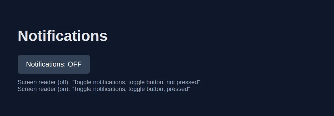
2. Naming Elements: aria-label, aria-labelledby & aria-describedby
Every interactive element needs an accessible name — the text a screen reader speaks. Three attributes give you one:
- aria-label — type the name directly. Use it when there's no visible text (an icon button).
- aria-labelledby — point at the id of existing visible text, so the name stays in sync.
- aria-describedby — point at extra help text spoken after the name (a hint, not the name itself).
<!DOCTYPE html>
<html lang="en">
<head>
  <meta charset="UTF-8">
  <title>ARIA Labels</title>
  <style>
    body { background:#0f172a; color:#e5e7eb; font-family:system-ui, sans-serif; padding:30px; }
    .example { background:#1e293b; padding:20px; border-radius:8px; margin:15px 0; }
    h3 { color:#22c55e; margin:20px 0 8px; font-size:1rem; }
    button { background:#3b82f6; color:#fff; border:none; padding:10px; border-radius:6px;
             cursor:pointer; width:40px; height:40px; font-size:18px; margin:4px; }
    label { display:block; margin-bottom:4px; }
    input { background:#334155; border:1px solid #475569; color:#fff; padding:8px 12px;
            border-radius:6px; width:100%; }
    .note { color:#94a3b8; font-size:13px; margin-top:8px; }
    code { background:#334155; padding:2px 6px; border-radius:4px; font-size:13px; }
  </style>
</head>
<body>
  <h1>Naming Controls</h1>

  <h3>1. aria-label — no visible text</h3>
  <div class="example">
    <!-- The "X" glyph means nothing to a screen reader, so we name it directly -->
    <button aria-label="Close dialog">✕</button>
    <button aria-label="Search">🔍</button>
    <p class="note">Announced: "Close dialog, button" — not just "button".</p>
  </div>

  <h3>2. aria-labelledby — reuse visible text</h3>
  <div class="example">
    <h2 id="billing-title">Billing address</h2>
    <!-- The group's name IS the heading above it; we reference its id -->
    <div role="group" aria-labelledby="billing-title">
      <label for="street">Street</label>
      <input id="street" type="text" placeholder="123 Main St">
    </div>
    <p class="note">Announced for the group: "Billing address, group".</p>
  </div>

  <h3>3. aria-describedby — extra help after the name</h3>
  <div class="example">
    <label for="pwd">Password</label>
    <!-- describedby adds the hint AFTER the field's name, it does not replace it -->
    <input id="pwd" type="password" aria-describedby="pwd-help">
    <p id="pwd-help" class="note">Must be at least 8 characters with one number.</p>
    <p class="note" style="color:#22c55e;">
      Announced: "Password, edit. Must be at least 8 characters with one number."
    </p>
  </div>
  <!-- ✅ Expected result, measured in a real browser:
     button -> cursor: pointer
     label -> display: block
     .note -> count: 4
  -->
</body>
</html>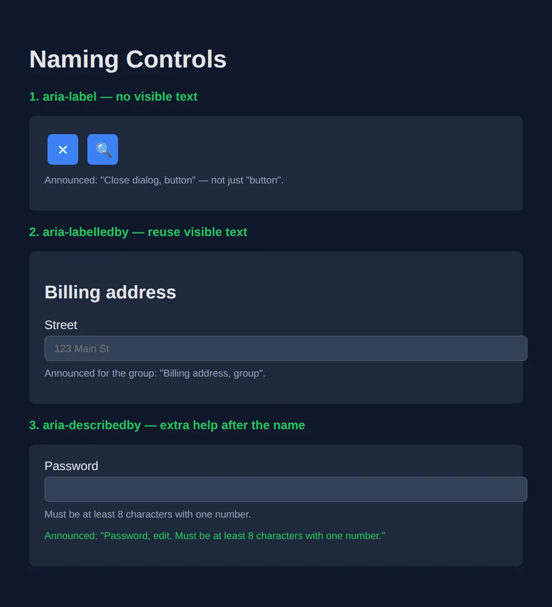
3. Common States: aria-expanded, aria-hidden & aria-current
States communicate what's happening right now. The three you'll reach for most:
- aria-expanded — is this menu/accordion open? Flip it with JavaScript on each toggle.
- aria-hidden="true" — hide decorative content from screen readers. Never put it on anything focusable.
- aria-current="page" — mark the current item in a nav, pagination, or breadcrumb.
<!DOCTYPE html>
<html lang="en">
<head>
  <meta charset="UTF-8">
  <title>ARIA States</title>
  <style>
    body { background:#0f172a; color:#e5e7eb; font-family:system-ui, sans-serif; padding:30px; }
    .disclosure { background:#334155; color:#fff; border:none; padding:10px 16px;
                  border-radius:6px; cursor:pointer; font-size:15px; }
    .panel { background:#1e293b; padding:14px; border-radius:6px; margin-top:8px; }
    nav a { color:#94a3b8; text-decoration:none; margin-right:16px; }
    nav a[aria-current="page"] { color:#22c55e; font-weight:700; border-bottom:2px solid #22c55e; }
    .note { color:#94a3b8; font-size:13px; margin-top:8px; }
    code { background:#334155; padding:2px 6px; border-radius:4px; font-size:13px; }
    h3 { color:#22c55e; margin:22px 0 8px; }
  </style>
</head>
<body>
  <h1>Showing State</h1>

  <h3>aria-expanded — disclosure</h3>
  <!-- aria-expanded mirrors whether the panel is visible; we flip it on each click -->
  <button class="disclosure" aria-expanded="false" aria-controls="more"
          onclick="toggle(this)">
    Show details
  </button>
  <div id="more" class="panel" hidden>Here are the extra details.</div>

  <h3>aria-hidden — decorative icon</h3>
  <!-- The star is decoration; aria-hidden stops the reader saying "star" pointlessly -->
  <p><span aria-hidden="true">⭐</span> Top rated product</p>

  <h3>aria-current — current page</h3>
  <nav aria-label="Main">
    <a href="#">Home</a>
    <a href="#" aria-current="page">Pricing</a>  <!-- announced "current page" -->
    <a href="#">About</a>
  </nav>

  <script>
    function toggle(btn) {
      var open = btn.getAttribute('aria-expanded') === 'true';
      btn.setAttribute('aria-expanded', String(!open));  // "true" when open
      document.getElementById('more').hidden = open;      // show / hide panel
      btn.textContent = open ? 'Show details' : 'Hide details';
    }
  </script>
  <!-- ✅ Expected result, measured in a real browser:
     .disclosure -> cursor: pointer
     nav a -> text-decoration-line: none
  -->
</body>
</html>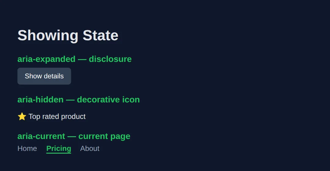
4. Live Regions — Announcing Dynamic Content
When content changes without a page reload — a "saved" toast, a form error, a cart count — sighted users see it, but a screen reader stays silent unless you mark the container as a live region. Use aria-live="polite" for routine updates and aria-live="assertive" (or role="alert") for urgent errors that should interrupt.
<!DOCTYPE html>
<html lang="en">
<head>
  <meta charset="UTF-8">
  <title>Live Regions</title>
  <style>
    body { background:#0f172a; color:#e5e7eb; font-family:system-ui, sans-serif; padding:30px; }
    button { background:#3b82f6; color:#fff; border:none; padding:10px 18px; border-radius:6px;
             cursor:pointer; font-size:14px; margin:5px 0; }
    .status { background:#14532d; border:1px solid #22c55e; padding:12px; border-radius:6px; margin-top:10px; }
    .alert  { background:#7f1d1d; border:1px solid #ef4444; padding:12px; border-radius:6px; margin-top:10px; }
    h3 { color:#22c55e; margin:22px 0 8px; }
    code { background:#334155; padding:2px 6px; border-radius:4px; font-size:13px; }
  </style>
</head>
<body>
  <h1>Dynamic Announcements</h1>

  <h3>aria-live="polite" — announced when the reader is idle</h3>
  <button onclick="save()">Save form</button>
  <!-- The region exists in the DOM up front; we only change its TEXT later -->
  <div id="saved" class="status" aria-live="polite"></div>

  <h3>role="alert" — interrupts immediately (implicitly assertive)</h3>
  <button onclick="fail()">Submit (triggers error)</button>
  <div id="err" class="alert" role="alert"></div>

  <h3>role="status" — polite shortcut for counters</h3>
  <p>Items in cart: <span role="status" id="count">0</span></p>
  <button onclick="add()">Add to cart</button>

  <script>
    function save() {
      // Changing text inside a live region triggers the announcement
      document.getElementById('saved').textContent = '✅ Saved at ' + new Date().toLocaleTimeString();
    }
    function fail() {
      document.getElementById('err').textContent = '⚠️ Email address is required.';
    }
    function add() {
      var c = document.getElementById('count');
      c.textContent = parseInt(c.textContent, 10) + 1;  // role=status announces the new number
    }
  </script>
  <!-- ✅ Expected result, measured in a real browser:
     button -> cursor: pointer
     .status -> padding-top: 12px
  -->
</body>
</html>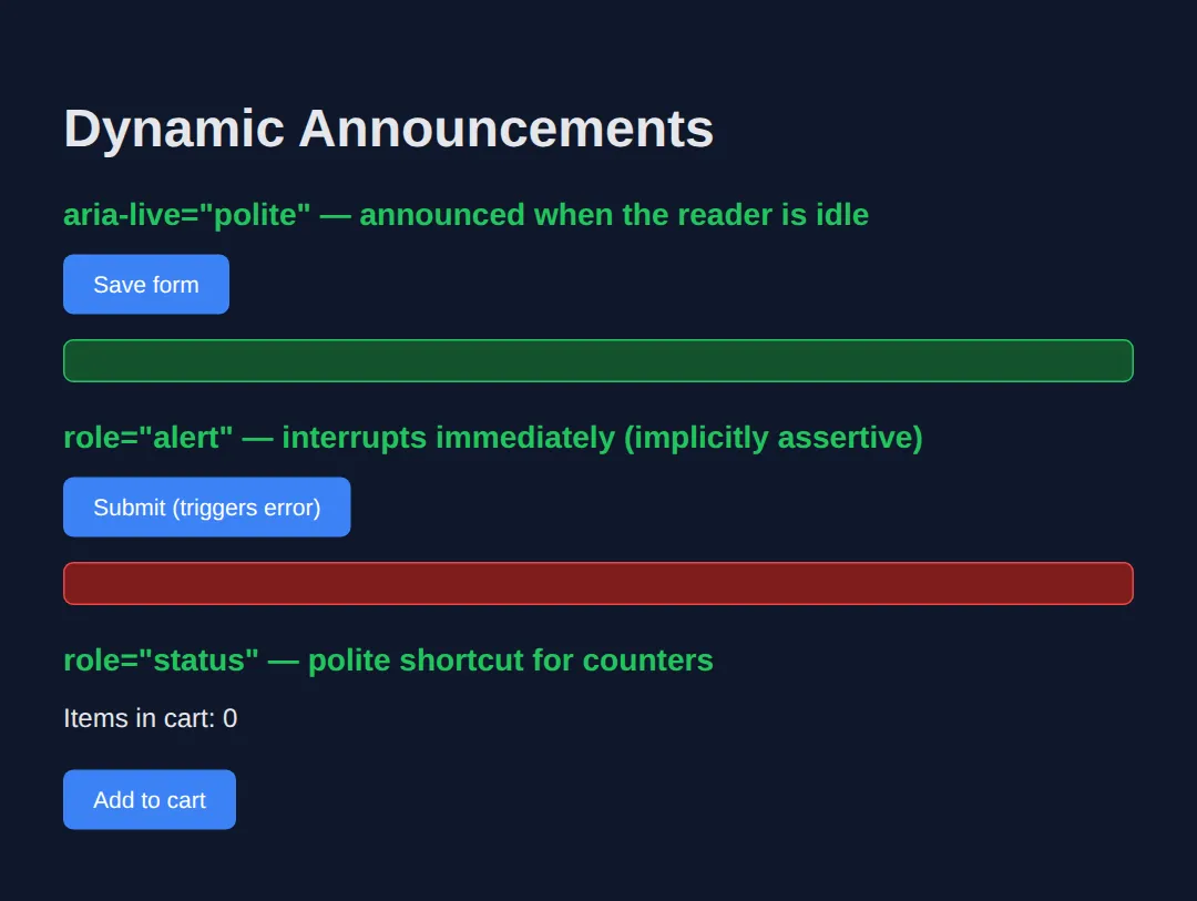
5. Roles for Custom Widgets: Tabs & Menus
Some widgets — tabs, menus, sliders — have no native HTML element. Here ARIA earns its keep: you build the structure from <div>s, then describe it with a coordinated set of roles and states (a "design pattern"). A tab set needs role="tablist", role="tab" with aria-selected, and role="tabpanel".
<!DOCTYPE html>
<html lang="en">
<head>
  <meta charset="UTF-8">
  <title>Accessible Tabs</title>
  <style>
    body { background:#0f172a; color:#e5e7eb; font-family:system-ui, sans-serif; padding:30px; }
    [role="tablist"] { display:flex; gap:4px; border-bottom:1px solid #334155; }
    [role="tab"] { background:none; color:#94a3b8; border:none; padding:10px 16px;
                   cursor:pointer; font-size:15px; }
    [role="tab"][aria-selected="true"] { color:#22c55e; border-bottom:2px solid #22c55e; }
    [role="tabpanel"] { background:#1e293b; padding:16px; border-radius:0 0 6px 6px; }
    code { background:#334155; padding:2px 6px; border-radius:4px; font-size:13px; }
  </style>
</head>
<body>
  <h1>Settings</h1>

  <!-- tablist groups the tabs; each tab CONTROLS its panel via aria-controls -->
  <div role="tablist" aria-label="Settings sections">
    <button role="tab" id="t1" aria-selected="true"  aria-controls="p1" onclick="pick('1')">Profile</button>
    <button role="tab" id="t2" aria-selected="false" aria-controls="p2" onclick="pick('2')">Privacy</button>
  </div>

  <!-- Each panel names itself with the tab that owns it (aria-labelledby) -->
  <div role="tabpanel" id="p1" aria-labelledby="t1">Your profile settings.</div>
  <div role="tabpanel" id="p2" aria-labelledby="t2" hidden>Your privacy settings.</div>

  <script>
    function pick(n) {
      ['1','2'].forEach(function(i) {
        var selected = i === n;
        // aria-selected is the STATE the reader announces for each tab
        document.getElementById('t' + i).setAttribute('aria-selected', String(selected));
        document.getElementById('p' + i).hidden = !selected;
      });
    }
  </script>
  <!-- ✅ Expected result, measured in a real browser:
     [role="tablist"] -> display: flex
     [role="tab"] -> cursor: pointer
  -->
</body>
</html>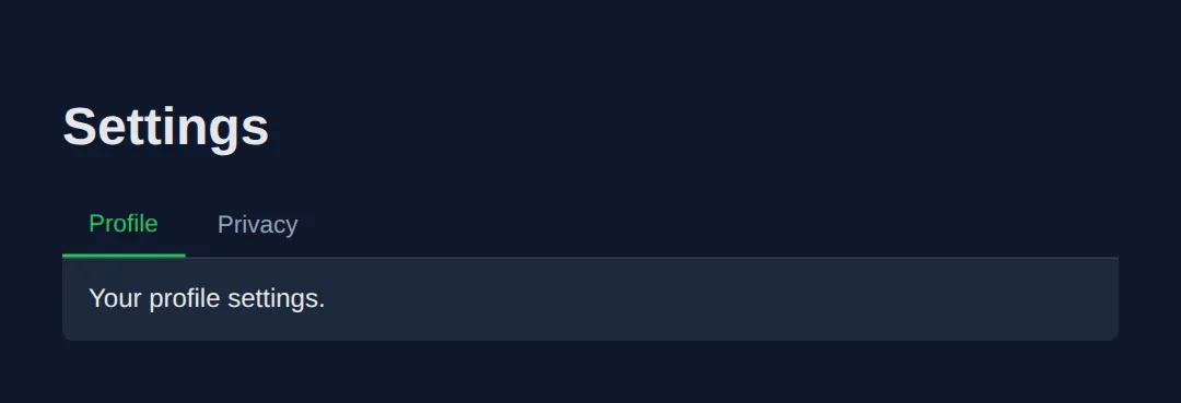
🎯 Your Turn #1 — Name the Icon Buttons
These icon-only buttons are silent to a screen reader. Add an accessible name to each by filling in the blanks. One concept, one minute.
<!DOCTYPE html>
<html lang="en">
<head>
  <meta charset="UTF-8">
  <title>Your Turn — Labels</title>
  <style>
    body { background:#0f172a; color:#e5e7eb; font-family:system-ui, sans-serif; padding:30px; }
    button { background:#3b82f6; color:#fff; border:none; width:44px; height:44px;
             border-radius:6px; cursor:pointer; font-size:20px; margin:6px; }
  </style>
</head>
<body>
  <h1>Toolbar</h1>

  <!-- 🎯 YOUR TURN — replace each ___ with a clear aria-label -->

  <!-- 1) This trash icon deletes the item -->
  <button aria-label="___">🗑️</button>     <!-- 👉 e.g. aria-label="Delete item" -->

  <!-- 2) This pencil icon edits the item -->
  <button aria-label="___">✏️</button>     <!-- 👉 name what it DOES, not the emoji -->

  <!-- 3) This printer icon prints the page -->
  <button aria-label="___">🖨️</button>     <!-- 👉 keep it short, e.g. "Print" -->

  <!--
    ✅ Expected: a screen reader announces "Delete item, button",
       "Edit item, button", "Print, button" — never just "button".
  -->
</body>
</html>
🎯 Your Turn #2 — Wire Up aria-expanded
This "Read more" disclosure shows and hides a panel, but the screen reader never learns whether it's open. Add the missing state and keep it in sync.
<!DOCTYPE html>
<html lang="en">
<head>
  <meta charset="UTF-8">
  <title>Your Turn — Expanded</title>
  <style>
    body { background:#0f172a; color:#e5e7eb; font-family:system-ui, sans-serif; padding:30px; }
    button { background:#334155; color:#fff; border:none; padding:10px 16px;
             border-radius:6px; cursor:pointer; font-size:15px; }
    .panel { background:#1e293b; padding:14px; border-radius:6px; margin-top:8px; }
  </style>
</head>
<body>
  <h1>FAQ</h1>

  <!-- 🎯 YOUR TURN — fill in the three blanks -->

  <!-- 1) Start the button collapsed: aria-expanded should be "false" -->
  <button id="toggle" aria-expanded="___" aria-controls="answer" onclick="open()">
    Read more
  </button>
  <div id="answer" class="panel" hidden>ARIA makes custom widgets understandable.</div>

  <script>
    function open() {
      var btn = document.getElementById('toggle');
      var isOpen = btn.getAttribute('aria-expanded') === 'true';

      // 2) Set aria-expanded to the OPPOSITE of isOpen (as a string)
      btn.setAttribute('aria-expanded', String(___));

      // 3) Show the panel when opening, hide it when closing
      document.getElementById('answer').hidden = ___;

      btn.textContent = isOpen ? 'Read more' : 'Read less';
    }
  </script>

  <!--
    ✅ Expected: closed reads "Read more, collapsed"; after a click it reads
       "Read less, expanded" and the panel is visible.
    Hints: 1) "false"   2) !isOpen   3) isOpen
  -->
</body>
</html>
🧩 Mini-Challenge — Accessible "Saved" Toast
Support is faded now — only an outline is given. Build a button that, when clicked, makes a live region announce that the form was saved. Use what you learned in Section 4.
<!DOCTYPE html>
<html lang="en">
<head>
  <meta charset="UTF-8">
  <title>Mini-Challenge — Toast</title>
  <style>
    body { background:#0f172a; color:#e5e7eb; font-family:system-ui, sans-serif; padding:30px; }
    button { background:#22c55e; color:#0f172a; border:none; padding:10px 18px;
             border-radius:6px; cursor:pointer; font-weight:600; }
    .toast { background:#14532d; border:1px solid #22c55e; padding:12px;
             border-radius:6px; margin-top:12px; min-height:20px; }
  </style>
</head>
<body>
  <h1>Newsletter Settings</h1>

  <!-- 🧩 MINI-CHALLENGE
       1. Add a <button> labelled "Save" that calls save() on click.
       2. Add an empty <div id="toast" class="toast"> that is a POLITE live region
          (hint: aria-live="polite") so a screen reader announces text changes.
       3. In save(), set the toast's textContent to "Settings saved." with the time.

       ✅ Expected: clicking Save makes the screen reader announce
          "Settings saved." without any page reload.
  -->

  <!-- your HTML here -->

  <script>
    function save() {
      // your code here
    }
  </script>
</body>
</html>
⚠️ Common Errors (and the Fix)
- Redundant ARIA on semantic elements. <button role="button"> or <nav role="navigation"> repeat a role the element already has — and some redundant roles actively suppress native behaviour. Fix: drop the role; the native element already carries it.
- aria-hidden on a focusable element. Putting aria-hidden="true" on (or around) a link or button creates a "ghost" stop — keyboard users Tab to it but screen readers say nothing. Fix: never hide focusable content; if it must be hidden, remove it from the tab order too (e.g. with the hidden attribute or tabindex="-1" plus removal).
- Wrong or invented roles. role="text" on a heading, or role="button" on something that scrolls, lies to the user about what the element does. Fix: use a real role from the ARIA spec that matches the actual behaviour — or a native element instead.
- aria-label ignored on a non-interactive element. Browsers often drop aria-label on a plain <span> or <div> with no role. Fix: put labels on elements that take a name (buttons, links, inputs, or things with a widget/landmark role).
📋 ARIA Quick Reference
| Attribute / role | Kind | What it does |
|---|---|---|
| aria-label | Property | Sets the accessible name directly (no visible text) |
| aria-labelledby | Property | Names an element from another element's id |
| aria-describedby | Property | Adds help text spoken after the name |
| aria-expanded | State | Whether a disclosure / menu is open |
| aria-hidden | State | Hides decorative content from screen readers |
| aria-current | State | Marks the current item (page, step, date) |
| aria-live | Property | "polite" or "assertive" — announce changes |
| role="alert" | Role | Assertive live region for urgent errors |
| role="tablist"/"tab"/"tabpanel" | Role | Structure for a custom tab widget |
💡 Pro tip: before adding any of these, ask "is there a native element that already does this?" — the answer is usually yes.
🎉 Lesson Complete
You can now add ARIA the way pros do — sparingly and correctly:
- ✅ Native HTML first — ARIA changes the label, never the behaviour
- ✅ Name controls with aria-label / aria-labelledby, add hints with aria-describedby
- ✅ Track conditions with aria-expanded, aria-hidden and aria-current
- ✅ Announce dynamic updates through aria-live regions
- ✅ Reach for widget roles (tabs, menus) only when no native element fits
Practice quiz
In ARIA terms, what does a 'role' describe?
- A condition that changes as the user interacts
- The accessible name spoken by a screen reader
- What an element IS, like role="tab" or role="alert"
- The keyboard behaviour of a custom widget
Answer: What an element IS, like role="tab" or role="alert". A role tells assistive technology what a thing is. States change at runtime; properties set fixed characteristics.
What is 'the first rule of ARIA'?
- Don't use ARIA — prefer a native HTML element when one fits
- Always add a role to every element
- Put aria-hidden on every decorative element
- Use aria-label on every div
Answer: Don't use ARIA — prefer a native HTML element when one fits. Native elements like button and nav carry the correct role and behaviour for free; ARIA only changes the spoken label, not behaviour.
When should you use aria-label rather than aria-labelledby?
- When the name already exists as visible text on the page
- Only on non-interactive span elements
- Whenever you need to add help text after the name
- When there is no visible text, such as an icon-only button
Answer: When there is no visible text, such as an icon-only button. aria-label types the name directly and is used when there is no visible text. aria-labelledby points at existing visible text by id.
What does aria-hidden="true" do?
- Removes the element from keyboard focus order
- Removes the element and its children from the accessibility tree
- Disables the element so it cannot be clicked
- Hides the element visually with display: none
Answer: Removes the element and its children from the accessibility tree. It removes content from the accessibility tree so screen readers skip it, but it does NOT remove the element from keyboard focus.
Why must you never put aria-hidden="true" on a focusable element?
- Keyboard users can still Tab to it while screen readers stay silent, creating a confusing dead spot
- It would make the element visually invisible
- It automatically deletes the element from the DOM
- It changes the element's role to presentation
Answer: Keyboard users can still Tab to it while screen readers stay silent, creating a confusing dead spot. aria-hidden does not affect focus, so a focusable element inside it becomes a 'ghost' stop a keyboard user reaches but the reader cannot announce.
Which attribute announces dynamic content updates without a page reload?
- aria-label
- aria-expanded
- aria-live
- aria-current
Answer: aria-live. A live region uses aria-live (or role="status"/role="alert") so changes to its content are announced automatically.
Which aria-live value is used for urgent errors that must interrupt the user?
- polite
- assertive
- off
- passive
Answer: assertive. aria-live="assertive" (or role="alert") interrupts immediately; aria-live="polite" waits until the reader is idle.
Which state attribute reports whether a disclosure or menu is currently open?
- aria-current
- aria-haspopup
- aria-describedby
- aria-expanded
Answer: aria-expanded. aria-expanded mirrors open/closed and is flipped between "true" and "false" with JavaScript on each toggle.
If you build a custom toggle as a div role="button", what must you still add by hand?
- Nothing — the role provides all behaviour
- tabindex and JavaScript to respond to Enter and Space
- Only a CSS background colour
- An aria-live region
Answer: tabindex and JavaScript to respond to Enter and Space. ARIA roles only change the spoken label. A div role="button" needs tabindex="0" and key handlers — which is why native button is preferred.
Which set of roles correctly structures an accessible custom tab widget?
- role="menu", role="menuitem", role="group"
- role="navigation", role="link", role="region"
- role="tablist", role="tab", role="tabpanel"
- role="grid", role="row", role="cell"
Answer: role="tablist", role="tab", role="tabpanel". A tab set uses role="tablist" containing role="tab" buttons (with aria-selected) and matching role="tabpanel" panels.
Continue this course
- Previous: Advanced HTML5 Semantic Architecture
- Next: Mastering Complex Forms & Validation Patterns — Build multi-step forms, custom validation, and error states
- Quick reference: HTML & CSS cheat sheet
Frequently asked questions
What is the difference between a role, a state, and a property in ARIA?
A role tells assistive tech what a thing IS (role="tab", role="alert"). A state describes a condition that changes as the user interacts (aria-expanded, aria-checked, aria-hidden). A property describes a fixed characteristic that rarely changes (aria-label, aria-labelledby, aria-haspopup). Roles and properties are usually set once; states are updated with JavaScript.
Why is 'the first rule of ARIA: don't use ARIA' the most important rule?
Native HTML elements like <button>, <nav>, <a href> and <input> already carry the correct role, keyboard behaviour, and focus handling for free. ARIA changes only how a screen reader describes an element — it adds zero behaviour. So a <div role="button"> still needs you to wire up Tab focus, Enter/Space keys, and a focus ring by hand, and most people forget at least one. Reaching for the native element is less code and fewer bugs.
When should I use aria-label versus aria-labelledby?
Use aria-label when there is NO visible text to name the element — for example an icon-only button (aria-label="Close"). Use aria-labelledby when the name already exists as visible text somewhere on the page; you point it at that element's id so the name stays in sync. If both are present, aria-labelledby wins.
What does aria-hidden="true" do, and what is the trap?
aria-hidden="true" removes an element and all its children from the accessibility tree, so screen readers skip it — useful for decorative icons. The trap: it does NOT remove the element from keyboard focus. If you hide a container that holds a focusable button, a keyboard user can still Tab to a button that screen readers cannot announce — a confusing dead spot. Never put aria-hidden on, or around, anything focusable.
What is an aria-live region and when do I need one?
A live region is an element with aria-live (or role="status"/role="alert") that tells the screen reader to announce changes to its content automatically. You need one whenever content updates without a page reload — form errors, search-result counts, 'saved' toasts. Use aria-live="polite" for non-urgent updates and aria-live="assertive" (or role="alert") for errors that must interrupt.
Do I still need to handle the keyboard if I add a role to a div?
Yes. ARIA roles only change the spoken label — they add no behaviour. A <div role="button"> needs tabindex="0" to be focusable and JavaScript to respond to Enter and Space. This is exactly why native <button> is preferred: it does all of that automatically.