Mastering Complex Forms & Validation
Reviewed & published by Brayan K
Complex HTML forms group related inputs with <fieldset> and <label> for accessibility and use built-in constraint validation attributes like required, pattern, and type to check user input in the browser before it is ever submitted.
Part of the free HTML & CSS course at LearnCodingFast — hands-on lessons with examples you run in your browser, plus practice exercises and a quick quiz.
By the end of this lesson you can build a structured, fully accessible form that validates itself with native HTML — no JavaScript required — and shows clear, friendly errors.
What You'll Learn
Before you start: you should be comfortable with basic form elements (<input>, <select>, <button>) and CSS selectors. If labels and inputs feel new, revisit Accessibility & ARIA first.
💡 Think of It Like This
Picture a paper job application. It is split into boxed sections — Personal Info, Education, References — and each box has a heading. In a web form, the box is a <fieldset> and the heading is its <legend>.
Each blank line has a printed name beside it ("Email:") so you know what to write — that is the <label>. And before HR accepts the form, they check the rules: this field is required, this one must look like an email. That HR check is native HTML validation — built into the browser, running before anything is sent.
1. Structure: fieldset, legend, and real labels
A good form is grouped and labelled before it is styled. Wrap related fields in a <fieldset> and give the group a name with <legend>. Then connect every input to a <label> by matching the label's for to the input's id. Now clicking the label focuses the field, and screen readers read the label aloud.
<!DOCTYPE html>
<html lang="en">
<head>
  <meta charset="UTF-8">
  <title>Form Structure</title>
  <style>
    body { background:#0f172a; color:#e5e7eb; font-family: system-ui, sans-serif; padding:24px; }
    form { max-width:420px; margin:0 auto; }

    /* A fieldset draws a labelled box around a group of fields */
    fieldset {
      border:1px solid #334155;   /* the box outline */
      border-radius:8px;
      padding:18px;
      margin-bottom:18px;
    }
    /* legend = the heading that sits on the fieldset's border */
    legend { color:#3b82f6; font-weight:bold; padding:0 6px; }

    /* Labels on their own line read more clearly */
    label { display:block; margin-bottom:4px; font-size:14px; color:#94a3b8; }

    input, select {
      width:100%; padding:10px; border-radius:6px;
      background:#1e293b; border:1px solid #334155; color:#fff;
    }
    .field { margin-bottom:14px; }
  </style>
</head>
<body>
  <form>
    <fieldset>
      <legend>Contact details</legend>

      <div class="field">
        <!-- for="name" points at the input id="name" below -->
        <label for="name">Full name</label>
        <input id="name" type="text">
        <!-- Click the word "Full name" — the box focuses. That link is what makes it accessible. -->
      </div>

      <div class="field">
        <label for="email">Email</label>
        <input id="email" type="email">
      </div>
    </fieldset>
  </form>
  <!-- ✅ Expected result, measured in a real browser:
     label -> display: block
     form -> max-width: 420px
     .field -> count: 2
  -->
</body>
</html>
2. Native validation: let the browser check the input
You do not need JavaScript to enforce basic rules. Attributes like required, type="email", minlength, and pattern are read by the browser. When the user submits, the browser blocks the form and points at the first field that breaks a rule — for free, in every language.
<!DOCTYPE html>
<html lang="en">
<head>
  <meta charset="UTF-8">
  <title>Native Validation</title>
  <style>
    body { background:#0f172a; color:#e5e7eb; font-family: system-ui, sans-serif; padding:24px; }
    form { max-width:420px; margin:0 auto; }
    label { display:block; margin-bottom:4px; font-size:14px; color:#94a3b8; }
    input { width:100%; padding:10px; border-radius:6px; background:#1e293b; border:1px solid #334155; color:#fff; }
    .field { margin-bottom:14px; }
    button { width:100%; padding:12px; border:none; border-radius:6px; background:#3b82f6; color:#fff; font-weight:600; cursor:pointer; }
  </style>
</head>
<body>
  <form>
    <div class="field">
      <label for="u">Username</label>
      <!-- required = cannot be empty; minlength = at least 3 characters -->
      <input id="u" type="text" required minlength="3">
    </div>

    <div class="field">
      <label for="e">Email</label>
      <!-- type="email" makes the browser check for the name@domain shape -->
      <input id="e" type="email" required>
    </div>

    <div class="field">
      <label for="z">UK postcode</label>
      <!-- pattern = a regular expression the value must match -->
      <input id="z" type="text" pattern="[A-Za-z0-9 ]{5,8}" placeholder="SW1A 1AA">
    </div>

    <button type="submit">Submit</button>
    <!-- Press Submit with empty/short fields: the browser stops you and shows why. -->
  </form>
  <!-- ✅ Expected result, measured in a real browser:
     label -> display: block
     button -> cursor: pointer
     .field -> count: 3
  -->
</body>
</html>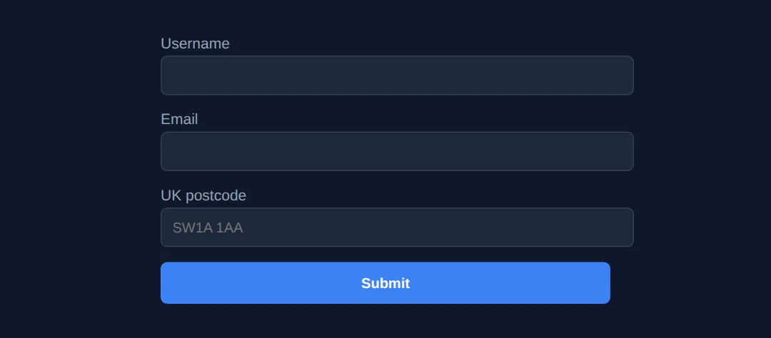
3. Style the states: :valid, :invalid, and a visible focus ring
Validation feels alive when the field reacts. The :valid and :invalid pseudo-classes let CSS colour the border green or red. Guard them with :not(:placeholder-shown) so you do not flash red before the user has typed. And never remove the focus ring without replacing it — a visible :focus style is essential for keyboard users. The autocomplete attribute lets browsers and password managers fill fields in one tap.
<!DOCTYPE html>
<html lang="en">
<head>
  <meta charset="UTF-8">
  <title>State Styling</title>
</head>
<body>
  <form>
    <div class="field">
      <label for="email">Email <span class="req">*</span></label>
      <!-- placeholder is needed so :not(:placeholder-shown) can detect "untouched" -->
      <input id="email" type="email" required autocomplete="email" placeholder="[email protected]">
    </div>

    <div class="field">
      <label for="pwd">Password <span class="req">*</span></label>
      <input id="pwd" type="password" required minlength="8"
             autocomplete="new-password" placeholder="At least 8 characters">
    </div>

    <button type="submit">Create account</button>
  </form>
</body>
</html>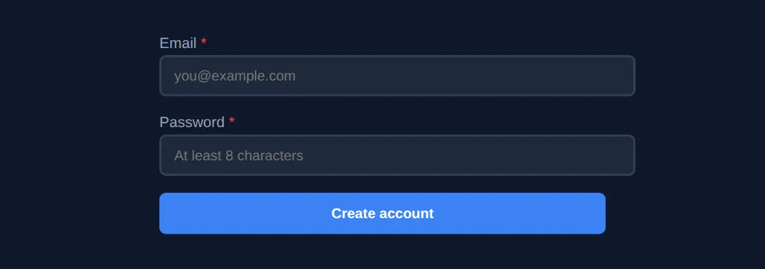
4. Worked Example: a complete, accessible registration form
Here is everything together: grouped fieldsets, linked labels, native validation, styled states, autocomplete, and a custom error message wired up with aria-describedby and role="alert" so screen readers announce it. Read the comments, run it, then break a rule on purpose to watch it respond.
<!DOCTYPE html>
<html lang="en">
<head>
  <meta charset="UTF-8">
  <title>Accessible Registration</title>
  <style>
    * { box-sizing:border-box; margin:0; padding:0; }
    body { background:#0f172a; color:#e5e7eb; font-family: system-ui, sans-serif; padding:30px; }
    form { max-width:460px; margin:0 auto; }
    h1 { text-align:center; margin-bottom:20px; }

    fieldset { border:1px solid #334155; border-radius:8px; padding:18px; margin-bottom:18px; }
    legend { color:#3b82f6; font-weight:bold; font-size:1.05rem; padding:0 8px; }

    .field { margin-bottom:14px; }
    label { display:block; margin-bottom:4px; font-size:14px; color:#94a3b8; }
    .req { color:#ef4444; }

    input, select {
      width:100%; padding:10px 12px; border-radius:6px;
      background:#1e293b; border:2px solid #334155; color:#fff; font-size:14px;
      transition:border-color .2s, box-shadow .2s;
    }
    input:focus, select:focus {
      outline:none; border-color:#3b82f6; box-shadow:0 0 0 3px rgba(59,130,246,.35);
    }
    input:not(:placeholder-shown):valid   { border-color:#22c55e; }
    input:not(:placeholder-shown):invalid { border-color:#ef4444; }

    .help  { font-size:12px; color:#64748b; margin-top:4px; }
    /* The custom error: hidden by default, shown only when the field is invalid */
    .error { font-size:12px; color:#ef4444; margin-top:4px; display:none; }
    input:not(:placeholder-shown):invalid ~ .error { display:block; }

    button { width:100%; padding:12px; border:none; border-radius:6px;
             background:#3b82f6; color:#fff; font-weight:600; font-size:16px; cursor:pointer; margin-top:6px; }
    button:hover { background:#2563eb; }
  </style>
</head>
<body>
  <h1>📝 Create your account</h1>
  <form>
    <fieldset>
      <legend>Personal information</legend>

      <div class="field">
        <label for="name">Full name <span class="req">*</span></label>
        <input id="name" type="text" required minlength="2"
               autocomplete="name" placeholder="Jane Doe">
        <p class="help">At least 2 characters.</p>
      </div>

      <div class="field">
        <label for="email">Email <span class="req">*</span></label>
        <!-- aria-describedby links the error text to this input for screen readers -->
        <input id="email" type="email" required
               autocomplete="email" placeholder="[email protected]"
               aria-describedby="email-error">
        <!-- role="alert" makes screen readers announce it the moment it appears -->
        <span id="email-error" class="error" role="alert">Please enter a valid email address.</span>
      </div>
    </fieldset>

    <fieldset>
      <legend>Security</legend>
      <div class="field">
        <label for="pwd">Password <span class="req">*</span></label>
        <input id="pwd" type="password" required minlength="8"
               autocomplete="new-password" placeholder="At least 8 characters">
        <p class="help">8 or more characters.</p>
      </div>
    </fieldset>

    <button type="submit">Create account</button>
    <!-- Try: leave email blank, or type "abc" — the border turns red and the alert shows. -->
  </form>
  <!-- ✅ Expected result, measured in a real browser:
     label -> display: block
     .error -> display: none
     button -> cursor: pointer
     .field -> count: 3
  -->
</body>
</html>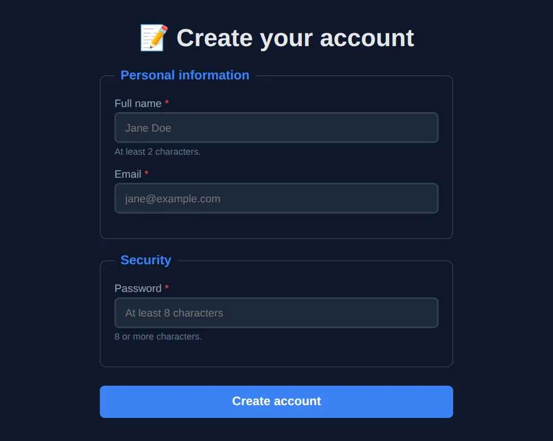
🎯 Your Turn #1 — add the missing validation
This form has the structure but no rules. Fill in the blanks marked ___ so the browser checks each field. The comments tell you what to add.
<!DOCTYPE html>
<html lang="en">
<head>
  <meta charset="UTF-8">
  <title>Your Turn — Validation</title>
  <style>
    body { background:#0f172a; color:#e5e7eb; font-family: system-ui, sans-serif; padding:24px; }
    form { max-width:420px; margin:0 auto; }
    label { display:block; margin-bottom:4px; font-size:14px; color:#94a3b8; }
    input { width:100%; padding:10px; border-radius:6px; background:#1e293b; border:2px solid #334155; color:#fff; }
    input:not(:placeholder-shown):valid   { border-color:#22c55e; }
    input:not(:placeholder-shown):invalid { border-color:#ef4444; }
    .field { margin-bottom:14px; }
    button { width:100%; padding:12px; border:none; border-radius:6px; background:#3b82f6; color:#fff; font-weight:600; cursor:pointer; }
  </style>
</head>
<body>
  <!-- 🎯 YOUR TURN — fill in the blanks marked ___ -->
  <form>
    <div class="field">
      <label for="user">Username</label>
      <!-- 👉 Make this field mandatory and at least 3 characters long -->
      <input id="user" type="text" ___ minlength="___" placeholder="your name">
    </div>

    <div class="field">
      <label for="mail">Email</label>
      <!-- 👉 Set the type so the browser checks the email shape, and make it required -->
      <input id="mail" type="___" ___ placeholder="[email protected]">
    </div>

    <div class="field">
      <label for="age">Age</label>
      <!-- 👉 Use a number input that only allows 18 to 120 -->
      <input id="age" type="number" min="___" max="___" placeholder="18">
    </div>

    <button type="submit">Sign up</button>
  </form>

  <!-- ✅ Expected: empty/short username, bad email, or age 17 -> field turns RED
       and Submit is blocked. Valid values turn the border GREEN. -->
</body>
</html>
🎯 Your Turn #2 — connect the labels
These inputs work, but the labels are not linked — clicking a label does nothing and screen readers stay silent. Add the matching for and id values so each label points at its input.
<!DOCTYPE html>
<html lang="en">
<head>
  <meta charset="UTF-8">
  <title>Your Turn — Labels</title>
  <style>
    body { background:#0f172a; color:#e5e7eb; font-family: system-ui, sans-serif; padding:24px; }
    form { max-width:420px; margin:0 auto; }
    label { display:block; margin-bottom:4px; font-size:14px; color:#94a3b8; cursor:pointer; }
    input { width:100%; padding:10px; border-radius:6px; background:#1e293b; border:1px solid #334155; color:#fff; }
    .field { margin-bottom:14px; }
  </style>
</head>
<body>
  <!-- 🎯 YOUR TURN — link each label to its input -->
  <form>
    <div class="field">
      <!-- 👉 point this label at the input by setting for="firstName" -->
      <label for="___">First name</label>
      <!-- 👉 give this input id="firstName" -->
      <input id="___" type="text">
    </div>

    <div class="field">
      <!-- 👉 do the same here using "phone" -->
      <label for="___">Phone</label>
      <input id="___" type="tel" autocomplete="tel">
    </div>
  </form>

  <!-- ✅ Expected: clicking the word "First name" or "Phone" focuses the box below it. -->
</body>
</html>
🚀 Mini-Challenge — a newsletter signup (support faded)
Now build one from an outline. No blanks to fill — just a brief and an empty form. Use what you learned: a fieldset, linked labels, native validation, and a styled focus state.
<!DOCTYPE html>
<html lang="en">
<head>
  <meta charset="UTF-8">
  <title>Mini-Challenge — Newsletter</title>
  <style>
    body { background:#0f172a; color:#e5e7eb; font-family: system-ui, sans-serif; padding:24px; }
    form { max-width:420px; margin:0 auto; }
    /* Add your own styling for labels, inputs, :focus and :valid/:invalid */
  </style>
</head>
<body>
  <!-- 🚀 MINI-CHALLENGE: Newsletter signup
       1. Wrap the form in a <fieldset> with a <legend> "Join the newsletter"
       2. Add a Name field: <label for/id>, required, minlength 2
       3. Add an Email field: type="email", required, autocomplete="email"
       4. Add a "How often?" <select> with Daily / Weekly / Monthly options
       5. Add a Subscribe <button type="submit">
       6. In CSS: a visible :focus ring, and green/red :valid/:invalid borders
          (remember placeholders so :not(:placeholder-shown) works)

       ✅ Expected: clicking a label focuses its field; submitting empty is blocked;
          valid fields show a green border, invalid show red.
  -->

  <form>
    <!-- your form here -->
  </form>
  <!-- ✅ Expected result, measured in a real browser:
     body -> padding-top: 24px
     form -> max-width: 420px
  -->
</body>
</html>
⚠️ Common Errors (and the fix)
- No label association. A bare <label>Email</label> next to an input is decoration only. Fix: match <label for="email"> to <input id="email"> — now it is clickable and announced.
- Validating only in JavaScript. If your only check lives in a JS submit handler, it breaks when JS fails and is trivially bypassed. Fix: add native attributes ( required, type, pattern) and always re-check on the server.
- Placeholder used as a label. <input placeholder="Email"> with no label means the name vanishes the instant the user types. Fix: keep a real <label>; use the placeholder only as an example hint.
- Inaccessible error messages. A red <div> that only conveys an error by colour is invisible to screen readers and to colour-blind users. Fix: give it role="alert", link it with aria-describedby, and pair colour with text/an icon.
📋 Quick Reference — validation attributes
| Attribute | What it checks | Example |
|---|---|---|
| required | Field must not be empty | <input required> |
| type | Format for email / url / number / tel | type="email" |
| minlength / maxlength | Text length limits | minlength="8" |
| min / max | Number or date range | min="18" max="120" |
| pattern | Value must match a regex | pattern="[0-9]{4}" |
| step | Allowed number increments | step="0.5" |
| autocomplete | Hint for autofill / password managers | autocomplete="email" |
| :valid / :invalid | CSS hook for current state | input:invalid { ... } |
💡 Guard :invalid styles with :not(:placeholder-shown) or :focus so errors appear only after the user engages a field.
🎉 Lesson Complete
You can now build professional, accessible forms:
- ✅ Group related fields with fieldset and legend
- ✅ Link every input to a label with for/id
- ✅ Validate natively with required, type, pattern, minlength
- ✅ Style :valid/:invalid states and a visible focus ring
- ✅ Announce errors accessibly with role="alert" and aria-describedby
Practice quiz
How do you link a <label> to its input so clicking the label focuses the field?
- Match the label's 'id' to the input's 'name'
- Wrap them in a <fieldset>
- Match the label's 'for' to the input's 'id'
- Use the label's 'target' attribute
Answer: Match the label's 'for' to the input's 'id'. Setting the label's for attribute to the input's id links them; clicking the label then focuses the input.
Which element groups related form fields and gives the group a heading?
- <fieldset> and <legend>
- <section> and <h2>
- <div> and <label>
- <group> and <title>
Answer: <fieldset> and <legend>. <fieldset> wraps a group of related fields and <legend> provides the group's accessible heading.
Which attribute makes a field mandatory using native HTML validation?
- mandatory
- validate
- needed
- required
Answer: required. The required attribute prevents submission while the field is empty.
What does type="email" do on an input?
- Hides the text like a password
- Makes the browser check for a name@domain shape
- Limits input to 50 characters
- Encrypts the value
Answer: Makes the browser check for a name@domain shape. type="email" makes the browser validate that the value looks like an email address.
Why should you still validate on the server even with HTML validation?
- HTML validation can be bypassed by the user
- HTML validation is slower
- Servers ignore HTML rules
- HTML validation only works in Chrome
Answer: HTML validation can be bypassed by the user. Client-side validation is a convenience anyone can bypass; the server is the real gate that protects your data.
Which pseudo-class styles an input that currently fails its validation constraints?
- :valid
- :checked
- :invalid
- :required
Answer: :invalid. :invalid matches inputs that fail their constraints; :valid matches ones that pass.
Why guard :invalid styles with :not(:placeholder-shown)?
- To support older browsers
- So errors don't flash red before the user types
- To make the field required
- To hide the placeholder text
Answer: So errors don't flash red before the user types. :not(:placeholder-shown) ensures the red error styling only appears after the user has typed something.
What does the autocomplete attribute (e.g. autocomplete="email") help with?
- Validating the email shape
- Making the field required
- Limiting input length
- Letting browsers and password managers fill the field
Answer: Letting browsers and password managers fill the field. autocomplete tells browsers and password managers what data a field holds so they can fill it correctly.
Which attribute restricts a number input to a range of 18 to 120?
- minlength and maxlength
- min and max
- range and limit
- low and high
Answer: min and max. min and max set the allowed numeric range; minlength/maxlength control text length instead.
How do you make a custom error message announced by screen readers the moment it appears?
- Use a red <div> styled with color
- Put it in the placeholder
- Add role="alert" and link it via aria-describedby
- Use the title attribute
Answer: Add role="alert" and link it via aria-describedby. role="alert" makes screen readers announce it instantly, and aria-describedby links it to the input.
Continue this course
- Previous: Accessibility (A11y) Deep Dive & ARIA Roles
- Next: Advanced Input Types, Sliders, Color Pickers, & Custom Controls — HTML5 input types and styling custom form controls from scratch
- Quick reference: HTML & CSS cheat sheet › HTML Forms
- From the blog: Building Forms with HTML5 and Validation
Frequently asked questions
Why use a <label> instead of just a placeholder?
A placeholder vanishes the moment the user starts typing, so it cannot act as a permanent name for the field. A <label> stays visible, and when it is linked to an input (via for/id) clicking it focuses the field and screen readers announce it. Placeholders are hints, not labels — you need both for an accessible field.
Do I still need server-side validation if HTML and CSS already validate?
Yes, always. HTML validation is a convenience for honest users — it improves the experience but anyone can bypass it by disabling JavaScript or editing the page. Treat client-side validation as the first gate and server-side validation as the real one that protects your database.
What is the difference between :valid and :invalid?
These CSS pseudo-classes reflect whether an input currently passes its validation constraints. An <input required> is :invalid while empty and becomes :valid once filled. Pair them with :not(:placeholder-shown) or :focus so you do not flash red errors before the user has even typed.
How do I show a custom error message instead of the browser default?
Add a <span> with role="alert" next to the field and link it with aria-describedby on the input. You control the text and styling, and because it carries role="alert" screen readers announce it the moment it appears. You can still keep the native constraints for the actual checking.
What does the autocomplete attribute do?
autocomplete tells the browser and password managers what kind of data a field holds — autocomplete="email", autocomplete="new-password", autocomplete="name". This lets users fill forms in one tap and helps password managers save credentials correctly. Standard tokens are far better than guessing from the field name.