Advanced Input Types & Custom Controls
Reviewed & published by Brayan K
HTML5 input types like date, color, range, and email give the browser the right keyboard, picker, and built-in validation for each kind of data, so you write less JavaScript and users get a better experience.
Part of the free HTML & CSS course at LearnCodingFast — hands-on lessons with examples you run in your browser, plus practice exercises and a quick quiz.
💡 Think of It Like This
HTML5 input types are like specialised tools. A text input is a Swiss Army knife — works for everything but nothing perfectly. A type="date" input is a calendar. A type="color" is a paint palette. Using the right input type gives users the best native controls for each data type.
| Input Type | What It Shows | Mobile Keyboard |
|---|---|---|
| range | Slider control | N/A |
| color | Color picker popup | N/A |
| date | Calendar date picker | Date wheel |
| time | Time selector | Time wheel |
| datetime-local | Date + time combined | Date + time |
| search | Searchable text with clear button | Search keyboard |
| tel | Phone number input | Numeric pad |
| url | URL input with validation | .com keyboard |
HTML5 Input Types Gallery
Try every HTML5 input type in one interactive demo.
<!DOCTYPE html>
<html lang="en">
<head>
  <meta charset="UTF-8">
  <title>HTML5 Input Types</title>
  <style>
    * { box-sizing: border-box; margin: 0; padding: 0; }
    body { background: #0f172a; font-family: system-ui, sans-serif; color: #e5e7eb; padding: 30px; }

    .grid {
      display: grid;
      grid-template-columns: repeat(auto-fill, minmax(220px, 1fr));
      gap: 15px;
    }

    .input-card {
      background: #1e293b;
      padding: 15px;
      border-radius: 8px;
    }

    label {
      display: block;
      font-size: 12px;
      color: #3b82f6;
      font-weight: 600;
      text-transform: uppercase;
      letter-spacing: 0.5px;
      margin-bottom: 8px;
    }

    .type-tag {
      font-size: 11px;
      background: #334155;
      padding: 2px 6px;
      border-radius: 4px;
      color: #94a3b8;
    }

    input, select {
      width: 100%;
      padding: 8px 10px;
      background: #334155;
      border: 1px solid #475569;
      border-radius: 6px;
      color: white;
      font-size: 14px;
    }

    input[type="color"] {
      height: 40px;
      padding: 4px;
      cursor: pointer;
    }

    input[type="range"] {
      padding: 0;
      cursor: pointer;
    }

    .output {
      font-size: 12px;
      color: #94a3b8;
      margin-top: 5px;
    }

    h1 { margin-bottom: 20px; }
  </style>
</head>
<body>
  <h1>🎛️ HTML5 Input Types</h1>
  <div class="grid">
    <div class="input-card">
      <label>Range <span class="type-tag">type="range"</span></label>
      <input type="range" min="0" max="100" value="50" oninput="this.nextElementSibling.textContent='Value: '+this.value">
      <p class="output">Value: 50</p>
    </div>

    <div class="input-card">
      <label>Color <span class="type-tag">type="color"</span></label>
      <input type="color" value="#3b82f6" oninput="this.nextElementSibling.textContent=this.value">
      <p class="output">#3b82f6</p>
    </div>

    <div class="input-card">
      <label>Date <span class="type-tag">type="date"</span></label>
      <input type="date">
    </div>

    <div class="input-card">
      <label>Time <span class="type-tag">type="time"</span></label>
      <input type="time">
    </div>

    <div class="input-card">
      <label>DateTime <span class="type-tag">type="datetime-local"</span></label>
      <input type="datetime-local">
    </div>

    <div class="input-card">
      <label>Search <span class="type-tag">type="search"</span></label>
      <input type="search" placeholder="Search...">
    </div>

    <div class="input-card">
      <label>Tel <span class="type-tag">type="tel"</span></label>
      <input type="tel" placeholder="+1 (555) 000-0000">
    </div>

    <div class="input-card">
      <label>URL <span class="type-tag">type="url"</span></label>
      <input type="url" placeholder="https://example.com">
    </div>

    <div class="input-card">
      <label>Number <span class="type-tag">type="number"</span></label>
      <input type="number" min="0" max="999" step="1" value="42">
    </div>

    <div class="input-card">
      <label>Month <span class="type-tag">type="month"</span></label>
      <input type="month">
    </div>

    <div class="input-card">
      <label>Week <span class="type-tag">type="week"</span></label>
      <input type="week">
    </div>

    <div class="input-card">
      <label>With Datalist <span class="type-tag">list="..."</span></label>
      <input list="frameworks" placeholder="Type a framework...">
      <datalist id="frameworks">
        <option value="React">
        <option value="Vue">
        <option value="Angular">
        <option value="Svelte">
        <option value="Solid">
      </datalist>
    </div>
  </div>
  <!-- ✅ Expected result, measured in a real browser:
     .grid -> display: grid
     label -> display: block
     input[type="color"] -> cursor: pointer
     input[type="range"] -> cursor: pointer
     .input-card -> count: 12
  -->
</body>
</html>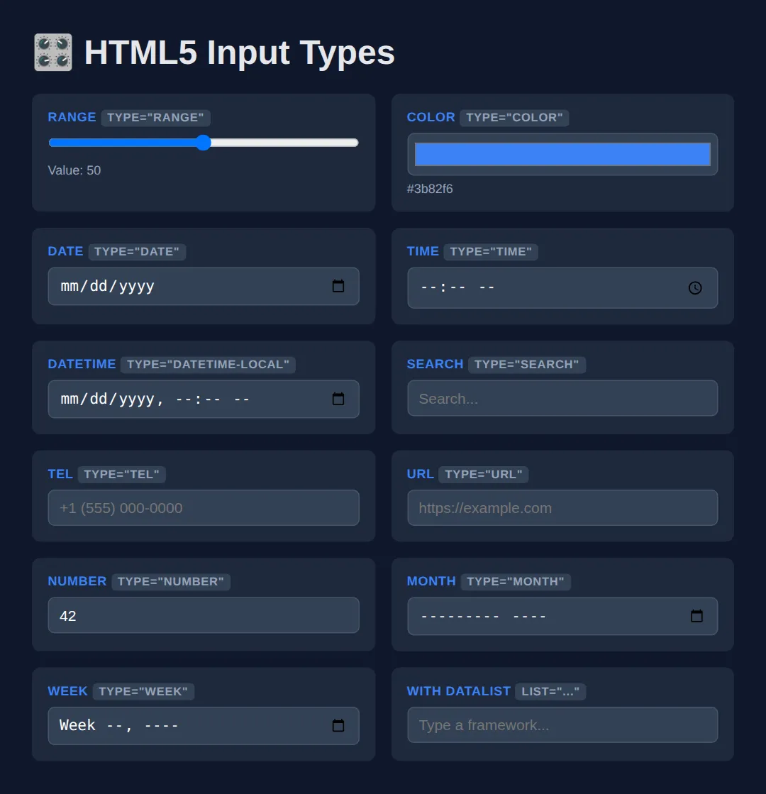
🧠 Worked Example — a form the browser validates for you
The gallery above shows what each type looks like. This example shows what each type does — because the real payoff of picking the right type is that the browser starts checking the data for you, with no JavaScript at all. Read the comments, then run it and try to submit rubbish.
<!DOCTYPE html>
<html lang="en">
<head>
<meta charset="UTF-8">
<title>Worked Example: A form the browser validates</title>
<style>
* { box-sizing: border-box; margin: 0; padding: 0; }
body { background:#0f172a; color:#e5e7eb; font-family:system-ui,sans-serif; padding:24px; }
form { max-width: 420px; background:#1e293b; padding:20px; border-radius:12px; display:grid; gap:14px; }
label { display:block; font-size:.78rem; text-transform:uppercase; letter-spacing:.5px; color:#60a5fa; font-weight:700; margin-bottom:6px; }
input, select { width:100%; padding:9px 10px; background:#334155; border:1px solid #475569; border-radius:6px; color:#fff; font-size:14px; }
input[type="range"] { padding:0; }
/* :user-invalid only kicks in AFTER the person has typed and left the field,
so an untouched empty form is never painted red. (Its older cousin
:invalid turns a required-but-empty field red the moment the page loads,
which reads as "you got it wrong" before they have typed a thing.) */
input:user-invalid { border-color:#ef4444; } /* red once it is genuinely wrong */
input:user-valid { border-color:#22c55e; } /* green once it is genuinely right */
.hint { font-size:.78rem; color:#94a3b8; margin-top:4px; }
button { padding:10px; background:#3b82f6; border:none; border-radius:8px; color:#fff; font-weight:700; font-size:15px; cursor:pointer; }
output { font-weight:700; color:#22c55e; }
</style>
</head>
<body>
<form id="booking">
<div>
<!-- for="email" matches id="email": clicking the label focuses the input,
and screen readers announce the label when the input is focused. -->
<label for="email">Email</label>
<!-- type="email" gives phones the @ keyboard AND makes the browser check
the shape of the address. required means "cannot be left empty". -->
<input id="email" name="email" type="email" required placeholder="[email protected]">
<p class="hint">Try typing "nope" and pressing Tab.</p>
</div>
<div>
<label for="when">Preferred date</label>
<!-- type="date" gives a real calendar picker instead of a text box.
min/max fence the allowed range: dates outside 2026 are rejected. -->
<input id="when" name="when" type="date" required min="2026-01-01" max="2026-12-31">
<p class="hint">Pick 2027 and the browser refuses it.</p>
</div>
<div>
<label for="guests">Guests</label>
<!-- step="1" means whole numbers only; min/max cap it at 1 to 8. -->
<input id="guests" name="guests" type="number" min="1" max="8" step="1" value="2">
</div>
<div>
<!-- <output> is a real HTML element for "a value the page calculated".
for="budget" links it to the input it reports on. -->
<label for="budget">Budget: £<output id="budgetOut" for="budget">60</output></label>
<!-- step="10" means the slider can only ever land on 20, 30, 40 ... 200.
oninput fires on every drag; "this.value" is the slider's new number. -->
<input id="budget" name="budget" type="range" min="20" max="200" step="10" value="60"
oninput="document.getElementById('budgetOut').value = this.value">
</div>
<div>
<label for="city">City</label>
<!-- list="cities" points at the <datalist id="cities"> below: suggestions
appear as you type, but anything else is still allowed. -->
<input id="city" name="city" type="text" list="cities" placeholder="Start typing...">
<datalist id="cities">
<option value="Bristol"></option>
<option value="Leeds"></option>
<option value="Manchester"></option>
</datalist>
</div>
<button type="submit">Request booking</button>
</form>
<!-- ✅ What you should see when you run it and try to break it:
- Every border starts neutral grey. Type "nope" in Email, press Tab: that
border turns red. Fix it to [email protected] and it turns green.
- Press "Request booking" with Email empty and the form does not submit —
Chrome and Edge pop up "Please fill out this field."; with "nope" in it
they say "Please include an '@' in the email address." Firefox and
Safari word these messages differently.
- Type 20 into Guests and submit: "Value must be less than or equal to 8."
- Choose 1 May 2027: "Value must be 12/31/2026 or earlier."
- Drag the Budget slider: the number after the £ follows it, and because
step is 10 it only ever shows 20, 30, 40 ... 200.
Not one line of validation JavaScript was written to get any of that. -->
<!-- ✅ Expected result, measured in a real browser:
form -> display: grid
label -> display: block
button -> cursor: pointer
.hint -> count: 2
-->
</body>
</html>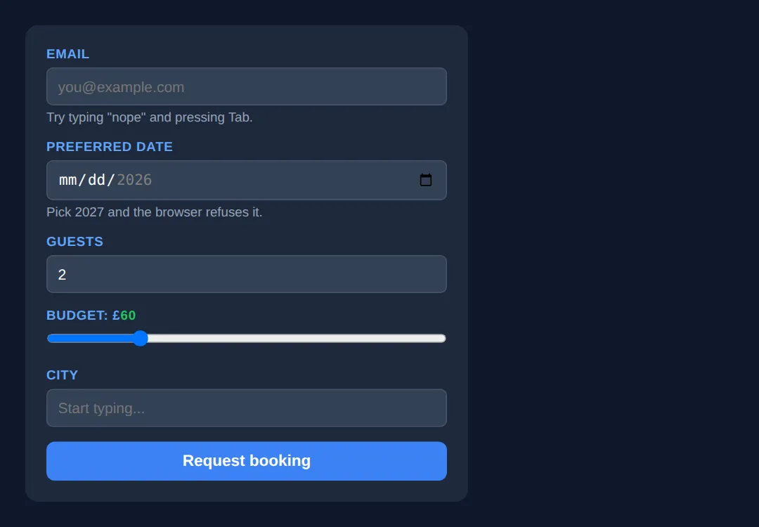
Those pop-up messages are written by the browser, not by you, which is why the exact wording differs between Chrome, Firefox and Safari — and why they are already translated into the user's language.
🎯 Your Turn — pick the right type and wire the datalist
This form is built but deliberately dumb: every field is a plain text box. Fill in the four blanks marked ___ to turn it into something the browser understands.
<!DOCTYPE html>
<html lang="en">
<head>
  <meta charset="UTF-8">
  <title>Your Turn: Pick the right input</title>
  <style>
    /* 🎯 YOUR TURN — fill in the four blanks marked ___ (all four are in the HTML below) */

    * { box-sizing:border-box; margin:0; padding:0; }
    body { background:#0f172a; color:#e5e7eb; font-family:system-ui,sans-serif; padding:24px; }
    form { max-width:400px; background:#1e293b; padding:20px; border-radius:12px; display:grid; gap:14px; }
    label { display:block; font-size:.78rem; text-transform:uppercase; color:#60a5fa; font-weight:700; margin-bottom:6px; letter-spacing:.5px; }
    input { width:100%; padding:9px 10px; background:#334155; border:1px solid #475569; border-radius:6px; color:#fff; font-size:14px; }
    input[type="range"] { padding:0; }
    input:user-invalid { border-color:#ef4444; }
    input:user-valid { border-color:#22c55e; }
    output { color:#22c55e; font-weight:700; }
  </style>
</head>
<body>
  <form>
    <div>
      <label for="mail">Work email</label>
      <!-- 1) Make the browser check this is an email address (and give phones the @ key). -->
      <input id="mail" type="___" required placeholder="[email protected]">
      <!-- 👉 replace ___ with  email  -->
    </div>

    <div>
      <label for="vol">Volume: <output id="volOut">50</output>%</label>
      <!-- 2) Make this a slider instead of a text box. -->
      <!-- 3) Make it move in jumps of 5 (so it can only ever be 0, 5, 10 ... 100). -->
      <input id="vol" type="___" min="0" max="100" step="___" value="50"
             oninput="document.getElementById('volOut').value = this.value">
      <!-- 👉 replace the first ___ with  range , the second ___ with  5  -->
    </div>

    <div>
      <label for="lang">Favourite language</label>
      <!-- 4) Connect this input to the <datalist> below so suggestions appear.
              The value must match the datalist's id exactly. -->
      <input id="lang" type="text" list="___" placeholder="Start typing...">
      <!-- 👉 replace ___ with  langs  -->
      <datalist id="langs">
        <option value="CSS"></option>
        <option value="HTML"></option>
        <option value="JavaScript"></option>
        <option value="Python"></option>
      </datalist>
    </div>
  </form>

  <!-- ✅ Expected once all four blanks are filled:
       - Work email: type "hello", press Tab -> the border goes red and the field
         is rejected on submit. Change it to [email protected] -> border goes green.
       - Volume: a draggable slider. Drag it and the green number next to
         "Volume:" follows. Because step is 5 it never shows 97 — it snaps to 95.
       - Favourite language: a dropdown of suggestions appears as you type, but
         you can still type something that is not on the list.
       Leave a blank unfilled and that field silently stays an ordinary text box —
       an unknown type value falls back to type="text". -->
</body>
</html>
Custom Toggle Switch & Styled Checkbox
Build beautiful custom controls using only CSS — no JavaScript needed.
<!DOCTYPE html>
<html lang="en">
<head>
  <meta charset="UTF-8">
  <title>Custom Controls</title>
  <style>
    * { box-sizing: border-box; margin: 0; padding: 0; }
    body { background: #0f172a; font-family: system-ui, sans-serif; color: #e5e7eb; padding: 30px; }

    h2 { color: #3b82f6; margin: 25px 0 15px; }

    /* === TOGGLE SWITCH === */
    .toggle-label {
      display: flex;
      align-items: center;
      gap: 12px;
      cursor: pointer;
      margin: 10px 0;
      font-size: 15px;
    }

    .toggle-input {
      display: none;
    }

    .toggle-slider {
      width: 50px;
      height: 26px;
      background: #475569;
      border-radius: 13px;
      position: relative;
      transition: background 0.3s;
    }

    .toggle-slider::after {
      content: '';
      position: absolute;
      top: 3px;
      left: 3px;
      width: 20px;
      height: 20px;
      background: white;
      border-radius: 50%;
      transition: transform 0.3s;
    }

    .toggle-input:checked + .toggle-slider {
      background: #3b82f6;
    }

    .toggle-input:checked + .toggle-slider::after {
      transform: translateX(24px);
    }

    /* === CUSTOM CHECKBOX === */
    .custom-check {
      display: flex;
      align-items: center;
      gap: 10px;
      cursor: pointer;
      margin: 8px 0;
      font-size: 15px;
    }

    .custom-check input {
      display: none;
    }

    .checkmark {
      width: 22px;
      height: 22px;
      border: 2px solid #475569;
      border-radius: 4px;
      display: flex;
      align-items: center;
      justify-content: center;
      transition: all 0.2s;
      flex-shrink: 0;
    }

    .checkmark::after {
      content: '✓';
      color: white;
      font-size: 14px;
      font-weight: bold;
      opacity: 0;
      transform: scale(0);
      transition: all 0.2s;
    }

    .custom-check input:checked + .checkmark {
      background: #3b82f6;
      border-color: #3b82f6;
    }

    .custom-check input:checked + .checkmark::after {
      opacity: 1;
      transform: scale(1);
    }

    /* === CUSTOM RADIO === */
    .custom-radio {
      display: flex;
      align-items: center;
      gap: 10px;
      cursor: pointer;
      margin: 8px 0;
      font-size: 15px;
    }

    .custom-radio input { display: none; }

    .radio-dot {
      width: 22px;
      height: 22px;
      border: 2px solid #475569;
      border-radius: 50%;
      display: flex;
      align-items: center;
      justify-content: center;
      transition: border-color 0.2s;
      flex-shrink: 0;
    }

    .radio-dot::after {
      content: '';
      width: 10px;
      height: 10px;
      background: #3b82f6;
      border-radius: 50%;
      opacity: 0;
      transform: scale(0);
      transition: all 0.2s;
    }

    .custom-radio input:checked + .radio-dot {
      border-color: #3b82f6;
    }

    .custom-radio input:checked + .radio-dot::after {
      opacity: 1;
      transform: scale(1);
    }

    .card {
      background: #1e293b;
      padding: 20px;
      border-radius: 8px;
      margin: 10px 0;
    }
  </style>
</head>
<body>
  <h1>🎨 Custom CSS Controls</h1>

  <h2>Toggle Switches</h2>
  <div class="card">
    <label class="toggle-label">
      <input type="checkbox" class="toggle-input" checked>
      <span class="toggle-slider"></span>
      Dark Mode
    </label>
    <label class="toggle-label">
      <input type="checkbox" class="toggle-input">
      <span class="toggle-slider"></span>
      Notifications
    </label>
    <label class="toggle-label">
      <input type="checkbox" class="toggle-input" checked>
      <span class="toggle-slider"></span>
      Auto-save
    </label>
  </div>

  <h2>Custom Checkboxes</h2>
  <div class="card">
    <label class="custom-check">
      <input type="checkbox" checked>
      <span class="checkmark"></span>
      HTML & CSS
    </label>
    <label class="custom-check">
      <input type="checkbox">
      <span class="checkmark"></span>
      JavaScript
    </label>
    <label class="custom-check">
      <input type="checkbox" checked>
      <span class="checkmark"></span>
      Python
    </label>
  </div>

  <h2>Custom Radio Buttons</h2>
  <div class="card">
    <label class="custom-radio">
      <input type="radio" name="plan" checked>
      <span class="radio-dot"></span>
      Free Plan
    </label>
    <label class="custom-radio">
      <input type="radio" name="plan">
      <span class="radio-dot"></span>
      Pro Plan — $9/mo
    </label>
    <label class="custom-radio">
      <input type="radio" name="plan">
      <span class="radio-dot"></span>
      Enterprise — $29/mo
    </label>
  </div>
  <!-- ✅ Expected result, measured in a real browser:
     .toggle-label -> display: flex
     .toggle-input -> display: none
     .toggle-slider -> position: relative
     .custom-check -> display: flex
     .card -> count: 3
  -->
</body>
</html>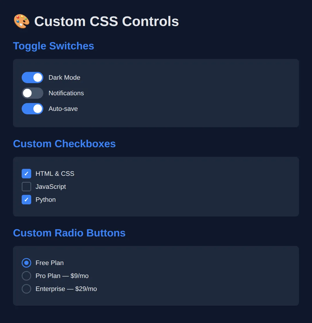
🧩 Mini-Challenge — a custom checkbox that keyboard users can still use
The demo above hides the real checkbox with display: none and draws a replacement next to it. It looks great with a mouse, but a display: none input is removed from the page completely — you cannot Tab to it and a screen reader never announces it. Your challenge is to build the same look without hiding anything, by restyling the real checkbox with appearance: none. Outline only this time.
<!DOCTYPE html>
<html lang="en">
<head>
<meta charset="UTF-8">
<title>Mini-Challenge: Accessible Custom Checkbox</title>
<style>
/* 🧩 MINI-CHALLENGE: a custom checkbox with nothing hidden
1. input[type="checkbox"] — set appearance: none; (add -webkit-appearance: none;
for older Safari). This strips the browser's own tick box and leaves you a
plain, still-focusable, still-checkable element to style.
2. Give it a size (about 22px square), a 2px border, a border-radius and
vertical-align: middle so it lines up with the label text.
3. input[type="checkbox"]:checked — change the background and border colour.
4. Draw the tick with input[type="checkbox"]:checked::after { content: '✓'; }
and centre it (display:grid; place-items:center; on the input works).
5. input[type="checkbox"]:focus-visible — add an outline so keyboard users can
see where they are. This is the bit the display:none version can never have.
✅ How to check it: click the box — it ticks. Now click somewhere else and press
Tab until you reach it — you should SEE a focus ring, and pressing Space
should tick it. Do the same on the display:none demo higher up the page and
the Tab key skips straight past it: the checkbox is unreachable.
*/
* { box-sizing: border-box; margin: 0; padding: 0; }
body { background:#0f172a; color:#e5e7eb; font-family:system-ui,sans-serif; padding:30px; }
label { display:flex; align-items:center; gap:10px; margin:10px 0; font-size:15px; cursor:pointer; }
/* your CSS here */
</style>
</head>
<body>
<h1>Pick your topics</h1>
<!-- Markup done for you: real checkboxes, each inside its own label. -->
<label><input type="checkbox" checked> HTML & CSS</label>
<label><input type="checkbox"> JavaScript</label>
<label><input type="checkbox"> Python</label>
<!-- ✅ Expected result, measured in a real browser:
body -> padding-top: 30px
label -> display: flex
-->
</body>
</html>⚠️ Common Mistakes
- Using type="text" for everything — Use the right input type (email, tel, url, number) so mobile users get the right keyboard and browsers validate automatically.
- Hiding native inputs with display: none — a display: none checkbox is removed from the page entirely: it cannot be reached with the Tab key and screen readers never announce it, so the control becomes mouse-only. Keep the real input in the page and restyle it with appearance: none instead (see the mini-challenge below), or, if you must overlay a custom shape, hide the input with opacity: 0; position: absolute; — that keeps it focusable. Either way, keep it inside a <label> so clicking the visible control still toggles it.
- Forgetting :focus-visible on custom controls — Keyboard users need visible focus indicators on custom checkboxes and toggles.
- Not providing a datalist fallback — The datalist element degrades gracefully to a normal text input in unsupported browsers.
🎉 Lesson Complete
You can now use and style every HTML5 input type:
- ✅ Use specialised input types (range, color, date, search) for better UX
- ✅ Build custom toggle switches, checkboxes, and radios with pure CSS
- ✅ Use <datalist> for autocomplete suggestions
- ✅ Always keep custom controls accessible with labels and focus indicators
Practice quiz
Which input type shows a native calendar date picker?
- type="text"
- type="date"
- type="calendar"
- type="day"
Answer: type="date". type="date" gives the browser a built-in calendar picker, and "calendar"/"day" are not real input types.
On a mobile device, which input type brings up the numeric phone keypad?
- type="number"
- type="phone"
- type="tel"
- type="digits"
Answer: type="tel". type="tel" is for telephone numbers and triggers the numeric phone keypad on mobile.
What does the <datalist> element provide for an input?
- A dropdown that forces one of its values
- Autocomplete suggestions while still allowing free text
- A multi-select list
- Client-side form validation
Answer: Autocomplete suggestions while still allowing free text. <datalist> offers suggested values for autocomplete but the user can still type any value, and it degrades to a plain text input.
Which input type renders a slider control?
- type="slider"
- type="range"
- type="number"
- type="scroll"
Answer: type="range". type="range" produces a slider whose value is between its min and max.
Which input type opens a color picker?
- type="color"
- type="hex"
- type="paint"
- type="rgb"
Answer: type="color". type="color" shows the native color picker and its value is a hex color like #3b82f6.
Which attributes set the bounds and step of a number or range input?
- low, high, by
- start, end, gap
- min, max, step
- from, to, increment
Answer: min, max, step. min and max bound the value and step controls the increment for number and range inputs.
To make a hidden native checkbox still toggle when you click your custom control, you should keep the input inside which element?
- A <span>
- A <label>
- A <button>
- A <fieldset>
Answer: A <label>. Wrapping the input in a <label> means clicking the label (and your custom control) still toggles the real input.
In the toggle-switch pattern, which CSS combinator styles the slider when the checkbox is checked?
- .toggle-input:checked > .toggle-slider
- .toggle-input:checked + .toggle-slider
- .toggle-input:checked .toggle-slider
- .toggle-slider:checked
Answer: .toggle-input:checked + .toggle-slider. The adjacent sibling combinator (+) targets the .toggle-slider that immediately follows the checked input.
Which input type adds URL validation and a ".com"-style keyboard on mobile?
- type="link"
- type="web"
- type="url"
- type="href"
Answer: type="url". type="url" validates that the value looks like a URL and offers a URL-friendly keyboard.
Why prefer type="email" over type="text" for an email field?
- It encrypts the value
- It gives an email keyboard and built-in email validation
- It hides the typed characters
- It auto-submits the form
Answer: It gives an email keyboard and built-in email validation. type="email" surfaces the right mobile keyboard and lets the browser validate the format automatically.
Continue this course
- Previous: Mastering Complex Forms & Validation Patterns
- Next: Responsive Typography with clamp(), fluid units, & viewport math — Scale type fluidly across viewports with clamp(), vw, and container units
- Quick reference: HTML & CSS cheat sheet
- From the blog: Building Forms with HTML5 and Validation