Responsive Typography with clamp()
Reviewed & published by Brayan K
Responsive typography scales text fluidly between a minimum and maximum size as the viewport changes, most simply with the CSS clamp() function, so headings and body copy stay readable on every screen without a stack of media queries.
Part of the free HTML & CSS course at LearnCodingFast — hands-on lessons with examples you run in your browser, plus practice exercises and a quick quiz.
By the end of this lesson you'll be able to make text that scales smoothly from phone to desktop with a single line of CSS, build a balanced type scale, set a comfortable line length, and do it all without breaking the zoom your low-vision readers rely on.
💡 Think of It Like This
clamp() is a thermostat with a guaranteed range. You set a minimum the room can never fall below, a preferred setting that drifts with the weather outside (your viewport width), and a maximum it can never exceed. The temperature glides between those bounds on its own — you never have to step in for "if it's between 18° and 22°, do this."
Old-school responsive type was the opposite: a stack of if statements (media queries) that snapped the font from one fixed size to the next at hard breakpoints — comfortable at each chosen width, jumpy in between. clamp() replaces the staircase with a ramp. One line gives you a smooth, bounded size at every width.
1. rem vs em vs px — Pick the Right Unit
Before you can size text responsively, you need to size it accessibly, and that comes down to the unit. A px is a fixed device pixel — it never changes. A rem is relative to the root font size (the <html> element), so 1rem follows whatever base size the user picked. An em is relative to the current element's font size, so it tracks its immediate context — and compounds when you nest things.
| Unit | Relative to | Best for | Zoom-safe? |
|---|---|---|---|
| rem | Root (html) font size | Font sizes, spacing, layout | ✅ Yes |
| em | This element's font size | Padding/gaps that track their text | ✅ Yes (but compounds) |
| px | Nothing — fixed | Borders, shadows, hairlines | ⚠️ Ignores font preference |
| vw | 1% of viewport width | Fluid growth (inside clamp!) | ❌ Ignores zoom on its own |
Run the worked example and watch the trap spring: the em heading nested inside another em heading gets huge, because each em multiplies the one above it.
<!DOCTYPE html>
<html lang="en">
<head>
  <meta charset="UTF-8">
  <meta name="viewport" content="width=device-width, initial-scale=1.0">
  <title>Units compared</title>
  <style>
    /* The root font size. Change 16px to 24px and watch every rem grow,
       every px stay frozen — that is exactly what a user's "larger text"
       browser setting does. */
    html { font-size: 16px; }

    body { background:#0f172a; color:#e5e7eb; font-family: system-ui, sans-serif; padding:24px; }
    .row { background:#1e293b; padding:14px; border-radius:8px; margin:10px 0; }
    .tag { color:#3b82f6; font-weight:600; font-size:12px; text-transform:uppercase; }

    .px  { font-size: 24px; }    /* always 24 device pixels, ignores html */
    .rem { font-size: 1.5rem; }  /* 1.5 x root = 24px now, 36px if root => 24px */
    .em  { font-size: 1.5em; }   /* 1.5 x THIS element's inherited size */

    /* Nesting em inside em compounds: 1.5 x 1.5 = 2.25x the base. */
    .em .em { font-size: 1.5em; } /* => surprisingly large */
  </style>
</head>
<body>
  <div class="row"><span class="tag">px</span><p class="px">px: fixed at 24px, no matter the root.</p></div>
  <div class="row"><span class="tag">rem</span><p class="rem">rem: 1.5 x root. Change html font-size and this follows.</p></div>
  <div class="row"><span class="tag">em</span>
    <p class="em">em: 1.5x of its context...
      <span class="em">...and a nested em compounds to 2.25x!</span>
    </p>
  </div>

  <!-- ✅ Try it: set html { font-size: 24px; }. The rem line jumps to 36px,
       the px line never moves. That frozen px line is why px font sizes
       break a user's zoom / large-text preference. -->
  <!-- ✅ Expected result, measured in a real browser:
     .tag -> text-transform: uppercase
     .row -> padding-top: 14px
     .row -> count: 3
  -->
</body>
</html>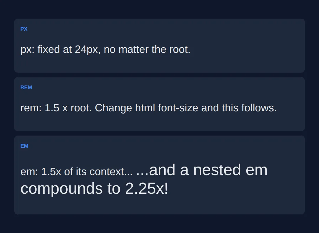
2. Fluid Type with clamp(min, preferred-vw, max)
clamp() takes three values and returns the middle one — unless it strays outside the bounds, in which case it's pinned to the nearest one. So clamp(2rem, 5vw, 4rem) means: aim for 5vw, but never smaller than 2rem and never larger than 4rem. It is literally max(min, min(preferred, max)), just readable.
The pattern that keeps it accessible: a rem floor, a vw-based middle so it grows with the screen, and a rem ceiling. Because the floor and ceiling are in rem, browser zoom still enlarges the text — the thing a bare vw can't do. Resize the preview to see it glide.
<!DOCTYPE html>
<html lang="en">
<head>
  <meta charset="UTF-8">
  <meta name="viewport" content="width=device-width, initial-scale=1.0">
  <title>Fluid type scale</title>
  <style>
    * { box-sizing: border-box; margin:0; padding:0; }
    body { background:#0f172a; color:#e5e7eb; font-family: system-ui, sans-serif; padding:30px; }

    /* FLUID TYPE SCALE — one clamp() per level, no media queries.
       Pattern is always clamp(rem-floor, vw-growth, rem-ceiling). */
    h1 { font-size: clamp(2rem, 6vw, 4rem);    color:#3b82f6; line-height:1.1; }   /* 32 -> 64px */
    h2 { font-size: clamp(1.5rem, 4vw, 2.5rem); color:#22c55e; margin-top:24px; }  /* 24 -> 40px */
    h3 { font-size: clamp(1.2rem, 3vw, 1.75rem); color:#f97316; margin-top:18px; } /* ~19 -> 28px */
    p  { font-size: clamp(1rem, 1.5vw, 1.25rem); line-height:1.7; color:#cbd5e1;
         max-width:65ch; margin-top:12px; }                                        /* 16 -> 20px */

    .formula { background:#1e293b; padding:18px; border-radius:8px; margin:20px 0;
               font-family:monospace; font-size:14px; }
    .floor { color:#ef4444; } .grow { color:#22c55e; } .ceil { color:#3b82f6; }
  </style>
</head>
<body>
  <h1>Fluid Typography</h1>
  <p>This heading slides from 2rem on a phone up to 4rem on a desktop — smoothly, with no breakpoints.</p>

  <div class="formula">
    font-size: clamp(<span class="floor">2rem</span>, <span class="grow">6vw</span>, <span class="ceil">4rem</span>);
    <br><br>
    <span class="floor">^ never smaller (accessible floor)</span><br>
    <span class="grow">^ grows with viewport width</span><br>
    <span class="ceil">^ never larger (sane ceiling)</span>
  </div>

  <h2>A second level</h2>
  <p>Each heading level has its own clamp(), so the whole scale breathes together as the screen changes.</p>

  <h3>A third level</h3>
  <p>↔ Drag the edge of this preview wide and narrow to watch every size respond in real time.</p>

  <!-- ✅ Expected: wide preview => big headings near the rem ceilings;
       narrow preview => headings shrink but stop at their rem floors. -->
  <!-- ✅ Expected result, measured in a real browser:
     h1 -> color: rgb(59, 130, 246)
     h2 -> margin-top: 24px
     .floor -> count: 2
  -->
</body>
</html>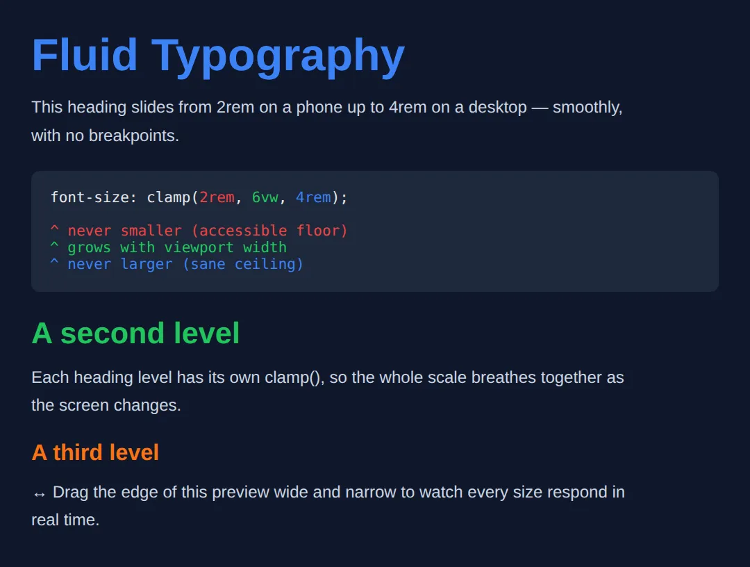
3. A Modular Type Scale
Picking font sizes at random gives a page that feels off. A modular scale picks one base size and one ratio, then multiplies up: each step is the previous size times the ratio. A ratio of 1.25 (the "major third") is a calm, common choice — 1rem, 1.25rem, 1.563rem, 1.953rem, and so on.
Store the steps as custom properties so the scale lives in one place and every heading just reads a token. Wrap each one in clamp() and you get a scale that is both consistent (the ratio) and fluid (the clamp).
<!DOCTYPE html>
<html lang="en">
<head>
  <meta charset="UTF-8">
  <meta name="viewport" content="width=device-width, initial-scale=1.0">
  <title>Modular scale</title>
  <style>
    :root {
      /* Base 1rem, ratio 1.25 (major third). Each step = previous x 1.25,
         and each is clamped so it stays fluid AND readable. */
      --step-0: clamp(1rem, 0.95rem + 0.3vw, 1.125rem);   /* body */
      --step-1: clamp(1.25rem, 1.1rem + 0.8vw, 1.563rem); /* h3 */
      --step-2: clamp(1.563rem, 1.3rem + 1.4vw, 1.953rem);/* h2 */
      --step-3: clamp(1.953rem, 1.5rem + 2.4vw, 2.441rem);/* h1 */
    }
    body { background:#0f172a; color:#e5e7eb; font-family: system-ui, sans-serif; padding:30px; }

    h1 { font-size: var(--step-3); color:#3b82f6; line-height:1.15; }
    h2 { font-size: var(--step-2); color:#22c55e; margin-top:20px; }
    h3 { font-size: var(--step-1); color:#f97316; margin-top:16px; }
    p  { font-size: var(--step-0); line-height:1.7; color:#cbd5e1; max-width:65ch; margin-top:10px; }
    .scale { background:#1e293b; padding:16px; border-radius:8px; margin-top:20px; font-family:monospace; font-size:13px; color:#94a3b8; }
  </style>
</head>
<body>
  <h1>Heading One (step 3)</h1>
  <h2>Heading Two (step 2)</h2>
  <h3>Heading Three (step 1)</h3>
  <p>Body copy uses step 0. Every size comes from the same ratio, so the jumps between them feel intentional rather than arbitrary.</p>

  <div class="scale">
    base 1rem x ratio 1.25:
    1.000 -> 1.250 -> 1.563 -> 1.953 -> 2.441 rem
  </div>

  <!-- ✅ Expected: four clearly stepped sizes whose gaps look even and
       deliberate. Change the ratio (e.g. 1.25 -> 1.333) and the rhythm
       of the whole page changes with it. -->
  <!-- ✅ Expected result, measured in a real browser:
     h1 -> color: rgb(59, 130, 246)
     h2 -> margin-top: 20px
  -->
</body>
</html>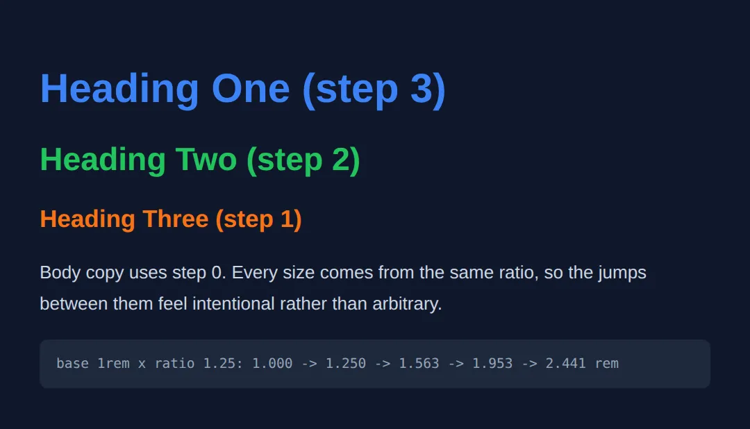
4. Line-height, Measure (ch) & text-wrap
Size is only half of readable text. Line-height is the vertical space between lines — set it unitless (e.g. line-height: 1.6) so it multiplies the font size and scales with it; a px line-height won't. Measure is the line length, and the comfortable range is about 45–75 characters. Cap it with max-width: 65ch, where 1ch is the width of a "0" in your font.
Finally, text-wrap: balance evens out the lines of a heading so you don't get one orphan word on its own line, while text-wrap: pretty tidies the last lines of long paragraphs. Use balance for headings, pretty for body text.
<!DOCTYPE html>
<html lang="en">
<head>
  <meta charset="UTF-8">
  <meta name="viewport" content="width=device-width, initial-scale=1.0">
  <title>Measure & wrapping</title>
  <style>
    body { background:#0f172a; color:#e5e7eb; font-family: system-ui, sans-serif; padding:30px; }

    h1 {
      font-size: clamp(1.75rem, 4vw, 2.75rem);
      color:#3b82f6;
      max-width: 22ch;          /* short measure for the headline */
      text-wrap: balance;       /* even out the lines, no lonely last word */
      line-height: 1.15;
    }

    /* 65ch keeps paragraphs in the readable 45-75 character sweet spot,
       even on a 2000px monitor. Unitless line-height scales with font size. */
    p {
      max-width: 65ch;
      line-height: 1.7;         /* unitless => 1.7 x the font size */
      color:#cbd5e1;
      margin-top: 14px;
      text-wrap: pretty;        /* avoids orphans on the final lines */
    }
    .full { max-width:none; border-left:3px solid #ef4444; padding-left:10px; }
    .tag { color:#64748b; font-size:13px; margin-top:18px; }
  </style>
</head>
<body>
  <h1>A balanced headline never leaves one sad word stranded alone</h1>

  <p>This paragraph is capped at 65ch. Notice how, even if the window is very
     wide, the line length stays comfortable so your eye can find the start of
     the next line without effort. That cap is the single biggest readability
     win for long text on big screens.</p>

  <p class="tag">Below: the SAME text with no max-width, for contrast.</p>
  <p class="full">This paragraph is capped at 65ch... (no max-width) ...the line
     length stays comfortable so your eye can find the start of the next line
     without effort. That cap is the single biggest readability win for long
     text on big screens.</p>

  <!-- ✅ Expected: the capped paragraph holds a tidy ~65-char width; the
       red-barred one runs edge to edge and is noticeably harder to read.
       Resize narrow and the balanced headline stays evenly split. -->
  <!-- ✅ Expected result, measured in a real browser:
     h1 -> max-width: 489.844px
     p -> max-width: 661.68px
  -->
</body>
</html>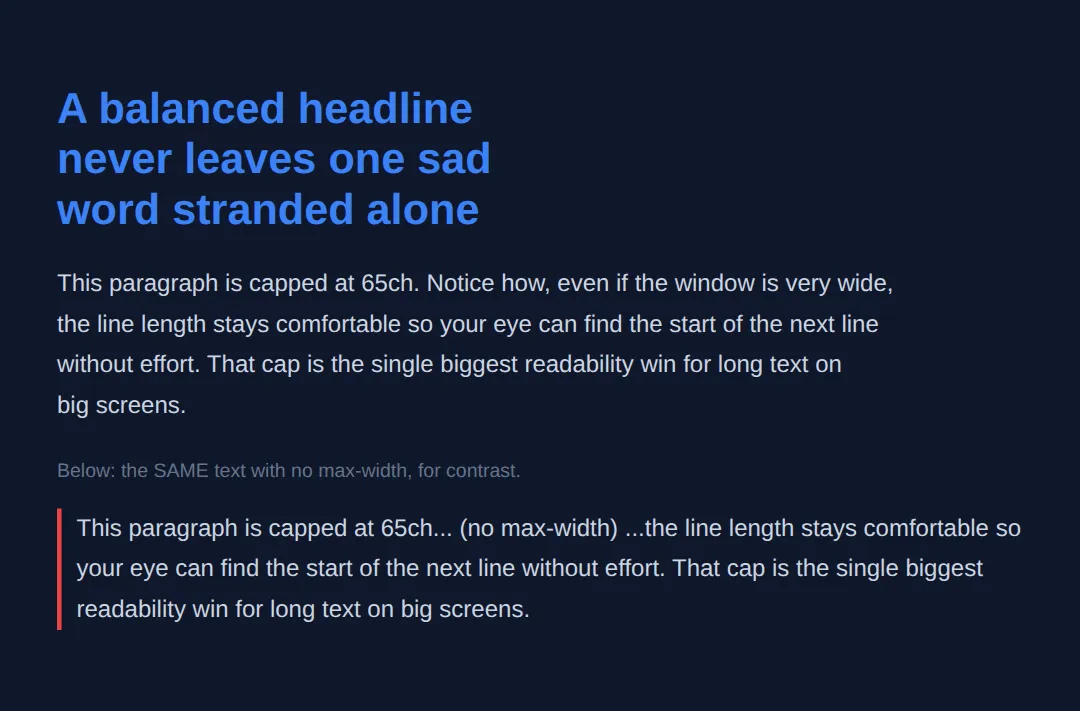
5. Respecting User Zoom
People with low vision raise their browser's base font size or zoom the page, and accessibility guidelines require text to stay usable when zoomed to 200%. The golden rule: every font size must contain at least one rem (or em). A pure vw size ignores zoom entirely; a clamp() with rem bounds keeps growing.
Keep body text at a minimum of 1rem (16px), never pin the root size in a way that fights the user, and your fluid type stays friendly to everyone. The worked example puts a zoom-safe and a zoom-hostile heading side by side.
<!DOCTYPE html>
<html lang="en">
<head>
  <meta charset="UTF-8">
  <meta name="viewport" content="width=device-width, initial-scale=1.0">
  <title>Zoom & type</title>
  <style>
    body { background:#0f172a; color:#e5e7eb; font-family: system-ui, sans-serif; padding:30px; }
    .card { background:#1e293b; padding:18px; border-radius:8px; margin:12px 0; }
    .tag { color:#3b82f6; font-weight:600; font-size:12px; text-transform:uppercase; }

    /* GOOD: rem floor + rem ceiling. Browser zoom and "larger text"
       settings still enlarge this, because rem honours them. */
    .safe { font-size: clamp(1.5rem, 4vw, 2.5rem); color:#22c55e; }

    /* BAD: a bare vw. It changes with window WIDTH but ignores zoom
       completely — a low-vision user gets no bigger text. */
    .hostile { font-size: 4vw; color:#ef4444; }
  </style>
</head>
<body>
  <div class="card">
    <span class="tag">zoom-safe (rem-clamped)</span>
    <p class="safe">This text obeys zoom.</p>
  </div>
  <div class="card">
    <span class="tag">zoom-hostile (bare vw)</span>
    <p class="hostile">This text ignores zoom.</p>
  </div>

  <!-- ✅ Try it: press Ctrl/Cmd and "+" to zoom the page. The green line
       grows; the red bare-vw line barely changes. That gap is why every
       responsive font size needs a rem in it. -->
  <!-- ✅ Expected result, measured in a real browser:
     .tag -> text-transform: uppercase
     .card -> padding-top: 18px
     .card -> count: 2
  -->
</body>
</html>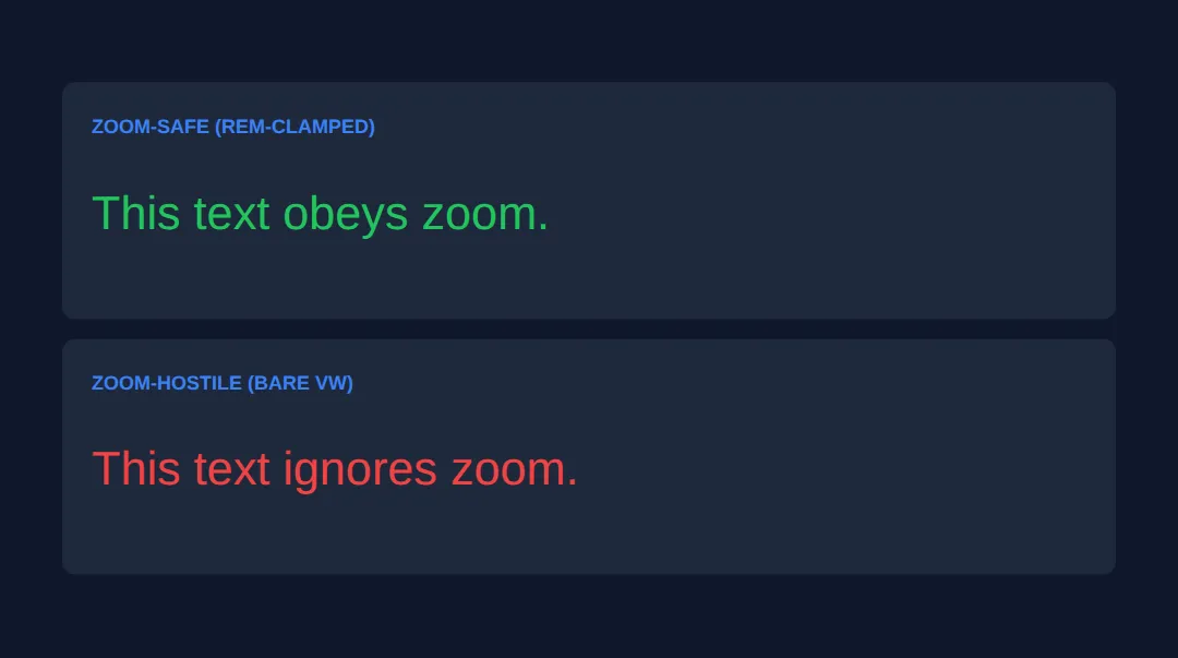
🎯 Your Turn #1 — Make a heading fluid
The heading below is frozen at one px size and the paragraph runs the full width. Convert the heading to a fluid clamp() and cap the paragraph's measure. Fill in the blanks marked ___, then run it and check the comments.
<!DOCTYPE html>
<html lang="en">
<head>
  <meta charset="UTF-8">
  <meta name="viewport" content="width=device-width, initial-scale=1.0">
  <title>Your Turn 1</title>
  <style>
    /* 🎯 YOUR TURN — fill in the blanks marked ___ */

    body { background:#0f172a; color:#e5e7eb; font-family: system-ui, sans-serif; padding:30px; }

    h1 {
      /* 1) Make this fluid: min 1.75rem, grow at 5vw, max 3.5rem. */
      font-size: ___;       /* 👉 replace ___ with  clamp(1.75rem, 5vw, 3.5rem) */
      color:#3b82f6;
      line-height: 1.15;
    }

    p {
      font-size: clamp(1rem, 1.5vw, 1.25rem);
      line-height: 1.7;
      color:#cbd5e1;
      /* 2) Cap the line length at about 60 characters. */
      max-width: ___;       /* 👉 replace ___ with  60ch */
    }
  </style>
</head>
<body>
  <h1>Resize me and watch the heading flex</h1>
  <p>Once you cap the measure, this paragraph stops sprawling across a wide
     screen and stays in the comfortable reading range no matter how wide
     the preview gets.</p>

  <!-- ✅ Expected: the heading scales smoothly between 1.75rem and 3.5rem
       as you resize, and the paragraph never grows wider than ~60 characters. -->
</body>
</html>
🎯 Your Turn #2 — Tokenise a scale and tidy the wrapping
Add the two missing scale tokens, point the headings at them, and tidy the ragged wrapping with text-wrap. Use the right keyword for each: balance for the heading, pretty for the paragraph.
<!DOCTYPE html>
<html lang="en">
<head>
  <meta charset="UTF-8">
  <meta name="viewport" content="width=device-width, initial-scale=1.0">
  <title>Your Turn 2</title>
  <style>
    /* 🎯 YOUR TURN — fill in the blanks marked ___ */

    :root {
      /* 1) Add the two larger steps (ratio 1.25 from --step-1). */
      --step-1: clamp(1.25rem, 1.1rem + 0.8vw, 1.563rem);
      ___   /* 👉 add:  --step-2: clamp(1.563rem, 1.3rem + 1.4vw, 1.953rem); */
      ___   /* 👉 add:  --step-3: clamp(1.953rem, 1.5rem + 2.4vw, 2.441rem); */
    }

    body { background:#0f172a; color:#e5e7eb; font-family: system-ui, sans-serif; padding:30px; }

    h1 {
      font-size: var(--step-3);   /* uses the token you added */
      color:#3b82f6; line-height:1.15; max-width:24ch;
      /* 2) Even out the headline's lines (headings want this one). */
      text-wrap: ___;             /* 👉 replace ___ with  balance */
    }
    h2 { font-size: var(--step-2); color:#22c55e; margin-top:18px; }

    p {
      font-size: clamp(1rem, 1.5vw, 1.25rem); line-height:1.7;
      color:#cbd5e1; max-width:62ch; margin-top:10px;
      /* 3) Avoid orphans on long paragraphs (body wants this one). */
      text-wrap: ___;             /* 👉 replace ___ with  pretty */
    }
  </style>
</head>
<body>
  <h1>A tokenised, balanced headline that wraps without a stray word</h1>
  <h2>Driven by the same ratio</h2>
  <p>This body paragraph uses pretty wrapping so the final line is never a
     single lonely word, and it sits at a comfortable measure thanks to the
     62ch cap above.</p>

  <!-- ✅ Expected: h1 and h2 sizes step in proportion (ratio 1.25), the
       headline's lines are evenly balanced, and the paragraph has no orphan
       word on its last line. -->
</body>
</html>
🧩 Mini-Challenge — A responsive article header from scratch
Support is faded now — only an outline is given. Build a small article header that is fluid, consistently scaled, comfortably measured, and zoom-safe. Lean on the worked examples in sections 2–4 if you get stuck.
<!DOCTYPE html>
<html lang="en">
<head>
  <meta charset="UTF-8">
  <meta name="viewport" content="width=device-width, initial-scale=1.0">
  <title>Mini-Challenge</title>
  <style>
    /* 🧩 MINI-CHALLENGE: a responsive article header
       1. In :root, declare a small type scale as tokens (ratio your choice):
            --title, --lead, --body  — each wrapped in clamp(rem, vw, rem)
       2. Style <h1> with var(--title), a short measure (~22ch) and
            text-wrap: balance
       3. Style the .lead paragraph with var(--lead)
       4. Style normal <p> with var(--body), line-height ~1.7,
            max-width ~65ch and text-wrap: pretty
       5. Make sure EVERY font-size has a rem in its clamp() so zoom still works

       ✅ Expected: resize the preview and the whole header scales smoothly
          (no jumps); zoom the page (Ctrl/Cmd +) and all text grows; the body
          paragraph stays around 65 characters wide and the headline lines
          are evenly balanced. */

    body { background:#0f172a; color:#e5e7eb; font-family: system-ui, sans-serif; padding:30px; }

    /* your styles here */
  </style>
</head>
<body>

  <!-- your markup here: an <h1>, a <p class="lead">, and a normal <p> -->

</body>
</html>
⚠️ Common Errors (and the fix)
- px font sizes break zoom. Setting body text in px (e.g. font-size: 18px) ignores a user's chosen base size, so "larger text" settings do nothing. Fix: size text in rem — font-size: 1.125rem — and reserve px for borders and hairlines.
- vw with no min/max. font-size: 5vw turns microscopic on a phone, enormous on a monitor, and ignores zoom entirely. Fix: wrap it — clamp(1rem, 5vw, 3rem) — so the rem floor and ceiling keep it readable and zoom-friendly.
- Lines too long (no measure cap). A paragraph with no max-width runs edge-to-edge on a wide screen; past ~75 characters the eye struggles to find the next line. Fix: max-width: 65ch on your text containers.
- Line-height in px. line-height: 24px doesn't scale when the font grows, so big headings cramp. Fix: use a unitless multiplier — line-height: 1.6.
- balance on a long paragraph. text-wrap: balance is for short text and browsers cap how many lines it touches, so it won't help body copy. Fix: use balance on headings and pretty on paragraphs.
📋 Quick Reference
| Goal | Use this |
|---|---|
| Accessible font size | font-size: 1.125rem; |
| Fluid heading (no media query) | font-size: clamp(2rem, 6vw, 4rem); |
| Floor / ceiling only | max(1rem, 4vw) / min(4vw, 3rem) |
| Type scale token | --step-2: clamp(1.5rem, 1.3rem + 1.4vw, 1.95rem); |
| Readable line height | line-height: 1.6; (unitless) |
| Cap line length (measure) | max-width: 65ch; |
| Balance a heading | text-wrap: balance; |
| Tidy a paragraph's last lines | text-wrap: pretty; |
🎉 Lesson Complete
You can now build typography that's fluid, consistent and accessible. The essentials:
- ✅ Size text in rem so it respects the user's font preference; keep px for borders
- ✅ Make it fluid with clamp(rem-floor, vw-growth, rem-ceiling) — no media queries
- ✅ Pick one base size and ratio for a modular type scale that feels deliberate
- ✅ Use unitless line-height and cap the measure at ~65ch
- ✅ text-wrap: balance for headings, pretty for paragraphs
- ✅ Every font size keeps a rem in it so browser zoom still works
Practice quiz
What is a 'rem' unit relative to?
- The parent element's font size
- The viewport width
- The root (<html>) element's font size
- A fixed 12px
Answer: The root (<html>) element's font size. 1rem equals the root font size (16px by default), so rem-sized text respects the user's chosen base size — making it the go-to unit for fonts.
Why does 'em' compound when elements are nested?
- It is relative to the current element's font size, which multiplies down the tree
- It is relative to the viewport
- It ignores inheritance
- It is a bug in browsers
Answer: It is relative to the current element's font size, which multiplies down the tree. em is relative to the element's own font size, so an em inside an em multiplies (1.5 × 1.5 = 2.25×), making nested sizes grow unexpectedly.
What does clamp(min, preferred, max) compute?
- The average of the three values
- Always the preferred value
- The smallest of the three
- max(min, min(preferred, max)) — the preferred value bounded by a floor and ceiling
Answer: max(min, min(preferred, max)) — the preferred value bounded by a floor and ceiling. clamp() returns the preferred value but never lets it drop below min or rise above max — equivalent to max(min, min(preferred, max)).
Why is a bare 'font-size: 5vw' bad for accessibility?
- It is invalid syntax
- vw ignores browser zoom, so a low-vision user who zooms gets no larger text
- It only works on Chrome
- It makes text too small everywhere
Answer: vw ignores browser zoom, so a low-vision user who zooms gets no larger text. A pure vw value scales with window width but ignores zoom and font-size preferences, so zooming in doesn't enlarge it. Wrap it in clamp() with rem bounds.
What is the accessible pattern for a fluid heading with clamp()?
- A rem floor, a vw-based preferred value, and a rem ceiling
- clamp(5vw, 1rem, 10vw)
- Three vw values
- clamp with only px values
Answer: A rem floor, a vw-based preferred value, and a rem ceiling. Use clamp(rem-floor, vw-growth, rem-ceiling), e.g. clamp(2rem, 5vw, 4rem). The rem bounds keep zoom working while vw drives fluid growth.
In a modular type scale, how is each step's size calculated?
- Add a fixed number of pixels each step
- Halve the previous size
- Multiply the previous size by a chosen ratio
- Use random values
Answer: Multiply the previous size by a chosen ratio. A modular scale picks a base and a ratio (e.g. 1.25), and each step is the previous size times that ratio, giving deliberate, consistent jumps.
What does the 'ch' unit represent, and why use it for line length?
- A character's height; for line-height
- The width of the digit '0' in the current font; to cap the measure
- The viewport's width; for full-bleed text
- A fixed centimetre
Answer: The width of the digit '0' in the current font; to cap the measure. 1ch is roughly one character wide, so max-width: 65ch caps the measure around 65 characters — the comfortable 45-75 character reading range.
Why should line-height usually be unitless (e.g. 1.6)?
- It is shorter to type
- Units are not allowed on line-height
- It disables wrapping
- A unitless value multiplies the font size, so it scales as the font grows
Answer: A unitless value multiplies the font size, so it scales as the font grows. A unitless line-height of 1.6 means 1.6 × the element's font size, so big headings keep proportional spacing — a fixed px line-height won't.
Which text-wrap value is meant for headings to avoid a lonely last word?
- text-wrap: pretty
- text-wrap: balance
- text-wrap: nowrap
- text-wrap: stable
Answer: text-wrap: balance. text-wrap: balance evens out the characters across a heading's lines (best for short text); use text-wrap: pretty for long paragraphs.
What keeps fluid type accessible so browser zoom still enlarges it?
- Using only vw units
- Setting font-size in px
- Every font size containing at least one rem (or em) in its clamp()
- Disabling the viewport meta tag
Answer: Every font size containing at least one rem (or em) in its clamp(). As long as the clamp() floor and ceiling are in rem, zoom and 'larger text' settings still grow the text — a rem in every size keeps it zoom-friendly.
Continue this course
- Previous: Advanced Input Types, Sliders, Color Pickers, & Custom Controls
- Next: CSS Flexbox: Advanced Patterns & Real Layouts — Sticky footers, holy grail, card grids — real-world flex patterns
- Quick reference: HTML & CSS cheat sheet
Frequently asked questions
Should I use rem, em, or px for font sizes?
Use rem for font sizes almost every time. A rem is always relative to the root (the <html> element), so 1rem is whatever the user's chosen base size is — usually 16px, but larger if they've turned font size up in their browser settings. That means rem text respects the user's preference. em is relative to the element's own font size, which is great for spacing that should track the text it sits next to (like padding inside a button) but surprising for font sizes because it compounds when nested. px is a fixed device pixel: fine for hairline borders and shadows, but it ignores the user's font preference, so never set body font size in px.
Why is font-size: 5vw a bad idea on its own?
A raw vw value is a pure percentage of the viewport width with no floor and no ceiling. On a 320px phone, 5vw is only 16px; on a tiny watch it becomes unreadable, and on a 2560px monitor it balloons to 128px. Worse, vw does not respond to browser zoom or the user's font-size preference at all, so a low-vision user who zooms in gets no larger text. The fix is to wrap it: clamp(1rem, 5vw + 0.5rem, 4rem). The rem-based min and max give you a readable floor and a sane ceiling, and because rem units honour zoom, the clamped value still grows when the user zooms.
What does clamp(min, preferred, max) actually compute?
clamp() returns the preferred (middle) value, but never lets it drop below min or rise above max. So clamp(1.5rem, 4vw, 3rem) says: try 4vw; if that comes out under 1.5rem use 1.5rem instead; if it comes out over 3rem use 3rem. It is exactly max(min, min(preferred, max)) written more readably. Put your accessible floor in the first slot, the fluid viewport-based growth in the middle, and your upper limit in the third — and you get smooth scaling between two breakpoints with no media queries.
What is the ch unit and why limit line length with it?
1ch is the width of the digit zero in the current font, so it's a rough stand-in for one character. Typographers find lines of roughly 45–75 characters the most comfortable to read; longer and the eye loses its place returning to the next line. Setting max-width: 65ch on your text containers caps the measure (line length) at about 65 characters regardless of how wide the screen is, which keeps long paragraphs readable on big monitors. Because ch is font-relative, the cap scales sensibly when the font size changes.
What does text-wrap: balance do, and when should I use pretty instead?
text-wrap: balance evens out the number of characters across every line of a block, so a two- or three-line heading doesn't end with one lonely word on the last line. It's meant for short text — headings, titles, pull quotes — and browsers only balance a handful of lines for performance. For long body paragraphs use text-wrap: pretty instead: it doesn't balance the whole block but it prevents orphans (a single short word stranded on the final line) and improves the last few lines. Rule of thumb: balance for headings, pretty for paragraphs.
Does using clamp() and vw break accessibility or zoom?
It can if you do it carelessly, but done right it's fine. The danger is a font size built only from viewport units, because vw ignores zoom. As long as your clamp() min and max are written in rem (or em), the text still grows when a user zooms or raises their base font size — WCAG requires text to be resizable up to 200% without loss of content. Keep body text at a minimum of 1rem, never set the root font size in a way that locks it (avoid html { font-size: 62.5% } pinned in px), and your fluid type stays accessible.