CSS Flexbox Advanced Patterns
Reviewed & published by Brayan K
Advanced flexbox uses the flex-grow, flex-shrink, and flex-basis shorthand to control exactly how items share leftover space and reorder, letting you build production layouts like sticky footers, the holy-grail page, and equal-height card grids.
Part of the free HTML & CSS course at LearnCodingFast — hands-on lessons with examples you run in your browser, plus practice exercises and a quick quiz.
By the end of this lesson you'll control exactly how flex items grow, shrink, and reorder themselves — and use that control to build the layouts real apps ship with: a sticky footer, the holy-grail page, and equal-height responsive card grids.
💡 Think of It Like This
A flex container is a row of passengers sharing a bench seat. flex-basis is how much room each person needs before anyone budges. flex-grow is appetite for the empty space — a passenger with flex-grow: 2 spreads out into twice as much of the leftover bench as a neighbour on flex-grow: 1.
flex-shrink is who gives way when the bench gets crowded: a higher number means "I'll squeeze in first." So the flex shorthand — grow shrink basis — is really just three answers to: how big do I start, how eagerly do I expand, and how willingly do I compress? Nail those three and every layout in this lesson becomes obvious.
1. The flex Shorthand: grow, shrink, basis
Three properties decide how a flex item is sized. flex-basis is the item's starting size along the main axis (its width in a row). flex-grow says how much of any leftover space it absorbs, as a ratio against its siblings. flex-shrink says how much it gives up when there isn't enough room. You almost always set all three at once with the flex shorthand.
| Shorthand | Means | Use it for |
|---|---|---|
| flex: 1 | 1 1 0% | Equal columns, ignoring content size |
| flex: auto | 1 1 auto | Grow/shrink but respect content size |
| flex: none | 0 0 auto | Fixed, never grows or shrinks |
| flex: 0 0 200px | 0 0 200px | A rigid 200px sidebar |
Run the worked example. The same three boxes are shown with different flex values so you can see grow ratios, a fixed item, and a basis-driven start size side by side.
<!DOCTYPE html>
<html lang="en">
<head>
  <meta charset="UTF-8">
  <title>flex shorthand</title>
  <style>
    * { box-sizing: border-box; margin: 0; padding: 0; }
    body { background:#0f172a; color:#e5e7eb; font-family: system-ui, sans-serif; padding:20px; }
    h3 { color:#3b82f6; margin:18px 0 8px; font-size:14px; }

    .row { display:flex; gap:8px; margin-bottom:6px; }
    .box { padding:14px; border-radius:8px; color:#fff; font-size:13px; text-align:center; }
    .a { background:#3b82f6; }   /* blue  */
    .b { background:#22c55e; }   /* green */
    .c { background:#f97316; }   /* orange */

    /* ROW 1: every item flex: 1 (= 1 1 0%) => three EQUAL thirds. */
    .equal .box { flex: 1; }

    /* ROW 2: grow ratios 1 : 2 : 1 => the middle box takes twice the leftover. */
    .ratio .a { flex: 1; }
    .ratio .b { flex: 2; }      /* grabs 2x the spare space of its siblings */
    .ratio .c { flex: 1; }

    /* ROW 3: a FIXED 120px sidebar that never moves, plus a flexible main. */
    .fixed .a { flex: 0 0 120px; }  /* basis 120px, no grow, no shrink */
    .fixed .b { flex: 1; }          /* eats all the remaining width */
  </style>
</head>
<body>
  <h3>flex: 1 on all three → equal thirds</h3>
  <div class="row equal"><div class="box a">1</div><div class="box b">1</div><div class="box c">1</div></div>

  <h3>flex grow ratio 1 : 2 : 1 → middle box is twice as wide</h3>
  <div class="row ratio"><div class="box a">1</div><div class="box b">2</div><div class="box c">1</div></div>

  <h3>flex: 0 0 120px (fixed) + flex: 1 (fills the rest)</h3>
  <div class="row fixed"><div class="box a">120px</div><div class="box b">flex: 1</div></div>

  <!-- ✅ Expected: row 1 = three equal boxes; row 2 = green box twice as wide;
       row 3 = a fixed blue box on the left, green filling the rest. -->
  <!-- ✅ Expected result, measured in a real browser:
     .row -> display: flex
     .equal .box -> flex-grow: 1
     .ratio .a -> flex-grow: 1
     .ratio .b -> flex-grow: 2
     .box -> count: 8
  -->
</body>
</html>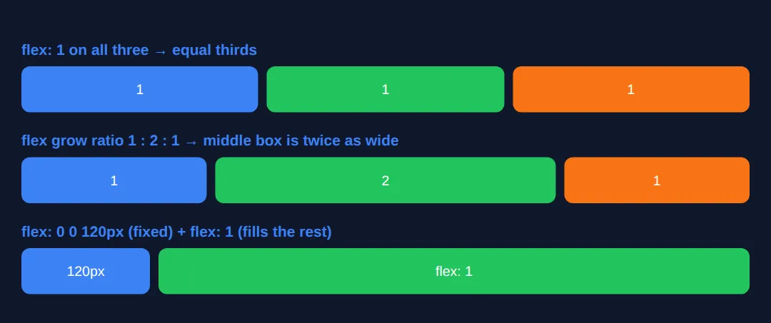
2. Overriding One Item: align-self & order
align-items aligns every item on the cross axis. When you want one item to break ranks, align-self on that single child overrides the container's alignment just for it — handy for pushing one badge to the top while the rest sit centred.
order changes the visual position of an item without touching the HTML. Items sort by their order value (default 0), low to high. It is perfect for reordering on different screen sizes — but remember it only moves things visually, so keyboard and screen-reader order still follow your HTML.
<!DOCTYPE html>
<html lang="en">
<head>
  <meta charset="UTF-8">
  <title>align-self & order</title>
  <style>
    * { box-sizing: border-box; margin: 0; padding: 0; }
    body { background:#0f172a; color:#e5e7eb; font-family: system-ui, sans-serif; padding:20px; }
    h3 { color:#3b82f6; margin:18px 0 8px; font-size:14px; }

    .row {
      display:flex;
      align-items:center;   /* default: all items vertically centred */
      gap:10px; height:120px;
      background:#1e293b; border-radius:10px; padding:10px;
    }
    .box { padding:14px 18px; border-radius:8px; color:#fff; font-weight:600; }
    .a { background:#3b82f6; }
    .b { background:#22c55e; }
    .c { background:#f97316; }

    /* align-self overrides align-items for THIS item only. */
    .top    { align-self: flex-start; }   /* jumps to the top */
    .bottom { align-self: flex-end; }      /* drops to the bottom */

    /* order sorts items low → high; defaults are 0. */
    .first { order: -1; }   /* moves visually before the 0s */
    .last  { order: 1; }    /* moves visually after the 0s */
  </style>
</head>
<body>
  <h3>align-self: one item per corner, rest stay centred</h3>
  <div class="row">
    <div class="box a top">top</div>
    <div class="box b">centre</div>
    <div class="box c bottom">bottom</div>
  </div>

  <h3>order: HTML is A, B, C — but they render C, A, B</h3>
  <div class="row">
    <div class="box a">A (order 0)</div>
    <div class="box b last">B (order 1)</div>
    <div class="box c first">C (order -1)</div>
  </div>

  <!-- ✅ Expected: row 1 shows blue at top, green centred, orange at bottom.
       Row 2 renders left-to-right as C, A, B even though the HTML order is A, B, C. -->
  <!-- ✅ Expected result, measured in a real browser:
     .row -> display: flex
     .top -> align-self: flex-start
     .bottom -> align-self: flex-end
     .first -> order: -1
     .box -> count: 6
  -->
</body>
</html>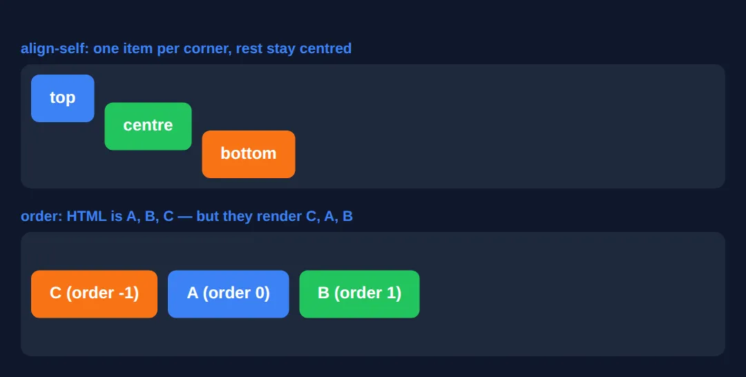
3. Wrapping: flex-wrap, align-content & gap
By default flex items stay on one line and shrink to fit. Set flex-wrap: wrap and items that don't fit flow onto a new line instead — this is what turns a flex row into a responsive grid. Pair it with gap, which adds consistent spacing between items (and between wrapped rows) without the margin headaches.
Once items wrap onto multiple lines, align-content spaces those lines along the cross axis — think of it as justify-content but for whole rows. It does nothing on a single-line container, which trips up a lot of people. Run the example and shrink the preview to watch items wrap and the rows space out.
<!DOCTYPE html>
<html lang="en">
<head>
  <meta charset="UTF-8">
  <meta name="viewport" content="width=device-width, initial-scale=1.0">
  <title>flex-wrap</title>
  <style>
    * { box-sizing: border-box; margin: 0; padding: 0; }
    body { background:#0f172a; color:#e5e7eb; font-family: system-ui, sans-serif; padding:20px; }
    p { color:#94a3b8; font-size:13px; margin-bottom:10px; }

    .wrap {
      display:flex;
      flex-wrap: wrap;            /* let items spill onto new lines */
      align-content: space-between; /* space the WRAPPED ROWS apart */
      gap: 12px;                  /* even spacing between items AND rows */
      height: 260px;             /* tall enough to see the rows separate */
      background:#1e293b; border-radius:10px; padding:12px;
    }
    .item {
      flex: 1 1 130px;            /* start at 130px, grow, shrink, then wrap */
      min-height: 60px;
      display:flex; align-items:center; justify-content:center;
      background:#3b82f6; border-radius:8px; color:#fff; font-weight:600;
    }
    .item:nth-child(even) { background:#22c55e; }
  </style>
</head>
<body>
  <p>Resize the preview — items wrap onto new rows and the rows spread apart (align-content: space-between).</p>
  <div class="wrap">
    <div class="item">1</div>
    <div class="item">2</div>
    <div class="item">3</div>
    <div class="item">4</div>
    <div class="item">5</div>
    <div class="item">6</div>
  </div>

  <!-- ✅ Expected: tiles fill the row, wrap to a second/third row when space runs
       out, and the rows are pushed to the top and bottom with a gap between. -->
  <!-- ✅ Expected result, measured in a real browser:
     .wrap -> display: flex
     .item -> display: flex
     .item -> count: 6
  -->
</body>
</html>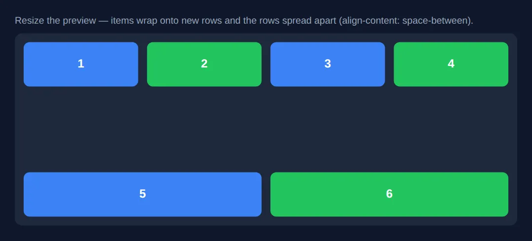
4. Nested Flex: the Holy-Grail Layout
Real layouts are flex containers inside flex containers. The classic "holy grail" — header, two sidebars, a main column, and a footer — is just a vertical flex column whose middle row is itself a horizontal flex row. The outer column uses flex: 1 on the middle band so it fills the height; the inner row uses fixed-basis sidebars and a flex: 1 main.
Note min-width: 0 on the main column — without it, long content would refuse to shrink and blow out the layout (more on that in Common Errors). On narrow screens, flex-wrap and a media query collapse everything into a single column.
<!DOCTYPE html>
<html lang="en">
<head>
  <meta charset="UTF-8">
  <meta name="viewport" content="width=device-width, initial-scale=1.0">
  <title>Holy Grail</title>
  <style>
    * { box-sizing: border-box; margin: 0; padding: 0; }
    body {
      background:#0f172a; color:#e5e7eb; font-family: system-ui, sans-serif;
      display:flex; flex-direction:column;   /* OUTER: vertical column */
      min-height:100vh;
    }
    header, footer { background:#1e293b; padding:15px 20px; text-align:center; }
    header { border-bottom:2px solid #3b82f6; }
    header h1 { color:#3b82f6; font-size:1.2rem; }
    footer { border-top:1px solid #334155; color:#64748b; font-size:13px; }

    .content {
      flex:1;                 /* middle band fills the leftover height */
      display:flex;           /* INNER: horizontal row of 3 columns */
      flex-wrap:wrap;
    }
    nav  { flex:0 0 200px; background:#1a2332; padding:20px; border-right:1px solid #334155; }
    aside{ flex:0 0 180px; background:#1a2332; padding:20px; border-left:1px solid #334155; }
    main {
      flex:1;                 /* main eats the space between the sidebars */
      min-width:0;            /* allow it to shrink past long content */
      padding:25px;
    }
    nav h3   { color:#f97316; margin-bottom:10px; font-size:.9rem; }
    aside h3 { color:#8b5cf6; margin-bottom:10px; font-size:.9rem; }
    main h2  { color:#22c55e; margin-bottom:10px; }
    nav a { display:block; color:#94a3b8; text-decoration:none; padding:6px 0; font-size:14px; }
    main p, aside p { color:#94a3b8; line-height:1.7; font-size:14px; }

    /* Narrow screens: collapse the three columns into one stack. */
    @media (max-width:700px) {
      .content { flex-direction:column; }
      nav, aside { flex-basis:auto; border:none; border-bottom:1px solid #334155; }
    }
  </style>
</head>
<body>
  <header><h1>Holy Grail Layout</h1></header>
  <div class="content">
    <nav>
      <h3>Nav</h3>
      <a href="#">Home</a><a href="#">Articles</a><a href="#">Contact</a>
    </nav>
    <main>
      <h2>Main Content</h2>
      <p>The middle band has flex: 1 so it fills the height; this column has flex: 1 so it fills the width between the two sidebars. Resize to watch it stack.</p>
    </main>
    <aside>
      <h3>Aside</h3>
      <p>Related links and ads.</p>
    </aside>
  </div>
  <footer>© 2026 Holy Grail Layout</footer>

  <!-- ✅ Expected: full-height page; header on top, footer pinned to the bottom,
       fixed sidebars hugging a flexible centre. Under 700px it stacks vertically. -->
  <!-- ✅ Expected result, measured in a real browser:
     .content -> display: flex
     nav -> flex-grow: 0
     aside -> flex-grow: 0
     main -> flex-grow: 1
  -->
</body>
</html>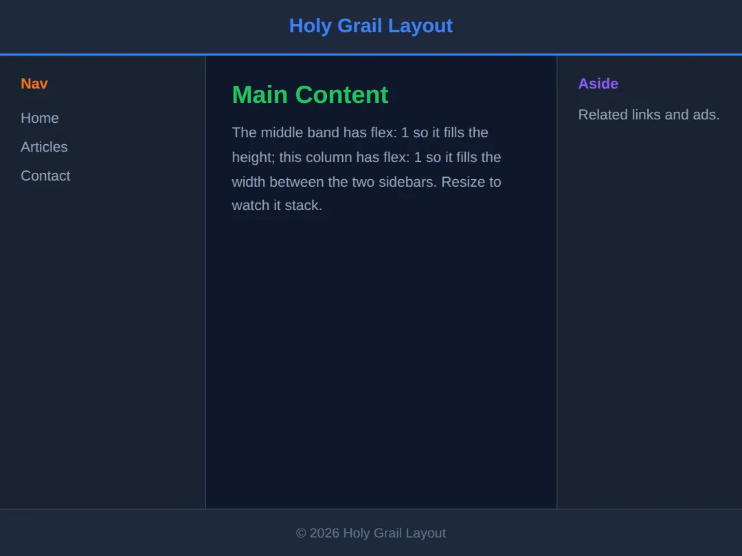
5. Equal-Height Card Grid
Cards with different amounts of text usually end up different heights — ugly. Flexbox fixes it twice over. First, align-items: stretch (the default on the cross axis) makes every card in a row the same height automatically. Second, make each card itself a vertical flex column and put margin-top: auto on the footer button — the auto margin soaks up spare space and pins the button to the bottom, so buttons line up across cards of any length.
<!DOCTYPE html>
<html lang="en">
<head>
  <meta charset="UTF-8">
  <meta name="viewport" content="width=device-width, initial-scale=1.0">
  <title>Equal-height cards</title>
  <style>
    * { box-sizing: border-box; margin: 0; padding: 0; }
    body { background:#0f172a; color:#e5e7eb; font-family: system-ui, sans-serif; padding:24px; }
    h1 { color:#3b82f6; margin-bottom:18px; font-size:1.3rem; }

    .grid {
      display:flex; flex-wrap:wrap; gap:16px;
      align-items: stretch;   /* every card in a row matches the tallest */
    }
    .card {
      flex: 1 1 220px;        /* min 220px wide, then grow/shrink/wrap */
      display:flex;           /* NESTED: each card is a vertical column */
      flex-direction:column;
      background:#1e293b; border-radius:12px; padding:18px;
    }
    .card h3 { color:#22c55e; margin-bottom:8px; }
    .card p  { color:#94a3b8; font-size:14px; line-height:1.6; }
    .card .btn {
      margin-top:auto;        /* THE TRICK: push the button to the bottom */
      background:#3b82f6; color:#fff; border:none;
      padding:10px; border-radius:8px; font-weight:600; cursor:pointer;
    }
  </style>
</head>
<body>
  <h1>Equal-height cards</h1>
  <div class="grid">
    <div class="card">
      <h3>Short</h3>
      <p>Just one line of text here.</p>
      <button class="btn">Open</button>
    </div>
    <div class="card">
      <h3>Medium</h3>
      <p>A bit more copy than the first card, spilling onto two lines of text.</p>
      <button class="btn">Open</button>
    </div>
    <div class="card">
      <h3>Long</h3>
      <p>This card has the most text of all so you can clearly see that every card still matches its tallest neighbour, and every button lines up neatly along the bottom edge.</p>
      <button class="btn">Open</button>
    </div>
  </div>

  <!-- ✅ Expected: all three cards are the SAME height (matching the longest one)
       and all three buttons sit on the same bottom line, thanks to margin-top:auto. -->
  <!-- ✅ Expected result, measured in a real browser:
     .grid -> display: flex
     .card -> display: flex
     .card .btn -> cursor: pointer
     .card -> count: 3
  -->
</body>
</html>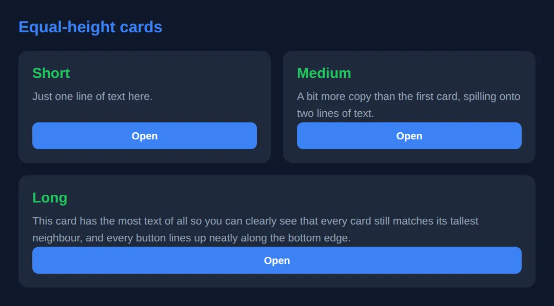
🎯 Your Turn #1 — A fixed sidebar with the flex shorthand
Build a two-column row: a rigid 220px sidebar that never resizes, and a main column that fills the rest. Fill in the blanks marked ___, run it, and check the expected result in the comments.
<!DOCTYPE html>
<html lang="en">
<head>
  <meta charset="UTF-8">
  <title>Your Turn 1</title>
  <style>
    /* 🎯 YOUR TURN — fill in the blanks marked ___ */

    * { box-sizing: border-box; margin: 0; padding: 0; }
    body { background:#0f172a; color:#e5e7eb; font-family: system-ui, sans-serif; padding:20px; }

    .layout { display:flex; gap:12px; }

    .sidebar {
      background:#1e293b; padding:16px; border-radius:10px;
      /* 1) Make this a RIGID 220px column: no grow, no shrink, basis 220px. */
      ___                       /* 👉 add:  flex: 0 0 220px; */
    }

    .main {
      background:#1a2332; padding:16px; border-radius:10px;
      /* 2) Make this fill ALL the remaining width. */
      ___                       /* 👉 add:  flex: 1; */
    }
  </style>
</head>
<body>
  <div class="layout">
    <div class="sidebar"><strong>Sidebar</strong><br>Always 220px wide.</div>
    <div class="main"><strong>Main</strong><br>I take everything else.</div>
  </div>

  <!-- ✅ Expected: a fixed-width sidebar on the left that never changes size,
       and a main column that grows to fill the rest. Resize to confirm only
       the main column changes width. -->
</body>
</html>
🎯 Your Turn #2 — Wrap a grid and align one item
Turn a flex row into a wrapping grid with even spacing, then make the "featured" tile jump to the front using order. Fill in the blanks and verify the expected behaviour in the comments.
<!DOCTYPE html>
<html lang="en">
<head>
  <meta charset="UTF-8">
  <meta name="viewport" content="width=device-width, initial-scale=1.0">
  <title>Your Turn 2</title>
  <style>
    /* 🎯 YOUR TURN — fill in the blanks marked ___ */

    * { box-sizing: border-box; margin: 0; padding: 0; }
    body { background:#0f172a; color:#e5e7eb; font-family: system-ui, sans-serif; padding:20px; }

    .grid {
      display:flex;
      /* 1) Let items spill onto new lines when they don't fit. */
      ___                       /* 👉 add:  flex-wrap: wrap; */
      /* 2) Put even 14px spacing between items (and rows). */
      ___                       /* 👉 add:  gap: 14px; */
    }
    .tile {
      flex: 1 1 140px;
      padding:20px; border-radius:8px; text-align:center; font-weight:600;
      background:#3b82f6; color:#fff;
    }

    /* 3) Make the featured tile appear FIRST, before the others. */
    .featured {
      background:#22c55e;
      ___                       /* 👉 add:  order: -1; */
    }
  </style>
</head>
<body>
  <div class="grid">
    <div class="tile">One</div>
    <div class="tile">Two</div>
    <div class="tile featured">Featured</div>
    <div class="tile">Four</div>
    <div class="tile">Five</div>
  </div>

  <!-- ✅ Expected: tiles wrap onto new rows as the preview narrows, sit 14px
       apart, and the green "Featured" tile renders FIRST even though it is
       third in the HTML. -->
</body>
</html>
🧩 Mini-Challenge — Equal-height pricing cards from scratch
Support is faded now — only an outline is given. Build a row of pricing cards that stay equal height with their buttons aligned along the bottom. Use the worked examples in sections 3 and 5 as your reference if you get stuck.
<!DOCTYPE html>
<html lang="en">
<head>
  <meta charset="UTF-8">
  <meta name="viewport" content="width=device-width, initial-scale=1.0">
  <title>Mini-Challenge</title>
  <style>
    /* 🧩 MINI-CHALLENGE: a row of equal-height pricing cards
       1. Make a .pricing container: display:flex, flex-wrap:wrap, gap:16px
       2. Give each .plan card  flex: 1 1 200px  so they wrap on small screens
       3. Make each .plan a NESTED column: display:flex; flex-direction:column
       4. Put margin-top:auto on the .plan .btn so every button sits on the
          bottom edge, no matter how much text the card above it has
       5. Add at least three .plan cards with DIFFERENT amounts of text

       ✅ Expected: every card is the same height (matching the tallest), and
          all the buttons line up along one bottom edge. On a narrow preview the
          cards wrap onto new rows with even 16px gaps. */

    * { box-sizing: border-box; margin: 0; padding: 0; }
    body { background:#0f172a; color:#e5e7eb; font-family: system-ui, sans-serif; padding:24px; }

    /* your CSS here: .pricing, .plan, .plan .btn ... */
  </style>
</head>
<body>

  <!-- your markup here: a .pricing wrapper with 3+ .plan cards,
       each ending in a <button class="btn"> -->

</body>
</html>
⚠️ Common Errors (and the fix)
- Flex item overflows the page / won't shrink. Every flex item has min-width: auto by default, so a long word, a wide image, or a <pre> block stops it shrinking and blows out the layout. Fix: add min-width: 0 (or min-height: 0 in a column) to the item.
- Confusing flex-basis with width. Setting both width and flex-basis is contradictory — flex-basis wins for the initial main-axis size. Fix: inside a flex container, size items with the flex shorthand (e.g. flex: 1 1 280px), not width.
- "flex: 1 made my cards tiny." flex: 1 is 1 1 0% — a zero basis — so items collapse to equal fractions and ignore a minimum width. Fix: give them a real basis: flex: 1 1 280px.
- align-content does nothing. It only spaces multiple lines. On a single-line container it has no effect. Fix: make sure flex-wrap: wrap is set and there is more than one row of items.
- order broke keyboard navigation. order moves items visually but not in the DOM, so tab order and screen readers still follow the HTML. Fix: write the HTML in a sensible reading order and use order only for small visual tweaks.
📋 Quick Reference
| Goal | Use this |
|---|---|
| Equal columns (ignore content) | flex: 1; |
| Card that wraps, min 280px | flex: 1 1 280px; |
| Rigid 200px sidebar | flex: 0 0 200px; |
| Align one item differently | align-self: flex-end; |
| Reorder visually | order: -1; |
| Wrap onto new lines | flex-wrap: wrap; |
| Space wrapped rows | align-content: space-between; |
| Spacing between items | gap: 16px; |
| Pin a footer/button to bottom | margin-top: auto; |
| Stop overflow / allow shrink | min-width: 0; |
🎉 Lesson Complete
You can now bend Flexbox to any layout. The essentials:
- ✅ flex: grow shrink basis — use flex: 1 for equal columns, flex: 1 1 280px for wrapping cards, flex: 0 0 200px for rigid sidebars
- ✅ align-self overrides one item's cross-axis alignment; order moves it visually (not for screen readers)
- ✅ flex-wrap: wrap + gap builds responsive grids; align-content spaces the wrapped rows
- ✅ Nest flex containers for holy-grail layouts and equal-height cards with margin-top: auto
- ✅ Remember min-width: 0 to stop content overflowing
Practice quiz
The flex shorthand sets three properties in which order?
- flex-basis, flex-grow, flex-shrink
- flex-grow, flex-shrink, flex-basis
- flex-shrink, flex-grow, flex-basis
- flex-grow, flex-basis, flex-shrink
Answer: flex-grow, flex-shrink, flex-basis. The flex shorthand is flex: <grow> <shrink> <basis>.
What does flex: 1 expand to?
- 1 1 auto
- 1 0 0%
- 1 1 0%
- 0 1 100%
Answer: 1 1 0%. flex: 1 is shorthand for flex: 1 1 0% — grow 1, shrink 1, basis 0%.
What does flex-grow control?
- How much of the leftover free space an item absorbs relative to siblings
- How small an item can shrink
- The item's starting size before space is distributed
- The item's visual order
Answer: How much of the leftover free space an item absorbs relative to siblings. flex-grow is the ratio of leftover space an item takes compared with its siblings.
What does flex-basis define?
- The item's final fixed width
- The item's starting size along the main axis before grow/shrink are applied
- The gap between items
- Whether the item wraps
Answer: The item's starting size along the main axis before grow/shrink are applied. flex-basis sets the initial main-axis size before flex-grow and flex-shrink redistribute space.
Which value creates a rigid 200px sidebar that never grows or shrinks?
- flex: 1 1 200px
- flex: 0 0 200px
- flex: auto
- flex: 1 0 0%
Answer: flex: 0 0 200px. flex: 0 0 200px means no grow, no shrink, and a fixed 200px basis.
When does align-content have a visible effect?
- Only when items are wrapped onto multiple lines
- On any single-line flex container
- Only when flex-direction is row
- Only when justify-content is set
Answer: Only when items are wrapped onto multiple lines. align-content distributes wrapped lines, so it only does something with multiple lines (flex-wrap: wrap).
What does the order property do to a flex item?
- Changes its visual position only, not its DOM/tab order
- Removes it from the layout
- Changes both its visual and its keyboard/screen-reader order
- Sorts items alphabetically
Answer: Changes its visual position only, not its DOM/tab order. order changes only the visual position; focus and screen-reader order still follow the HTML.
Why might a flex item overflow its container instead of shrinking?
- Because flex-shrink defaults to 0
- Because items have min-width: auto by default, refusing to shrink below their content
- Because gap is too large
- Because justify-content is set to center
Answer: Because items have min-width: auto by default, refusing to shrink below their content. The default min-width: auto stops an item shrinking past its content; min-width: 0 fixes it.
How does margin-top: auto on a button help build equal-height cards?
- It centers the button horizontally
- In a flex column it absorbs spare space, pushing the button to the bottom so buttons align across cards
- It removes the card's padding
- It makes the card taller than its content
Answer: In a flex column it absorbs spare space, pushing the button to the bottom so buttons align across cards. An auto margin soaks up free space in a flex column, pinning the button to the bottom edge.
What does align-self do?
- Overrides align-items for a single flex item on the cross axis
- Aligns the whole container on the page
- Sets the main-axis distribution
- Reverses the flex direction
Answer: Overrides align-items for a single flex item on the cross axis. align-self overrides the container's align-items for that one item on the cross axis.
Continue this course
- Previous: Responsive Typography with clamp(), fluid units, & viewport math
- Next: CSS Grid Level 2: Subgrid, Masonry & Complex Layouts — Subgrid, masonry layout, and named template areas in depth
- Quick reference: HTML & CSS cheat sheet · CSS Flexbox cheat sheet › Item — sizing
- From the blog: CSS Flexbox: A Visual Guide
Frequently asked questions
What is the difference between flex-basis and width?
flex-basis sets a flex item's size along the main axis (its width in a row, its height in a column) before flex-grow and flex-shrink redistribute leftover space. width is fixed and ignores that redistribution unless flex-shrink kicks in. The practical differences: flex-basis switches axis automatically with flex-direction, it wins over width when both are set on the same item, and flex-basis: 0 makes an item start from nothing so flex-grow shares space in pure ratios. Reach for flex-basis (usually via the flex shorthand) when an item lives in a flex container; reach for width when you want a hard size that grow and shrink leave alone.
Why is my flex item overflowing its container instead of shrinking?
By default every flex item has min-width: auto (or min-height: auto in a column), which means it refuses to shrink smaller than its content — a long word, a wide image, or a <pre> block sets a floor that flex-shrink cannot cross. The fix is to add min-width: 0 (or min-height: 0) to the item so it is allowed to shrink past its content and let overflow, text-overflow, or word-break handle the rest. This single line is the cure for the classic 'my flexbox blows out the page width' bug.
What does flex: 1 actually mean?
flex: 1 is shorthand for flex: 1 1 0% — flex-grow: 1, flex-shrink: 1, flex-basis: 0%. Because the basis is 0, every item starts from nothing and the whole container is shared out in proportion to the grow values, so three items with flex: 1 each become exactly equal thirds. That is different from flex: 1 1 auto (which factors in each item's content size first) and from flex: auto (which is flex: 1 1 auto). When you want equal columns regardless of content, flex: 1 is the right tool; when you want a minimum size that still grows, use flex: 1 1 280px.
Should I use order to rearrange my layout?
Use order for purely visual reordering — for example, moving a sidebar before the main content on wide screens while keeping the main content first in the HTML for screen readers and tab order. The key caveat is that order changes only the visual position, not the DOM order: keyboard focus and assistive tech still follow the source order, so a large mismatch confuses users. Use it sparingly and never as a substitute for writing the HTML in a sensible reading order.
When should I use Flexbox instead of CSS Grid?
Flexbox is one-dimensional: it lays items out along a single axis (a row or a column) and is ideal for distributing space inside that line — navbars, toolbars, button groups, centering, and content that should flow and wrap. CSS Grid is two-dimensional: it controls rows and columns at the same time and is the better choice for full page layouts and gallery grids where items must line up in both directions. A good rule of thumb: if you are thinking in a single line, use Flexbox; if you are thinking in a real grid of rows and columns, use Grid. They also compose well — a Grid page with flex containers inside its cells is common.
What is the difference between justify-content, align-items and align-content?
justify-content distributes space along the main axis (the direction your items flow). align-items aligns items along the cross axis within a single line. align-content only does something when items wrap onto multiple lines — it distributes the lines themselves along the cross axis, so on a single-line container it has no effect. If your align-content rule seems to be ignored, the usual reason is that flex-wrap is not set to wrap or there is only one line of items.