Flexbox Mastery
Reviewed & published by Brayan K
Flexbox is a one-dimensional CSS layout model that distributes space and aligns items along a single row or column using justify-content and align-items, making it the go-to tool for navbars, toolbars, and centring content.
Part of the free HTML & CSS course at LearnCodingFast — hands-on lessons with examples you run in your browser, plus practice exercises and a quick quiz.
💡 Think of Flexbox Like This
Imagine a bookshelf: You can arrange books left-to-right (row) or stack them top-to-bottom (column). You can push them to the left, center, or spread them evenly. Flexbox gives you this same control over web elements!
| Property | Real-World Analogy | What It Does |
|---|---|---|
| display: flex | Turning a container into a shelf | Enables flexbox on container |
| justify-content | How books spread across the shelf | Horizontal alignment |
| align-items | How tall/short books align | Vertical alignment |
| gap | Space between books | Spacing between items |
| flex-direction | Horizontal vs vertical shelf | Row or column layout |
What is Flexbox?
Flexbox is a powerful one-dimensional layout system that makes it easy to align and distribute items in a container, even when their size is unknown or dynamic.
<!DOCTYPE html>
<html>
<head>
  <title>Flexbox Basics</title>
  <style>
    body {
      background: #0f172a;
      font-family: system-ui, sans-serif;
      padding: 20px;
      color: #e5e7eb;
    }

    h2 { color: #3b82f6; }

    .no-flex {
      background: #1e293b;
      padding: 20px;
      margin: 20px 0;
      border-radius: 8px;
    }

    .with-flex {
      display: flex;
      gap: 15px;
      background: #1e293b;
      padding: 20px;
      margin: 20px 0;
      border-radius: 8px;
    }

    .item {
      background: #3b82f6;
      padding: 20px 30px;
      border-radius: 8px;
      color: white;
      font-weight: bold;
    }

    .note {
      color: #94a3b8;
      font-size: 14px;
    }
  </style>
</head>
<body>
  <h1>Flexbox Magic</h1>

  <h2>Without Flexbox:</h2>
  <div class="no-flex">
    <div class="item">Item 1</div>
    <div class="item">Item 2</div>
    <div class="item">Item 3</div>
  </div>
  <p class="note">Items stack vertically (default block behavior)</p>

  <h2>With Flexbox:</h2>
  <div class="with-flex">
    <div class="item">Item 1</div>
    <div class="item">Item 2</div>
    <div class="item">Item 3</div>
  </div>
  <p class="note">Items sit side by side with gap spacing!</p>
  <!-- ✅ Expected result, measured in a real browser:
     .with-flex -> display: flex
     h2 -> color: rgb(59, 130, 246)
     .item -> count: 6
  -->
</body>
</html>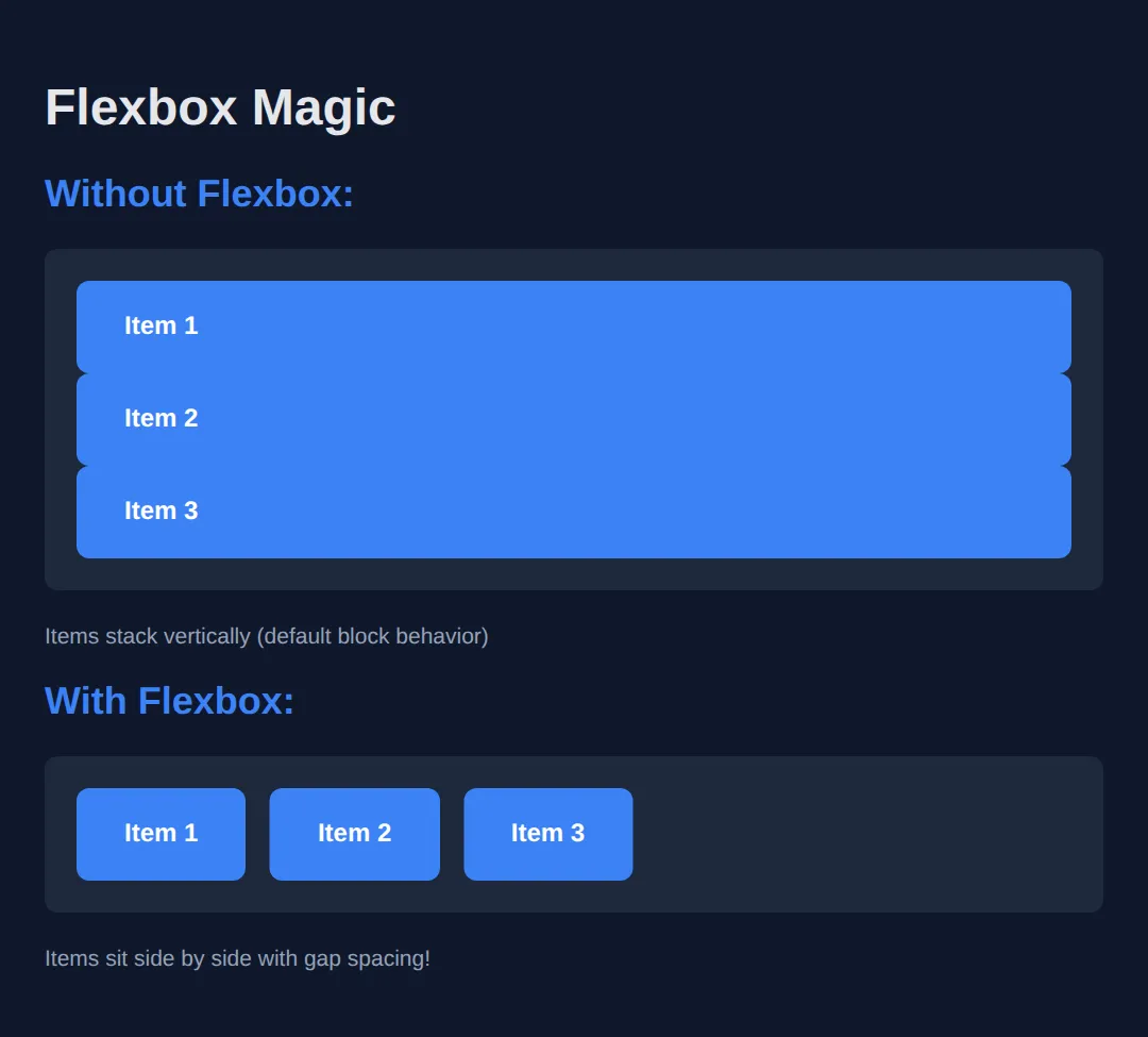
justify-content (Main Axis)
Controls how items are distributed along the main axis (horizontal by default).
<!DOCTYPE html>
<html>
<head>
  <title>justify-content</title>
  <style>
    body {
      background: #0f172a;
      font-family: system-ui, sans-serif;
      padding: 20px;
      color: #e5e7eb;
    }

    .demo {
      display: flex;
      background: #1e293b;
      padding: 15px;
      margin: 10px 0;
      border-radius: 8px;
      min-height: 60px;
    }

    .item {
      background: #3b82f6;
      padding: 10px 20px;
      border-radius: 6px;
      color: white;
    }

    .start { justify-content: flex-start; }
    .center { justify-content: center; }
    .end { justify-content: flex-end; }
    .between { justify-content: space-between; }
    .around { justify-content: space-around; }
    .evenly { justify-content: space-evenly; }

    h3 {
      color: #22c55e;
      margin: 20px 0 5px 0;
      font-size: 14px;
    }
  </style>
</head>
<body>
  <h1>justify-content</h1>

  <h3>flex-start (default)</h3>
  <div class="demo start">
    <div class="item">1</div>
    <div class="item">2</div>
    <div class="item">3</div>
  </div>

  <h3>center</h3>
  <div class="demo center">
    <div class="item">1</div>
    <div class="item">2</div>
    <div class="item">3</div>
  </div>

  <h3>flex-end</h3>
  <div class="demo end">
    <div class="item">1</div>
    <div class="item">2</div>
    <div class="item">3</div>
  </div>

  <h3>space-between</h3>
  <div class="demo between">
    <div class="item">1</div>
    <div class="item">2</div>
    <div class="item">3</div>
  </div>

  <h3>space-around</h3>
  <div class="demo around">
    <div class="item">1</div>
    <div class="item">2</div>
    <div class="item">3</div>
  </div>

  <h3>space-evenly</h3>
  <div class="demo evenly">
    <div class="item">1</div>
    <div class="item">2</div>
    <div class="item">3</div>
  </div>
  <!-- ✅ Expected result, measured in a real browser:
     .demo -> display: flex
     .start -> justify-content: flex-start
     .center -> justify-content: center
     .end -> justify-content: flex-end
     .item -> count: 18
  -->
</body>
</html>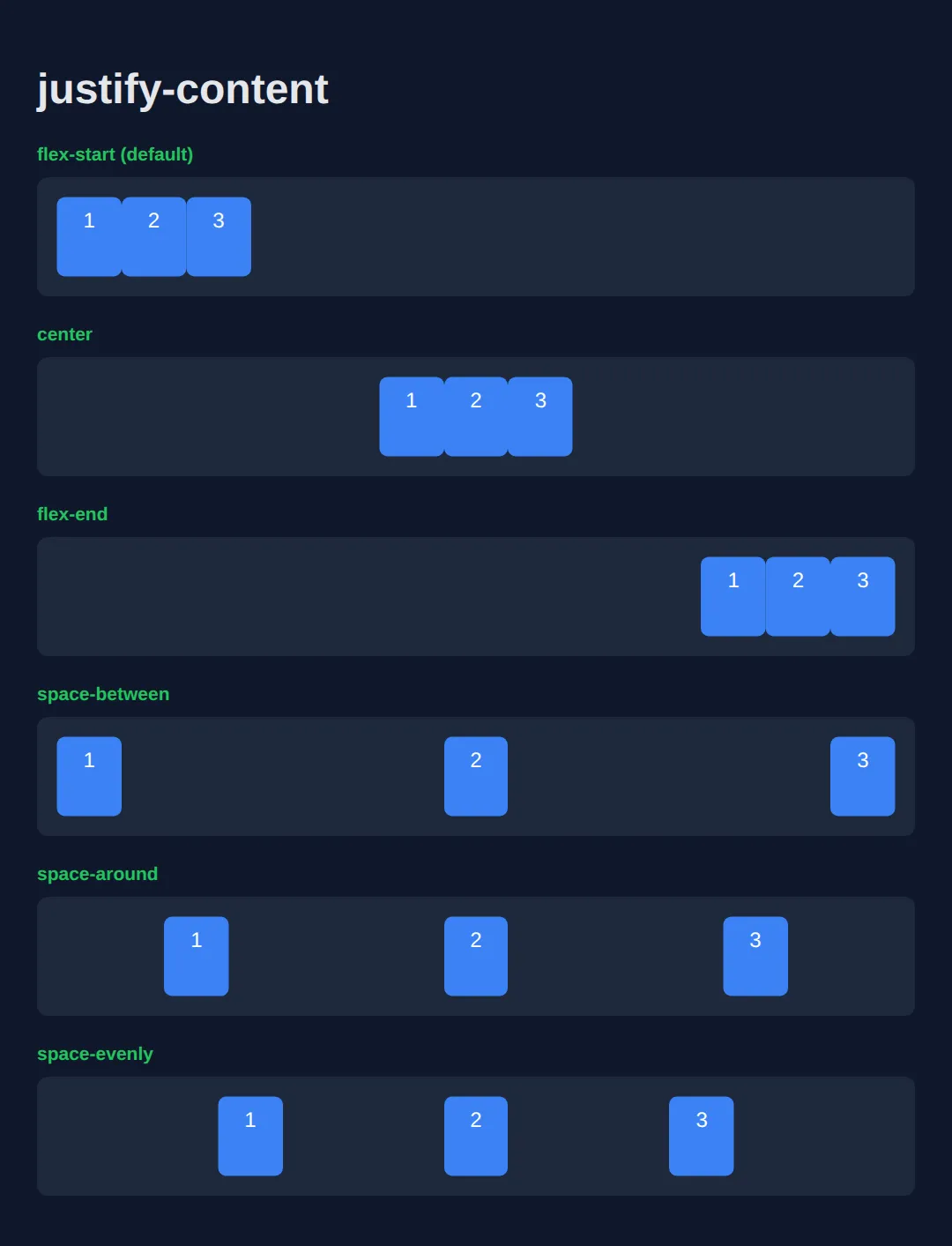
align-items (Cross Axis)
Controls how items are aligned along the cross axis (vertical by default).
<!DOCTYPE html>
<html>
<head>
  <title>align-items</title>
  <style>
    body {
      background: #0f172a;
      font-family: system-ui, sans-serif;
      padding: 20px;
      color: #e5e7eb;
    }

    .demo {
      display: flex;
      gap: 10px;
      background: #1e293b;
      padding: 15px;
      margin: 10px 0;
      border-radius: 8px;
      height: 120px;
    }

    .item {
      background: #3b82f6;
      padding: 10px 20px;
      border-radius: 6px;
      color: white;
    }

    .tall { padding: 30px 20px; }
    .short { padding: 5px 20px; }

    .start { align-items: flex-start; }
    .center { align-items: center; }
    .end { align-items: flex-end; }
    .stretch { align-items: stretch; }

    h3 {
      color: #22c55e;
      margin: 20px 0 5px 0;
      font-size: 14px;
    }

    .stretch .item {
      padding: 10px 20px;
      height: auto;
    }
  </style>
</head>
<body>
  <h1>align-items</h1>

  <h3>flex-start</h3>
  <div class="demo start">
    <div class="item tall">Tall</div>
    <div class="item">Normal</div>
    <div class="item short">Short</div>
  </div>

  <h3>center</h3>
  <div class="demo center">
    <div class="item tall">Tall</div>
    <div class="item">Normal</div>
    <div class="item short">Short</div>
  </div>

  <h3>flex-end</h3>
  <div class="demo end">
    <div class="item tall">Tall</div>
    <div class="item">Normal</div>
    <div class="item short">Short</div>
  </div>

  <h3>stretch (items fill height)</h3>
  <div class="demo stretch">
    <div class="item">Stretched</div>
    <div class="item">Stretched</div>
    <div class="item">Stretched</div>
  </div>
  <!-- ✅ Expected result, measured in a real browser:
     .demo -> display: flex
     .start -> align-items: flex-start
     .center -> align-items: center
     .end -> align-items: flex-end
     .item -> count: 12
  -->
</body>
</html>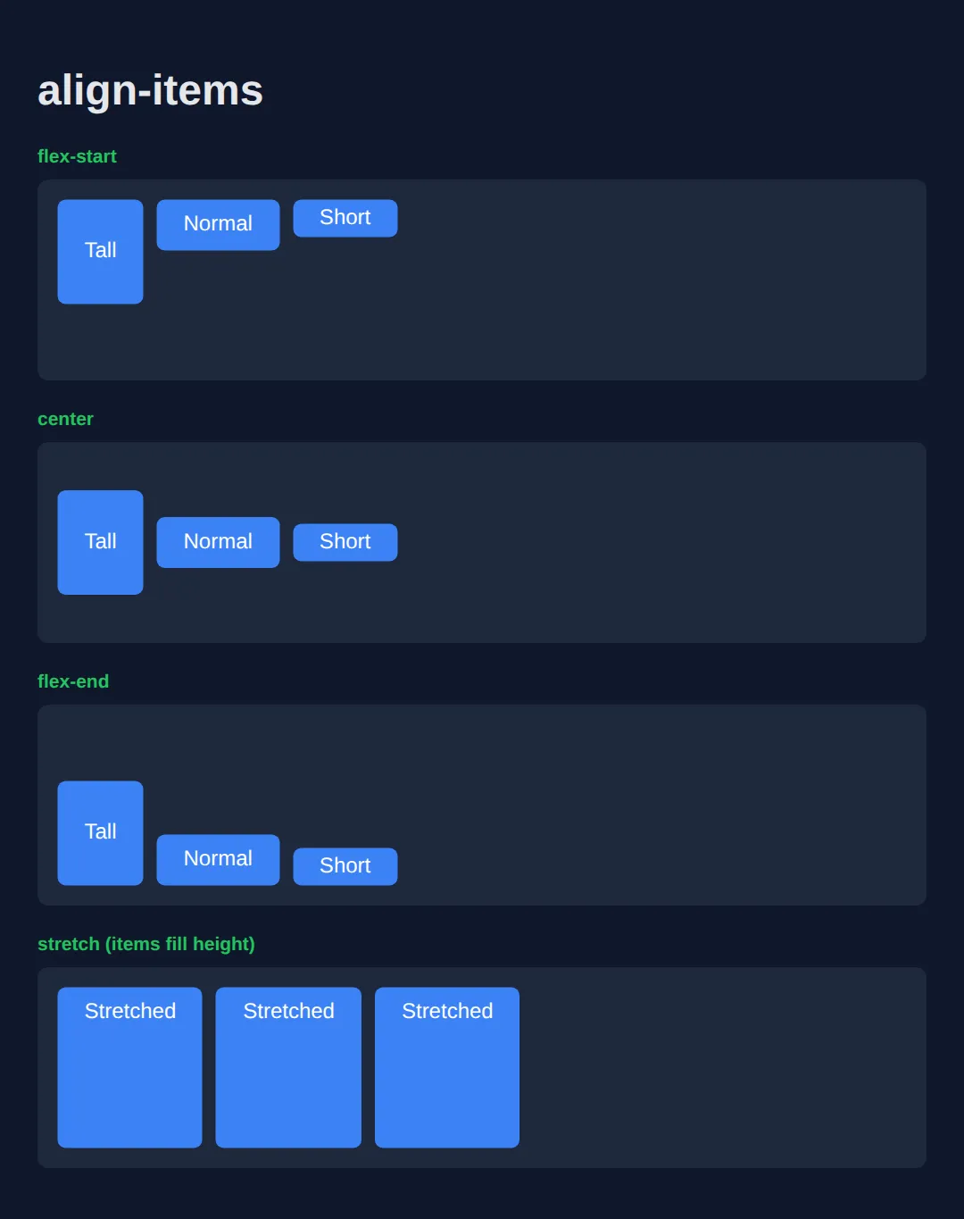
Perfect Centering
The holy grail of CSS - centering both horizontally AND vertically!
<!DOCTYPE html>
<html>
<head>
  <title>Perfect Centering</title>
  <style>
    body {
      background: #0f172a;
      font-family: system-ui, sans-serif;
      margin: 0;
      padding: 0;
    }

    /* THE MAGIC FORMULA */
    .centered-container {
      display: flex;
      justify-content: center;
      align-items: center;

      /* Full viewport height */
      min-height: 100vh;
    }

    .centered-content {
      background: linear-gradient(135deg, #3b82f6, #8b5cf6);
      padding: 40px 60px;
      border-radius: 16px;
      text-align: center;
      color: white;
      box-shadow: 0 20px 40px rgba(0, 0, 0, 0.4);
    }

    h1 {
      margin: 0 0 10px 0;
      font-size: 2rem;
    }

    p {
      margin: 0;
      opacity: 0.9;
    }

    .code {
      background: rgba(0, 0, 0, 0.3);
      padding: 15px 20px;
      border-radius: 8px;
      margin-top: 20px;
      font-family: monospace;
      font-size: 14px;
      text-align: left;
    }
  </style>
</head>
<body>
  <div class="centered-container">
    <div class="centered-content">
      <h1>Perfectly Centered!</h1>
      <p>Both horizontally and vertically</p>
      <div class="code">
        display: flex;<br>
        justify-content: center;<br>
        align-items: center;
      </div>
    </div>
  </div>
  <!-- ✅ Expected result, measured in a real browser:
     .centered-container -> display: flex
     p -> opacity: 0.9
  -->
</body>
</html>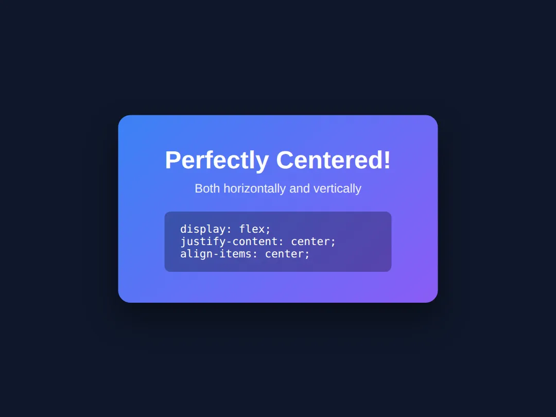
flex-direction
Change the main axis direction - row (horizontal) or column (vertical).
<!DOCTYPE html>
<html>
<head>
  <title>flex-direction</title>
  <style>
    body {
      background: #0f172a;
      font-family: system-ui, sans-serif;
      padding: 20px;
      color: #e5e7eb;
    }

    .demo {
      display: flex;
      gap: 10px;
      background: #1e293b;
      padding: 20px;
      margin: 10px 0;
      border-radius: 8px;
    }

    .item {
      background: #3b82f6;
      padding: 15px 25px;
      border-radius: 6px;
      color: white;
      font-weight: bold;
    }

    .row { flex-direction: row; }
    .row-reverse { flex-direction: row-reverse; }
    .column { flex-direction: column; width: 200px; }
    .column-reverse { flex-direction: column-reverse; width: 200px; }

    h3 {
      color: #22c55e;
      margin: 25px 0 5px 0;
    }
  </style>
</head>
<body>
  <h1>flex-direction</h1>

  <h3>row (default)</h3>
  <div class="demo row">
    <div class="item">1</div>
    <div class="item">2</div>
    <div class="item">3</div>
  </div>

  <h3>row-reverse</h3>
  <div class="demo row-reverse">
    <div class="item">1</div>
    <div class="item">2</div>
    <div class="item">3</div>
  </div>

  <h3>column</h3>
  <div class="demo column">
    <div class="item">1</div>
    <div class="item">2</div>
    <div class="item">3</div>
  </div>

  <h3>column-reverse</h3>
  <div class="demo column-reverse">
    <div class="item">1</div>
    <div class="item">2</div>
    <div class="item">3</div>
  </div>
  <!-- ✅ Expected result, measured in a real browser:
     .demo -> display: flex
     .row -> flex-direction: row
     .row-reverse -> flex-direction: row-reverse
     .column -> flex-direction: column
     .item -> count: 12
  -->
</body>
</html>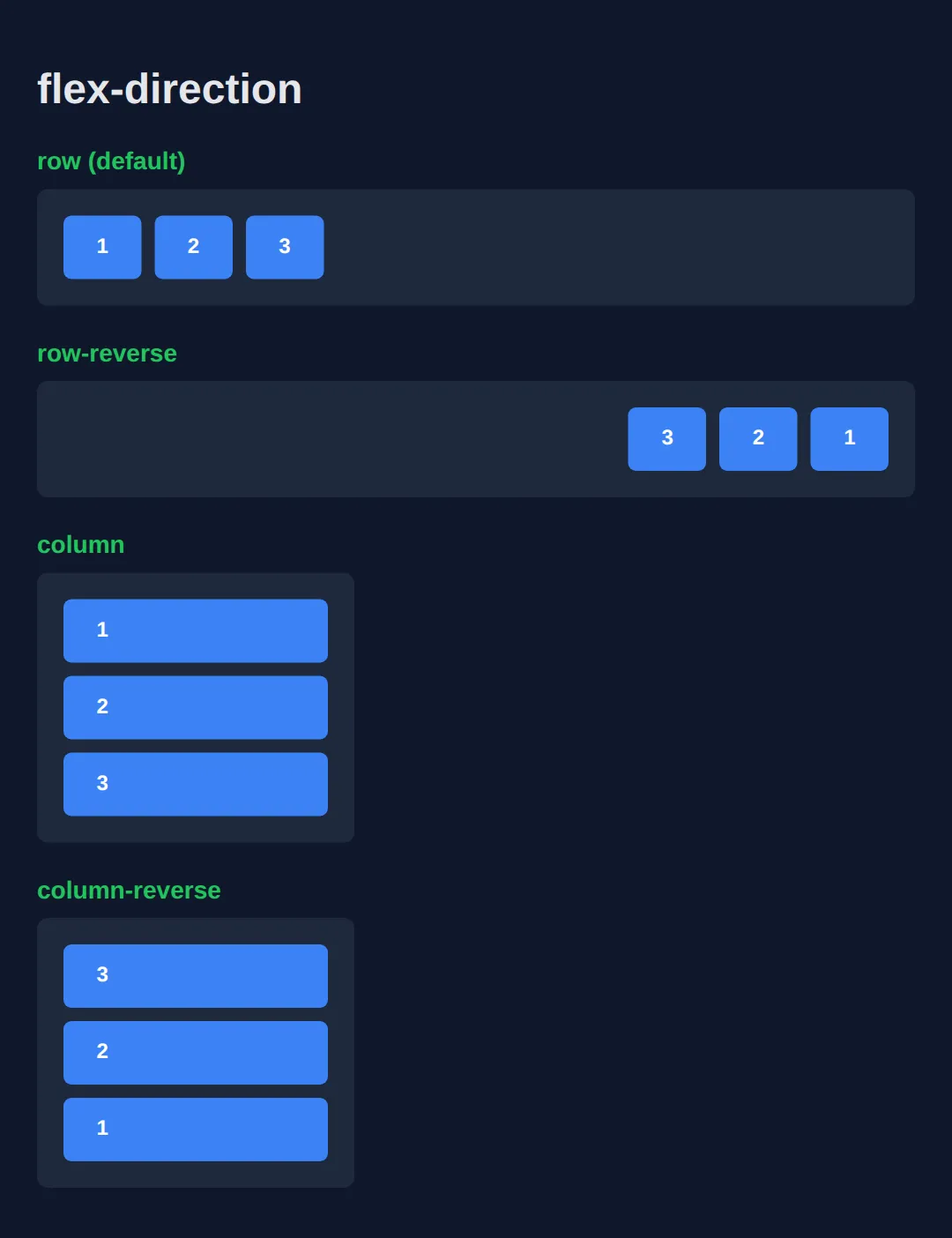
🧠 Worked Example — a dashboard header and card row
Everything above was one property at a time. Here is a finished, working layout that uses all of them together, with a comment on every line that matters. Read it top to bottom before you run it — the interesting part is that .card is both a flex item (of the row) and a flex container (for its own contents). That is how the "Open" buttons end up level with each other even though the cards hold different amounts of text.
<!DOCTYPE html>
<html>
<head>
  <title>Worked Example: Flexbox Toolbar + Cards</title>
  <style>
    /* Reset so padding never widens a box unexpectedly */
    * { box-sizing: border-box; margin: 0; padding: 0; }

    body {
      background: #0f172a;
      color: #e5e7eb;
      font-family: system-ui, sans-serif;
      padding: 24px;
    }

    /* ---------- 1. The toolbar: one flex row ---------- */
    .toolbar {
      display: flex;                    /* the two children below become flex items, side by side */
      justify-content: space-between;   /* main axis: title pushed left, buttons pushed right */
      align-items: center;              /* cross axis: title and buttons share one centre line */
      gap: 16px;                        /* minimum space between them if the row gets tight */
      background: #1e293b;
      padding: 14px 18px;
      border-radius: 10px;
      margin-bottom: 20px;
    }

    .toolbar h1 { font-size: 1.25rem; color: #60a5fa; }

    /* .actions is a flex ITEM of .toolbar and a flex CONTAINER for its own buttons */
    .actions {
      display: flex;                    /* the buttons sit in a row instead of stacking */
      gap: 10px;                        /* 10px between buttons, none on the outer edges */
    }

    .actions button {
      background: #3b82f6;
      color: white;
      border: none;
      padding: 9px 16px;
      border-radius: 8px;
      font: inherit;
      cursor: pointer;
    }

    /* ---------- 2. The card row: another flex row ---------- */
    .cards {
      display: flex;                    /* the three cards sit side by side */
      gap: 16px;                        /* even 16px gutters between cards */
      align-items: stretch;             /* default: every card grows to the tallest card's height */
    }

    /* ---------- 3. Each card: a flex COLUMN ---------- */
    .card {
      flex: 1;                          /* shorthand: each card takes an equal share of the row */
      display: flex;                    /* the card is now its own flex container... */
      flex-direction: column;           /* ...but stacked top-to-bottom, so the main axis is vertical */
      justify-content: space-between;   /* main axis is vertical now: text at top, button at bottom */
      gap: 12px;
      background: #1e293b;
      border-top: 3px solid #3b82f6;
      border-radius: 10px;
      padding: 18px;
    }

    .card h2 { font-size: 1rem; color: #93c5fd; }
    .card p  { font-size: 0.9rem; color: #94a3b8; }

    .card a {
      /* align-self overrides the container's align-items for THIS item only.
         In a column, the cross axis is horizontal, so flex-start means "left". */
      align-self: flex-start;
      background: #22c55e;
      color: #052e16;
      font-weight: 700;
      text-decoration: none;
      padding: 8px 14px;
      border-radius: 8px;
    }
  </style>
</head>
<body>

  <div class="toolbar">
    <h1>Dashboard</h1>
    <div class="actions">
      <button>Export</button>
      <button>New</button>
    </div>
  </div>

  <div class="cards">
    <div class="card">
      <h2>Short card</h2>
      <p>One line.</p>
      <a href="#">Open</a>
    </div>
    <div class="card">
      <h2>Tall card</h2>
      <p>This card has a lot more text in it, so it is the tallest card in the row and it decides the height of all three.</p>
      <a href="#">Open</a>
    </div>
    <div class="card">
      <h2>Medium card</h2>
      <p>A middling amount of text here.</p>
      <a href="#">Open</a>
    </div>
  </div>

  <!-- ✅ What you should see: "Dashboard" hard left in the grey bar with the two
       blue buttons hard right, all on the same centre line. Below it, three cards
       of identical width and identical height (the tall middle one sets the
       height), and all three green "Open" buttons sitting on the same bottom line. -->

  <!-- ✅ Expected result, measured in a real browser:
     .toolbar -> display: flex
     .actions -> display: flex
     .actions button -> cursor: pointer
     .cards -> display: flex
     .card -> count: 3
  -->
</body>
</html>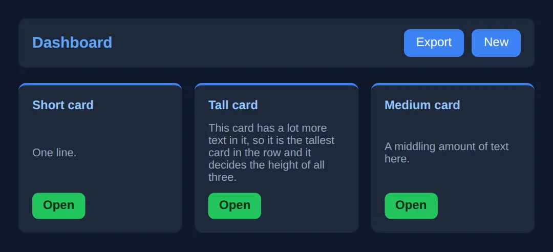
Try one change to prove the point to yourself: delete justify-content: space-between; from .card and re-run. The buttons jump up to sit right under the text, so the short card's button no longer lines up with the others.
🎯 Your Turn — build a site header
Right now the logo and the links are stacked on top of each other, because the header is still a plain block. Everything else is written for you — fill in the three blanks marked ___, run it, and check the result against the comment at the bottom.
<!DOCTYPE html>
<html>
<head>
  <title>Your Turn: Flexbox Header</title>
  <style>
    /* 🎯 YOUR TURN — fill in the three blanks marked ___ */

    * { box-sizing: border-box; margin: 0; padding: 0; }
    body { background: #0f172a; color: #e5e7eb; font-family: system-ui, sans-serif; padding: 24px; }

    .header {
      /* 1) Turn the header into a flex container so its two children sit in a row. */
      display: ___;               /* 👉 replace ___ with  flex  */

      /* 2) Push the logo to the far left and the links to the far right. */
      justify-content: ___;       /* 👉 replace ___ with  space-between  */

      /* 3) The logo is taller than the links. Line them both up on one centre line. */
      align-items: ___;           /* 👉 replace ___ with  center  */

      background: #1e293b;
      border-radius: 10px;
      padding: 14px 20px;
    }

    .logo { font-size: 1.6rem; font-weight: 700; color: #60a5fa; }

    /* Already done for you: the nav is its own little flex row */
    .links { display: flex; gap: 20px; }
    .links a { color: #94a3b8; text-decoration: none; }
    .links a:hover { color: #60a5fa; }
  </style>
</head>
<body>
  <header class="header">
    <div class="logo">FlexCo</div>
    <nav class="links">
      <a href="#">Home</a>
      <a href="#">Pricing</a>
      <a href="#">Contact</a>
    </nav>
  </header>

  <!-- ✅ Expected once all three blanks are filled: one grey bar with "FlexCo"
       flush against its left padding edge, the three links flush against its
       right padding edge, and the logo and links on the same horizontal centre
       line. Before you fill them in, the links sit on a separate line below. -->
</body>
</html>
Practice: Build a Navigation Bar
Build a navigation bar with Flexbox:
- Logo on the left
- Navigation links on the right
- Vertically centered items
<!DOCTYPE html>
<html>
<head>
  <title>Flexbox Navigation</title>
  <style>
    * {
      box-sizing: border-box;
      margin: 0;
      padding: 0;
    }

    body {
      background: #0f172a;
      font-family: system-ui, sans-serif;
      color: #e5e7eb;
    }

    /* FLEXBOX NAVBAR */
    .navbar {
      display: flex;
      justify-content: space-between;
      align-items: center;

      background: #1e293b;
      padding: 15px 30px;
      border-bottom: 1px solid #334155;
    }

    .logo {
      font-size: 1.5rem;
      font-weight: bold;
      color: #3b82f6;
    }

    .nav-links {
      display: flex;
      gap: 25px;
    }

    .nav-links a {
      color: #94a3b8;
      text-decoration: none;
      transition: color 0.2s;
    }

    .nav-links a:hover {
      color: #3b82f6;
    }

    .btn {
      background: #3b82f6;
      color: white;
      padding: 10px 20px;
      border-radius: 8px;
      text-decoration: none;
      font-weight: 600;
    }

    .btn:hover {
      background: #2563eb;
    }

    /* Page content */
    .content {
      padding: 40px;
      text-align: center;
    }

    .content h1 {
      color: #22c55e;
      margin-bottom: 20px;
    }
  </style>
</head>
<body>
  <nav class="navbar">
    <div class="logo">MyBrand</div>

    <div class="nav-links">
      <a href="#">Home</a>
      <a href="#">About</a>
      <a href="#">Services</a>
      <a href="#">Contact</a>
    </div>

    <a href="#" class="btn">Sign Up</a>
  </nav>

  <div class="content">
    <h1>Flexbox Navigation Complete!</h1>
    <p>Logo left, links center, button right - all with flexbox.</p>
  </div>
  <!-- ✅ Expected result, measured in a real browser:
     .navbar -> display: flex
     .nav-links -> display: flex
     .nav-links a -> text-decoration-line: none
     .btn -> text-decoration-line: none
  -->
</body>
</html>
🧩 Mini-Challenge — a comment list
No blanks this time — just an outline. Build the comment layout you have seen on every blog and social app: a round avatar on the left, the comment text filling the rest of the width, and the timestamp pushed to the far right of the name line. Two nested flex containers is all it takes. Scroll back to the worked example if you get stuck.
<!DOCTYPE html>
<html>
<head>
  <meta charset="utf-8">
  <title>Mini-Challenge: Comment List</title>
  <style>
    /* 🧩 MINI-CHALLENGE: a comment list
       1. .comment  — a flex row. Give it a gap (about 12px) and align-items: flex-start
                      so the avatar stays at the TOP of a long comment, not centred.
       2. .avatar   — 48px wide and 48px tall, border-radius: 50%. Add flex-shrink: 0
                      so a long comment cannot squash it. Centre its initials with a
                      nested display:flex + justify-content:center + align-items:center.
       3. .body     — flex: 1, so it soaks up all the width the avatar does not use.
       4. .meta     — a flex row inside .body with justify-content: space-between,
                      so .name sits left and .time sits right on the same line.

       ✅ What you are aiming for: both avatars start at exactly the same left edge,
          both timestamps end at exactly the same right edge (level with the right
          edge of the comment text), and the name and time share one line. The long
          second comment should wrap under its own text, never under the avatar.
    */

    * { box-sizing: border-box; margin: 0; padding: 0; }
    body { background: #0f172a; color: #e5e7eb; font-family: system-ui, sans-serif; padding: 24px; }

    /* your CSS here — .comment, .avatar, .body, .meta, .name, .time, .text */

  </style>
</head>
<body>

  <!-- The markup is done for you. Style it. -->
  <div class="comment">
    <div class="avatar">AL</div>
    <div class="body">
      <div class="meta"><span class="name">Alice</span><span class="time">2 min ago</span></div>
      <p class="text">Flexbox finally clicked for me.</p>
    </div>
  </div>

  <div class="comment">
    <div class="avatar">BO</div>
    <div class="body">
      <div class="meta"><span class="name">Bo</span><span class="time">10 min ago</span></div>
      <p class="text">The bit about the main axis flipping when you set flex-direction: column was the part I kept getting wrong.</p>
    </div>
  </div>

  <!-- ✅ Expected result, measured in a real browser:
     body -> padding-top: 24px
     .comment -> count: 2
  -->
</body>
</html>
🎉 Lesson Complete
You now have a solid grasp of Flexbox — the most-used layout tool in modern CSS. Key takeaways:
- ✅ display: flex turns a container into a flex container
- ✅ justify-content controls horizontal distribution
- ✅ align-items controls vertical alignment
- ✅ gap adds consistent spacing between items
- ✅ flex-direction: column switches to vertical layout
- ✅ Perfect centering = justify-content: center; align-items: center;
Practice quiz
What does the declaration display: flex do to an element?
- It makes the element a flex container, laying out its direct children as flex items
- It makes the element itself a flex item inside its parent
- It centers the element on the page automatically
- It hides the element until it is needed
Answer: It makes the element a flex container, laying out its direct children as flex items. display: flex turns the element into a flex container; its direct children become flex items.
Which property controls how flex items are distributed along the main axis?
- align-items
- justify-content
- flex-direction
- align-content
Answer: justify-content. justify-content distributes items along the main axis (horizontal by default).
Which property aligns flex items along the cross axis?
- justify-content
- gap
- align-items
- order
Answer: align-items. align-items controls alignment on the cross axis (vertical by default in a row).
What is the default value of flex-direction on a flex container?
- column
- row
- row-reverse
- column-reverse
Answer: row. The default is row, so items flow left to right along a horizontal main axis.
Which justify-content value places equal space between items but no space at the outer edges?
- space-around
- space-evenly
- space-between
- center
Answer: space-between. space-between puts the first and last items at the edges with equal gaps between all items.
To perfectly center a single item both horizontally and vertically in a flex container, you use:
- justify-content: center; align-items: center;
- text-align: center; vertical-align: middle;
- margin: auto; padding: auto;
- align-content: center; order: 0;
Answer: justify-content: center; align-items: center;. justify-content: center centers on the main axis and align-items: center on the cross axis.
When flex-direction is set to column, what becomes the main axis?
- The horizontal axis
- The vertical axis
- There is no main axis
- Both axes equally
Answer: The vertical axis. With flex-direction: column the main axis is vertical, so justify-content then works top-to-bottom.
What does the gap property do in a flex container?
- Adds space between flex items without adding space on the outer edges
- Adds equal padding inside every flex item
- Removes the default margins from items
- Sets the minimum width of each item
Answer: Adds space between flex items without adding space on the outer edges. gap creates consistent spacing between flex items without edge margins.
Which align-items value makes items fill the full height of the container's cross axis?
- flex-start
- center
- stretch
- flex-end
Answer: stretch. stretch (the default) makes items expand to fill the cross-axis size of the container.
Flexbox is best described as which kind of layout model?
- A two-dimensional model controlling rows and columns at once
- A one-dimensional model that lays items out along a single axis
- A model only for absolute positioning
- A model only for table layouts
Answer: A one-dimensional model that lays items out along a single axis. Flexbox is one-dimensional: it arranges items along a single row or column.
Continue this course
- Previous: CSS Layouts & Box Model
- Next: CSS Grid System — Create complex two-dimensional layouts with CSS Grid
- Quick reference: HTML & CSS cheat sheet › CSS Layout · CSS Flexbox cheat sheet › Container — alignment
- From the blog: CSS Grid Layout Tutorial · CSS Flexbox: A Visual Guide · Responsive Web Design Fundamentals