CSS Grid System
Reviewed & published by Brayan K
CSS Grid is a two-dimensional layout system that arranges elements into rows and columns at the same time using grid-template-columns and grid-template-rows, making it ideal for page layouts, dashboards, and any design built on a real grid.
Part of the free HTML & CSS course at LearnCodingFast — hands-on lessons with examples you run in your browser, plus practice exercises and a quick quiz.
💡 Grid vs Flexbox: When to Use Each
Think of Grid like a spreadsheet: You define rows AND columns, then place items in specific cells. Flexbox is like a single row or column; Grid is the whole table!
| Feature | Flexbox | Grid |
|---|---|---|
| Dimensions | One (row OR column) | Two (rows AND columns) |
| Best for | Navbars, buttons, small components | Page layouts, galleries, dashboards |
| Item sizing | Content-based | Track-based (columns/rows) |
| Overlap items? | No | Yes (with grid-area) |
What is CSS Grid?
CSS Grid is a powerful two-dimensional layout system that allows you to create complex layouts with rows and columns. It's perfect for page layouts, galleries, and structured content.
<!DOCTYPE html>
<html>
<head>
  <title>CSS Grid Basics</title>
  <style>
    body {
      background: #0f172a;
      font-family: system-ui, sans-serif;
      padding: 20px;
      color: #e5e7eb;
    }

    .grid-container {
      display: grid;
      grid-template-columns: repeat(3, 1fr);
      gap: 15px;
      background: #1e293b;
      padding: 20px;
      border-radius: 12px;
    }

    .grid-item {
      background: #3b82f6;
      padding: 30px;
      text-align: center;
      border-radius: 8px;
      color: white;
      font-weight: bold;
      font-size: 1.2rem;
    }

    .note {
      color: #94a3b8;
      margin-top: 15px;
      font-size: 14px;
    }
  </style>
</head>
<body>
  <h1>CSS Grid Magic</h1>

  <div class="grid-container">
    <div class="grid-item">1</div>
    <div class="grid-item">2</div>
    <div class="grid-item">3</div>
    <div class="grid-item">4</div>
    <div class="grid-item">5</div>
    <div class="grid-item">6</div>
  </div>

  <p class="note">
    grid-template-columns: repeat(3, 1fr) creates 3 equal columns.<br>
    gap: 15px adds space between all items.
  </p>
  <!-- ✅ Expected result, measured in a real browser:
     .grid-container -> display: grid
     .grid-item -> padding-top: 30px
     .grid-item -> count: 6
  -->
</body>
</html>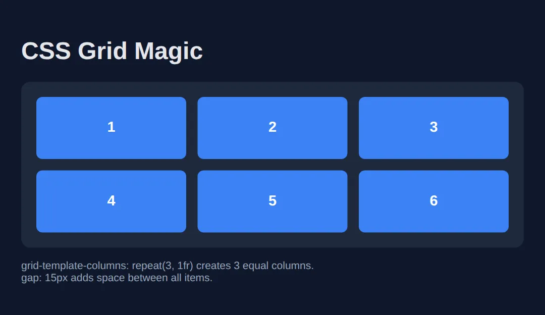
grid-template-columns
Define your column structure with flexible options.
<!DOCTYPE html>
<html>
<head>
  <title>Grid Columns</title>
  <style>
    body {
      background: #0f172a;
      font-family: system-ui, sans-serif;
      padding: 20px;
      color: #e5e7eb;
    }

    .section {
      margin: 25px 0;
    }

    h3 {
      color: #22c55e;
      margin-bottom: 10px;
      font-size: 14px;
    }

    .grid {
      display: grid;
      gap: 10px;
      background: #1e293b;
      padding: 15px;
      border-radius: 8px;
    }

    .item {
      background: #3b82f6;
      padding: 15px;
      text-align: center;
      border-radius: 6px;
      color: white;
    }

    /* Different column setups */
    .fixed { grid-template-columns: 100px 200px 100px; }
    .equal { grid-template-columns: 1fr 1fr 1fr; }
    .mixed { grid-template-columns: 200px 1fr 1fr; }
    .repeat { grid-template-columns: repeat(4, 1fr); }
    .minmax { grid-template-columns: repeat(auto-fit, minmax(150px, 1fr)); }
  </style>
</head>
<body>
  <h1>grid-template-columns</h1>

  <div class="section">
    <h3>Fixed widths: 100px 200px 100px</h3>
    <div class="grid fixed">
      <div class="item">100px</div>
      <div class="item">200px</div>
      <div class="item">100px</div>
    </div>
  </div>

  <div class="section">
    <h3>Equal fractions: 1fr 1fr 1fr</h3>
    <div class="grid equal">
      <div class="item">1fr</div>
      <div class="item">1fr</div>
      <div class="item">1fr</div>
    </div>
  </div>

  <div class="section">
    <h3>Mixed: 200px 1fr 1fr</h3>
    <div class="grid mixed">
      <div class="item">200px</div>
      <div class="item">1fr</div>
      <div class="item">1fr</div>
    </div>
  </div>

  <div class="section">
    <h3>repeat(4, 1fr) - 4 equal columns</h3>
    <div class="grid repeat">
      <div class="item">1</div>
      <div class="item">2</div>
      <div class="item">3</div>
      <div class="item">4</div>
    </div>
  </div>

  <div class="section">
    <h3>auto-fit + minmax (responsive!)</h3>
    <div class="grid minmax">
      <div class="item">Auto</div>
      <div class="item">Fit</div>
      <div class="item">Magic</div>
      <div class="item">Resize!</div>
    </div>
  </div>
  <!-- ✅ Expected result, measured in a real browser:
     .grid -> display: grid
     .fixed -> grid-template-columns: 100px 200px 100px
     .equal -> grid-template-columns: 231.328px 231.328px 231.328px
     .mixed -> grid-template-columns: 200px 247px 247px
     .item -> count: 17
  -->
</body>
</html>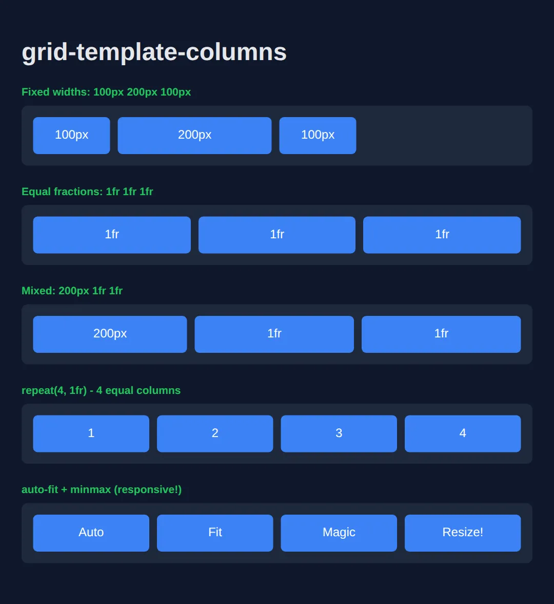
Spanning Rows and Columns
Make items span multiple columns or rows for complex layouts.
<!DOCTYPE html>
<html>
<head>
  <title>Grid Spanning</title>
  <style>
    body {
      background: #0f172a;
      font-family: system-ui, sans-serif;
      padding: 20px;
      color: #e5e7eb;
    }

    .grid {
      display: grid;
      grid-template-columns: repeat(4, 1fr);
      grid-template-rows: repeat(3, 100px);
      gap: 10px;
      background: #1e293b;
      padding: 20px;
      border-radius: 12px;
    }

    .item {
      background: #3b82f6;
      padding: 15px;
      border-radius: 8px;
      color: white;
      display: flex;
      align-items: center;
      justify-content: center;
      font-weight: bold;
    }

    /* Spanning */
    .span-2-cols {
      grid-column: span 2;
      background: #22c55e;
    }

    .span-2-rows {
      grid-row: span 2;
      background: #f59e0b;
    }

    .span-both {
      grid-column: span 2;
      grid-row: span 2;
      background: #ef4444;
    }

    .note {
      color: #94a3b8;
      margin-top: 20px;
      font-size: 14px;
    }
  </style>
</head>
<body>
  <h1>Grid Spanning</h1>

  <div class="grid">
    <div class="item span-both">2x2</div>
    <div class="item">3</div>
    <div class="item">4</div>
    <div class="item">5</div>
    <div class="item">6</div>
    <div class="item span-2-cols">Span 2 Columns</div>
    <div class="item span-2-rows">Span 2 Rows</div>
    <div class="item">10</div>
  </div>

  <div class="note">
    <p><strong>grid-column: span 2;</strong> - takes 2 columns</p>
    <p><strong>grid-row: span 2;</strong> - takes 2 rows</p>
  </div>
  <!-- ✅ Expected result, measured in a real browser:
     .grid -> display: grid
     .item -> display: flex
     .span-2-cols -> grid-column: span 2
     .span-2-rows -> grid-row: span 2
     .item -> count: 8
  -->
</body>
</html>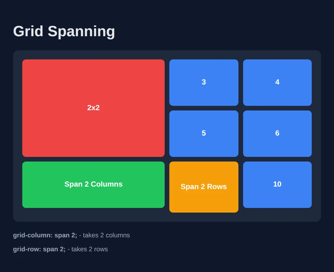
🧠 Worked Example — where the pixels actually go
The thing that trips people up about 1fr is that it does not mean "a quarter of the container". It means "a quarter of what is left over once the gaps have been taken out". This example pins the grid to 640px so you can check every number yourself, and comments the arithmetic line by line.
<!DOCTYPE html>
<html>
<head>
  <meta charset="utf-8">
  <title>Worked Example: fr, gaps and spans</title>
  <style>
    * { box-sizing: border-box; margin: 0; padding: 0; }
    body { background:#0f172a; color:#e5e7eb; font-family:system-ui,sans-serif; padding:24px; }
    h1 { font-size:1.2rem; color:#60a5fa; margin-bottom:4px; }
    p.note { font-size:.85rem; color:#94a3b8; margin-bottom:16px; }

    .dash {
      /* Pinned to a fixed width ONLY so the sums below come out exact.
         Real grids are usually fluid — take this line out and every number
         below scales, but the relationships stay identical. */
      width: 640px;

      display: grid;

      /* repeat(4, 1fr) = four columns that share the leftover space equally.
         Leftover = 640 total - 3 gaps x 16px = 640 - 48 = 592.
         592 / 4 = 148, so each column is exactly 148px wide. NOT 160px. */
      grid-template-columns: repeat(4, 1fr);

      /* gap only goes BETWEEN tracks — never around the outside edge. */
      gap: 16px;

      background:#1e293b;
      padding:0;
    }

    .tile { background:#334155; border-top:3px solid #3b82f6; border-radius:8px; padding:16px; font-size:.9rem; }

    /* span 2 = "take up two columns". It swallows the gap that used to sit
       between them, so its width is 148 + 16 + 148 = 312px, not 296px. */
    .wide { grid-column: span 2; border-top-color:#22c55e; }

    /* Same idea vertically: two rows of 51px plus the 16px gap = 118px tall. */
    .tall { grid-row: span 2; border-top-color:#f59e0b; }

    /* Line numbers instead of a span: 1 is the first grid line, -1 is the LAST
       one, counted from the end. "1 / -1" therefore means "edge to edge,
       however many columns there happen to be" — it never needs updating. */
    .full { grid-column: 1 / -1; border-top-color:#a855f7; }
  </style>
</head>
<body>
  <h1>Four columns, three spans</h1>
  <p class="note">The grid itself is pinned to 640px so the numbers below are exact.</p>

  <div class="dash">
    <div class="tile">1fr</div>
    <div class="tile wide">span 2</div>
    <div class="tile tall">span 2 rows</div>
    <div class="tile">1fr</div>
    <div class="tile">1fr</div>
    <div class="tile">1fr</div>
    <div class="tile full">1 / -1 (edge to edge)</div>
  </div>

  <!-- ✅ What you should see, and can measure:
       Row 1: a 148px tile, a 312px green tile, and the orange tile.
       The orange tile is 148px wide but twice as tall — it hangs down into row 2.
       Row 2: three 148px tiles, filling the gap the orange tile left.
       Row 3: one purple tile stretching the full 640px, both edges flush.
       Add a fifth column to grid-template-columns and every 1fr tile gets
       narrower, the green tile still covers exactly two of them, and the purple
       1 / -1 tile still reaches both edges without you touching it. -->
  <!-- ✅ Expected result, measured in a real browser:
     .dash -> display: grid
     .wide -> grid-column: span 2
     .tall -> grid-row: span 2
     .full -> grid-column: 1 / -1
     .tile -> count: 7
  -->
</body>
</html>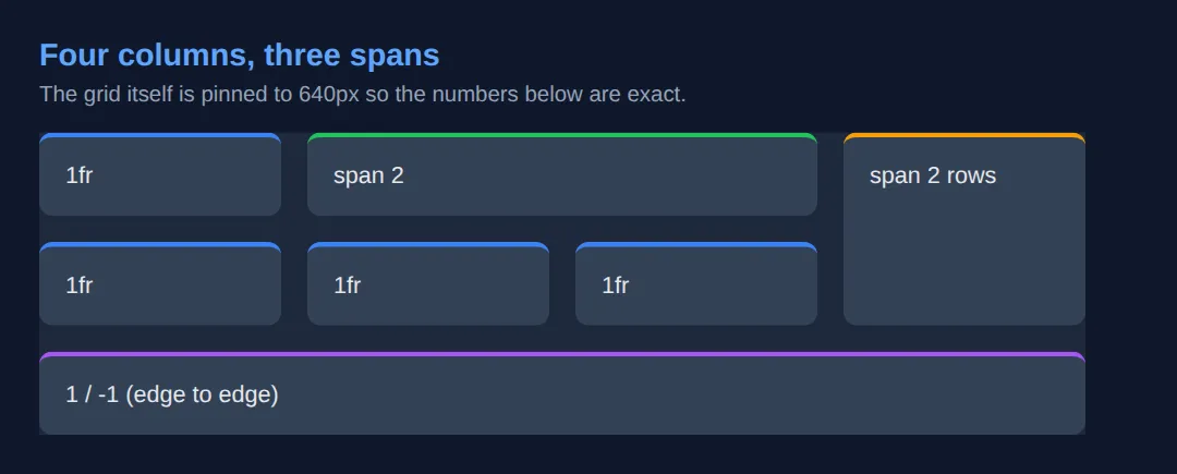
🎯 Your Turn — build a gallery grid
Seven photos are currently stacked in one long column because the container is still a plain block. Four blanks marked ___ turn it into a gallery with a double-width featured tile.
<!DOCTYPE html>
<html>
<head>
  <meta charset="utf-8">
  <title>Your Turn: Build the grid</title>
  <style>
    /* 🎯 YOUR TURN — fill in the four blanks marked ___ */

    * { box-sizing:border-box; margin:0; padding:0; }
    body { background:#0f172a; color:#e5e7eb; font-family:system-ui,sans-serif; padding:24px; }
    h1 { font-size:1.1rem; color:#60a5fa; margin-bottom:12px; }

    .gallery {
      width: 480px;                    /* fixed so you can check the maths */

      /* 1) Turn the container into a grid. */
      display: ___;                    /* 👉 replace ___ with  grid  */

      /* 2) Three equal columns. Use repeat() rather than typing 1fr three times. */
      grid-template-columns: ___;      /* 👉 replace ___ with  repeat(3, 1fr)  */

      /* 3) 12px of space between tiles, and none around the outside. */
      gap: ___;                        /* 👉 replace ___ with  12px  */
    }

    .photo { background:#334155; border-radius:8px; padding:24px 10px; text-align:center; font-size:.85rem; color:#cbd5e1; }

    .featured {
      /* 4) Make the featured tile cover two columns instead of one. */
      grid-column: ___;                /* 👉 replace ___ with  span 2  */

      background:#3b82f6;
      color:#fff;
      font-weight:700;
    }
  </style>
</head>
<body>
  <h1>Gallery</h1>

  <div class="gallery">
    <div class="photo featured">Featured</div>
    <div class="photo">2</div>
    <div class="photo">3</div>
    <div class="photo">4</div>
    <div class="photo">5</div>
    <div class="photo">6</div>
    <div class="photo">7</div>
  </div>

  <!-- ✅ Expected once all four blanks are filled: three rows.
       Row 1: the blue "Featured" tile (316px wide = 152 + 12 gap + 152) then tile 2.
       Row 2: tiles 3, 4 and 5, each 152px wide.
       Row 3: tiles 6 and 7, with the third column left empty.
       (480 total - 2 gaps x 12px = 456; 456 / 3 = 152px per column.)
       Notice you never told tiles 2-7 where to go — grid placed them itself, in
       source order, into the next free cell. -->
</body>
</html>
Grid Areas (Named Layouts)
Create intuitive layouts by naming areas - perfect for page structure!
<!DOCTYPE html>
<html>
<head>
  <title>Grid Areas</title>
  <style>
    * {
      box-sizing: border-box;
      margin: 0;
      padding: 0;
    }

    body {
      background: #0f172a;
      font-family: system-ui, sans-serif;
      color: #e5e7eb;
    }

    .page-layout {
      display: grid;
      grid-template-areas:
        "header header header"
        "sidebar main main"
        "footer footer footer";
      grid-template-columns: 200px 1fr 1fr;
      grid-template-rows: 60px 1fr 50px;
      gap: 10px;
      min-height: 100vh;
      padding: 10px;
    }

    .header {
      grid-area: header;
      background: #1e293b;
      padding: 15px 20px;
      border-radius: 8px;
      display: flex;
      align-items: center;
    }

    .sidebar {
      grid-area: sidebar;
      background: #1e293b;
      padding: 20px;
      border-radius: 8px;
    }

    .main {
      grid-area: main;
      background: #1e293b;
      padding: 20px;
      border-radius: 8px;
    }

    .footer {
      grid-area: footer;
      background: #1e293b;
      padding: 15px 20px;
      border-radius: 8px;
      display: flex;
      align-items: center;
      justify-content: center;
    }

    h1 { color: #3b82f6; font-size: 1.2rem; }
    h2 { color: #22c55e; font-size: 1rem; margin-bottom: 15px; }

    .nav-item {
      padding: 10px;
      margin: 5px 0;
      background: #334155;
      border-radius: 6px;
    }
  </style>
</head>
<body>
  <div class="page-layout">
    <header class="header">
      <h1>Grid Areas Layout</h1>
    </header>

    <aside class="sidebar">
      <h2>Sidebar</h2>
      <div class="nav-item">Dashboard</div>
      <div class="nav-item">Settings</div>
      <div class="nav-item">Profile</div>
    </aside>

    <main class="main">
      <h2>Main Content</h2>
      <p>This is the main content area. It spans 2 columns because of grid-template-areas!</p>
      <br>
      <p>grid-template-areas makes complex layouts readable and easy to modify.</p>
    </main>

    <footer class="footer">
      <p>Footer - spans all 3 columns</p>
    </footer>
  </div>
  <!-- ✅ Expected result, measured in a real browser:
     .page-layout -> display: grid
     .header -> display: flex
     .footer -> display: flex
     .nav-item -> count: 3
  -->
</body>
</html>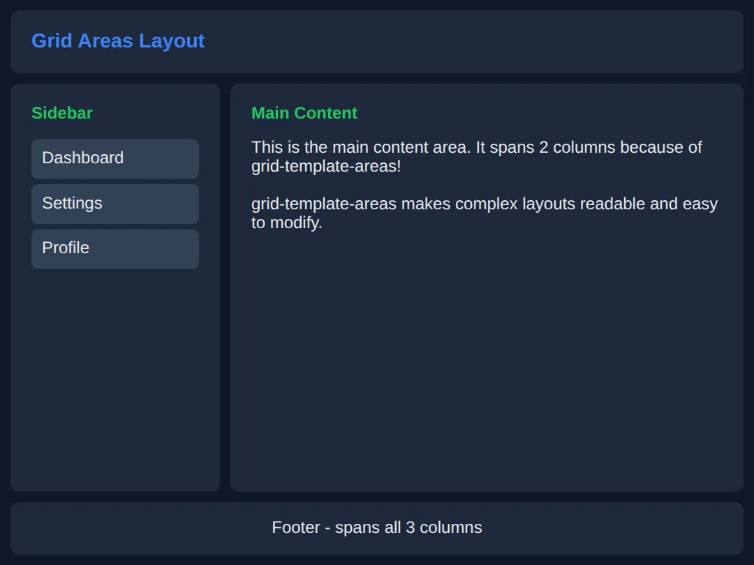
Responsive Grid with auto-fit
Create responsive grids without media queries!
<!DOCTYPE html>
<html>
<head>
  <title>Responsive Grid</title>
  <style>
    body {
      background: #0f172a;
      font-family: system-ui, sans-serif;
      padding: 20px;
      color: #e5e7eb;
    }

    h1 { margin-bottom: 20px; }

    /* THE MAGIC: auto-fit + minmax */
    .card-grid {
      display: grid;
      grid-template-columns: repeat(auto-fit, minmax(250px, 1fr));
      gap: 20px;
    }

    .card {
      background: #1e293b;
      border-radius: 12px;
      overflow: hidden;
      transition: transform 0.2s;
    }

    .card:hover {
      transform: translateY(-5px);
    }

    .card-image {
      height: 150px;
      background: linear-gradient(135deg, #3b82f6, #8b5cf6);
      display: flex;
      align-items: center;
      justify-content: center;
      font-size: 3rem;
    }

    .card-content {
      padding: 20px;
    }

    .card h3 {
      color: #22c55e;
      margin: 0 0 10px 0;
    }

    .card p {
      color: #94a3b8;
      font-size: 14px;
      margin: 0;
    }

    .note {
      background: #22c55e;
      color: #0f172a;
      padding: 15px 20px;
      border-radius: 8px;
      margin-bottom: 25px;
    }
  </style>
</head>
<body>
  <h1>Responsive Card Grid</h1>

  <div class="note">
    <strong>No media queries needed!</strong><br>
    grid-template-columns: repeat(auto-fit, minmax(250px, 1fr));
  </div>

  <div class="card-grid">
    <div class="card">
      <div class="card-image">🚀</div>
      <div class="card-content">
        <h3>Card One</h3>
        <p>Cards automatically reflow based on available space.</p>
      </div>
    </div>

    <div class="card">
      <div class="card-image">💡</div>
      <div class="card-content">
        <h3>Card Two</h3>
        <p>Minimum 250px wide, expands to fill available space.</p>
      </div>
    </div>

    <div class="card">
      <div class="card-image">⚡</div>
      <div class="card-content">
        <h3>Card Three</h3>
        <p>Try resizing your browser window to see the magic!</p>
      </div>
    </div>

    <div class="card">
      <div class="card-image">🎨</div>
      <div class="card-content">
        <h3>Card Four</h3>
        <p>This is the modern way to create responsive grids.</p>
      </div>
    </div>
  </div>
  <!-- ✅ Expected result, measured in a real browser:
     .card-grid -> display: grid
     .card -> overflow: hidden
     .card-image -> display: flex
     .card -> count: 4
  -->
</body>
</html>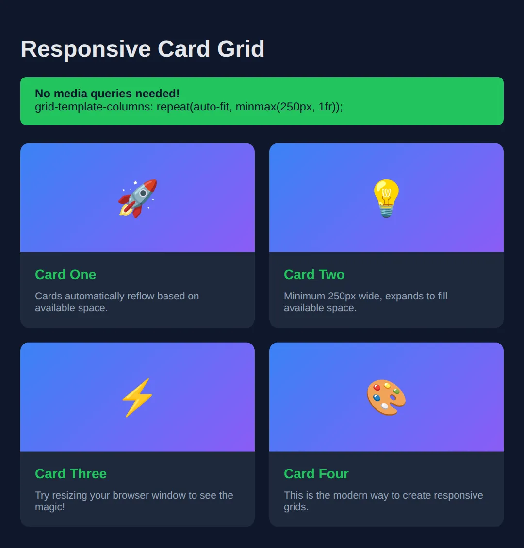
Practice: Photo Gallery
Create a photo gallery grid with:
- Responsive columns using auto-fit
- One featured image that spans 2 columns
- Consistent gap between items
<!DOCTYPE html>
<html>
<head>
  <title>Photo Gallery</title>
  <style>
    * {
      box-sizing: border-box;
      margin: 0;
      padding: 0;
    }

    body {
      background: #0f172a;
      font-family: system-ui, sans-serif;
      padding: 20px;
      color: #e5e7eb;
    }

    h1 {
      text-align: center;
      margin-bottom: 30px;
      color: #3b82f6;
    }

    .gallery {
      display: grid;
      grid-template-columns: repeat(auto-fit, minmax(200px, 1fr));
      gap: 15px;
      max-width: 1000px;
      margin: 0 auto;
    }

    .photo {
      aspect-ratio: 1;
      border-radius: 12px;
      overflow: hidden;
      position: relative;
      cursor: pointer;
      transition: transform 0.3s;
    }

    .photo:hover {
      transform: scale(1.02);
    }

    .photo img {
      width: 100%;
      height: 100%;
      object-fit: cover;
    }

    /* Featured image spans 2 columns */
    .featured {
      grid-column: span 2;
      aspect-ratio: 2/1;
    }

    .photo-overlay {
      position: absolute;
      bottom: 0;
      left: 0;
      right: 0;
      background: linear-gradient(transparent, rgba(0,0,0,0.8));
      padding: 20px;
      opacity: 0;
      transition: opacity 0.3s;
    }

    .photo:hover .photo-overlay {
      opacity: 1;
    }

    .photo-overlay h3 {
      color: white;
      font-size: 1rem;
    }
  </style>
</head>
<body>
  <h1>📸 Photo Gallery</h1>

  <div class="gallery">
    <div class="photo featured">
      <img src="https://via.placeholder.com/600x300/3b82f6/ffffff?text=Featured+Photo" alt="Featured">
      <div class="photo-overlay">
        <h3>Featured Image</h3>
      </div>
    </div>

    <div class="photo">
      <img src="https://via.placeholder.com/300/22c55e/ffffff?text=Photo+1" alt="Photo 1">
      <div class="photo-overlay"><h3>Nature</h3></div>
    </div>

    <div class="photo">
      <img src="https://via.placeholder.com/300/f59e0b/ffffff?text=Photo+2" alt="Photo 2">
      <div class="photo-overlay"><h3>Sunset</h3></div>
    </div>

    <div class="photo">
      <img src="https://via.placeholder.com/300/ef4444/ffffff?text=Photo+3" alt="Photo 3">
      <div class="photo-overlay"><h3>Architecture</h3></div>
    </div>

    <div class="photo">
      <img src="https://via.placeholder.com/300/8b5cf6/ffffff?text=Photo+4" alt="Photo 4">
      <div class="photo-overlay"><h3>Abstract</h3></div>
    </div>

    <div class="photo">
      <img src="https://via.placeholder.com/300/06b6d4/ffffff?text=Photo+5" alt="Photo 5">
      <div class="photo-overlay"><h3>Ocean</h3></div>
    </div>
  </div>
  <!-- ✅ Expected result, measured in a real browser:
     .gallery -> display: grid
     .photo -> position: relative
     .photo img -> object-fit: cover
     .featured -> grid-column: span 2
     .photo -> count: 6
  -->
</body>
</html>
🧩 Mini-Challenge — a whole page layout, rearranged by one map
This is the challenge that shows why Grid exists. Build a classic page — header, sidebar, main, footer — using grid-template-areas, then re-arrange the whole thing for narrow screens by rewriting nothing but the little ASCII map. No blanks this time, just the brief.
🎉 Lesson Complete
You now understand CSS Grid — the most powerful layout system in CSS. Key takeaways:
- ✅ display: grid creates a two-dimensional layout
- ✅ grid-template-columns defines column structure
- ✅ fr units create flexible, fractional columns
- ✅ grid-column: span 2 makes items span multiple cells
- ✅ grid-template-areas creates readable named layouts
- ✅ auto-fit + minmax() creates responsive grids without media queries
Practice quiz
How is CSS Grid best described compared to Flexbox?
- A one-dimensional system for a single row or column
- A system only for centering single elements
- A two-dimensional system that controls rows and columns at the same time
- A replacement for the HTML <table> element only
Answer: A two-dimensional system that controls rows and columns at the same time. Grid is two-dimensional, arranging items into rows and columns simultaneously.
What does grid-template-columns: repeat(3, 1fr) create?
- Three equal-width flexible columns that share the available space
- Three columns each exactly 1 pixel wide
- One column repeated three times vertically
- Three rows of equal height
Answer: Three equal-width flexible columns that share the available space. repeat(3, 1fr) makes three columns that each take an equal fraction of the free space.
What does the fr unit represent in CSS Grid?
- A fixed number of pixels
- A font-relative size like em
- A percentage of the viewport width
- A fraction of the available free space in the grid container
Answer: A fraction of the available free space in the grid container. fr is a fractional unit representing a share of the remaining free space in the grid.
Which declaration makes a grid item span two columns?
- grid-span: 2;
- grid-column: span 2;
- column-count: 2;
- grid-columns: 2;
Answer: grid-column: span 2;. grid-column: span 2 makes the item occupy two column tracks.
What does grid-template-areas let you do?
- Name regions of the layout and place items by referencing those names
- Automatically import images into the grid
- Define the maximum number of rows allowed
- Set the gap between items
Answer: Name regions of the layout and place items by referencing those names. grid-template-areas names regions so items can be placed with grid-area by name.
Which combination creates a responsive grid without media queries?
- repeat(3, 100px)
- grid-column: span 2
- repeat(auto-fit, minmax(250px, 1fr))
- display: inline-grid
Answer: repeat(auto-fit, minmax(250px, 1fr)). repeat(auto-fit, minmax(250px, 1fr)) lets columns reflow automatically as space changes.
What does the gap property control in a grid?
- The outer margin of the grid container
- The space between rows and columns of the grid
- The padding inside each grid item
- The number of columns
Answer: The space between rows and columns of the grid. gap sets the spacing between grid tracks (both rows and columns).
Which declaration turns an element into a grid container?
- display: block;
- position: grid;
- layout: grid;
- display: grid;
Answer: display: grid;. display: grid makes the element a grid container so its children become grid items.
Which property is used to define the explicit row tracks of a grid?
- grid-rows
- grid-template-rows
- row-template
- grid-row-gap
Answer: grid-template-rows. grid-template-rows defines the explicit row track sizes of the grid.
Which is the recommended general rule for choosing between Grid and Flexbox?
- Use Grid for components and Flexbox for page structure
- Always use Grid and never use Flexbox
- Use Flexbox for components and Grid for overall page structure
- They are interchangeable with no difference
Answer: Use Flexbox for components and Grid for overall page structure. A common rule of thumb: Flexbox for one-dimensional components, Grid for two-dimensional page structure.
Continue this course
- Previous: Flexbox Mastery
- Next: Responsive Design — Make your sites look perfect on phones, tablets, and desktops with media queries
- Quick reference: HTML & CSS cheat sheet › CSS Layout · CSS Grid cheat sheet › Defining the tracks
- From the blog: CSS Grid Layout Tutorial · CSS Flexbox: A Visual Guide · Responsive Web Design Fundamentals