Responsive Design
Reviewed & published by Brayan K
Responsive design is the practice of building one layout that adapts to any screen size, using flexible units, fluid grids, and @media queries so a page looks great on phones, tablets, and desktops alike.
Part of the free HTML & CSS course at LearnCodingFast — hands-on lessons with examples you run in your browser, plus practice exercises and a quick quiz.
💡 Think of It Like This
Imagine water in different containers: Water naturally fills whatever shape it's poured into — a glass, a bowl, a bottle. Responsive design works the same way: your content flows and adapts to whatever screen size it's viewed on, from a tiny phone to a giant desktop monitor.
Without responsive design, your website is like a rigid block of ice — it stays the same size no matter what container you put it in, and it overflows or looks broken on smaller screens.
1. Why Responsive Design Matters
Over 60% of all web traffic comes from mobile devices. If your website doesn't look good on a phone, most visitors will leave immediately. Google also uses mobile-first indexing, meaning it judges your site primarily by how it looks on mobile.
| Without Responsive Design | With Responsive Design |
|---|---|
| Text too small to read on mobile | Text scales to readable size |
| Horizontal scrolling required | Content fits the screen width |
| Buttons too small to tap | Touch-friendly button sizes |
| Poor Google ranking | Better SEO and ranking |
2. The Viewport Meta Tag (Required!)
Every responsive website must include this tag in the <head>. Without it, mobile browsers will render your page at desktop width (typically 980px) and then shrink it down, making everything tiny and unreadable.
| Attribute | What It Does |
|---|---|
| width=device-width | Sets viewport width to the device's actual screen width |
| initial-scale=1.0 | Sets initial zoom level to 100% (no zoom in or out) |
⚠️ Common Mistake: Forgetting this meta tag is the #1 reason responsive CSS "doesn't work." Always add it first!
3. Media Queries — The Heart of Responsive Design
Media queries let you apply different CSS rules based on screen size. Think of them as "if statements" for CSS — "if the screen is smaller than 768px, do this."
<!DOCTYPE html>
<html>
<head>
  <meta name="viewport" content="width=device-width, initial-scale=1.0">
  <title>Media Queries</title>
  <style>
    body {
      background: #0f172a;
      font-family: system-ui, sans-serif;
      padding: 20px;
      color: #e5e7eb;
      margin: 0;
    }

    .status {
      padding: 20px;
      border-radius: 12px;
      text-align: center;
      font-size: 1.5rem;
      font-weight: bold;
      margin: 20px;
      transition: all 0.3s ease;
    }

    /* Desktop (default) */
    .status {
      background: #22c55e;
      color: #0f172a;
    }
    .status::after { content: "🖥️ Desktop View (> 1024px)"; }

    /* Tablet */
    @media (max-width: 1024px) {
      .status {
        background: #3b82f6;
        color: white;
      }
      .status::after { content: "📱 Tablet View (769px – 1024px)"; }
    }

    /* Mobile */
    @media (max-width: 768px) {
      .status {
        background: #f59e0b;
        color: #0f172a;
      }
      .status::after { content: "📱 Mobile View (≤ 768px)"; }
    }

    .grid {
      display: grid;
      grid-template-columns: repeat(3, 1fr);
      gap: 15px;
      padding: 20px;
    }

    .card {
      background: #1e293b;
      padding: 25px;
      border-radius: 12px;
      text-align: center;
      border: 2px solid #334155;
    }

    @media (max-width: 1024px) {
      .grid { grid-template-columns: repeat(2, 1fr); }
    }

    @media (max-width: 768px) {
      .grid { grid-template-columns: 1fr; }
    }
  </style>
</head>
<body>
  <div class="status"></div>

  <div class="grid">
    <div class="card">
      <h3>Card 1</h3>
      <p>Resize the window!</p>
    </div>
    <div class="card">
      <h3>Card 2</h3>
      <p>Watch me reflow</p>
    </div>
    <div class="card">
      <h3>Card 3</h3>
      <p>I'm responsive! 🎉</p>
    </div>
  </div>
  <!-- ✅ Expected result, measured in a real browser:
     .grid -> display: grid
     .status -> padding-top: 20px
     .card -> count: 3
  -->
</body>
</html>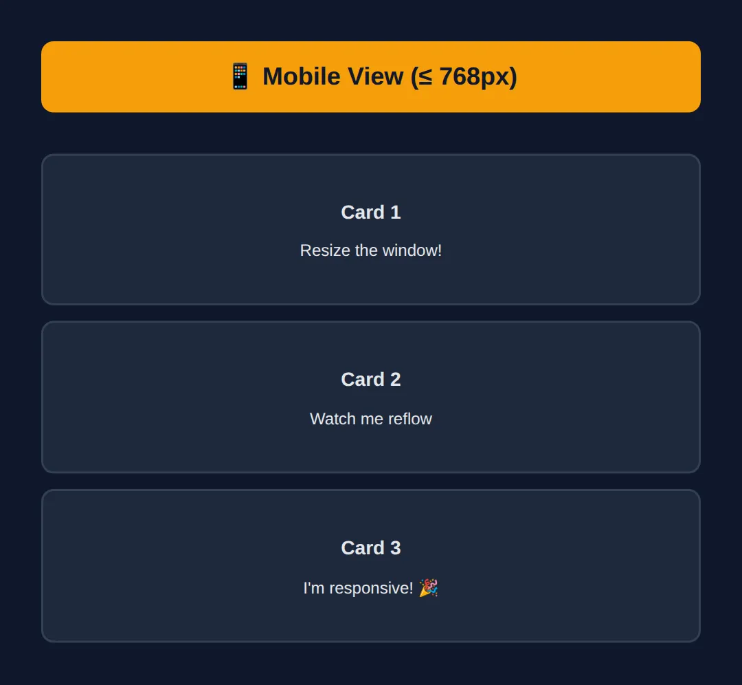
4. Common Breakpoints
Breakpoints are the screen widths where your layout changes. Here are the most commonly used ones:
| Device | Width Range | Media Query |
|---|---|---|
| 📱 Mobile | 320px – 768px | @media (max-width: 768px) |
| 📱 Tablet | 769px – 1024px | @media (max-width: 1024px) |
| 💻 Laptop | 1025px – 1440px | @media (max-width: 1440px) |
| 🖥️ Desktop | 1441px+ | @media (min-width: 1441px) |
💡 Pro Tip: Don't overthink breakpoints. Most projects only need 2-3: one for mobile (~768px), one for tablet (~1024px), and desktop is the default.
5. Mobile-First vs Desktop-First
There are two approaches to writing responsive CSS. Mobile-first is recommended by most professionals.
| Approach | How It Works | Media Query |
|---|---|---|
| Mobile-First ✅ | Write mobile styles first, then add desktop overrides | @media (min-width: 768px) |
| Desktop-First | Write desktop styles first, then override for mobile | @media (max-width: 768px) |
<!DOCTYPE html>
<html>
<head>
  <meta name="viewport" content="width=device-width, initial-scale=1.0">
  <title>Mobile-First</title>
  <style>
    body {
      background: #0f172a;
      font-family: system-ui, sans-serif;
      padding: 20px;
      color: #e5e7eb;
      margin: 0;
    }

    h1 { margin-bottom: 20px; }

    /* MOBILE STYLES (default — no media query!) */
    .grid {
      display: grid;
      grid-template-columns: 1fr;
      gap: 15px;
    }

    .card {
      background: #1e293b;
      padding: 25px;
      border-radius: 12px;
      border-left: 4px solid #3b82f6;
    }

    .card h3 { color: #3b82f6; margin: 0 0 8px 0; }
    .card p { color: #94a3b8; margin: 0; font-size: 14px; }

    /* TABLET: 2 columns */
    @media (min-width: 768px) {
      .grid { grid-template-columns: repeat(2, 1fr); }
    }

    /* DESKTOP: 3 columns */
    @media (min-width: 1024px) {
      .grid { grid-template-columns: repeat(3, 1fr); }
      .card { padding: 30px; }
    }

    .label {
      background: #22c55e;
      color: #0f172a;
      padding: 10px 20px;
      border-radius: 8px;
      margin-bottom: 20px;
      font-weight: bold;
    }
  </style>
</head>
<body>
  <h1>Mobile-First Design</h1>

  <div class="label">
    ✅ Default = mobile (1 column)<br>
    📱 ≥768px = tablet (2 columns)<br>
    💻 ≥1024px = desktop (3 columns)
  </div>

  <div class="grid">
    <div class="card"><h3>Feature 1</h3><p>Responsive without extra work</p></div>
    <div class="card"><h3>Feature 2</h3><p>Mobile styles are the simplest</p></div>
    <div class="card"><h3>Feature 3</h3><p>Desktop styles add complexity</p></div>
    <div class="card"><h3>Feature 4</h3><p>This is the professional approach</p></div>
    <div class="card"><h3>Feature 5</h3><p>Google recommends mobile-first</p></div>
    <div class="card"><h3>Feature 6</h3><p>Try resizing this preview!</p></div>
  </div>
  <!-- ✅ Expected result, measured in a real browser:
     .grid -> display: grid
     .card -> padding-top: 25px
     .card -> count: 6
  -->
</body>
</html>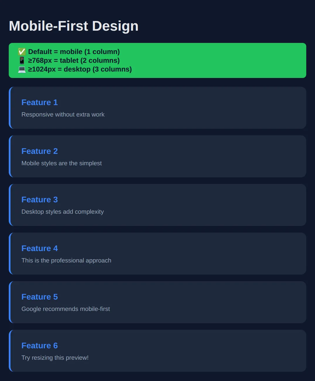
6. Responsive Units
Using the right CSS units is crucial for responsive design. Avoid fixed px values for things that should scale.
| Unit | Relative To | Best For | Example |
|---|---|---|---|
| % | Parent element | Widths, containers | width: 80%; |
| vw / vh | Viewport width/height | Full-screen sections | height: 100vh; |
| rem | Root font size (16px) | Font sizes, spacing | font-size: 1.25rem; |
| em | Parent font size | Padding relative to text | padding: 1.5em; |
<!DOCTYPE html>
<html>
<head>
  <meta name="viewport" content="width=device-width, initial-scale=1.0">
  <title>Responsive Units</title>
  <style>
    body {
      background: #0f172a;
      font-family: system-ui, sans-serif;
      padding: 20px;
      color: #e5e7eb;
      margin: 0;
    }

    h1 { margin-bottom: 20px; }
    h3 { color: #22c55e; margin: 20px 0 8px; }

    .demo {
      padding: 15px;
      border-radius: 8px;
      margin: 8px 0;
      font-size: 14px;
      font-weight: bold;
    }

    /* Fixed px - doesn't adapt */
    .px-demo {
      width: 400px;
      background: #ef4444;
    }

    /* Percentage - relative to parent */
    .percent-demo {
      width: 80%;
      background: #3b82f6;
    }

    /* vw - relative to viewport */
    .vw-demo {
      width: 50vw;
      background: #22c55e;
      color: #0f172a;
    }

    /* rem font sizing */
    .rem-demo {
      font-size: 1.25rem;
      background: #8b5cf6;
      width: fit-content;
      padding: 10px 20px;
    }

    .warning {
      background: #f59e0b;
      color: #0f172a;
      padding: 10px 15px;
      border-radius: 8px;
      margin-top: 20px;
      font-size: 13px;
    }
  </style>
</head>
<body>
  <h1>CSS Units Comparison</h1>

  <h3>❌ width: 400px (fixed — overflows on small screens!)</h3>
  <div class="demo px-demo">400px — I don't adapt!</div>

  <h3>✅ width: 80% (relative to parent)</h3>
  <div class="demo percent-demo">80% — I shrink with my parent</div>

  <h3>✅ width: 50vw (50% of viewport)</h3>
  <div class="demo vw-demo">50vw — I'm always half the screen</div>

  <h3>✅ font-size: 1.25rem (scalable text)</h3>
  <div class="demo rem-demo">1.25rem text — scales with browser settings</div>

  <div class="warning">
    ⚠️ <strong>Rule of thumb:</strong> Use % or vw for widths, rem for font sizes, and avoid fixed px for anything that needs to be responsive.
  </div>
  <!-- ✅ Expected result, measured in a real browser:
     h3 -> margin-top: 20px
     .demo -> padding-top: 15px
     .demo -> count: 4
  -->
</body>
</html>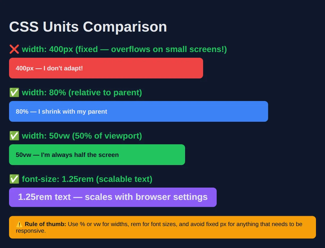
7. Responsive Images
Images are one of the biggest causes of broken responsive layouts. By default, images render at their natural size, which can overflow containers on smaller screens.
💡 Pro Tip: Always add max-width: 100%; height: auto; to all images. Many CSS resets include this automatically.
Two lines of CSS is easy to nod along to and hard to believe until you see the damage the missing version does. Run the worked example below and narrow the preview to phone width.
<!DOCTYPE html>
<html lang="en">
<head>
  <meta charset="UTF-8">
  <meta name="viewport" content="width=device-width, initial-scale=1.0">
  <title>Responsive Images</title>
  <style>
    body {
      margin: 0;
      padding: 20px;
      background: #0f172a;
      color: #e5e7eb;
      font-family: system-ui, sans-serif;
    }

    /* A dashed frame so you can see where the container ENDS. */
    .frame {
      border: 2px dashed #64748b;
      padding: 8px;
      margin-bottom: 24px;
    }

    /* No rules at all. The image renders at its natural 800 x 400
       whatever the screen size, and drags the whole page sideways. */
    .fixed { }

    /* max-width: 100%  ->  never wider than the container
       height: auto     ->  keep the original shape while shrinking
       Without height: auto the image would squash instead of scale. */
    .fluid {
      max-width: 100%;
      height: auto;
    }

    h3 { font-size: 14px; margin: 0 0 6px; }
  </style>
</head>
<body>
  <h3>Without the rule</h3>
  <div class="frame">
    <img class="fixed"
         src="data:image/svg+xml,%3Csvg xmlns='http://www.w3.org/2000/svg' width='800' height='400'%3E%3Crect width='800' height='400' fill='%233b82f6'/%3E%3Ctext x='400' y='215' font-size='44' fill='white' text-anchor='middle' font-family='sans-serif'%3E800 %C3%97 400%3C/text%3E%3C/svg%3E"
         alt="Blue placeholder image, 800 by 400 pixels">
  </div>

  <h3>With max-width: 100%; height: auto;</h3>
  <div class="frame">
    <img class="fluid"
         src="data:image/svg+xml,%3Csvg xmlns='http://www.w3.org/2000/svg' width='800' height='400'%3E%3Crect width='800' height='400' fill='%2322c55e'/%3E%3Ctext x='400' y='215' font-size='44' fill='white' text-anchor='middle' font-family='sans-serif'%3E800 %C3%97 400%3C/text%3E%3C/svg%3E"
         alt="Green placeholder image, 800 by 400 pixels">
  </div>
  <!-- ✅ Expected result, measured in a real browser:
     .frame -> padding-top: 8px
     .fluid -> height: 370px
     .frame -> count: 2
  -->
</body>
</html>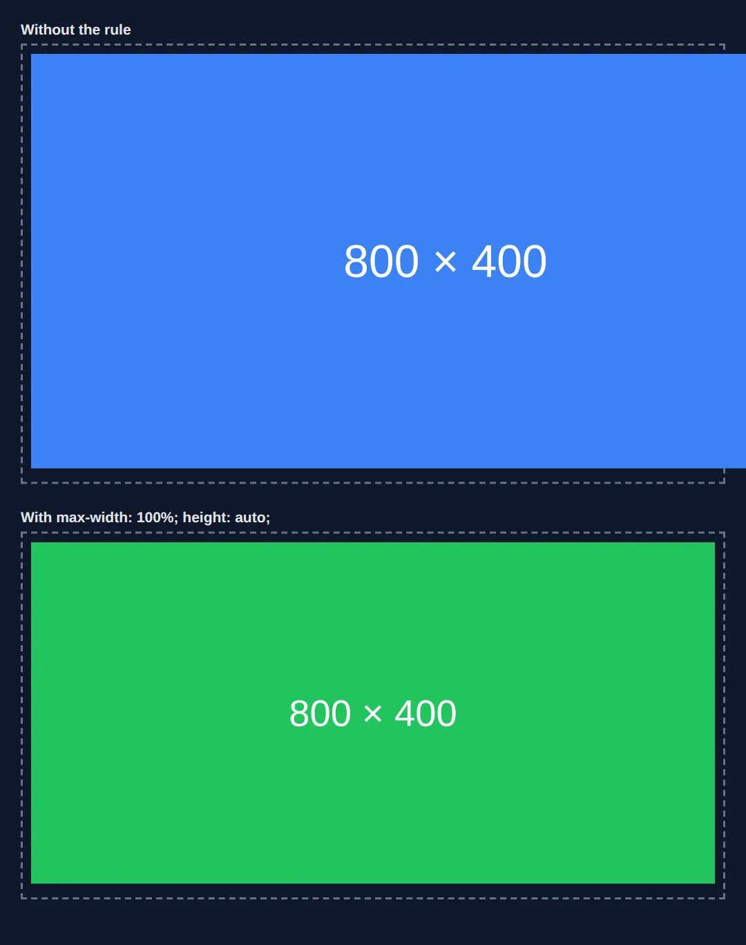
- In a 375px window, the blue image stays 800 × 400 and pushes the page out to 830px wide — that is 455px of unwanted sideways scrolling.
- The green image shrinks to 315 × 157.5 in the same window: exactly its container's width, with the 2:1 shape intact.
- In a 900px window both images are 800 × 400. max-width only ever shrinks — it never blows a small image up and makes it blurry.
The image is a data URI here so it works with no internet connection, but the behaviour is identical for a normal .jpg from your images folder.
8. Building a Complete Responsive Page
Let's put everything together — viewport meta tag, media queries, responsive units, and mobile-first design:
<!DOCTYPE html>
<html>
<head>
  <meta name="viewport" content="width=device-width, initial-scale=1.0">
  <title>Responsive Page</title>
  <style>
    * { box-sizing: border-box; margin: 0; padding: 0; }

    body {
      background: #0f172a;
      font-family: system-ui, sans-serif;
      color: #e5e7eb;
    }

    /* NAVBAR */
    .nav {
      display: flex;
      justify-content: space-between;
      align-items: center;
      padding: 15px 20px;
      background: #1e293b;
      border-bottom: 1px solid #334155;
    }

    .logo { font-weight: bold; color: #3b82f6; font-size: 1.25rem; }

    .nav-links { display: flex; gap: 20px; list-style: none; }

    .nav-links a {
      color: #94a3b8;
      text-decoration: none;
      font-size: 0.9rem;
    }

    /* HERO */
    .hero {
      text-align: center;
      padding: 60px 20px;
      background: linear-gradient(135deg, #1e293b, #0f172a);
    }

    .hero h1 { font-size: 2.5rem; margin-bottom: 15px; }
    .hero p { color: #94a3b8; font-size: 1.1rem; max-width: 600px; margin: 0 auto; }

    /* CARDS */
    .cards {
      display: grid;
      grid-template-columns: repeat(3, 1fr);
      gap: 20px;
      padding: 40px 20px;
      max-width: 1000px;
      margin: 0 auto;
    }

    .card {
      background: #1e293b;
      padding: 25px;
      border-radius: 12px;
      border-top: 3px solid #3b82f6;
    }

    .card h3 { color: #3b82f6; margin-bottom: 10px; }
    .card p { color: #94a3b8; font-size: 0.9rem; line-height: 1.6; }

    /* FOOTER */
    .footer {
      text-align: center;
      padding: 25px;
      background: #1e293b;
      color: #64748b;
      font-size: 0.85rem;
      border-top: 1px solid #334155;
    }

    /* === TABLET === */
    @media (max-width: 1024px) {
      .cards { grid-template-columns: repeat(2, 1fr); }
      .hero h1 { font-size: 2rem; }
    }

    /* === MOBILE === */
    @media (max-width: 768px) {
      .nav { flex-direction: column; gap: 10px; }
      .nav-links { gap: 15px; }
      .hero { padding: 40px 20px; }
      .hero h1 { font-size: 1.5rem; }
      .hero p { font-size: 1rem; }
      .cards { grid-template-columns: 1fr; padding: 20px; }
    }
  </style>
</head>
<body>
  <nav class="nav">
    <div class="logo">MyBrand</div>
    <ul class="nav-links">
      <li><a href="#">Home</a></li>
      <li><a href="#">About</a></li>
      <li><a href="#">Services</a></li>
      <li><a href="#">Contact</a></li>
    </ul>
  </nav>

  <section class="hero">
    <h1>Build Amazing Websites</h1>
    <p>Learn responsive design and make your websites look perfect on every device.</p>
  </section>

  <section class="cards">
    <div class="card">
      <h3>📱 Mobile-First</h3>
      <p>Start with mobile and enhance for larger screens.</p>
    </div>
    <div class="card">
      <h3>📐 Flexible Grids</h3>
      <p>Use CSS Grid and Flexbox for fluid layouts.</p>
    </div>
    <div class="card">
      <h3>🖼️ Responsive Media</h3>
      <p>Images and videos that scale beautifully.</p>
    </div>
  </section>

  <footer class="footer">
    <p>© 2024 MyBrand — Fully Responsive</p>
  </footer>
  <!-- ✅ Expected result, measured in a real browser:
     .nav -> display: flex
     .nav-links -> display: flex
     .nav-links a -> text-decoration-line: none
     .cards -> display: grid
     .card -> count: 3
  -->
</body>
</html>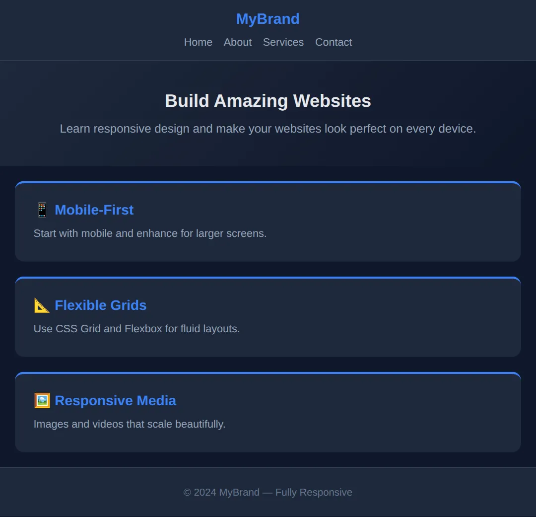
🎯 Your Turn: Write a Mobile-First Layout
Now write one yourself. The mobile styles are already done — that is the mobile-first order: the plain rules are the phone layout, and the media query adds the desktop version on top. Three ___ gaps are left for you.
<!DOCTYPE html>
<html lang="en">
<head>
  <meta charset="UTF-8">

  <!-- 👉 1) Without this tag a phone pretends it is a 980px desktop and
         zooms your page out, so no media query ever fires.
         Replace ___ with:  width=device-width, initial-scale=1.0  -->
  <meta name="viewport" content="___">

  <title>Your Turn: Mobile First</title>
  <style>
    /* 🎯 YOUR TURN — three ___ gaps are marked with 👉 below.
       Everything else on this page already works. */

    *, *::before, *::after { box-sizing: border-box; }

    body {
      margin: 0;
      padding: 1rem;
      background: #0f172a;
      color: #e5e7eb;
      font-family: system-ui, sans-serif;
    }

    h1 { font-size: 1.5rem; }        /* phone size - 24px */

    /* PHONE FIRST: one card per row, always. No media query needed. */
    .cards {
      display: grid;
      grid-template-columns: 1fr;
      gap: 1rem;
    }

    .card {
      background: #1e293b;
      border: 1px solid #334155;
      border-radius: 10px;
      padding: 1rem;
    }
    .card h2 { font-size: 1.1rem; margin: 0 0 .5rem; }
    .card p  { margin: 0; font-size: .9rem; color: #94a3b8; }

    /* 👉 2) Add the desktop layer. Mobile-first uses min-width, and the
           usual tablet/desktop breakpoint in this lesson is 768px. */
    @media (min-width: ___) {

      .cards {
        /* 👉 3) Put the three cards side by side in three equal columns.
               repeat() and the fr unit will do it in one value. */
        grid-template-columns: ___;
      }

      h1 { font-size: 2.25rem; }     /* roomier heading on a big screen */
    }

    /* ✅ Expected result, measured in Chrome:
       - At a 375px viewport: one column. Each card is 343px wide and they
         stack at y = 76, 170 and 264. The h1 computes to 24px.
       - At a 1000px viewport: three columns. Each card is 312px wide and
         all three share the same row. The h1 computes to 36px.
       - If the cards never go side by side, check blank 2: max-width
         would be the desktop-first version and is the wrong way round
         here. */
  </style>
</head>
<body>
  <h1>Our Plans</h1>

  <div class="cards">
    <div class="card"><h2>Starter</h2><p>For trying things out.</p></div>
    <div class="card"><h2>Pro</h2><p>For working developers.</p></div>
    <div class="card"><h2>Team</h2><p>For small studios.</p></div>
  </div>
</body>
</html>
<meta name="viewport" content="width=device-width, initial-scale=1.0">
@media (min-width: 768px) { ... }
grid-template-columns: repeat(3, 1fr);🏆 Mini-Challenge: A Responsive Article Page
No blanks and no answers. Build a blog article page that is a single readable column on a phone and grows a sidebar on wide screens. Everything you need is in this lesson: the viewport tag, mobile-first media queries, relative units, and the responsive image rule.
<!DOCTYPE html>
<html lang="en">
<head>
  <meta charset="UTF-8">
  <meta name="viewport" content="width=device-width, initial-scale=1.0">
  <title>Mini-Challenge: Responsive Article</title>
  <style>
    /* 🎯 MINI-CHALLENGE — write the rules yourself. No answers below.

       PHONE FIRST (no media query):
       1. *, *::before, *::after -> box-sizing: border-box
       2. body    -> margin 0, padding 1rem, a readable line-height (1.6),
                     font-family: system-ui, sans-serif
       3. img     -> max-width: 100%; height: auto;   (the rule from part 7)
       4. .layout -> display: grid; gap: 1.5rem;  one column for now
       5. aside   -> a tinted background, 1rem of padding, border-radius

       THEN ADD THE WIDE-SCREEN LAYER:
       6. @media (min-width: 900px)
            .layout -> grid-template-columns: 2fr 1fr;
                       (article gets two thirds, sidebar gets one)
            body    -> max-width: 1100px; margin: 0 auto;
            h1      -> a bigger font-size than the phone version

       ✅ Check yourself:
          - Narrow the preview to about 375px. There must be NO horizontal
            scrollbar, and the sidebar must sit under the article, not
            beside it.
          - Widen it past 900px. The sidebar should move to the right and
            the page should stop growing at 1100px.
          - Delete the img rule from step 3 and narrow again. The page will
            start scrolling sideways - that is the bug that rule prevents.
    */
  </style>
</head>
<body>
  <h1>Why Mobile-First Wins</h1>

  <div class="layout">
    <article>
      <img src="data:image/svg+xml,%3Csvg xmlns='http://www.w3.org/2000/svg' width='800' height='400'%3E%3Crect width='800' height='400' fill='%233b82f6'/%3E%3C/svg%3E"
           alt="Decorative blue banner">
      <p>Writing the phone layout first forces you to decide what actually
         matters on the page, because there is no room for anything else.</p>
      <p>Everything after that is an enhancement, added with min-width.</p>
    </article>

    <aside>
      <h2>About</h2>
      <p>A short sidebar that belongs beside the article on a laptop and
         underneath it on a phone.</p>
    </aside>
  </div>
</body>
</html>
⚠️ Common Mistakes
- Forgetting the viewport meta tag — Without it, media queries won't work on mobile devices. Always add it to your HTML head.
- Using fixed pixel widths — width: 800px will overflow on smaller screens. Use max-width: 800px with width: 100% instead.
- Too many breakpoints — Most sites need only 2-3 breakpoints. Adding more creates maintenance headaches.
- Not testing on real devices — Browser dev tools are helpful, but always test on a real phone and tablet when possible.
- Hiding content on mobile — Don't use display: none to hide important content on mobile. Reorganise it instead.
🎉 Lesson Complete
You now understand responsive design — the skill that makes your websites work on every device. Key takeaways:
- ✅ Always include the viewport meta tag
- ✅ Use media queries to adapt layouts at different screen widths
- ✅ Mobile-first is the professional approach (min-width queries)
- ✅ Use %, vw, rem instead of fixed px for responsive sizing
- ✅ Add max-width: 100%; height: auto; to all images
- ✅ Most sites only need 2-3 breakpoints
Practice quiz
What does the viewport meta tag do for a responsive page?
- Loads media queries faster
- Compresses images on mobile
- Tells mobile browsers to set the viewport width to the device's actual screen width
- Disables zooming entirely
Answer: Tells mobile browsers to set the viewport width to the device's actual screen width. Without <meta name="viewport" content="width=device-width, initial-scale=1.0">, mobile browsers render at ~980px desktop width and shrink the page, so it looks tiny.
Which media query applies styles only on screens 768px wide or narrower?
- @media (max-width: 768px)
- @media (min-width: 768px)
- @media screen and (width: 768px)
- @media (max-device: 768px)
Answer: @media (max-width: 768px). max-width: 768px matches when the viewport is at or below 768px — the classic mobile/desktop-first breakpoint.
In a mobile-first approach, which type of media query do you add for larger screens?
- max-width queries
- aspect-ratio queries
- no queries are needed
- min-width queries
Answer: min-width queries. Mobile-first writes the base (small-screen) styles first, then layers on enhancements with min-width queries as the screen grows.
What is the rule of thumb for the number of breakpoints most sites need?
- One per device model
- 2-3 breakpoints
- At least 10
- None — use only fixed pixels
Answer: 2-3 breakpoints. Most projects need only 2-3 breakpoints (roughly mobile ~768px, tablet ~1024px, desktop default). More creates maintenance headaches.
What does the unit 'vw' refer to?
- 1% of the viewport width
- The parent element's width
- The root font size
- A fixed value in pixels
Answer: 1% of the viewport width. vw is relative to the viewport: 100vw is the full viewport width, so 50vw is always half the screen width.
Which unit is best for setting font sizes so text scales with the user's preference?
- px
- deg
- rem
- fr
Answer: rem. rem is relative to the root font size (16px by default), so it respects the user's chosen base size — ideal for fonts and spacing.
What is the essential CSS rule that keeps images from overflowing their container?
- width: 100%; only
- max-width: 100%; height: auto;
- object-fit: cover; only
- display: block;
Answer: max-width: 100%; height: auto;. max-width: 100% stops the image being wider than its container, and height: auto preserves the aspect ratio.
Why is using a fixed 'width: 800px' risky for responsive layouts?
- It loads slowly
- It disables media queries
- It only works on desktop browsers
- It overflows on screens narrower than 800px
Answer: It overflows on screens narrower than 800px. A fixed pixel width causes horizontal overflow on smaller screens. Use max-width: 800px with width: 100% instead so it can shrink.
What does 'mobile-first indexing' mean for SEO?
- Google only indexes mobile apps
- Google judges your site primarily by how it looks on mobile
- Mobile pages load before desktop pages
- Indexing is disabled on mobile
Answer: Google judges your site primarily by how it looks on mobile. Google primarily evaluates and ranks sites based on the mobile version, which is why responsive design directly affects SEO.
Why is hiding important content with display: none on mobile discouraged?
- It slows the page down
- It breaks media queries
- It removes content users may still need; reorganise instead
- It only hides images
Answer: It removes content users may still need; reorganise instead. Hiding important content with display: none denies it to mobile users. Better to reorganise the layout so the content is still reachable.
Continue this course
- Previous: CSS Grid System
- Next: CSS Animations & Transitions — Add smooth motion and interactivity to your pages with CSS
- Quick reference: HTML & CSS cheat sheet › Responsive Design
- From the blog: CSS Grid Layout Tutorial · CSS Flexbox: A Visual Guide · Responsive Web Design Fundamentals