CSS Animations & Transitions
Reviewed & published by Brayan K
CSS animations bring elements to life over time: transition smoothly interpolates a property between two states (like a hover), while @keyframes with the animation property defines multi-step sequences that can loop, all without JavaScript.
Part of the free HTML & CSS course at LearnCodingFast — hands-on lessons with examples you run in your browser, plus practice exercises and a quick quiz.
💡 Think of It Like This
Transitions are like a light dimmer switch: You set a starting state and an ending state, and the browser smoothly transitions between them. A light switch is instant (on/off), but a dimmer gradually changes brightness — that's what CSS transitions do for properties like colour, size, and position.
Animations are like a movie: You define a sequence of frames (@keyframes) and the browser plays them in order, potentially looping forever. Much more powerful than simple transitions.
1. CSS Transitions
Transitions animate the change from one CSS value to another. You define what to animate, how long it takes, and the timing curve.
| Property | What It Does | Example |
|---|---|---|
| transition-property | Which property to animate | background, transform, all |
| transition-duration | How long the animation lasts | 0.3s, 500ms |
| transition-timing-function | Speed curve (easing) | ease, linear, ease-in-out |
| transition-delay | Wait before starting | 0s, 0.2s |
<!DOCTYPE html>
<html>
<head>
  <title>CSS Transitions</title>
  <style>
    body {
      background: #0f172a;
      font-family: system-ui, sans-serif;
      padding: 30px;
      color: #e5e7eb;
    }

    h3 { color: #22c55e; margin: 25px 0 10px; }

    .box {
      width: 150px;
      height: 80px;
      display: flex;
      align-items: center;
      justify-content: center;
      border-radius: 12px;
      font-weight: bold;
      cursor: pointer;
      margin: 10px 0;
    }

    /* Color transition */
    .color-demo {
      background: #3b82f6;
      color: white;
      transition: background 0.4s ease;
    }
    .color-demo:hover { background: #ef4444; }

    /* Scale transition */
    .scale-demo {
      background: #8b5cf6;
      color: white;
      transition: transform 0.3s ease;
    }
    .scale-demo:hover { transform: scale(1.2); }

    /* Multiple transitions */
    .multi-demo {
      background: #1e293b;
      color: #94a3b8;
      border: 2px solid #334155;
      transition: all 0.3s ease;
    }
    .multi-demo:hover {
      background: #22c55e;
      color: #0f172a;
      border-color: #22c55e;
      transform: translateY(-5px);
      box-shadow: 0 10px 30px rgba(34, 197, 94, 0.3);
    }

    /* Shadow + lift */
    .shadow-demo {
      background: #f59e0b;
      color: #0f172a;
      transition: transform 0.2s ease, box-shadow 0.2s ease;
    }
    .shadow-demo:hover {
      transform: translateY(-8px);
      box-shadow: 0 15px 40px rgba(245, 158, 11, 0.4);
    }

    .note { color: #64748b; font-size: 13px; margin-top: 5px; }
  </style>
</head>
<body>
  <h1>CSS Transitions</h1>
  <p>Hover over each box to see the transition effect.</p>

  <h3>Color Transition (0.4s)</h3>
  <div class="box color-demo">Hover me!</div>
  <p class="note">transition: background 0.4s ease;</p>

  <h3>Scale Transition (0.3s)</h3>
  <div class="box scale-demo">Grow!</div>
  <p class="note">transition: transform 0.3s ease;</p>

  <h3>Multiple Properties</h3>
  <div class="box multi-demo">Everything!</div>
  <p class="note">transition: all 0.3s ease;</p>

  <h3>Shadow + Lift</h3>
  <div class="box shadow-demo">Float up!</div>
  <p class="note">transition: transform 0.2s, box-shadow 0.2s;</p>
  <!-- ✅ Expected result, measured in a real browser:
     .box -> display: flex
     h3 -> margin-top: 25px
     .box -> count: 4
  -->
</body>
</html>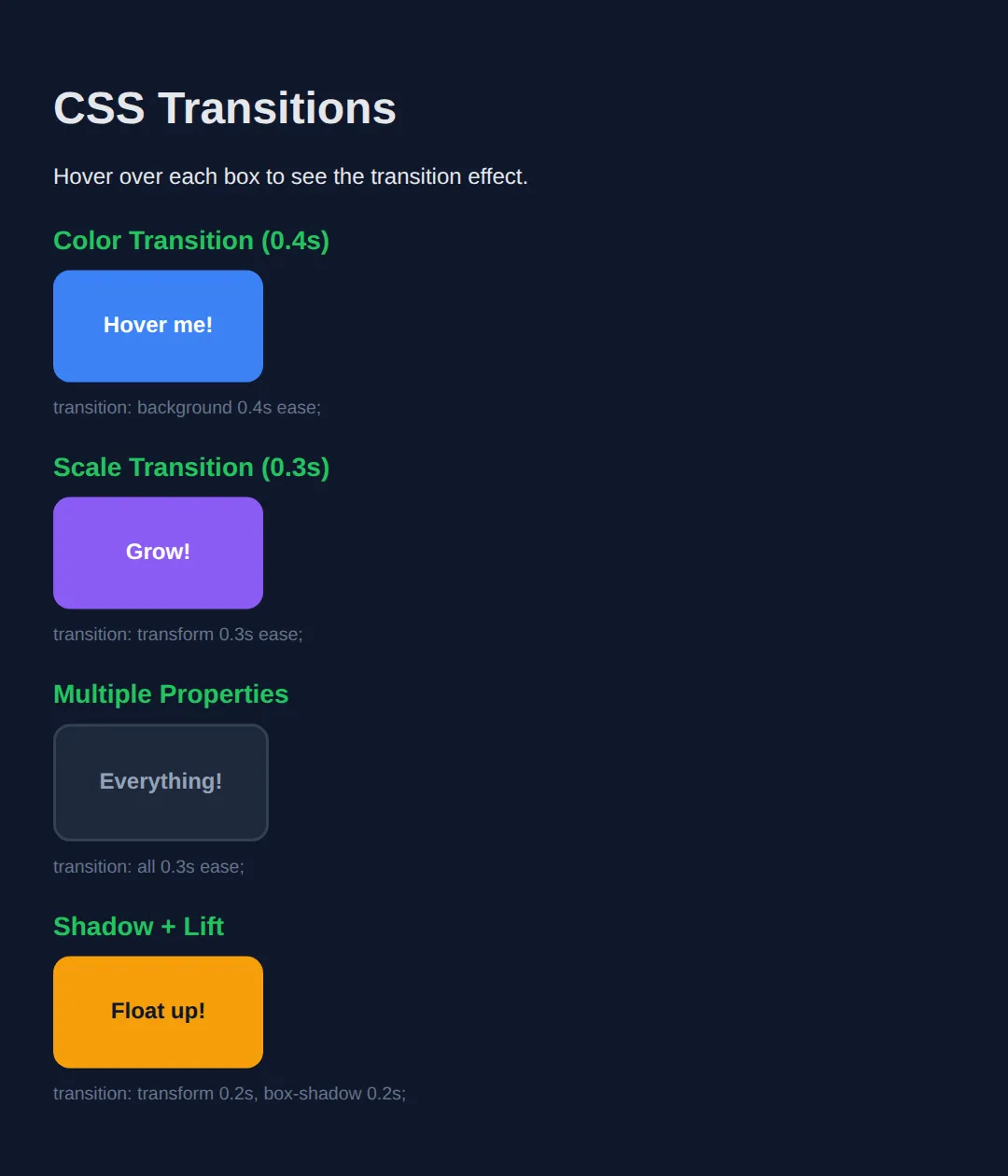
2. CSS Transforms
Transforms change an element's shape, size, position, or rotation without affecting the page layout. They're GPU-accelerated, making them the fastest way to move things on screen.
| Transform | What It Does | Example |
|---|---|---|
| translate(x, y) | Moves element horizontally/vertically | translateX(50px) |
| scale(x, y) | Resizes element (1 = normal) | scale(1.5) |
| rotate(angle) | Rotates clockwise | rotate(45deg) |
| skew(x, y) | Tilts/slants element | skewX(15deg) |
💡 Pro Tip: You can combine multiple transforms: transform: translateX(50px) rotate(10deg) scale(1.1);
The demo below is the worked example for this section. Each blue box is transformed; the dashed rectangle behind it shows the space the element still occupies in the layout. Notice that the dashed boxes never move — that is the whole point of transforms.
<!DOCTYPE html>
<html>
<head>
  <title>CSS Transforms</title>
  <style>
    body {
      background: #0f172a;
      color: #e5e7eb;
      font-family: system-ui, sans-serif;
      padding: 30px;
    }
    h3 { color: #22c55e; margin: 20px 0 36px 30px; font-size: 15px; }

    /* The "ghost" slot. It uses outline, not border, because an outline
       is drawn OUTSIDE the box and takes up no space - so the blue box
       inside it stays exactly 120 x 80. */
    .slot {
      box-sizing: border-box;
      width: 120px;
      height: 80px;
      outline: 2px dashed #475569;
      margin: 0 0 55px 30px;   /* extra left margin so scale(1.5) has room to spill */
    }

    .box {
      width: 100%;                /* = 120px */
      height: 100%;               /* = 80px  */
      background: #3b82f6;
      color: white;
      display: flex;
      align-items: center;
      justify-content: center;
      font-size: 13px;
      font-weight: bold;
      border-radius: 6px;
    }

    /* Moves 60px right. Size stays 120 x 80 - translate only shifts pixels. */
    .move  { transform: translateX(60px); }

    /* 1.5x bigger: 120 x 80 becomes 180 x 120 on screen.
       It grows from the CENTRE, so it spills 30px left and 30px right. */
    .grow  { transform: scale(1.5); }

    /* Rotated 45deg. The box itself is still 120 x 80, but the rectangle it
       now covers on screen measures 141.42 x 141.42. */
    .turn  { transform: rotate(45deg); }

    /* Slants the vertical edges by 15deg. Width on screen becomes 141.44px;
       the height is unchanged at 80px. */
    .lean  { transform: skewX(15deg); }

    /* Combined: read RIGHT TO LEFT - scale first, then rotate, then move.
       Change the order and you get a different result. */
    .combo { transform: translateX(40px) rotate(15deg) scale(1.2); }

    .note { font-size: 13px; color: #94a3b8; margin: 0 0 4px; }
  </style>
</head>
<body>
  <h1>Transforms</h1>
  <p class="note">The dashed rectangle is where the element still sits in the layout. The blue box is what you see.</p>

  <h3>translateX(60px)</h3>
  <div class="slot"><div class="box move">moved</div></div>

  <h3>scale(1.5)</h3>
  <div class="slot"><div class="box grow">bigger</div></div>

  <h3>rotate(45deg)</h3>
  <div class="slot"><div class="box turn">turned</div></div>

  <h3>skewX(15deg)</h3>
  <div class="slot"><div class="box lean">leaning</div></div>

  <h3>combined</h3>
  <div class="slot"><div class="box combo">all three</div></div>
  <!-- ✅ Expected result, measured in a real browser:
     .slot -> box-sizing: border-box
     .box -> display: flex
     .slot -> count: 5
  -->
</body>
</html>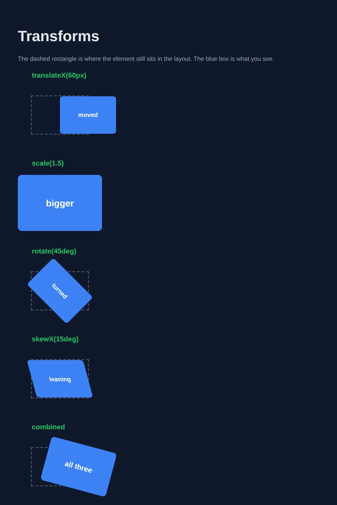
What you should see (all five dashed slots stay in a perfect vertical line):
- translateX(60px) — the blue box sits 60px to the right of its slot, still 120 × 80.
- scale(1.5) — the box covers 180 × 120 and overhangs its slot on every side.
- rotate(45deg) — a diamond whose bounding rectangle measures 141.42 × 141.42.
- skewX(15deg) — a parallelogram 141.44px wide, still 80px tall.
Because the dashed slots never shift, nothing else on the page moves either. That is why transforms are cheap: the browser skips re-calculating the layout and just repaints the element.
3. @keyframes — Multi-Step Animations
While transitions only go from A to B, @keyframes lets you define any number of steps (A → B → C → D...) and control the timing of each.
<!DOCTYPE html>
<html>
<head>
  <title>Keyframe Animations</title>
  <style>
    body {
      background: #0f172a;
      font-family: system-ui, sans-serif;
      padding: 30px;
      color: #e5e7eb;
    }

    h3 { color: #22c55e; margin: 30px 0 10px; }

    .demo {
      display: flex;
      gap: 20px;
      align-items: center;
      min-height: 100px;
    }

    .box {
      width: 80px;
      height: 80px;
      border-radius: 12px;
      display: flex;
      align-items: center;
      justify-content: center;
      font-weight: bold;
      color: white;
    }

    /* BOUNCE */
    @keyframes bounce {
      0%, 100% { transform: translateY(0); }
      50% { transform: translateY(-25px); }
    }
    .bounce {
      background: #3b82f6;
      animation: bounce 0.8s ease infinite;
    }

    /* PULSE */
    @keyframes pulse {
      0%, 100% { transform: scale(1); opacity: 1; }
      50% { transform: scale(1.15); opacity: 0.8; }
    }
    .pulse {
      background: #ef4444;
      animation: pulse 1.5s ease-in-out infinite;
    }

    /* SPIN */
    @keyframes spin {
      0% { transform: rotate(0deg); }
      100% { transform: rotate(360deg); }
    }
    .spin {
      background: #f59e0b;
      border-radius: 50%;
      animation: spin 2s linear infinite;
    }

    /* FADE IN */
    @keyframes fadeIn {
      0% { opacity: 0; transform: translateY(20px); }
      100% { opacity: 1; transform: translateY(0); }
    }
    .fade-in {
      background: #8b5cf6;
      animation: fadeIn 1.5s ease forwards;
    }

    /* SLIDE IN */
    @keyframes slideIn {
      0% { transform: translateX(-100px); opacity: 0; }
      100% { transform: translateX(0); opacity: 1; }
    }
    .slide-in {
      background: #22c55e;
      animation: slideIn 1s ease forwards;
    }

    .note { color: #64748b; font-size: 13px; margin-left: 15px; }
  </style>
</head>
<body>
  <h1>@keyframes Animations</h1>

  <h3>Bounce (infinite)</h3>
  <div class="demo">
    <div class="box bounce">⬆️</div>
    <span class="note">animation: bounce 0.8s ease infinite;</span>
  </div>

  <h3>Pulse (infinite)</h3>
  <div class="demo">
    <div class="box pulse">❤️</div>
    <span class="note">animation: pulse 1.5s ease-in-out infinite;</span>
  </div>

  <h3>Spin (infinite)</h3>
  <div class="demo">
    <div class="box spin">⚙️</div>
    <span class="note">animation: spin 2s linear infinite;</span>
  </div>

  <h3>Fade In (once)</h3>
  <div class="demo">
    <div class="box fade-in">👋</div>
    <span class="note">animation: fadeIn 1.5s ease forwards;</span>
  </div>

  <h3>Slide In (once)</h3>
  <div class="demo">
    <div class="box slide-in">→</div>
    <span class="note">animation: slideIn 1s ease forwards;</span>
  </div>
  <!-- ✅ Expected result, measured in a real browser:
     .demo -> display: flex
     .box -> display: flex
     .demo -> count: 5
  -->
</body>
</html>
4. Animation Properties Reference
| Property | Values | What It Does |
|---|---|---|
| animation-name | Name of @keyframes | Which animation to play |
| animation-duration | 0.5s, 2s, 300ms | How long one cycle takes |
| animation-timing-function | ease, linear, ease-in-out | Speed curve / easing |
| animation-delay | 0s, 0.5s, 1s | Wait before starting |
| animation-iteration-count | 1, 3, infinite | How many times to repeat |
| animation-direction | normal, reverse, alternate | Play forward, backward, or both |
| animation-fill-mode | none, forwards, backwards, both | Keep end state after finishing |
5. Practical: Animated Button & Loading Spinner
Let's build two common real-world patterns — a professionally animated button and a CSS-only loading spinner:
<!DOCTYPE html>
<html>
<head>
  <title>Animated Button & Spinner</title>
  <style>
    body {
      background: #0f172a;
      font-family: system-ui, sans-serif;
      padding: 40px;
      color: #e5e7eb;
      display: flex;
      flex-direction: column;
      align-items: center;
      gap: 50px;
    }

    /* ANIMATED BUTTON */
    .btn {
      padding: 14px 40px;
      font-size: 1.1rem;
      font-weight: 700;
      border: none;
      border-radius: 12px;
      cursor: pointer;
      color: white;
      background: linear-gradient(135deg, #3b82f6, #8b5cf6);
      position: relative;
      overflow: hidden;
      transition: transform 0.2s ease, box-shadow 0.2s ease;
    }

    .btn:hover {
      transform: translateY(-3px);
      box-shadow: 0 12px 35px rgba(59, 130, 246, 0.4);
    }

    .btn:active {
      transform: translateY(0);
      box-shadow: 0 4px 15px rgba(59, 130, 246, 0.3);
    }

    /* Shine effect */
    .btn::after {
      content: '';
      position: absolute;
      top: 0; left: -100%;
      width: 100%; height: 100%;
      background: linear-gradient(90deg, transparent, rgba(255,255,255,0.2), transparent);
      transition: left 0.5s ease;
    }
    .btn:hover::after { left: 100%; }

    /* LOADING SPINNER */
    .spinner-container {
      text-align: center;
    }

    @keyframes spin {
      0% { transform: rotate(0deg); }
      100% { transform: rotate(360deg); }
    }

    .spinner {
      width: 50px;
      height: 50px;
      border: 4px solid #334155;
      border-top: 4px solid #3b82f6;
      border-radius: 50%;
      animation: spin 0.8s linear infinite;
      margin: 0 auto 15px;
    }

    .label {
      color: #64748b;
      font-size: 14px;
    }

    h2 { color: #22c55e; margin-bottom: 10px; }
  </style>
</head>
<body>
  <div>
    <h2>Animated Button</h2>
    <button class="btn">Get Started →</button>
    <p class="label" style="margin-top: 15px;">Hover for lift + shine effect</p>
  </div>

  <div class="spinner-container">
    <h2>Loading Spinner</h2>
    <div class="spinner"></div>
    <p class="label">Pure CSS — no JavaScript needed!</p>
  </div>
  <!-- ✅ Expected result, measured in a real browser:
     .btn -> position: relative
     .spinner-container -> text-align: center
     .label -> count: 2
  -->
</body>
</html>
🎯 Your Turn: Build a Hover Card
Time to write the animation yourself. The card and badge below are fully styled — only the three declarations this lesson teaches are missing. Fill in each ___, run it, and hover the card.
<!DOCTYPE html>
<html>
<head>
  <title>Your Turn: Hover Card</title>
  <style>
    body {
      background: #0f172a;
      color: #e5e7eb;
      font-family: system-ui, sans-serif;
      padding: 40px;
    }

    /* 🎯 YOUR TURN — replace each ___ below. Everything else already works. */

    .card {
      width: 260px;
      padding: 20px;
      box-sizing: border-box;
      background: #1e293b;
      border: 1px solid #334155;
      border-radius: 12px;
      box-shadow: 0 2px 6px rgba(0, 0, 0, 0.35);
      cursor: pointer;

      /* 👉 1) Animate every property that changes, over 0.3 seconds,
             using the "ease" curve. Order is: property duration timing. */
      transition: ___;
    }

    .card:hover {
      /* 👉 2) Lift the card 8px UP and make it 3% bigger.
             Up is a NEGATIVE Y. Combine two functions in one value. */
      transform: ___;

      box-shadow: 0 14px 28px rgba(0, 0, 0, 0.5);
      border-color: #22c55e;
    }

    .badge {
      display: inline-block;
      padding: 4px 12px;
      border-radius: 999px;
      background: #22c55e;
      color: #052e16;
      font-size: 12px;
      font-weight: bold;

      /* 👉 3) Run the "pulse" keyframes below for 1.5s, ease-in-out,
             looping forever. Order is: name duration timing count. */
      animation: ___;
    }

    @keyframes pulse {
      0%   { transform: scale(1); }
      50%  { transform: scale(1.15); }   /* 15% bigger at the halfway point */
      100% { transform: scale(1); }      /* back to normal, so the loop is seamless */
    }

    h3 { margin: 12px 0 6px; }
    p  { margin: 0; font-size: 14px; color: #94a3b8; }

    /* ✅ Expected result:
       - The green NEW badge grows and shrinks forever, about once every 1.5s.
       - Hovering the card glides it upward and slightly larger over 0.3s,
         the border turns green, and the shadow deepens.
       - Measured with the correct answers: the card's box goes from
         260px wide to 267.8px wide, and its top edge rises from y=48
         to y=38.22 (8px of translate plus the growth from scaling).
       - If the card JUMPS instead of gliding, blank 1 is still empty.
       - If the badge sits still, blank 3 is still empty. */
  </style>
</head>
<body>
  <div class="card">
    <span class="badge">NEW</span>
    <h3>Hover me</h3>
    <p>I lift up and grow a little.</p>
  </div>
</body>
</html>
transition: all 0.3s ease;
transform: translateY(-8px) scale(1.03);
animation: pulse 1.5s ease-in-out infinite;Once it works, try changing 0.3s to 2s. Slowing an animation right down is the fastest way to see exactly what it is doing.
6. Animation Performance Tips
Not all CSS properties animate equally well. For smooth 60fps animations, stick to properties that are handled by the GPU:
| ✅ Fast (GPU) | ❌ Slow (causes reflow) |
|---|---|
| transform | width / height |
| opacity | top / left / right / bottom |
| filter | margin / padding |
💡 Golden Rule: Instead of animating top or left, use transform: translate(). Instead of animating width, use transform: scale().
🏆 Mini-Challenge: Three Bouncing Loading Dots
No blanks this time — a brief and an outline only. Build the three-dot "loading" indicator you have seen in chat apps: three circles that bounce in a wave, each one starting slightly after the last, looping forever. The trick is not a new property — it is animation-delay on each dot.
<!DOCTYPE html>
<html>
<head>
  <title>Mini-Challenge: Loading Dots</title>
  <style>
    body {
      background: #0f172a;
      color: #e5e7eb;
      font-family: system-ui, sans-serif;
      padding: 60px;
    }

    /* 🎯 MINI-CHALLENGE — write the rules yourself. No answers below.

       1. .dot -> 16px wide, 16px tall, border-radius 50% (that makes a circle),
                  background #22c55e, display: inline-block, margin-right 8px

       2. @keyframes bounce -> 0% and 100% sit at translateY(0);
                               50% sits at translateY(-16px)
          (Use transform, NOT top or margin - see the performance table above.)

       3. .dot -> animation: bounce 0.6s ease-in-out infinite;

       4. Stagger them so they form a wave instead of moving as one block:
          .dot:nth-child(2) -> animation-delay: 0.15s;
          .dot:nth-child(3) -> animation-delay: 0.3s;

       5. Be kind to motion-sensitive users. Inside
          @media (prefers-reduced-motion: reduce)
          set .dot { animation: none; }

       ✅ Check yourself:
          - All three dots must move, and they must NOT move in unison.
            If they bounce together, step 4 is missing or the :nth-child
            numbers are wrong.
          - The bouncing must never stop. If it runs once and halts, the
            "infinite" keyword is missing from step 3.
    */
  </style>
</head>
<body>
  <p>Loading</p>

  <div class="loader">
    <span class="dot"></span>
    <span class="dot"></span>
    <span class="dot"></span>
  </div>
  <!-- ✅ Expected result, measured in a real browser:
     body -> padding-top: 60px
     .dot -> count: 3
  -->
</body>
</html>
Stretch goal once it works: swap infinite for 3 and add animation-fill-mode: forwards. Watch where the dots end up — that is what forwards is for.
⚠️ Common Mistakes
- Animating width/height instead of transform — Width/height changes force the browser to recalculate layout for every frame, causing jank. Use transform: scale() instead.
- Too many animations at once — Animating 50 elements simultaneously will drop frame rates. Be selective — one or two well-placed animations are more effective than many.
- Forgetting animation-fill-mode: forwards — Without it, elements snap back to their original state after the animation ends. Add forwards to keep the end state.
- Animations that never stop — Infinite animations consume CPU/battery. Only use infinite for loading spinners or subtle background effects.
- No reduced-motion support — Some users get motion sickness. Add @media (prefers-reduced-motion: reduce) to disable animations for those users.
🎉 Lesson Complete
You now know how to bring your web pages to life with CSS animations. Key takeaways:
- ✅ Transitions animate between two states (hover, focus, active)
- ✅ Transforms move, scale, rotate, and skew elements efficiently
- ✅ @keyframes create multi-step, looping animations
- ✅ Animate transform and opacity for smooth 60fps performance
- ✅ Use animation-fill-mode: forwards to keep the end state
- ✅ Respect prefers-reduced-motion for accessibility
Practice quiz
What does a CSS transition do?
- Defines a multi-step looping sequence
- Removes an element from the layout
- Smoothly interpolates a property between two states, such as on hover
- Changes the HTML structure
Answer: Smoothly interpolates a property between two states, such as on hover. A transition animates the change from one CSS value to another (A to B), commonly triggered by states like :hover.
In the shorthand 'transition: property duration timing-function delay', which value comes first?
- the property to animate
- duration
- delay
- timing-function
Answer: the property to animate. The shorthand order is property, duration, timing-function, delay.
What lets you define multi-step animations (A to B to C to D)?
- transition
- transform
- @media
- @keyframes
Answer: @keyframes. @keyframes defines any number of steps (0% to 100% or from/to), unlike a transition which only goes from one state to another.
Which transform moves an element horizontally and vertically without affecting layout?
- scale(x, y)
- translate(x, y)
- rotate(angle)
- skew(x, y)
Answer: translate(x, y). translate(x, y) shifts the element; transforms don't affect page layout and are GPU-accelerated.
Which transform function resizes an element, where 1 is normal size?
- scale()
- translate()
- rotate()
- skew()
Answer: scale(). scale() resizes the element; scale(1.5) makes it 1.5x its size.
Which animation property controls how many times an animation repeats?
- animation-direction
- animation-fill-mode
- animation-iteration-count
- animation-delay
Answer: animation-iteration-count. animation-iteration-count takes values like 1, 3, or infinite.
What does animation-fill-mode: forwards do?
- Plays the animation in reverse
- Keeps the element in its end state after the animation finishes
- Makes the animation loop forever
- Delays the animation start
Answer: Keeps the element in its end state after the animation finishes. Without forwards, the element snaps back to its original state when the animation ends; forwards retains the final keyframe.
Which properties animate most smoothly because the GPU handles them?
- width and height
- top, left, right and bottom
- margin and padding
- transform and opacity
Answer: transform and opacity. transform and opacity (and filter) are GPU-accelerated. Animating width/height or top/left forces layout reflow and causes jank.
Instead of animating the 'left' property to move an element, what should you use for performance?
- margin-left
- transform: translate()
- position: absolute
- width
Answer: transform: translate(). The golden rule: use transform: translate() instead of top/left, and transform: scale() instead of width/height.
Which media query should you respect to disable animations for users who get motion sickness?
- @media (prefers-color-scheme: dark)
- @media (max-width: 600px)
- @media (prefers-reduced-motion: reduce)
- @media (hover: none)
Answer: @media (prefers-reduced-motion: reduce). @media (prefers-reduced-motion: reduce) lets you turn off or tone down animations for users who prefer less motion.
Continue this course
- Previous: Responsive Design
- Next: Advanced CSS Selectors — Target elements precisely with pseudo-classes, combinators, and attribute selectors
- Quick reference: HTML & CSS cheat sheet › CSS Motion & State