Advanced CSS Selectors
Reviewed & published by Brayan K
Advanced CSS selectors target elements by their relationships and state instead of just their class or tag, using combinators like > and ~, attribute selectors such as [type="email"], and pseudo-classes like :nth-child() to style markup precisely without extra classes.
Part of the free HTML & CSS course at LearnCodingFast — hands-on lessons with examples you run in your browser, plus practice exercises and a quick quiz.
💡 Think of It Like This
Basic selectors are like addressing a letter to "John". Advanced selectors are like saying "the third John who lives on Main Street, but only when he's at home." They give you surgical precision — you can target any element based on its state, position, attributes, or relationship to other elements.
1. Pseudo-classes — Targeting Element States
Pseudo-classes select elements based on their current state — whether they're hovered, focused, the first child, or match a pattern.
| Category | Selector | What It Targets |
|---|---|---|
| Interactive | :hover | Mouse is over element |
| :focus | Element has keyboard focus | |
| :active | Element is being clicked | |
| :visited | Link has been visited | |
| Position | :first-child | First child of parent |
| :last-child | Last child of parent | |
| :nth-child(n) | Nth child (odd, even, 3n, 2n+1) | |
| :not(selector) | Everything except the selector | |
| Form | :checked | Checked checkbox/radio |
| :valid / :invalid | Form validation state | |
| :disabled | Disabled form element |
<!DOCTYPE html>
<html>
<head>
  <title>Pseudo-classes</title>
  <style>
    body {
      background: #0f172a;
      font-family: system-ui, sans-serif;
      padding: 30px;
      color: #e5e7eb;
    }

    h3 { color: #22c55e; margin: 25px 0 10px; }

    /* Styled list with nth-child */
    ul { list-style: none; padding: 0; max-width: 400px; }

    li {
      padding: 12px 16px;
      border-radius: 6px;
      margin: 4px 0;
      transition: all 0.2s;
    }

    /* Alternate row colours */
    li:nth-child(odd) { background: #1e293b; }
    li:nth-child(even) { background: #334155; }

    /* First and last child */
    li:first-child {
      border-left: 4px solid #3b82f6;
      font-weight: bold;
    }

    li:last-child {
      border-left: 4px solid #22c55e;
    }

    /* Hover effect (but not first child) */
    li:not(:first-child):hover {
      background: #3b82f6;
      color: white;
      transform: translateX(5px);
    }

    /* Link states */
    .links a {
      display: inline-block;
      padding: 10px 20px;
      margin: 5px;
      background: #1e293b;
      color: #94a3b8;
      text-decoration: none;
      border-radius: 6px;
      transition: all 0.2s;
    }

    .links a:hover { background: #3b82f6; color: white; }
    .links a:active { transform: scale(0.95); }

    /* Form states */
    input {
      background: #1e293b;
      border: 2px solid #334155;
      color: white;
      padding: 10px;
      border-radius: 6px;
      margin: 5px 0;
      width: 300px;
      display: block;
    }

    input:focus { border-color: #3b82f6; outline: none; }
    input:valid { border-color: #22c55e; }
    input:invalid { border-color: #ef4444; }

    .note { color: #64748b; font-size: 13px; margin-top: 5px; }
  </style>
</head>
<body>
  <h1>Pseudo-classes Demo</h1>

  <h3>:nth-child, :first-child, :last-child, :not()</h3>
  <ul>
    <li>📌 First item (blue border, bold)</li>
    <li>Second item (hover me!)</li>
    <li>Third item (hover me!)</li>
    <li>Fourth item (hover me!)</li>
    <li>✅ Last item (green border)</li>
  </ul>
  <p class="note">Odd = dark, Even = lighter. :not(:first-child) gets hover effect.</p>

  <h3>:hover and :active</h3>
  <div class="links">
    <a href="#">Hover Me</a>
    <a href="#">Click Me</a>
    <a href="#">Try Me</a>
  </div>

  <h3>:focus, :valid, :invalid</h3>
  <input type="email" placeholder="Enter email (try valid/invalid)" required>
  <p class="note">Focus = blue border. Valid email = green. Invalid = red.</p>
  <!-- ✅ Expected result, measured in a real browser:
     ul -> list-style-type: none
     .links a -> display: inline-block
     input -> display: block
     .note -> count: 2
  -->
</body>
</html>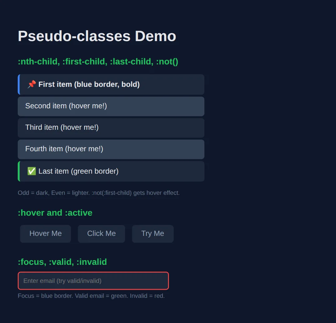
2. Pseudo-elements — Virtual Content
Pseudo-elements create virtual elements that don't exist in the HTML. They're perfect for decorative content, icons, and styling parts of text.
| Pseudo-element | What It Does |
|---|---|
| ::before | Inserts content before element (requires content) |
| ::after | Inserts content after element (requires content) |
| ::first-letter | Styles only the first letter of text |
| ::first-line | Styles only the first line of a paragraph |
| ::selection | Styles highlighted/selected text |
<!DOCTYPE html>
<html>
<head>
  <title>Pseudo-elements</title>
  <style>
    body {
      background: #0f172a;
      font-family: system-ui, sans-serif;
      padding: 30px;
      color: #e5e7eb;
    }

    h3 { color: #22c55e; margin: 25px 0 10px; }

    /* ::before and ::after */
    .quote {
      background: #1e293b;
      padding: 20px 25px;
      border-radius: 8px;
      font-style: italic;
      font-size: 1.1rem;
      position: relative;
      margin: 15px 0;
    }

    .quote::before {
      content: "❝";
      font-size: 3rem;
      color: #3b82f6;
      position: absolute;
      top: -10px;
      left: 10px;
    }

    .quote::after {
      content: "❞";
      font-size: 3rem;
      color: #3b82f6;
      position: absolute;
      bottom: -20px;
      right: 10px;
    }

    /* ::first-letter - drop cap */
    .drop-cap {
      background: #1e293b;
      padding: 20px;
      border-radius: 8px;
      line-height: 1.7;
      margin: 15px 0;
    }

    .drop-cap::first-letter {
      font-size: 3.5rem;
      font-weight: bold;
      color: #3b82f6;
      float: left;
      margin-right: 10px;
      line-height: 1;
    }

    /* ::selection */
    ::selection {
      background: #3b82f6;
      color: white;
    }

    /* Labels with ::before */
    .tag {
      display: inline-block;
      padding: 6px 14px;
      background: #1e293b;
      border-radius: 20px;
      font-size: 14px;
      margin: 5px;
    }

    .tag.new::before { content: "🆕 "; }
    .tag.hot::before { content: "🔥 "; }
    .tag.sale::before { content: "💰 "; }

    /* Required field asterisk */
    .required::after {
      content: " *";
      color: #ef4444;
      font-weight: bold;
    }

    .note { color: #64748b; font-size: 13px; margin-top: 5px; }
  </style>
</head>
<body>
  <h1>Pseudo-elements</h1>

  <h3>::before and ::after — Decorative quotes</h3>
  <div class="quote">
    The only way to do great work is to love what you do.
  </div>

  <h3>::first-letter — Drop cap</h3>
  <div class="drop-cap">
    Once upon a time in the land of CSS, developers discovered they could style individual letters and lines without adding extra HTML elements. This changed everything about web typography.
  </div>

  <h3>::before for icons/labels</h3>
  <div>
    <span class="tag new">Feature</span>
    <span class="tag hot">Trending</span>
    <span class="tag sale">Discount</span>
  </div>

  <h3>::after for required markers</h3>
  <p><span class="required">Email</span></p>
  <p><span class="required">Password</span></p>

  <h3>::selection — Try selecting this text!</h3>
  <p>Highlight me to see custom selection colours (blue background, white text).</p>
  <!-- ✅ Expected result, measured in a real browser:
     .quote -> position: relative
     .tag -> display: inline-block
     .tag -> count: 3
  -->
</body>
</html>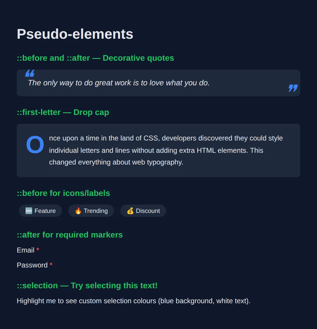
3. Combinators — Relationship Selectors
Combinators target elements based on their relationship to other elements in the DOM tree.
| Combinator | Syntax | Targets |
|---|---|---|
| Descendant | div p | All p elements inside div (any depth) |
| Child | div > p | Only direct child p elements of div |
| Adjacent sibling | h2 + p | First p immediately after h2 |
| General sibling | h2 ~ p | All p elements after h2 (same parent) |
🧠 Worked Example — which paragraph does each combinator actually hit?
The table above tells you what each combinator means. This example shows you which elements it really matches on a page that is shaped like a real page — with one paragraph tucked inside a <div>, which is where nearly every combinator bug comes from. Four paragraphs, six rules; every rule's actual victims are listed in the comments.
<!DOCTYPE html>
<html lang="en">
<head>
<meta charset="UTF-8">
<title>Worked Example: Combinators</title>
<style>
  * { box-sizing:border-box; margin:0; padding:0; }
  body { background:#0f172a; color:#e5e7eb; font-family:system-ui,sans-serif; padding:24px; }
  .demo { background:#1e293b; border-radius:10px; padding:16px; }
  h2 { font-size:1rem; color:#e5e7eb; margin-bottom:10px; }
  p { font-size:.9rem; margin:6px 0; padding:8px 10px; background:#334155; border-radius:6px; }
  .wrap { border:1px dashed #64748b; border-radius:8px; padding:10px; margin:8px 0; }

  /* DESCENDANT (a space): any p anywhere inside .demo, however deeply buried.
     Hits P1, P2, P3, P4 — including P3, which is inside the dashed div. */
  .demo p          { color:#94a3b8; }

  /* CHILD (>): only p elements that are DIRECT children of .demo.
     Hits P1, P2, P4. P3 misses out — its parent is .wrap, not .demo. */
  .demo > p        { border-left:4px solid #3b82f6; }

  /* ADJACENT SIBLING (+): the one p that comes immediately after the h2.
     Hits P1 only. */
  h2 + p           { background:#1d4ed8; }

  /* GENERAL SIBLING (~): every p after the h2 that shares its parent.
     Hits P1, P2, P4. P3 is not a sibling of the h2, so it stays light. */
  h2 ~ p           { font-weight:700; }

  /* THE CLASSIC TRAP: :nth-child counts ALL the children, not just the p's.
     The children of .demo are  h2(1)  P1(2)  P2(3)  .wrap(4)  P4(5).
     The odd ones are 1, 3 and 5 — so this hits P2 and P4, NOT P1.
     If you want "every other paragraph", use :nth-of-type(odd) instead. */
  .demo > p:nth-child(odd) { outline:2px solid #f59e0b; }

  /* :not() takes any simple selector and inverts it. Hits P1, P2, P3. */
  .demo p:not(.skip) { text-decoration:none; }
  .skip            { opacity:.5; }
</style>
</head>
<body>
<section class="demo">
  <h2>Heading</h2>
  <p>P1 — right after the h2</p>
  <p>P2 — a later sibling</p>
  <div class="wrap"><p>P3 — nested inside a div</p></div>
  <p class="skip">P4 — has class "skip"</p>
</section>

<!-- ✅ What you should see, paragraph by paragraph:
     P1 — solid blue background, bold text, blue left bar, no orange outline.
     P2 — grey background, bold, blue left bar, AND an orange outline.
     P3 — grey background, NOT bold, NO blue left bar (it is not a direct child,
          and not a sibling of the h2). This is the paragraph that proves the
          difference between a space and a > in a selector.
     P4 — grey, bold, blue left bar, orange outline, and faded to 50% by .skip.
     Now change  .demo > p:nth-child(odd)  to  .demo > p:nth-of-type(odd)  and the
     orange outline moves from P2 and P4 onto P1 and P4 — because nth-of-type
     ignores the h2 and the div and counts only the paragraphs it is sitting
     among: P1 is the 1st, P2 the 2nd, P4 the 3rd. Run it and check. -->
  <!-- ✅ Expected result, measured in a real browser:
     .demo p:not(.skip) -> text-decoration-line: none
     .skip -> opacity: 0.5
  -->
</body></html>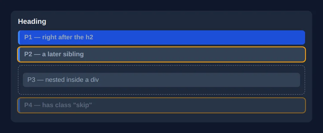
4. Attribute Selectors
Target elements based on their HTML attributes — incredibly useful for styling links, inputs, and data attributes.
| Selector | Matches | Example Use |
|---|---|---|
| [href] | Has the attribute | Any element with href |
| [type="email"] | Exact match | Email inputs only |
| [href*="youtube"] | Contains substring | Links containing "youtube" |
| [href^="https"] | Starts with | Secure links |
| [href$=".pdf"] | Ends with | PDF download links |
<!DOCTYPE html>
<html>
<head>
  <title>Attribute Selectors</title>
  <style>
    body {
      background: #0f172a;
      font-family: system-ui, sans-serif;
      padding: 30px;
      color: #e5e7eb;
    }

    h3 { color: #22c55e; margin: 25px 0 10px; }

    .links { display: flex; flex-direction: column; gap: 8px; max-width: 400px; }

    a {
      display: block;
      padding: 12px 16px;
      background: #1e293b;
      color: #94a3b8;
      text-decoration: none;
      border-radius: 6px;
      border-left: 4px solid #334155;
      transition: all 0.2s;
    }

    /* External links (start with https) */
    a[href^="https"] {
      border-left-color: #3b82f6;
    }
    a[href^="https"]::after {
      content: " 🔗";
    }

    /* PDF links */
    a[href$=".pdf"] {
      border-left-color: #ef4444;
    }
    a[href$=".pdf"]::after {
      content: " 📄";
    }

    /* YouTube links */
    a[href*="youtube"] {
      border-left-color: #ef4444;
      background: #1c1917;
    }
    a[href*="youtube"]::after {
      content: " ▶️";
    }

    /* Email inputs */
    input[type="email"] {
      background: #1e293b;
      border: 2px solid #3b82f6;
      color: white;
      padding: 10px;
      border-radius: 6px;
      width: 300px;
    }

    input[type="password"] {
      background: #1e293b;
      border: 2px solid #f59e0b;
      color: white;
      padding: 10px;
      border-radius: 6px;
      width: 300px;
    }

    .note { color: #64748b; font-size: 13px; margin-top: 5px; }
  </style>
</head>
<body>
  <h1>Attribute Selectors</h1>

  <h3>Links styled by href attribute</h3>
  <div class="links">
    <a href="#internal">Internal link (no icon)</a>
    <a href="https://google.com">External link [href^="https"]</a>
    <a href="https://youtube.com/watch">YouTube link [href*="youtube"]</a>
    <a href="report.pdf">Download PDF [href$=".pdf"]</a>
  </div>

  <h3>Inputs styled by type attribute</h3>
  <p><input type="email" placeholder="[type='email'] — blue border"></p>
  <p><input type="password" placeholder="[type='password'] — amber border"></p>
  <!-- ✅ Expected result, measured in a real browser:
     .links -> display: flex
     a -> display: block
  -->
</body>
</html>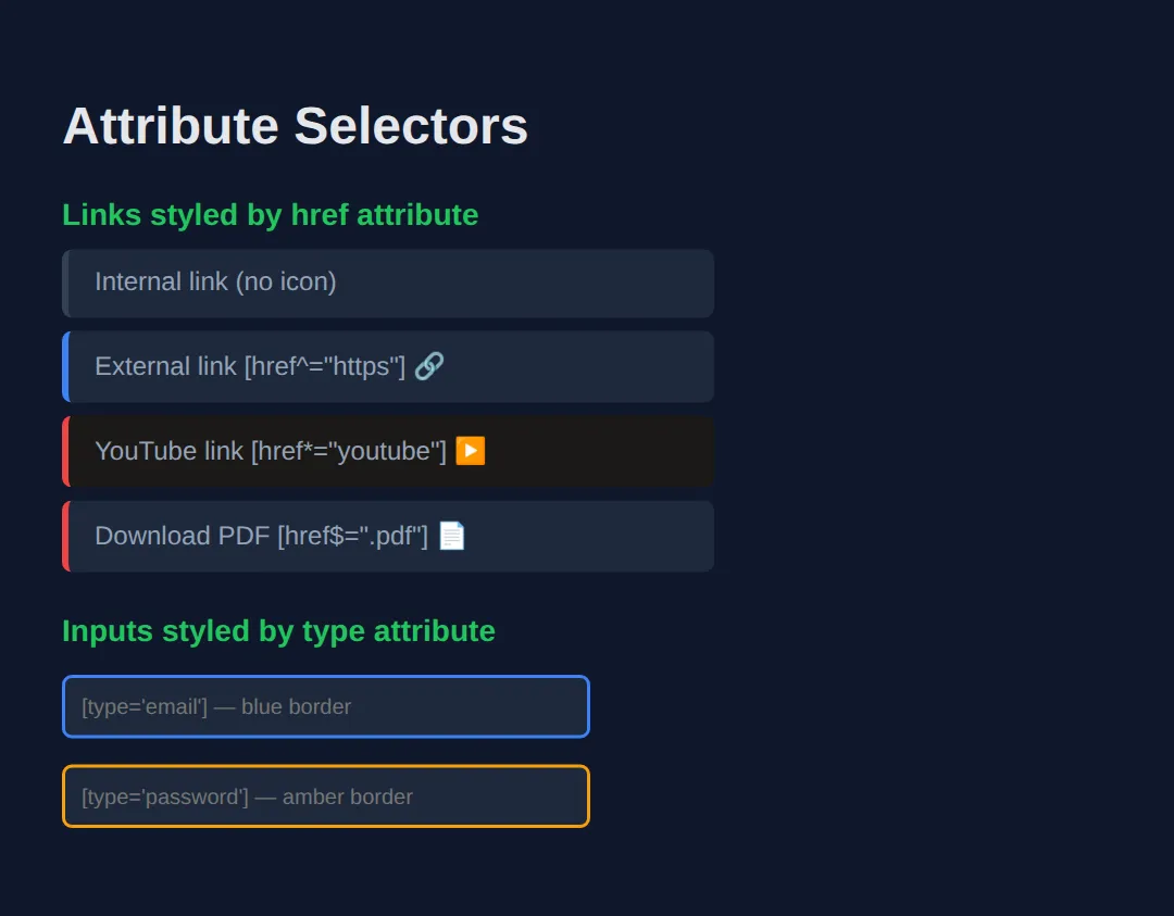
🎯 Your Turn — style a list and a set of links, without touching the HTML
This is the whole point of good selectors: the HTML below has no extra classes for striping, no "insecure" class on the bad link, no "pdf" class on the download. You add all four effects from CSS alone. Four blanks, marked ___.
<!DOCTYPE html>
<html lang="en">
<head>
<meta charset="UTF-8">
<title>Your Turn: Selectors</title>
<style>
  /* 🎯 YOUR TURN — fill in the four blanks marked ___ */

  * { box-sizing:border-box; margin:0; padding:0; }
  body { background:#0f172a; color:#e5e7eb; font-family:system-ui,sans-serif; padding:24px; }
  h2 { font-size:.95rem; color:#60a5fa; margin:18px 0 8px; }
  .tasks { list-style:none; max-width:360px; }
  .tasks li { padding:8px 12px; border-radius:6px; }
  .tasks li.done { color:#64748b; text-decoration:line-through; }
  .links a { display:block; color:#93c5fd; margin:4px 0; }

  /* 1) Zebra-stripe the list: shade the 2nd, 4th, 6th... item. */
  .tasks li:nth-child(___) { background:#1e293b; }
  /* 👉 replace ___ with  even  */

  /* 2) Make only the tasks that are NOT finished bold. */
  .tasks li:not(___) { font-weight:700; }
  /* 👉 replace ___ with  .done  */

  /* 3) Turn any link that STARTS WITH an insecure http:// address red.
        Careful: "http" on its own would also match https. */
  .links a[href^="___"] { color:#ef4444; }
  /* 👉 replace ___ with  http://  */

  /* 4) Any link whose address ENDS WITH .pdf gets a "(PDF)" marker after it. */
  .links a[href$="___"]::after { content:" (PDF)"; color:#f59e0b; }
  /* 👉 replace ___ with  .pdf  */
</style>
</head>
<body>
  <h2>Tasks</h2>
  <ul class="tasks">
    <li>Wash up</li>
    <li class="done">Buy milk</li>
    <li>Write CSS</li>
    <li class="done">Feed cat</li>
    <li>Ship it</li>
  </ul>

  <h2>Links</h2>
  <p class="links">
    <a href="https://example.com">Secure link</a>
    <a href="http://example.com">Insecure link</a>
    <a href="/about">Internal link</a>
    <a href="report.pdf">Quarterly report</a>
  </p>

  <!-- ✅ Expected once all four blanks are filled:
       Tasks: "Buy milk" and "Feed cat" (items 2 and 4) sit on a darker band.
              "Wash up", "Write CSS" and "Ship it" are bold; the two struck-through
              done tasks are not.
       Links: "Insecure link" is red. "Secure link" stays blue — if it went red
              too, you used  http  instead of  http://  .
              "Quarterly report" reads "Quarterly report (PDF)" in orange; none of
              the other three get a marker. -->
</body></html>
🧩 Mini-Challenge — a form that reacts, with no JavaScript
Combine a state pseudo-class with a sibling combinator and you get behaviour, not just decoration — the checkbox hack that powers menus, accordions and "show more" panels all over the web. Outline only; you write the CSS.
<!DOCTYPE html>
<html lang="en">
<head>
<meta charset="UTF-8">
<title>Mini-Challenge: Reactive Form</title>
<style>
  /* 🧩 MINI-CHALLENGE: no JavaScript anywhere
     1. .panel — hide it by default with  max-height: 0; overflow: hidden;
        and add  transition: max-height .3s ease;  so it slides.
     2. Reveal it when the checkbox is ticked, using a sibling combinator that
        reaches from the checkbox across to the panel:
              #toggle:checked ~ .panel { max-height: 200px; }
        Read that as: "any .panel later in the same parent as a ticked #toggle".
        It has to be ~ and not +, because the <label> sits between them and +
        only ever reaches the very next sibling.
     3. Do the same to the status line with  #toggle:checked ~ .status  — change
        its colour so it turns green when the panel is open.
     4. Give the email box live feedback with  input[type="email"]:user-invalid
        (red border) and  :user-valid  (green border).
     5. Add  label:focus-within  or an outline on  #toggle:focus-visible  so
        keyboard users can see what is focused.

     ✅ How to check it: tick the checkbox and the hidden panel slides open; untick
        it and it slides shut — with no script on the page. The status line changes
        colour at the same moment, even though there are two elements between it
        and the checkbox, because ~ reaches every later sibling, not just the next.
        If nothing happens when you tick it, you almost certainly used + instead
        of ~ and are styling the <label>.
        Type "abc" in the email box and Tab away: red border. Fix it: green.
  */

  * { box-sizing:border-box; margin:0; padding:0; }
  body { background:#0f172a; color:#e5e7eb; font-family:system-ui,sans-serif; padding:24px; }
  form { max-width:380px; background:#1e293b; padding:18px; border-radius:12px; }
  label { cursor:pointer; font-weight:700; color:#60a5fa; display:inline-block; margin-bottom:10px; }
  input[type="email"] { width:100%; padding:9px 10px; background:#334155; border:1px solid #475569; border-radius:6px; color:#fff; }
  .status { margin-top:12px; font-size:.85rem; }

  /* your CSS here */

</style>
</head>
<body>
  <form>
    <!-- Markup done for you. Note the ORDER: the checkbox comes before the panel,
         which comes before the status line. Sibling combinators only ever look
         forwards, so this order is what makes the CSS possible. -->
    <input type="checkbox" id="toggle">
    <label for="toggle">Show advanced options</label>

    <div class="panel">
      <p style="padding:10px 0;">Advanced options live in here.</p>
      <input type="email" placeholder="Notify this address">
    </div>

    <p class="status">Advanced options are hidden.</p>
  </form>
  <!-- ✅ Expected result, measured in a real browser:
     label -> display: inline-block
     form -> max-width: 380px
  -->
</body></html>
⚠️ Common Mistakes
- Confusing : and :: — Single colon :hover is a pseudo-class (state). Double colon ::before is a pseudo-element (virtual content).
- Forgetting content for ::before/::after — These pseudo-elements require the content property, even if it's empty: content: "";
- Over-specific selectors — div.container ul li a:hover is overly specific and fragile. Keep selectors as short as possible.
- Using :nth-child when you mean :nth-of-type — :nth-child(2) targets the 2nd child regardless of type. :nth-of-type(2) targets the 2nd element of that specific type.
🎉 Lesson Complete
You now have surgical precision when targeting CSS elements:
- ✅ Pseudo-classes target states: :hover, :focus, :nth-child, :not()
- ✅ Pseudo-elements create virtual content: ::before, ::after, ::first-letter
- ✅ Combinators target relationships: child (>), sibling (+, ~)
- ✅ Attribute selectors target by attribute: [href$=".pdf"], [type="email"]
Practice quiz
What is the difference between a single colon and a double colon, as in :hover vs ::before?
- They are interchangeable
- Double colons are invalid CSS
- A single colon marks a pseudo-class (state); a double colon marks a pseudo-element (virtual content)
- Single colons only work on links
Answer: A single colon marks a pseudo-class (state); a double colon marks a pseudo-element (virtual content). Pseudo-classes (:hover, :focus) target a state; pseudo-elements (::before, ::after) create virtual content.
What does the child combinator div > p select?
- Only p elements that are direct children of div
- All p elements anywhere inside div
- The first p after a div
- All p elements that follow div
Answer: Only p elements that are direct children of div. The > combinator matches only direct (immediate) child p elements of div, not deeper descendants.
What does the descendant combinator div p (with a space) select?
- Only direct child p elements
- The p immediately after div
- div elements inside p
- All p elements inside div at any depth
Answer: All p elements inside div at any depth. A space is the descendant combinator: it matches all p inside div regardless of nesting depth.
What does the adjacent sibling combinator h2 + p select?
- All p siblings after h2
- The first p immediately after an h2 (same parent)
- Every p inside h2
- The p before h2
Answer: The first p immediately after an h2 (same parent). h2 + p matches the single p that immediately follows an h2 and shares its parent.
What does the general sibling combinator h2 ~ p select?
- All p elements after h2 that share the same parent
- Only the first p after h2
- p elements inside h2
- The p directly before h2
Answer: All p elements after h2 that share the same parent. h2 ~ p matches every p that comes after an h2 and has the same parent.
Which attribute selector matches links whose href ends with .pdf?
- [href^=".pdf"]
- [href*=".pdf"]
- [href$=".pdf"]
- [href~=".pdf"]
Answer: [href$=".pdf"]. $= matches values that end with the substring, so [href$=".pdf"] targets PDF links.
Which attribute selector matches links whose href starts with https?
- [href$="https"]
- [href^="https"]
- [href*="https"]
- [href="https"]
Answer: [href^="https"]. ^= matches values that start with the substring, so [href^="https"] targets secure links.
Which attribute selector matches an href that contains the substring 'youtube' anywhere?
- [href^="youtube"]
- [href$="youtube"]
- [href="youtube"]
- [href*="youtube"]
Answer: [href*="youtube"]. *= matches values containing the substring anywhere within them.
What must you always include for a ::before or ::after pseudo-element to render?
- A width property
- The content property (even if empty: content: "")
- A position value
- A z-index
Answer: The content property (even if empty: content: ""). ::before and ::after require the content property; without it they do not render at all.
What is the difference between :nth-child(2) and :nth-of-type(2)?
- They are identical
- :nth-of-type counts from the end
- :nth-child(2) targets the 2nd child of any type; :nth-of-type(2) targets the 2nd element of that specific type
- :nth-child only works on lists
Answer: :nth-child(2) targets the 2nd child of any type; :nth-of-type(2) targets the 2nd element of that specific type. :nth-child counts among all siblings; :nth-of-type counts only siblings of the same element type.
Continue this course
- Previous: CSS Animations & Transitions
- Next: CSS Transforms & 3D — Rotate, scale, skew, and create 3D effects with CSS transforms
- Quick reference: HTML & CSS cheat sheet › CSS Selectors · CSS Selectors cheat sheet › Combinators
- From the blog: Building Forms with HTML5 and Validation