CSS Transforms & 3D
Reviewed & published by Brayan K
The CSS transform property repositions an element visually by moving, rotating, scaling, or skewing it in 2D or 3D space, all without disturbing the surrounding layout.
Part of the free HTML & CSS course at LearnCodingFast — hands-on lessons with examples you run in your browser, plus practice exercises and a quick quiz.
💡 Think of It Like This
2D transforms are like moving a sticker on a flat desk — you can slide it, spin it, stretch it, or tilt it. 3D transforms add depth — imagine holding a playing card and flipping it over, or spinning a globe. The perspective property is like how close your eyes are to the object — closer means more dramatic depth.
1. 2D Transform Functions
| Function | What It Does | Example |
|---|---|---|
| translate(x, y) | Moves element without affecting layout | translate(50px, -20px) |
| scale(x, y) | Resizes element (1 = original) | scale(1.5) |
| rotate(angle) | Rotates clockwise | rotate(45deg) |
| skew(x, y) | Tilts/slants element | skewX(15deg) |
<!DOCTYPE html>
<html>
<head>
  <title>2D Transforms</title>
  <style>
    body {
      background: #0f172a;
      font-family: system-ui, sans-serif;
      padding: 30px;
      color: #e5e7eb;
    }

    .grid {
      display: grid;
      grid-template-columns: repeat(2, 1fr);
      gap: 30px;
      max-width: 500px;
    }

    .box {
      width: 120px;
      height: 120px;
      background: #3b82f6;
      border-radius: 12px;
      display: flex;
      align-items: center;
      justify-content: center;
      color: white;
      font-weight: bold;
      font-size: 14px;
      text-align: center;
      cursor: pointer;
      transition: transform 0.4s ease;
      margin: 20px auto;
    }

    .translate:hover { transform: translate(30px, -20px); }
    .scale:hover { transform: scale(1.4); }
    .rotate:hover { transform: rotate(45deg); }
    .skew:hover { transform: skewX(20deg); }
    .combined:hover {
      transform: translate(10px, -10px) rotate(15deg) scale(1.1);
    }

    h3 { color: #22c55e; text-align: center; font-size: 13px; }
    .note { color: #64748b; font-size: 13px; text-align: center; margin-top: 20px; }
  </style>
</head>
<body>
  <h1>2D Transforms — Hover Each Box</h1>

  <div class="grid">
    <div>
      <h3>translate(30px, -20px)</h3>
      <div class="box translate">Move ↗️</div>
    </div>
    <div>
      <h3>scale(1.4)</h3>
      <div class="box scale">Grow 🔍</div>
    </div>
    <div>
      <h3>rotate(45deg)</h3>
      <div class="box rotate">Spin 🔄</div>
    </div>
    <div>
      <h3>skewX(20deg)</h3>
      <div class="box skew">Tilt ↗️</div>
    </div>
  </div>

  <p class="note">💡 Transforms don't affect page layout — other elements stay in place!</p>
  <!-- ✅ Expected result, measured in a real browser:
     .grid -> display: grid
     .box -> display: flex
     .box -> count: 4
  -->
</body>
</html>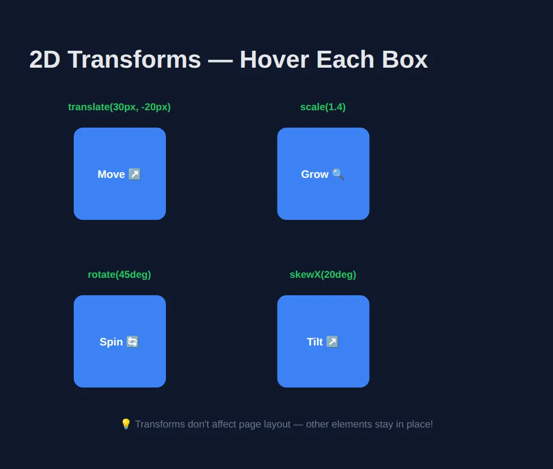
🧠 Worked Example — the three things transforms always surprise you with
The table above tells you what each function does on its own. This example shows the three behaviours that catch people out when they start combining them: the order of the functions changes the answer, a transform never disturbs the elements around it, and transform-origin decides what the element pivots around. Read the comments, run it, then change one number at a time.
<!DOCTYPE html>
<html>
<head>
<meta charset="utf-8">
<title>Worked Example: Transforms</title>
<style>
  * { box-sizing:border-box; margin:0; padding:0; }
  body { background:#0f172a; color:#e5e7eb; font-family:system-ui,sans-serif; padding:24px; }
  h2 { font-size:.95rem; color:#60a5fa; margin:22px 0 10px; }
  .stage { position:relative; height:150px; background:#1e293b; border-radius:8px; }
  .box { position:absolute; top:40px; left:40px; width:70px; height:70px; background:#3b82f6; border-radius:8px;
         display:grid; place-items:center; font-size:.72rem; color:#fff; }

  /* A and B sit at exactly the same top/left. They use exactly the same two
     functions. Only the ORDER differs, and they end up 57px apart.
     Read a transform list left to right: each function moves the element's own
     axes, and the next function then works on those NEW axes.

     A: move 80px right first, THEN spin on the spot.
        -> ends up 80px right of where it started. */
  .a { transform: translateX(80px) rotate(45deg); }

  /* B: spin the axes 45deg first, THEN move 80px along the now-diagonal X axis.
        -> ends up about 57px right AND 57px down (80 x cos45 = 56.6). */
  .b { transform: rotate(45deg) translateX(80px); background:#22c55e; }

  .row { display:flex; gap:12px; background:#1e293b; border-radius:8px; padding:12px; }
  .cell { width:80px; height:60px; background:#334155; border-radius:6px; display:grid; place-items:center; font-size:.75rem; }

  /* scale(1.5) paints the middle cell 1.5x bigger (80x60 becomes 120x90),
     but its LAYOUT box is still 80x60. That is why cells 1 and 3 do not budge
     and the big cell simply overlaps them. Transforms are drawn after layout is
     finished — which is exactly why they are cheap to animate. */
  .grown { transform: scale(1.5); background:#f59e0b; color:#0f172a; }

  /* Default transform-origin is 50% 50% (the centre), so the centre stays put
     and the box spins around it. */
  .origin { transform: rotate(30deg); }

  /* Pin the top-left corner instead and the same 30deg swings the whole box
     down and to the left — the corner is the only point that does not move. */
  .origin-tl { transform: rotate(30deg); transform-origin: top left; background:#a855f7; }
</style>
</head>
<body>
  <h2>1. Order matters</h2>
  <div class="stage">
    <div class="box a">A</div>
    <div class="box b">B</div>
  </div>

  <h2>2. transform never moves the neighbours</h2>
  <div class="row">
    <div class="cell">1</div>
    <div class="cell grown">1.5x</div>
    <div class="cell">3</div>
  </div>

  <h2>3. transform-origin picks the pivot</h2>
  <div class="stage">
    <div class="box origin">50% 50%</div>
    <div class="box origin-tl">top left</div>
  </div>

  <!-- ✅ What you should see:
       1. Two diamonds, not one. A is up and to the right; B is down and to the
          left of it, because rotating first bent the direction "right" into a
          45-degree diagonal. Swap the two functions in .b and it lands on A.
       2. The orange cell is drawn half as big again and spills over cells 1 and 3
          and out of the grey strip. Cells 1 and 3 have not moved a pixel.
       3. Two overlapping tilted squares. The blue one is still centred where it
          started; the purple one has swung down-left because it is hinged on its
          top-left corner. -->
  <!-- ✅ Expected result, measured in a real browser:
     .stage -> position: relative
     .box -> display: grid
     .row -> display: flex
     .cell -> display: grid
     .box -> count: 4
  -->
</body>
</html>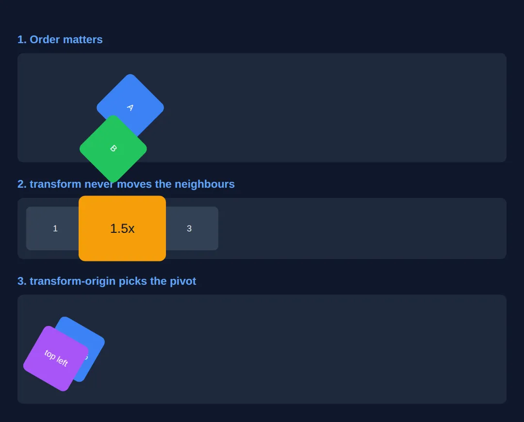
🎯 Your Turn — centre a badge, tilt a ribbon, grow on hover
Three blanks, marked ___, and three of the jobs you will actually use transforms for. The middle one — the "translate minus fifty percent" trick — is worth memorising: percentages in translate() are percentages of the element's own size, which is the only way to shift something by exactly half of itself when you do not know how big it is.
<!DOCTYPE html>
<html>
<head>
<meta charset="utf-8">
<title>Your Turn: Transforms</title>
<style>
  /* 🎯 YOUR TURN — fill in the three blanks marked ___ */

  * { box-sizing:border-box; margin:0; padding:0; }
  body { background:#0f172a; color:#e5e7eb; font-family:system-ui,sans-serif; padding:24px; }

  .stage { position:relative; width:300px; height:200px; background:#1e293b; border-radius:10px; overflow:hidden; }

  .badge {
    position:absolute;
    top:50%;                  /* this puts the badge's TOP EDGE at the halfway line... */
    left:50%;                 /* ...and its LEFT EDGE at the halfway line, so it sits low and right */

    /* 1) Pull the badge back by half its own width and half its own height,
          so its middle — not its corner — lands on the centre. */
    transform: ___;           /* 👉 replace ___ with  translate(-50%, -50%)  */

    background:#3b82f6; color:#fff; font-weight:700; font-size:.9rem;
    padding:10px 18px; border-radius:999px;
  }

  .ribbon {
    position:absolute; top:22px; left:-40px;
    background:#ef4444; color:#fff; font-weight:700; font-size:.75rem;
    padding:6px 50px;

    /* 2) Tilt the ribbon anticlockwise so it lies across the top-left corner.
          Anticlockwise means a NEGATIVE angle. */
    transform: rotate(___);   /* 👉 replace ___ with  -45deg  */

    transform-origin: center;
  }

  .card {
    width:180px; margin-top:20px; padding:16px; background:#334155; border-radius:10px;
    transition: transform .25s ease;   /* already done: makes the change animate */
    font-size:.9rem;
  }

  /* 3) Make the card grow to 110% of its size while the pointer is on it. */
  .card:hover { transform: scale(___); }   /* 👉 replace ___ with  1.1  */
</style>
</head>
<body>
  <div class="stage">
    <div class="ribbon">SALE</div>
    <div class="badge">Dead centre</div>
  </div>

  <div class="card">Hover me</div>

  <!-- ✅ Expected once all three blanks are filled:
       - "Dead centre" sits exactly in the middle of the grey stage, both
         horizontally and vertically. Delete the translate and it slumps down and
         to the right, with its top-left corner on the centre point instead.
       - The red SALE ribbon runs diagonally across the top-left corner of the
         stage, its ends hidden by overflow: hidden.
       - Hovering the card makes it grow smoothly by 10% (180px wide becomes
         198px) and shrink back when you leave. It grows out from its centre in
         both directions, so its middle stays exactly where it was. -->
</body>
</html>
2. 3D Transforms & Perspective
3D transforms add a Z-axis (depth). The perspective property controls how "deep" the 3D effect feels — lower values create more dramatic perspective.
| Property | Purpose |
|---|---|
| perspective: 800px; | Distance from viewer to 3D plane (on parent) |
| transform-style: preserve-3d; | Keeps children in 3D space (not flattened) |
| backface-visibility: hidden; | Hides the back of rotated elements |
3. Practical: 3D Flip Card
The classic 3D effect — a card that flips to reveal content on the back:
<!DOCTYPE html>
<html>
<head>
  <title>3D Flip Card</title>
  <style>
    body {
      background: #0f172a;
      font-family: system-ui, sans-serif;
      padding: 40px;
      color: #e5e7eb;
      display: flex;
      flex-direction: column;
      align-items: center;
      gap: 30px;
    }

    .cards { display: flex; gap: 30px; flex-wrap: wrap; justify-content: center; }

    .flip-card {
      width: 220px;
      height: 280px;
      perspective: 800px;
      cursor: pointer;
    }

    .flip-inner {
      width: 100%;
      height: 100%;
      position: relative;
      transition: transform 0.6s ease;
      transform-style: preserve-3d;
    }

    .flip-card:hover .flip-inner {
      transform: rotateY(180deg);
    }

    .flip-front, .flip-back {
      position: absolute;
      width: 100%;
      height: 100%;
      box-sizing: border-box; /* the padding stays inside the card */
      backface-visibility: hidden;
      border-radius: 16px;
      display: flex;
      flex-direction: column;
      align-items: center;
      justify-content: center;
      padding: 25px;
      text-align: center;
    }

    .flip-front {
      background: linear-gradient(135deg, #3b82f6, #8b5cf6);
    }

    .flip-back {
      background: linear-gradient(135deg, #22c55e, #06b6d4);
      transform: rotateY(180deg);
    }

    .flip-front h2 { font-size: 3rem; margin-bottom: 10px; }
    .flip-front p { font-size: 1rem; opacity: 0.9; }
    .flip-back h3 { font-size: 1.2rem; margin-bottom: 10px; }
    .flip-back p { font-size: 0.9rem; opacity: 0.9; line-height: 1.5; }

    .note { color: #64748b; font-size: 14px; }
  </style>
</head>
<body>
  <h1>3D Flip Cards</h1>
  <p class="note">Hover over each card to flip it!</p>

  <div class="cards">
    <div class="flip-card">
      <div class="flip-inner">
        <div class="flip-front">
          <h2>🚀</h2>
          <p>Fast</p>
        </div>
        <div class="flip-back">
          <h3>Lightning Speed</h3>
          <p>Built with performance in mind. GPU-accelerated transforms for smooth 60fps.</p>
        </div>
      </div>
    </div>

    <div class="flip-card">
      <div class="flip-inner">
        <div class="flip-front">
          <h2>🎨</h2>
          <p>Beautiful</p>
        </div>
        <div class="flip-back">
          <h3>Stunning Design</h3>
          <p>Pure CSS — no JavaScript needed. Just perspective, preserve-3d, and backface-visibility.</p>
        </div>
      </div>
    </div>

    <div class="flip-card">
      <div class="flip-inner">
        <div class="flip-front">
          <h2>✨</h2>
          <p>Simple</p>
        </div>
        <div class="flip-back">
          <h3>Easy to Build</h3>
          <p>Only 3 CSS properties: perspective, transform-style, backface-visibility. That's it!</p>
        </div>
      </div>
    </div>
  </div>
  <!-- ✅ Expected result, measured in a real browser:
     .cards -> display: flex
     .flip-card -> cursor: pointer
     .flip-inner -> position: relative
     .flip-front p -> opacity: 0.9
     .flip-card -> count: 3
  -->
</body>
</html>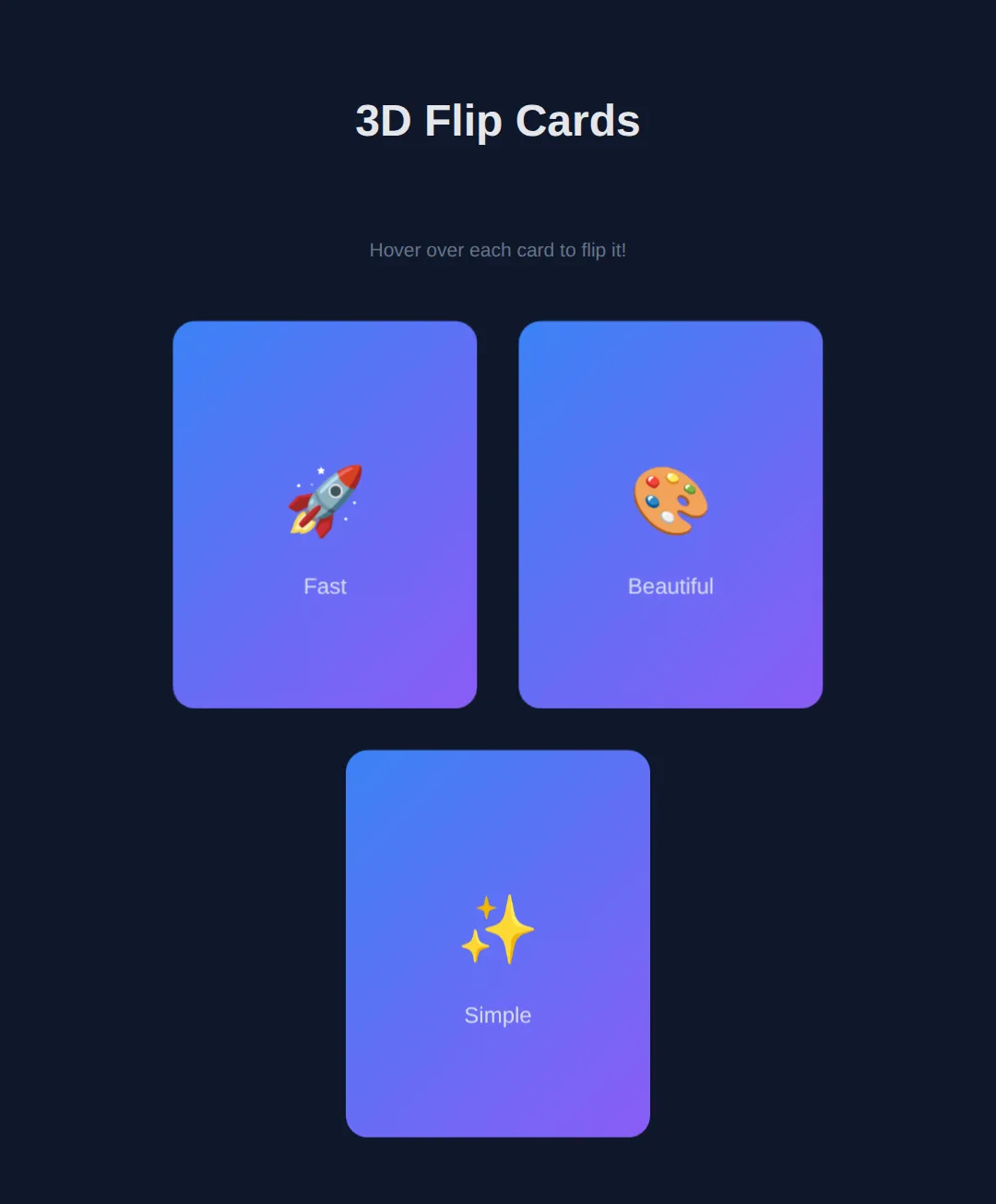
4. Advanced: Rotating 3D Cube
The ultimate 3D CSS demo — a spinning cube with six faces positioned in 3D space:
<!DOCTYPE html>
<html>
<head>
  <title>3D Cube</title>
  <style>
    body {
      background: #0f172a;
      font-family: system-ui, sans-serif;
      display: flex;
      flex-direction: column;
      align-items: center;
      justify-content: center;
      min-height: 100vh;
      margin: 0;
      color: #e5e7eb;
    }

    .scene {
      width: 200px;
      height: 200px;
      perspective: 600px;
      margin: 40px;
    }

    .cube {
      width: 200px;
      height: 200px;
      position: relative;
      transform-style: preserve-3d;
      animation: spin 8s infinite linear;
    }

    @keyframes spin {
      from { transform: rotateX(0deg) rotateY(0deg); }
      to { transform: rotateX(360deg) rotateY(360deg); }
    }

    .face {
      position: absolute;
      width: 200px;
      height: 200px;
      display: flex;
      align-items: center;
      justify-content: center;
      font-size: 1.5rem;
      font-weight: bold;
      border: 2px solid rgba(255,255,255,0.2);
      border-radius: 8px;
      opacity: 0.85;
    }

    .front  { background: #3b82f6; transform: rotateY(0deg) translateZ(100px); }
    .back   { background: #22c55e; transform: rotateY(180deg) translateZ(100px); }
    .right  { background: #f59e0b; transform: rotateY(90deg) translateZ(100px); }
    .left   { background: #ef4444; transform: rotateY(-90deg) translateZ(100px); }
    .top    { background: #8b5cf6; transform: rotateX(90deg) translateZ(100px); }
    .bottom { background: #06b6d4; transform: rotateX(-90deg) translateZ(100px); }

    .note { color: #64748b; font-size: 14px; text-align: center; }
  </style>
</head>
<body>
  <h1>CSS 3D Cube</h1>
  <div class="scene">
    <div class="cube">
      <div class="face front">Front</div>
      <div class="face back">Back</div>
      <div class="face right">Right</div>
      <div class="face left">Left</div>
      <div class="face top">Top</div>
      <div class="face bottom">Bottom</div>
    </div>
  </div>
  <p class="note">Pure CSS — perspective + preserve-3d + translateZ + @keyframes</p>
  <!-- ✅ Expected result, measured in a real browser:
     .cube -> position: relative
     .face -> display: flex
     .face -> count: 6
  -->
</body>
</html>
🧩 Mini-Challenge — a stack of scattered photos
Support removed. Build the "polaroids dropped on a table" effect you see on photography sites: three cards, each tilted at a slightly different angle, that straighten up and lift when you hover them. Everything you need is in the worked example and the flip card above.
<!DOCTYPE html>
<html>
<head>
<meta charset="utf-8">
<title>Mini-Challenge: Photo Stack</title>
<style>
  /* 🧩 MINI-CHALLENGE: three tilted photo cards
     1. .stack — a flex row with a gap, so the three cards sit side by side.
     2. .photo — give it a size, a background, a border-radius and
          transition: transform .3s ease;   (so every change animates)
     3. Tilt each card differently using :nth-child():
          .photo:nth-child(1) { transform: rotate(-6deg); }
          .photo:nth-child(2) { transform: rotate(3deg); }
          .photo:nth-child(3) { transform: rotate(-2deg); }
     4. .photo:hover — straighten it AND lift it AND enlarge it in one
          transform list, e.g. rotate(0deg) translateY(-10px) scale(1.06).
          Remember: everything you want kept must be in the SAME transform
          declaration — a second transform property replaces the first, it does
          not add to it.
     5. Optional: add  z-index: 1;  to :hover so the lifted card is drawn on top
          of its neighbours instead of underneath them.

     ✅ How to check it:
        - At rest the three cards lean at different angles, like dropped photos.
        - Hovering one makes it stand upright, rise, and grow — smoothly, because
          of the transition — and the other two do not move at all, because a
          transform never affects layout.
        - If a hovered card grows but stays tilted, you wrote two transform lines
          and the second one won. Merge them into one.
  */

  * { box-sizing:border-box; margin:0; padding:0; }
  body { background:#0f172a; color:#e5e7eb; font-family:system-ui,sans-serif; padding:40px 24px; }
  h1 { font-size:1.1rem; color:#60a5fa; margin-bottom:24px; }

  /* your CSS here */

</style>
</head>
<body>
  <h1>Recent shots</h1>

  <!-- Markup done for you. Style it. -->
  <div class="stack">
    <div class="photo">Harbour</div>
    <div class="photo">Moorland</div>
    <div class="photo">Old pier</div>
  </div>
  <!-- ✅ Expected result, measured in a real browser:
     h1 -> color: rgb(96, 165, 250)
     .photo -> count: 3
  -->
</body>
</html>
⚠️ Common Mistakes
- Forgetting perspective on the parent — 3D transforms look flat without perspective on the container element.
- Missing transform-style: preserve-3d — Without this, child elements are flattened into 2D, destroying the 3D effect.
- Not hiding backfaces — For flip cards, you need backface-visibility: hidden on both faces, or you'll see through to the back.
- Animating too many 3D elements — 3D transforms are GPU-intensive. Limit simultaneous 3D animations to avoid frame drops.
🎉 Lesson Complete
You can now manipulate elements in 2D and 3D space with CSS:
- ✅ translate, scale, rotate, skew for 2D transforms
- ✅ rotateX, rotateY, translateZ for 3D transforms
- ✅ perspective controls depth perception
- ✅ preserve-3d keeps children in 3D space
- ✅ backface-visibility: hidden for flip cards
Practice quiz
What does the transform function translate(x, y) do?
- Resizes the element
- Rotates the element
- Moves the element without affecting the surrounding layout
- Skews the element
Answer: Moves the element without affecting the surrounding layout. translate(x, y) shifts the element visually; transforms don't affect page layout, so other elements stay in place.
What does scale(1.5) do to an element?
- Makes it 1.5 times its original size
- Moves it 1.5px
- Rotates it 1.5 degrees
- Reduces it to 15%
Answer: Makes it 1.5 times its original size. scale() multiplies the element's size; 1 is the original, so scale(1.5) makes it 150% as large.
In which direction does rotate(45deg) turn an element?
- Counter-clockwise
- It flips it vertically
- It moves it 45px
- Clockwise
Answer: Clockwise. A positive rotate() angle turns the element clockwise; a negative angle turns it counter-clockwise.
A key advantage of transforms is that they...
- Change the document flow
- Don't affect the layout of surrounding elements
- Only work on text
- Require JavaScript
Answer: Don't affect the layout of surrounding elements. Transforms reposition an element visually without disturbing the layout, so neighbouring elements don't move.
Where must the perspective property be set for a 3D effect to appear?
- On the parent/container element
- On the rotating child itself
- On the body only
- On the html root
Answer: On the parent/container element. perspective is set on the parent (container). It defines the viewer's distance from the 3D plane; without it, 3D transforms look flat.
What does a lower perspective value (e.g. 200px vs 1000px) produce?
- A flatter look
- No change
- A more dramatic, exaggerated depth effect
- A larger element
Answer: A more dramatic, exaggerated depth effect. Lower perspective values place the viewer closer, exaggerating the depth; higher values look flatter and more distant.
What does transform-style: preserve-3d do?
- Hides the element's back
- Keeps child elements positioned in 3D space instead of flattening them
- Doubles the perspective
- Disables animations
Answer: Keeps child elements positioned in 3D space instead of flattening them. preserve-3d lets nested children keep their own 3D positions; without it, children are flattened into the parent's 2D plane.
Which property hides the reverse side of a rotated element in a flip card?
- overflow: hidden
- visibility: hidden
- display: none
- backface-visibility: hidden
Answer: backface-visibility: hidden. backface-visibility: hidden hides an element's back face when it's rotated away, so you don't see through to the mirror image.
In the 3D cube, what positions each face outward from the center?
- margin: 100px
- A rotate plus translateZ(100px)
- position: absolute alone
- z-index: 100
Answer: A rotate plus translateZ(100px). Each face is rotated to its orientation (rotateY/rotateX) and pushed out along the Z-axis with translateZ(100px) — half the cube's size.
Which transforms are GPU-accelerated and best for smooth 60fps animation?
- width and height
- margin and padding
- transform and opacity
- top and left
Answer: transform and opacity. transform (and opacity) are composited on the GPU, so they animate smoothly without triggering layout reflow like width/height/top/left do.
Continue this course
- Previous: Advanced CSS Selectors
- Next: CSS Custom Properties — Build reusable design systems with CSS variables and dynamic theming
- Quick reference: HTML & CSS cheat sheet › CSS Motion & State