CSS Layouts & Box Model
Reviewed & published by Brayan K
Master the foundation of CSS layouts — every element is a box, and display controls behavior.
Part of the free HTML & CSS course at LearnCodingFast — hands-on lessons with examples you run in your browser, plus practice exercises and a quick quiz.
💡 Think of the Box Model Like a Picture Frame
Every HTML element is like a framed picture on a wall:
| Layer | Frame Analogy | CSS Property |
|---|---|---|
| Content | The actual photo/artwork | width, height |
| Padding | The mat/white space around the photo | padding |
| Border | The actual frame | border |
| Margin | Wall space between frames | margin |
Why This Lesson Matters
Most beginners think CSS is about colors and fonts. They are wrong.
Layout problems, broken designs, elements not aligning, weird spacing, mobile issues — 90% of these problems come from NOT understanding the Box Model and Display.
If you master this lesson:
- ✓ You will stop fighting CSS
- ✓ You will understand why things look wrong
- ✓ You will be able to fix layouts without guessing
The CSS Box Model (Most Important Concept)
Every single HTML element is a box.
Each box is made of four layers, from inside to outside:
- Content – the actual thing inside
- Padding – space inside the box
- Border – the edge of the box
- Margin – space outside the box
<!DOCTYPE html>
<html>
<head>
  <title>Box Model</title>
  <style>
    body {
      background: #0f172a;
      font-family: system-ui, sans-serif;
      padding: 20px;
      color: #e5e7eb;
    }

    .box-demo {
      /* CONTENT: The actual size */
      width: 200px;
      height: 100px;
      background: #3b82f6;

      /* PADDING: Space inside the border */
      padding: 20px;

      /* BORDER: The edge of the box */
      border: 5px solid #22c55e;

      /* MARGIN: Space outside the box */
      margin: 30px;

      color: white;
      text-align: center;
    }

    .label {
      background: #1e293b;
      padding: 10px;
      margin: 20px 0;
      border-radius: 8px;
    }

    code {
      background: #334155;
      padding: 2px 8px;
      border-radius: 4px;
      color: #22c55e;
    }
  </style>
</head>
<body>
  <h1>The CSS Box Model</h1>

  <div class="label">
    <p>🔵 Blue = Content (200x100px)</p>
    <p>⬜ Inside space = Padding (20px)</p>
    <p>🟢 Green line = Border (5px)</p>
    <p>↔️ Outside space = Margin (30px)</p>
  </div>

  <div class="box-demo">
    Content Area
  </div>

  <div class="label">
    <p>Total width = 200 + 40 (padding) + 10 (border) = <code>250px</code></p>
    <p>Plus 30px of margin on every side (which adds 60px of empty space horizontally)</p>
  </div>
  <!-- ✅ Expected result, measured in a real browser:
     .box-demo -> width: 200px
     .label -> padding-top: 10px
     .label -> count: 2
  -->
</body>
</html>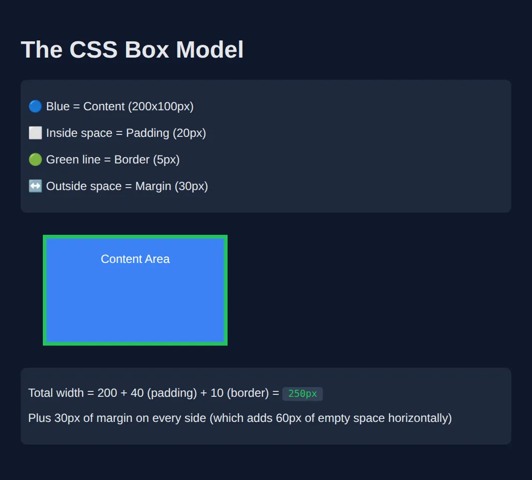
Padding (Space Inside the Box)
Padding creates space between the content and the border. Think of padding as breathing room inside the box.
<!DOCTYPE html>
<html>
<head>
  <title>Padding</title>
  <style>
    body {
      background: #0f172a;
      font-family: system-ui, sans-serif;
      padding: 20px;
      color: #e5e7eb;
    }

    .demo {
      background: #3b82f6;
      color: white;
      margin: 15px 0;
      border: 2px solid #60a5fa;
    }

    .no-padding {
      padding: 0;
    }

    .small-padding {
      padding: 10px;
    }

    .large-padding {
      padding: 30px;
    }

    .different-sides {
      padding-top: 10px;
      padding-right: 40px;
      padding-bottom: 10px;
      padding-left: 40px;
    }

    .shorthand {
      /* top right bottom left */
      padding: 10px 30px 10px 30px;
    }

    .shorthand-two {
      /* vertical horizontal */
      padding: 15px 40px;
    }

    .label {
      color: #94a3b8;
      font-size: 14px;
      margin-top: 5px;
    }
  </style>
</head>
<body>
  <h1>Padding Examples</h1>

  <div class="demo no-padding">No padding - text touches edges</div>
  <p class="label">padding: 0;</p>

  <div class="demo small-padding">Small padding - 10px all around</div>
  <p class="label">padding: 10px;</p>

  <div class="demo large-padding">Large padding - 30px all around</div>
  <p class="label">padding: 30px;</p>

  <div class="demo different-sides">Different sides - more on left/right</div>
  <p class="label">padding: 10px 40px 10px 40px;</p>

  <div class="demo shorthand-two">Shorthand - vertical | horizontal</div>
  <p class="label">padding: 15px 40px;</p>
  <!-- ✅ Expected result, measured in a real browser:
     .demo -> margin-top: 15px
     .no-padding -> padding-top: 0px
     .demo -> count: 5
  -->
</body>
</html>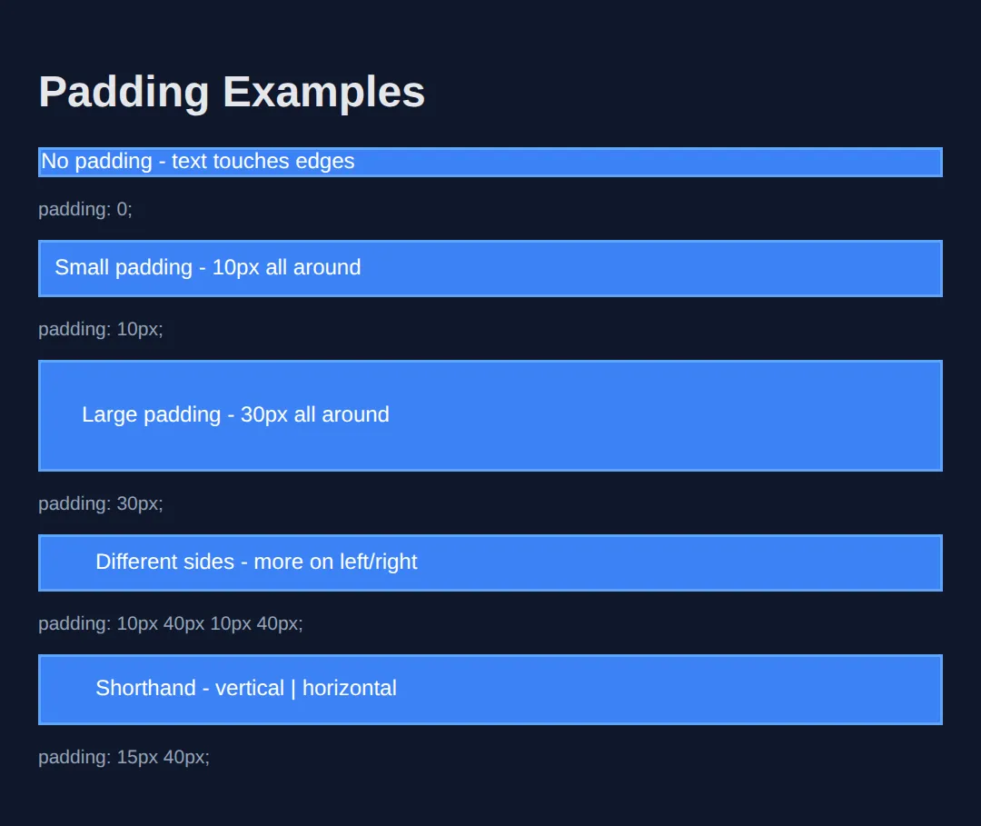
Margin (Space Outside the Box)
Margin creates space OUTSIDE the element. It pushes other elements away.
<!DOCTYPE html>
<html>
<head>
  <title>Margin</title>
  <style>
    body {
      background: #0f172a;
      font-family: system-ui, sans-serif;
      padding: 20px;
      color: #e5e7eb;
      margin: 0;
    }

    .box {
      background: #3b82f6;
      padding: 20px;
      color: white;
      border-radius: 8px;
    }

    .with-margin {
      margin: 20px;
    }

    .margin-bottom {
      margin-bottom: 40px;
    }

    /* CENTERING with margin auto */
    .centered {
      max-width: 400px;
      margin-left: auto;
      margin-right: auto;
      /* Shorthand: margin: 20px auto; */
    }

    .section {
      background: #1e293b;
      padding: 20px;
      margin: 30px 0;
      border-radius: 8px;
    }

    h2 {
      color: #22c55e;
      margin-top: 0;
    }
  </style>
</head>
<body>
  <h1>Margin Examples</h1>

  <div class="section">
    <h2>Spacing Between Elements</h2>
    <div class="box margin-bottom">Box 1 - margin-bottom: 40px</div>
    <div class="box">Box 2 - pushed down by Box 1's margin</div>
  </div>

  <div class="section">
    <h2>Centering with margin: auto</h2>
    <div class="box centered">
      This box is centered!<br>
      max-width + margin: auto
    </div>
  </div>

  <div class="section">
    <h2>Common Pattern: Container</h2>
    <div style="max-width: 600px; margin: 0 auto; background: #334155; padding: 20px; border-radius: 8px;">
      <p>This is how you center page content!</p>
      <code>max-width: 600px; margin: 0 auto;</code>
    </div>
  </div>
  <!-- ✅ Expected result, measured in a real browser:
     .box -> padding-top: 20px
     .section -> count: 3
  -->
</body>
</html>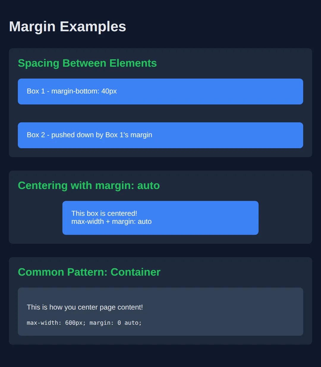
The box-sizing Fix (Industry Standard)
By default, width = content only. Padding + border get added ON TOP.
This breaks layouts! The fix: box-sizing: border-box
<!DOCTYPE html>
<html>
<head>
  <title>Box Sizing</title>
  <style>
    body {
      background: #0f172a;
      font-family: system-ui, sans-serif;
      padding: 20px;
      color: #e5e7eb;
    }

    .container {
      width: 300px;
      background: #1e293b;
      padding: 20px;
      margin: 20px 0;
      border-radius: 8px;
    }

    /* DEFAULT: content-box (bad) */
    .content-box {
      box-sizing: content-box;
      width: 300px;
      padding: 20px;
      border: 5px solid #ef4444;
      background: #334155;
    }

    /* BETTER: border-box (good) */
    .border-box {
      box-sizing: border-box;
      width: 300px;
      padding: 20px;
      border: 5px solid #22c55e;
      background: #334155;
    }

    h2 { margin-top: 0; }
    .bad { color: #ef4444; }
    .good { color: #22c55e; }

    /* THE FIX: Apply to all elements */
    /*
    * {
      box-sizing: border-box;
    }
    */
  </style>
</head>
<body>
  <h1>box-sizing Comparison</h1>

  <div class="container">
    <h2 class="bad">❌ content-box (default)</h2>
    <div class="content-box">
      width: 300px<br>
      + padding: 40px<br>
      + border: 10px<br>
      = <strong>350px total!</strong>
    </div>
    <p>Overflows the 300px container!</p>
  </div>

  <div class="container">
    <h2 class="good">✅ border-box (recommended)</h2>
    <div class="border-box">
      width: 300px<br>
      (includes padding & border)<br>
      = <strong>300px total!</strong>
    </div>
    <p>Fits perfectly in the 300px container!</p>
  </div>

  <div style="background: #22c55e; color: #0f172a; padding: 20px; border-radius: 8px; margin-top: 30px;">
    <strong>Always add this to your CSS:</strong><br>
    <code>* { box-sizing: border-box; }</code>
  </div>
  <!-- ✅ Expected result, measured in a real browser:
     .content-box -> box-sizing: content-box
     .border-box -> box-sizing: border-box
     .container -> count: 2
  -->
</body>
</html>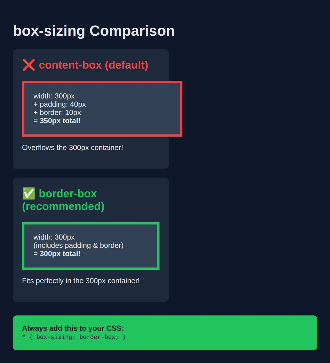
🧠 Worked Example — do the box-model arithmetic yourself
This is the example to read slowly, because it is the one that explains every mystery gap and every "why is my layout 10 pixels too wide". Two cards get identical CSS — same width, same padding, same border. Only box-sizing differs, and they end up 50 pixels apart in real width.
<!DOCTYPE html>
<html>
<head>
<meta charset="utf-8">
<title>Worked Example: Box Model Arithmetic</title>
<style>
body { background:#0f172a; color:#e5e7eb; font-family: system-ui, sans-serif; padding:24px; }
h1 { font-size:1.2rem; color:#60a5fa; margin:0 0 6px; }
p.note { color:#94a3b8; font-size:.88rem; margin:0 0 16px; }
/* A 340px-wide "column" so you can SEE which card fits and which spills out. */
.rail {
width: 340px; /* the space each card is allowed to occupy */
background: #1e293b;
padding: 0;
}
/* Both cards below get EXACTLY these numbers. Only box-sizing differs. */
.card {
width: 300px; /* what "width" means depends on box-sizing (see below) */
padding: 20px; /* 20px on all four sides -> 40px of horizontal padding */
border: 5px solid; /* 5px on all four sides -> 10px of horizontal border */
margin: 0 0 16px 0; /* margin is OUTSIDE the border: it never counts in width */
background: #334155;
font-size: .9rem;
}
/* content-box is the browser default: width = CONTENT only.
Rendered width = 300 content + 40 padding + 10 border = 350px.
350 > 340, so this card spills past the right edge of the rail. */
.content-box { box-sizing: content-box; border-color: #ef4444; }
/* border-box: width = content + padding + border, all in.
Rendered width = 300px exactly, so the CONTENT shrinks to 250px to make room
(300 - 40 padding - 10 border = 250).
300 < 340, so this card sits comfortably inside the rail. */
.border-box { box-sizing: border-box; border-color: #22c55e; }
</style>
</head>
<body>
<h1>Two identical cards, one property different</h1>
<p class="note">The grey rail behind them is exactly 340px wide.</p>
<div class="rail">
<div class="card content-box">box-sizing: content-box → 350px on screen</div>
<div class="card border-box">box-sizing: border-box → 300px on screen</div>
</div>
<!-- ✅ What you should see: the red-bordered card is visibly WIDER than the grey
rail and hangs 10px past its right edge. The green-bordered card is narrower
than the rail with grey showing to its right. Both were told "width: 300px". -->
<!-- ✅ Expected result, measured in a real browser:
.content-box -> box-sizing: content-box
.border-box -> box-sizing: border-box
.card -> count: 2
-->
</body>
</html>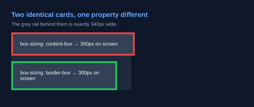
That 10px overhang is the whole reason for the * { box-sizing: border-box; } reset at the top of nearly every real stylesheet. With it, the number you type is the number you get.
🎯 Your Turn — a 400px notice box, centred
There is an orange ruler at the top of the page that is exactly 400px wide. Your job is to make the notice box below match it exactly and sit dead centre. Three blanks, marked ___ — everything else is written for you.
<!DOCTYPE html>
<html>
<head>
  <meta charset="utf-8">
  <title>Your Turn: Box Model</title>
  <style>
    /* 🎯 YOUR TURN — fill in the three blanks marked ___ */

    body { background:#0f172a; color:#e5e7eb; font-family: system-ui, sans-serif; padding:24px; }

    /* The measuring stick. Do not change this. */
    .ruler { width:400px; height:8px; background:#f59e0b; margin:0 auto 10px; }

    .notice {
      /* 1) Make width mean "everything, borders included", so the padding and
            border below do NOT push the box past 400px. */
      box-sizing: ___;        /* 👉 replace ___ with  border-box  */

      width: 400px;

      /* 2) Give the text 24px of breathing room on all four sides. */
      padding: ___;           /* 👉 replace ___ with  24px  */

      /* 3) Centre the box: no margin top/bottom, equal automatic margins left/right. */
      margin: ___;            /* 👉 replace ___ with  0 auto  */

      border: 4px solid #3b82f6;
      background:#1e293b;
      border-radius:10px;
    }

    .notice h2 { margin:0 0 8px; font-size:1rem; color:#60a5fa; }
    .notice p  { margin:0; font-size:.9rem; color:#94a3b8; }
  </style>
</head>
<body>
  <div class="ruler"></div>

  <div class="notice">
    <h2>Heads up</h2>
    <p>This box should be exactly as wide as the orange ruler above it, and sit dead centre.</p>
  </div>

  <!-- ✅ Expected once all three blanks are filled: the blue box lines up edge to
       edge with the orange ruler — same left edge, same right edge, 400px wide —
       and both stay centred when you widen or narrow the preview. Inside, the
       content area is 400 - 48 padding - 8 border = 344px wide.
       Get box-sizing wrong and the box measures 456px and overhangs the ruler
       by 28px on each side. -->
</body>
</html>
CSS Display Property
The display property controls how an element participates in layout.
<!DOCTYPE html>
<html>
<head>
  <title>Display Property</title>
  <style>
    body {
      background: #0f172a;
      font-family: system-ui, sans-serif;
      padding: 20px;
      color: #e5e7eb;
    }

    .section {
      background: #1e293b;
      padding: 20px;
      margin: 20px 0;
      border-radius: 8px;
    }

    h2 { color: #3b82f6; margin-top: 0; }

    /* BLOCK: Full width, stacks vertically */
    .block-demo {
      display: block;
      background: #ef4444;
      padding: 10px;
      margin: 5px 0;
    }

    /* INLINE: Flows with text, ignores width/height */
    .inline-demo {
      display: inline;
      background: #22c55e;
      padding: 5px 10px;
      /* width and height are IGNORED! */
      width: 500px; /* Won't work */
    }

    /* INLINE-BLOCK: Best of both worlds */
    .inline-block-demo {
      display: inline-block;
      background: #3b82f6;
      padding: 15px 25px;
      margin: 5px;
      width: 120px;
      text-align: center;
    }

    .note {
      color: #94a3b8;
      font-size: 14px;
      margin-top: 10px;
    }
  </style>
</head>
<body>
  <h1>CSS Display Property</h1>

  <div class="section">
    <h2>display: block</h2>
    <div class="block-demo">Block 1 - Full width</div>
    <div class="block-demo">Block 2 - Stacks below</div>
    <div class="block-demo">Block 3 - New line each</div>
    <p class="note">Block elements take full width and stack vertically.</p>
  </div>

  <div class="section">
    <h2>display: inline</h2>
    <p>
      Text with <span class="inline-demo">inline</span> elements
      <span class="inline-demo">flow</span> with the
      <span class="inline-demo">text</span> naturally.
    </p>
    <p class="note">Inline elements ignore width/height settings!</p>
  </div>

  <div class="section">
    <h2>display: inline-block</h2>
    <div class="inline-block-demo">Card 1</div>
    <div class="inline-block-demo">Card 2</div>
    <div class="inline-block-demo">Card 3</div>
    <div class="inline-block-demo">Card 4</div>
    <p class="note">Inline-block: sits inline BUT respects width/height!</p>
  </div>
  <!-- ✅ Expected result, measured in a real browser:
     .block-demo -> display: block
     .inline-demo -> display: inline
     .inline-block-demo -> display: inline-block
     .inline-block-demo -> count: 4
  -->
</body>
</html>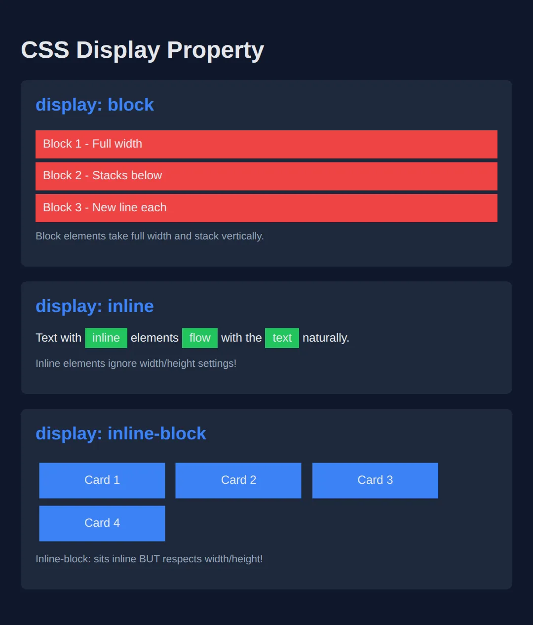
display: none vs visibility: hidden
<!DOCTYPE html>
<html>
<head>
  <title>Hiding Elements</title>
  <style>
    body {
      background: #0f172a;
      font-family: system-ui, sans-serif;
      padding: 20px;
      color: #e5e7eb;
    }

    .container {
      display: flex;
      gap: 10px;
      margin: 20px 0;
    }

    .box {
      background: #3b82f6;
      padding: 20px;
      border-radius: 8px;
      color: white;
    }

    /* display: none - REMOVED from layout */
    .hidden-display {
      display: none;
    }

    /* visibility: hidden - INVISIBLE but space reserved */
    .hidden-visibility {
      visibility: hidden;
    }

    .section {
      background: #1e293b;
      padding: 20px;
      margin: 20px 0;
      border-radius: 8px;
    }

    h2 { color: #22c55e; margin-top: 0; }

    .comparison {
      display: grid;
      grid-template-columns: 1fr 1fr;
      gap: 20px;
    }

    .note {
      background: #334155;
      padding: 10px;
      border-radius: 6px;
      margin-top: 10px;
      font-size: 14px;
    }
  </style>
</head>
<body>
  <h1>Hiding Elements</h1>

  <div class="comparison">
    <div class="section">
      <h2>display: none</h2>
      <div class="container">
        <div class="box">Box 1</div>
        <div class="box hidden-display">Box 2 (hidden)</div>
        <div class="box">Box 3</div>
      </div>
      <div class="note">
        ❌ Element is <strong>completely removed</strong><br>
        ❌ Takes up NO space<br>
        ❌ Other elements fill the gap
      </div>
    </div>

    <div class="section">
      <h2>visibility: hidden</h2>
      <div class="container">
        <div class="box">Box 1</div>
        <div class="box hidden-visibility">Box 2 (hidden)</div>
        <div class="box">Box 3</div>
      </div>
      <div class="note">
        👻 Element is <strong>invisible</strong><br>
        ✓ Space is STILL reserved<br>
        ✓ Layout unchanged
      </div>
    </div>
  </div>
  <!-- ✅ Expected result, measured in a real browser:
     .container -> display: flex
     .hidden-display -> display: none
     .comparison -> display: grid
     .box -> count: 6
  -->
</body>
</html>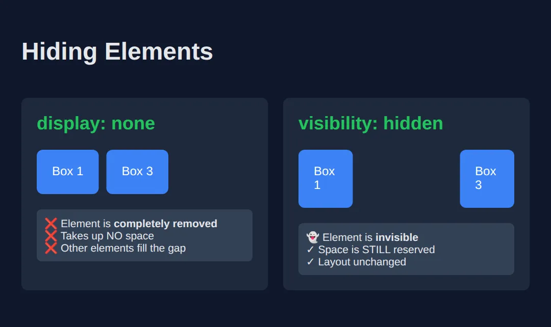
Practice Challenge
Build a card layout with:
- box-sizing: border-box on all elements
- Proper padding inside cards
- Margin between cards
- Centered container
<!DOCTYPE html>
<html>
<head>
  <title>Box Model Practice</title>
  <style>
    /* ALWAYS include this reset */
    * {
      box-sizing: border-box;
      margin: 0;
      padding: 0;
    }

    body {
      background: linear-gradient(180deg, #0f172a, #1e293b);
      font-family: system-ui, sans-serif;
      color: #e5e7eb;
      min-height: 100vh;
      padding: 40px 20px;
    }

    /* Centered container */
    .container {
      max-width: 800px;
      margin: 0 auto;
    }

    h1 {
      text-align: center;
      color: #3b82f6;
      margin-bottom: 40px;
    }

    /* Card grid using inline-block */
    .card-grid {
      text-align: center;
    }

    .card {
      display: inline-block;
      width: 220px;
      background: #1e293b;
      padding: 25px;
      margin: 10px;
      border-radius: 12px;
      border: 1px solid #334155;
      text-align: left;
      vertical-align: top;
      transition: transform 0.2s, box-shadow 0.2s;
    }

    .card:hover {
      transform: translateY(-5px);
      box-shadow: 0 10px 30px rgba(0, 0, 0, 0.4);
    }

    .card h3 {
      color: #22c55e;
      margin-bottom: 10px;
    }

    .card p {
      color: #94a3b8;
      font-size: 14px;
      line-height: 1.5;
    }

    .card .price {
      display: block;
      margin-top: 15px;
      padding-top: 15px;
      border-top: 1px solid #334155;
      color: #3b82f6;
      font-size: 24px;
      font-weight: bold;
    }
  </style>
</head>
<body>
  <div class="container">
    <h1>Pricing Cards</h1>

    <div class="card-grid">
      <div class="card">
        <h3>Basic</h3>
        <p>Perfect for getting started with the essentials.</p>
        <span class="price">$9/mo</span>
      </div>

      <div class="card">
        <h3>Pro</h3>
        <p>Everything in Basic plus advanced features.</p>
        <span class="price">$29/mo</span>
      </div>

      <div class="card">
        <h3>Enterprise</h3>
        <p>Custom solutions for large teams and organizations.</p>
        <span class="price">$99/mo</span>
      </div>
    </div>
  </div>
  <!-- ✅ Expected result, measured in a real browser:
     .card -> display: inline-block
     .card .price -> display: block
     .card -> count: 3
  -->
</body>
</html>
🧩 Mini-Challenge — an article card, to spec
No blanks now, just a spec and an empty stylesheet. The markup is already written; you write the CSS that hits every measurement below. If a number comes out wrong, the box model is telling you something — go back to the worked example and redo the arithmetic.
<!DOCTYPE html>
<html>
<head>
  <meta charset="utf-8">
  <title>Mini-Challenge: Article Card</title>
  <style>
    /* 🧩 MINI-CHALLENGE: build .article to this spec
       1. Start with the reset:  * { box-sizing: border-box; margin: 0; padding: 0; }
       2. .article  — exactly 480px wide ON SCREEN, including its 24px padding and
                      its 2px border. Centre it with an auto left/right margin.
                      Give it a background and a border-radius.
       3. .badge    — display: inline-block so it is only as wide as the word "NEW"
                      (a block would stretch the full width; an inline element would
                      ignore your vertical padding). Add small padding and a
                      margin-bottom to separate it from the heading.
       4. .article p — 16px of space below each paragraph, and no trailing space
                      after the last one (use  p:last-child { margin-bottom: 0; }).

       ✅ How to check you got it right, without any tools:
          - The card's left and right gaps against the window edge stay equal as you
            resize the preview (that is margin: 0 auto working).
          - The green NEW badge hugs the word — it does NOT stretch across the card.
          - The two paragraphs are separated by one clear 16px gap, and there is no
            extra empty space between the last paragraph and the bottom border.
          - If your card looks wider than 480px, box-sizing is still content-box:
            480 + 48 padding + 4 border = 532px on screen.
    */

    /* your CSS here */

  </style>
</head>
<body>

  <article class="article">
    <span class="badge">NEW</span>
    <h2>Box model, sorted</h2>
    <p>First paragraph of the article.</p>
    <p>Second paragraph, 16px below the first.</p>
  </article>

</body>
</html>
Key Takeaways
- ✓ Every element is a box: content + padding + border + margin
- ✓ Always use box-sizing: border-box
- ✓ Block elements stack vertically, inline flows with text
- ✓ Inline-block gives you the best of both worlds
- ✓ Use margin: auto for horizontal centering
Practice quiz
How many layers make up the CSS box model, from inside out?
- Content, border, padding, margin
- Padding, content, margin, border
- Content, padding, border, margin
- Margin, border, padding, content
Answer: Content, padding, border, margin. From inside out the box model is content, then padding, then border, then margin.
Which box model layer is the space INSIDE the border, around the content?
- Padding
- Margin
- Border
- Outline
Answer: Padding. Padding is the breathing room inside the border between the border and the content.
With the default `box-sizing: content-box`, where do padding and border go relative to `width`?
- They are included inside the declared width
- They replace the width
- They are ignored
- They are added on top of the declared width
Answer: They are added on top of the declared width. With content-box, width applies to content only and padding plus border are added on top, increasing the total size.
Which declaration makes width include padding and border for predictable sizing?
- box-sizing: content-box
- box-sizing: border-box
- box-model: include
- sizing: full
Answer: box-sizing: border-box. box-sizing: border-box makes the declared width include padding and border, the industry-standard fix.
Which display value makes an element take the full width and stack on its own line?
- block
- inline
- inline-block
- flex-item
Answer: block. Block elements take the full available width and stack vertically, each on a new line.
Which statement about `display: inline` elements is true?
- They respect width and height
- They always start a new line
- They ignore width and height settings
- They cannot contain text
Answer: They ignore width and height settings. Inline elements flow with the text and ignore explicit width and height.
Which display value flows inline with text but still respects width and height?
- block
- inline-block
- inline
- none
Answer: inline-block. inline-block sits inline like text but honors width and height — the best of both.
What is the common pattern to horizontally center a fixed-width block?
- text-align: center on the block
- padding: auto
- float: center
- margin: 0 auto with a set width/max-width
Answer: margin: 0 auto with a set width/max-width. Setting a width (or max-width) plus margin-left/right of auto (margin: 0 auto) centers a block horizontally.
What is the key difference between `display: none` and `visibility: hidden`?
- They behave identically
- display: none removes the element from layout; visibility: hidden keeps its space
- visibility: hidden removes the element; display: none keeps its space
- Neither affects layout
Answer: display: none removes the element from layout; visibility: hidden keeps its space. display: none removes the element entirely (no space reserved); visibility: hidden hides it but still reserves its space.
Which CSS reset is commonly applied to all elements for predictable layouts?
- * { display: block; }
- * { margin: auto; }
- * { box-sizing: border-box; }
- * { position: relative; }
Answer: * { box-sizing: border-box; }. Applying box-sizing: border-box to all elements gives predictable sizing across the whole page.
Continue this course
- Previous: CSS Box Model & Display
- Next: Flexbox Mastery — Align and distribute elements with CSS Flexbox — the modern layout tool
- Quick reference: HTML & CSS cheat sheet › CSS Box Model