CSS Grid Level 2: Subgrid & Masonry
Reviewed & published by Brayan K
Subgrid lets a nested grid borrow its parent's row and column tracks with grid-template-columns: subgrid so child items align to the outer grid, while masonry packs items into the shortest available column like a Pinterest board.
Part of the free HTML & CSS course at LearnCodingFast — hands-on lessons with examples you run in your browser, plus practice exercises and a quick quiz.
💡 Think of It Like This
Grid template areas are like drawing a floor plan. You name each room (area) and arrange them visually in your CSS. Subgrid is like a room that inherits the building's structural columns — child elements align to the parent grid's tracks automatically.
| Feature | Browser Support | Use Case |
|---|---|---|
| grid-template-areas | ✅ All browsers | Visual page layouts |
| subgrid | ✅ Firefox, Chrome 117+, Safari 16+ | Aligned card content |
| auto-fill | ✅ All browsers | Fill available space with tracks |
| auto-fit | ✅ All browsers | Like auto-fill but collapses empty tracks |
Named Grid Template Areas
Draw your layout visually in CSS using named areas — the most readable way to build complex layouts.
<!DOCTYPE html>
<html lang="en">
<head>
<meta charset="UTF-8">
<meta name="viewport" content="width=device-width, initial-scale=1.0">
<title>Grid Template Areas</title>
<style>
* { box-sizing: border-box; margin: 0; padding: 0; }
body { background: #0f172a; font-family: system-ui, sans-serif; color: #e5e7eb; }
.dashboard {
display: grid;
grid-template-areas:
"header header header"
"nav main aside"
"nav footer footer";
grid-template-columns: 200px 1fr 250px;
grid-template-rows: 60px 1fr 50px;
min-height: 100vh;
gap: 1px;
background: #334155;
}
.dashboard > * {
padding: 15px;
}
.header {
grid-area: header;
background: #1e293b;
display: flex;
align-items: center;
gap: 10px;
}
.header h1 { color: #3b82f6; font-size: 1.2rem; }
.nav {
grid-area: nav;
background: #1a2332;
}
.nav h3 { color: #f97316; font-size: 0.85rem; margin-bottom: 10px; }
.nav a { display: block; color: #94a3b8; text-decoration: none; padding: 8px 0; font-size: 14px; }
.main {
grid-area: main;
background: #0f172a;
}
.main h2 { color: #22c55e; margin-bottom: 10px; }
.aside {
grid-area: aside;
background: #1a2332;
}
.aside h3 { color: #8b5cf6; font-size: 0.85rem; margin-bottom: 10px; }
.footer {
grid-area: footer;
background: #1e293b;
display: flex;
align-items: center;
color: #64748b;
font-size: 13px;
}
.code-preview {
background: #1e293b;
padding: 15px;
border-radius: 8px;
font-family: monospace;
font-size: 13px;
margin-top: 15px;
line-height: 1.8;
}
.area-name { color: #3b82f6; font-weight: bold; }
.stat-card {
background: #1e293b;
padding: 15px;
border-radius: 8px;
margin: 8px 0;
}
.stat-card .number { font-size: 1.5rem; font-weight: bold; color: #3b82f6; }
.stat-card .label { font-size: 12px; color: #94a3b8; }
@media (max-width: 700px) {
.dashboard {
grid-template-areas:
"header"
"main"
"aside"
"nav"
"footer";
grid-template-columns: 1fr;
grid-template-rows: auto;
}
}
</style>
</head>
<body>
<div class="dashboard">
<header class="header">
<h1>📊 Dashboard</h1>
</header>
<nav class="nav">
<h3>Menu</h3>
<a href="#">Overview</a>
<a href="#">Analytics</a>
<a href="#">Reports</a>
<a href="#">Settings</a>
</nav>
<main class="main">
<h2>Overview</h2>
<div class="code-preview">
grid-template-areas:<br>
"<span class="area-name">header</span> <span class="area-name">header</span> <span class="area-name">header</span>"<br>
"<span class="area-name">nav</span> <span class="area-name">main</span> <span class="area-name">aside</span>"<br>
"<span class="area-name">nav</span> <span class="area-name">footer</span> <span class="area-name">footer</span>";
</div>
<div class="stat-card"><div class="number">1,234</div><div class="label">Active Users</div></div>
<div class="stat-card"><div class="number">98.5%</div><div class="label">Uptime</div></div>
</main>
<aside class="aside">
<h3>Activity</h3>
<p style="font-size:13px;color:#94a3b8;">Recent notifications and updates appear here.</p>
</aside>
<footer class="footer">
<p>© 2025 Dashboard — Built with CSS Grid template areas</p>
</footer>
</div>
<!-- ✅ Expected result, measured in a real browser:
.dashboard -> display: grid
.header -> display: flex
.nav a -> display: block
.footer -> display: flex
.area-name -> count: 9
-->
</body>
</html>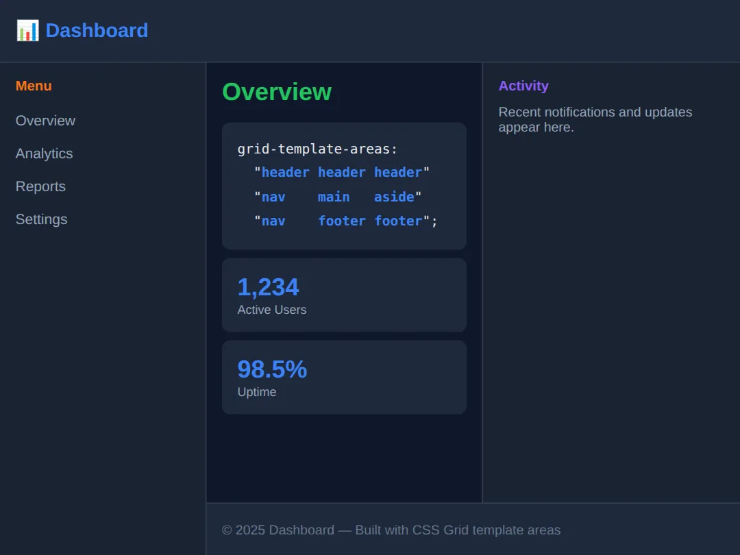
auto-fill vs auto-fit
Both create responsive grids without media queries, but they handle empty space differently.
<!DOCTYPE html>
<html lang="en">
<head>
  <meta charset="UTF-8">
  <meta name="viewport" content="width=device-width, initial-scale=1.0">
  <title>auto-fill vs auto-fit</title>
  <style>
    * { box-sizing: border-box; margin: 0; padding: 0; }
    body { background: #0f172a; font-family: system-ui, sans-serif; color: #e5e7eb; padding: 30px; }

    h1 { color: #3b82f6; margin-bottom: 25px; }
    h3 { margin: 25px 0 10px; }

    .auto-fill {
      display: grid;
      grid-template-columns: repeat(auto-fill, minmax(150px, 1fr));
      gap: 10px;
      background: #1e293b;
      padding: 15px;
      border-radius: 8px;
    }

    .auto-fit {
      display: grid;
      grid-template-columns: repeat(auto-fit, minmax(150px, 1fr));
      gap: 10px;
      background: #1e293b;
      padding: 15px;
      border-radius: 8px;
    }

    .item {
      background: #3b82f6;
      padding: 20px;
      border-radius: 6px;
      text-align: center;
      font-weight: bold;
    }

    .fill-label { color: #f97316; }
    .fit-label { color: #22c55e; }

    .note { color: #94a3b8; font-size: 13px; margin-top: 8px; }
    code { background: #334155; padding: 2px 6px; border-radius: 4px; font-size: 13px; }
  </style>
</head>
<body>
  <h1>auto-fill vs auto-fit</h1>

  <h3 class="fill-label">auto-fill — keeps empty tracks</h3>
  <div class="auto-fill">
    <div class="item">1</div>
    <div class="item">2</div>
    <div class="item">3</div>
  </div>
  <p class="note">Items stay at their minmax size. Empty columns are reserved even if unused.</p>
  <p class="note"><code>grid-template-columns: repeat(auto-fill, minmax(150px, 1fr))</code></p>

  <h3 class="fit-label">auto-fit — collapses empty tracks</h3>
  <div class="auto-fit">
    <div class="item">1</div>
    <div class="item">2</div>
    <div class="item">3</div>
  </div>
  <p class="note">Items stretch to fill available space. Empty columns collapse to 0.</p>
  <p class="note"><code>grid-template-columns: repeat(auto-fit, minmax(150px, 1fr))</code></p>

  <p class="note" style="margin-top: 25px; color: #22c55e;">↕ Resize the preview to see the difference more clearly!</p>
  <!-- ✅ Expected result, measured in a real browser:
     .auto-fill -> display: grid
     .auto-fit -> display: grid
     .item -> count: 6
  -->
</body>
</html>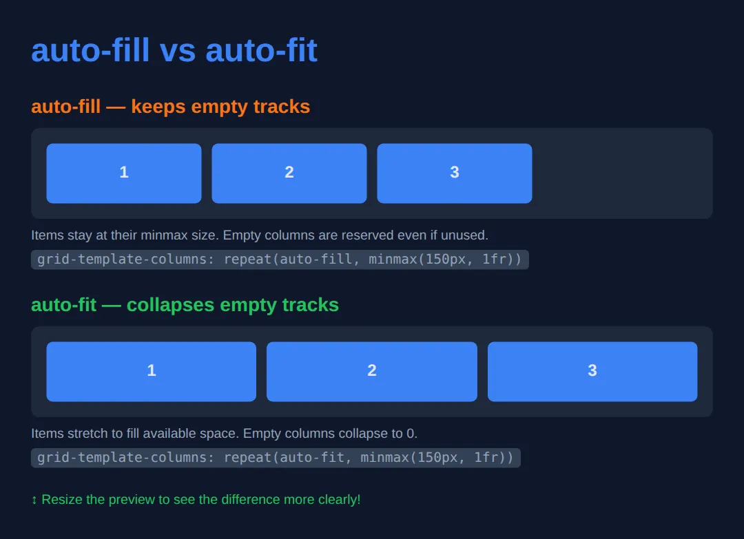
🧠 Worked Example — subgrid, and the problem it solves
Here is the problem subgrid exists for. A row of cards each has a title, a body and a footer strip. Because every card is its own little grid, one long title pushes that card's body and footer down and the row stops lining up. Before subgrid you fixed this by hard-coding heights and hoping. Now a nested grid can simply borrow its parent's rows.
Two lines make it work, and both are required: grid-row: span 3 on the card (so the card occupies three of the parent's rows) and grid-template-rows: subgrid inside it (so its own children use those same three rows instead of new ones).
<!DOCTYPE html>
<html lang="en">
<head>
<meta charset="UTF-8">
<title>Worked Example: subgrid</title>
<style>
  * { box-sizing:border-box; margin:0; padding:0; }
  body { background:#0f172a; color:#e5e7eb; font-family:system-ui,sans-serif; padding:24px; }
  h1 { font-size:1rem; color:#60a5fa; margin:0 0 10px; }

  .cards {
    display: grid;
    grid-template-columns: repeat(3, 1fr);

    /* THE OUTER GRID owns the three rows: title band, body, footer strip.
       Each row sizes itself to the tallest content across ALL three cards. */
    grid-template-rows: auto auto auto;

    gap: 14px;
    margin-bottom: 26px;
  }

  .card {
    /* 1 of 2: the card must actually OCCUPY three of the parent's rows.
       Without this it sits in one row and there is nothing to borrow. */
    grid-row: span 3;

    display: grid;

    /* 2 of 2: "do not invent your own rows — reuse the three I am spanning".
       The card's h2, p and .foot now land on the parent's row lines. */
    grid-template-rows: subgrid;

    background:#1e293b; border-radius:10px; overflow:hidden;
  }

  /* The second grid below overrides just this one line, so each card falls back
     to sizing its own three rows independently. Everything else is identical. */
  .no-sub .card { grid-template-rows: auto auto auto; }

  .card h2 { background:#334155; padding:10px 12px; font-size:.95rem; color:#93c5fd; }
  .card p  { padding:10px 12px; font-size:.85rem; color:#94a3b8; }
  .card .foot { background:#0b1220; padding:10px 12px; font-size:.8rem; color:#22c55e; }
</style>
</head>
<body>
  <h1>WITH grid-template-rows: subgrid</h1>
  <div class="cards sub">
    <div class="card"><h2>Short</h2><p>One line.</p><div class="foot">Footer</div></div>
    <div class="card"><h2>A much longer card title that wraps onto two lines</h2><p>Some more text in the middle of this one so the body is taller than the others.</p><div class="foot">Footer</div></div>
    <div class="card"><h2>Medium</h2><p>A bit of text.</p><div class="foot">Footer</div></div>
  </div>

  <h1>WITHOUT subgrid (each card has its own rows)</h1>
  <div class="cards no-sub">
    <div class="card"><h2>Short</h2><p>One line.</p><div class="foot">Footer</div></div>
    <div class="card"><h2>A much longer card title that wraps onto two lines</h2><p>Some more text in the middle of this one so the body is taller than the others.</p><div class="foot">Footer</div></div>
    <div class="card"><h2>Medium</h2><p>A bit of text.</p><div class="foot">Footer</div></div>
  </div>

  <!-- ✅ What you should see — compare the two rows carefully:
       TOP row (subgrid): all three grey title bands end on exactly the same line,
       and all three dark "Footer" strips start on exactly the same line, even
       though the middle card's title takes two lines. The short cards simply have
       more empty space in the middle.
       BOTTOM row (no subgrid): the middle card's title band is deeper than its
       neighbours', so its body and its footer are both pushed lower. Nothing
       lines up across the row.
       Delete  grid-row: span 3;  from .card and the top row breaks in the same
       way — subgrid needs BOTH lines, not just the interesting-looking one. -->
  <!-- ✅ Expected result, measured in a real browser:
     .cards -> display: grid
     .card -> display: grid
     .card -> count: 6
  -->
</body></html>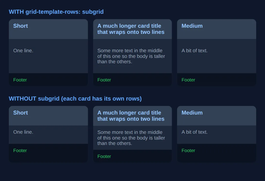
🎯 Your Turn — a responsive card row that stays aligned
Put this lesson's two big ideas together: a grid that reflows on its own, whose cards still line up internally. Three blanks, marked ___.
<!DOCTYPE html>
<html lang="en">
<head>
<meta charset="UTF-8">
<title>Your Turn: subgrid</title>
<style>
  /* 🎯 YOUR TURN — fill in the three blanks marked ___ */

  * { box-sizing:border-box; margin:0; padding:0; }
  body { background:#0f172a; color:#e5e7eb; font-family:system-ui,sans-serif; padding:24px; }

  .row {
    display: grid;

    /* 1) Fit as many 180px-minimum columns as will go, and COLLAPSE any track
          that ends up empty so the real cards stretch to fill the row.
          (The other keyword leaves the empty track sitting there.) */
    grid-template-columns: repeat(auto-___, minmax(180px, 1fr));
    /* 👉 replace ___ with  fit  */

    grid-template-rows: auto 1fr auto;
    gap: 14px;
  }

  .card {
    /* 2) Make each card occupy all three of the rows declared above. */
    grid-row: span ___;
    /* 👉 replace ___ with  3  */

    display: grid;

    /* 3) Tell the card to reuse those rows instead of making its own. */
    grid-template-rows: ___;
    /* 👉 replace ___ with  subgrid  */

    background:#1e293b; border-radius:10px; overflow:hidden;
  }

  .card h2 { background:#334155; padding:10px 12px; font-size:.9rem; color:#93c5fd; }
  .card p  { padding:10px 12px; font-size:.82rem; color:#94a3b8; }
  .card .meta { background:#0b1220; padding:8px 12px; font-size:.75rem; color:#22c55e; }
</style>
</head>
<body>
  <div class="row">
    <div class="card"><h2>Bread</h2><p>Short.</p><div class="meta">2 min read</div></div>
    <div class="card"><h2>A considerably longer headline that wraps</h2><p>A longer excerpt that runs to two or three lines in this card.</p><div class="meta">6 min read</div></div>
    <div class="card"><h2>Cheese</h2><p>Medium length excerpt here.</p><div class="meta">4 min read</div></div>
  </div>

  <!-- ✅ Expected once all three blanks are filled, in a wide preview:
       three cards side by side, filling the full width with no leftover gap on
       the right. Every grey title band ends on the same line and every green
       "min read" strip starts on the same line, even though only one headline
       wraps to two lines.
       Now change auto-fit to auto-fill and re-run: the cards get noticeably
       narrower and roughly a whole card's width of empty space appears on the
       right — that is the fourth track, created but never filled.
       Narrow the preview below about 400px and the cards stack into one column.
       They stop lining up with each other at that point, which is correct: each
       card now sits in its own set of rows. -->
</body></html>
Masonry-Style Layout
Create a Pinterest-style masonry layout where items of different heights pack tightly together.
<!DOCTYPE html>
<html lang="en">
<head>
  <meta charset="UTF-8">
  <meta name="viewport" content="width=device-width, initial-scale=1.0">
  <title>Masonry Layout</title>
  <style>
    * { box-sizing: border-box; margin: 0; padding: 0; }
    body { background: #0f172a; font-family: system-ui, sans-serif; color: #e5e7eb; padding: 30px; }

    h1 { color: #3b82f6; margin-bottom: 20px; }

    /* CSS Columns approach (widely supported) */
    .masonry {
      columns: 3;
      column-gap: 15px;
    }

    @media (max-width: 700px) {
      .masonry { columns: 2; }
    }

    @media (max-width: 450px) {
      .masonry { columns: 1; }
    }

    .masonry-item {
      break-inside: avoid;
      margin-bottom: 15px;
      background: #1e293b;
      border-radius: 10px;
      overflow: hidden;
    }

    .masonry-item .img-placeholder {
      display: flex;
      align-items: center;
      justify-content: center;
      font-size: 2rem;
    }

    .masonry-item .body {
      padding: 15px;
    }

    .masonry-item h3 {
      color: #22c55e;
      margin-bottom: 5px;
      font-size: 0.95rem;
    }

    .masonry-item p {
      color: #94a3b8;
      font-size: 13px;
      line-height: 1.6;
    }

    .tag {
      display: inline-block;
      background: #334155;
      padding: 3px 8px;
      border-radius: 12px;
      font-size: 11px;
      color: #3b82f6;
      margin-top: 8px;
    }
  </style>
</head>
<body>
  <h1>📌 Masonry Layout</h1>
  <div class="masonry">
    <div class="masonry-item">
      <div class="img-placeholder" style="height:180px;background:linear-gradient(135deg,#3b82f6,#8b5cf6);">🌊</div>
      <div class="body"><h3>Ocean Waves</h3><p>A stunning capture of the Pacific coast at sunset.</p><span class="tag">Nature</span></div>
    </div>
    <div class="masonry-item">
      <div class="img-placeholder" style="height:120px;background:linear-gradient(135deg,#22c55e,#06b6d4);">🌿</div>
      <div class="body"><h3>Forest Path</h3><p>Winding through ancient redwoods.</p><span class="tag">Travel</span></div>
    </div>
    <div class="masonry-item">
      <div class="img-placeholder" style="height:220px;background:linear-gradient(135deg,#f97316,#ef4444);">🏔️</div>
      <div class="body"><h3>Mountain Peak</h3><p>The summit at 14,000 feet with breathtaking panoramic views stretching across the entire horizon.</p><span class="tag">Adventure</span></div>
    </div>
    <div class="masonry-item">
      <div class="img-placeholder" style="height:150px;background:linear-gradient(135deg,#ec4899,#8b5cf6);">🌸</div>
      <div class="body"><h3>Cherry Blossoms</h3><p>Spring in Tokyo.</p><span class="tag">Japan</span></div>
    </div>
    <div class="masonry-item">
      <div class="img-placeholder" style="height:100px;background:linear-gradient(135deg,#eab308,#f97316);">☀️</div>
      <div class="body"><h3>Sunrise</h3><p>Golden hour magic.</p><span class="tag">Photo</span></div>
    </div>
    <div class="masonry-item">
      <div class="img-placeholder" style="height:200px;background:linear-gradient(135deg,#06b6d4,#3b82f6);">🐳</div>
      <div class="body"><h3>Deep Blue</h3><p>Underwater photography revealing the incredible diversity of marine life in coral reef ecosystems.</p><span class="tag">Marine</span></div>
    </div>
  </div>
  <!-- ✅ Expected result, measured in a real browser:
     .masonry -> column-gap: 15px
     .masonry-item -> overflow: hidden
     .masonry-item .img-placeholder -> display: flex
     .tag -> display: inline-block
     .masonry-item -> count: 6
  -->
</body>
</html>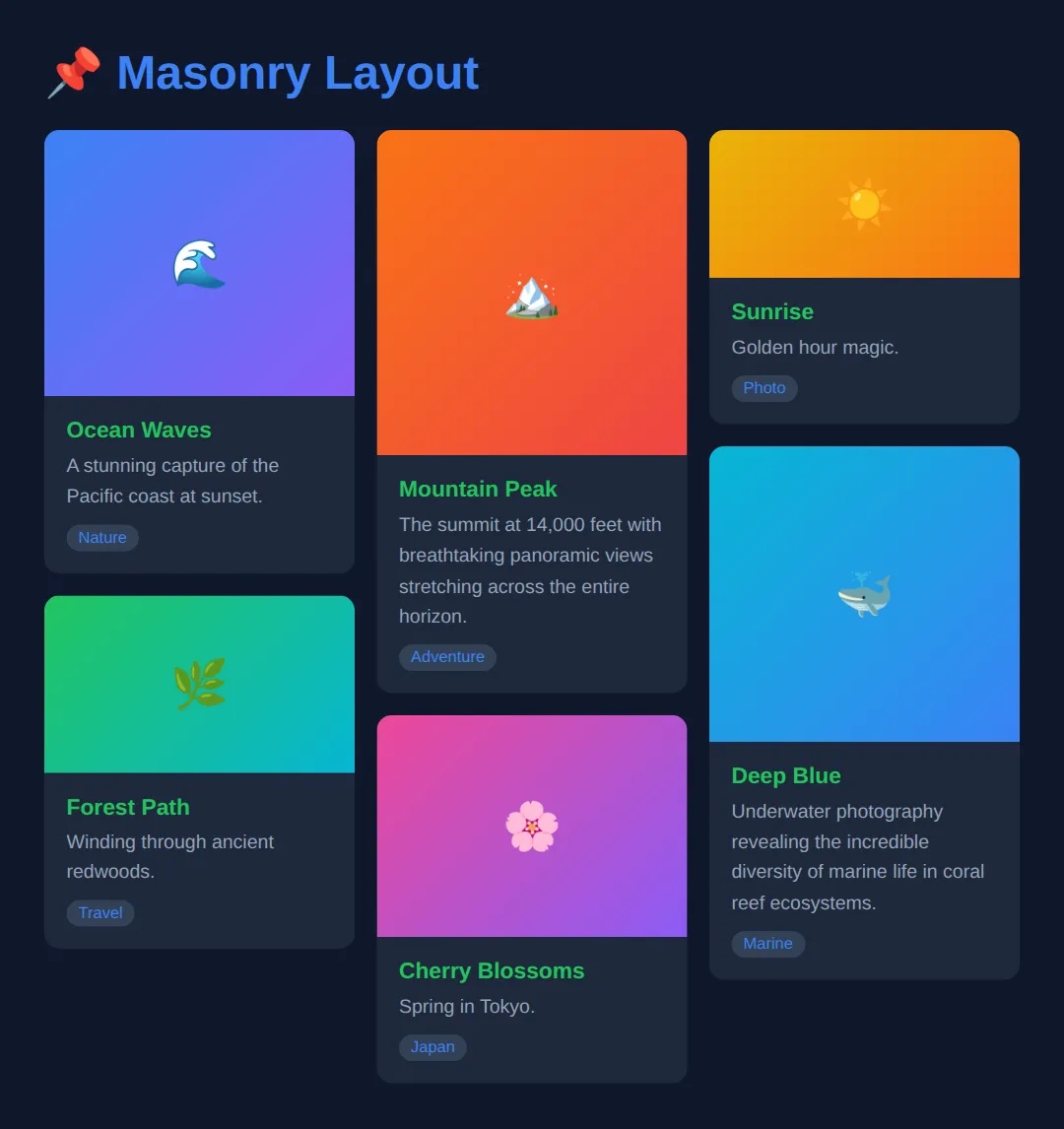
🧩 Mini-Challenge — a dashboard that uses all three
Everything from this lesson in one layout: named areas for the page shell, an auto-fitting grid for the stat cards inside it, and subgrid so those cards line up. Outline only — no CSS is written for you beyond the colours.
<!DOCTYPE html>
<html lang="en">
<head>
<meta charset="UTF-8">
<title>Mini-Challenge: Dashboard</title>
<style>
  /* 🧩 MINI-CHALLENGE: three techniques, one layout
     1. .shell — a grid using NAMED AREAS:
            "sidebar topbar"
            "sidebar content"
        with grid-template-columns: 200px 1fr;
             grid-template-rows: auto 1fr;
             gap: 12px; min-height: 100vh; padding: 12px;
        Then give .side, .top and .content their grid-area names.
     2. .content — an auto-fitting card grid, no media queries:
            grid-template-columns: repeat(auto-fit, minmax(200px, 1fr));
            grid-template-rows: auto 1fr auto;
            gap: 12px;
     3. .stat — grid-row: span 3;  display: grid;  grid-template-rows: subgrid;
        so every card's label row, number row and note row line up across the row,
        no matter how long an individual label is.

     ✅ How to check it:
        - Wide preview: a 200px sidebar down the left, a top bar across the
          remaining width, and the cards below it in as many columns as fit.
        - All the card labels end on one line and all the small grey notes start
          on one line, even though one label is much longer than the others. If
          the long-label card is out of step, either grid-row: span 3 or
          grid-template-rows: subgrid is missing.
        - Drag the preview narrower: the card count drops with no media query, and
          nothing about the sidebar or top bar changes.
        - Swap auto-fit for auto-fill on a wide screen and empty space appears on
          the right instead of the cards stretching.
  */

  * { box-sizing:border-box; margin:0; padding:0; }
  body { background:#0f172a; color:#e5e7eb; font-family:system-ui,sans-serif; }

  /* Colours done for you so you can see the regions. */
  .side { background:#1e293b; padding:14px; border-radius:10px; }
  .top { background:#1e293b; padding:14px; border-radius:10px; }
  .stat { background:#1e293b; border-radius:10px; overflow:hidden; }
  .stat .label { background:#334155; padding:8px 12px; font-size:.8rem; color:#93c5fd; }
  .stat .value { padding:12px; font-size:1.6rem; font-weight:700; color:#22c55e; }
  .stat .note { background:#0b1220; padding:8px 12px; font-size:.72rem; color:#94a3b8; }

  /* your grid CSS here */

</style>
</head>
<body>
  <!-- Markup done for you. Style it. -->
  <div class="shell">
    <nav class="side">Sidebar</nav>
    <header class="top">Dashboard</header>

    <div class="content">
      <div class="stat"><div class="label">Visitors</div><div class="value">1,204</div><div class="note">last 7 days</div></div>
      <div class="stat"><div class="label">Average time on page, all devices</div><div class="value">2m 41s</div><div class="note">last 7 days</div></div>
      <div class="stat"><div class="label">Signups</div><div class="value">38</div><div class="note">last 7 days</div></div>
      <div class="stat"><div class="label">Bounce</div><div class="value">41%</div><div class="note">last 7 days</div></div>
    </div>
  </div>
  <!-- ✅ Expected result, measured in a real browser:
     .stat -> overflow: hidden
     .side -> padding-top: 14px
     .stat -> count: 4
  -->
</body></html>
⚠️ Common Mistakes
- Confusing auto-fill and auto-fit — auto-fill creates empty tracks; auto-fit collapses them. When you have few items, auto-fit makes them stretch to fill the row.
- Expecting subgrid to work everywhere — Check browser support. Subgrid is well-supported now but not in older browsers.
- Using area names with spaces/special chars — Grid area names must be valid CSS identifiers (no spaces, hyphens are okay).
- Forgetting break-inside: avoid for masonry — Without it, items can be split across columns.
🎉 Lesson Complete
You've mastered CSS Grid Level 2 features:
- ✅ Named template areas for visual, readable layouts
- ✅ auto-fill vs auto-fit for responsive grids without media queries
- ✅ Masonry layouts using CSS columns with break-inside: avoid
- ✅ Subgrid for aligned child elements within nested grids
Practice quiz
What is the key difference between auto-fill and auto-fit in repeat()?
- auto-fill collapses empty tracks; auto-fit keeps them
- They are identical in every situation
- auto-fill keeps empty tracks reserved; auto-fit collapses empty tracks so items stretch to fill the row
- auto-fit only works in Flexbox
Answer: auto-fill keeps empty tracks reserved; auto-fit collapses empty tracks so items stretch to fill the row. auto-fill leaves empty tracks in place, while auto-fit collapses empty tracks so existing items stretch.
What does subgrid allow a nested grid to do?
- Inherit the parent grid's row and column tracks so children align to the outer grid
- Create an infinite number of new tracks automatically
- Disable the parent grid entirely
- Convert a grid into a flex container
Answer: Inherit the parent grid's row and column tracks so children align to the outer grid. subgrid lets a nested grid borrow the parent's tracks so child items align to the outer grid lines.
Which value enables subgrid on a nested grid's columns?
- grid-template-columns: inherit;
- grid-columns: parent;
- subgrid: columns;
- grid-template-columns: subgrid;
Answer: grid-template-columns: subgrid;. You write grid-template-columns: subgrid (or for rows) to adopt the parent's tracks.
Which CSS approach is commonly used to build a Pinterest-style masonry layout that is widely supported?
- display: table-cell
- CSS columns with break-inside: avoid on items
- position: absolute on every item
- float: left only
Answer: CSS columns with break-inside: avoid on items. The widely-supported masonry approach uses CSS multi-column layout with break-inside: avoid.
Why is break-inside: avoid important for a CSS-columns masonry layout?
- It stops an item from being split across two columns
- It centers each item
- It removes the gap between columns
- It forces all items to the same height
Answer: It stops an item from being split across two columns. Without break-inside: avoid, an item can be broken across column boundaries.
What must a grid area name be in grid-template-areas?
- Always wrapped in quotes individually
- A number only
- A valid CSS identifier with no spaces (hyphens are allowed)
- A full URL
Answer: A valid CSS identifier with no spaces (hyphens are allowed). Grid area names must be valid CSS identifiers; spaces are not allowed, though hyphens are fine.
In grid-template-areas, what does repeating the same name across cells do?
- It creates an error
- It makes that named area span those adjacent cells
- It deletes the duplicate cells
- It reorders the rows alphabetically
Answer: It makes that named area span those adjacent cells. Repeating a name across adjacent cells makes the area span those rows/columns.
Both auto-fill and auto-fit are typically paired with which function?
- calc()
- translate()
- var()
- minmax()
Answer: minmax(). minmax(min, max) sets a track's flexible size range, e.g. minmax(150px, 1fr).
If a grid has fewer items than columns, which keyword makes the existing items stretch to fill the whole row?
- auto-fill
- auto-fit
- span
- dense
Answer: auto-fit. auto-fit collapses empty tracks, so the present items expand to fill the available width.
Which is the most readable way to build a complex named page layout in Grid?
- Many nested floats
- Absolute positioning of every section
- grid-template-areas with named regions
- A single flex row
Answer: grid-template-areas with named regions. grid-template-areas draws the layout visually in CSS, making complex layouts readable.
Continue this course
- Previous: CSS Flexbox: Advanced Patterns & Real Layouts
- Next: Container Queries & Modern Responsive Techniques — Style components based on their container size, not the viewport
- Quick reference: HTML & CSS cheat sheet · CSS Grid cheat sheet › Responsive patterns
- From the blog: CSS Grid Layout Tutorial