Container Queries & Modern Responsive
Reviewed & published by Brayan K
After this lesson you'll build components that style themselves by their container's size — so a single card works in a wide column or a narrow sidebar without a single media query.
Part of the free HTML & CSS course at LearnCodingFast — hands-on lessons with examples you run in your browser, plus practice exercises and a quick quiz.
What You'll Learn
- Why container queries beat media queries for reusable components
- Turn a wrapper into a query container with container-type
- Name containers and target them with container-name
- Write @container (min-width: …) rules that read the parent's size
- Size things with container units: cqw, cqh, cqi, cqb
- Know when to still reach for a media query
Prerequisites: You should be comfortable with selectors from CSS Basics & Selectors and have met @media queries for responsive design. Container queries are the component-level upgrade to that idea.
💡 Real-World Analogy
Think of a media query as dressing for the weather forecast for the whole city: everyone hears "it's cold downtown" and puts on a coat, even the person sitting in a warm room. A container query is dressing for the room you're actually in — you check the temperature where you are and react to that.
A card component is the person. With media queries it dresses for the screen size (the city forecast), which is wrong when it's placed in a narrow sidebar on a big monitor. With a container query it dresses for its own container (the room), so it always fits — wherever you drop it.
📊 Media Query vs Container Query
| Feature | Media Query | Container Query |
|---|---|---|
| Measures | Viewport (screen) size | A parent container's size |
| Reusability | ⚠️ Tied to page layout | ✅ Works wherever you place the component |
| Syntax | @media (min-width: 400px) | @container (min-width: 400px) |
| Setup needed | None | container-type: inline-size on the parent |
1. Make a Container, Then Query It
Container queries are a two-step deal. First you mark an element as a query container with container-type: inline-size — this says "measure my width so my children can ask about it." inline-size means width-only containment, which is what you want almost every time. Optionally give it a name with container-name so you can target a specific container later.
Then, on a child, you write an @container rule: @container card (min-width: 400px) { … }. The browser checks the nearest ancestor that is a container and applies those styles when its width crosses the threshold. Run the example — the same card is vertical in the narrow panel and horizontal in the wide one, with no media query anywhere.
<!DOCTYPE html>
<html lang="en">
<head>
<meta charset="UTF-8">
<meta name="viewport" content="width=device-width, initial-scale=1.0">
<title>Container Query Card</title>
<style>
* { box-sizing: border-box; margin: 0; padding: 0; }
body { background: #0f172a; font-family: system-ui, sans-serif;
color: #e5e7eb; padding: 30px; }
h1 { color: #3b82f6; margin-bottom: 6px; }
h2 { color: #22c55e; margin: 22px 0 10px; font-size: 1rem; }
.label { color: #64748b; font-size: 12px; margin-bottom: 6px; }
/* 1) TURN A WRAPPER INTO A QUERY CONTAINER.
'container-type: inline-size' tells the browser "measure my WIDTH so
children can ask about it". Without this line, @container does nothing. */
.panel {
container-type: inline-size; /* required: enables width queries */
container-name: card; /* optional: a name to target later */
border: 1px dashed #334155;
border-radius: 12px;
padding: 12px;
margin-bottom: 14px;
}
/* 2) THE CARD COMPONENT — default (narrow) layout is a vertical stack. */
.card { background: #1e293b; border-radius: 10px; overflow: hidden;
display: flex; flex-direction: column; } /* stacked by default */
.thumb { height: 110px; display: flex; align-items: center;
justify-content: center; font-size: 2.4rem;
background: linear-gradient(135deg, #3b82f6, #8b5cf6); }
.body { padding: 14px; }
.body h3 { margin-bottom: 4px; }
.body p { color: #94a3b8; font-size: 13px; margin-bottom: 8px; }
.price { color: #22c55e; font-weight: bold; font-size: 1.1rem; }
.buy { width: 100%; margin-top: 10px; background: #3b82f6; color: #fff;
border: none; padding: 8px 14px; border-radius: 6px; cursor: pointer; }
/* 3) THE QUERY — "when MY container 'card' is at least 400px wide,
switch this card to a side-by-side layout." It reads the PARENT's
width, so the card never needs to know the screen size. */
@container card (min-width: 400px) {
.card { flex-direction: row; } /* now horizontal */
.thumb { width: 180px; height: auto; }
.body { flex: 1; display: flex; flex-direction: column;
justify-content: center; }
.buy { width: auto; align-self: flex-start; }
}
</style>
</head>
<body>
<h1>One card, two layouts</h1>
<p style="color:#94a3b8; margin-bottom: 6px;">
Same HTML in both panels — only the container width differs.</p>
<h2>Narrow panel (260px) → vertical</h2>
<div class="panel" style="width: 260px;">
<p class="label">container width: 260px</p>
<div class="card">
<div class="thumb">🎧</div>
<div class="body">
<h3>Wireless Headphones</h3>
<p>Noise-cancelling, 40h battery.</p>
<span class="price">$149.99</span>
<button class="buy">Add to Cart</button>
</div>
</div>
</div>
<h2>Wide panel (560px) → horizontal</h2>
<div class="panel" style="width: 100%; max-width: 560px;">
<p class="label">container width: 560px</p>
<div class="card">
<div class="thumb">🎧</div>
<div class="body">
<h3>Wireless Headphones</h3>
<p>Same component — but its container is wide, so it lays out side by side.</p>
<span class="price">$149.99</span>
<button class="buy">Add to Cart</button>
</div>
</div>
</div>
<!-- ✅ Expected result, measured in a real browser:
.card -> display: flex
.thumb -> display: flex
.buy -> cursor: pointer
.panel -> count: 2
-->
</body>
</html>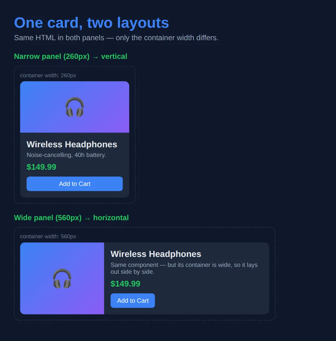
2. Container Query Units (cqw, cqh, cqi, cqb)
Queries flip layouts at breakpoints; container units let you scale things smoothly with the container. They mirror viewport units, but relative to the query container instead of the screen: cqw is 1% of the container's width, cqh is 1% of its height, and cqi/cqb are the writing-mode-aware versions (inline/block — width/height in normal left-to-right text).
They pair beautifully with clamp(): font-size: clamp(1rem, 5cqi, 3rem) means "5% of the container's width, but never smaller than 1rem or larger than 3rem." Resize the box below and watch the text and bar respond to the container, not the window.
<!DOCTYPE html>
<html lang="en">
<head>
<meta charset="UTF-8">
<title>Container Query Units</title>
<style>
* { box-sizing: border-box; margin: 0; padding: 0; }
body { background: #0f172a; font-family: system-ui, sans-serif;
color: #e5e7eb; padding: 30px; }
h1 { color: #3b82f6; margin-bottom: 8px; }
.hint { color: #94a3b8; font-size: 13px; margin-bottom: 14px; }
/* This box is a container AND is resizable so you can experiment. */
.box {
container-type: inline-size; /* unlock cq* units for children */
background: #1e293b;
border: 1px dashed #475569;
border-radius: 8px;
padding: 20px;
resize: horizontal; /* drag the bottom-right corner */
overflow: auto;
min-width: 200px;
max-width: 100%;
}
/* 5cqi = 5% of the container's inline size (its width in normal text). */
.scale-text { font-size: clamp(1rem, 5cqi, 3rem);
color: #22c55e; font-weight: bold; margin-bottom: 12px; }
/* 60cqi = 60% of the container width — NOT 60% of the screen. */
.bar { width: 60cqi; height: 28px; border-radius: 6px;
background: linear-gradient(90deg, #3b82f6, #8b5cf6);
display: flex; align-items: center; justify-content: center;
font-size: 12px; font-weight: bold; }
table { width: 100%; border-collapse: collapse; font-size: 14px; margin-top: 18px; }
th { text-align: left; padding: 8px; border-bottom: 1px solid #334155; color: #3b82f6; }
td { padding: 8px; border-bottom: 1px solid #1e293b; }
code { background: #334155; padding: 2px 6px; border-radius: 4px; }
</style>
</head>
<body>
<h1>Container query units</h1>
<p class="hint">↔ Drag the bottom-right corner of the box to resize it.</p>
<div class="box">
<p class="scale-text">I scale with my box</p>
<div class="bar">60cqi wide</div>
</div>
<table>
<tr><th>Unit</th><th>Means</th><th>Like</th></tr>
<tr><td><code>cqw</code></td><td>1% of container width</td><td>vw, but for the container</td></tr>
<tr><td><code>cqh</code></td><td>1% of container height</td><td>vh, but for the container</td></tr>
<tr><td><code>cqi</code></td><td>1% of container inline size</td><td>width in left-to-right text</td></tr>
<tr><td><code>cqb</code></td><td>1% of container block size</td><td>height in left-to-right text</td></tr>
</table>
<!-- ✅ Expected result, measured in a real browser:
.box -> overflow: auto
.bar -> display: flex
-->
</body>
</html>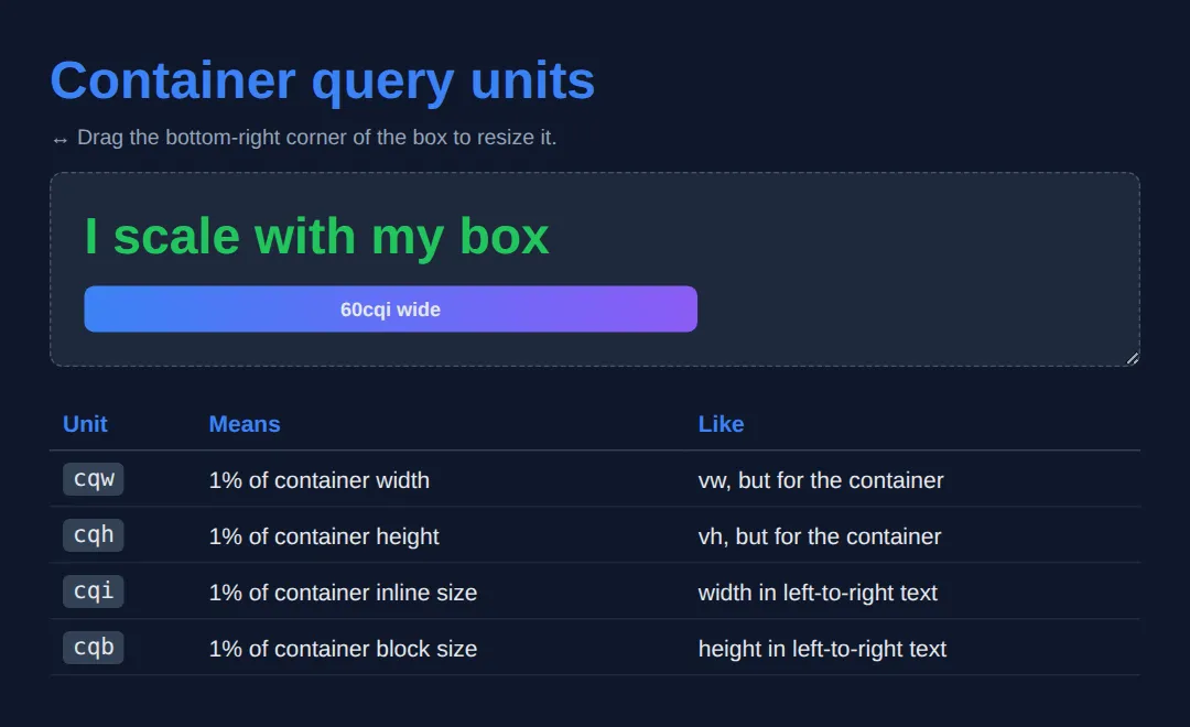
🎯 Your Turn 1 — Make It a Container
The @container rule is already written, but it never fires because the wrapper isn't a container yet. Add the two lines (container-type and container-name) so the badge turns green. The expected result is in the comments.
<!DOCTYPE html>
<html lang="en">
<head>
<style>
* { box-sizing: border-box; }
body { background: #0f172a; color: #e5e7eb;
font-family: system-ui, sans-serif; padding: 24px; }
/* 🎯 YOUR TURN 1 — the @container rule below is already written, but it
never fires because the wrapper isn't a container yet. Add the two
lines that turn .wrapper into a width-query container. */
.wrapper {
width: 480px;
border: 1px dashed #334155;
border-radius: 10px;
padding: 10px;
/* 👉 add this line: container-type: ___; (use inline-size) */
/* 👉 add this line: container-name: ___; (call it "box") */
}
.badge { background: #1e293b; padding: 16px; border-radius: 8px;
text-align: center; color: #94a3b8; }
/* This already exists — it just needs a real container to query. */
@container box (min-width: 400px) {
.badge { background: #22c55e; color: #0f172a; font-weight: bold; }
}
/* ✅ Expected: the badge turns GREEN, because the 480px wrapper is now a
named container wider than 400px. (Without the two lines, it stays grey.) */
</style>
</head>
<body>
<div class="wrapper">
<div class="badge">I go green when my container is >= 400px</div>
</div>
</body>
</html>🎯 Your Turn 2 — Write the Query and a Unit
Containment is set up for you. Now write the @container breakpoint and use a cqi unit: make the heading scale with the container, and switch the tile to two columns when the container is at least 450px wide. Fill in the three blanks.
<!DOCTYPE html>
<html lang="en">
<head>
  <style>
    * { box-sizing: border-box; }
    body { background: #0f172a; color: #e5e7eb;
           font-family: system-ui, sans-serif; padding: 24px; }

    /* 🎯 YOUR TURN 2 — containment is already set up. Write the query and a unit. */

    .panel {
      container-type: inline-size;   /* ready to be queried */
      width: 500px;
      border: 1px dashed #334155; border-radius: 10px; padding: 12px;
    }

    .tile { background: #1e293b; padding: 18px; border-radius: 8px;
            display: grid; gap: 8px; }

    .tile h3 {
      /* 👉 make this heading scale with the container:
            replace the size with clamp(1rem, ___, 2rem)  — use 6cqi */
      font-size: 1rem;
      color: #3b82f6;
    }

    /* 👉 write a query: when the container is at least 450px wide, put the
          tile's two columns side by side (grid-template-columns: 1fr 1fr). */
    @container (min-width: ___) {
      .tile { grid-template-columns: ___; }
    }

    /* ✅ Expected: the heading is large (6% of 500px ≈ 30px) and the two cells
          sit in two columns, because 500px >= 450px. */
  </style>
</head>
<body>
  <div class="panel">
    <div class="tile">
      <h3>Responsive tile</h3>
      <div style="background:#334155;padding:10px;border-radius:6px;">Cell A</div>
      <div style="background:#334155;padding:10px;border-radius:6px;">Cell B</div>
    </div>
  </div>
</body>
</html>
🧩 Mini-Challenge — A Self-Adapting Profile
Now without the blanks. Build a profile component that stacks vertically by default and goes horizontal (with a larger, cqi-scaled name) once its container passes 380px — then drop the same markup into a narrow frame and a wide frame. No media queries allowed. The brief and expected result are in the comments.
<!DOCTYPE html>
<html lang="en">
<head>
  <style>
    * { box-sizing: border-box; }
    body { background: #0f172a; color: #e5e7eb;
           font-family: system-ui, sans-serif; padding: 24px; }

    /* 🎯 MINI-CHALLENGE: a self-adapting "profile" component
       1. Make .frame a width container  (container-type: inline-size)
       2. Default (narrow) layout: .profile stacks vertically (flex-direction: column)
       3. Add @container (min-width: 380px):
            - .profile becomes a row (avatar left, text right)
            - .name uses a container unit, e.g. font-size: clamp(1rem, 5cqi, 1.6rem)
       4. Render the SAME .profile inside a narrow frame and a wide frame

       ✅ Expected: identical markup — vertical in the narrow frame, horizontal
          (with a bigger name) in the wide frame, with NO @media queries. */

    /* your CSS here */
  </style>
</head>
<body>
  <!-- your narrow frame + wide frame, each containing the same .profile -->
</body>
</html>
Container or Media Query?
- Container query: any reusable component (card, widget, media object) that might live in columns of different widths.
- Container units: type or spacing that should scale fluidly with the component's own width.
- Media query: page-level decisions — overall margins, how many columns the whole page has.
- Media query: device-level concerns — print styles, prefers-reduced-motion, prefers-color-scheme.
- Both together: media query sets the page's column count; each column's components adapt with container queries.
Common Errors
- Forgetting container-type. Symptom: your @container block is ignored and nothing changes. Cause: no ancestor is a container. Fix: add container-type: inline-size to the wrapper element you want to query.
- Querying the element itself. Symptom: you put container-type and the @container styles on the same element and it doesn't react. Cause: an element can't query its own size. Fix: put containment on a wrapper and style the child inside it.
- Naming mismatch. Symptom: @container card (…) never matches. Cause: the container's container-name isn't card (or you have a typo). Fix: match the names exactly, or drop the name from the query to target the nearest container of any name.
- Assuming no fallback / ignoring old browsers. Container queries are Baseline in 2026, but if you support legacy browsers the @container block is simply skipped there. Fix: make the styles outside the query a complete, sensible default so the component still works as a progressive enhancement.
📋 Quick Reference — Container Queries
| What | Syntax | Does |
|---|---|---|
| Enable (width) | container-type: inline-size; | Makes the element a width-query container |
| Enable (both axes) | container-type: size; | Width + height queries (element needs explicit height) |
| Name it | container-name: card; | A name so a query can target this container |
| Shorthand | container: card / inline-size; | Sets name and type in one line |
| Query | @container card (min-width: 400px) { … } | Styles a child when the container is wide enough |
| Units | cqw cqh cqi cqb | 1% of container width / height / inline / block |
💡 Rule of thumb: containment goes on the wrapper; the @container styles and cq* units go on the children inside it.
🎉 Lesson Complete
- ✅ Container queries style components by their parent's size, not the viewport
- ✅ Step 1: container-type: inline-size (and optional container-name) on a wrapper
- ✅ Step 2: @container (min-width: 400px) on a child to flip its layout
- ✅ cqw / cqh / cqi / cqb scale things to the container, like vw/vh do for the screen
- ✅ Containment goes on the wrapper — an element can't query its own size
- ✅ Media queries still own page-level and device-level decisions; use both together
Practice quiz
What does a container query measure, compared to a media query?
- The viewport size
- A parent container's size
- The font size
- The device pixel ratio
Answer: A parent container's size. A container query reacts to an ancestor container's size; a media query reacts to the viewport.
Which declaration turns an element into a width-query container?
- container-type: inline-size
- container: width
- query-type: width
- display: container
Answer: container-type: inline-size. container-type: inline-size makes the element a width-query container so children can query it.
Why might an @container rule do nothing?
- The browser is too old
- No ancestor has container-type set
- You used min-width instead of max-width
- The element is display: none
Answer: No ancestor has container-type set. An @container rule needs an ancestor with container-type set; without one, there's nothing to query.
Can an element query its own size with a container query?
- Yes, always
- No — containment goes on a wrapper, not the styled element
- Only with container-type: size
- Only in Firefox
Answer: No — containment goes on a wrapper, not the styled element. An element can't query itself; you put container-type on a wrapper and style the child inside it.
What does the unit 50cqi represent?
- 50% of the viewport width
- 50 pixels
- 50% of the container's inline size (width in LTR text)
- 50% of the container's height
Answer: 50% of the container's inline size (width in LTR text). cqi is 1% of the container's inline size, so 50cqi is half the container's width in left-to-right text.
Which container unit corresponds to 1% of the container's height?
- cqw
- cqh
- cqi
- cqb
Answer: cqh. cqh is 1% of the container's height; cqw is 1% of its width.
What is the correct syntax to target a named container in a query?
- @container card (min-width: 400px)
- @container (name: card) (min-width: 400px)
- @media card (min-width: 400px)
- @query card { min-width: 400px }
Answer: @container card (min-width: 400px). Place the container name right after @container: @container card (min-width: 400px) { … }.
What does container-name let you do?
- Set the container's width
- Target a specific container in an @container rule
- Make the container scrollable
- Disable inheritance
Answer: Target a specific container in an @container rule. container-name labels a container so an @container query can target that specific one.
For which task is a media query still the right tool over a container query?
- Adapting a reusable card
- Scaling a heading with its parent
- Page-level decisions like print styles or prefers-color-scheme
- Switching a widget to two columns
Answer: Page-level decisions like print styles or prefers-color-scheme. Media queries remain best for device/page-level concerns like print styles and prefers-color-scheme.
What is the shorthand to set both container name and type in one line?
- container: card / inline-size
- container-all: card inline-size
- container-type: card inline-size
- container-shorthand: card, inline-size
Answer: container: card / inline-size. container: card / inline-size sets the container-name and container-type together.
Continue this course
- Previous: CSS Grid Level 2: Subgrid, Masonry & Complex Layouts
- Next: CSS Cascade, Layers, Specificity & Inheritance (Deep Dive) — Understand exactly how the browser resolves conflicting styles
- Quick reference: HTML & CSS cheat sheet
Frequently asked questions
What is the difference between a container query and a media query?
A media query asks about the viewport — 'how wide is the screen?' A container query asks about an element's parent — 'how wide is my container?' That difference is everything for reusable components: a card dropped into a wide main column and the same card dropped into a narrow sidebar can lay themselves out differently, because each reads its own container rather than the shared screen width.
Why isn't my @container rule doing anything?
Almost always because the ancestor you expect to query is not actually a container. A @container rule measures the nearest ancestor that has container-type set (inline-size or size). If no ancestor declares container-type, there is nothing to query and the rule is silently ignored. Add container-type: inline-size to the wrapper, then your @container rules will fire.
Can an element query its own size?
No. The element you style with a @container rule is a child of the container, never the container itself. A box cannot apply containment to itself and then react to its own size — that would create a layout feedback loop. The standard pattern is a wrapper with container-type, and the component you actually style lives inside it.
What do cqw, cqh, cqi, and cqb mean?
They are container query units, sized relative to the query container instead of the viewport. cqw is 1% of the container's width and cqh is 1% of its height; cqi (inline) and cqb (block) are the writing-mode-aware versions — in left-to-right text, cqi tracks width and cqb tracks height. So 50cqi is half the container's width, the container-scoped cousin of 50vw.
Do container queries replace media queries?
No — they complement them. Media queries are still the right tool for page-level decisions tied to the device: overall page margins, how many columns the whole layout has, print styles, or prefers-reduced-motion. Container queries are for component-level adaptation, so a component stays reusable wherever you place it. Most modern layouts use both.
Is browser support good enough to use container queries in production?
Yes for current browsers — size container queries (container-type, @container, and cq* units) shipped across Chrome, Edge, Safari, and Firefox in 2023, so they are Baseline and widely available in 2026. If you must support older browsers, provide a sensible default layout outside the @container block (it acts as the fallback) and treat the container query as a progressive enhancement.