CSS Shapes & Clip-Path
Reviewed & published by Brayan K
The CSS clip-path property crops an element into a non-rectangular shape like a circle, polygon, or arrow, while shape-outside lets surrounding text wrap around that shape for magazine-style layouts.
Part of the free HTML & CSS course at LearnCodingFast — hands-on lessons with examples you run in your browser, plus practice exercises and a quick quiz.
By the end of this lesson you'll be able to cut any element into a circle, hexagon or arrow with clip-path, animate those clips for reveal effects, wrap paragraphs around shapes with shape-outside, and fade an image edge with a CSS mask — the toolkit behind every "how did they do that?" layout.
💡 Think of It Like This
clip-path is a cookie cutter. You press a shaped cutter onto a sheet of dough and only the dough inside the cutter stays — but the whole sheet is still on the table underneath. The element keeps its full rectangle for layout and clicks; you've only changed what shows through.
shape-outside is a stone dropped in a stream. The water (your text) doesn't flow through the stone — it bends and hugs the outline as it passes. And a mask is a stencil with a gradient: where the stencil is solid the paint lands fully, where it fades the paint fades too, so you can dissolve an edge into nothing.
1. The Four Basic Shapes
clip-path defines a clipping region: everything inside the shape is visible, everything outside is hidden (but still in the DOM). You build that region with a shape function. Four cover almost everything:
| Function | Shape | Example |
|---|---|---|
| circle() | Round, radius + centre | circle(50% at 50% 50%) |
| ellipse() | Oval, two radii | ellipse(40% 60% at 50% 50%) |
| inset() | Rectangle pulled in from edges | inset(10% round 12px) |
| polygon() | Any shape from x% y% points | polygon(50% 0%, 0% 100%, 100% 100%) |
Run the worked example. Each tile is an ordinary <div> with a background colour — only the clip-path line differs. Read the comments to see how each function maps to a shape.
<!DOCTYPE html>
<html lang="en">
<head>
  <meta charset="UTF-8">
  <title>clip-path basics</title>
  <style>
    body { font-family: system-ui, sans-serif; padding:24px; background:#fafafa; }
    .grid { display:flex; flex-wrap:wrap; gap:24px; justify-content:center; }
    /* Every tile is a plain 150x150 box. clip-path decides what shows. */
    .tile {
      width:150px; height:150px; display:flex; align-items:center;
      justify-content:center; color:white; font-weight:700; font-size:.8rem;
      text-align:center; padding:8px;
    }

    /* circle(radius at centerX centerY) => a perfect circle. */
    .circle  { clip-path: circle(50% at 50% 50%); background:#F44336; }

    /* ellipse(radiusX radiusY at ...) => a squashed oval. */
    .ellipse { clip-path: ellipse(45% 30% at 50% 50%); background:#FF9800; }

    /* inset(top right bottom left round corner) => an inset rounded rectangle. */
    .inset   { clip-path: inset(15% 15% 15% 15% round 16px); background:#4CAF50; }

    /* polygon(point, point, ...) each point is "x% y%". 3 points => triangle. */
    .triangle{ clip-path: polygon(50% 0%, 0% 100%, 100% 100%); background:#2196F3; }
  </style>
</head>
<body>
  <h1>The four basic clip-path shapes</h1>
  <div class="grid">
    <div class="tile circle">circle(50%)</div>
    <div class="tile ellipse">ellipse(45% 30%)</div>
    <div class="tile inset">inset(15% round 16px)</div>
    <div class="tile triangle">polygon(3 points)</div>
  </div>

  <!-- ✅ Expected: four 150px boxes clipped to a circle, an oval, a
       rounded rectangle, and a triangle. The full square box still
       exists underneath each one — only the visible part changed. -->
  <!-- ✅ Expected result, measured in a real browser:
     .grid -> display: flex
     .tile -> display: flex
     .tile -> count: 4
  -->
</body>
</html>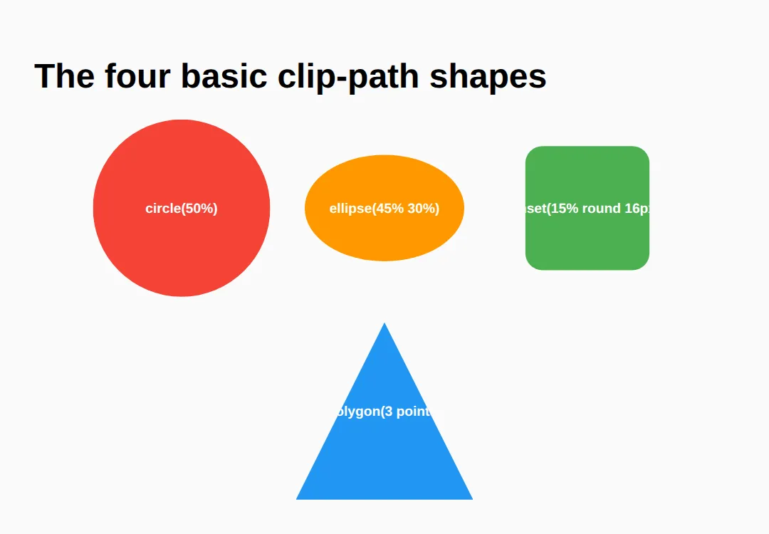
2. polygon() — The Coordinate Workhorse
polygon() is the one you'll reach for most. Each point is an x% y% pair measured from the element's own box: 0% 0% is the top-left corner, 100% 100% the bottom-right. List the points in order around the outline — walk the perimeter clockwise — and the browser joins them with straight lines.
That single rule gives you hexagons, stars, arrows and diagonal section edges. The worked example below annotates a hexagon point by point so you can see the walk.
<!DOCTYPE html>
<html lang="en">
<head>
  <meta charset="UTF-8">
  <title>polygon hexagon</title>
  <style>
    body { font-family: system-ui, sans-serif; padding:24px; background:#fafafa; }
    .row { display:flex; gap:32px; flex-wrap:wrap; align-items:center; }
    .hex {
      width:180px; height:200px; background:linear-gradient(135deg,#1976D2,#64B5F6);
      color:white; display:flex; align-items:center; justify-content:center;
      font-weight:700;
      /* Walk clockwise from the top-left vertex:
         25% 0   -> top-left point
         75% 0   -> top-right point
         100% 50 -> right point
         75% 100 -> bottom-right point
         25% 100 -> bottom-left point
         0% 50   -> left point  (back toward the start) */
      clip-path: polygon(25% 0%, 75% 0%, 100% 50%, 75% 100%, 25% 100%, 0% 50%);
    }
    .arrow {
      width:200px; height:120px; background:#E91E63; color:white;
      display:flex; align-items:center; justify-content:center; font-weight:700;
      /* 7 points make a right-pointing arrow. */
      clip-path: polygon(0% 20%, 60% 20%, 60% 0%, 100% 50%, 60% 100%, 60% 80%, 0% 80%);
    }
    code { background:#f0f0f0; padding:2px 6px; border-radius:4px; }
  </style>
</head>
<body>
  <h1>polygon() reads as x% y% points</h1>
  <div class="row">
    <div class="hex">Hexagon</div>
    <div class="arrow">Arrow</div>
  </div>
  <p>Top-left is <code>0% 0%</code>, bottom-right is <code>100% 100%</code>. Points are listed clockwise around the edge.</p>

  <!-- ✅ Expected: a 6-point hexagon and a 7-point arrow. Try nudging
       one point (e.g. change 100% 50% to 90% 50%) and watch only that
       vertex move. -->
  <!-- ✅ Expected result, measured in a real browser:
     .row -> display: flex
     .hex -> display: flex
     .arrow -> display: flex
  -->
</body>
</html>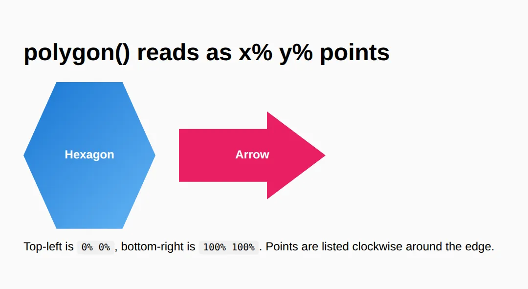
3. shape-outside — Wrap Text Around a Shape
By default, text wraps around the rectangular box of a floated element, even if the element looks round. shape-outside changes the wrapping contour to a shape you choose, so paragraphs hug a circle or a pentagon like a magazine layout.
Three things must be true for it to work: the element is floated, it has an explicit width and height, and the text is a sibling after it. Use the same shape for shape-outside (the wrap) and clip-path or border-radius (the look) so they line up.
<!DOCTYPE html>
<html lang="en">
<head>
  <meta charset="UTF-8">
  <title>shape-outside</title>
  <style>
    body { font-family: system-ui, sans-serif; padding:24px; max-width:680px; margin:0 auto; }
    h2 { color:#1565C0; }

    .float-circle {
      float: left;                 /* 1) MUST be floated */
      width:150px; height:150px;   /* 2) MUST have a size */
      margin:0 20px 10px 0;
      border-radius:50%;           /* makes it LOOK round */
      shape-outside: circle(50%);  /* makes the TEXT wrap round */
      background:linear-gradient(135deg,#1976D2,#64B5F6);
    }

    .float-pentagon {
      float: right;
      width:160px; height:200px;
      margin:0 0 10px 20px;
      /* Same polygon for the wrap AND the visible clip => they match. */
      shape-outside: polygon(0% 0%, 100% 0%, 100% 75%, 50% 100%, 0% 75%);
      clip-path:    polygon(0% 0%, 100% 0%, 100% 75%, 50% 100%, 0% 75%);
      background:linear-gradient(135deg,#4CAF50,#8BC34A);
    }
    p { line-height:1.8; color:#444; }
    code { background:#f0f0f0; padding:2px 6px; border-radius:4px; }
  </style>
</head>
<body>
  <h2>Text hugging a circle</h2>
  <div class="float-circle"></div>
  <p>With <code>shape-outside: circle(50%)</code> the lines curve in toward the
     circle and back out, instead of butting against a square box. Without it,
     this same float would leave a rectangular gap. Lorem ipsum dolor sit amet,
     consectetur adipiscing elit, sed do eiusmod tempor incididunt ut labore et
     dolore magna aliqua. Ut enim ad minim veniam, quis nostrud exercitation.</p>
  <div style="clear:both"></div>

  <h2>Text hugging a pentagon</h2>
  <div class="float-pentagon"></div>
  <p>Here <code>shape-outside</code> and <code>clip-path</code> share one polygon,
     so the text follows the exact same edge you can see. Ut enim ad minim veniam,
     quis nostrud exercitation ullamco laboris nisi ut aliquip ex ea commodo
     consequat. Duis aute irure dolor in reprehenderit in voluptate velit esse.</p>
  <div style="clear:both"></div>

  <!-- ✅ Expected: the paragraphs bend around the circle and the pentagon
       rather than wrapping in a straight rectangular column. -->
  <!-- ✅ Expected result, measured in a real browser:
     .float-circle -> float: left
     .float-pentagon -> float: right
  -->
</body>
</html>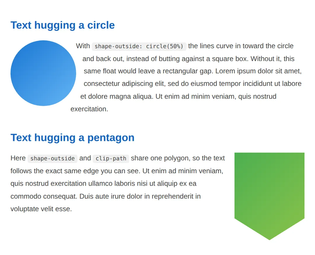
4. Animating clip-path — Reveals & Morphs
Because clip-path is animatable, you can grow a circle from nothing to reveal an image, or morph one polygon into another. The catch: the browser can only tween between two values that use the same function with the same number of points. A circle() animates to another circle(); a 4-point polygon morphs to another 4-point polygon. Mismatched counts jump instantly instead of sliding.
<!DOCTYPE html>
<html lang="en">
<head>
<meta charset="UTF-8">
<title>animated clip-path</title>
<style>
body { font-family: system-ui, sans-serif; padding:24px; background:#fafafa; }
h2 { color:#1565C0; }
/* REVEAL: circle grows from 0% to 100% on hover. Same function both
sides => smooth. */
.reveal {
width:220px; height:160px; border-radius:12px;
background:linear-gradient(135deg,#F44336,#FF9800);
color:white; display:flex; align-items:center; justify-content:center;
font-weight:700; cursor:pointer;
clip-path: circle(15% at 50% 50%);
transition: clip-path .5s ease;
}
.reveal:hover { clip-path: circle(75% at 50% 50%); }
/* MORPH: diamond (4 points) -> square (4 points). Equal counts => smooth. */
.morph {
width:200px; height:200px; margin-top:24px;
background:linear-gradient(135deg,#1976D2,#64B5F6);
color:white; display:flex; align-items:center; justify-content:center;
font-weight:700; cursor:pointer;
clip-path: polygon(50% 0%, 100% 50%, 50% 100%, 0% 50%); /* diamond */
transition: clip-path .5s ease;
}
.morph:hover { clip-path: polygon(0% 0%, 100% 0%, 100% 100%, 0% 100%); } /* square */
</style>
</head>
<body>
<h2>Circle reveal (hover)</h2>
<div class="reveal">Hover to reveal</div>
<h2>Shape morph (hover)</h2>
<div class="morph">Diamond → Square</div>
<!-- ✅ Expected: hovering grows the circle smoothly and slides the diamond
into a square. Both work because each side of the transition uses the
same shape function with the same number of points. -->
<!-- ✅ Expected result, measured in a real browser:
.reveal -> display: flex
.morph -> display: flex
-->
</body>
</html>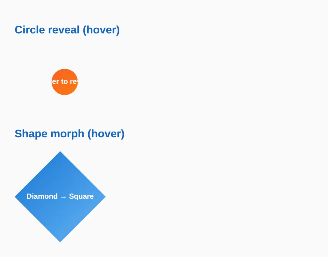
5. mask-image & Creative Sections
Where clip-path makes a hard edge, mask-image can make a soft one. A mask uses an image (often a gradient) as an alpha stencil: where the mask is opaque the element shows, where it's transparent the element fades out. A linear-gradient mask dissolves an edge into nothing — perfect for fading the bottom of a hero image.
Combine these tricks for the layouts people notice: a diagonal clip-path section edge, plus a masked fade. The example shows both.
<!DOCTYPE html>
<html lang="en">
<head>
  <meta charset="UTF-8">
  <title>mask + sections</title>
  <style>
    body { font-family: system-ui, sans-serif; margin:0; background:#fafafa; color:#333; }

    /* Diagonal section: a polygon clip cuts the bottom edge on a slant. */
    .diagonal {
      background:linear-gradient(135deg,#1976D2,#42A5F5);
      color:white; padding:60px 24px 90px; text-align:center;
      clip-path: polygon(0 0, 100% 0, 100% 80%, 0 100%);
    }
    .diagonal h2 { margin:0 0 8px; }

    /* Gradient MASK: solid at the top, transparent at the bottom => the
       image fades out instead of ending on a hard line. */
    .fade {
      width:100%; max-width:360px; height:200px; margin:24px auto; display:block;
      object-fit:cover;
      -webkit-mask-image: linear-gradient(to bottom, black 55%, transparent 100%);
              mask-image: linear-gradient(to bottom, black 55%, transparent 100%);
    }
    .note { max-width:520px; margin:0 auto 40px; padding:0 24px; line-height:1.7; }
  </style>
</head>
<body>
  <section class="diagonal">
    <h2>Diagonal section</h2>
    <p>clip-path: polygon() slants the bottom edge of this block.</p>
  </section>

  <img class="fade" src="https://picsum.photos/400/300" alt="Faded image">

  <p class="note">The blue block uses <strong>clip-path</strong> for a crisp angled
     edge. The image uses a <strong>mask-image</strong> gradient so its lower edge
     dissolves into the page instead of stopping abruptly.</p>

  <!-- ✅ Expected: a blue section with a slanted bottom, and a photo whose
       bottom fades smoothly to transparent. -->
  <!-- ✅ Expected result, measured in a real browser:
     .fade -> display: block
     .diagonal -> padding-top: 60px
  -->
</body>
</html>
🎯 Your Turn #1 — Clip a hexagon and an inset card
Fill in the blanks marked ___ to clip one tile into a hexagon and another into an inset rounded rectangle. Run it and check the expected result in the comments.
<!DOCTYPE html>
<html lang="en">
<head>
  <meta charset="UTF-8">
  <title>Your Turn 1</title>
  <style>
    /* 🎯 YOUR TURN — fill in the blanks marked ___ */
    body { font-family: system-ui, sans-serif; padding:24px; background:#fafafa; }
    .grid { display:flex; gap:24px; flex-wrap:wrap; }
    .tile { width:160px; height:160px; display:flex; align-items:center;
            justify-content:center; color:white; font-weight:700; text-align:center; }

    /* 1) Clip .hex into a 6-point hexagon. The points (clockwise) are:
          25% 0%, 75% 0%, 100% 50%, 75% 100%, 25% 100%, 0% 50% */
    .hex {
      background:#4CAF50;
      clip-path: ___;   /* 👉 add: polygon(25% 0%, 75% 0%, 100% 50%, 75% 100%, 25% 100%, 0% 50%) */
    }

    /* 2) Clip .card so 12% is cut from every edge, with 14px rounded corners. */
    .card {
      background:#1976D2;
      clip-path: ___;   /* 👉 add: inset(12% round 14px) */
    }
  </style>
</head>
<body>
  <div class="grid">
    <div class="tile hex">Hexagon</div>
    <div class="tile card">Inset card</div>
  </div>

  <!-- ✅ Expected: a green hexagon and a blue inset rounded rectangle.
       If a tile is still a full square, its clip-path line is blank. -->
</body>
</html>
🎯 Your Turn #2 — Wrap text and add a reveal
One float needs shape-outside so the text hugs the circle, and one box needs a hover transition so its circle clip grows. Fill in the blanks, then verify against the comments.
<!DOCTYPE html>
<html lang="en">
<head>
  <meta charset="UTF-8">
  <title>Your Turn 2</title>
  <style>
    /* 🎯 YOUR TURN — fill in the blanks marked ___ */
    body { font-family: system-ui, sans-serif; padding:24px; max-width:640px; margin:0 auto; }

    .blob {
      float:left; width:150px; height:150px; margin:0 20px 10px 0;
      border-radius:50%; background:linear-gradient(135deg,#9C27B0,#E040FB);
      /* 1) Make the TEXT wrap around the circle, not the square box. */
      ___                       /* 👉 add: shape-outside: circle(50%); */
    }
    p { line-height:1.8; color:#444; }

    .reveal {
      width:220px; height:140px; clear:both; margin-top:24px;
      background:linear-gradient(135deg,#F44336,#FF9800);
      color:white; display:flex; align-items:center; justify-content:center;
      font-weight:700; cursor:pointer;
      clip-path: circle(15% at 50% 50%);
      /* 2) Animate the clip-path change over 0.5s. */
      ___                       /* 👉 add: transition: clip-path 0.5s ease; */
    }
    /* 3) On hover, grow the circle to 75%. */
    .reveal:hover { ___ }       /* 👉 add: clip-path: circle(75% at 50% 50%); */
  </style>
</head>
<body>
  <div class="blob"></div>
  <p>This text should curve around the purple circle. Lorem ipsum dolor sit amet,
     consectetur adipiscing elit, sed do eiusmod tempor incididunt ut labore et
     dolore magna aliqua. Ut enim ad minim veniam, quis nostrud exercitation.</p>

  <div class="reveal">Hover to reveal</div>

  <!-- ✅ Expected: the paragraph hugs the circle, and hovering the box
       smoothly grows its circular clip from small to large. -->
</body>
</html>
🧩 Mini-Challenge — A diagonal hero from scratch
Support is faded now — only an outline is given. Build a hero section with a slanted bottom edge. Lean on sections 1, 2 and 5 if you get stuck.
<!DOCTYPE html>
<html lang="en">
<head>
  <meta charset="UTF-8">
  <title>Mini-Challenge</title>
  <style>
    /* 🧩 MINI-CHALLENGE: a diagonal hero
       1. Style a .hero section: a background colour or gradient, white text,
          generous padding, and text centred.
       2. Give .hero a clip-path: polygon(...) that keeps the top flat but
          slants the BOTTOM edge (hint: 0 0, 100% 0, 100% 85%, 0 100%).
       3. Inside the hero, add a .badge div clipped to a circle() with a
          different background — a round avatar-style badge.
       4. Below the hero, add a normal paragraph of body text.

       ✅ Expected: a coloured hero block whose bottom edge cuts on a
          diagonal, a round badge inside it, and plain text underneath that
          is NOT clipped. */

    /* your code here */
  </style>
</head>
<body>

  <!-- your markup here: a .hero section containing a .badge, then a <p> below -->

</body>
</html>
⚠️ Common Errors (and the fix)
- The clipped-away corners still catch clicks. clip-path hides pixels but keeps the full rectangular hit area, so the invisible corners still register hover and clicks (and can steal them from elements behind). Fix: add pointer-events: none to the clipped element, or make a smaller inner element the click target.
- Overflow leaks past the parent. A clipped image inside a box can still spill or show scrollbars on the wrapper. Fix: set overflow: hidden on the parent so anything outside the clip is contained.
- shape-outside does nothing. It only applies to a floated element that has an explicit width and height. Miss the float or the size and the browser silently wraps text around the plain rectangle. Fix: add float: left (or right) and a fixed size.
- Animation jumps instead of sliding. Transitioning a 3-point shape to a 6-point shape (or circle() to polygon()) can't interpolate. Fix: match the function and the point count on both sides — add duplicate vertices to the simpler shape if needed.
- Polygon looks tangled. Listing points out of order makes edges cross. Fix: order the points by walking the outline once, clockwise or counter-clockwise — don't jump between opposite corners.
- mask works in Safari but not "everywhere". Some engines still want the prefix. Fix: write -webkit-mask-image alongside mask-image, and treat the effect as progressive enhancement so unsupported browsers just see the un-masked element.
📋 Quick Reference
| Goal | Use this |
|---|---|
| Clip to a circle | clip-path: circle(50% at 50% 50%); |
| Clip to an oval | clip-path: ellipse(40% 60% at 50% 50%); |
| Inset rounded rectangle | clip-path: inset(10% round 12px); |
| Custom shape | clip-path: polygon(50% 0%, 0% 100%, 100% 100%); |
| Slant a section edge | clip-path: polygon(0 0, 100% 0, 100% 85%, 0 100%); |
| Animate a clip | transition: clip-path .5s ease; (same shape + point count) |
| Wrap text around a shape | float:left; shape-outside: circle(50%); |
| Fade an edge | mask-image: linear-gradient(black, transparent); |
| Stop clipped corners catching clicks | pointer-events: none; |
🎉 Lesson Complete
You can now cut, wrap and fade elements into shapes most sites never attempt. The essentials:
- ✅ circle(), ellipse(), inset() and polygon() clip an element to a shape
- ✅ Polygon points are x% y% pairs listed in order around the outline
- ✅ Animate clip-path only between same-shape, same-point-count values
- ✅ shape-outside wraps text around a shape — but needs float + size
- ✅ mask-image with a gradient fades an edge into nothing
- ✅ Clipping is visual only — the full box still catches clicks unless you set pointer-events: none
Practice quiz
What does the clip-path property do to an element?
- Deletes part of it from the DOM
- Changes its background colour
- Crops it to a shape — everything inside the shape shows, everything outside is hidden
- Moves it off-screen
Answer: Crops it to a shape — everything inside the shape shows, everything outside is hidden. clip-path defines a clipping region: the visible part is whatever falls inside the shape; the rest is hidden but still in the DOM.
How is each point in polygon() written?
- As an x% y% pair relative to the element's own box
- As an angle in degrees
- As pixel offsets from the center
- As a single radius value
Answer: As an x% y% pair relative to the element's own box. Each polygon() point is an x y pair in percentages of the element's box: 0% 0% is top-left, 100% 100% is bottom-right.
What does clip-path: polygon(50% 0%, 0% 100%, 100% 100%) produce?
- A circle
- A square
- A hexagon
- A triangle (top-center, bottom-left, bottom-right)
Answer: A triangle (top-center, bottom-left, bottom-right). Three points — top-center, bottom-left, bottom-right — joined by straight lines form a triangle.
Why must polygon() points be listed in order around the outline?
- For performance
- Jumping between non-adjacent points makes the edges cross, producing a tangled shape
- Browsers require alphabetical order
- Order doesn't matter
Answer: Jumping between non-adjacent points makes the edges cross, producing a tangled shape. The browser joins points in the order given, so walk the perimeter clockwise (or counter-clockwise); jumping around creates crossed, tangled edges.
Why is a clipped element's hidden area still clickable?
- clip-path is purely visual — the element keeps its full rectangular box for layout and hit-testing
- A browser bug
- Because of z-index
- It isn't clickable
Answer: clip-path is purely visual — the element keeps its full rectangular box for layout and hit-testing. clip-path only changes what's visible, not the geometry. The full rectangle still registers clicks; add pointer-events: none to stop the invisible area catching them.
Why might a clip-path transition jump instantly instead of animating smoothly?
- The duration is too short
- clip-path can't be animated
- The two shapes use different functions or different numbers of points, so the browser can't interpolate
- The element has no background
Answer: The two shapes use different functions or different numbers of points, so the browser can't interpolate. Interpolation needs the same shape function and the same point count on both sides — a circle() to circle() or a 4-point polygon to another 4-point polygon.
What three conditions must be true for shape-outside to take effect?
- Any element, any size, any position
- The element must be floated, have an explicit width and height, and the text must be a sibling after it
- It must be position: absolute
- It only needs a background image
Answer: The element must be floated, have an explicit width and height, and the text must be a sibling after it. shape-outside only works on a floated element with an explicit size, with the wrapping text as a following sibling; otherwise text wraps the plain rectangle.
What is the key difference between clip-path and shape-outside?
- They are the same property
- shape-outside crops the element
- clip-path only works on images
- clip-path changes the element's own visible shape; shape-outside changes how nearby text wraps around it
Answer: clip-path changes the element's own visible shape; shape-outside changes how nearby text wraps around it. clip-path cuts the element's appearance; shape-outside controls the contour that surrounding text flows around. They're independent and often paired.
How does a gradient mask-image fade an element's edge?
- By blurring the pixels
- It acts as an alpha stencil — where the mask is opaque the element shows, where transparent it fades out
- By lowering the element's opacity uniformly
- By cropping it to a circle
Answer: It acts as an alpha stencil — where the mask is opaque the element shows, where transparent it fades out. mask-image uses the image's alpha: a linear-gradient from black to transparent dissolves that edge into nothing, e.g. fading the bottom of a hero image.
Which clip-path polygon slants only the BOTTOM edge of a section?
- polygon(50% 0%, 0% 100%, 100% 100%)
- circle(50%)
- polygon(0 0, 100% 0, 100% 85%, 0 100%)
- inset(10%)
Answer: polygon(0 0, 100% 0, 100% 85%, 0 100%). Keeping the top two points flat (0 0 and 100% 0) and offsetting the bottom two (100% 85% vs 0 100%) cuts the bottom edge on a diagonal.
Continue this course
- Previous: Advanced Positioning: sticky, fixed, absolute, smart layouts
- Next: Filters, Blend Modes & Modern Visual Effects — Apply blur, grayscale, drop shadows, and mix-blend-mode effects
- Quick reference: HTML & CSS cheat sheet
Frequently asked questions
What is the difference between clip-path and shape-outside?
They solve two different problems and are completely independent. clip-path controls what part of an element is visible — it cuts the element to a shape, hiding everything outside that shape. shape-outside controls how other text flows around a floated element — it tells nearby text to wrap along a shape's contour instead of the element's rectangular box. clip-path changes the element's own appearance; shape-outside changes the layout of the content next to it. You often use both together (with the same polygon) so the visible shape and the text-wrap shape line up perfectly.
Why is the hidden part of my clipped element still clickable?
Because clip-path is purely visual — it only changes what you can see, not the element's geometry. The element keeps its full rectangular bounding box for layout, hit-testing, and click events, so the transparent corners you clipped away still register hover and clicks. If those invisible areas are stealing clicks from elements behind them, add pointer-events: none to the clipped element (or restructure so the clickable target is a smaller inner element).
Why won't my clip-path animation work — it just jumps instantly?
The browser can only interpolate between two clip-path values when they use the same shape function and the same number of points. circle() can animate to another circle(), and a 4-point polygon() can morph to another 4-point polygon(), but a 3-point triangle cannot smoothly become a 6-point hexagon — that produces an instant jump. The fix is to give both shapes the same point count: add invisible duplicate points (two vertices at the same coordinate) to the simpler shape so the counts match.
Why is my shape-outside being ignored — text wraps in a rectangle?
shape-outside only takes effect on a floated element that has an explicit size. Three things must all be true: the element must be floated (float: left or right), it must have a width and height (a shape needs a box to be relative to), and the wrapping text must be a sibling that comes after it in the source. Miss any one and the browser silently falls back to wrapping around the normal rectangular box. Note shape-outside changes the wrap only — pair it with clip-path or border-radius if you also want the element itself to look like that shape.
How do I read the percentages in a polygon()?
Each point in polygon() is an x y pair, written as percentages of the element's own box. The first number is horizontal: 0% is the left edge, 100% is the right edge. The second number is vertical: 0% is the top, 100% is the bottom. So polygon(50% 0%, 0% 100%, 100% 100%) means top-centre, then bottom-left, then bottom-right — a triangle. List the points in order around the outline (clockwise or counter-clockwise); jumping around produces a crossed, tangled shape.
Are clip-path, shape-outside and mask safe to use in production?
clip-path with basic shapes (circle, ellipse, inset, polygon) and mask-image are supported in every current version of Chrome, Firefox, Safari and Edge, so they are safe today. shape-outside is supported in all modern browsers too, though older Edge versions lacked it. Because these are visual enhancements, the safe pattern is progressive enhancement: build a layout that still reads fine as plain rectangles, then layer the shapes on top. If a browser ignores the property, users see a square image instead of a hexagon — not a broken page.