Advanced Positioning: sticky, fixed, absolute
Reviewed & published by Brayan K
CSS positioning controls where an element sits using the position property: relative nudges from its normal spot, absolute pins it to its nearest positioned ancestor, fixed locks it to the viewport, and sticky scrolls until it hits a threshold and then stays put.
Part of the free HTML & CSS course at LearnCodingFast — hands-on lessons with examples you run in your browser, plus practice exercises and a quick quiz.
By the end you'll be able to pin badges, centre overlays, build sticky headers, and finally understand why z-index sometimes refuses to work.
What You'll Learn
- Tell relative, absolute, fixed and sticky apart
- Use the containing block to control where absolute lands
- Place elements precisely with top / right / bottom / left
- Build sticky headers, centred overlays and tooltips
- Layer elements correctly with z-index
- Know what creates a new stacking context (and why z-index fails)
Prerequisites: You should be comfortable with selectors and the box model first. If not, revisit CSS Basics & Selectors before continuing.
💡 Real-World Analogy
Static is a book on a shelf — it sits exactly where the flow puts it. Relative is sliding that book a few centimetres while leaving its gap on the shelf. Absolute is a sticky note pinned inside an open drawer — move the drawer (the parent) and the note moves with it. Fixed is a sticker on your monitor glass — it never moves no matter what scrolls behind it. Sticky is a fridge magnet that slides down with the door until it hits the bottom rail and stays there.
1. The five position values
Every element has a position. The default is static — it ignores top/right/bottom/left and sits where the normal flow puts it. The other four switch on placement powers. The single most important idea is the containing block: the box that an element's offsets are measured from.
- absolute is measured from the nearest positioned ancestor (an ancestor whose position is relative, absolute, fixed or sticky). If there is none, it falls back to the page.
- fixed is measured from the viewport — the visible window — so it ignores scrolling.
- sticky is measured from its scroll container, toggling between relative and fixed at a threshold.
In the worked example below, position: relative nudges box 2 down and right, but keeps its original gap in the flow — that is the giveaway that relative elements still occupy their space.
📋 Quick Reference — position values
| Value | Measured from | In flow? | Scroll behaviour |
|---|---|---|---|
| static | Normal flow (default) | Yes | Scrolls normally; ignores offsets |
| relative | Its own normal position | Yes (gap kept) | Scrolls normally |
| absolute | Nearest positioned ancestor | No | Scrolls with that ancestor |
| fixed | Viewport | No | Stays put while scrolling |
| sticky | Scroll container | Yes (until stuck) | Locks at its threshold |
<!DOCTYPE html>
<html>
<head>
<style>
  body { font-family: system-ui, sans-serif; padding: 24px; background: #f5f5f5; }
  .row { display: flex; gap: 16px; margin: 24px 0; }
  .box { width: 90px; height: 90px; background: #1976D2; color: white;
         display: flex; align-items: center; justify-content: center;
         border-radius: 8px; font-weight: 700; }

  /* position: relative keeps the box IN the normal flow, but lets you nudge
     it with top/left. The space it WOULD have taken is still reserved. */
  .nudged {
    position: relative;   /* turn on offset powers (and become a context) */
    top: 20px;            /* push DOWN 20px from where it normally sits */
    left: 30px;           /* push RIGHT 30px */
    background: #E91E63;  /* pink so you can spot the moved one */
  }
</style>
</head>
<body>
  <h1>position: relative</h1>
  <p>The pink box is nudged down 20px and right 30px. Notice the gap it left
     behind — relative boxes keep their original space in the flow.</p>
  <div class="row">
    <div class="box">1</div>
    <div class="box nudged">2</div>  <!-- this one is offset -->
    <div class="box">3</div>
  </div>
  <!-- Result: box 2 sits lower-right of its slot; boxes 1 and 3 do NOT move. -->
  <!-- ✅ Expected result, measured in a real browser:
     .row -> display: flex
     .box -> display: flex
     .nudged -> position: relative
     .box -> count: 3
  -->
</body>
</html>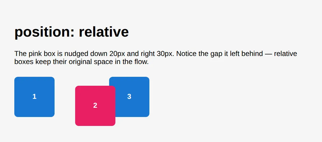
2. The absolute + relative pattern
Step 1: put position: relative on the parent. It barely changes anything visually, but it becomes the containing block.
Step 2: put position: absolute on the child plus the offsets you want (top/right/bottom/left).
The child is now placed against the parent's edges. This one pattern powers notification badges, close buttons, tooltips and dropdown menus.
<!DOCTYPE html>
<html>
<head>
<style>
  body { font-family: system-ui, sans-serif; padding: 24px; }
  h2 { color: #1565C0; }

  /* THE PATTERN: parent is "relative" (the containing block),
     child is "absolute" and pinned to the parent's edges. */
  .relative-box {
    position: relative;   /* 👈 makes THIS the containing block */
    background: #FFF3E0; padding: 40px 20px; border-radius: 12px;
    margin: 20px 0; border: 2px dashed #FF9800;
  }
  .abs-badge {
    position: absolute;   /* measured from .relative-box, not the page */
    top: -10px; right: -10px;   /* sits on the top-right corner */
    background: #F44336; color: white; width: 28px; height: 28px;
    border-radius: 50%; display: flex; align-items: center;
    justify-content: center; font-size: 0.8rem; font-weight: 700;
  }

  /* Tooltip: same pattern, centred above the button */
  .tooltip-wrapper { position: relative; display: inline-block; margin: 20px 0; }
  .tooltip-btn { padding: 10px 20px; background: #1976D2; color: white;
                 border: none; border-radius: 6px; font-weight: 600; }
  .tooltip {
    position: absolute;
    bottom: calc(100% + 8px);    /* 8px above the wrapper's top edge */
    left: 50%; transform: translateX(-50%);   /* true horizontal centre */
    background: #333; color: white; padding: 8px 16px; border-radius: 6px;
    font-size: 0.85rem; white-space: nowrap;
  }
</style>
</head>
<body>
  <h1>The absolute + relative pattern</h1>

  <h2>1. Notification badge</h2>
  <div class="relative-box">
    <div class="abs-badge">3</div>
    <strong>position: relative container</strong>
    <p>The red "3" is absolute, pinned to top:-10px right:-10px — it can even
       break outside the box edges.</p>
  </div>

  <h2>2. Tooltip centred above a button</h2>
  <div class="tooltip-wrapper">
    <div class="tooltip">I'm centred above!</div>
    <button class="tooltip-btn">Target</button>
  </div>

  <!-- Result: badge hugs the corner; tooltip floats centred above the button.
       Remove "position: relative" from a parent and the child jumps to the
       page corner instead — try it! -->
  <!-- ✅ Expected result, measured in a real browser:
     .relative-box -> position: relative
     .abs-badge -> display: flex
     .tooltip-wrapper -> display: inline-block
     .tooltip -> position: absolute
  -->
</body>
</html>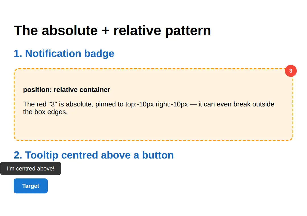
🎯 Your Turn 1 — centre an overlay
Fill in the ___ blanks so the white card sits dead-centre of the blue stage, both horizontally and vertically. Use the classic absolute-centring trick: top: 50%; left: 50%; transform: translate(-50%, -50%).
<!DOCTYPE html>
<html>
<head>
<style>
  body { font-family: system-ui, sans-serif; margin: 0; }
  /* 🎯 YOUR TURN — perfectly centre the card inside .stage */
  .stage {
    position: relative;   /* containing block is ready for you */
    height: 280px; background: #1976D2; overflow: hidden;
  }
  .card {
    /* 👉 1) take the card out of flow so we can place it freely */
    position: ___;        /* 👉 use the value measured from .stage */
    /* 👉 2) move its top-left corner to the centre of .stage */
    top: ___;             /* 👉 50% */
    left: ___;            /* 👉 50% */
    /* 👉 3) pull it back by half ITS OWN size so it's truly centred */
    transform: translate(___, ___);   /* 👉 -50%, -50% */

    background: white; color: #1565C0; padding: 24px 40px;
    border-radius: 12px; font-weight: 700; box-shadow: 0 8px 24px rgba(0,0,0,0.3);
  }
</style>
</head>
<body>
  <div class="stage">
    <div class="card">Centre me!</div>
  </div>
  <!-- ✅ Expected: the white card sits dead-centre, horizontally and vertically.
       Solution: position: absolute; top: 50%; left: 50%;
                 transform: translate(-50%, -50%); -->
</body>
</html>
3. Fixed and sticky: persistent UI
fixed glues an element to the viewport — perfect for headers, floating action buttons and cookie bars that must stay visible.
A sticky element flows normally until you scroll past its threshold (e.g. top: 56px), then it locks there until its parent scrolls away. Sticky is the modern way to build section headers and table headers without JavaScript.
<!DOCTYPE html>
<html>
<head>
<style>
  body { font-family: system-ui, sans-serif; margin: 0; padding-bottom: 80px; }

  /* FIXED: glued to the viewport. Scrolling the page does NOT move it. */
  .fixed-header {
    position: fixed; top: 0; left: 0; right: 0;   /* stretch across the top */
    background: #1976D2; color: white; padding: 12px 24px;
    z-index: 100;   /* sit above page content */
    font-weight: 700; box-shadow: 0 2px 8px rgba(0,0,0,0.2);
  }

  /* A fixed header overlaps content, so push the page down by its height. */
  .content { margin-top: 56px; max-width: 700px;
             margin-left: auto; margin-right: auto; padding: 24px; }

  /* STICKY: a section label that scrolls normally, then locks at top: 56px
     (right under the fixed header) once it reaches that line. */
  .section-header {
    position: sticky; top: 56px;   /* threshold — sticky NEEDS this */
    background: #E3F2FD; color: #1565C0; padding: 10px 16px;
    border-radius: 8px; font-weight: 700; margin: 24px 0 12px; z-index: 50;
  }

  p { line-height: 1.8; color: #555; }
</style>
</head>
<body>
  <div class="fixed-header">Fixed header — always visible</div>
  <div class="content">
    <h1>Fixed vs Sticky</h1>
    <div class="section-header">Section A (sticky — scroll me)</div>
    <p>The blue header never moves: it is fixed to the viewport.</p>
    <p>This grey label scrolls with the page until it touches top:56px, then it
       sticks just under the fixed header.</p>
    <p>Lorem ipsum dolor sit amet, consectetur adipiscing elit. Sed do eiusmod
       tempor incididunt ut labore et dolore magna aliqua.</p>
    <div class="section-header">Section B (sticky again)</div>
    <p>Each sticky label locks at its own turn. Keep scrolling to watch the
       handover between Section A and Section B.</p>
    <p style="padding-bottom: 240px;">Extra space so there is room to scroll.</p>
  </div>
  <!-- Result: blue bar fixed at the top; grey labels stick under it in turn. -->
  <!-- ✅ Expected result, measured in a real browser:
     .fixed-header -> position: fixed
     .section-header -> position: sticky
     .section-header -> count: 2
  -->
</body>
</html>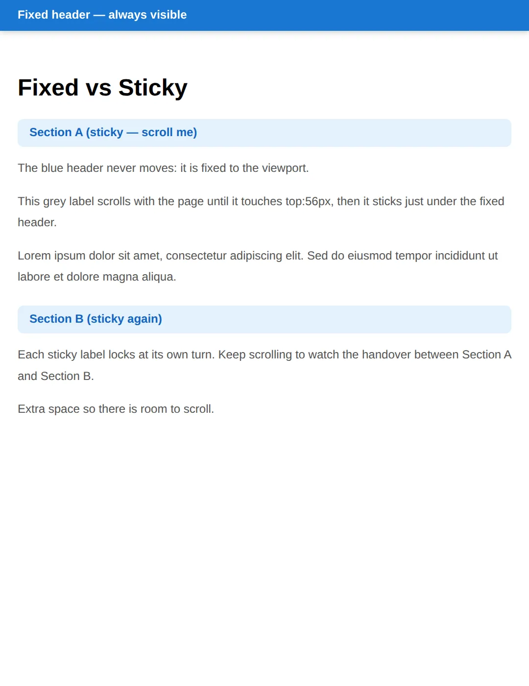
Sticky needs a threshold and a scroll container. You must give it at least one of top/right/bottom/left, and no ancestor may have overflow: hidden/scroll/auto — that quietly clips sticky and it silently stops working.
🎯 Your Turn 2 — pin a SALE badge
Fill in the ___ blanks so the pink SALE badge sits in the product card's top-right corner. Remember the two steps: make the card relative, make the badge absolute.
<!DOCTYPE html>
<html>
<head>
<style>
  body { font-family: system-ui, sans-serif; padding: 40px; background: #f5f5f5; }
  /* 🎯 YOUR TURN — pin the SALE badge to the card's top-right corner */
  .product {
    /* 👉 1) make the card the containing block for the badge */
    position: ___;        /* 👉 relative */
    width: 220px; background: white; border-radius: 12px;
    padding: 20px; box-shadow: 0 4px 12px rgba(0,0,0,0.1);
  }
  .badge {
    /* 👉 2) take the badge out of flow, measured from .product */
    position: ___;        /* 👉 absolute */
    top: 12px;            /* given */
    right: ___;           /* 👉 12px — sit 12px from the right edge */
    background: #E91E63; color: white; padding: 4px 12px;
    border-radius: 20px; font-size: 0.8rem; font-weight: 700;
  }
</style>
</head>
<body>
  <div class="product">
    <div class="badge">SALE</div>
    <h3>Wireless Headphones</h3>
    <p>Crisp sound, 30-hour battery.</p>
  </div>
  <!-- ✅ Expected: the pink SALE badge sits inside the card's top-right corner.
       Solution: .product { position: relative } .badge { position: absolute;
       right: 12px } -->
</body>
</html>
4. z-index and stacking contexts
When positioned elements overlap, z-index decides who is on top — higher numbers win. But there is a catch that trips up nearly everyone: z-index is only compared within the same stacking context.
A stacking context is a self-contained layer pile. A child's z-index — even 9999 — can never escape its parent's context. The cure for z-index wars is not bigger numbers; it is creating contexts deliberately, e.g. with isolation: isolate.
A new stacking context is created by, among others: a positioned element with a z-index other than auto, opacity less than 1, any transform or filter, and isolation: isolate.
<!DOCTYPE html>
<html>
<head>
<style>
  body { font-family: system-ui, sans-serif; padding: 24px; }
  h2 { color: #1565C0; }

  .stack { position: relative; height: 180px; margin: 16px 0; }
  .layer { position: absolute; width: 180px; padding: 16px; border-radius: 12px;
           color: white; font-weight: 700; box-shadow: 0 4px 12px rgba(0,0,0,0.2); }
  /* Higher z-index paints LATER, so it lands on top. */
  .red   { background: #F44336; top: 0;   left: 0;   z-index: 1; }
  .green { background: #4CAF50; top: 28px; left: 56px; z-index: 2; }
  .blue  { background: #1976D2; top: 56px; left: 112px; z-index: 3; }  /* on top */

  /* A NEW stacking context: isolation:isolate traps z-index inside this box. */
  .trap { position: relative; isolation: isolate; background: #FFF3E0;
          padding: 20px; border-radius: 12px; margin-top: 24px;
          border: 2px solid #FF9800; }
  .trapped { position: relative; z-index: 999; background: #FF9800;
             color: white; padding: 12px; border-radius: 8px; }
  .sibling { position: relative; z-index: 1; background: #E3F2FD; color: #1565C0;
             padding: 12px; border-radius: 8px; margin-top: -8px;
             border: 2px solid #1976D2; }
</style>
</head>
<body>
  <h1>z-index and stacking contexts</h1>

  <h2>Higher z-index wins</h2>
  <div class="stack">
    <div class="layer red">z-index: 1</div>
    <div class="layer green">z-index: 2</div>
    <div class="layer blue">z-index: 3 (top)</div>
  </div>

  <h2>z-index: 999 that still loses</h2>
  <div class="trap">
    <div class="trapped">z-index: 999 — but trapped in this box</div>
  </div>
  <div class="sibling">z-index: 1 — yet I sit ON TOP of the 999 above,
     because 999 only counts inside its own stacking context.</div>
  <!-- Result: blue is on top of the trio; the z-index:1 strip beats the
       z-index:999 box because the 999 is scoped to its isolated context. -->
  <!-- ✅ Expected result, measured in a real browser:
     .stack -> position: relative
     .layer -> position: absolute
     .red -> z-index: 1
     .green -> z-index: 2
     .layer -> count: 3
  -->
</body>
</html>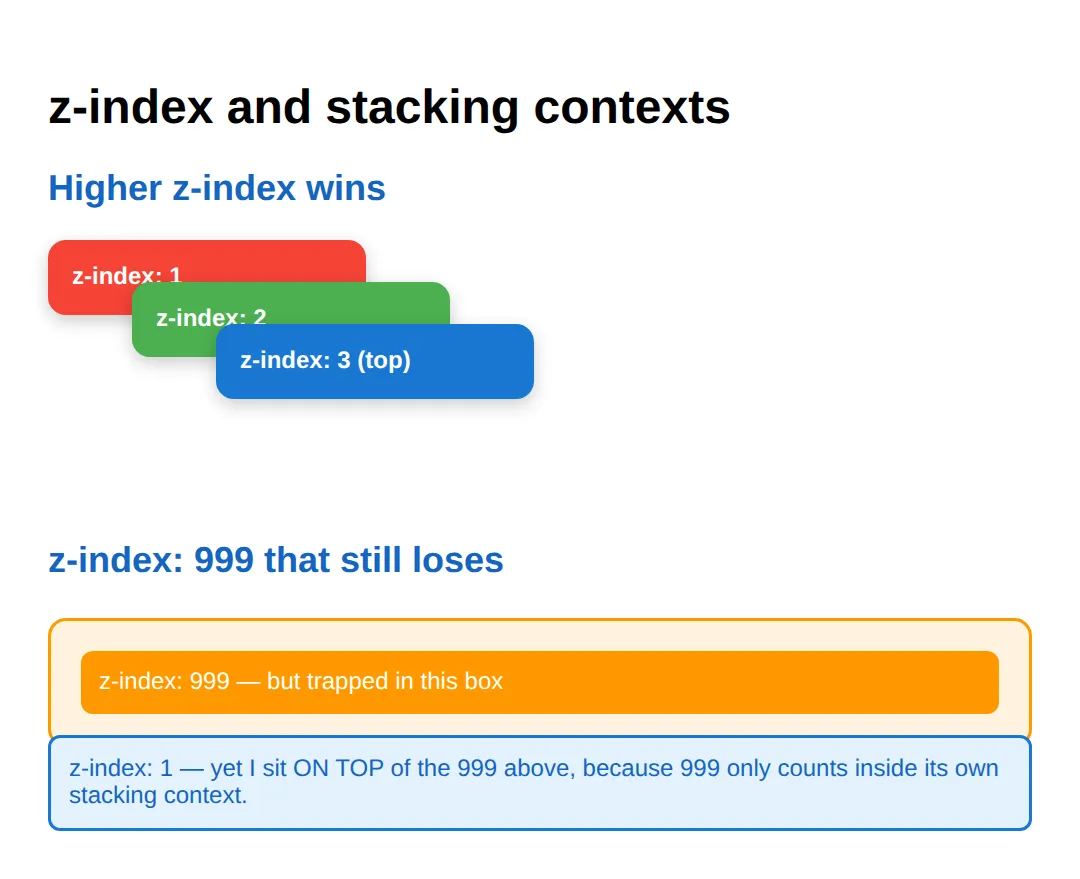
When to reach for each
- Sticky: table headers, section labels, sidebars that follow the scroll
- Fixed: persistent navbars, floating action buttons, cookie banners, back-to-top buttons
- Absolute: notification badges, tooltips, dropdown menus, close buttons, centred overlays
- Isolation: wrap a component in isolation: isolate to stop its z-index leaking out
🧗 Mini-Challenge — back-to-top button
Now with the scaffolding removed. The starter has only a comment outline — write the .back-to-top rule yourself so a circular blue button stays glued to the bottom-right corner while the page scrolls.
<!DOCTYPE html>
<html>
<head>
<style>
  body { font-family: system-ui, sans-serif; margin: 0; }
  .page { padding: 24px; max-width: 700px; margin: 0 auto; }
  p { line-height: 1.8; color: #555; }

  /* 🎯 MINI-CHALLENGE: a circular "↑" button fixed to the bottom-right corner.
     1. position: fixed so it ignores scrolling and sticks to the viewport
     2. bottom: 24px and right: 24px to sit in the corner with breathing room
     3. width/height 56px + border-radius: 50% for a circle
     4. z-index high enough (e.g. 100) to float above the page text
     5. background: #1976D2, white text, no border, pointer cursor

     ✅ Expected: a blue circle in the bottom-right that stays put while the
        page scrolls. */
  .back-to-top {
    /* your code here */
  }
</style>
</head>
<body>
  <div class="page">
    <h1>Long article</h1>
    <p>Scroll down — your fixed button should never move.</p>
    <p style="padding-bottom: 600px;">...lots of content...</p>
  </div>
  <button class="back-to-top"
          onclick="window.scrollTo({top:0,behavior:'smooth'})">↑</button>
  <!-- ✅ Expected result, measured in a real browser:
     .page -> max-width: 700px
     p -> color: rgb(85, 85, 85)
  -->
</body>
</html>
Common Errors & Fixes
- "My z-index does nothing / a smaller number wins." Either the element isn't positioned (z-index only works on relative/absolute/fixed/sticky), or a parent created a stacking context (opacity < 1, a transform, a filter, or isolation: isolate) that traps the child's z-index inside it. Fix: raise z-index on the parent context, or remove the property creating it.
- "position: sticky just won't stick." Sticky needs a threshold and a scroll container. Fix: add at least one of top/right/bottom/left, ensure the parent is tall enough to scroll, and check that no ancestor has overflow: hidden/scroll/auto, which clips sticky.
- "My absolute element jumped to the corner of the page." There was no positioned ancestor, so it measured from the page. Fix: add position: relative to the parent you want it placed inside.
- "My fixed header covers the first paragraph." Fixed elements leave the flow, so content slides underneath. Fix: add padding-top (or margin-top) equal to the header's height on the body or content wrapper.
- "My fixed element acts like absolute." A transform, filter or perspective on any ancestor re-bases fixed to that ancestor. This is the spec, not a bug. Fix: move the fixed element out of the transformed ancestor.
🎉 Lesson Complete
- ✅ static ignores offsets; relative nudges but keeps its gap and becomes a containing block
- ✅ absolute is measured from the nearest positioned ancestor — give the parent position: relative
- ✅ fixed is glued to the viewport; sticky locks at a threshold inside its scroll container
- ✅ Centre anything with top:50%; left:50%; transform: translate(-50%,-50%)
- ✅ z-index only works on positioned elements and only inside one stacking context
- ✅ opacity < 1, transform, filter and isolation: isolate all create stacking contexts
- ✅ Use positioning for overlays and badges — use Flexbox/Grid for page layout
Practice quiz
Which position value keeps an element in the normal flow but lets you nudge it with top/left, reserving its original space?
- absolute
- fixed
- relative
- sticky
Answer: relative. position: relative nudges the box with offsets while still occupying its original slot in the flow.
An element with position: absolute is positioned relative to what?
- The nearest ancestor that is itself positioned (relative, absolute, fixed or sticky)
- The viewport
- Its own normal position
- The document body, always
Answer: The nearest ancestor that is itself positioned (relative, absolute, fixed or sticky). Absolute is measured from the nearest positioned ancestor. If none exists, it falls back to the initial containing block (the page).
Which position value locks an element to the viewport so it ignores scrolling?
- relative
- absolute
- static
- fixed
Answer: fixed. position: fixed is measured from the viewport, so the element stays put while the page scrolls.
How does position: sticky behave?
- It is always glued to the viewport
- It acts like relative until you scroll past its threshold, then like fixed within its scroll container
- It removes the element from the flow immediately
- It ignores all offset values
Answer: It acts like relative until you scroll past its threshold, then like fixed within its scroll container. Sticky is a hybrid: relative until its threshold (e.g. top: 0) is reached, then it locks like fixed inside its scroll container.
What must a position: sticky element have to actually stick?
- At least one threshold (top, right, bottom or left)
- A z-index value
- display: flex
- A fixed ancestor
Answer: At least one threshold (top, right, bottom or left). Sticky needs a threshold, room to scroll, and no ancestor with overflow hidden/scroll/auto clipping it.
The classic way to perfectly centre an absolutely positioned child is top: 50%; left: 50%; plus what?
- margin: auto
- text-align: center
- transform: translate(-50%, -50%)
- position: fixed
Answer: transform: translate(-50%, -50%). top/left 50% places the child's top-left corner at the centre; translate(-50%, -50%) pulls it back by half its own size so its centre lands on the centre.
z-index only applies to elements with which positions?
- Any element regardless of position
- relative, absolute, fixed or sticky
- Only static elements
- Only fixed elements
Answer: relative, absolute, fixed or sticky. z-index has no effect on static elements; the element must be positioned (relative, absolute, fixed or sticky).
Why can a child with z-index: 9999 still appear below another element?
- 9999 is too large and overflows
- z-index only works on images
- The browser caps z-index at 100
- z-index is only compared within the same stacking context; the child may be trapped in its parent's context
Answer: z-index is only compared within the same stacking context; the child may be trapped in its parent's context. z-index is scoped to a stacking context. A child's huge z-index cannot escape a parent that created its own context.
Which of these creates a new stacking context?
- display: block
- opacity less than 1, a transform, a filter, or isolation: isolate
- margin: auto
- position: static
Answer: opacity less than 1, a transform, a filter, or isolation: isolate. opacity < 1, any transform or filter, isolation: isolate, and a positioned element with a z-index other than auto all create stacking contexts.
The 'absolute + relative' pattern for badges and tooltips means:
- Both parent and child use position: absolute
- The parent is fixed and the child is sticky
- The parent is position: relative (the containing block) and the child is position: absolute
- The child uses float instead of position
Answer: The parent is position: relative (the containing block) and the child is position: absolute. Make the parent relative so it becomes the containing block, then place the child absolutely against the parent's edges.
Continue this course
- Previous: Dark Mode Design with prefers-color-scheme
- Next: CSS Shapes & Clip-Path for Creative Layouts — Create circles, polygons, and text wrapping around custom shapes
- Quick reference: HTML & CSS cheat sheet › CSS Layout
Frequently asked questions
What is the difference between position: relative, absolute, fixed and sticky?
relative keeps the element in the normal flow but lets you nudge it with top/left and makes it a containing block for absolute children. absolute removes the element from the flow and positions it against the nearest positioned ancestor. fixed removes it from the flow and positions it against the viewport, so it ignores scrolling. sticky is a hybrid: the element behaves like relative until you scroll past its threshold (e.g. top: 0), then it behaves like fixed within its scroll container.
Why isn't my z-index working?
Two common reasons. First, z-index only applies to positioned elements (position is relative, absolute, fixed or sticky) — on a static element it does nothing. Second, z-index is only compared within the same stacking context. If a parent created a new stacking context (via opacity below 1, a transform, a filter, or isolation: isolate), then a huge z-index on a child is still trapped inside that parent and cannot rise above elements outside it.
Why is my position: sticky element not sticking?
Sticky needs three things. It needs a threshold — at least one of top, right, bottom or left — or the browser has no line to stick to. It needs room to scroll within its parent. And no ancestor can have overflow set to hidden, scroll or auto, because that clips the sticky element to that ancestor. Also make sure the parent is taller than the sticky element, otherwise there is nothing to scroll past.
Why did my absolute element jump to the corner of the page?
absolute positions against the nearest ancestor that is itself positioned (relative, absolute, fixed or sticky). If no ancestor is positioned, it falls all the way back to the initial containing block — effectively the page. The fix is to add position: relative to the parent you want it measured from.
How do I perfectly centre an element with positioning?
Set the parent to position: relative, then on the child use position: absolute; top: 50%; left: 50%; transform: translate(-50%, -50%). top/left 50% places the child's top-left corner at the centre, and the translate pulls it back by half of its own width and height so its centre lands on the centre. For ordinary layout, Flexbox (justify-content/align-items: center) is usually simpler.