CSS Styling & Colors
Reviewed & published by Brayan K
Master colors, fonts, spacing, and visual styling to create professional-looking websites.
Part of the free HTML & CSS course at LearnCodingFast — hands-on lessons with examples you run in your browser, plus practice exercises and a quick quiz.
What You'll Learn
- ✓ Text color and background color properties
- ✓ Hex, RGB, RGBA, and HSL color formats
- ✓ Gradient backgrounds (linear and radial)
- ✓ Font families, sizes, and typography
- ✓ Padding vs margin (spacing mastery)
- ✓ Modern button styling with hover effects
- ✓ Box shadows and border-radius
- ✓ Building a complete styled landing section
Before You Start
Make sure you've completed these lessons first:
- ✅ CSS Basics & Selectors — you need to understand selectors before styling
- ✅ HTML Elements — you need elements to style them
1️⃣ What CSS Styling Actually Means
When people say "CSS makes websites look good", that is an understatement. CSS doesn't just make things "pretty" — it controls whether users trust your website or leave within seconds.
Think of CSS like interior design. Two identical houses with the same floor plan can feel completely different. One feels warm, modern, and inviting. The other feels cold, cluttered, and cheap. The difference? How things are styled — colors, spacing, lighting, and furniture choices. CSS is your website's interior designer.
- 🎨 Color & Contrast
- 📖 Readability
- 🎭 Mood & Brand identity
- 🤝 User trust
- ♿ Accessibility
- 📱 Responsiveness
Users decide in less than 50 milliseconds whether a site looks professional. That judgment is driven almost entirely by color and spacing.
2️⃣ Essential Styling Properties (Your Toolkit)
90% of real websites rely on this core set. Master these and you can already build clean, modern layouts:
| Property | What It Does | Example |
|---|---|---|
| color | Text color | color: #3b82f6; |
| background-color | Background fill | background-color: #1e293b; |
| font-family | Font choice | font-family: system-ui; |
| font-size | Text size | font-size: 16px; |
| line-height | Line spacing (readability) | line-height: 1.6; |
| padding | Inner spacing | padding: 20px; |
| margin | Outer spacing | margin: 16px 0; |
| border-radius | Rounded corners | border-radius: 12px; |
3️⃣ Color Formats: Hex, RGB, RGBA, and HSL
CSS gives you four ways to define colors. Each has a purpose:
| Format | Syntax | When to Use |
|---|---|---|
| Hex | #3b82f6 | Most common, industry standard |
| RGB | rgb(59, 130, 246) | When you need decimal values |
| RGBA | rgba(0, 0, 0, 0.5) | When you need transparency |
| HSL | hsl(217, 91%, 60%) | Best for creating color palettes |
<!DOCTYPE html>
<html lang="en">
<head>
  <meta charset="UTF-8">
  <title>Color Formats</title>
  <style>
    body {
      background-color: #020617;
      font-family: system-ui, sans-serif;
      padding: 30px;
      color: #e5e7eb;
    }
    .color-box {
      padding: 20px;
      border-radius: 12px;
      margin: 12px 0;
      font-weight: 600;
    }
    .hex { background-color: #3b82f6; color: white; }
    .rgb { background-color: rgb(34, 197, 94); color: white; }
    .rgba {
      background-color: rgba(139, 92, 246, 0.7);
      color: white;
      backdrop-filter: blur(4px);
    }
    .hsl { background-color: hsl(0, 84%, 60%); color: white; }

    .transparent-demo {
      margin-top: 20px;
      background: linear-gradient(135deg, #3b82f6, #8b5cf6);
      padding: 30px;
      border-radius: 16px;
    }
    .glass {
      background-color: rgba(255, 255, 255, 0.15);
      backdrop-filter: blur(10px);
      padding: 20px;
      border-radius: 12px;
      border: 1px solid rgba(255, 255, 255, 0.2);
      color: white;
    }
    code {
      background: rgba(0,0,0,0.3);
      padding: 2px 6px;
      border-radius: 4px;
      font-size: 14px;
    }
  </style>
</head>
<body>
  <h1>CSS Color Formats</h1>

  <div class="color-box hex">
    Hex: <code>#3b82f6</code> — Most common in real projects
  </div>

  <div class="color-box rgb">
    RGB: <code>rgb(34, 197, 94)</code> — Decimal values
  </div>

  <div class="color-box rgba">
    RGBA: <code>rgba(139, 92, 246, 0.7)</code> — With transparency!
  </div>

  <div class="color-box hsl">
    HSL: <code>hsl(0, 84%, 60%)</code> — Hue, Saturation, Lightness
  </div>

  <div class="transparent-demo">
    <div class="glass">
      <h3>Glass Effect with RGBA</h3>
      <p>This card uses rgba() for the semi-transparent background. Try changing the 0.15 value!</p>
    </div>
  </div>
  <!-- ✅ Expected result, measured in a real browser:
     .color-box -> padding-top: 20px
     .hex -> color: rgb(255, 255, 255)
     .color-box -> count: 4
  -->
</body>
</html>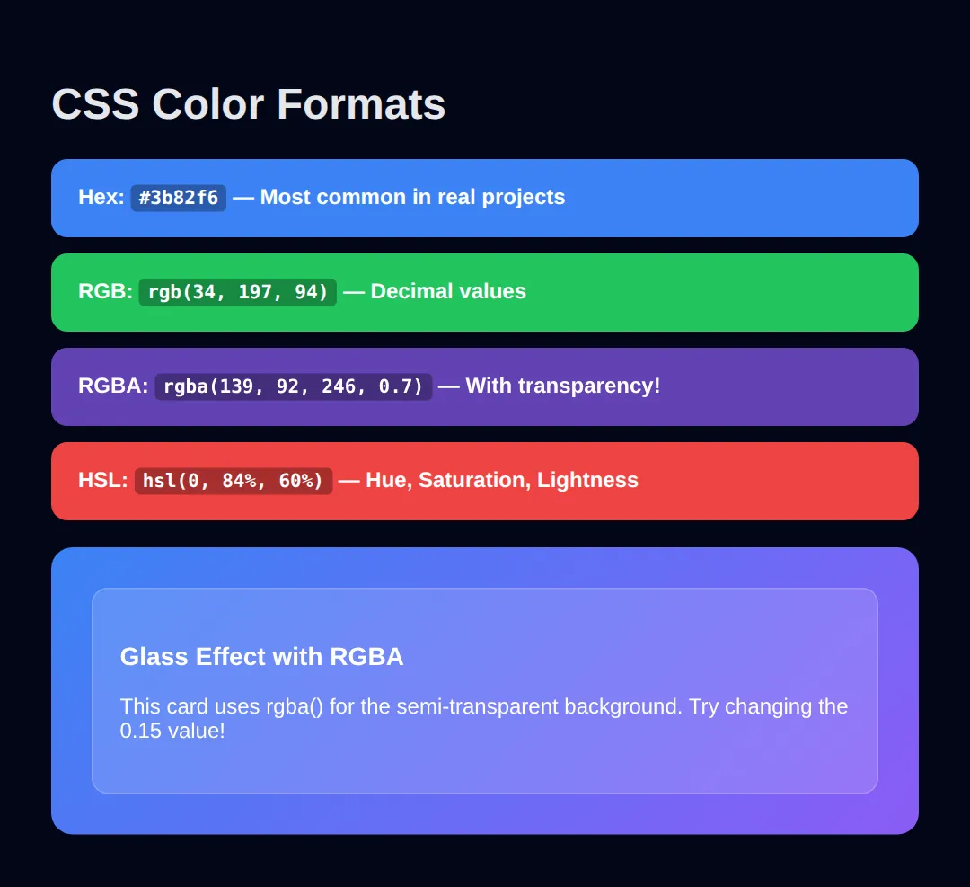
For beginners, start with hex colors — they're the most common in tutorials and design tools. Use RGBA when you need transparency (overlays, glass effects). Use HSL when you want to create color variations easily (just change the lightness value).
Hex and RGB are two spellings of the same idea: how much red, green and blue to mix. HSL is a different idea altogether, and it is the one that makes palettes easy — so it is worth a worked example of its own.
<!DOCTYPE html>
<html lang="en">
<head>
  <meta charset="UTF-8">
  <title>HSL Palette</title>
  <style>
    * { box-sizing: border-box; margin: 0; padding: 0; }
    body {
      background: #020617;
      color: #e5e7eb;
      font-family: system-ui, sans-serif;
      padding: 32px;
    }

    /* HSL = Hue, Saturation, Lightness.
       Hue        0-360  where on the colour wheel (217 = a blue)
       Saturation 0-100% how colourful (0% = grey)
       Lightness  0-100% how bright (0% = black, 100% = white)

       Keep hue and saturation FIXED and change only lightness, and you
       get a matched palette. Doing this by hand in hex is guesswork. */

    .swatch {
      padding: 14px 18px;
      border-radius: 8px;
      margin-bottom: 8px;
      font-family: monospace;
      font-size: 13px;
    }

    .l90 { background: hsl(217, 91%, 90%); color: #0f172a; }  /* rgb(206, 224, 253) */
    .l60 { background: hsl(217, 91%, 60%); color: #0f172a; }  /* rgb(60, 131, 246)  */
    .l45 { background: hsl(217, 91%, 45%); color: #ffffff; }  /* rgb(10, 90, 219)   */
    .l30 { background: hsl(217, 91%, 30%); color: #ffffff; }  /* rgb(7, 60, 146)    */
    .l15 { background: hsl(217, 91%, 15%); color: #ffffff; }  /* rgb(3, 30, 73)     */

    /* Same three colours, three notations, for comparison. */
    .hex  { background: #3b82f6; }                 /* rgb(59, 130, 246) */
    .rgb  { background: rgb(59, 130, 246); }       /* rgb(59, 130, 246) - identical */
    .hsl  { background: hsl(217, 91%, 60%); }      /* rgb(60, 131, 246) - ONE off */

    .row { display: flex; gap: 8px; margin-top: 24px; }
    .row div { flex: 1; height: 60px; border-radius: 8px; }
    h2 { font-size: 15px; margin: 24px 0 10px; color: #22c55e; }
    p.note { font-size: 13px; color: #94a3b8; margin-top: 10px; line-height: 1.6; }
  </style>
</head>
<body>
  <h1>One hue, five shades</h1>

  <h2>Lightness 90 → 15, hue and saturation untouched</h2>
  <div class="swatch l90">hsl(217, 91%, 90%)</div>
  <div class="swatch l60">hsl(217, 91%, 60%)</div>
  <div class="swatch l45">hsl(217, 91%, 45%)</div>
  <div class="swatch l30">hsl(217, 91%, 30%)</div>
  <div class="swatch l15">hsl(217, 91%, 15%)</div>

  <h2>Hex vs RGB vs HSL — the same blue, three ways</h2>
  <div class="row">
    <div class="hex"></div>
    <div class="rgb"></div>
    <div class="hsl"></div>
  </div>
  <p class="note">
    Change 217 to 12 in all five swatch rules and you get the identical palette in red.
    Try doing that with five hex codes.
  </p>
  <!-- ✅ Expected result, measured in a real browser:
     .row -> display: flex
     .row div -> flex-grow: 1
     .swatch -> count: 5
  -->
</body>
</html>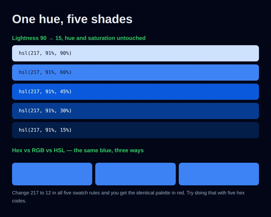
Measured in Chrome — the five shades resolve to:
- hsl(217, 91%, 90%) → rgb(206, 224, 253)
- hsl(217, 91%, 60%) → rgb(60, 131, 246)
- hsl(217, 91%, 45%) → rgb(10, 90, 219)
- hsl(217, 91%, 30%) → rgb(7, 60, 146)
- hsl(217, 91%, 15%) → rgb(3, 30, 73)
An honest footnote: #3b82f6 and rgb(59, 130, 246) are the same colour exactly. hsl(217, 91%, 60%) computes to rgb(60, 131, 246) — one step off in red and green, because 217 and 60% are rounded versions of that blue's true hue and lightness. Indistinguishable by eye, but not the same number, and worth knowing before you assume two notations are interchangeable.
4️⃣ Gradient Backgrounds (Add Depth)
Flat, single colors everywhere make sites look cheap and dated. Gradients create depth and visual interest that makes your site feel modern and premium.
<!DOCTYPE html>
<html lang="en">
<head>
  <meta charset="UTF-8">
  <title>Gradients</title>
  <style>
    body {
      background: #020617;
      font-family: system-ui, sans-serif;
      padding: 30px;
      color: white;
    }
    .gradient-card {
      padding: 30px;
      border-radius: 16px;
      margin: 16px 0;
      text-align: center;
    }
    .linear-1 {
      background: linear-gradient(135deg, #3b82f6, #8b5cf6);
    }
    .linear-2 {
      background: linear-gradient(to right, #22c55e, #06b6d4);
    }
    .linear-3 {
      background: linear-gradient(180deg, #f59e0b, #ef4444);
    }
    .radial {
      background: radial-gradient(circle at top left, #8b5cf6, #1e293b);
    }
    .hero-section {
      background: linear-gradient(135deg, #0f172a 0%, #1e3a5f 50%, #0f172a 100%);
      padding: 60px 30px;
      border-radius: 20px;
      margin-top: 20px;
    }
    .hero-section h1 {
      font-size: 2.5rem;
      margin-bottom: 10px;
    }
    .hero-section p {
      color: #94a3b8;
      font-size: 1.1rem;
    }
    .hero-btn {
      background: linear-gradient(135deg, #3b82f6, #8b5cf6);
      color: white;
      border: none;
      padding: 14px 32px;
      border-radius: 10px;
      font-size: 16px;
      font-weight: 600;
      cursor: pointer;
      margin-top: 20px;
    }
    code {
      background: rgba(0,0,0,0.3);
      padding: 2px 6px;
      border-radius: 4px;
      font-size: 13px;
    }
  </style>
</head>
<body>
  <h1>CSS Gradients</h1>

  <div class="gradient-card linear-1">
    <h3>Linear Gradient (135°)</h3>
    <code>linear-gradient(135deg, #3b82f6, #8b5cf6)</code>
  </div>

  <div class="gradient-card linear-2">
    <h3>Left to Right</h3>
    <code>linear-gradient(to right, #22c55e, #06b6d4)</code>
  </div>

  <div class="gradient-card linear-3">
    <h3>Top to Bottom</h3>
    <code>linear-gradient(180deg, #f59e0b, #ef4444)</code>
  </div>

  <div class="gradient-card radial">
    <h3>Radial Gradient</h3>
    <code>radial-gradient(circle at top left, #8b5cf6, #1e293b)</code>
  </div>

  <div class="hero-section">
    <h1>Hero Section Example</h1>
    <p>This is how real websites use subtle gradients for hero sections</p>
    <button class="hero-btn">Get Started →</button>
  </div>
  <!-- ✅ Expected result, measured in a real browser:
     .hero-btn -> cursor: pointer
     .gradient-card -> padding-top: 30px
     .gradient-card -> count: 4
  -->
</body>
</html>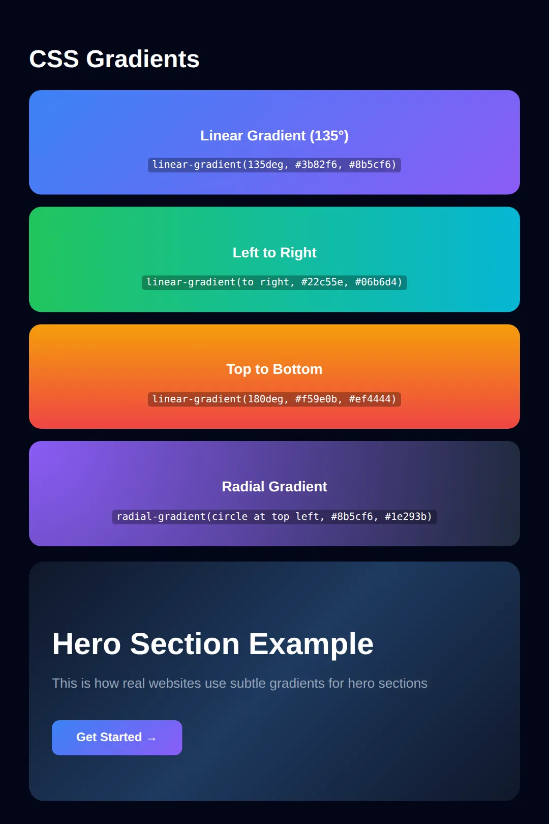
Don't use too many colors in one gradient. Two colors is usually enough. Three colors can work for backgrounds but often looks messy for smaller elements. Subtle gradients beat flashy ones in professional design.
5️⃣ Typography: Fonts That Build Trust
Fonts decide whether your site looks professional or amateur. The wrong font instantly destroys credibility — even if everything else is perfect.
- Using Comic Sans or Papyrus
- Mixing 4+ different fonts
- Tiny text (under 14px)
- No line-height (cramped text)
- System fonts or Google Fonts
- 1-2 fonts maximum
- Body text: 16px minimum
- line-height: 1.5 to 1.8
<!DOCTYPE html>
<html lang="en">
<head>
  <meta charset="UTF-8">
  <title>Typography</title>
  <style>
    body {
      background-color: #020617;
      padding: 30px;
      margin: 0;
    }
    .example {
      padding: 30px;
      border-radius: 12px;
      margin: 16px 0;
    }
    .bad-typography {
      background: #1e293b;
      font-family: "Comic Sans MS", cursive;
      color: #e5e7eb;
      font-size: 12px;
      line-height: 1.0;
      border: 2px solid #ef4444;
    }
    .good-typography {
      background: #1e293b;
      font-family: system-ui, -apple-system, sans-serif;
      color: #e5e7eb;
      font-size: 16px;
      line-height: 1.6;
      border: 2px solid #22c55e;
    }
    .good-typography h2 {
      font-size: 1.8rem;
      font-weight: 700;
      letter-spacing: -0.02em;
      color: white;
      margin-top: 0;
    }
    .bad-typography h2 {
      margin-top: 0;
      color: #ef4444;
    }
    .label {
      display: inline-block;
      padding: 4px 12px;
      border-radius: 20px;
      font-size: 12px;
      font-weight: 600;
      margin-bottom: 12px;
      font-family: system-ui, sans-serif;
    }
    .label-bad { background: #ef4444; color: white; }
    .label-good { background: #22c55e; color: white; }
  </style>
</head>
<body>
  <div class="example bad-typography">
    <span class="label label-bad">❌ BAD</span>
    <h2>This Looks Unprofessional</h2>
    <p>Comic Sans, tiny font size, cramped line-height. Nobody trusts this website. Users will leave immediately.</p>
  </div>

  <div class="example good-typography">
    <span class="label label-good">✅ GOOD</span>
    <h2>This Looks Professional</h2>
    <p>System fonts load instantly and look clean on every device. Good font size and line-height make text easy to read. This is what real companies use — Apple, Google, GitHub all use system fonts.</p>
  </div>
  <!-- ✅ Expected result, measured in a real browser:
     .label -> display: inline-block
     .example -> padding-top: 30px
     .example -> count: 2
  -->
</body>
</html>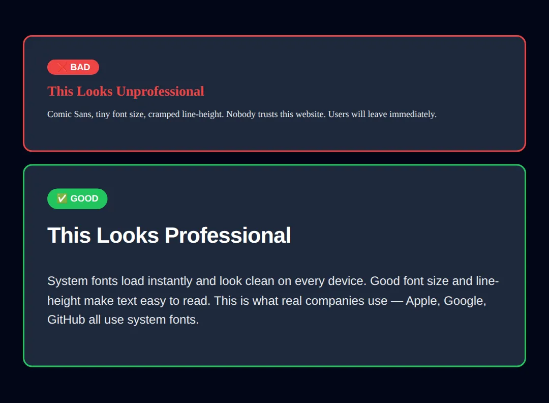
6️⃣ Padding vs Margin: Spacing Mastery
If your site feels cramped, messy, or hard to read — you're missing spacing. Spacing is not decoration. It's design logic.
Padding = the foam inside a gift box protecting the item. Margin = the space between gift boxes on a shelf. Padding is inside space. Margin is outside space. Get this right and your layouts feel instantly professional.
<!DOCTYPE html>
<html lang="en">
<head>
  <meta charset="UTF-8">
  <title>Spacing</title>
  <style>
    body {
      background-color: #020617;
      padding: 30px;
      font-family: system-ui, sans-serif;
      color: #e5e7eb;
    }
    .demo-area {
      background: rgba(59, 130, 246, 0.1);
      border: 2px dashed #3b82f6;
      padding: 10px;
      margin-bottom: 30px;
      border-radius: 8px;
    }
    .padding-demo {
      background-color: #1e293b;
      border: 2px solid #22c55e;
      border-radius: 8px;
      /* THIS IS PADDING - space INSIDE */
      padding: 40px;
    }
    .margin-demo {
      background-color: #1e293b;
      border: 2px solid #f59e0b;
      border-radius: 8px;
      padding: 20px;
      /* THIS IS MARGIN - space OUTSIDE */
      margin: 30px 0;
    }
    .no-spacing {
      background-color: #1e293b;
      border: 2px solid #ef4444;
      border-radius: 8px;
    }
    .shorthand-demo {
      background: #334155;
      padding: 20px;
      border-radius: 8px;
      margin-top: 20px;
    }
    code {
      background: rgba(0,0,0,0.3);
      padding: 2px 6px;
      border-radius: 4px;
      font-size: 13px;
      color: #22c55e;
    }
    h3 { margin-top: 0; }
  </style>
</head>
<body>
  <h1>Padding vs Margin</h1>

  <h2 style="color: #22c55e;">✅ With Padding (40px)</h2>
  <div class="demo-area">
    <div class="padding-demo">
      <h3>Comfortable Content</h3>
      <p>Text doesn't touch the edges. The green border is the element — padding pushes content inward.</p>
    </div>
  </div>

  <h2 style="color: #ef4444;">❌ Without Padding</h2>
  <div class="demo-area">
    <div class="no-spacing">
      <h3>Cramped! Text touches edges!</h3>
      <p>This looks terrible. No breathing room.</p>
    </div>
  </div>

  <h2 style="color: #f59e0b;">Margin Creates Gaps Between Elements</h2>
  <div class="margin-demo">Card 1 — has margin: 30px below</div>
  <div class="margin-demo">Card 2 — margin creates space between cards</div>

  <div class="shorthand-demo">
    <h3>Shorthand Values:</h3>
    <p><code>padding: 20px;</code> → all sides</p>
    <p><code>padding: 10px 20px;</code> → top/bottom, left/right</p>
    <p><code>padding: 10px 20px 30px 40px;</code> → top, right, bottom, left</p>
    <p><code>margin: 0 auto;</code> → center a block horizontally</p>
  </div>
  <!-- ✅ Expected result, measured in a real browser:
     .demo-area -> padding-top: 10px
     .padding-demo -> padding-top: 40px
     .demo-area -> count: 2
  -->
</body>
</html>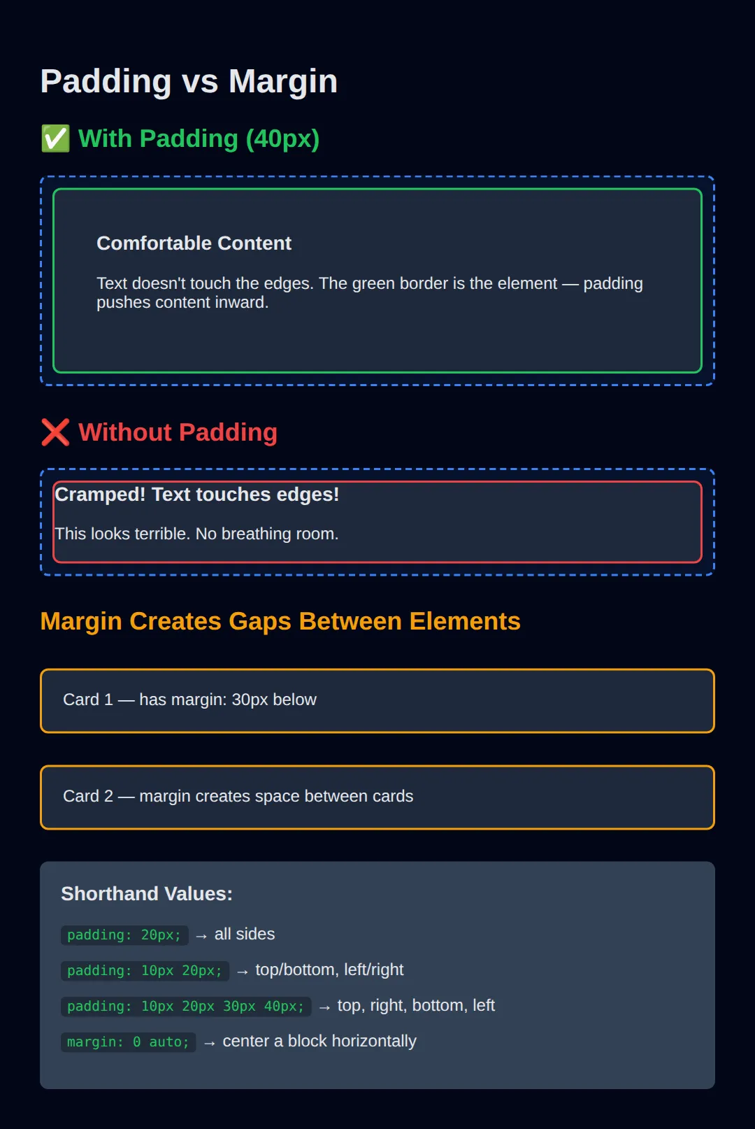
7️⃣ Box Shadows & Border-Radius (Modern Polish)
Two properties instantly make your designs feel modern and premium: box-shadow for depth and border-radius for softness.
<!DOCTYPE html>
<html lang="en">
<head>
  <meta charset="UTF-8">
  <title>Shadows & Radius</title>
  <style>
    body {
      background: #0f172a;
      font-family: system-ui, sans-serif;
      padding: 30px;
      color: #e5e7eb;
    }
    .card {
      background: #1e293b;
      padding: 24px;
      margin: 20px 0;
      transition: all 0.3s ease;
    }
    .no-style {
      /* No shadow, no radius */
    }
    .subtle {
      border-radius: 8px;
      box-shadow: 0 2px 8px rgba(0, 0, 0, 0.3);
    }
    .medium {
      border-radius: 12px;
      box-shadow: 0 4px 16px rgba(0, 0, 0, 0.4);
    }
    .dramatic {
      border-radius: 16px;
      box-shadow: 0 10px 40px rgba(59, 130, 246, 0.3);
    }
    .dramatic:hover {
      transform: translateY(-4px);
      box-shadow: 0 20px 60px rgba(59, 130, 246, 0.4);
    }
    .pill {
      border-radius: 999px;
      display: inline-block;
      padding: 12px 32px;
      background: #3b82f6;
      color: white;
      font-weight: 600;
    }
    .circle {
      width: 80px;
      height: 80px;
      border-radius: 50%;
      background: linear-gradient(135deg, #22c55e, #06b6d4);
      display: flex;
      align-items: center;
      justify-content: center;
      font-size: 24px;
      margin: 10px 0;
    }
    .label { color: #94a3b8; font-size: 14px; margin-bottom: 4px; }
    code {
      background: rgba(0,0,0,0.3);
      padding: 2px 6px;
      border-radius: 4px;
      font-size: 12px;
    }
  </style>
</head>
<body>
  <h1>Box Shadows & Border-Radius</h1>

  <p class="label">No styling:</p>
  <div class="card no-style">Flat and sharp — feels outdated</div>

  <p class="label">Subtle: <code>border-radius: 8px</code></p>
  <div class="card subtle">Slight rounding + soft shadow — clean and modern</div>

  <p class="label">Medium: <code>border-radius: 12px</code></p>
  <div class="card medium">More rounding + deeper shadow — premium feel</div>

  <p class="label">Dramatic (hover me!): <code>border-radius: 16px</code></p>
  <div class="card dramatic">Colored shadow + hover animation — interactive!</div>

  <h2>Special Radius Values</h2>
  <p><span class="pill">border-radius: 999px (pill shape)</span></p>
  <div class="circle">🎨</div>
  <p class="label"><code>border-radius: 50%</code> = perfect circle</p>
  <!-- ✅ Expected result, measured in a real browser:
     .pill -> display: inline-block
     .circle -> display: flex
     .label -> count: 5
  -->
</body>
</html>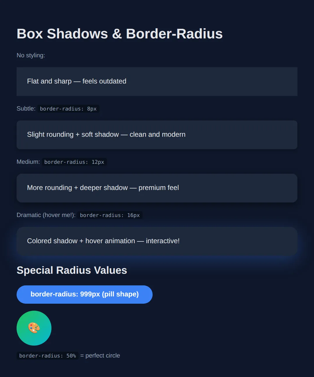
8️⃣ Modern Button Styling (With Hover Effects)
Buttons are the most clicked element on any website. They need to look clickable, feel responsive, and guide the user. Here's how professionals style them:
<!DOCTYPE html>
<html lang="en">
<head>
  <meta charset="UTF-8">
  <title>Buttons</title>
  <style>
    body {
      background-color: #020617;
      padding: 40px;
      font-family: system-ui, sans-serif;
      color: #e5e7eb;
    }
    .btn-group {
      display: flex;
      gap: 12px;
      flex-wrap: wrap;
      margin: 20px 0;
    }
    button {
      padding: 12px 24px;
      border: none;
      border-radius: 10px;
      font-size: 15px;
      font-weight: 600;
      cursor: pointer;
      transition: all 0.2s ease;
    }
    .btn-primary {
      background: #3b82f6;
      color: white;
    }
    .btn-primary:hover {
      background: #2563eb;
      transform: translateY(-1px);
      box-shadow: 0 4px 12px rgba(59, 130, 246, 0.4);
    }
    .btn-success {
      background: #22c55e;
      color: white;
    }
    .btn-success:hover {
      background: #16a34a;
      transform: translateY(-1px);
    }
    .btn-danger {
      background: #ef4444;
      color: white;
    }
    .btn-danger:hover {
      background: #dc2626;
      transform: translateY(-1px);
    }
    .btn-outline {
      background: transparent;
      border: 2px solid #3b82f6;
      color: #3b82f6;
    }
    .btn-outline:hover {
      background: #3b82f6;
      color: white;
    }
    .btn-ghost {
      background: transparent;
      color: #94a3b8;
    }
    .btn-ghost:hover {
      background: rgba(255,255,255,0.1);
      color: white;
    }
    .btn-gradient {
      background: linear-gradient(135deg, #3b82f6, #8b5cf6);
      color: white;
      border-radius: 999px;
      padding: 14px 32px;
    }
    .btn-gradient:hover {
      transform: translateY(-2px);
      box-shadow: 0 8px 24px rgba(139, 92, 246, 0.4);
    }
    .btn-lg {
      padding: 16px 40px;
      font-size: 18px;
      border-radius: 12px;
    }
    .btn-sm {
      padding: 8px 16px;
      font-size: 13px;
    }
    h3 { color: #94a3b8; margin-bottom: 8px; }
  </style>
</head>
<body>
  <h1>Button Styles</h1>

  <h3>Solid Buttons</h3>
  <div class="btn-group">
    <button class="btn-primary">Primary</button>
    <button class="btn-success">Success</button>
    <button class="btn-danger">Delete</button>
  </div>

  <h3>Outline & Ghost</h3>
  <div class="btn-group">
    <button class="btn-outline">Outline</button>
    <button class="btn-ghost">Ghost</button>
  </div>

  <h3>Gradient (Premium Feel)</h3>
  <div class="btn-group">
    <button class="btn-gradient">Get Started →</button>
  </div>

  <h3>Sizes</h3>
  <div class="btn-group" style="align-items: center;">
    <button class="btn-primary btn-sm">Small</button>
    <button class="btn-primary">Default</button>
    <button class="btn-primary btn-lg">Large</button>
  </div>
  <!-- ✅ Expected result, measured in a real browser:
     .btn-group -> display: flex
     button -> cursor: pointer
     .btn-group -> count: 4
  -->
</body>
</html>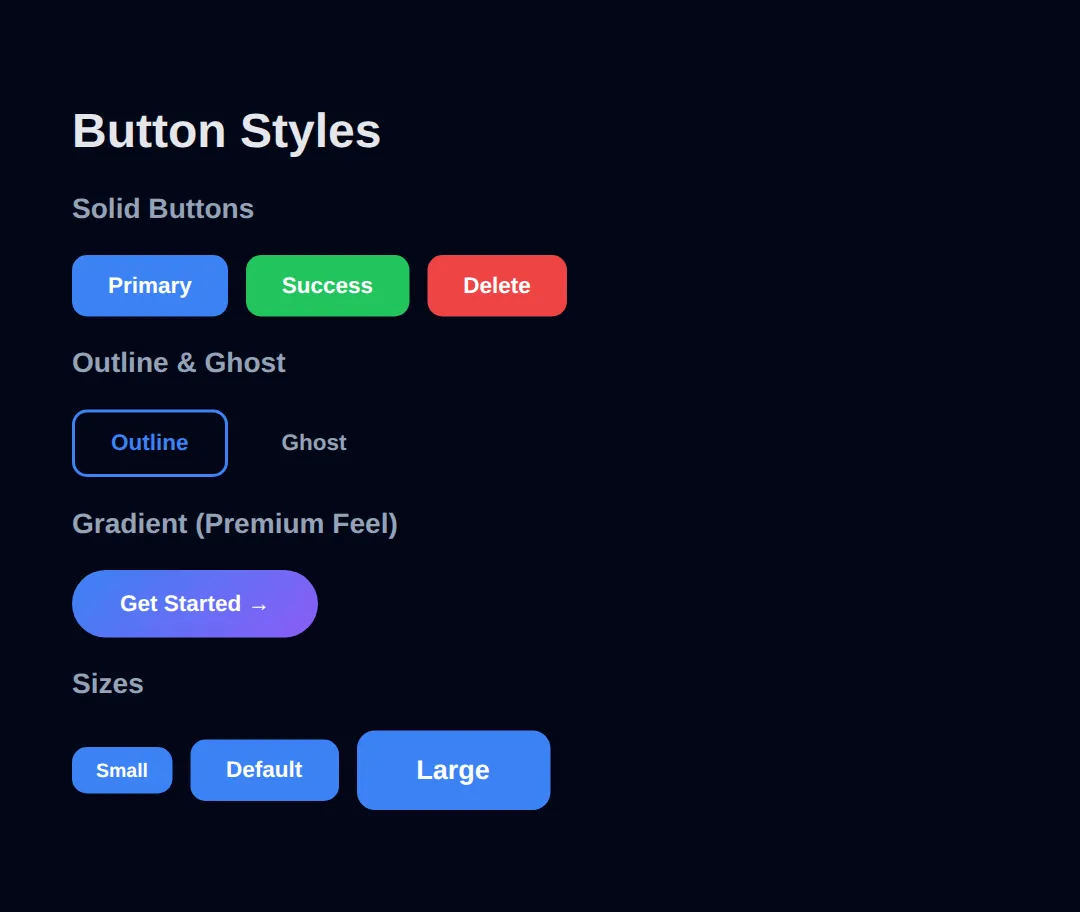
⚠️ Common Mistakes with Buttons
- ❌ Using a <div> as a button — always use <button>
- ❌ No hover effect — users don't know it's clickable
- ❌ Too small — minimum touch target should be 44×44px on mobile
- ❌ No cursor: pointer — looks broken on desktop
🎯 Your Turn: Style a Notification Card
You have now seen colours, gradients, shadows and spacing demonstrated. Time to type three of them yourself. The card below is fully built — only the three declarations that make it look designed are missing.
<!DOCTYPE html>
<html lang="en">
<head>
  <meta charset="UTF-8">
  <title>Your Turn: Notification Card</title>
  <style>
    * { box-sizing: border-box; margin: 0; padding: 0; }

    body {
      background: #020617;
      color: #e5e7eb;
      font-family: system-ui, sans-serif;
      padding: 40px;
    }

    /* 🎯 YOUR TURN — replace each ___ below. Everything else already works. */

    .card {
      max-width: 360px;
      border-radius: 16px;
      padding: 24px;

      /* 👉 1) A diagonal gradient from blue #3b82f6 to purple #8b5cf6.
             The angle goes first: 135deg points down and to the right. */
      background: linear-gradient(___);

      /* 👉 2) A soft drop shadow. Order is: x-offset y-offset blur colour.
             No sideways offset, 10px down, 25px of blur, and black at 35%
             opacity - which is a job for rgba(), not hex. */
      box-shadow: ___;
    }

    .card h2 {
      font-size: 1.25rem;
      font-weight: 700;
      margin-bottom: 8px;
      color: #ffffff;
    }

    .card p {
      font-size: .95rem;
      line-height: 1.6;

      /* 👉 3) Body text on a blue card should be a pale tint of the SAME
             blue, not plain grey. Keep hue 217 and saturation 91%, and
             set the lightness to 85%. */
      color: hsl(217, 91%, ___);
    }

    /* ✅ Expected result, measured in Chrome:
       - The card renders 360px wide with 24px of padding and a 16px radius.
       - Its computed background-image is
         linear-gradient(135deg, rgb(59, 130, 246), rgb(139, 92, 246)).
       - Its computed box-shadow is
         rgba(0, 0, 0, 0.35) 0px 10px 25px 0px.
       - The paragraph colour computes to rgb(182, 209, 252) - a pale blue
         that clearly belongs to the same family as the card behind it.
       - If the card has a flat colour instead of a blend, blank 1 is
         missing its angle or its second colour. A gradient needs two. */
  </style>
</head>
<body>
  <div class="card">
    <h2>Deploy finished</h2>
    <p>Your site went live 2 minutes ago.</p>
  </div>
</body>
</html>
background: linear-gradient(135deg, #3b82f6, #8b5cf6);
box-shadow: 0 10px 25px rgba(0, 0, 0, 0.35);
color: hsl(217, 91%, 85%);9️⃣ Design Consistency (The #1 Rule)
The single biggest difference between amateur and professional CSS is consistency. Random choices create visual chaos.
- Pick random colors for each element
- Mix 5 different fonts
- Use 13px here, 17px there, 22px somewhere else
- Padding: 8px, 15px, 23px — no system
- Use a small color palette (3-5 colors)
- Stick to 1-2 font families
- Use a size scale: 14, 16, 18, 24, 32, 48px
- Spacing system: 4, 8, 12, 16, 24, 32, 48px
💡 Pro Tip: The 60-30-10 Color Rule
Use your primary color for 60% of the design (backgrounds), a secondary color for 30% (cards, sections), and an accent color for 10% (buttons, links, highlights). This creates visual harmony automatically.
🔟 Practice Challenge: Build a Styled Landing Section
Combine everything you've learned to build a complete, professional landing section:
- Dark gradient background
- Professional typography with system fonts
- Cards with shadows, rounded corners, and hover effects
- Gradient button with hover animation
- Consistent spacing and color palette
🏆 Mini-Challenge: One Hue, A Whole Card
No blanks, no answers, and one hard constraint: every colour you write must be an hsl() with the same first number. Pick a hue you like — 217 for blue, 12 for red, 152 for green — and build the whole component out of lightness variations of it. This is how designers get a palette that looks deliberate instead of assembled from whatever hex codes were lying around.
📋 Quick Reference: CSS Styling Cheat Sheet
| Property | Best Practice |
|---|---|
| Colors | Use hex (#3b82f6) for solid, rgba for transparency |
| Fonts | system-ui for speed, 16px min body, 1.6 line-height |
| Padding | 20-24px for cards, 12-16px for buttons |
| Margin | 16-24px between sections, 0 auto to center |
| Border-radius | 8-16px for cards, 999px for pills, 50% for circles |
| Box-shadow | Subtle: 0 2px 8px rgba(0,0,0,0.3) |
| Transitions | all 0.2s ease for smooth hover effects |
Lesson Complete!
- ✓ You understand hex, RGB, RGBA, and HSL color formats
- ✓ You can create gradients for backgrounds and buttons
- ✓ You know the difference between padding and margin
- ✓ You can style professional buttons with hover effects
- ✓ You understand box-shadow and border-radius for modern design
- ✓ You know the 60-30-10 color rule for design consistency
Practice quiz
Which CSS property sets the text color of an element?
- text-color
- font-color
- color
- background-color
Answer: color. The color property sets text color; background-color sets the background fill.
What does rgba(0, 0, 0, 0.5) represent?
- Black at 50% opacity
- Pure black with no transparency
- White at 50% opacity
- An invalid color
Answer: Black at 50% opacity. In rgba(), the fourth value is the alpha (opacity); 0.5 means 50% transparent black.
Which color format is best for easily creating palette variations by adjusting lightness?
- Hex
- RGB
- RGBA
- HSL
Answer: HSL. HSL (Hue, Saturation, Lightness) lets you tweak the lightness value to create variations.
What is the difference between padding and margin?
- Padding is outside space, margin is inside
- Padding is inside space, margin is outside
- They are identical
- Padding only works on text
Answer: Padding is inside space, margin is outside. Padding is the space inside an element's border; margin is the space outside it.
Which value of border-radius makes a perfect circle on a square element?
- 50%
- 999px
- 12px
- 100px
Answer: 50%. border-radius: 50% turns a square element into a perfect circle.
What does the CSS shorthand 'margin: 0 auto;' do to a block element?
- Removes all spacing
- Centers it vertically
- Centers it horizontally
- Adds automatic padding
Answer: Centers it horizontally. margin: 0 auto sets top/bottom margin to 0 and left/right to auto, centering a block horizontally.
Which function creates a gradient that radiates outward from a point?
- linear-gradient()
- radial-gradient()
- conic-gradient()
- repeat-gradient()
Answer: radial-gradient(). radial-gradient() produces colors radiating out from a center point.
What does 'padding: 10px 20px;' mean?
- 10px on all sides
- 10px left/right, 20px top/bottom
- 10px top, 20px everywhere else
- 10px top/bottom, 20px left/right
Answer: 10px top/bottom, 20px left/right. Two values set top/bottom first, then left/right: 10px top/bottom and 20px left/right.
Which CSS property adds a drop shadow to an element's box?
- text-shadow
- box-shadow
- drop-shadow
- shadow
Answer: box-shadow. box-shadow adds shadow to an element's box; text-shadow applies only to text.
Which property controls the spacing between lines of text for readability?
- letter-spacing
- font-size
- line-height
- word-spacing
Answer: line-height. line-height sets the vertical spacing between lines of text; 1.5 to 1.8 is recommended for body text.
Continue this course
- Previous: CSS Basics & Selectors
- Next: CSS Box Model & Display — Understand margin, padding, border, and how elements take up space
- Quick reference: HTML & CSS cheat sheet › CSS Text