Complex Tables: Styling & Accessibility
Reviewed & published by Brayan K
An accessible data table uses semantic structure — <caption>, <thead>, and <th scope> header cells — so screen readers can announce each cell's row and column, while CSS keeps the table readable and responsive on small screens.
Part of the free HTML & CSS course at LearnCodingFast — hands-on lessons with examples you run in your browser, plus practice exercises and a quick quiz.
<!DOCTYPE html>
<html><head><style>
body { font-family: system-ui, sans-serif; padding: 24px; }
/* Wrapper enables horizontal scroll on narrow screens */
.table-wrapper { overflow-x: auto; border-radius: 12px; box-shadow: 0 2px 8px rgba(0,0,0,0.08); }
table { width: 100%; border-collapse: collapse; background: white; }  /* collapse = single shared borders */
caption { padding: 16px; font-weight: 700; font-size: 1.1rem; text-align: left; background: #1976D2; color: white; }
/* sticky keeps the header visible if the table is tall and scrolls */
thead th { background: #E3F2FD; color: #1565C0; padding: 12px 16px; text-align: left; font-size: 0.85rem; text-transform: uppercase; letter-spacing: 0.5px; position: sticky; top: 0; }
tbody td { padding: 12px 16px; border-bottom: 1px solid #f0f0f0; }
tbody tr:nth-child(even) { background: #FAFAFA; }   /* zebra striping = every 2nd row tinted */
tbody tr:hover { background: #F5F5F5; }             /* hover highlights the row you're scanning */
tbody tr:nth-child(even):hover { background: #F0F0F0; }
tfoot td { padding: 12px 16px; background: #F5F5F5; font-weight: 700; border-top: 2px solid #ddd; }
.status { display: inline-block; padding: 2px 10px; border-radius: 99px; font-size: 0.75rem; font-weight: 700; }
.status-active { background: #E8F5E9; color: #2E7D32; }
.status-pending { background: #FFF3E0; color: #E65100; }
.status-inactive { background: #FFEBEE; color: #C62828; }
.amount { font-family: monospace; text-align: right; }  /* right-align + monospace = tidy numbers */
</style></head><body>
<h1>Styled Data Table</h1>
<div class="table-wrapper">
  <table>
    <caption>Q4 Sales Report</caption>
    <!-- scope="col" links each header to the column below it -->
    <thead><tr><th scope="col">Name</th><th scope="col">Region</th><th scope="col">Status</th><th scope="col">Revenue</th></tr></thead>
    <tbody>
      <!-- scope="row" makes the name the row's header for screen readers -->
      <tr><th scope="row">Alice Johnson</th><td>North</td><td><span class="status status-active">Active</span></td><td class="amount">$42,500</td></tr>
      <tr><th scope="row">Bob Smith</th><td>South</td><td><span class="status status-pending">Pending</span></td><td class="amount">$31,200</td></tr>
      <tr><th scope="row">Carol Davis</th><td>East</td><td><span class="status status-active">Active</span></td><td class="amount">$58,900</td></tr>
      <tr><th scope="row">Dan Wilson</th><td>West</td><td><span class="status status-inactive">Inactive</span></td><td class="amount">$12,400</td></tr>
    </tbody>
    <tfoot><tr><td colspan="3">Total</td><td class="amount">$145,000</td></tr></tfoot>
  </table>
</div>
  <!-- ✅ Expected result, measured in a real browser:
     thead th -> position: sticky
     .status -> display: inline-block
     .amount -> count: 5
  -->
</body></html>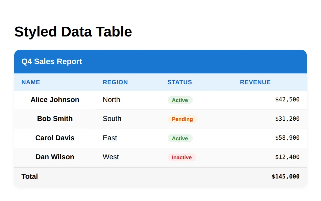
<!DOCTYPE html>
<html><head><style>
body { font-family: system-ui, sans-serif; padding: 24px; }
table { width: 100%; border-collapse: collapse; background: white; box-shadow: 0 2px 8px rgba(0,0,0,0.08); }
caption { padding: 14px; font-weight: 700; text-align: left; background: #1976D2; color: white; }
thead th { background: #E3F2FD; color: #1565C0; padding: 12px 16px; text-align: left; }
tbody td, tbody th { padding: 12px 16px; border-bottom: 1px solid #f0f0f0; text-align: left; }

/* 🎯 YOUR TURN — make this plain table easy to scan.
   Fill in the two blanks marked with ___ below. */

/* 1) Zebra striping: tint every EVEN row light grey */
tbody tr:nth-child(___) {        /* 👉 replace ___ with the keyword for even rows */
  background: #FAFAFA;
}

/* 2) Hover highlight: change the row colour when the mouse is over it */
tbody tr:___ {                   /* 👉 replace ___ with the hover state keyword */
  background: #F0F7FF;
}

/* ✅ Expected result: even rows look grey, and any row turns light blue on hover. */
</style></head><body>
<h1>Practice: Zebra + Hover</h1>
<table>
  <caption>Team Roster</caption>
  <thead><tr><th scope="col">Player</th><th scope="col">Position</th><th scope="col">Goals</th></tr></thead>
  <tbody>
    <tr><th scope="row">Maya</th><td>Forward</td><td>14</td></tr>
    <tr><th scope="row">Leo</th><td>Midfield</td><td>6</td></tr>
    <tr><th scope="row">Priya</th><td>Defence</td><td>2</td></tr>
    <tr><th scope="row">Sam</th><td>Goalkeeper</td><td>0</td></tr>
  </tbody>
</table>
</body></html>
<!DOCTYPE html>
<html><head><meta name="viewport" content="width=device-width, initial-scale=1"><style>
body { font-family: system-ui, sans-serif; padding: 24px; }
h1 { color: #1565C0; margin-bottom: 8px; }
.subtitle { color: #999; margin-bottom: 24px; }
.table-wrapper { overflow-x: auto; border-radius: 12px; border: 1px solid #e0e0e0; }
table { width: 100%; border-collapse: collapse; }
thead th { background: #f5f5f5; padding: 12px 16px; text-align: left; font-size: 0.85rem; color: #666; text-transform: uppercase; letter-spacing: 0.5px; }
tbody td { padding: 12px 16px; border-bottom: 1px solid #f0f0f0; }
tbody tr:hover { background: #fafafa; }
.avatar { width: 32px; height: 32px; border-radius: 50%; background: #E3F2FD; color: #1565C0; display: inline-flex; align-items: center; justify-content: center; font-weight: 700; font-size: 0.8rem; margin-right: 8px; vertical-align: middle; }
/* Mobile: below 600px, turn each row into a stacked card */
@media (max-width: 600px) {
thead { display: none; } /* hide the header row */
tbody tr { display: block; margin-bottom: 16px; border: 1px solid #e0e0e0; border-radius: 8px; overflow: hidden; }
tbody td { display: flex; justify-content: space-between; padding: 10px 16px; border-bottom: 1px solid #f5f5f5; }
tbody td::before { content: attr(data-label); font-weight: 700; color: #1565C0; text-transform: uppercase; font-size: 0.75rem; } /* reprint the column name */
tbody td:last-child { border-bottom: none; }
}
</style></head><body>
<h1>Responsive Table</h1>
<p class="subtitle">Resize below 600px to see card-style stacking</p>
<div class="table-wrapper">
<table>
<thead><tr><th scope="col">Employee</th><th scope="col">Role</th><th scope="col">Department</th><th scope="col">Salary</th></tr></thead>
<tbody>
<tr><td data-label="Employee"><span class="avatar">AJ</span>Alice Johnson</td><td data-label="Role">Senior Developer</td><td data-label="Department">Engineering</td><td data-label="Salary">$125,000</td></tr>
<tr><td data-label="Employee"><span class="avatar">BS</span>Bob Smith</td><td data-label="Role">Product Manager</td><td data-label="Department">Product</td><td data-label="Salary">$115,000</td></tr>
<tr><td data-label="Employee"><span class="avatar">CD</span>Carol Davis</td><td data-label="Role">UX Designer</td><td data-label="Department">Design</td><td data-label="Salary">$105,000</td></tr>
</tbody>
</table>
</div>
<!-- ✅ Expected result, measured in a real browser:
thead th -> text-transform: uppercase
.avatar -> display: inline-flex
thead -> display: table-header-group
tbody tr -> display: table-row
.avatar -> count: 3
-->
</body></html>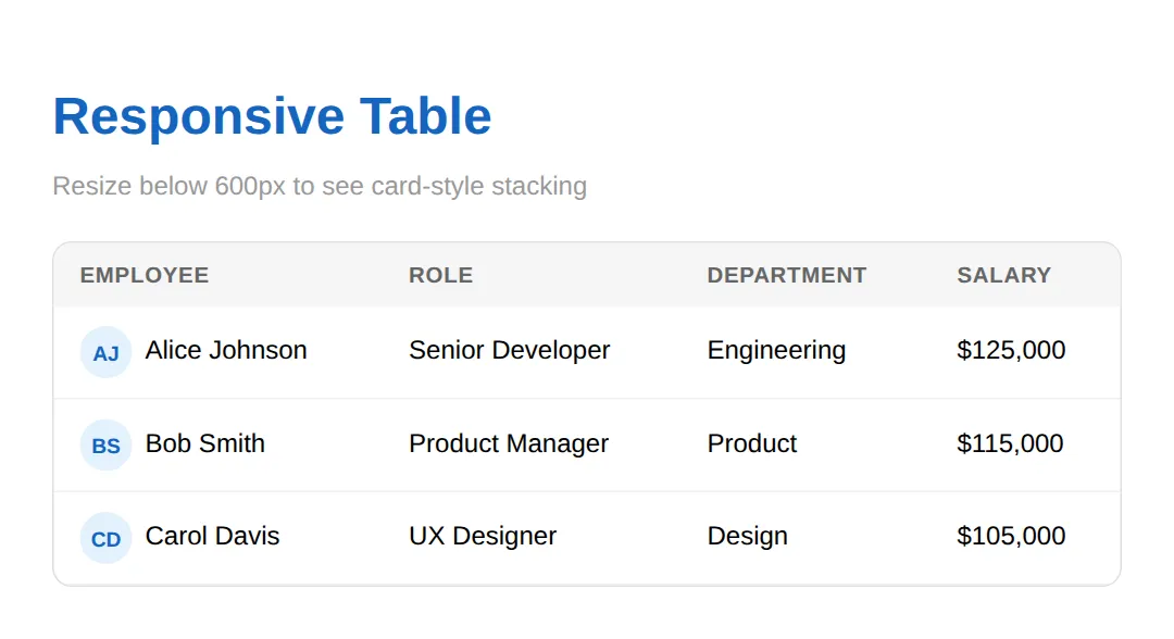
<!DOCTYPE html>
<html><head><meta name="viewport" content="width=device-width, initial-scale=1"><style>
body { font-family: system-ui, sans-serif; padding: 24px; }
table { width: 100%; border-collapse: collapse; }
thead th { background: #f5f5f5; padding: 12px 16px; text-align: left; }
tbody td { padding: 12px 16px; border-bottom: 1px solid #f0f0f0; }

/* 🎯 YOUR TURN — finish the mobile card pattern.
   The CSS is written, but the labels won't appear until you label the cells. */
@media (max-width: 600px) {
  thead { display: none; }
  tbody tr { display: block; margin-bottom: 16px; border: 1px solid #e0e0e0; border-radius: 8px; }
  tbody td { display: flex; justify-content: space-between; padding: 10px 16px; border-bottom: 1px solid #f5f5f5; }
  tbody td::before { content: attr(data-label); font-weight: 700; color: #1565C0; }  /* reads the data-label attribute */
}
</style></head><body>
<h1>Practice: Stacked Cards</h1>
<p>Shrink the preview below 600px wide.</p>
<table>
  <thead><tr><th scope="col">Book</th><th scope="col">Author</th><th scope="col">Year</th></tr></thead>
  <tbody>
    <!-- 👉 Add a data-label="..." to EACH td so the column name shows on mobile.
         Example: <td data-label="Book">Dune</td>  -->
    <tr><td>Dune</td><td>Herbert</td><td>1965</td></tr>
    <tr><td>Neuromancer</td><td>Gibson</td><td>1984</td></tr>
  </tbody>
</table>
<!-- ✅ Expected (narrow view): each value shows its column name in blue beside it, e.g. "BOOK   Dune". -->
  <!-- ✅ Expected result, measured in a real browser:
     thead -> display: table-header-group
     tbody tr -> display: table-row
  -->
</body></html>
<!DOCTYPE html>
<html><head><style>
body { font-family: system-ui, sans-serif; padding: 24px; }
h1 { color: #1565C0; margin-bottom: 16px; }
/* The scroll container: fixed height + overflow makes sticky work */
.scroll-table { max-height: 300px; overflow-y: auto; border-radius: 12px; border: 1px solid #e0e0e0; }
table { width: 100%; border-collapse: collapse; }
/* sticky + top:0 pins the header to the top of .scroll-table while you scroll */
thead th { position: sticky; top: 0; background: #1976D2; color: white; padding: 12px 16px; text-align: left; font-size: 0.85rem; z-index: 1; }
tbody td, tbody th { padding: 10px 16px; border-bottom: 1px solid #f0f0f0; text-align: left; }
tbody tr:nth-child(even) { background: #fafafa; }
tbody tr:hover { background: #f5f5f5; }
.bar { height: 8px; border-radius: 4px; background: #e0e0e0; }
.bar-fill { height: 100%; border-radius: 4px; }
.bar-high { background: #4CAF50; }
.bar-med { background: #FF9800; }
.bar-low { background: #F44336; }
td.mono { font-family: monospace; }
.info { background: #E3F2FD; padding: 16px; border-radius: 8px; margin-bottom: 16px; border-left: 4px solid #1976D2; }
</style></head><body>
<h1>Sticky Header Table</h1>
<div class="info"><strong>Scroll down</strong> inside the table — the header row stays fixed at the top. It uses <code>position: sticky; top: 0;</code> on the <code>th</code> elements.</div>
<div class="scroll-table">
<table>
<thead><tr><th scope="col">Server</th><th scope="col">CPU %</th><th scope="col">Load</th><th scope="col">Status</th></tr></thead>
<tbody>
<tr><th scope="row">web-01</th><td class="mono">23%</td><td><div class="bar"><div class="bar-fill bar-high" style="width:23%"></div></div></td><td>Healthy</td></tr>
<tr><th scope="row">web-02</th><td class="mono">67%</td><td><div class="bar"><div class="bar-fill bar-med" style="width:67%"></div></div></td><td>Warning</td></tr>
<tr><th scope="row">web-03</th><td class="mono">12%</td><td><div class="bar"><div class="bar-fill bar-high" style="width:12%"></div></div></td><td>Healthy</td></tr>
<tr><th scope="row">api-01</th><td class="mono">89%</td><td><div class="bar"><div class="bar-fill bar-low" style="width:89%"></div></div></td><td>Critical</td></tr>
<tr><th scope="row">api-02</th><td class="mono">45%</td><td><div class="bar"><div class="bar-fill bar-med" style="width:45%"></div></div></td><td>Warning</td></tr>
<tr><th scope="row">db-01</th><td class="mono">34%</td><td><div class="bar"><div class="bar-fill bar-high" style="width:34%"></div></div></td><td>Healthy</td></tr>
<tr><th scope="row">db-02</th><td class="mono">56%</td><td><div class="bar"><div class="bar-fill bar-med" style="width:56%"></div></div></td><td>Warning</td></tr>
<tr><th scope="row">cache-01</th><td class="mono">8%</td><td><div class="bar"><div class="bar-fill bar-high" style="width:8%"></div></div></td><td>Healthy</td></tr>
<tr><th scope="row">cache-02</th><td class="mono">15%</td><td><div class="bar"><div class="bar-fill bar-high" style="width:15%"></div></div></td><td>Healthy</td></tr>
<tr><th scope="row">worker-01</th><td class="mono">92%</td><td><div class="bar"><div class="bar-fill bar-low" style="width:92%"></div></div></td><td>Critical</td></tr>
</tbody>
</table>
</div>
<!-- ✅ Expected result, measured in a real browser:
thead th -> position: sticky
h1 -> color: rgb(21, 101, 192)
.mono -> count: 10
-->
</body></html>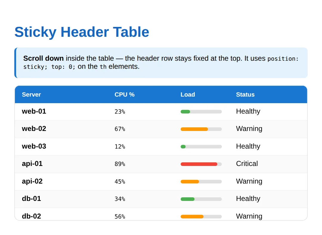
<!DOCTYPE html>
<html><head><style>
body { font-family: system-ui, sans-serif; padding: 24px; }
h1 { color: #1565C0; margin-bottom: 16px; }
table { width: 100%; border-collapse: collapse; border: 2px solid #1976D2; }
th, td { padding: 12px 16px; border: 1px solid #ddd; text-align: center; }
th { background: #E3F2FD; color: #1565C0; font-size: 0.85rem; }
.group-header { background: #1976D2; color: white; font-weight: 700; }
.row-header { background: #f5f5f5; font-weight: 600; text-align: left; }
td { font-family: monospace; }
.highlight { background: #FFF9C4; }
.info { background: #E3F2FD; padding: 16px; border-radius: 8px; margin-bottom: 16px; border-left: 4px solid #1976D2; }
</style></head><body>
<h1>colspan & rowspan</h1>
<div class="info"><strong>colspan</strong> merges cells across columns. <strong>rowspan</strong> merges cells down rows. They build multi-level layouts like schedules and financial reports.</div>
<table>
  <caption style="caption-side:top;text-align:left;font-weight:700;padding:8px 0;">Annual Revenue Report</caption>
  <tr><th class="group-header" colspan="4">Annual Revenue Report</th></tr>  <!-- 1 cell spanning 4 columns -->
  <tr><th scope="col">Quarter</th><th scope="col">Product A</th><th scope="col">Product B</th><th scope="col">Total</th></tr>
  <tr><th scope="row" class="row-header">Q1</th><td>$50K</td><td>$30K</td><td class="highlight" rowspan="2">$180K (H1)</td></tr>  <!-- spans 2 rows -->
  <tr><th scope="row" class="row-header">Q2</th><td>$60K</td><td>$40K</td></tr>
  <tr><th scope="row" class="row-header">Q3</th><td>$55K</td><td>$35K</td><td class="highlight" rowspan="2">$210K (H2)</td></tr>
  <tr><th scope="row" class="row-header">Q4</th><td>$70K</td><td>$50K</td></tr>
  <tr><th colspan="3">Grand Total</th><th>$390K</th></tr>
</table>
  <!-- ✅ Expected result, measured in a real browser:
     h1 -> color: rgb(21, 101, 192)
     table -> width: 736px
     .row-header -> count: 4
  -->
</body></html>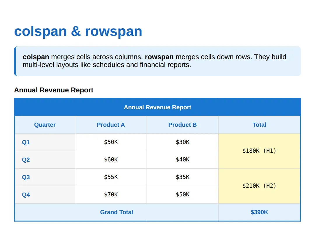
<!DOCTYPE html>
<html><head><style>
body { font-family: system-ui, sans-serif; padding: 24px; }

/* 🎯 MINI-CHALLENGE: Build a styled, accessible "Monthly Budget" table.
   Support has faded — only this outline is given. Write the HTML + CSS yourself.

   1. Wrap the table in a div with overflow-x: auto (mobile scroll safety net).
   2. Give the table a <caption> reading "Monthly Budget".
   3. <thead> with three column headers: Category, Budget, Spent (use scope="col").
   4. <tbody> with at least 3 rows; make the first cell of each row a
      <th scope="row"> (the category name).
   5. <tfoot> with a totals row — use colspan="1" or merge cells as you like.
   6. CSS: border-collapse: collapse, zebra striping on even rows,
      a tr:hover highlight, and right-align the number columns.

   ✅ Expected result: a clean report where even rows are tinted, rows
      highlight on hover, headers are bold, and numbers line up on the right.
*/

</style></head><body>
<!-- your table here -->
</body></html>| What it does | |
|---|---|
| <caption> | Title announced before the table by screen readers |
| <thead> / <tbody> / <tfoot> | Group header, data, and summary rows |
| scope="col" / "row" | Links a <th> to its column or row for accessibility |
| border-collapse: collapse | Merges cell borders into single shared lines |
| tr:nth-child(even) | Selects every second row for zebra striping |
| tr:hover | Highlights the row under the cursor |
| position: sticky; top: 0 | Pins the header while the container scrolls |
| overflow-x: auto | Lets a wide table scroll sideways on mobile |
| content: attr(data-label) | Reprints the column name in the stacked-card pattern |
| colspan / rowspan | Merge cells horizontally / vertically |
🎉 Lesson Complete
- ✅ Use <caption>, <thead>, <tbody>, <tfoot> for semantic structure
- ✅ Add scope="col" and scope="row" to every <th> for accessibility
- ✅ Zebra striping with :nth-child(even) plus tr:hover makes data easy to scan
- ✅ position: sticky; top: 0 pins headers in a scrollable container
- ✅ data-label + ::before turn rows into mobile cards; overflow-x: auto is the simple fallback
- ✅ colspan merges horizontally, rowspan merges vertically
Practice quiz
Which table section element marks the header rows?
- <tbody>
- <tfoot>
- <thead>
- <caption>
Answer: <thead>. <thead> groups the header rows; <tbody> holds the data and <tfoot> the summary/total rows.
What does scope="col" on a <th> mean?
- This header labels the whole column below it
- This header labels the row to its right
- This cell spans multiple columns
- This is the table caption
Answer: This header labels the whole column below it. scope="col" tells assistive tech the header labels the column beneath it; scope="row" labels the row.
Which CSS declaration merges adjacent cell borders into single shared lines?
- border-merge: on
- border-spacing: 0
- border-style: shared
- border-collapse: collapse
Answer: border-collapse: collapse. border-collapse: collapse merges adjacent borders so you don't get doubled lines and gaps.
Which selector applies zebra striping to every second row?
- tr:hover
- tr:nth-child(even)
- tr:first-child
- tr:checked
Answer: tr:nth-child(even). tr:nth-child(even) selects every second row, the standard way to add zebra striping.
What three things does position: sticky need to pin a table header while scrolling?
- position: sticky, a top value, and a scrolling ancestor
- display: flex, a width, and z-index
- overflow: hidden and a fixed height
- float: top and a margin
Answer: position: sticky, a top value, and a scrolling ancestor. Sticky needs position: sticky plus a top value, and a scrollable ancestor with no overflow:hidden in between.
In the stacked-card responsive pattern, what reprints the column name next to each value?
- the <caption> element
- scope="row"
- content: attr(data-label) on td::before
- a second <thead>
Answer: content: attr(data-label) on td::before. td::before with content: attr(data-label) reprints each column's name once the <thead> is hidden on mobile.
Which is the simplest way to keep a wide table usable on a narrow phone?
- Delete some columns
- Wrap it in a div with overflow-x: auto
- Use display: none on the table
- Set the table width to 100vw
Answer: Wrap it in a div with overflow-x: auto. Wrapping the table in a container with overflow-x: auto lets it scroll sideways instead of breaking the layout.
What does colspan="3" do to a table cell?
- Merges it down across 3 rows
- Repeats it 3 times
- Adds 3px of padding
- Merges it across 3 columns
Answer: Merges it across 3 columns. colspan merges a cell horizontally across the given number of columns; rowspan merges vertically.
Which element gives a table a title that screen readers announce before the cells?
- <title>
- <caption>
- <legend>
- <header>
Answer: <caption>. <caption>, placed inside the table, provides a title announced before the table's contents.
When should you NOT use a <table>?
- For financial reports
- For schedules
- For page layout
- For comparison charts
Answer: For page layout. Tables are for genuinely tabular data; using them for page layout is a 1990s anti-pattern — use Grid or Flexbox.
Continue this course
- Previous: Modern Layout Techniques (Split screens, grids, hero headers)
- Next: Print Stylesheets & Export-Friendly Layouts — Create clean print layouts and PDF-export-friendly pages
- Quick reference: HTML & CSS cheat sheet
Frequently asked questions
Why should I use thead, tbody, and tfoot instead of just rows?
These section tags tell the browser and screen readers what each part of the table means. thead marks the header rows, tbody the data, and tfoot the totals. They also unlock features you can't get otherwise: position: sticky headers work cleanly with thead, and a screen reader can announce 'table header' versus 'table body' so a blind user knows where they are.
What's the difference between scope="col" and scope="row"?
scope="col" on a <th> says 'this header labels the whole column below it' — use it in your thead. scope="row" says 'this header labels the row to its right' — use it on the first cell of a data row, like a person's name or a date. Scope is how a screen reader links each data cell back to the right header when reading across.
How do I make a wide table work on a phone?
Two patterns. The simplest is to wrap the table in a div with overflow-x: auto so it scrolls sideways. The fancier one is the data-label stacked-card pattern: with a @media query you hide the thead and turn each row into a card, then a td::before with content: attr(data-label) reprints the column name next to each value. Pick scroll for dense data, cards for readability.
Why isn't my sticky header sticking?
position: sticky needs three things to work. The element needs position: sticky AND a top value (usually top: 0). The scroll has to happen on an ancestor — put your table inside a container with a fixed max-height and overflow-y: auto. And no parent between the th and the scroll container can have overflow: hidden, or sticky silently stops working.
When should I NOT use a table?
Never use a table for page layout — that's a 1990s anti-pattern that breaks on mobile and confuses screen readers; use CSS Grid or Flexbox instead. Only use <table> for genuinely tabular data: things with rows and columns that relate to shared headers, like reports, schedules, and price comparisons.