Modern Layout Techniques
Reviewed & published by Brayan K
Modern CSS layout combines Grid and Flexbox with intrinsic sizing tools like minmax(), clamp(), and auto-fit to build layouts that respond to their content and container automatically, often with no media queries at all.
Part of the free HTML & CSS course at LearnCodingFast — hands-on lessons with examples you run in your browser, plus practice exercises and a quick quiz.
By the end of this lesson you'll build responsive layouts that adapt themselves — a card grid that reflows from many columns to one with no media queries, fluid sizes that scale with the screen, media boxes that never jump, and perfect centring in a single line — by combining CSS Grid and Flexbox the way modern sites actually do.
💡 Think of It Like This
Modern layout is like a smart bookshelf, not a fixed display case. An old fixed layout is a glass case built for exactly six items at exactly one width — add a seventh or shrink the room and it breaks. Grid and Flexbox give you an adjustable shelf instead: you say "each book needs at least 250mm, and never let one fall below that," and the shelf decides how many fit per row as the room changes size.
minmax() is the "at least this wide" rule, auto-fit is the shelf counting how many fit, and clamp() is a label that grows with the shelf but never gets silly-big or unreadably small. You describe the intent once; the browser does the rearranging — that is what "intrinsic, responsive layout" means.
1. Intrinsic Sizing — Let Content Decide
Most sizes you write are extrinsic — a number you picked, like width: 300px. Intrinsic sizing instead lets the content set the size. Three keywords do the work: min-content is the narrowest a box can be without its text overflowing (roughly the longest single word), max-content is as wide as the content wants if it never wrapped, and fit-content sits between the two: shrink to the content, but cap at the available space.
| Keyword | Meaning | Typical use |
|---|---|---|
| min-content | Narrowest without overflow (longest word) | Tags, tight buttons |
| max-content | As wide as the content unwrapped | Single-line labels |
| fit-content | Shrink to content, cap at available space | Self-sizing callouts |
Run the worked example. Each box has the same text but a different sizing keyword, so you can see how the box hugs, expands, or caps itself based on the content — no pixel widths anywhere.
<!DOCTYPE html>
<html lang="en">
<head>
  <meta charset="UTF-8">
  <title>Intrinsic sizing</title>
  <style>
    body { font-family: system-ui, sans-serif; background:#0f172a; color:#e5e7eb; padding:24px; }
    .box { background:#1e293b; border-left:4px solid #3b82f6; padding:10px 14px;
           border-radius:8px; margin:12px 0; }

    /* min-content: as narrow as possible -> wraps after the longest word. */
    .min { width: min-content; }      /* very tall, very narrow column */

    /* max-content: as wide as the text wants -> one long line, no wrapping. */
    .max { width: max-content; }      /* may overflow on small screens */

    /* fit-content: shrink to content, but never exceed the available width. */
    .fit { width: fit-content; }      /* the "just right" option */
  </style>
</head>
<body>
  <div class="box min">min-content makes me narrow</div>
  <div class="box max">max-content keeps me on one wide line</div>
  <div class="box fit">fit-content shrinks me to my text but caps at the page width</div>

  <!-- ✅ Expected: box 1 is a tall skinny column, box 2 is one long line,
       box 3 hugs its text but never wider than the page. No px widths used. -->
  <!-- ✅ Expected result, measured in a real browser:
     .box -> padding-top: 10px
     .min -> width: 61.25px
     .box -> count: 3
  -->
</body>
</html>
2. clamp() — One Value, Two Guardrails
clamp(min, preferred, max) returns a value that scales with the viewport but never crosses two limits. The middle argument usually contains a viewport unit like vw (1vw = 1% of the viewport width), so the value grows as the screen grows — until it would dip below the min or rise above the max, where it locks. One line of clamp() replaces a whole stack of breakpoints.
It shines for fluid typography (font-size: clamp(1.5rem, 4vw, 3rem)) and fluid container widths. The text or box resizes smoothly across every screen size instead of jumping at fixed breakpoints.
<!DOCTYPE html>
<html lang="en">
<head>
  <meta charset="UTF-8">
  <title>clamp()</title>
  <style>
    body { font-family: system-ui, sans-serif; background:#0f172a; color:#e5e7eb;
           margin:0; padding:24px; }

    /* Fluid width: at least 320px, ideally 90% of the viewport, at most 700px. */
    .panel {
      width: clamp(320px, 90vw, 700px);   /* never tiny, never too wide */
      margin: 0 auto;                     /* centre it horizontally */
      background:#1e293b; border-radius:12px; padding: clamp(16px, 4vw, 40px);
    }

    /* Fluid heading: scales between 1.5rem and 3rem as the screen grows. */
    h1 { font-size: clamp(1.5rem, 4vw + 1rem, 3rem); margin:0 0 8px; color:#60a5fa; }
    p  { line-height:1.7; color:#94a3b8; margin:0; }
  </style>
</head>
<body>
  <div class="panel">
    <h1>This heading scales with the screen</h1>
    <p>The panel width, its padding, and this heading all use clamp(). Resize the
       preview (use the fullscreen button and drag the window) — everything grows
       smoothly, then stops at the min and max limits.</p>
  </div>

  <!-- ✅ Expected: on a wide screen the heading is large and the panel ~700px;
       on a narrow phone the heading shrinks but never below 1.5rem. -->
  <!-- ✅ Expected result, measured in a real browser:
     .panel -> width: 700px
     h1 -> margin-top: 0px
  -->
</body>
</html>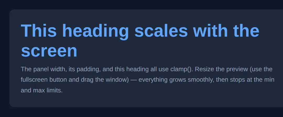
3. The Self-Reflowing Card Grid
This is the headline technique. Instead of telling Grid how many columns you want, you describe the shape of one column and let the browser fit as many as it can: grid-template-columns: repeat(auto-fit, minmax(250px, 1fr)). Read it as: "make as many columns as fit, each at least 250px wide, and let them grow to share the leftover space equally (1fr)."
As the screen narrows, fewer columns fit, so the grid drops from four to three to two to one — all by itself, with not a single media query. auto-fit collapses any empty tracks so your cards always stretch to fill the row; its sibling auto-fill keeps those empty tracks (covered in the FAQ). This is the worked example to study closely — the two "Your Turn" exercises build straight on it.
<!DOCTYPE html>
<html lang="en">
<head>
  <meta charset="UTF-8">
  <title>Responsive card grid</title>
  <style>
    * { box-sizing: border-box; margin: 0; }
    body { font-family: system-ui, sans-serif; background:#0f172a; color:#e5e7eb; padding:24px; }
    h1 { font-size: clamp(1.4rem, 3vw, 2rem); margin-bottom:16px; }

    /* The one line that does it all:
       auto-fit  -> make as many columns as fit, collapse the empties
       minmax    -> each column is at least 250px, but grows to 1fr (a fair share). */
    .cards {
      display: grid;
      grid-template-columns: repeat(auto-fit, minmax(250px, 1fr));
      gap: 16px;                 /* even spacing without margins on children */
    }

    .card {
      background:#1e293b; border-radius:12px; padding:20px;
      border-top:3px solid #3b82f6;
    }
    .card h3 { color:#60a5fa; margin-bottom:8px; }
    .card p  { color:#94a3b8; line-height:1.6; font-size:0.95rem; }
  </style>
</head>
<body>
  <h1>Resize me — the columns reflow on their own</h1>
  <div class="cards">
    <div class="card"><h3>Self-reflowing</h3><p>Wide screens show 4 columns, phones show 1 — no breakpoints.</p></div>
    <div class="card"><h3>Never too thin</h3><p>minmax(250px, ...) stops any card from squashing below 250px.</p></div>
    <div class="card"><h3>Always fills the row</h3><p>The 1fr maximum lets cards grow to share the leftover space.</p></div>
    <div class="card"><h3>One rule</h3><p>All of this is a single grid-template-columns line.</p></div>
    <div class="card"><h3>Even gaps</h3><p>gap handles spacing — no fiddly margins between cards.</p></div>
    <div class="card"><h3>Production-ready</h3><p>This is the real pattern modern sites ship.</p></div>
  </div>

  <!-- ✅ Expected: on a wide preview you see several columns; shrink it and the
       count drops smoothly to 1 — and every card stays >= 250px wide. -->
  <!-- ✅ Expected result, measured in a real browser:
     .cards -> display: grid
     h1 -> font-size: 24px
     .card -> count: 6
  -->
</body>
</html>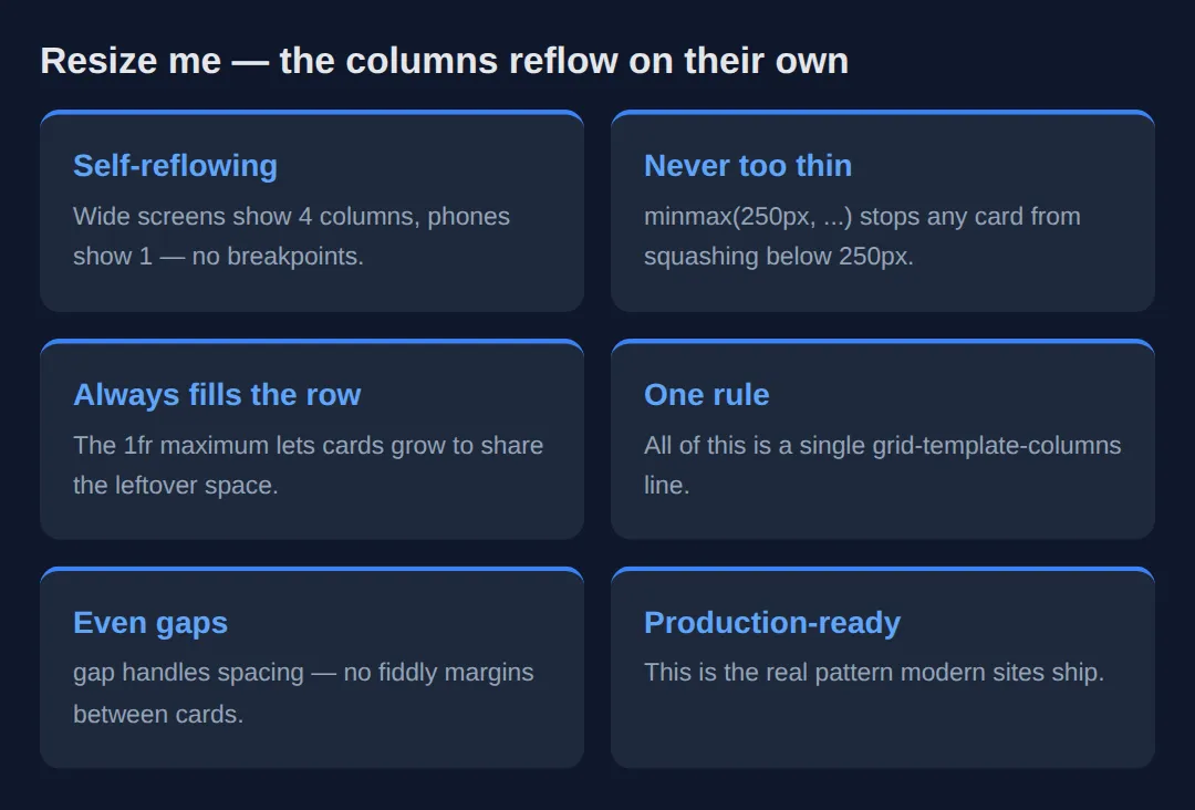
4. aspect-ratio — Reserve Space, Stop the Jump
When an image or video has a known width but its height arrives only once it loads, the page jumps as the box suddenly grows — that visible shift is "cumulative layout shift", and it hurts both the reader and your Core Web Vitals score. aspect-ratio: 16 / 9 fixes it by computing the height from the ratio and the known width before anything loads, so the slot is the right size from the start.
Set the width (or let the grid set it) and leave the height automatic — the browser fills in the missing dimension from the ratio. Pair it with an <img> using object-fit: cover so the picture fills the slot without distorting.
<!DOCTYPE html>
<html lang="en">
<head>
  <meta charset="UTF-8">
  <title>aspect-ratio</title>
  <style>
    * { box-sizing: border-box; margin: 0; }
    body { font-family: system-ui, sans-serif; background:#0f172a; color:#e5e7eb; padding:24px; }
    .gallery {
      display: grid;
      grid-template-columns: repeat(auto-fit, minmax(220px, 1fr));
      gap: 14px;
    }
    .tile {
      /* The slot is always 16:9 — height is derived from the column width. */
      aspect-ratio: 16 / 9;
      border-radius:12px;
      display: grid;
      place-items: center;             /* centre the label both ways (section 5) */
      font-weight:700; color:white;
      background: linear-gradient(135deg, #3b82f6, #8b5cf6);
    }
    .tile:nth-child(2) { background: linear-gradient(135deg, #ec4899, #f59e0b); }
    .tile:nth-child(3) { background: linear-gradient(135deg, #10b981, #06b6d4); }
    /* A square tile to prove the ratio is yours to choose. */
    .square { aspect-ratio: 1 / 1; background: linear-gradient(135deg, #6366f1, #14b8a6); }
  </style>
</head>
<body>
  <div class="gallery">
    <div class="tile">16 : 9</div>
    <div class="tile">16 : 9</div>
    <div class="tile">16 : 9</div>
    <div class="tile square">1 : 1</div>
  </div>

  <!-- ✅ Expected: the three wide tiles stay perfectly 16:9 and the last stays
       a square, no matter how wide each column becomes. No fixed heights. -->
  <!-- ✅ Expected result, measured in a real browser:
     .gallery -> display: grid
     .tile -> display: grid
     .square -> aspect-ratio: 1 / 1
     .tile -> count: 4
  -->
</body>
</html>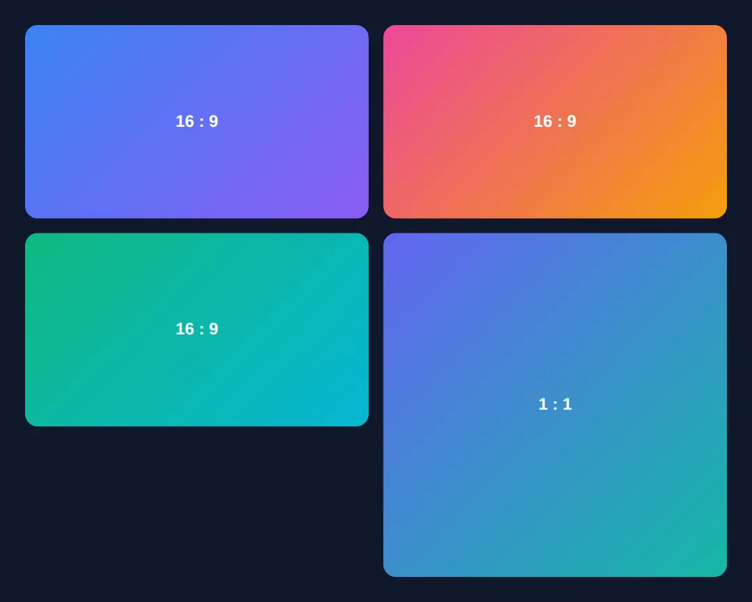
5. Perfect Centring in One Line
Centring on both axes used to need margin hacks or absolute positioning with transforms. Now, on any grid or flex container, one declaration does it: display: grid; place-items: center;. place-items is shorthand for align-items (the block / vertical axis) and justify-items (the inline / horizontal axis) at once, so center means dead-centre with no knowledge of the child's size.
The same trick works in Flexbox with display: flex; align-items: center; justify-content: center;. Use place-content instead when you want to centre the whole group of tracks rather than each item inside its cell.
<!DOCTYPE html>
<html lang="en">
<head>
  <meta charset="UTF-8">
  <title>Centring</title>
  <style>
    * { box-sizing: border-box; margin: 0; }
    /* Grid + place-items: center => the child sits dead-centre on both axes. */
    body {
      font-family: system-ui, sans-serif;
      min-height: 100vh;
      display: grid;
      place-items: center;             /* the whole trick, one line */
      background: radial-gradient(circle at 50% 30%, #1e293b, #0f172a);
      padding: 24px;
    }
    .hero {
      background:#0f172a; border:1px solid #334155; border-radius:16px;
      padding: clamp(24px, 5vw, 48px); text-align:center; max-width:420px;
      box-shadow: 0 20px 50px rgba(0,0,0,0.4);
    }
    .hero h1 { color:#60a5fa; font-size: clamp(1.5rem, 4vw, 2.2rem); margin-bottom:8px; }
    .hero p  { color:#94a3b8; line-height:1.7; }
  </style>
</head>
<body>
  <div class="hero">
    <h1>Centred without a hack</h1>
    <p>No margin: auto, no absolute positioning, no transforms — just
       display: grid and place-items: center on the body.</p>
  </div>

  <!-- ✅ Expected: the card is perfectly centred vertically and horizontally,
       at any screen size, with no knowledge of its own dimensions. -->
  <!-- ✅ Expected result, measured in a real browser:
     .hero -> max-width: 420px
     .hero h1 -> color: rgb(96, 165, 250)
  -->
</body>
</html>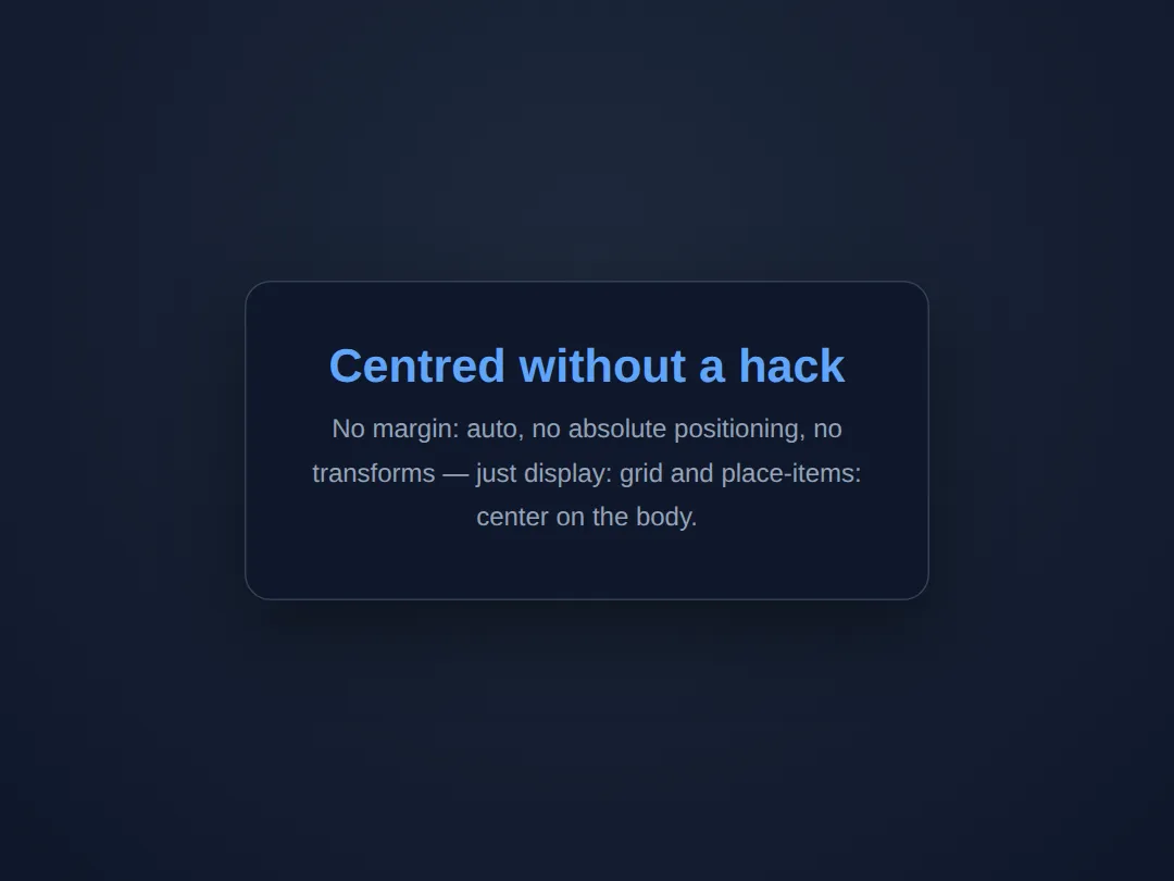
🎯 Your Turn #1 — Build the self-reflowing grid
The cards below are stacked because the grid line is missing. Fill in the blanks marked ___ to turn this into a responsive grid that reflows on its own, then run it and check the expected result in the comments.
<!DOCTYPE html>
<html lang="en">
<head>
  <meta charset="UTF-8">
  <title>Your Turn 1</title>
  <style>
    /* 🎯 YOUR TURN — fill in the blanks marked ___ */

    * { box-sizing: border-box; margin: 0; }
    body { font-family: system-ui, sans-serif; background:#0f172a; color:#e5e7eb; padding:24px; }

    .grid {
      display: grid;
      /* 1) Make as many columns as fit, each at least 240px, growing to 1fr. */
      grid-template-columns: ___;   /* 👉 use  repeat(auto-fit, minmax(240px, 1fr)) */

      /* 2) Add even spacing between the cards (try 16px). */
      ___                           /* 👉 add  gap: 16px; */
    }

    .item { background:#1e293b; border-radius:10px; padding:20px; border-top:3px solid #3b82f6; }
    .item h3 { color:#60a5fa; margin-bottom:6px; }
    .item p { color:#94a3b8; font-size:0.95rem; }
  </style>
</head>
<body>
  <div class="grid">
    <div class="item"><h3>One</h3><p>A reflowing card.</p></div>
    <div class="item"><h3>Two</h3><p>A reflowing card.</p></div>
    <div class="item"><h3>Three</h3><p>A reflowing card.</p></div>
    <div class="item"><h3>Four</h3><p>A reflowing card.</p></div>
    <div class="item"><h3>Five</h3><p>A reflowing card.</p></div>
  </div>

  <!-- ✅ Expected: a wide preview shows multiple columns with even gaps; shrink
       it and the count drops to 1 — every card stays at least 240px wide. -->
</body>
</html>
🎯 Your Turn #2 — Fixed-ratio tiles, fluid heading, centred label
Pull three of this lesson's tools together: give the heading a fluid size with clamp(), lock each tile to a 4:3 shape with aspect-ratio, and centre the label inside with place-items. Fill in the blanks, then verify against the comments.
<!DOCTYPE html>
<html lang="en">
<head>
  <meta charset="UTF-8">
  <title>Your Turn 2</title>
  <style>
    /* 🎯 YOUR TURN — fill in the blanks marked ___ */

    * { box-sizing: border-box; margin: 0; }
    body { font-family: system-ui, sans-serif; background:#0f172a; color:#e5e7eb; padding:24px; }

    /* 1) Fluid heading: at least 1.4rem, ideally 4vw, at most 2.4rem. */
    h1 { font-size: ___; margin-bottom:16px; color:#60a5fa; }  /* 👉 clamp(1.4rem, 4vw, 2.4rem) */

    .tiles { display: grid; grid-template-columns: repeat(auto-fit, minmax(200px, 1fr)); gap:14px; }

    .tile {
      /* 2) Lock every tile to a 4:3 shape, whatever its width. */
      ___                              /* 👉 add  aspect-ratio: 4 / 3; */

      /* 3) Centre the label on both axes with one line. */
      display: grid;
      ___                              /* 👉 add  place-items: center; */

      border-radius:12px; color:white; font-weight:700;
      background: linear-gradient(135deg, #3b82f6, #8b5cf6);
    }
  </style>
</head>
<body>
  <h1>Fluid, fixed-ratio, centred</h1>
  <div class="tiles">
    <div class="tile">4 : 3</div>
    <div class="tile">4 : 3</div>
    <div class="tile">4 : 3</div>
  </div>

  <!-- ✅ Expected: the heading scales with the screen; every tile keeps a 4:3
       shape at any width; each "4 : 3" label sits dead-centre in its tile. -->
</body>
</html>
🧩 Mini-Challenge — A responsive feature section from scratch
Support is faded now — only an outline is given. Build a small "Our Features" section that combines everything: a fluid heading, a self-reflowing card grid, fixed-ratio thumbnails, and a centred label. Use the worked examples in sections 2–5 as your reference if you get stuck.
<!DOCTYPE html>
<html lang="en">
<head>
  <meta charset="UTF-8">
  <title>Mini-Challenge</title>
  <style>
    /* 🧩 MINI-CHALLENGE: a responsive feature section
       1. Give <h1> a fluid size with clamp() (e.g. 1.5rem -> 2.5rem).
       2. Make a .features grid:
            grid-template-columns: repeat(auto-fit, minmax(260px, 1fr));
            and a gap between cards.
       3. Each .card has a .thumb at the top with aspect-ratio: 16 / 9
            and display:grid; place-items:center; to centre a label inside it.
       4. Below the thumb, add a card title and a short paragraph.

       ✅ Expected: wide screens show several feature cards in a row; narrowing
          the preview reflows them down to one column with no media query; every
          thumbnail keeps a 16:9 shape and its label stays centred. */

    * { box-sizing: border-box; margin: 0; }
    body { font-family: system-ui, sans-serif; background:#0f172a; color:#e5e7eb; padding:24px; }

    /* your code here */
  </style>
</head>
<body>

  <!-- your markup here: an <h1>, then a .features grid of at least three .card
       elements, each starting with a .thumb that has a centred label -->

</body>
</html>
⚠️ Common Errors (and the fix)
- Cards never grow to fill the row. Using minmax(250px, 250px) (or a bare 250px) locks the width, so wide screens leave ragged empty space. Fix: use minmax(250px, 1fr) so columns grow to share the row.
- Too much empty space with few items. auto-fill keeps empty tracks, so three cards in a five-track row sit cramped on the left. Fix: switch to auto-fit, which collapses the empties so your items stretch.
- clamp() arguments out of order. Writing clamp(3rem, 4vw, 1.5rem) (max before min) makes the value behave oddly because the order is clamp(MIN, preferred, MAX). Fix: smallest first, largest last — clamp(1.5rem, 4vw, 3rem).
- aspect-ratio seems ignored. Setting an explicit height (or letting taller content stretch the box) overrides the ratio. Fix: set only the width (or let the grid set it) and leave the height automatic so the ratio can supply it.
- place-items does nothing. place-items: center only works on a grid or flex container; on a plain block it has no effect. Fix: add display: grid (or flex) to the parent first.
📋 Quick Reference
| Goal | Use this |
|---|---|
| Size a box to its content | width: fit-content; |
| Narrowest / widest content size | min-content / max-content |
| Fluid value between limits | clamp(1.5rem, 4vw, 3rem) |
| Responsive grid, no media query | repeat(auto-fit, minmax(250px, 1fr)) |
| Keep columns when items are few | repeat(auto-fill, minmax(250px, 1fr)) |
| Reserve media space (no jump) | aspect-ratio: 16 / 9; |
| Centre on both axes (Grid) | display: grid; place-items: center; |
| Centre on both axes (Flex) | align-items: center; justify-content: center; |
🎉 Lesson Complete
You can now build layouts that adapt themselves instead of being pinned to fixed pixels. The essentials:
- ✅ Let content set the size with min-content, max-content and fit-content
- ✅ Scale a value smoothly with clamp(min, preferred, max) — no breakpoints
- ✅ Build a self-reflowing grid with repeat(auto-fit, minmax(250px, 1fr))
- ✅ auto-fit stretches items; auto-fill keeps empty tracks
- ✅ Reserve media space with aspect-ratio to stop layout shift
- ✅ Centre anything with one line: display: grid; place-items: center;
Practice quiz
Which one-line value builds a responsive card grid that reflows with no media queries?
- grid-template-columns: repeat(4, 1fr)
- grid-template-columns: repeat(auto-fit, minmax(250px, 1fr))
- grid-template-columns: auto auto auto
- grid-template-columns: 100%
Answer: grid-template-columns: repeat(auto-fit, minmax(250px, 1fr)). repeat(auto-fit, minmax(250px, 1fr)) makes as many columns as fit, each at least 250px and growing to share the row.
What does the `1fr` in `minmax(250px, 1fr)` do?
- Locks the column at 250px
- Lets the column grow to an equal share of leftover space
- Sets a 1px minimum
- Adds a 1rem gap
Answer: Lets the column grow to an equal share of leftover space. fr is a fraction of leftover space, so 1fr lets each column grow past 250px to share the row equally.
What is the difference between `auto-fit` and `auto-fill`?
- They are identical
- auto-fit collapses empty tracks so items stretch; auto-fill keeps empty tracks
- auto-fill collapses empty tracks; auto-fit keeps them
- auto-fit only works in Flexbox
Answer: auto-fit collapses empty tracks so items stretch; auto-fill keeps empty tracks. auto-fit collapses empty tracks so existing items stretch to fill the row; auto-fill keeps the empty tracks.
What is the correct argument order for `clamp()`?
- clamp(preferred, min, max)
- clamp(max, preferred, min)
- clamp(min, preferred, max)
- clamp(min, max, preferred)
Answer: clamp(min, preferred, max). clamp() takes the minimum first, the preferred (often viewport-based) value second, and the maximum last.
Which intrinsic keyword sizes a box to the narrowest it can be without overflow (roughly the longest word)?
- max-content
- fit-content
- min-content
- auto
Answer: min-content. min-content is the narrowest a box can be without its content overflowing — about the longest single word.
Which property reserves a media slot's height before the file loads to prevent layout shift?
- object-fit
- aspect-ratio
- min-height
- content-visibility
Answer: aspect-ratio. aspect-ratio (e.g. 16 / 9) computes the height from the known width up front, stopping cumulative layout shift.
For `aspect-ratio` to supply the height, what should you avoid setting?
- The width
- An explicit height
- A background color
- A border-radius
Answer: An explicit height. An explicit height overrides aspect-ratio; set only the width and leave height automatic so the ratio fills it in.
Which one line centers a child on both axes in a grid container?
- text-align: center
- place-items: center
- margin: auto
- vertical-align: middle
Answer: place-items: center. On a grid (or flex) container, place-items: center centers items on both axes; it is shorthand for align-items and justify-items.
`place-items: center` only works when the parent has which display value?
- block
- inline
- grid or flex
- table
Answer: grid or flex. place-items only takes effect on a grid or flex container; on a plain block it has no effect.
Which `clamp()` use scales a heading fluidly between two sizes?
- font-size: clamp(1.5rem, 4vw, 3rem)
- font-size: clamp(3rem, 4vw, 1.5rem)
- font-size: clamp(4vw)
- font-size: clamp(1.5rem, 3rem)
Answer: font-size: clamp(1.5rem, 4vw, 3rem). clamp(1.5rem, 4vw, 3rem) scales with the viewport but never drops below 1.5rem or exceeds 3rem.
Continue this course
- Previous: Responsive Navigation Patterns (Mobile/Tablet/Desktop)
- Next: Complex Tables: Styling, Responsiveness & Accessibility — Make data tables beautiful, responsive, and screen-reader friendly
- Quick reference: HTML & CSS cheat sheet · CSS Grid cheat sheet › Alignment
Frequently asked questions
What is the difference between auto-fit and auto-fill in a grid?
Both let the grid create as many columns as fit without you naming a number, but they treat leftover space differently. With auto-fill the grid keeps the empty column tracks it created — if three cards fit in a row that could hold five, you still have five tracks and the cards sit at their minimum width with gaps on the right. With auto-fit the empty tracks are collapsed to zero, so the items you do have stretch to share all the space. Rule of thumb: use auto-fit when you want items to grow and fill the row, and auto-fill when you want a stable column rhythm even with few items.
Why do I still need media queries if minmax() and auto-fit make the grid responsive?
For the grid's own column count, you usually don't — repeat(auto-fit, minmax(250px, 1fr)) reflows from many columns to one as the screen narrows, no breakpoint required. Media queries are still useful for changes the intrinsic math can't express: hiding a sidebar entirely, switching the whole page from a two-dimensional grid to a stack, or changing font sizes and spacing at specific widths. The modern approach is to let intrinsic sizing handle the common case and reach for a media query only for the structural jumps it can't do.
What does the 1fr in minmax(250px, 1fr) actually do?
fr means 'fraction of the leftover space', so 1fr tells each column to grow to fill an equal share of whatever room is left after the minimum is satisfied. minmax(250px, 1fr) therefore reads as 'never shrink below 250px, but happily grow past it to share the row'. Without the 1fr (e.g. minmax(250px, 250px)) the columns would be locked at 250px and leave ragged empty space on the right instead of stretching to fit.
When should I use clamp() instead of a media query for sizing?
Use clamp(min, preferred, max) whenever a value should scale smoothly with the viewport between two sensible limits — fluid font sizes, fluid padding, or a container width like clamp(320px, 90vw, 1100px). It replaces the stair-step of several breakpoints with one continuous curve, so the value is always 'as big as it can be without exceeding the max or dropping below the min'. Reach for a media query instead when you need a discrete change (a different layout, a hidden element), not a smooth scale.
How does aspect-ratio stop layout shift, and what overrides it?
aspect-ratio: 16 / 9 reserves the correct height from the ratio and the known width before any image or video loads, so the surrounding content doesn't jump when the media arrives — that jump is 'cumulative layout shift', and it hurts both UX and Core Web Vitals. The browser uses aspect-ratio to compute the missing dimension only while the other dimension is automatic; if you set an explicit height (or the content is taller than the box), that wins and the ratio is effectively ignored. So set the width and let aspect-ratio supply the height, not both.
Is place-items: center really all I need to centre something now?
For a grid or flex container, yes — display: grid; place-items: center centres a child on both axes with no magic margins, no transforms, and no knowing the child's size in advance. place-items is the shorthand for align-items and justify-items together; place-content centres the whole track group instead. The old tricks (margin: auto with a fixed width, or the absolute-position-plus-translate hack) still work but are rarely needed now that one line does it reliably.