Responsive Navigation Patterns
Reviewed & published by Brayan K
Responsive navigation is a menu that adapts to screen size, typically showing a full horizontal bar on wide screens and collapsing into a tappable hamburger drawer on mobile, all while staying keyboard-accessible and screen-reader friendly.
Part of the free HTML & CSS course at LearnCodingFast — hands-on lessons with examples you run in your browser, plus practice exercises and a quick quiz.
By the end of this lesson you'll be able to build a navbar that switches from a horizontal flexbox row on desktop to an accessible hamburger drawer on mobile — with a keyboard-usable toggle, a sticky header, and screen-reader support that actually works.
💡 Think of It Like This
A responsive nav is like a wall map versus a folding pocket map. In a big lobby (desktop) you hang the whole map flat on the wall so every destination is visible at a glance — that's your horizontal flexbox row.
Out walking (mobile) you can't carry a wall, so the same map folds into a pocket and you unfold it on request. The hamburger button is the fold: tap it and the drawer opens, tap again and it tucks away. The content is identical — only the presentation changes with the space you have. And just like a good folding map snaps shut cleanly, your menu must close properly: nothing should be left half-open where a finger, or a keyboard, can still reach a link that is meant to be hidden.
1. The Horizontal Navbar (Flexbox)
Almost every navbar is a flex container. You put the logo and the link list in one row, then use justify-content: space-between to push them to opposite ends and align-items: center to line them up vertically. The links themselves are a second flex row with a gap between them. Mark the whole thing up as <nav> with a <ul> of links — that semantic structure is what screen readers announce as "navigation".
Run the worked example. Resize the preview wide and narrow — at this stage the row never collapses; you're just seeing flexbox do the horizontal layout.
<!DOCTYPE html>
<html lang="en">
<head>
  <meta charset="UTF-8">
  <title>Flexbox navbar</title>
  <style>
    * { margin: 0; box-sizing: border-box; }
    body { font-family: system-ui, sans-serif; }

    /* The navbar is a flex row. */
    .navbar {
      display: flex;
      justify-content: space-between; /* logo to the left, links to the right */
      align-items: center;           /* everything centred on the same line */
      padding: 12px 24px;
      background: #1976D2;
      color: white;
    }
    .logo { font-weight: 800; font-size: 1.3rem; }

    /* The links are ALSO a flex row, with a gap instead of margins. */
    .nav-links {
      display: flex;
      gap: 24px;
      list-style: none;   /* drop the bullet points */
      margin: 0; padding: 0;
    }
    .nav-links a {
      color: white;
      text-decoration: none;
      font-weight: 500;
      padding: 8px;
      border-radius: 6px;
    }
    .nav-links a:hover { background: rgba(255,255,255,0.15); } /* subtle hover */
  </style>
</head>
<body>
  <nav class="navbar">
    <span class="logo">MyApp</span>
    <ul class="nav-links">
      <li><a href="#">Home</a></li>
      <li><a href="#">About</a></li>
      <li><a href="#">Services</a></li>
      <li><a href="#">Contact</a></li>
    </ul>
  </nav>

  <!-- ✅ Expected: a blue bar, "MyApp" on the left, four links spaced
       evenly on the right, all on one centred line. -->
  <!-- ✅ Expected result, measured in a real browser:
     .navbar -> display: flex
     .nav-links -> display: flex
     .nav-links a -> text-decoration-line: none
  -->
</body>
</html>
2. Make the Header Sticky
A sticky header stays pinned to the top while the page scrolls underneath it. You get it with two declarations: position: sticky and a top: 0 threshold that says "stick when you reach the top edge". Add a z-index so the header sits above the content it scrolls over.
sticky is not the same as fixed: a sticky element stays in the document flow and only "sticks" once you scroll to its threshold, so it doesn't need a manual padding-top spacer the way a fixed bar does. Watch out for one trap — sticky breaks if any ancestor has overflow: hidden.
<!DOCTYPE html>
<html lang="en">
<head>
  <meta charset="UTF-8">
  <title>Sticky header</title>
  <style>
    * { margin: 0; box-sizing: border-box; }
    body { font-family: system-ui, sans-serif; }

    .navbar {
      position: sticky;   /* stays in flow, then sticks... */
      top: 0;             /* ...once its top edge hits the viewport top */
      z-index: 100;       /* sit above the scrolling content */
      display: flex;
      justify-content: space-between;
      align-items: center;
      padding: 14px 24px;
      background: white;
      box-shadow: 0 2px 8px rgba(0,0,0,0.1); /* depth so it lifts off content */
    }
    .logo { font-weight: 800; color: #1976D2; }
    .nav-links { display: flex; gap: 20px; list-style: none; margin: 0; padding: 0; }
    .nav-links a { color: #333; text-decoration: none; font-weight: 500; }
    .nav-links a:hover { color: #1976D2; }

    .content { max-width: 700px; margin: 0 auto; padding: 24px; }
    .content p { line-height: 1.8; color: #555; margin-bottom: 16px; }
    .hint { background: #E3F2FD; padding: 14px; border-radius: 8px;
            color: #1565C0; font-weight: 600; text-align: center; }
  </style>
</head>
<body>
  <nav class="navbar">
    <span class="logo">StickyNav</span>
    <ul class="nav-links">
      <li><a href="#">Home</a></li>
      <li><a href="#">Features</a></li>
      <li><a href="#">Contact</a></li>
    </ul>
  </nav>
  <div class="content">
    <p class="hint">Scroll down — the bar stays pinned at the top.</p>
    <p>Lorem ipsum dolor sit amet, consectetur adipiscing elit. Sed do eiusmod tempor incididunt ut labore et dolore magna aliqua.</p>
    <p>Ut enim ad minim veniam, quis nostrud exercitation ullamco laboris nisi ut aliquip ex ea commodo consequat.</p>
    <p>Duis aute irure dolor in reprehenderit in voluptate velit esse cillum dolore eu fugiat nulla pariatur.</p>
    <p>Excepteur sint occaecat cupidatat non proident, sunt in culpa qui officia deserunt mollit anim id est laborum.</p>
    <p>Sed ut perspiciatis unde omnis iste natus error sit voluptatem accusantium doloremque laudantium.</p>
  </div>

  <!-- ✅ Expected: scroll the preview and the white bar stays glued to the
       top while the paragraphs slide up behind it. -->
  <!-- ✅ Expected result, measured in a real browser:
     .navbar -> display: flex
     .nav-links -> display: flex
     .nav-links a -> text-decoration-line: none
  -->
</body>
</html>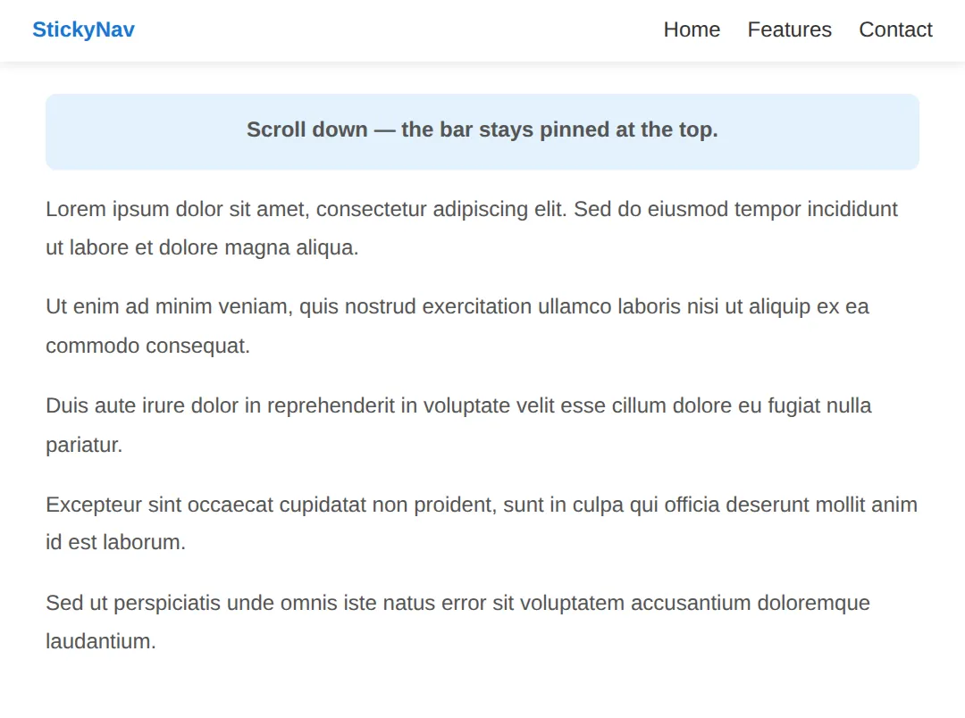
3. The Accessible Hamburger Toggle
On mobile the horizontal links don't fit, so you hide them and show a hamburger button (the ☰ icon) that opens them on demand. The single most important rule: the toggle must be a real <button>, not a <div>. A button is focusable, fires on Enter and Space for free, and is announced as a button — a div is none of those things.
Wire up the accessibility with three attributes: aria-controls names the menu it opens, aria-expanded reports open or closed (you must flip it in JavaScript every toggle), and aria-label gives the icon-only button a name. When the menu closes it goes to display: none so its links leave the tab order — a hidden link must never stay focusable.
<!DOCTYPE html>
<html lang="en">
<head>
  <meta charset="UTF-8">
  <meta name="viewport" content="width=device-width, initial-scale=1">
  <title>Accessible hamburger</title>
  <style>
    * { margin: 0; box-sizing: border-box; }
    body { font-family: system-ui, sans-serif; }

    .navbar {
      display: flex; justify-content: space-between; align-items: center;
      padding: 12px 24px; background: #1976D2; color: white;
    }
    .logo { font-weight: 800; font-size: 1.2rem; }

    /* The toggle is a real <button>: focusable + Enter/Space for free. */
    .hamburger {
      background: none; border: none; color: white;
      font-size: 1.6rem; cursor: pointer; padding: 6px 10px;
      border-radius: 6px;
    }
    /* A visible focus ring so keyboard users can see where they are. */
    .hamburger:focus-visible { outline: 3px solid #FFD54F; outline-offset: 2px; }

    /* Closed menu: display:none removes the links from BOTH the
       screen and the tab order — hidden links must not be focusable. */
    .menu {
      list-style: none; margin: 0; padding: 0;
      background: #1565C0; display: none;
    }
    .menu.open { display: block; }   /* toggled by JavaScript */
    .menu a {
      display: block; padding: 14px 24px; color: white;
      text-decoration: none; border-top: 1px solid rgba(255,255,255,0.12);
    }
    .menu a:hover, .menu a:focus-visible { background: rgba(255,255,255,0.12); }
  </style>
</head>
<body>
  <nav class="navbar">
    <span class="logo">MyApp</span>
    <button class="hamburger" id="toggle"
            aria-controls="menu"      /* names the element it opens */
            aria-expanded="false"     /* JS flips this true/false */
            aria-label="Open menu">☰</button>
  </nav>

  <ul class="menu" id="menu">
    <li><a href="#">Home</a></li>
    <li><a href="#">About</a></li>
    <li><a href="#">Services</a></li>
    <li><a href="#">Contact</a></li>
  </ul>

  <script>
    var btn  = document.getElementById('toggle');
    var menu = document.getElementById('menu');

    function setOpen(open) {
      menu.classList.toggle('open', open);
      // Keep the screen reader in sync EVERY time we toggle.
      btn.setAttribute('aria-expanded', open ? 'true' : 'false');
      btn.setAttribute('aria-label', open ? 'Close menu' : 'Open menu');
    }

    btn.addEventListener('click', function () {
      setOpen(!menu.classList.contains('open'));
    });

    // Escape closes the menu and returns focus to the button.
    document.addEventListener('keydown', function (e) {
      if (e.key === 'Escape' && menu.classList.contains('open')) {
        setOpen(false);
        btn.focus();
      }
    });
  </script>

  <!-- ✅ Try it: click ☰ to open/close. Then Tab to the button and press
       Enter or Space — it works because it's a real <button>. Open it and
       press Escape — it closes and focus jumps back to the button. -->
  <!-- ✅ Expected result, measured in a real browser:
     .navbar -> display: flex
     .hamburger -> cursor: pointer
     .menu -> display: none
  -->
</body>
</html>
4. The Off-Canvas Drawer
A polished mobile menu often slides in from the side as a drawer (also called off-canvas). You park the panel off-screen with transform: translateX(-100%) and slide it back to translateX(0) when open. Animating transform (not left) keeps the motion smooth.
Because the open drawer covers the page, a keyboard user could otherwise tab into the hidden content behind it. The accessible answer is to remove the drawer from the tab order while it is closed — here the closed drawer carries visibility: hidden, which both hides it and pulls its links out of focus order, then flips to visible when open. A dimmed backdrop also closes the drawer when clicked.
<!DOCTYPE html>
<html lang="en">
<head>
  <meta charset="UTF-8">
  <meta name="viewport" content="width=device-width, initial-scale=1">
  <title>Off-canvas drawer</title>
  <style>
    * { margin: 0; box-sizing: border-box; }
    body { font-family: system-ui, sans-serif; }

    .navbar {
      display: flex; align-items: center; gap: 12px;
      padding: 12px 24px; background: #1976D2; color: white;
    }
    .hamburger {
      background: none; border: none; color: white;
      font-size: 1.6rem; cursor: pointer; padding: 6px 10px; border-radius: 6px;
    }
    .hamburger:focus-visible { outline: 3px solid #FFD54F; outline-offset: 2px; }
    .logo { font-weight: 800; }

    /* Backdrop: invisible until the drawer opens. */
    .backdrop {
      position: fixed; inset: 0; background: rgba(0,0,0,0.4);
      opacity: 0; visibility: hidden; transition: opacity 0.25s; z-index: 90;
    }
    .backdrop.open { opacity: 1; visibility: visible; }

    /* The drawer sits off-screen to the left until opened. */
    .drawer {
      position: fixed; top: 0; left: 0; bottom: 0; width: 260px;
      background: white; z-index: 100;
      transform: translateX(-100%);   /* parked off-screen */
      visibility: hidden;             /* and out of the tab order */
      transition: transform 0.25s ease, visibility 0.25s;
      box-shadow: 2px 0 16px rgba(0,0,0,0.2);
    }
    .drawer.open {
      transform: translateX(0);       /* slide into view */
      visibility: visible;            /* now focusable */
    }
    .drawer a {
      display: block; padding: 16px 24px; color: #333;
      text-decoration: none; border-bottom: 1px solid #eee;
    }
    .drawer a:hover, .drawer a:focus-visible { background: #f3f6fb; }

    .content { padding: 24px; max-width: 600px; margin: 0 auto; }
    .content p { line-height: 1.8; color: #555; }
  </style>
</head>
<body>
  <nav class="navbar">
    <button class="hamburger" id="toggle"
            aria-controls="drawer" aria-expanded="false"
            aria-label="Open menu">☰</button>
    <span class="logo">DrawerApp</span>
  </nav>

  <div class="backdrop" id="backdrop"></div>

  <nav class="drawer" id="drawer" aria-label="Main menu">
    <a href="#">Home</a>
    <a href="#">About</a>
    <a href="#">Services</a>
    <a href="#">Contact</a>
  </nav>

  <div class="content">
    <h1>Off-canvas menu</h1>
    <p>Tap ☰ to slide the drawer in from the left. Tap the dark backdrop,
       or press Escape, to close it.</p>
  </div>

  <script>
    var btn      = document.getElementById('toggle');
    var drawer   = document.getElementById('drawer');
    var backdrop = document.getElementById('backdrop');

    function setOpen(open) {
      drawer.classList.toggle('open', open);
      backdrop.classList.toggle('open', open);
      btn.setAttribute('aria-expanded', open ? 'true' : 'false');
      btn.setAttribute('aria-label', open ? 'Close menu' : 'Open menu');
    }

    btn.addEventListener('click', function () {
      setOpen(!drawer.classList.contains('open'));
    });
    backdrop.addEventListener('click', function () { setOpen(false); });

    document.addEventListener('keydown', function (e) {
      if (e.key === 'Escape' && drawer.classList.contains('open')) {
        setOpen(false);
        btn.focus();   // send focus back to the trigger
      }
    });
  </script>

  <!-- ✅ Expected: ☰ slides a white panel in from the left over a dark
       backdrop; clicking the backdrop or pressing Escape closes it and
       focus returns to the button. -->
  <!-- ✅ Expected result, measured in a real browser:
     .navbar -> display: flex
     .hamburger -> cursor: pointer
     .backdrop -> position: fixed
  -->
</body>
</html>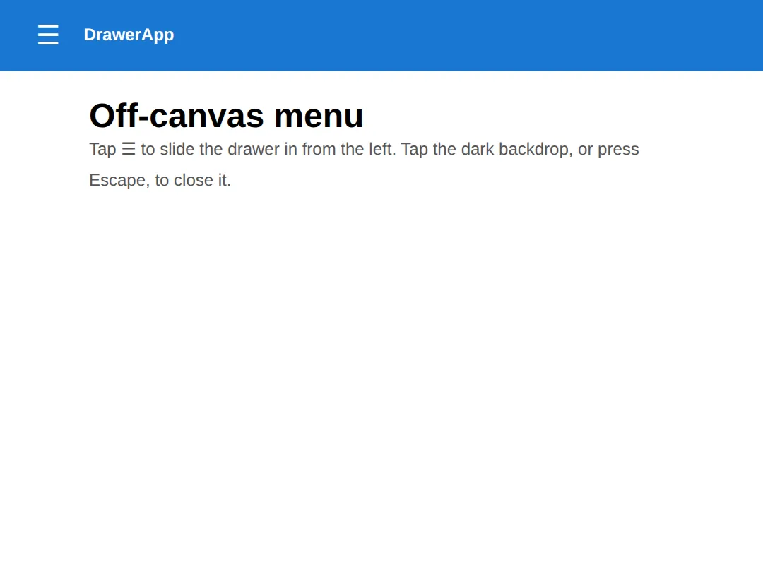
5. CSS-Only Checkbox Toggle vs JavaScript
You can open a menu with zero JavaScript using the "checkbox hack". A hidden <input type="checkbox"> stores the open/closed state, a <label> toggles it, and the :checked pseudo-class reveals the menu in pure CSS. It's clever and works offline.
The trade-off is accessibility. A checkbox is announced as a checkbox, not a menu button, and you can't easily expose aria-expanded or wire up Escape. So treat the checkbox pattern as a fallback; for real products prefer the JavaScript <button> from section 3. The example below shows the pure-CSS version so you can see the mechanism.
<!DOCTYPE html>
<html lang="en">
<head>
  <meta charset="UTF-8">
  <meta name="viewport" content="width=device-width, initial-scale=1">
  <title>Checkbox-hack menu</title>
  <style>
    * { margin: 0; box-sizing: border-box; }
    body { font-family: system-ui, sans-serif; }

    .navbar { background: #1976D2; color: white; padding: 12px 24px;
              display: flex; align-items: center; gap: 12px; }
    .logo { font-weight: 800; }

    /* 1) The checkbox holds the state but is hidden from view. */
    #nav-toggle { display: none; }

    /* 2) The label is what the user actually clicks. */
    .burger { font-size: 1.6rem; cursor: pointer; user-select: none; }

    /* 3) Menu starts hidden. */
    .menu { list-style: none; margin: 0; padding: 0;
            background: #1565C0; display: none; }
    .menu a { display: block; padding: 14px 24px; color: white;
              text-decoration: none; border-top: 1px solid rgba(255,255,255,0.12); }

    /* 4) When the checkbox is :checked, show the menu.
          The ~ selects the .menu that follows the checkbox. */
    #nav-toggle:checked ~ .menu { display: block; }
  </style>
</head>
<body>
  <nav class="navbar">
    <span class="logo">NoJS</span>
    <input type="checkbox" id="nav-toggle">
    <label class="burger" for="nav-toggle">☰</label>
  </nav>

  <ul class="menu">
    <li><a href="#">Home</a></li>
    <li><a href="#">About</a></li>
    <li><a href="#">Services</a></li>
    <li><a href="#">Contact</a></li>
  </ul>

  <!-- ✅ Expected: clicking ☰ shows/hides the menu with NO JavaScript.
       Note the cost: a screen reader calls this a checkbox, not a menu
       button — which is exactly why production code prefers a real
       <button> with aria-expanded. -->
  <!-- ✅ Expected result, measured in a real browser:
     .navbar -> display: flex
     #nav-toggle -> display: none
     .burger -> cursor: pointer
     .menu -> display: none
  -->
</body>
</html>
🎯 Your Turn #1 — Wire up the ARIA on a toggle
The menu opens and closes, but the screen-reader wiring is missing. Fill in the blanks marked ___ so the button reports its state, then run it and check the expected result in the comments.
<!DOCTYPE html>
<html lang="en">
<head>
  <meta charset="UTF-8">
  <meta name="viewport" content="width=device-width, initial-scale=1">
  <title>Your Turn 1</title>
  <style>
    * { margin: 0; box-sizing: border-box; }
    body { font-family: system-ui, sans-serif; }
    .navbar { background:#1976D2; color:white; padding:12px 24px;
              display:flex; justify-content:space-between; align-items:center; }
    .logo { font-weight:800; }
    .hamburger { background:none; border:none; color:white;
                 font-size:1.6rem; cursor:pointer; padding:6px 10px; }
    .hamburger:focus-visible { outline:3px solid #FFD54F; outline-offset:2px; }
    .menu { list-style:none; margin:0; padding:0; background:#1565C0; display:none; }
    .menu.open { display:block; }
    .menu a { display:block; padding:14px 24px; color:white; text-decoration:none; }
  </style>
</head>
<body>
  <!-- 🎯 YOUR TURN — fill in the blanks marked ___ -->
  <nav class="navbar">
    <span class="logo">MyApp</span>

    <!-- 1) Point the button at the menu it opens.  -->
    <button class="hamburger" id="toggle"
            ___                       /* 👉 add:  aria-controls="menu" */
            aria-expanded="false"
            aria-label="Open menu">☰</button>
  </nav>

  <ul class="menu" id="menu">
    <li><a href="#">Home</a></li>
    <li><a href="#">About</a></li>
    <li><a href="#">Contact</a></li>
  </ul>

  <script>
    var btn  = document.getElementById('toggle');
    var menu = document.getElementById('menu');

    btn.addEventListener('click', function () {
      var open = menu.classList.toggle('open');

      // 2) Keep the screen reader in sync: set aria-expanded to
      //    "true" when open, "false" when closed.
      btn.setAttribute('aria-expanded', ___);  /* 👉 use  open ? 'true' : 'false' */
    });
  </script>

  <!-- ✅ Expected: clicking ☰ opens the menu AND the button's
       aria-expanded flips to "true" (check it in DevTools); clicking
       again closes the menu and flips it back to "false". -->
</body>
</html>
🎯 Your Turn #2 — Collapse the navbar at a breakpoint
This navbar shows the links on every width and the hamburger is always hidden. Add a media query so that below 768px the links hide and the hamburger appears. Fill in the blanks, then resize the preview to check.
<!DOCTYPE html>
<html lang="en">
<head>
  <meta charset="UTF-8">
  <meta name="viewport" content="width=device-width, initial-scale=1">
  <title>Your Turn 2</title>
  <style>
    * { margin: 0; box-sizing: border-box; }
    body { font-family: system-ui, sans-serif; }
    .navbar { background:#1976D2; color:white; padding:12px 24px;
              display:flex; justify-content:space-between; align-items:center; }
    .logo { font-weight:800; }
    .nav-links { display:flex; gap:20px; list-style:none; margin:0; padding:0; }
    .nav-links a { color:white; text-decoration:none; font-weight:500; }

    /* The hamburger is hidden on desktop... */
    .hamburger { display:none; background:none; border:none; color:white;
                 font-size:1.6rem; cursor:pointer; }

    /* 🎯 YOUR TURN — fill in the blanks marked ___ */
    @media (max-width: 768px) {
      /* 1) Hide the horizontal links on narrow screens. */
      .nav-links { ___ }          /* 👉 add:  display: none; */

      /* 2) Show the hamburger button instead. */
      .hamburger { ___ }          /* 👉 add:  display: block; */
    }
  </style>
</head>
<body>
  <nav class="navbar">
    <span class="logo">MyApp</span>
    <ul class="nav-links">
      <li><a href="#">Home</a></li>
      <li><a href="#">About</a></li>
      <li><a href="#">Contact</a></li>
    </ul>
    <button class="hamburger" aria-label="Open menu" aria-expanded="false">☰</button>
  </nav>

  <!-- ✅ Expected: wide preview shows the links and NO hamburger; drag the
       preview below 768px and the links vanish while ☰ appears. -->
</body>
</html>
🧩 Mini-Challenge — A complete responsive navbar
Support is faded now — only an outline is given. Build a sticky navbar that is horizontal on desktop and collapses to an accessible hamburger drawer on mobile. Use the worked examples in sections 2, 3 and 4 as your reference if you get stuck.
<!DOCTYPE html>
<html lang="en">
<head>
  <meta charset="UTF-8">
  <meta name="viewport" content="width=device-width, initial-scale=1">
  <title>Mini-Challenge</title>
  <style>
    /* 🧩 MINI-CHALLENGE: a full responsive navbar
       1. Style .navbar as a sticky flex row (position: sticky; top: 0;
            display: flex; justify-content: space-between; align-items: center)
       2. Style .nav-links as a horizontal flex row with a gap; hide
            list bullets
       3. Hide .hamburger by default (display: none)
       4. In @media (max-width: 768px): hide .nav-links and the menu by
            default, show .hamburger, and add a .nav-links.open rule that
            displays the links as a vertical list
       5. Give .hamburger:focus-visible a visible outline

       ✅ Expected: wide screens show a sticky horizontal navbar; below
          768px the links collapse and ☰ appears. Clicking ☰ toggles the
          menu AND flips aria-expanded, and Tab + Enter operate the button. */

    /* your CSS here */
  </style>
</head>
<body>

  <!-- your markup here:
       a <nav class="navbar"> with a .logo, a <ul class="nav-links">,
       and a real <button class="hamburger"> carrying aria-controls,
       aria-expanded and aria-label -->

  <script>
    /* your toggle here:
       on click, toggle the 'open' class on .nav-links and set
       aria-expanded to match (open ? 'true' : 'false') */
  </script>

</body>
</html>
⚠️ Common Errors (and the fix)
- No aria-expanded (or it never updates). A screen-reader user can't tell whether the menu is open. Setting aria-expanded="false" once in the HTML isn't enough either. Fix: call btn.setAttribute('aria-expanded', open ? 'true' : 'false') inside the toggle handler so it tracks the real state.
- Hidden but still focusable. Hiding a menu with only opacity: 0 (or moving it off-screen) leaves its links in the tab order — keyboard users tab into an invisible menu. Fix: close with display: none or visibility: hidden, which remove the links from focus order too.
- Not keyboard accessible. Using a <div> or <span> with an onclick for the toggle can't be reached by Tab and ignores Enter/Space. Fix: use a real <button> — it's focusable and fires on both keys automatically.
- Missing focus trap / no Escape. With a full-screen drawer open, Tab can wander into the page hidden behind it, and there's no quick way out. Fix: at minimum, let Escape close the drawer and return focus to the button; for a covering overlay, also keep Tab cycling inside the open menu (a focus trap).
- Sticky header won't stick. position: sticky; top: 0; does nothing if an ancestor has overflow: hidden/auto/scroll or you forgot the top threshold. Fix: remove the overflow rule on parents and make sure you set top: 0.
📋 Quick Reference
| Goal | Use this |
|---|---|
| Horizontal navbar | display: flex; justify-content: space-between; align-items: center; |
| Space the links | .nav-links { display: flex; gap: 24px; } |
| Sticky header | position: sticky; top: 0; z-index: 100; |
| Accessible toggle | <button aria-controls="menu" aria-expanded="false"> |
| Keep ARIA in sync | btn.setAttribute('aria-expanded', open ? 'true' : 'false') |
| Collapse on mobile | @media (max-width: 768px) { .nav-links { display: none; } } |
| Off-canvas drawer | transform: translateX(-100%) → translateX(0) |
| Hide and unfocus | display: none / visibility: hidden |
| CSS-only toggle | #nav-toggle:checked ~ .menu { display: block; } |
🎉 Lesson Complete
You can now build a navbar that works on every screen and for every user. The essentials:
- ✅ A navbar is a flexbox row — space-between + align-items: center
- ✅ position: sticky; top: 0; pins the header while the page scrolls
- ✅ The mobile toggle must be a real <button> with aria-controls and aria-expanded
- ✅ Update aria-expanded on every toggle, and let Escape close + return focus
- ✅ Hide closed menus with display: none/visibility: hidden so links leave the tab order
- ✅ A drawer slides with transform: translateX; the checkbox hack is a no-JS fallback, not the accessible default
Practice quiz
Which flexbox declarations create the classic 'logo left, links right, vertically centered' navbar?
- display: grid; place-items: center
- display: block; text-align: center
- display: flex; justify-content: space-between; align-items: center
- display: inline-flex; gap: auto
Answer: display: flex; justify-content: space-between; align-items: center. justify-content: space-between pushes the logo and links to opposite ends, and align-items: center lines them up vertically.
What two declarations make a header stick to the top while the page scrolls?
- position: sticky; top: 0
- position: fixed; bottom: 0
- position: absolute; top: 0
- display: sticky; z-index: 0
Answer: position: sticky; top: 0. position: sticky plus a top: 0 threshold pins the header once it reaches the top edge, while staying in the document flow.
A common reason position: sticky silently fails is that an ancestor has which property?
- display: flex
- margin: 0 auto
- z-index: 100
- overflow: hidden (or auto/scroll)
Answer: overflow: hidden (or auto/scroll). An ancestor with overflow: hidden/auto/scroll creates a scroll container the sticky element sticks inside, breaking the expected behaviour.
Why must a hamburger toggle be a real <button> rather than a <div>?
- Divs cannot have a background
- A button is focusable, fires on Enter/Space, and is announced as a button
- Buttons load faster
- Divs cannot be clicked
Answer: A button is focusable, fires on Enter/Space, and is announced as a button. A real <button> is keyboard-focusable, responds to Enter and Space for free, and is announced as a button to screen readers — a div is none of those.
What does the aria-expanded attribute communicate on a menu toggle?
- Whether the controlled menu is currently open or closed
- The menu's animation speed
- The menu's width
- The number of menu items
Answer: Whether the controlled menu is currently open or closed. aria-expanded reports open (true) or closed (false). You must update it in JavaScript on every toggle so assistive tech stays in sync.
Which ARIA attribute names the element a toggle button opens?
- aria-label
- aria-hidden
- aria-controls
- aria-live
Answer: aria-controls. aria-controls points at the id of the menu the button opens, linking the trigger to the controlled element.
Why hide a closed mobile menu with display: none rather than just opacity: 0?
- opacity is slower
- display: none removes the links from the tab order; opacity: 0 leaves them focusable
- opacity: 0 is invalid CSS
- display: none animates better
Answer: display: none removes the links from the tab order; opacity: 0 leaves them focusable. An opacity: 0 menu is invisible but still in the tab order, so keyboard users tab into hidden links. display: none (or visibility: hidden) removes them from focus order.
What transform parks an off-canvas drawer off-screen to the left, ready to slide in?
- translateY(-100%)
- scale(0)
- rotate(-90deg)
- translateX(-100%)
Answer: translateX(-100%). translateX(-100%) pushes the drawer fully off the left edge; animating transform back to translateX(0) slides it in smoothly.
In the CSS-only 'checkbox hack' menu, what reveals the menu?
- A :hover rule on the body
- The :checked pseudo-class on the hidden checkbox
- An onclick attribute
- A media query
Answer: The :checked pseudo-class on the hidden checkbox. A hidden <input type="checkbox"> holds the state and #toggle:checked ~ .menu { display: block; } reveals the menu in pure CSS.
What is the minimum keyboard behaviour every toggle menu should provide?
- Arrow keys to scroll
- Tab disables the menu
- Escape closes the menu and returns focus to the trigger button
- Spacebar reloads the page
Answer: Escape closes the menu and returns focus to the trigger button. At minimum, pressing Escape should close the menu and send focus back to the button that opened it.
Continue this course
- Previous: SVG Mastery: Paths, Gradients, Filters, Animation
- Next: Modern Layout Techniques (Split screens, grids, hero headers) — Recreate real-world page layouts with modern CSS techniques
- Quick reference: HTML & CSS cheat sheet
Frequently asked questions
Why does aria-expanded matter on a hamburger button?
A sighted user can see whether the menu is open or shut. A screen-reader user cannot — all they hear is the button's name. aria-expanded="false" tells assistive tech the button controls something that is currently collapsed; flipping it to "true" when the menu opens announces "expanded". Without it the user has no idea the button did anything, or whether the menu is already open. You must update the attribute in JavaScript every time you toggle the menu — setting it once in the HTML is not enough.
Should I use display:none or visibility/opacity to hide the mobile menu?
Both fully remove the element from the accessibility tree and the tab order, which is what you want for a closed menu — a hidden link must not be focusable. display:none is the simplest and most reliable. The catch is that display cannot be animated, so if you want a slide or fade you animate transform/opacity for the motion and still toggle a state that removes it from focus when closed (for example a hidden attribute or display:none at the end of the transition). Never hide a menu with only opacity:0 or visibility:hidden left half-on, because the links stay clickable and tabbable while invisible.
What is a focus trap and do I need one?
A focus trap keeps keyboard focus inside an open overlay so Tab cycles through the menu's links instead of escaping to the page behind it. You need one for a full-screen or off-canvas drawer that visually covers the page — otherwise a keyboard user tabs into content they cannot see. For a simple dropdown that sits in the flow you usually do not trap focus; you just make sure Escape closes it and returns focus to the button. The minimum every toggle menu needs is: Escape closes it, and focus returns to the trigger button on close.
Can I build a mobile menu with no JavaScript at all?
Yes — the "checkbox hack" uses a hidden <input type="checkbox"> plus a <label> as the toggle, and the :checked pseudo-class reveals the menu in pure CSS. It works without JS, which is its appeal. The downside is accessibility: a checkbox is announced as a checkbox, not a menu button, and you cannot easily expose aria-expanded state or wire up Escape. For production, a real <button> with a few lines of JavaScript is the more accessible choice; reach for the checkbox hack only when JS is genuinely unavailable.
Why is my sticky header not sticking?
position: sticky only works if the element has a threshold to stick to (you set top: 0) and none of its ancestors clip or hide overflow. The most common cause is an ancestor with overflow: hidden, auto, or scroll — that creates a scroll container the sticky element sticks inside of, which usually is not the page. Also check the element is a direct, full-height-enough child of the scrolling area and that you actually gave it top: 0. Remove stray overflow rules on parents first.
Where should the hamburger menu break to mobile?
There is no magic number — the right breakpoint is wherever your horizontal links stop fitting comfortably, which you find by shrinking the window until they crowd or wrap. A common starting point is around 768px, but a nav with eight long items may need to switch sooner and a nav with three short items can stay horizontal longer. Design mobile-first: write the small-screen layout as the default, then add a min-width media query that lays the links out horizontally once there is room.