SVG Mastery: Paths, Gradients, Animation
Reviewed & published by Brayan K
SVG (Scalable Vector Graphics) is an XML-based markup format for drawing shapes, paths, text, and gradients that stay perfectly crisp at any size, and because it lives in the DOM you can style and animate it directly with CSS.
Part of the free HTML & CSS course at LearnCodingFast — hands-on lessons with examples you run in your browser, plus practice exercises and a quick quiz.
By the end of this lesson you'll be able to draw crisp, resolution-independent graphics in pure markup, style and theme them with CSS custom properties, animate a line so it appears to draw itself, build a reusable icon sprite, and make every graphic accessible to screen readers.
💡 Think of It Like This
A PNG is a photograph; an SVG is a recipe. A photo of a cake is a fixed grid of coloured dots — blow it up on a billboard and you see the dots. A recipe says "a 20cm round tin, two layers" — hand it to a baker and they can make the cake at any size, perfectly, every time.
SVG stores your graphic as a recipe in text: "draw a circle of radius 50 at (60, 60), fill it green." The browser is the baker. Because it's a recipe, not a snapshot, it stays sharp at any zoom, every ingredient is a real DOM element you can style and animate, and you can change one line to re-colour the whole thing.
1. Inline SVG & the viewBox Coordinate System
Inline SVG means writing the <svg> tag straight into your HTML instead of pointing an <img> at a file. The payoff is that every shape inside becomes a real DOM element — you can target it with CSS, hook up events, and inspect it in DevTools.
The single most important attribute is viewBox="minX minY width height". It sets up the SVG's own little coordinate grid: viewBox="0 0 100 100" means "inside here, the world is 100 units wide and tall." The width/height (or CSS) decide how big that grid is drawn on screen — so a 100-unit grid can be painted at 50px or 500px and the coordinates inside never change. Note (0, 0) is the top-left, and y grows downward.
Run this. The two squares are drawn with identical coordinates but different on-screen sizes — proof the viewBox is independent of pixels.
<!DOCTYPE html>
<html lang="en">
<head>
  <meta charset="UTF-8">
  <title>viewBox basics</title>
  <style>
    body { font-family: system-ui, sans-serif; padding: 24px; }
    svg { border: 1px dashed #94a3b8; }   /* show each SVG's box */
  </style>
</head>
<body>
  <h2>Same drawing, two sizes</h2>

  <!-- viewBox="0 0 100 100": the inside world is 100 x 100 units.
       width/height = 80px: that world is PAINTED at 80 pixels. -->
  <svg viewBox="0 0 100 100" width="80" height="80">
    <rect x="20" y="20" width="60" height="60" fill="#3b82f6" />
  </svg>

  <!-- IDENTICAL coordinates (x=20, width=60...) but painted at 200px.
       The rect scales up perfectly sharp — no pixels were stretched. -->
  <svg viewBox="0 0 100 100" width="200" height="200">
    <rect x="20" y="20" width="60" height="60" fill="#3b82f6" />
  </svg>

  <!-- ✅ Expected: two blue squares, one small one large, both centred
       in their dashed box. The big one is NOT blurry — that's vector. -->
  <!-- ✅ Expected result, measured in a real browser:
     body -> padding-top: 24px
     svg -> border-top-width: 1px
  -->
</body>
</html>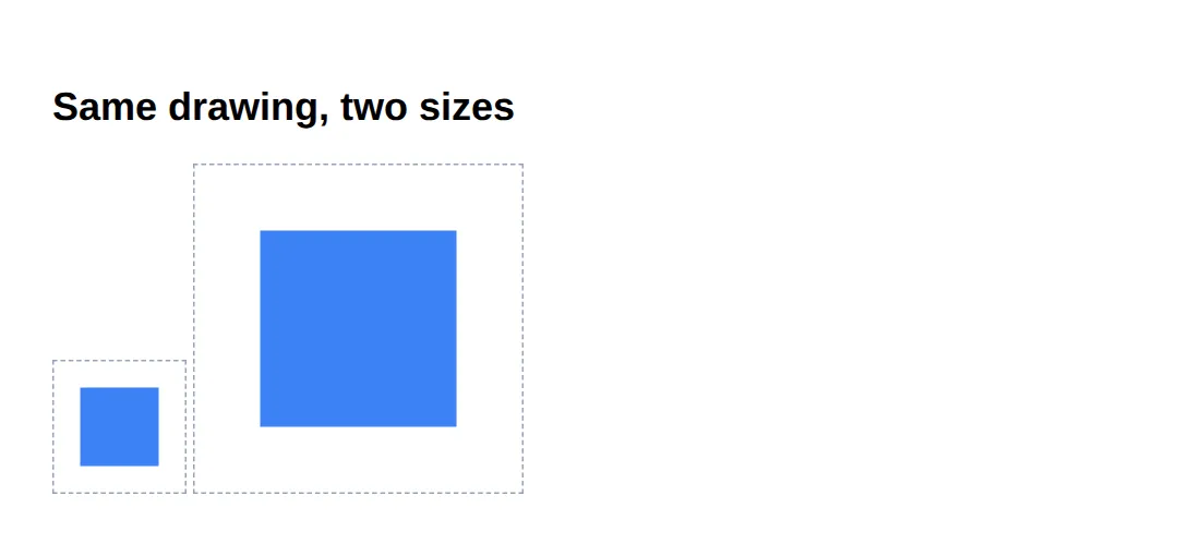
2. Shapes, fill & stroke
A handful of elements cover most graphics: <rect> (x, y, width, height, plus rx for rounded corners), <circle> (cx, cy centre and r radius), and the do-anything <path>, whose d attribute is a mini drawing language: M move to, L line to, Q/C curves, Z close.
Every shape has two paint properties: fill (the inside) and stroke (the outline, sized with stroke-width). Set fill="none" for an outline-only shape.
| Element | Key attributes | Use for |
|---|---|---|
| <rect> | x, y, width, height, rx | Boxes, rounded cards |
| <circle> | cx, cy, r | Dots, avatars, badges |
| <path> | d (M, L, Q, C, Z) | Anything — icons, curves |
<!DOCTYPE html>
<html lang="en">
<head>
  <meta charset="UTF-8">
  <title>Shapes, fill & stroke</title>
  <style>
    body { font-family: system-ui, sans-serif; padding: 24px; background:#0f172a; }
  </style>
</head>
<body>
  <!-- role="img" + <title> make this icon meaningful to screen readers (section 6). -->
  <svg viewBox="0 0 64 64" width="160" height="160" role="img" aria-labelledby="ok-title">
    <title id="ok-title">Success: task complete</title>

    <!-- circle: cx/cy is the CENTRE, r is the radius. fill paints the inside. -->
    <circle cx="32" cy="32" r="30" fill="#22c55e" />

    <!-- rect with rx rounds the corners; fill="none" + stroke = outline only. -->
    <rect x="16" y="16" width="32" height="32" rx="6"
          fill="none" stroke="#bbf7d0" stroke-width="1.5" />

    <!-- path: M moves the pen, L draws straight lines. This is the tick.
         stroke paints the line; no fill because it's an open shape. -->
    <path d="M20 33 L29 42 L45 24"
          fill="none" stroke="white" stroke-width="5"
          stroke-linecap="round" stroke-linejoin="round" />
  </svg>

  <!-- ✅ Expected: a green circle with a white tick and a soft rounded
       square outline — three shapes layered into one icon. -->
</body>
</html>
3. Styling SVG with CSS & Custom Properties
Because each shape is a DOM element, the same CSS you already know works on it — just remember the properties are fill, stroke and stroke-width rather than background and border. A CSS rule beats a fill="..." attribute, so you can leave a sensible colour in the markup and override it for hover or dark mode.
The killer combo is custom properties: store the colour in a --var and read it with var() inside fill. Now one variable re-themes the icon, and stroke="currentColor" makes an icon inherit the surrounding text colour automatically.
<!DOCTYPE html>
<html lang="en">
<head>
  <meta charset="UTF-8">
  <title>Styling SVG with CSS</title>
  <style>
    :root { --icon: #3b82f6; }   /* one token themes every icon below */

    body { font-family: system-ui, sans-serif; padding: 24px; background:#0f172a; color:#e5e7eb; }
    .row { display:flex; gap:24px; align-items:center; }

    /* fill reads the variable; change --icon once and all hearts re-colour. */
    .heart { fill: var(--icon); transition: fill .2s, transform .2s; cursor:pointer; }
    .heart:hover { fill:#ef4444; transform: scale(1.15); }  /* CSS beats fill="" */

    /* This icon has NO fill set in CSS, so stroke="currentColor" picks up
       the parent's text colour — recolour by setting color, not fill. */
    .danger { color:#f59e0b; }
  </style>
</head>
<body>
  <div class="row">
    <!-- fill comes from CSS (.heart), not from the markup. Hover to recolour. -->
    <svg class="heart" viewBox="0 0 24 24" width="64" height="64" role="img" aria-label="Like">
      <path d="M12 21s-7-4.35-9.5-8.5C.5 9 2.5 5 6 5c2 0 3.2 1.2 4 2.3C10.8 6.2 12 5 14 5c3.5 0 5.5 4 3.5 7.5C19 16.65 12 21 12 21z"/>
    </svg>

    <!-- stroke="currentColor" => this icon is amber because .danger sets color. -->
    <svg class="danger" viewBox="0 0 24 24" width="64" height="64" role="img" aria-label="Warning"
         fill="none" stroke="currentColor" stroke-width="2" stroke-linecap="round">
      <path d="M12 3 L22 20 H2 Z" />
      <line x1="12" y1="9" x2="12" y2="14" />
      <line x1="12" y1="17" x2="12.01" y2="17" />
    </svg>
  </div>

  <!-- ✅ Try it: change --icon to #22c55e and the heart turns green.
       Change .danger color to #ef4444 and the warning turns red — all via CSS. -->
  <!-- ✅ Expected result, measured in a real browser:
     .row -> display: flex
     .heart -> cursor: pointer
  -->
</body>
</html>
4. Animating SVG with CSS (the draw effect)
The famous "line draws itself" effect is a trick with two stroke properties. stroke-dasharray turns a solid line into dashes; make the single dash as long as the whole path and you get one big dash. stroke-dashoffset then slides that dash along the line — push it fully off the end and the line looks empty. Animate the offset back to 0 and the line appears to draw itself.
It only affects the stroke, so the shape needs fill: none and a stroke. For the exact length use path.getTotalLength() in JS; here a value safely larger than the path works fine.
SMIL note: SVG also has its own animation tags — <animate> and <animateTransform>, called SMIL. Prefer CSS (shown here) for almost everything: it's better supported, easier to control from JavaScript, and lives with the rest of your styles. Reach for SMIL only for the rare attribute CSS can't animate.
<!DOCTYPE html>
<html lang="en">
<head>
  <meta charset="UTF-8">
  <title>SVG draw animation</title>
  <style>
    body { font-family: system-ui, sans-serif; padding: 24px; background:#0f172a; }

    /* 1) dasharray makes one dash 600 units long (longer than the path).
       2) dashoffset 600 pushes that dash completely off-screen (line empty).
       3) the animation slides the offset back to 0 -> the line "draws". */
    .draw {
      fill: none;                 /* draw effect works on the STROKE only */
      stroke: #38bdf8;
      stroke-width: 4;
      stroke-linecap: round;
      stroke-dasharray: 600;
      stroke-dashoffset: 600;
      animation: draw 2.5s ease forwards;   /* forwards = stay drawn at the end */
    }
    @keyframes draw { to { stroke-dashoffset: 0; } }
  </style>
</head>
<body>
  <svg viewBox="0 0 400 120" width="400" height="120"
       role="img" aria-label="Animated signature line">
    <!-- a wavy path: M move, Q/T quadratic curves. fill:none so only the line shows. -->
    <path class="draw" d="M20 80 Q 90 10 160 80 T 300 80 T 380 50" />
  </svg>

  <!-- ✅ Expected: the blue wavy line animates on from left to right as if a
       pen is drawing it, then stays put. Reload to watch it again. -->
</body>
</html>
5. Reuse with <symbol> & <use>
Copy-pasting the same icon markup ten times is wasteful and a nightmare to update. Instead, define each icon once inside a <symbol id="..."> (give the symbol its own viewBox), then stamp it anywhere with <use href="#id" />. This is an "SVG sprite" — one definition, many instances.
Each <use> can be a different size and colour, and because the shapes use currentColor, the icon takes the surrounding text colour. Fix the definition once and every copy updates.
<!DOCTYPE html>
<html lang="en">
<head>
  <meta charset="UTF-8">
  <title>SVG sprites</title>
  <style>
    body { font-family: system-ui, sans-serif; padding: 24px; background:#0f172a; color:#e5e7eb; }
    .bar { display:flex; gap:24px; align-items:center; }
    /* size and colour each instance independently; currentColor reads color. */
    .icon { width:40px; height:40px; }
    .blue  { color:#3b82f6; }
    .green { color:#22c55e; }
    .big   { width:64px; height:64px; }
  </style>
</head>
<body>
  <!-- Define the icons ONCE. This <svg> is hidden; it's just a library. -->
  <svg width="0" height="0" style="position:absolute" aria-hidden="true">
    <symbol id="ic-star" viewBox="0 0 24 24">
      <path fill="currentColor"
            d="M12 2l3 6.5 7 .6-5.3 4.6 1.6 6.9L12 17l-6.3 3.6 1.6-6.9L2 9.1l7-.6z"/>
    </symbol>
    <symbol id="ic-bolt" viewBox="0 0 24 24">
      <path fill="currentColor" d="M13 2 4 14h6l-1 8 9-12h-6z"/>
    </symbol>
  </svg>

  <!-- Stamp them. Same definition, different sizes and colours. -->
  <div class="bar">
    <svg class="icon blue"><use href="#ic-star"/></svg>
    <svg class="icon green big"><use href="#ic-star"/></svg>
    <svg class="icon green"><use href="#ic-bolt"/></svg>
    <svg class="icon blue big"><use href="#ic-bolt"/></svg>
  </div>

  <!-- ✅ Expected: two stars and two bolts, in blue/green and small/large,
       all from just two <symbol> definitions. -->
  <!-- ✅ Expected result, measured in a real browser:
     .bar -> display: flex
     .icon -> width: 40px
     .icon -> count: 4
  -->
</body>
</html>
6. Accessibility — Make Graphics Announceable
A screen reader can't "see" your shapes, so you must describe them. For a meaningful graphic (a logo, an informative chart), add role="img" and an accessible name — the simplest is aria-label="Company logo" on the <svg>. A <title> as the first child also names it and shows as a tooltip; pair it with aria-labelledby for the most reliable support.
For a decorative graphic that adds nothing for a non-sighted user, do the opposite: aria-hidden="true" so the screen reader skips it entirely. The worst option is leaving a meaningful icon unlabelled and silent.
<!DOCTYPE html>
<html lang="en">
<head>
  <meta charset="UTF-8">
  <title>Accessible SVG</title>
  <style>
    body { font-family: system-ui, sans-serif; padding: 24px; background:#0f172a; color:#e5e7eb; }
    .row { display:flex; gap:32px; align-items:center; }
    svg { width:56px; height:56px; }
  </style>
</head>
<body>
  <div class="row">
    <!-- MEANINGFUL via aria-label: a reader announces "Download, image". -->
    <svg viewBox="0 0 24 24" role="img" aria-label="Download"
         fill="none" stroke="#38bdf8" stroke-width="2" stroke-linecap="round">
      <path d="M12 3v12"/><path d="M7 11l5 5 5-5"/><path d="M5 21h14"/>
    </svg>

    <!-- MEANINGFUL via <title> + aria-labelledby: also gives a hover tooltip. -->
    <svg viewBox="0 0 24 24" role="img" aria-labelledby="cog-t"
         fill="#22c55e">
      <title id="cog-t">Settings</title>
      <circle cx="12" cy="12" r="3" fill="#0f172a"/>
      <path d="M12 2l2 3 3-1 1 3 3 2-2 3 2 3-3 2-1 3-3-1-2 3-2-3-3 1-1-3-3-2 2-3-2-3 3-2 1-3 3 1z"/>
    </svg>

    <!-- DECORATIVE: aria-hidden hides it; the visible text carries the meaning. -->
    <span>
      <svg viewBox="0 0 24 24" aria-hidden="true" fill="#f59e0b">
        <circle cx="12" cy="12" r="10"/>
      </svg>
      Premium plan
    </span>
  </div>

  <!-- ✅ Expected (with a screen reader): icon 1 announces "Download",
       icon 2 "Settings", the third dot is silent (label is the text). -->
  <!-- ✅ Expected result, measured in a real browser:
     .row -> display: flex
     svg -> width: 56px
  -->
</body>
</html>
🎯 Your Turn #1 — Draw and colour a shape
Finish this inline SVG so it shows a yellow circle with a smiling mouth. Fill in the blanks marked ___, then run it and check the expected result in the comments.
<!DOCTYPE html>
<html lang="en">
<head>
  <meta charset="UTF-8">
  <title>Your Turn 1</title>
  <style>
    body { font-family: system-ui, sans-serif; padding: 24px; background:#0f172a; }
  </style>
</head>
<body>
  <!-- 🎯 YOUR TURN — fill in the blanks marked ___ -->

  <!-- 1) Give the SVG a coordinate grid 100 units wide and tall. -->
  <svg viewBox="___" width="200" height="200" role="img" aria-label="Smiley face">
    <!-- 👉 viewBox="0 0 100 100" -->

    <!-- 2) Draw the face: a circle centred at (50,50), radius 45, filled yellow. -->
    <circle cx="50" cy="50" r="45" fill="___" />
    <!-- 👉 fill="#facc15" (any yellow) -->

    <!-- eyes are done for you -->
    <circle cx="35" cy="40" r="6" fill="#1e293b" />
    <circle cx="65" cy="40" r="6" fill="#1e293b" />

    <!-- 3) The smile is a curved path. It needs NO fill, just a stroke.
            Set fill to none and stroke to a dark colour, width 5. -->
    <path d="M30 62 Q 50 82 70 62"
          fill="___" stroke="___" stroke-width="5" stroke-linecap="round" />
    <!-- 👉 fill="none"  stroke="#1e293b" -->
  </svg>

  <!-- ✅ Expected: a big yellow circle with two dark eyes and a curved
       dark smile. If the mouth is a solid blob, you filled it instead of
       stroking it — fill must be "none". -->
</body>
</html>
🎯 Your Turn #2 — Theme with CSS and draw the line
Two jobs: colour the icon from a custom property instead of the markup, and make the underline draw itself. Add the var(), the dash properties, and the keyframe target, then verify against the comments.
<!DOCTYPE html>
<html lang="en">
<head>
  <meta charset="UTF-8">
  <title>Your Turn 2</title>
  <style>
    /* 🎯 YOUR TURN — fill in the blanks marked ___ */

    :root { --brand: #8b5cf6; }   /* purple brand token */

    body { font-family: system-ui, sans-serif; padding: 24px; background:#0f172a; color:#e5e7eb; }

    /* 1) Colour the star from the variable, NOT a hard-coded hex. */
    .star { fill: ___; }                 /* 👉 var(--brand) */

    /* 2) Make this line draw itself. Set BOTH dash properties to 300,
          then animate the offset to 0 in the keyframe below. */
    .underline {
      fill: none;
      stroke: var(--brand);
      stroke-width: 5;
      stroke-linecap: round;
      stroke-dasharray: ___;             /* 👉 300 */
      stroke-dashoffset: ___;            /* 👉 300 */
      animation: drawLine 1.8s ease forwards;
    }
    @keyframes drawLine { to { stroke-dashoffset: ___; } }  /* 👉 0 */
  </style>
</head>
<body>
  <svg viewBox="0 0 24 24" width="56" height="56" role="img" aria-label="Featured">
    <path class="star" d="M12 2l3 6.5 7 .6-5.3 4.6 1.6 6.9L12 17l-6.3 3.6 1.6-6.9L2 9.1l7-.6z"/>
  </svg>

  <svg viewBox="0 0 300 30" width="300" height="30" role="img" aria-label="Animated underline">
    <path class="underline" d="M5 20 Q 150 0 295 20" />
  </svg>

  <!-- ✅ Expected: a purple star, and a purple underline that animates on
       from left to right. Change --brand to #06b6d4 and BOTH turn cyan. -->
</body>
</html>
🧩 Mini-Challenge — An accessible icon sprite from scratch
Support is faded now — only an outline is given. Build a tiny icon sprite and use it twice. Lean on the worked examples in sections 5 and 6 if you get stuck.
<!DOCTYPE html>
<html lang="en">
<head>
  <meta charset="UTF-8">
  <title>Mini-Challenge</title>
  <style>
    body { font-family: system-ui, sans-serif; padding: 24px; background:#0f172a; color:#e5e7eb; }

    /* 🧩 MINI-CHALLENGE: a reusable, themeable, accessible icon
       1. In a hidden <svg> (width=0 height=0, aria-hidden="true"), define a
          <symbol id="ic-check" viewBox="0 0 24 24"> containing a tick <path>
          that uses fill="none" stroke="currentColor".
       2. Stamp it TWICE with <svg ...><use href="#ic-check"/></svg>:
            - first at color:#22c55e (green), size 40px
            - second at color:#ef4444 (red), size 64px
       3. Give each visible <svg> role="img" and an aria-label
          ("Approved" and "Rejected").

       ✅ Expected: a small green tick and a large red tick from ONE <symbol>.
          A screen reader announces "Approved" and "Rejected". Changing the
          stroke in the symbol updates BOTH copies at once. */

    /* your CSS here (sizes + colours) */
  </style>
</head>
<body>

  <!-- your hidden sprite (the <symbol> definition) here -->

  <!-- your two <use> instances here -->

</body>
</html>
⚠️ Common Errors (and the fix)
- Missing viewBox. Without viewBox the browser has no coordinate grid to scale, so the graphic clips or refuses to resize when you change width/height. Fix: add viewBox="0 0 W H" matching the coordinates you drew in (e.g. 0 0 24 24).
- No accessible name. A meaningful icon with no label is invisible to screen readers — they announce nothing, or read raw markup. Fix: add role="img" plus aria-label (or a <title>); for decoration use aria-hidden="true".
- fill attribute won't change on hover. Setting color: red on an SVG does nothing — shapes use fill/stroke, not color directly. Fix: style fill in CSS, or set fill="currentColor" so color drives it.
- Draw effect does nothing. Animating stroke-dashoffset on a shape with a fill and no stroke shows no change. Fix: set fill: none, give it a stroke, and make stroke-dasharray ≥ the path length.
- Using SVG for a photo. SVG describes shapes, not pixels — there's nothing to "describe" in a photograph, so it bloats or can't be done. Fix: use a raster format (<img> with PNG/JPG/WebP) for photos; keep SVG for icons, logos and line art.
📋 Quick Reference
| Goal | Use this |
|---|---|
| Set the coordinate grid | <svg viewBox="0 0 24 24"> |
| Rectangle / rounded box | <rect x y width height rx /> |
| Circle | <circle cx cy r /> |
| Any shape / line | <path d="M.. L.. Q.. Z" /> |
| Outline only | fill="none" stroke="..." stroke-width="2" |
| Inherit text colour | stroke="currentColor" / fill="currentColor" |
| Theme from CSS | fill: var(--brand); |
| Draw a line on | stroke-dasharray + dashoffset → 0 |
| Reuse an icon | <symbol id> … <use href="#id"/> |
| Accessibility | role="img" aria-label="…" / aria-hidden="true" |
🎉 Lesson Complete
You can now draw, style, animate and label vector graphics in pure markup. The essentials:
- ✅ Inline SVG shapes are DOM elements — styleable, scriptable, inspectable
- ✅ viewBox sets the coordinate grid; width/height set the pixels — that's what makes SVG resolution-independent
- ✅ Draw with rect/circle/path; paint with fill and stroke
- ✅ Style from CSS and theme with var() / currentColor
- ✅ stroke-dasharray + stroke-dashoffset → 0 makes a line draw itself (prefer CSS over SMIL)
- ✅ <symbol> + <use> = define once, reuse everywhere
- ✅ Add role="img" + aria-label (or aria-hidden for decoration)
Practice quiz
Why does SVG stay sharp at any size while PNG/JPG can go blurry?
- SVG files are larger
- SVG compresses better
- SVG stores drawing instructions (vectors) the browser redraws at any size; raster formats store fixed pixels
- PNG has no transparency
Answer: SVG stores drawing instructions (vectors) the browser redraws at any size; raster formats store fixed pixels. SVG is a vector format describing shapes as instructions, so it re-renders crisply at any scale; raster formats store a fixed pixel grid that blurs when enlarged.
What does the viewBox attribute define on an <svg>?
- The internal coordinate grid (its own unit system)
- The file size
- The CSS background
- The animation speed
Answer: The internal coordinate grid (its own unit system). viewBox="minX minY width height" sets up the SVG's coordinate grid; width/height (or CSS) decide how big that grid is drawn on screen.
In viewBox="0 0 24 24", where is the point (0, 0)?
- The center
- The bottom-left corner
- It depends on the browser
- The top-left corner, with y growing downward
Answer: The top-left corner, with y growing downward. SVG's origin (0, 0) is the top-left, and the y-axis increases downward — the same convention as the screen.
Which attributes define a <circle> in SVG?
- x, y, width, height
- cx, cy (center) and r (radius)
- d only
- points
Answer: cx, cy (center) and r (radius). A <circle> uses cx and cy for its center and r for its radius. A <rect> uses x, y, width, height (and rx for rounded corners).
In a <path>, what does the 'M' command do in the 'd' attribute?
- Moves the pen to a new point (move to)
- Draws a line
- Mirrors the shape
- Closes the path
Answer: Moves the pen to a new point (move to). M is 'move to' (lift and reposition the pen). L is 'line to', Q/C are curves, and Z closes the path back to the start.
What is the idiomatic way to make an icon inherit the surrounding text colour?
- fill="inherit"
- color: auto
- stroke="currentColor" (or fill="currentColor")
- fill="text"
Answer: stroke="currentColor" (or fill="currentColor"). currentColor resolves to the element's CSS color, so fill/stroke="currentColor" makes an icon track the parent's text colour automatically.
Which wins when there's a conflict: a fill="red" attribute or a CSS fill rule?
- The fill attribute always wins
- The CSS rule overrides the presentation attribute
- Whichever comes first in the file
- Neither applies
Answer: The CSS rule overrides the presentation attribute. A presentation attribute like fill="red" is the weakest source, so any CSS fill rule overrides it (an inline style attribute would beat both).
How does the stroke-dasharray 'draw itself' animation work?
- It animates the fill color
- It rotates the path
- It uses opacity keyframes
- Make one dash as long as the path, offset it off the end, then animate stroke-dashoffset to 0
Answer: Make one dash as long as the path, offset it off the end, then animate stroke-dashoffset to 0. Set stroke-dasharray and stroke-dashoffset to the path length so the line looks empty, then animate stroke-dashoffset to 0 to slide the dash into view.
The draw-on effect requires the shape to have which setting?
- fill set to a solid colour
- fill: none plus a stroke (it only affects the stroke)
- no stroke at all
- a viewBox of 0 0 100 100
Answer: fill: none plus a stroke (it only affects the stroke). stroke-dasharray/offset animate the stroke only, so the shape needs a stroke and usually fill: none for the line to appear to draw itself.
How do you make a MEANINGFUL inline SVG icon accessible to screen readers?
- Leave it unlabelled
- Add aria-hidden="true"
- Add role="img" and an accessible name (aria-label or a <title>)
- Wrap it in a <noscript>
Answer: Add role="img" and an accessible name (aria-label or a <title>). A meaningful graphic needs role="img" plus a name via aria-label or a <title>. A purely decorative SVG should instead use aria-hidden="true" so readers skip it.
Continue this course
- Previous: HTML Canvas Essentials (Drawing, Animation, Images)
- Next: Responsive Navigation Patterns (Mobile/Tablet/Desktop) — Hamburger menus, mega navs, and responsive nav patterns
- Quick reference: HTML & CSS cheat sheet
Frequently asked questions
What is the difference between SVG and a PNG or JPG?
PNG and JPG are raster formats: they store a fixed grid of coloured pixels, so when you scale them up the browser has to invent pixels and the image goes blurry or blocky. SVG is a vector format: it stores instructions like 'draw a circle of radius 50 here' as text, and the browser redraws those instructions at whatever size you ask for, so it stays razor-sharp at any zoom or screen density. Use SVG for icons, logos, charts, and line art; use PNG or JPG for photographs, where there is no shape to describe — only millions of individual pixels.
Why does my SVG ignore width and height, or look the wrong size?
Almost always a missing or wrong viewBox. The viewBox defines the SVG's internal coordinate grid (its own little world of units); width and height define how big that grid is drawn on the page. Without a viewBox the browser can't map your 0-24 coordinates onto a 96px box, so the graphic gets clipped or sized strangely. Add viewBox="0 0 24 24" (matching the coordinates you drew in) and then width/height — or CSS — can scale it freely.
Should I set colours with the fill attribute or with CSS?
Either works, but CSS wins when there's a conflict, and CSS is what you want for anything that changes — hover, dark mode, theming. A presentation attribute like fill="red" on the element is the weakest source, so a CSS rule (even fill: blue from a class) overrides it. The exception is an inline style attribute, which beats both. The idiomatic pattern for icons is to set fill="none" stroke="currentColor" in the markup and let the parent's CSS color drive the colour.
How does the stroke-dasharray drawing animation actually work?
You turn the line into a dashed line whose single dash is as long as the whole path, then push that dash off the end with stroke-dashoffset so nothing shows. Animating the offset back to 0 slides the dash into view, which looks like the line drawing itself. Set stroke-dasharray and stroke-dashoffset to the path's total length (use getTotalLength() in JS for the exact number, or a value big enough to cover it), then animate stroke-dashoffset to 0. It only works on the stroke, so the shape needs a stroke and usually fill: none.
Should I use CSS animation or SMIL (<animate>) for SVG?
Prefer CSS (and the Web Animations API in JS) for almost everything. SMIL is SVG's built-in animation syntax — tags like <animate> and <animateTransform> embedded right in the markup — and it can animate a few attributes CSS historically couldn't, but it's quirky, harder to control from JavaScript, and was once deprecation-flagged in Chrome. CSS keyframes are better supported, more familiar, and integrate with the rest of your stylesheet, so reach for SMIL only for a specific attribute animation CSS can't express.
How do I make an SVG accessible to screen readers?
If the SVG conveys meaning (a logo, an informative chart), give it role="img" and an accessible name — either aria-label="Company logo" on the <svg>, or a <title> element as the first child (the <title> also shows as a tooltip). If the SVG is purely decorative, hide it instead with aria-hidden="true" so screen readers skip it. Don't rely on a <title> alone without role="img", because support for announcing it is inconsistent across screen readers.