Print Stylesheets & Export-Friendly Layouts
Reviewed & published by Brayan K
A print stylesheet is CSS written inside an @media print block that controls how a page looks when printed or saved as a PDF, letting you hide navigation and ads, set page margins, and manage where content breaks across pages.
Part of the free HTML & CSS course at LearnCodingFast — hands-on lessons with examples you run in your browser, plus practice exercises and a quick quiz.
By the end of this lesson you'll be able to give any page a clean printed (and "Save as PDF") version — hiding the nav and ads, setting paper margins, controlling where pages break, and printing link URLs so the paper is actually useful on its own.
💡 Think of It Like This
A print stylesheet is like the "export to PDF" filter on a document. Your web page is full of things that only make sense on a screen — a sticky navbar, ads, a cookie banner, a video player, a "Buy now" button. None of that belongs on a sheet of paper.
@media print is the filter that runs the moment someone hits Print. It strips away the digital chrome, flattens the colours so they don't drink ink, and leaves a clean, readable document behind — the same content, dressed for paper instead of for a browser. You write it once, and every printout (or saved PDF) comes out looking professional.
1. The @media print Block
Everything you wrap in @media print { … } applies only when the page is printed or shown in print preview. On screen those rules do nothing, so they can never break your normal layout. The single most important thing print CSS does is hide the chrome: display: none on the nav, ads, and buttons so they don't waste paper.
You can't see print CSS by looking at the page. To check your work, open print preview with Ctrl+P (Windows/Linux) or Cmd+P (Mac) — no paper required.
<!DOCTYPE html>
<html lang="en">
<head>
  <meta charset="UTF-8">
  <title>Hide chrome on print</title>
  <style>
    body { font-family: system-ui, sans-serif; padding: 24px; color: #222; }
    .navbar {
      background: #1976D2; color: white; padding: 16px;
      border-radius: 8px; margin-bottom: 24px;
      display: flex; justify-content: space-between; align-items: center;
    }
    .btn { background: white; color: #1976D2; border: none;
           padding: 8px 16px; border-radius: 6px; cursor: pointer; font-weight: 600; }
    h1 { color: #1565C0; }

    @media print {
      /* Hide everything that only makes sense on a screen. */
      .navbar, .no-print { display: none !important; }  /* gone on paper */
      body { padding: 0; }                               /* printer adds its own margin */
    }
  </style>
</head>
<body>
  <!-- This whole bar disappears in the printout. -->
  <div class="navbar">
    <span>My Site</span>
    <button class="btn no-print" onclick="window.print()">Print this page</button>
  </div>

  <h1>Annual Report 2024</h1>
  <p>This paragraph is the real content, so it stays in the printout.</p>

  <!-- ✅ Try it: click "Print this page" (or press Ctrl/Cmd+P).
       In the preview the blue navbar and the button are GONE,
       and only the heading + paragraph remain. -->
  <!-- ✅ Expected result, measured in a real browser:
     .navbar -> display: flex
     .btn -> cursor: pointer
  -->
</body>
</html>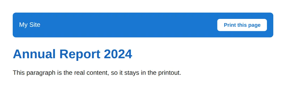
2. @page — Margins & Paper Size
The @page rule styles the printed sheet itself — its margins and its size. @page { margin: 2cm; } gives every page a 2cm border of white space; size: A4 landscape picks the paper and orientation. Use real print units here — cm, mm, in, or pt — never vh/vw, because a printout has no viewport.
You can even target specific pages: @page :first styles only page one (handy for a bigger top margin on a cover page), and @page :left / :right style even and odd pages for double-sided binding.
<!DOCTYPE html>
<html lang="en">
<head>
  <meta charset="UTF-8">
  <title>@page rules</title>
  <style>
    body { font-family: Georgia, serif; line-height: 1.7; color: #222; }
    h1 { color: #1565C0; }

    @media print {
      /* Every printed sheet gets a 2cm margin of white space all round. */
      @page { margin: 2cm; }

      /* The FIRST page gets extra space at the top, like a title page. */
      @page :first { margin-top: 5cm; }
    }
  </style>
</head>
<body>
  <h1>The Print Report</h1>
  <p>Open print preview (Ctrl/Cmd+P). Notice the comfortable margin
     around the page, and a larger gap above this heading on page one.</p>
  <p>Real documents use cm / mm / in / pt for print — never vh or vw,
     because paper has no viewport to measure against.</p>

  <!-- ✅ Expected in preview: 2cm margins everywhere, with page 1
       pushed further down the sheet by the @page :first rule. -->
  <!-- ✅ Expected result, measured in a real browser:
     body -> color: rgb(34, 34, 34)
     h1 -> color: rgb(21, 101, 192)
  -->
</body>
</html>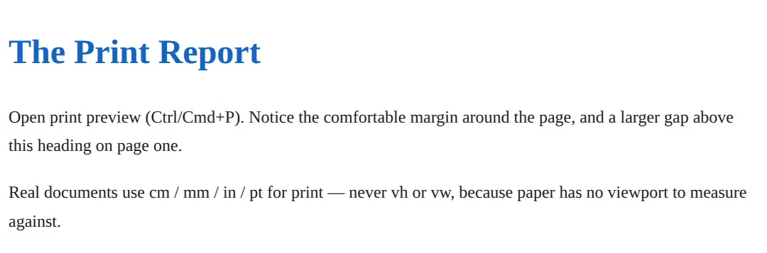
3. Page Breaks — Where New Pages Start
On screen content scrolls forever; on paper it has to be sliced into pages, and by default the browser slices wherever it runs out of room — sometimes mid-table or mid-heading. Three properties let you take control: break-before: page forces a new page before an element, break-after: page forces one after, and break-inside: avoid tells the browser "don't split this element across two pages" — perfect for tables, images, and cards.
For the fine detail, orphans and widows set the minimum number of lines a paragraph may leave at the bottom or carry to the top of a page, so you never strand a single lonely line.
<!DOCTYPE html>
<html lang="en">
<head>
  <meta charset="UTF-8">
  <title>Page breaks</title>
  <style>
    body { font-family: system-ui, sans-serif; padding: 24px; color: #333; }
    h2 { color: #1565C0; }
    section { margin-bottom: 32px; padding: 16px; border: 2px dashed #e0e0e0; border-radius: 8px; }
    table { width: 100%; border-collapse: collapse; margin-top: 12px; }
    th, td { padding: 8px 12px; border: 1px solid #ddd; text-align: left; }
    th { background: #f5f5f5; }

    @media print {
      section { border: none; padding: 0; }

      /* Start each chapter on a fresh page. */
      .chapter { break-before: page; }

      /* Never let this table split across two pages. */
      .keep-together { break-inside: avoid; }

      /* Keep a heading glued to the text that follows it. */
      h2 { break-after: avoid; }

      /* Don't strand single lines at a page edge. */
      p { orphans: 3; widows: 3; }
    }
  </style>
</head>
<body>
  <section>
    <h2>Chapter 1 — Summary</h2>
    <p>This first section prints on page one. The dashed borders are
       screen-only and removed for print.</p>
  </section>

  <section class="chapter">
    <h2>Chapter 2 — The Figures</h2>
    <table class="keep-together">
      <tr><th>Quarter</th><th>Revenue</th></tr>
      <tr><td>Q3</td><td>$138,000</td></tr>
      <tr><td>Q4</td><td>$162,000</td></tr>
    </table>
  </section>

  <!-- ✅ Expected in preview: Chapter 2 begins on a NEW page
       (break-before: page), and the table never breaks in half
       (break-inside: avoid). -->
  <!-- ✅ Expected result, measured in a real browser:
     h2 -> color: rgb(21, 101, 192)
     section -> padding-top: 16px
  -->
</body>
</html>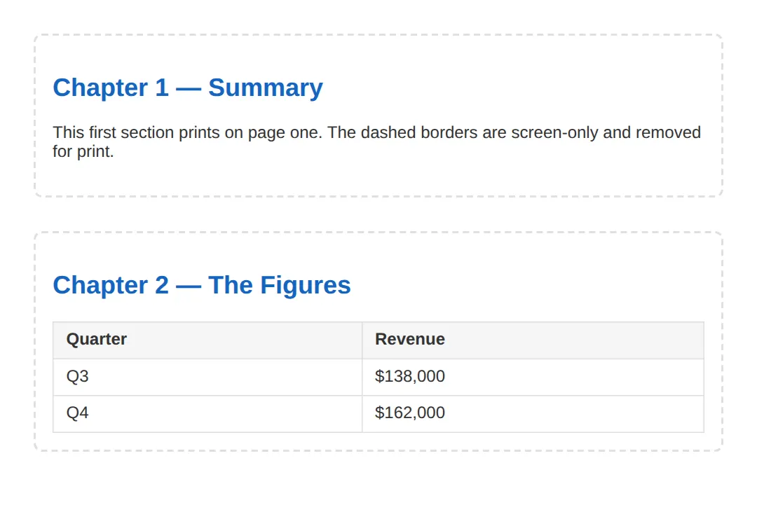
4. Printing Link URLs with attr(href)
A link is useless on paper — you can't click it, and "see our report" tells the reader nothing about where to look. The fix is generated content: a::after { content: " (" attr(href) ")"; }. The attr(href) function reads the URL out of the link's markup and prints it in brackets after the text, so the printout shows both the words and the address.
Scope it to a[href^="http"] if you only want to expand external links and leave in-page anchors like #top alone.
<!DOCTYPE html>
<html lang="en">
<head>
  <meta charset="UTF-8">
  <title>Print link URLs</title>
  <style>
    body { font-family: system-ui, sans-serif; padding: 24px; color: #222; line-height: 1.8; }
    a { color: #1976D2; }

    @media print {
      a { color: black; text-decoration: underline; }

      /* Only external links get their URL printed after the text. */
      a[href^="http"]::after {
        content: " (" attr(href) ")";   /* attr(href) = the link's URL */
        font-size: 0.85em;
        color: #555;
      }
    }
  </style>
</head>
<body>
  <p>Read the full
     <a href="https://example.com/annual-report">annual report</a>
     or jump to the <a href="#top">top of this page</a>.</p>

  <!-- ✅ Expected in print preview: the first link reads
       "annual report (https://example.com/annual-report)",
       while the in-page #top link is left untouched. -->
  <!-- ✅ Expected result, measured in a real browser:
     body -> padding-top: 24px
     a -> color: rgb(25, 118, 210)
  -->
</body>
</html>
5. Backgrounds & print-color-adjust
By default browsers drop background colours and images when printing — it saves ink and keeps text legible on white paper. Most of the time that's exactly what you want, so prefer borders over coloured fills to show structure. But sometimes a background is the point: a coloured invoice header, a code block, a status badge.
To force a background to print, set print-color-adjust: exact (add the -webkit- prefix for Chrome and Safari). It tells the browser "print these colours as I designed them, don't optimise them away." Use it sparingly — only on the few elements that genuinely need their colour.
<!DOCTYPE html>
<html lang="en">
<head>
  <meta charset="UTF-8">
  <title>print-color-adjust</title>
  <style>
    body { font-family: system-ui, sans-serif; padding: 24px; color: #222; }
    .banner {
      background: #1976D2; color: white;
      padding: 16px 20px; border-radius: 8px; font-weight: 700;
    }
    .note { background: #E3F2FD; padding: 16px; border-radius: 8px; margin-top: 16px; }

    @media print {
      /* The banner colour is part of the brand, so keep it. */
      .banner {
        -webkit-print-color-adjust: exact;   /* Chrome / Safari */
        print-color-adjust: exact;           /* standard */
      }

      /* The note doesn't need its tint — swap the fill for a border. */
      .note { background: none; border: 1px solid #999; }
    }
  </style>
</head>
<body>
  <div class="banner">Paid in full — Invoice #0847</div>
  <div class="note">This note prints with a border instead of its blue tint.</div>

  <!-- ✅ Expected in preview: the blue banner KEEPS its colour
       (print-color-adjust: exact), while the note loses its tint
       and shows a grey border instead. -->
  <!-- ✅ Expected result, measured in a real browser:
     .banner -> padding-top: 16px
     .note -> padding-top: 16px
  -->
</body>
</html>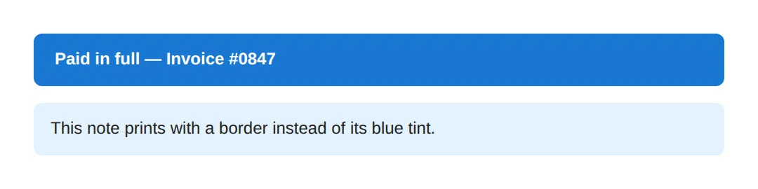
6. Putting It Together — A Print-Optimised Article
Here's a complete article that uses every idea from this lesson at once: it hides the nav and ads, sets page margins, prints link URLs, keeps the figure whole, forces the references onto a fresh page, and keeps just the one background it needs. Read the comments, then open print preview to see the screen version melt into a clean document.
<!DOCTYPE html>
<html lang="en">
<head>
  <meta charset="UTF-8">
  <title>Print-optimised article</title>
  <style>
    * { box-sizing: border-box; }
    body { font-family: Georgia, serif; line-height: 1.7; color: #222; margin: 0; }

    .topbar { background: #1976D2; color: white; padding: 12px 20px;
              display: flex; justify-content: space-between; align-items: center; }
    .topbar button { background: white; color: #1976D2; border: none;
                     padding: 8px 14px; border-radius: 6px; cursor: pointer; font-weight: 600; }
    .ad { background: #FFF3E0; border: 1px dashed #FB8C00; padding: 12px;
          text-align: center; color: #E65100; margin: 16px 0; }

    article { max-width: 720px; margin: 0 auto; padding: 24px; }
    h1 { color: #1565C0; }
    figure { margin: 20px 0; padding: 16px; background: #f5f5f5; border-radius: 8px; text-align: center; }
    figcaption { font-size: 0.85em; color: #666; margin-top: 8px; }
    a { color: #1976D2; }
    .references { margin-top: 32px; }

    @media print {
      /* 1) Hide everything that only matters on screen. */
      .topbar, .ad, .no-print { display: none !important; }

      /* 2) Set comfortable paper margins. */
      @page { margin: 2cm; }

      /* 3) Black ink-friendly text, no page padding (the @page margin does it). */
      body { color: black; }
      article { max-width: none; padding: 0; }

      /* 4) Print external link URLs after the text. */
      a[href^="http"]::after { content: " (" attr(href) ")"; font-size: 0.85em; color: #555; }

      /* 5) Never split the figure across pages. */
      figure { break-inside: avoid; -webkit-print-color-adjust: exact; print-color-adjust: exact; }

      /* 6) Start the references list on a fresh page. */
      .references { break-before: page; }

      /* 7) No stranded lines. */
      p { orphans: 3; widows: 3; }
    }
  </style>
</head>
<body>
  <div class="topbar">
    <strong>DevJournal</strong>
    <button class="no-print" onclick="window.print()">Print article</button>
  </div>

  <article>
    <h1>Why Print Stylesheets Still Matter</h1>
    <div class="ad">Advertisement — 50% off hosting!</div>

    <p>Readers still print articles to read offline, file invoices, and archive
       records. A few lines of print CSS turn a cluttered web page into a clean
       document. Learn more at
       <a href="https://example.com/print-guide">our print guide</a>.</p>

    <figure>
      <div style="font-size:2rem;">📊</div>
      <figcaption>Figure 1 — kept whole with break-inside: avoid.</figcaption>
    </figure>

    <p>The toolbar and the advertisement above are gone from the printout,
       link URLs are spelled out, and the figure never breaks in half.</p>

    <div class="references">
      <h2>References</h2>
      <p>This section starts on its own page thanks to break-before: page.
         See <a href="https://developer.mozilla.org/">MDN Web Docs</a>.</p>
    </div>
  </article>

  <!-- ✅ Open print preview (Ctrl/Cmd+P): no toolbar, no ad, 2cm margins,
       links show their URLs, the figure stays whole, and References
       begins on a new page. -->
  <!-- ✅ Expected result, measured in a real browser:
     .topbar -> display: flex
     .topbar button -> cursor: pointer
  -->
</body>
</html>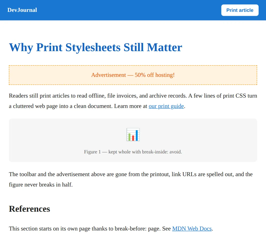
🎯 Your Turn #1 — Hide the chrome and set margins
This receipt prints with its toolbar and a cramped layout. Add a print block that hides the toolbar and gives the page sensible margins. Fill in the blanks marked ___, then open print preview and check the comments.
<!DOCTYPE html>
<html lang="en">
<head>
  <meta charset="UTF-8">
  <title>Your Turn 1</title>
  <style>
    /* 🎯 YOUR TURN — fill in the blanks marked ___ */

    body { font-family: system-ui, sans-serif; padding: 24px; color: #222; }
    .toolbar { background: #1976D2; color: white; padding: 12px 16px;
               border-radius: 8px; margin-bottom: 20px; display: flex;
               justify-content: space-between; align-items: center; }
    .toolbar button { background: white; color: #1976D2; border: none;
                      padding: 6px 14px; border-radius: 6px; cursor: pointer; }
    h1 { color: #1565C0; }

    @media print {
      /* 1) Hide the toolbar so it doesn't print. */
      .toolbar { ___ }                /* 👉 add:  display: none; */

      /* 2) Give every printed page a 2cm margin. */
      ___ { margin: 2cm; }            /* 👉 replace ___ with  @page */
    }
  </style>
</head>
<body>
  <div class="toolbar">
    <span>Order #1042</span>
    <button onclick="window.print()">Print receipt</button>
  </div>
  <h1>Receipt</h1>
  <p>Thank you for your purchase. Total: $48.00</p>

  <!-- ✅ Expected in print preview: the blue toolbar is GONE and the
       page has a comfortable 2cm margin all the way around. -->
</body>
</html>
🎯 Your Turn #2 — Show link URLs and protect a table
This report's links print as plain text (no URL) and its table can split across pages. Add generated content to show the URLs and a rule to keep the table whole. Fill in the blanks, then verify in print preview.
<!DOCTYPE html>
<html lang="en">
<head>
  <meta charset="UTF-8">
  <title>Your Turn 2</title>
  <style>
    /* 🎯 YOUR TURN — fill in the blanks marked ___ */

    body { font-family: system-ui, sans-serif; padding: 24px; color: #222; line-height: 1.7; }
    a { color: #1976D2; }
    table { width: 100%; border-collapse: collapse; margin-top: 16px; }
    th, td { padding: 8px 12px; border: 1px solid #ddd; text-align: left; }
    th { background: #f5f5f5; }

    @media print {
      a { color: black; text-decoration: underline; }

      /* 1) After every link, print its URL in brackets. */
      a::after { content: " (" ___ ")"; }   /* 👉 replace ___ with  attr(href) */

      /* 2) Stop the table from splitting across two pages. */
      table { ___ }                          /* 👉 add:  break-inside: avoid; */
    }
  </style>
</head>
<body>
  <h1>Sales Report</h1>
  <p>Full figures are on <a href="https://example.com/sales">the sales dashboard</a>.</p>
  <table>
    <tr><th>Region</th><th>Sales</th></tr>
    <tr><td>North</td><td>$62,000</td></tr>
    <tr><td>South</td><td>$48,500</td></tr>
    <tr><td>East</td><td>$55,200</td></tr>
  </table>

  <!-- ✅ Expected in print preview: the link reads
       "the sales dashboard (https://example.com/sales)" and the
       table is never cut in half across a page boundary. -->
</body>
</html>
🧩 Mini-Challenge — A print-ready invoice from scratch
Support is faded now — only an outline is given. Write the print stylesheet for this invoice yourself. Use the worked examples in sections 1–6 as your reference if you get stuck.
<!DOCTYPE html>
<html lang="en">
<head>
  <meta charset="UTF-8">
  <title>Mini-Challenge</title>
  <style>
    body { font-family: system-ui, sans-serif; padding: 24px; color: #222; }
    .print-btn { background: #1976D2; color: white; border: none;
                 padding: 10px 18px; border-radius: 8px; cursor: pointer; font-weight: 700; }
    h1 { color: #1565C0; }
    table { width: 100%; border-collapse: collapse; margin: 16px 0; }
    th, td { padding: 8px 12px; border: 1px solid #ddd; text-align: left; }
    th { background: #f5f5f5; }
    .footer { margin-top: 24px; color: #666; }
    a { color: #1976D2; }

    /* 🧩 MINI-CHALLENGE: write the @media print block below.
       1. Open with  @media print { … }
       2. Hide the .print-btn with display: none
       3. Give every page a 1.5cm margin using @page
       4. Add  break-inside: avoid  to the table so it never splits
       5. After the footer link, print its URL with
            a::after { content: " (" attr(href) ")"; }

       ✅ Expected in print preview: no button, 1.5cm margins, the
          line-items table stays whole, and the footer link shows
          its full URL in brackets. */

    /* your print styles here */

  </style>
</head>
<body>
  <button class="print-btn" onclick="window.print()">Print invoice</button>
  <h1>Invoice #INV-0912</h1>
  <table>
    <tr><th>Item</th><th>Amount</th></tr>
    <tr><td>Design work</td><td>$1,200</td></tr>
    <tr><td>Development</td><td>$3,400</td></tr>
    <tr><td>Hosting</td><td>$300</td></tr>
  </table>
  <p class="footer">Questions? Visit
     <a href="https://example.com/billing">our billing page</a>.</p>
  <!-- ✅ Expected result, measured in a real browser:
     .print-btn -> cursor: pointer
     h1 -> color: rgb(21, 101, 192)
  -->
</body>
</html>
⚠️ Common Errors (and the fix)
- Forgetting to hide the chrome. The printout comes out with the navbar, ads, cookie banner, and buttons, wasting ink and space. Fix: inside @media print, set display: none on every screen-only element (a .no-print class is a handy catch-all).
- Never testing the print styles. Print CSS is invisible in the normal page view, so it's easy to ship rules that don't work. Fix: always check with Ctrl+P / Cmd+P (or emulate the print media type in DevTools) before you trust it.
- Awkward page breaks splitting tables and figures. A table or image gets cut in half across two pages and becomes unreadable. Fix: add break-inside: avoid to those elements, and break-after: avoid on headings to keep them with their text.
- Relying on background colour for meaning. Browsers drop backgrounds when printing, so a coloured "Paid" badge or status box vanishes. Fix: prefer borders and weight for structure; where a colour is essential, opt in with print-color-adjust: exact (plus the -webkit- prefix).
- Burning ink with full-colour text and big images. Bright body text and dark backgrounds drain cartridges and read poorly on white paper. Fix: set text to color: black and remove decorative backgrounds in the print block.
- Using vh/vw units. Print has no viewport, so viewport units behave unpredictably. Fix: size print layouts with cm, mm, in, or pt.
📋 Quick Reference
| Goal | Use this |
|---|---|
| Apply rules only on paper | @media print { … } |
| Hide screen-only elements | .no-print { display: none; } |
| Set page margins | @page { margin: 2cm; } |
| Set paper size / orientation | @page { size: A4 landscape; } |
| Style the first page only | @page :first { margin-top: 5cm; } |
| Force a new page before/after | break-before: page; / break-after: page; |
| Keep an element whole | break-inside: avoid; |
| Avoid stranded lines | orphans: 3; widows: 3; |
| Print a link's URL | a::after { content: " (" attr(href) ")"; } |
| Force a background to print | print-color-adjust: exact; |
🎉 Lesson Complete
You can now give any page a clean, professional printout. The essentials:
- ✅ @media print applies styles only when printing or in print preview
- ✅ Hide the chrome — nav, ads, buttons — with display: none
- ✅ @page { margin / size } sets paper margins and dimensions; @page :first targets page one
- ✅ break-before / break-after start new pages; break-inside: avoid keeps elements whole
- ✅ a::after { content: attr(href) } prints link URLs so paper is self-contained
- ✅ Backgrounds are dropped by default — use borders, or print-color-adjust: exact to keep the ones that matter
Practice quiz
Which at-rule wraps CSS that applies only when a page is printed?
- @media screen
- @media print
- @page print
Answer: @media print. @media print { … } applies its rules only when the page is printed or shown in print preview.
How do you preview your print styles without using paper?
- Open print preview with Ctrl+P / Cmd+P
- View the page source
- Resize the window
- Disable CSS
Answer: Open print preview with Ctrl+P / Cmd+P. Print CSS is invisible on screen; open print preview (Ctrl+P / Cmd+P) or emulate the print media type in DevTools.
What is the most common job of a print stylesheet?
- Add animations
- Increase font sizes
- Load web fonts
- Hide screen-only chrome like nav, ads, and buttons with display: none
Answer: Hide screen-only chrome like nav, ads, and buttons with display: none. The single most important thing print CSS does is hide screen-only chrome with display: none so it does not waste paper.
Which rule sets the printed page's margins and paper size?
- @paper
- @page
- @sheet
- @margin
Answer: @page. The @page rule styles the printed sheet itself — for example @page { margin: 2cm; size: A4 landscape; }.
Which units are appropriate for print layouts?
- cm, mm, in, pt
- vw and vh
- px only
- em and rem only
Answer: cm, mm, in, pt. Print has no viewport, so use real print units (cm, mm, in, pt); avoid viewport units like vw/vh.
Which property keeps a table or figure from splitting across two printed pages?
- break-before: page
- page-break: keep
- break-inside: avoid
- overflow: hidden
Answer: break-inside: avoid. break-inside: avoid tells the browser not to split that element across a page boundary.
Which property forces a new page before an element (e.g. starting a chapter)?
- break-after: avoid
- break-before: page
- break-inside: avoid
- page-start: new
Answer: break-before: page. break-before: page forces a page break before the element; break-after: page forces one after it.
How do you print a link's URL after its text on paper?
- a { content: url; }
- a { print-url: true; }
- a::before { href: show; }
- a::after { content: " (" attr(href) ")"; }
Answer: a::after { content: " (" attr(href) ")"; }. Generated content with attr(href) — a::after { content: " (" attr(href) ")"; } — pulls the URL into the printout.
Why are background colors usually missing in a printout, and how do you force one to print?
- Browsers cache them; use background-cache
- Browsers strip them to save ink; opt in with print-color-adjust: exact
- They print by default; nothing to do
- They require a <canvas>
Answer: Browsers strip them to save ink; opt in with print-color-adjust: exact. Browsers drop backgrounds by default to save ink; print-color-adjust: exact (plus the -webkit- prefix) forces them to print.
What do the `orphans` and `widows` properties control in print?
- Page numbering
- Image quality
- The minimum lines left at the bottom or carried to the top of a page
- Font substitution
Answer: The minimum lines left at the bottom or carried to the top of a page. orphans and widows set the minimum number of lines a paragraph may leave at the bottom or carry to the top of a page.
Continue this course
- Previous: Complex Tables: Styling, Responsiveness & Accessibility
- Next: CSS Performance Optimization & Rendering Pipelines — Reduce layout thrashing, use will-change, and keep CSS fast
- Quick reference: HTML & CSS cheat sheet
Frequently asked questions
Why don't I see any difference when I add @media print?
Print styles are invisible on screen by design — they only apply when the page is actually printed. To see them, open the browser's print preview with Ctrl+P (Windows/Linux) or Cmd+P (Mac), or in DevTools use the rendering panel to emulate the 'print' media type. If you never check the preview, you'll have no idea whether your rules work, because nothing changes in the normal page view.
Why are my background colours missing in the printout?
Browsers strip background colours and images when printing by default — it saves ink and keeps text readable on white paper. If a background is essential (a coloured invoice header, a code block, a chart), opt back in with print-color-adjust: exact (and the -webkit- prefix for Safari/Chrome). But for most pages the better fix is to not depend on backgrounds at all: use borders, weight, and spacing to show structure instead.
What's the difference between break-before: page and the old page-break-before?
They do the same thing — force a page break before the element — but break-before is the modern, standardised property and page-break-before is the legacy one. break-before also supports more values (like 'column' and 'region'). For maximum browser coverage you can write both, putting page-break-before first and break-before second so the modern one wins where it's supported.
How do I show a link's URL on paper when the text just says 'click here'?
Use generated content: a[href]::after { content: " (" attr(href) ")"; }. The attr(href) function pulls the link's URL out of the markup and prints it in brackets after the link text, so a reader holding the paper can still find the page. Scope it to a[href^="http"] if you only want to expand external links and leave in-page anchors alone.
Can I control the paper size and orientation from CSS?
Yes, with the @page rule. @page { size: A4; } picks the paper size, @page { size: landscape; } rotates it, and you can combine them: @page { size: A4 landscape; }. You can also set margins there — @page { margin: 2cm; } — and target the first page separately with @page :first. The browser's own print dialog can still override these, but they're a strong default.
Should I use a separate print.css file or an @media print block?
Either works and both are equally valid. A <link rel="stylesheet" media="print" href="print.css"> keeps print rules in their own file, which is tidy for large sites. An @media print { } block inside your main stylesheet keeps everything in one place, which is simpler for small projects. The rules behave identically; pick whichever keeps your codebase easiest to maintain.