CSS Performance Optimization
Reviewed & published by Brayan K
CSS performance optimization is the practice of writing styles that load and render faster — sizing media to prevent layout shift, animating GPU-friendly properties like transform and opacity, and avoiding render-blocking resources — so pages paint quickly and feel smooth.
Part of the free HTML & CSS course at LearnCodingFast — hands-on lessons with examples you run in your browser, plus practice exercises and a quick quiz.
By the end of this lesson you'll be able to make a page load faster and feel smoother using nothing but HTML and CSS — sizing images so the layout never jumps, animating on the GPU instead of the layout engine, skipping work on off-screen content, and loading fonts and styles without blocking the first paint.
💡 Think of It Like This
The browser draws your page like a theatre crew sets a stage. First the crew measures the floor and marks where every prop goes — that is layout. Then they paint the scenery — that is paint. Finally they slide finished flats around under the lights — that is composite.
Sliding a finished flat (a transform) is cheap — the crew just moves something already built. But changing a prop's actual size mid-show (animating width) forces them to re-measure the whole floor and repaint on every single frame, and the show stutters. Performance work is mostly about staying in the cheap "slide the flats" stage — and not making the crew build things the audience cannot even see yet.
1. The Three Core Web Vitals
Before you optimise anything, you need to know what "fast" is measured by. Google's Core Web Vitals are three real-user metrics, and a surprising amount of each is controlled by plain HTML and CSS:
| Metric | Measures | Good | CSS/HTML lever |
|---|---|---|---|
| LCP Largest Contentful Paint | Time until the biggest element appears | < 2.5s | Non-blocking CSS, eager hero image |
| CLS Cumulative Layout Shift | How much the page jumps as it loads | < 0.1 | width/height on images |
| INP Interaction to Next Paint | How fast the page responds to a click/tap | < 200ms | Cheap animations, less layout work |
The demo below is a live "scorecard" so you can see what the targets feel like. The numbers are illustrative — the point is to learn the three names and their thresholds, because every fix later in this lesson maps back to one of them.
<!DOCTYPE html>
<html lang="en">
<head>
  <meta charset="UTF-8">
  <title>Core Web Vitals</title>
  <style>
    body { background:#0f172a; color:#e5e7eb; font-family: system-ui, sans-serif; padding:24px; }
    .grid { display:grid; grid-template-columns: repeat(auto-fit, minmax(180px, 1fr)); gap:16px; }
    .vital { background:#1e293b; border-radius:12px; padding:18px; border-top:4px solid var(--c); }
    .vital .name { font-size:1.6rem; font-weight:800; color: var(--c); }    /* big metric label */
    .vital .full { font-size:0.8rem; color:#94a3b8; margin:2px 0 10px; }
    .vital .target { font-size:0.95rem; }
    .vital .good { color:#22c55e; font-weight:700; }                        /* the "good" threshold */

    .lcp { --c:#60a5fa; }   /* each card themes itself with one variable */
    .cls { --c:#f59e0b; }
    .inp { --c:#22c55e; }
  </style>
</head>
<body>
  <h1>Core Web Vitals</h1>
  <p>The three numbers Google uses to score real-world page experience.</p>
  <div class="grid">
    <div class="vital lcp">
      <div class="name">LCP</div>
      <div class="full">Largest Contentful Paint</div>
      <div class="target">When the biggest element shows up.</div>
      <div class="target good">Good: under 2.5s</div>
    </div>
    <div class="vital cls">
      <div class="name">CLS</div>
      <div class="full">Cumulative Layout Shift</div>
      <div class="target">How much the page jumps while loading.</div>
      <div class="target good">Good: under 0.1</div>
    </div>
    <div class="vital inp">
      <div class="name">INP</div>
      <div class="full">Interaction to Next Paint</div>
      <div class="target">How fast it reacts to a click.</div>
      <div class="target good">Good: under 200ms</div>
    </div>
  </div>

  <!-- ✅ Try it: these three names (LCP, CLS, INP) and their thresholds are the
       vocabulary for the rest of the lesson. Every fix below moves one of them. -->
  <!-- ✅ Expected result, measured in a real browser:
     .grid -> display: grid
     .vital -> padding-top: 18px
     .target -> count: 6
  -->
</body>
</html>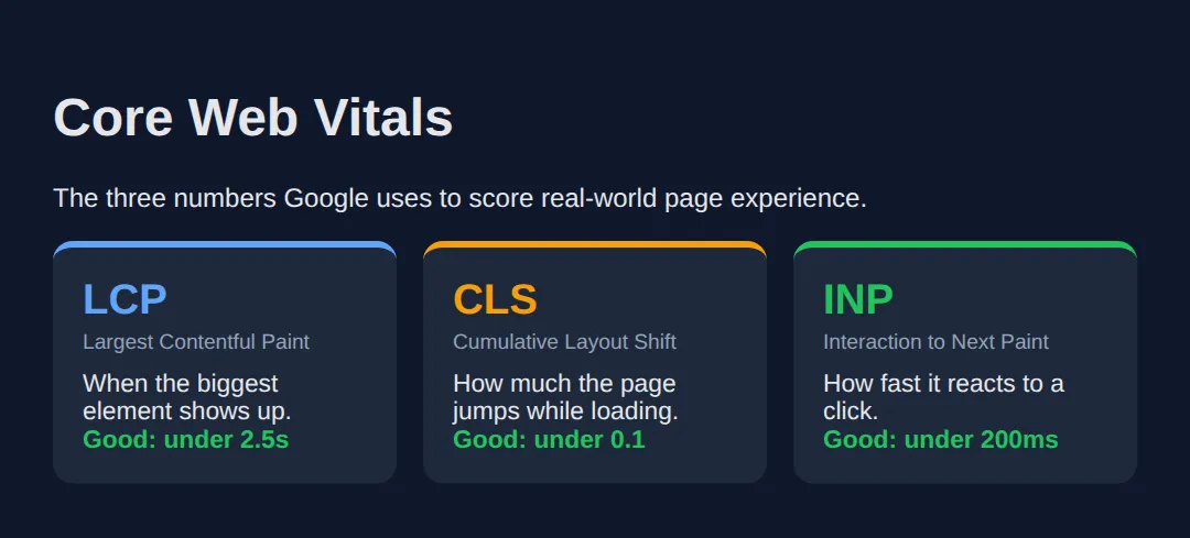
2. Images: Size Them, Lazy-Load Them, Serve Less
Images are usually the heaviest thing on a page, so they drive both LCP (the hero image is often the largest element) and CLS (an unsized image shoves the layout when it arrives). Four HTML/CSS habits fix most of it:
- Always set width and height so the browser reserves the right box before the file downloads — this alone kills most CLS.
- loading="lazy" on below-the-fold images so they download only when scrolled near. Keep your hero image eager.
- srcset to offer multiple sizes so a phone downloads a small file and a desktop a large one.
- Modern formats — WebP and AVIF are far smaller than JPEG/PNG at the same quality.
Read the worked example. The first image is done right; the comments explain why each attribute is there and what would break without it.
<!DOCTYPE html>
<html lang="en">
<head>
  <meta charset="UTF-8">
  <title>Optimised images</title>
  <style>
    body { background:#0f172a; color:#e5e7eb; font-family: system-ui, sans-serif; padding:24px; }
    .frame { background:#1e293b; border-radius:12px; padding:16px; margin:16px 0; max-width:480px; }
    /* aspect-ratio reserves space even if the width/height attrs are missing. */
    img { width:100%; height:auto; border-radius:8px; aspect-ratio: 16 / 9; background:#334155; object-fit:cover; }
    code { background:#334155; padding:2px 6px; border-radius:4px; font-size:0.85rem; }
    .note { color:#94a3b8; font-size:0.85rem; margin-top:8px; }
  </style>
</head>
<body>
  <h1>One image, four optimisations</h1>

  <div class="frame">
    <!--
      width + height  -> browser reserves a 16:9 box, so NOTHING shifts (good CLS)
      srcset + sizes  -> phone grabs the 400w file, desktop the 800w file
      loading="lazy"  -> only downloads when scrolled near (below the fold)
      <picture> AVIF  -> modern format first, JPEG as the universal fallback
    -->
    <picture>
      <source srcset="photo.avif" type="image/avif">
      <source srcset="photo.webp" type="image/webp">
      <img src="photo.jpg"
           width="800" height="450"
           srcset="photo-400.jpg 400w, photo-800.jpg 800w"
           sizes="(max-width: 600px) 100vw, 480px"
           loading="lazy"
           alt="A sample photo">
    </picture>
    <div class="note">Sized box + lazy + srcset + modern format = fast and shift-free.</div>
  </div>

  <!-- The grey box above is the reserved 16:9 space the browser holds for the
       image BEFORE it loads. That reserved space is what stops the page jumping.

       ✅ Note: the files (photo.avif, etc.) don't exist here, so you see the
       placeholder box — but the box keeps its shape, which is the whole point. -->
  <!-- ✅ Expected result, measured in a real browser:
     img -> aspect-ratio: auto
     .frame -> max-width: 480px
  -->
</body>
</html>
3. Animate on the Compositor: transform & opacity
To draw a frame, the browser may run up to four steps: Style (which rules apply) → Layout (sizes and positions) → Paint (fill in pixels) → Composite (slide finished layers around). At 60fps you have about 16ms per frame. The trick is to trigger as few of those steps as possible.
transform and opacity are special: they only touch Composite, the cheapest step, and run on the GPU. Animating width, height, top, or left forces a full Layout recalculation every frame — that is what makes animations stutter. will-change: transform is a hint that lets the browser promote an element to its own GPU layer in advance — use it sparingly, only on things that actually animate.
<!DOCTYPE html>
<html lang="en">
<head>
  <meta charset="UTF-8">
  <title>Animation cost</title>
  <style>
    body { background:#0f172a; color:#e5e7eb; font-family: system-ui, sans-serif; padding:24px; }
    .row { display:flex; gap:32px; flex-wrap:wrap; margin:16px 0; }
    .demo { text-align:center; }
    .box { width:120px; height:120px; border-radius:12px; cursor:pointer; }

    /* ✅ GOOD: only transform + opacity change -> Composite only, runs on GPU. */
    .good {
      background:#22c55e;
      transition: transform .3s, opacity .3s;
      will-change: transform;          /* hint: promote to its own GPU layer */
    }
    .good:hover { transform: translateY(-12px) scale(1.08); opacity:.85; }

    /* ❌ BAD: width + height change -> full Layout recalculation EVERY frame. */
    .bad {
      background:#ef4444;
      transition: width .3s, height .3s;
    }
    .bad:hover { width:150px; height:150px; }

    .label { font-size:.8rem; color:#94a3b8; margin-top:8px; }
  </style>
</head>
<body>
  <h1>Hover each box</h1>
  <div class="row">
    <div class="demo">
      <div class="box good"></div>
      <div class="label">✅ transform + opacity<br>Composite only — smooth</div>
    </div>
    <div class="demo">
      <div class="box bad"></div>
      <div class="label">❌ width + height<br>Layout every frame — janky</div>
    </div>
  </div>

  <!-- ✅ Expected: both grow, but the GREEN box (transform) stays buttery while
       the RED box (width/height) can stutter because it re-runs Layout each frame.
       To move something, prefer transform: translate() over top/left. -->
  <!-- ✅ Expected result, measured in a real browser:
     .row -> display: flex
     .box -> cursor: pointer
     .demo -> count: 2
  -->
</body>
</html>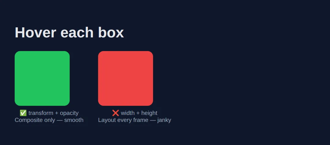
4. Skip Off-Screen Work with content-visibility
On a long page, the browser still does layout and paint work for sections far below the fold that nobody has scrolled to yet. content-visibility: auto tells it to skip rendering an element until it is near the viewport — a huge win for long feeds, articles, and lists.
The catch: a skipped element has no size, so it can cause its own layout shift when it pops in. Pair it with contain-intrinsic-size to give the browser an estimated height to reserve, so the scrollbar stays stable.
<!DOCTYPE html>
<html lang="en">
<head>
  <meta charset="UTF-8">
  <title>content-visibility</title>
  <style>
    body { background:#0f172a; color:#e5e7eb; font-family: system-ui, sans-serif; padding:24px; line-height:1.6; }

    .chunk {
      background:#1e293b; border-radius:12px; padding:20px; margin:16px 0;
      /* Skip rendering this block while it's far off-screen... */
      content-visibility: auto;
      /* ...but reserve ~300px so the scrollbar doesn't jump when it renders. */
      contain-intrinsic-size: auto 300px;
    }
    h2 { color:#60a5fa; margin-top:0; }
    code { background:#334155; padding:2px 6px; border-radius:4px; font-size:0.85rem; }
  </style>
</head>
<body>
  <h1>A long page, rendered lazily</h1>
  <p>Each section below uses <code>content-visibility: auto</code>. The browser
     skips the layout and paint of any section that's far off-screen, then renders
     it just before you scroll to it.</p>

  <section class="chunk"><h2>Section 1</h2><p>Visible now, so it renders normally.</p></section>
  <section class="chunk"><h2>Section 2</h2><p>Below the fold — its work is deferred.</p></section>
  <section class="chunk"><h2>Section 3</h2><p>Also deferred until you scroll near.</p></section>
  <section class="chunk"><h2>Section 4</h2><p>Imagine 500 of these in a feed: the browser only does the work for what you can see.</p></section>

  <!-- ✅ Expected: it looks identical to a normal page, but on a huge feed the
       initial render is dramatically faster because off-screen sections are skipped.
       contain-intrinsic-size keeps the scrollbar honest. -->
  <!-- ✅ Expected result, measured in a real browser:
     .chunk -> padding-top: 20px
     h2 -> margin-top: 0px
     .chunk -> count: 4
  -->
</body>
</html>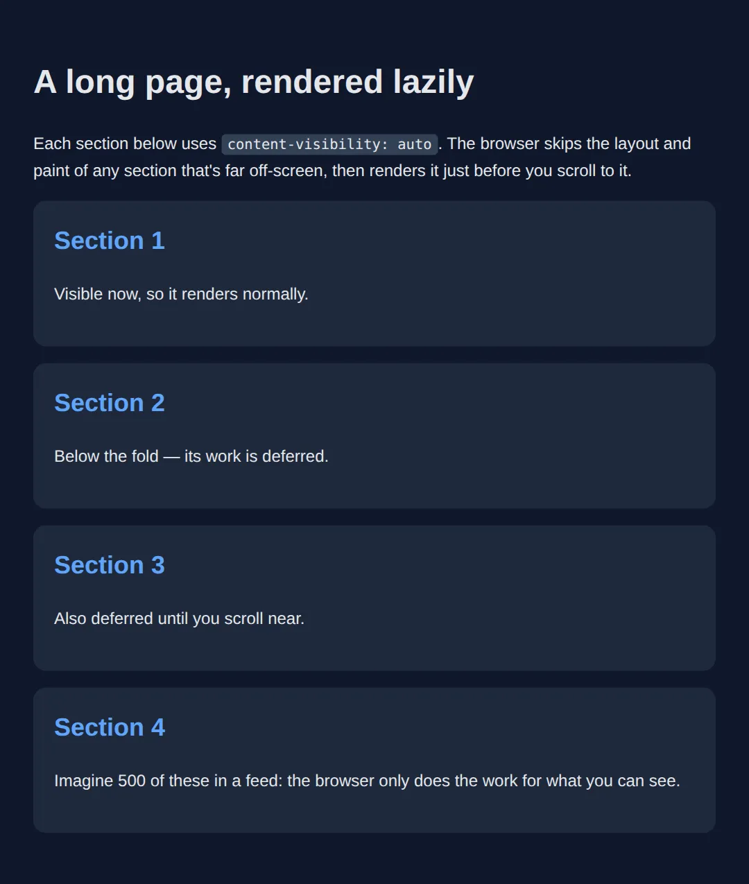
5. First Paint: Critical CSS & Font Loading
A <link rel="stylesheet"> in the <head> is render-blocking: the browser refuses to paint anything until that file is downloaded and parsed, which delays LCP. Two habits cut that delay: inline the critical CSS (the few rules the above-the-fold view needs) directly in a <style> tag, and defer the rest with rel="preload". Avoid @import, which loads stylesheets one-by-one instead of in parallel.
Fonts have the same problem. By default a downloading web font hides its text (a flash of invisible text). font-display: swap shows a system fallback immediately and swaps in your font when it arrives, so the reader is never staring at blank space.
<!DOCTYPE html>
<html lang="en">
<head>
  <meta charset="UTF-8">
  <title>First paint</title>

  <!-- 1) CRITICAL CSS inlined: the few rules needed for the first screen.
          Because it's inline, it blocks nothing — it paints instantly. -->
  <style>
    body { margin:0; font-family: system-ui, sans-serif; background:#0f172a; color:#e5e7eb; }
    .hero { min-height:60vh; display:grid; place-items:center; padding:24px; text-align:center; }
    .hero h1 { font-size:2.2rem; margin:0; }

    /* font-display: swap -> show fallback text now, swap to the web font later,
       so there's never a flash of INVISIBLE text. */
    @font-face {
      font-family: "Brand";
      src: url("brand.woff2") format("woff2");
      font-display: swap;
    }
  </style>

  <!-- 2) NON-CRITICAL CSS deferred: preload, then flip to a stylesheet on load,
          so the big file never blocks the first paint. -->
  <link rel="preload" href="rest.css" as="style"
        onload="this.onload=null;this.rel='stylesheet'">

  <!-- ❌ Avoid this: @import loads sequentially and blocks rendering.
       <style>@import url('rest.css');</style> -->
</head>
<body>
  <section class="hero">
    <h1>This headline paints immediately</h1>
  </section>

  <!-- ✅ Expected: the hero renders the instant the HTML arrives, because its
       styles are inline. The heavy stylesheet and the web font load in the
       background without holding up that first paint. -->
  <!-- ✅ Expected result, measured in a real browser:
     .hero -> display: grid
     .hero h1 -> margin-top: 0px
  -->
</body>
</html>
🎯 Your Turn #1 — Stop the layout shift
This image has no reserved space, so when it loads it shoves the paragraph below it (bad CLS). Give the image explicit dimensions and lazy-load it. Fill in the blanks marked ___, then check the expected result in the comments.
<!DOCTYPE html>
<html lang="en">
<head>
  <meta charset="UTF-8">
  <title>Your Turn 1</title>
  <style>
    /* 🎯 YOUR TURN — fill in the blanks marked ___ */
    body { background:#0f172a; color:#e5e7eb; font-family: system-ui, sans-serif; padding:24px; max-width:480px; }
    img { width:100%; height:auto; border-radius:8px; background:#334155; }
    p { color:#94a3b8; }
  </style>
</head>
<body>
  <h1>Below-the-fold image</h1>

  <!-- 1) Add width and height so the browser reserves the box up front (fixes CLS).
       2) Add loading="lazy" so it only downloads when scrolled near. -->
  <img src="photo.jpg"
       ___                       /* 👉 add:  width="800" height="450" */
       ___                       /* 👉 add:  loading="lazy" */
       alt="A scenic photo">

  <p>This paragraph should NOT jump when the image loads.</p>

  <!-- ✅ Expected: the browser reserves a sized box before the file arrives, so the
       paragraph stays put (no layout shift), and the image waits to download until
       you scroll near it. -->
</body>
</html>
🎯 Your Turn #2 — Make the animation cheap
This card slides up on hover by animating top — which forces a layout recalculation every frame and stutters. Rewrite it to move with transform instead, so it runs on the compositor. Fill in the blanks and verify the expected behaviour in the comments.
<!DOCTYPE html>
<html lang="en">
<head>
  <meta charset="UTF-8">
  <title>Your Turn 2</title>
  <style>
    /* 🎯 YOUR TURN — fill in the blanks marked ___ */
    body { background:#0f172a; color:#e5e7eb; font-family: system-ui, sans-serif; padding:40px; }

    .card {
      position: relative;
      width:200px; padding:20px; border-radius:12px;
      background:#1e293b; cursor:pointer;

      /* 1) Transition the CHEAP property instead of "top". */
      transition: ___ .3s;        /* 👉 replace ___ with  transform */
    }

    /* 2) On hover, move it up 12px with a transform (Composite only),
          NOT with top (which forces Layout). */
    .card:hover {
      ___                          /* 👉 add:  transform: translateY(-12px); */
    }
  </style>
</head>
<body>
  <div class="card">
    <h3>Hover me</h3>
    <p>I should lift up smoothly.</p>
  </div>

  <!-- ✅ Expected: the card lifts 12px on hover, but now the movement runs on the
       GPU compositor (no per-frame Layout), so it stays smooth even on a busy page. -->
</body>
</html>
🧩 Mini-Challenge — A fast-by-default hero
Support is faded now — only an outline is given. Build a small hero section that applies the lesson's habits all at once. Use the worked examples in sections 2, 3, and 5 as your reference if you get stuck.
<!DOCTYPE html>
<html lang="en">
<head>
  <meta charset="UTF-8">
  <title>Mini-Challenge</title>
  <style>
    /* 🧩 MINI-CHALLENGE: a hero that's fast by default
       1. Inline the critical styles for the hero right here (it's already inline — good).
       2. In an @font-face, add font-display: swap so text never goes invisible.
       3. Style a .cta button that lifts on hover using ONLY transform + opacity
            (transition: transform, opacity — never top/left/width).
       4. Below the hero, add an <img> with explicit width AND height plus
            loading="lazy" so it reserves space (no CLS) and defers its download.

       ✅ Expected: the headline paints instantly, the button animates smoothly on
          the GPU, and the image holds its box so nothing jumps when it loads. */

    body { margin:0; font-family: system-ui, sans-serif; background:#0f172a; color:#e5e7eb; }

    /* your @font-face here (with font-display: swap) */

    .hero { min-height:50vh; display:grid; place-items:center; text-align:center; padding:24px; }

    /* your .cta button styles here (transform + opacity only) */
  </style>
</head>
<body>
  <section class="hero">
    <div>
      <h1>Fast by default</h1>
      <!-- your .cta button here -->
    </div>
  </section>

  <!-- your sized, lazy <img> here -->

</body>
</html>
⚠️ Common Errors (and the fix)
- Animating width/top and getting jank. Transitioning width, height, top, or left forces a layout recalculation every frame, blowing the 16ms budget. Fix: express it as transform: translate() / scale() and animate opacity — Composite-only, GPU-driven.
- Images with no width/height → CLS. Without reserved space the page jumps when the image arrives, wrecking your CLS score. Fix: set explicit width and height attributes (or an aspect-ratio) on every image, iframe, and ad slot.
- Huge, unoptimised images. Shipping a 3000px JPEG to a phone wastes bandwidth and delays LCP. Fix: serve modern formats (WebP/AVIF), offer sizes with srcset, and compress — often a 10x size cut for no visible loss.
- Lazy-loading the hero image. Putting loading="lazy" on your above-the-fold image delays your LCP element. Fix: keep the hero eager (the default); lazy-load only what is below the fold.
- Render-blocking CSS via @import. @import url('a.css') loads stylesheets sequentially and blocks the first paint. Fix: use parallel <link> tags, inline critical CSS, and defer the rest.
- Overusing will-change. Slapping it on everything promotes too many GPU layers and eats memory, making things slower. Fix: apply it only to elements that genuinely animate, and remove it when the animation is done.
📋 Quick Reference
| Goal | Use this |
|---|---|
| Reserve image space (stop CLS) | <img width="800" height="450"> |
| Defer below-the-fold images | <img loading="lazy"> |
| Serve the right image size | srcset="a-400.jpg 400w, a-800.jpg 800w" |
| Animate smoothly (Composite only) | transition: transform .3s, opacity .3s; |
| Hint a GPU layer (sparingly) | will-change: transform; |
| Skip off-screen rendering | content-visibility: auto; |
| Reserve height for skipped blocks | contain-intrinsic-size: auto 300px; |
| Stop invisible text while a font loads | font-display: swap; |
| Defer a non-critical stylesheet | <link rel="preload" as="style" ...> |
🎉 Lesson Complete
You can now make a page measurably faster with HTML and CSS alone. The essentials:
- ✅ The three vitals: LCP (<2.5s), CLS (<0.1), INP (<200ms)
- ✅ Always set image width/height to kill layout shift
- ✅ loading="lazy" below the fold, eager hero; use srcset + WebP/AVIF
- ✅ Animate only transform and opacity — never width/top
- ✅ content-visibility: auto skips off-screen rendering on long pages
- ✅ Inline critical CSS, defer the rest, and use font-display: swap
Practice quiz
What does the Core Web Vital LCP measure?
- How fast the page reacts to a click
- How much the page jumps as it loads
- Time until the largest element appears
- Total page weight
Answer: Time until the largest element appears. LCP (Largest Contentful Paint) is the time until the biggest element appears; aim for under 2.5s.
Which Core Web Vital measures how much the page jumps around while loading?
- CLS
- LCP
- INP
- TTFB
Answer: CLS. CLS (Cumulative Layout Shift) measures unexpected movement; a good score is under 0.1.
Which single habit most reliably prevents layout shift (CLS) from images?
- Using loading="lazy"
- Using a WebP format
- Adding alt text
- Setting explicit width and height attributes
Answer: Setting explicit width and height attributes. Explicit width and height (or an aspect-ratio) let the browser reserve the right-sized box before the image loads.
Which two properties animate on the compositor (GPU) and skip layout and paint?
- width and height
- transform and opacity
- top and left
- margin and padding
Answer: transform and opacity. transform and opacity run on the compositor, so they stay smooth; animating width/top forces layout every frame.
Where should you NOT put loading="lazy"?
- On the above-the-fold hero / LCP image
- On footer images
- On below-the-fold gallery images
- On off-screen avatars
Answer: On the above-the-fold hero / LCP image. Lazy-loading the hero delays your LCP element; keep above-the-fold images eager and lazy-load only below the fold.
What does `content-visibility: auto` do on a long page?
- Hides the element permanently
- Compresses images
- Skips rendering an element until it is near the viewport
- Disables animations
Answer: Skips rendering an element until it is near the viewport. content-visibility: auto defers layout and paint for off-screen sections until they near the viewport.
Which property pairs with content-visibility to reserve a skipped block's height?
- min-height
- contain-intrinsic-size
- aspect-ratio
- will-change
Answer: contain-intrinsic-size. contain-intrinsic-size gives the browser an estimated size so the scrollbar stays stable when blocks render in.
What is the main problem with a render-blocking <link rel="stylesheet"> in the <head>?
- It breaks the layout
- It disables JavaScript
- It prevents caching
- The browser will not paint until that CSS downloads and parses
Answer: The browser will not paint until that CSS downloads and parses. Render-blocking CSS stops the first paint until it downloads and parses, delaying LCP; inline critical CSS and defer the rest.
What does `font-display: swap` do?
- Hides text until the web font loads
- Shows fallback text immediately, then swaps to the web font
- Prevents the font from loading
- Compresses the font file
Answer: Shows fallback text immediately, then swaps to the web font. font-display: swap shows a system fallback right away and swaps in the web font on arrival, avoiding invisible text (FOIT).
Why should you avoid CSS `@import` for loading stylesheets?
- It is invalid CSS
- It only works in old browsers
- It loads stylesheets sequentially, blocking the first paint
- It disables media queries
Answer: It loads stylesheets sequentially, blocking the first paint. @import loads stylesheets one after another instead of in parallel, blocking rendering; use parallel <link> tags instead.
Continue this course
- Previous: Print Stylesheets & Export-Friendly Layouts
- Next: Progressive Enhancement & Graceful Degradation — Build features that work for everyone, enhanced for modern browsers
- Quick reference: HTML & CSS cheat sheet
Frequently asked questions
What are Core Web Vitals and why should I care about them as a front-end developer?
Core Web Vitals are three real-user metrics Google uses to measure page experience: LCP (Largest Contentful Paint) is how long until the biggest thing on screen appears — aim for under 2.5 seconds; CLS (Cumulative Layout Shift) is how much the page jumps around as it loads — aim for under 0.1; and INP (Interaction to Next Paint) is how quickly the page responds when you click or type — aim for under 200ms. They matter because they affect both how the page feels to a real person and where it ranks in Google search. A huge amount of each score is controlled by plain HTML and CSS: sized images, non-render-blocking styles, and compositor-friendly animations. You do not need a framework to fix them.
Why does my page jump around while it loads, and how do I stop it?
That jumping is layout shift (the CLS in Core Web Vitals), and the usual culprit is an image or embed with no reserved space. The browser lays out the text first, then the image arrives, pushes everything down, and the reader loses their place. The fix is to always give images explicit width and height attributes (or an aspect-ratio in CSS) so the browser reserves the right-sized box before the file downloads. The same applies to ads, iframes, and any web font that swaps to a different-sized face — reserve the space up front and nothing shifts.
What does loading="lazy" actually do, and should I put it on every image?
loading="lazy" tells the browser not to download an image until it is about to scroll into view, which saves bandwidth and speeds up the initial load. Put it on images that are below the fold — further down the page. Do NOT put it on your hero image or anything visible on first paint, because lazy-loading your LCP element delays it and makes your LCP score worse. Rule of thumb: eager (the default) for above-the-fold, lazy for everything below.
Why is animating width or top janky when transform looks smooth?
Changing width, height, top, left, or margin forces the browser to re-run layout — it recalculates the size and position of that element and often everything around it — then repaint, on every single frame. At 60fps you only have about 16ms per frame, and layout blows through that budget, so the animation stutters. transform and opacity are special: they run on the compositor (often the GPU) and skip layout and paint entirely, so they stay smooth. The fix is almost always to express movement as transform: translate() instead of top/left, and scaling as transform: scale() instead of width/height.
What is render-blocking CSS and how do I avoid it?
When the browser finds a <link rel="stylesheet"> in the <head>, it stops rendering the page until that file has downloaded and parsed — the stylesheet is render-blocking. A big or slow CSS file therefore delays your first paint and hurts LCP. You reduce the impact by keeping your CSS small, inlining the tiny bit of critical CSS the above-the-fold view needs directly in a <style> tag, and avoiding @import (which loads stylesheets one after another instead of in parallel). The less CSS stands between the browser and the first paint, the faster the page feels.
What does font-display: swap do, and why might text be invisible without it?
By default, when a custom web font is still downloading, the browser hides the text that uses it — a flash of invisible text (FOIT) that can last seconds on a slow connection. font-display: swap tells the browser to show the text immediately in a fallback system font and then swap to your web font once it arrives. The reader can start reading right away. The trade-off is a brief flash of the fallback font (FOUT), which you minimise by picking a fallback with a similar size so the swap does not cause a layout shift.