Progressive Enhancement
Reviewed & published by Brayan K
Progressive enhancement is a strategy that starts with a working baseline of semantic HTML and then layers on CSS and JavaScript as optional improvements, so the page still functions even when styles or scripts fail to load.
Part of the free HTML & CSS course at LearnCodingFast — hands-on lessons with examples you run in your browser, plus practice exercises and a quick quiz.
By the end of this lesson you'll be able to build a page from a rock-solid baseline up — semantic HTML that works with no CSS or JS, then optional CSS and JavaScript layers gated by feature checks — so no visitor ever gets a broken experience.
💡 Think of It Like This
Progressive enhancement is a building with stairs first, then an escalator, then a lift. The stairs (semantic HTML) let everyone reach every floor, always. The escalator (CSS) makes the trip smoother. The lift (JavaScript) makes it effortless.
Crucially, you build the stairs first and they never depend on the lift. If the power cuts out, the lift stops but people still get upstairs. A badly-built site does the opposite: it installs only a lift, so the day the power fails, nobody can move at all. That is the difference between enhancing a working base and betting everything on the top layer.
1. Start With a Baseline That Can't Break
Progressive enhancement is a philosophy: build the most basic, universally-supported version first, then add layers for browsers that can handle them. The baseline is semantic HTML — real headings, real links, real forms — that is readable and usable before a single byte of CSS or JavaScript arrives.
The test is simple: would this page still work with CSS and JS switched off? A <a href> still navigates. A <form method action> still submits to the server. That guaranteed floor is what every later layer stands on. Run this stripped-down page — it has no styles and no scripts on purpose.
<!DOCTYPE html>
<html lang="en">
<head>
  <meta charset="UTF-8">
  <title>Resilient baseline</title>
</head>
<body>
  <!-- This page has NO CSS and NO JS on purpose. It is the baseline —
       the layer that must work for absolutely everyone. -->

  <!-- A real link navigates with zero JavaScript. -->
  <nav><a href="#article">Skip to article</a></nav>

  <article id="article">
    <h1>Why the baseline matters</h1>
    <p>Semantic HTML is readable and usable before a single byte of CSS
       or JS arrives. Headings give structure, links navigate, and the
       form below submits on its own.</p>
  </article>

  <!-- A real form with method + action submits without JavaScript.
       JS can later intercept submit to add validation or AJAX — but if
       JS never loads, the form still posts to the server. -->
  <form method="post" action="/subscribe">
    <label for="email">Email</label>
    <input id="email" name="email" type="email" required>
    <button type="submit">Subscribe</button>
  </form>

  <!-- ✅ Expected: an unstyled but fully functional page — the heading
       reads, the skip link jumps to the article, and the form would
       post to /subscribe. This is the floor every visitor stands on. -->
</body>
</html>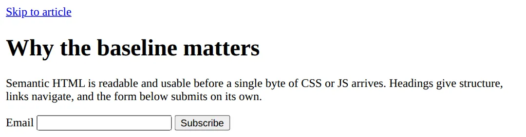
2. Enhance With @supports Feature Queries
Once the baseline works, you layer styling on top — but only where it is safe. The tool for that in CSS is the feature query, @supports. It works like a media query, but instead of asking about the screen it asks about the browser's capabilities: @supports (display: grid) { … } applies the enclosed styles only if the browser understands that exact declaration.
This is the heart of an enhancement with a fallback. Write the version that works everywhere outside the block (here, flexbox wrapping), then put the upgrade inside the @supports block (CSS Grid). A browser without Grid simply ignores the block and keeps the flexbox base — no broken layout, no error.
<!DOCTYPE html>
<html lang="en">
<head>
  <meta charset="UTF-8">
  <title>@supports fallback</title>
  <style>
    body { font-family: system-ui, sans-serif; padding: 24px; background:#f8fafc; color:#1e293b; }
    h1 { color:#1565C0; }

    /* BASE LAYER — works in EVERY browser, even ones with no Grid.
       Flexbox + wrap gives a perfectly usable multi-column layout. */
    .grid {
      display: flex;          /* base: flexbox, supported everywhere */
      flex-wrap: wrap;
      gap: 16px;
    }
    .card {
      flex: 1 1 220px;        /* each card is at least 220px, then grows */
      background:#fff; border:1px solid #e2e8f0; border-radius:10px; padding:20px;
    }
    .card h3 { margin-top:0; color:#1565C0; }

    /* ENHANCEMENT LAYER — only browsers that understand Grid run this block.
       @supports (property: value) is a "feature query". The condition is
       true only when the browser supports that exact declaration. */
    @supports (display: grid) {
      .grid {
        display: grid;        /* upgrade: real grid replaces the flex fallback */
        grid-template-columns: repeat(auto-fit, minmax(220px, 1fr));
      }
    }
  </style>
</head>
<body>
  <h1>Flexbox base, Grid enhancement</h1>
  <p>Old browsers see a flexbox layout. Modern browsers get CSS Grid.
     The page works either way — the enhancement is optional.</p>
  <div class="grid">
    <div class="card"><h3>Card 1</h3><p>Base layer: flexbox wrap.</p></div>
    <div class="card"><h3>Card 2</h3><p>Enhanced: Grid auto-fit, if supported.</p></div>
    <div class="card"><h3>Card 3</h3><p>Nobody gets a broken layout.</p></div>
  </div>

  <!-- ✅ Expected: a tidy multi-column card layout. In a Grid-capable
       browser the columns are evenly sized; without Grid they fall back
       to flexbox wrapping. Either way: three readable cards. -->
  <!-- ✅ Expected result, measured in a real browser:
     .grid -> display: grid
     .card -> flex-grow: 1
     .card -> count: 3
  -->
</body>
</html>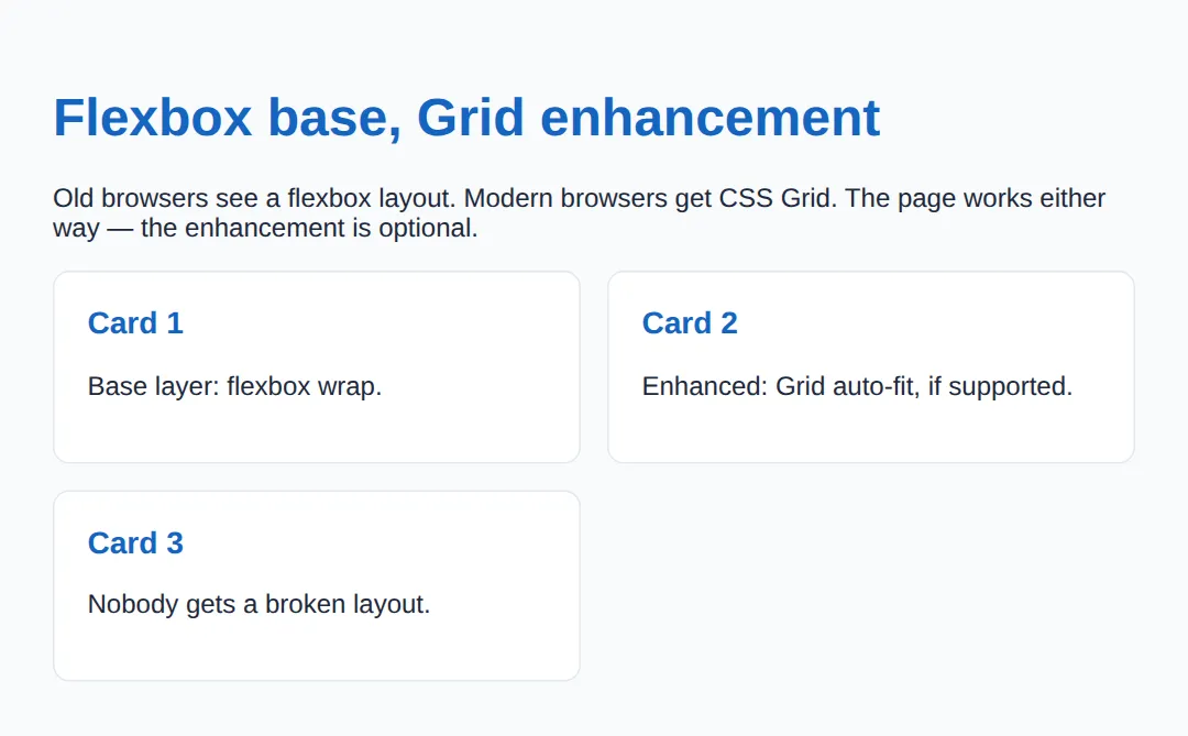
You can also test selectors with @supports selector(:has(*)), combine conditions with and / or, and negate with not — e.g. @supports not (display: grid) to target browsers that lack a feature.
3. Never Let a Layer Become Load-Bearing
The whole approach falls apart the moment a higher layer becomes required. If your only "Read more" control is a <div> wired up with a click handler, then a visitor whose JavaScript failed to load — flaky network, ad blocker, an extension, a crawler — gets nothing. The fix is to make the baseline the working version and let JS enhance it.
HTML gives you genuinely interactive elements that need no JavaScript at all: <details>/<summary> for an accordion, <dialog> for a modal, and a real <form> for submissions. Reach for these first; only add JS when you need to go beyond what they do.
| You want… | JS-free baseline |
|---|---|
| An expandable accordion | <details><summary> |
| A modal dialog | <dialog> |
| To submit data | <form method action> |
| To navigate | <a href> |
4. Progressive Enhancement vs Graceful Degradation
These are two routes to the same destination — a site that works for everyone — but they start at opposite ends. Progressive enhancement builds up: baseline first (HTML), then style (CSS), then behaviour (JS), each layer optional. Graceful degradation builds down: create the full modern experience first, then add fallbacks so older browsers do not collapse.
Modern best practice favours progressive enhancement because the working version comes first — you can never forget to add a fallback, because the fallback is the starting point. With graceful degradation, every missing fallback is a potential broken page. Think of it as the three-layer model: HTML (content) → CSS (presentation) → JavaScript (behaviour), where each layer enhances the one below and none replaces it.
Build up from a solid base. "Start simple, enhance for capable browsers." The baseline is guaranteed.
Fall back from the full experience. "Start complex, add fallbacks for limited browsers." Easy to miss one.
🎯 Your Turn #1 — Gate an enhancement behind @supports
A frosted-glass panel should upgrade only where backdrop-filter is supported, leaving a safe semi-transparent base everywhere else. Fill in the blanks marked ___, then run it and check the expected result in the comments.
<!DOCTYPE html>
<html lang="en">
<head>
  <meta charset="UTF-8">
  <title>Your Turn 1</title>
  <style>
    /* 🎯 YOUR TURN — fill in the blanks marked ___ */

    body { font-family: system-ui, sans-serif; padding:24px; background:#0f172a; color:#e5e7eb; }
    .box { padding:24px; border-radius:10px; margin:16px 0; }

    /* BASE: a plain solid panel — works in every browser. */
    .panel {
      background: rgba(255,255,255,0.18);   /* the safe fallback */
    }

    /* ENHANCEMENT: frosted glass, but ONLY if the browser supports it.
       1) Wrap the enhancement in a feature query for backdrop-filter. */
    ___ (backdrop-filter: blur(8px)) {     /* 👉 replace ___ with  @supports */
      .panel {
        /* 2) Apply the modern property the query just tested for. */
        ___ : blur(8px);                    /* 👉 replace ___ with  backdrop-filter */
        background: rgba(255,255,255,0.10);
      }
    }
  </style>
</head>
<body style="background:linear-gradient(135deg,#667eea,#764ba2)">
  <div class="box panel">
    <h2 style="margin-top:0">Glass panel</h2>
    <p>Base: a semi-transparent panel. Enhanced: a frosted-glass blur
       in browsers that support backdrop-filter.</p>
  </div>

  <!-- ✅ Expected: a readable translucent panel everywhere; in a
       supporting browser the background behind it is blurred. If you
       leave a blank wrong, the panel still works — that's the point. -->
</body>
</html>
🎯 Your Turn #2 — Make a widget JS-free and add a fallback
One "accordion" needs JavaScript to open, and one layout uses a feature you can't assume. Swap the JS-only widget for a native element pair, and wrap the upgrade in a feature query so old browsers keep the base. Verify the expected behaviour in the comments.
<!DOCTYPE html>
<html lang="en">
<head>
  <meta charset="UTF-8">
  <title>Your Turn 2</title>
  <style>
    body { font-family: system-ui, sans-serif; padding:24px; }
    .gap { display:flex; gap:16px; flex-wrap:wrap; }   /* base spacing fallback */
    .gap > * { background:#E3F2FD; padding:16px; border-radius:8px; }
  </style>
</head>
<body>
  <!-- 🎯 YOUR TURN — fix two resilience problems -->

  <h1>FAQ</h1>

  <!-- 1) This "accordion" is a div that needs JavaScript to open.
        Swap the div+button for a native element pair that works with
        NO JavaScript, so the answer is reachable even if JS fails. -->
  <___ >                                  <!-- 👉 replace ___ with  details -->
    <___>Do I need JavaScript for this?</___>  <!-- 👉 replace ___ with  summary -->
    <p>No — details/summary opens and closes on its own.</p>
  </___>                                  <!-- 👉 closing  details -->

  <!-- 2) The grid below uses a fancy 'gap' on a feature you can't assume.
        Wrap a 'gap: 24px' upgrade in a feature query so old browsers
        keep the 16px base and new ones get the bigger gap. -->
  <style>
    ___ (gap: 24px) {                     /* 👉 replace ___ with  @supports */
      .gap { gap: 24px; }
    }
  </style>
  <div class="gap"><div>HTML</div><div>CSS</div><div>JS</div></div>

  <!-- ✅ Expected: the FAQ question expands/collapses without any JS,
       and the three tags sit in a row with a 24px gap where supported,
       16px otherwise. No layer depends on another to be usable. -->
</body>
</html>
🧩 Mini-Challenge — Three layers from scratch
Support is faded now — only an outline is given. Build a small page with all three layers: a semantic HTML baseline, a flexbox CSS base, and a Grid enhancement gated by @supports. Use the worked examples in sections 1 and 2 as your reference if you get stuck.
<!DOCTYPE html>
<html lang="en">
<head>
  <meta charset="UTF-8">
  <title>Mini-Challenge</title>
  <style>
    /* 🧩 MINI-CHALLENGE: a resilient "feature" section, three layers
       1. BASE (HTML): write a <section> with a heading, a paragraph,
          and a real <a href="..."> link — it must read and navigate
          with no CSS and no JS.
       2. STYLE (CSS base): lay the cards out with FLEXBOX + wrap so
          the layout works in any browser.
       3. ENHANCEMENT: inside @supports (display: grid) { ... },
          upgrade the same container to CSS Grid with
          grid-template-columns: repeat(auto-fit, minmax(200px, 1fr)).

       ✅ Expected: with Grid support you get an even grid of cards;
          without it, flexbox wrapping still gives a usable layout; and
          with no CSS at all the headings, text, and link still work.
          Every layer must stand on its own. */

    /* your base CSS here (flexbox layout) */

    /* your @supports enhancement here (grid) */
  </style>
</head>
<body>

  <!-- your semantic HTML here: a <section>, a heading, a paragraph,
       a real link, and at least three .card elements in a container -->

</body>
</html>
⚠️ Common Errors (and the fix)
- Critical content locked behind JavaScript. An article that only renders after a script runs, or a "Buy" button that is a <div> with a click handler, disappears entirely when JS fails. Fix: put the content and core actions in HTML — real text, <a href>, <form> — and let JS enhance them.
- Using a modern feature with no fallback. Putting display: grid (or backdrop-filter, :has()) as your only layout means unsupported browsers get nothing. Fix: write a base that works outside the block and put the upgrade inside @supports.
- Assuming every browser has the feature. "It works in my Chrome" is not support — Safari, Firefox, in-app browsers, and old devices differ. Fix: use feature detection ( @supports in CSS, 'IntersectionObserver' in window in JS), never user-agent sniffing.
- Confusing @supports with @media. @media tests the device (screen size, scheme); @supports tests the browser's capabilities. Fix: use @supports for feature checks and @media for the environment — they can be combined.
- Putting the fallback inside the block. Writing the base styles inside @supports means a non-supporting browser gets no styling at all. Fix: baseline outside the block, enhancement inside.
📋 Quick Reference — @supports syntax
| Goal | Use this |
|---|---|
| Test a property/value | @supports (display: grid) { … } |
| Test a selector | @supports selector(:has(*)) { … } |
| Feature is missing | @supports not (gap: 1rem) { … } |
| Both must be true | @supports (a: b) and (c: d) { … } |
| Either may be true | @supports (a: b) or (c: d) { … } |
| Detect a JS API | if ('IntersectionObserver' in window) { … } |
| JS-free interactivity | <details>, <dialog>, <form> |
🎉 Lesson Complete
You can now build pages that work for everyone and get better where the browser allows. The essentials:
- ✅ Start with a semantic HTML baseline that works with no CSS or JS
- ✅ Layer CSS and JS on top — never let a layer become load-bearing
- ✅ Gate modern CSS behind @supports (feature) { … }
- ✅ Base styles go outside the block; the enhancement goes inside
- ✅ Use JS-free elements first: <details>, <dialog>, <form>
- ✅ Progressive enhancement builds up; graceful degradation builds down
Practice quiz
What is the foundation (baseline) layer in progressive enhancement?
- A JavaScript framework
- A CSS Grid layout
- Semantic HTML that works with no CSS or JS
- A service worker
Answer: Semantic HTML that works with no CSS or JS. Progressive enhancement starts from a working baseline of semantic HTML, then layers CSS and JS as optional improvements.
How do progressive enhancement and graceful degradation differ?
- PE builds up from a baseline; graceful degradation builds down from the full experience
- They are the same thing
- PE is only for CSS; graceful degradation is only for JS
- PE requires no HTML
Answer: PE builds up from a baseline; graceful degradation builds down from the full experience. Progressive enhancement builds up from a guaranteed baseline; graceful degradation starts complex and adds fallbacks.
What does an `@supports` feature query test?
- The screen width
- The user’s connection speed
- Whether JavaScript is enabled
- Whether the browser understands a CSS property/value
Answer: Whether the browser understands a CSS property/value. @supports tests the browser's capabilities — e.g. @supports (display: grid) is true only if Grid is understood.
How does `@supports` differ from `@media`?
- They are identical
- @media tests the device/environment; @supports tests the browser’s feature support
- @supports tests screen size; @media tests CSS features
- Only @media can be nested
Answer: @media tests the device/environment; @supports tests the browser’s feature support. @media asks about the environment (width, scheme, print); @supports asks whether the browser supports a feature.
In an enhancement-with-fallback, where does the base (fallback) style belong?
- Outside the @supports block
- Inside the @supports block
- Inside a @media block
- In a separate @supports not block only
Answer: Outside the @supports block. The universally-safe baseline goes outside the @supports block; the upgrade goes inside it.
What happens to styles inside an `@supports` block when the tested feature is missing?
- They override the base styles
- They cause a parse error
- The browser ignores the whole block, leaving the base styles
- They apply anyway
Answer: The browser ignores the whole block, leaving the base styles. If the feature is unsupported the condition is false and the block does nothing, so only the base styles apply.
Which native HTML elements give interactivity with NO JavaScript?
- <div> and <span>
- <details>/<summary>, <dialog>, and <form>
- <script> and <link>
- <canvas> and <svg>
Answer: <details>/<summary>, <dialog>, and <form>. <details>/<summary> (accordion), <dialog> (modal), and a real <form> work without any JavaScript.
Why should critical content never depend solely on JavaScript?
- JS is slow to write
- JS is not supported in any browser
- HTML cannot hold text
- JS can fail (flaky network, blockers, crawlers), leaving users a broken page
Answer: JS can fail (flaky network, blockers, crawlers), leaving users a broken page. Scripts fail more than expected; if content or core actions only exist after JS runs, those users get nothing.
Can `@supports` detect a JavaScript API like IntersectionObserver?
- Yes, @supports (IntersectionObserver)
- No — @supports is CSS-only; use JS feature detection like 'IntersectionObserver' in window
- Yes, with @supports script()
- Only in older browsers
Answer: No — @supports is CSS-only; use JS feature detection like 'IntersectionObserver' in window. @supports tests CSS only; for JS APIs use feature detection such as 'IntersectionObserver' in window.
Which `@supports` condition targets browsers that LACK a feature?
- @supports (display: grid)
- @supports no (display: grid)
- @supports not (display: grid)
- @supports !display: grid
Answer: @supports not (display: grid). @supports not (display: grid) is true only when the browser does not support that declaration.
Continue this course
- Previous: CSS Performance Optimization & Rendering Pipelines
- Next: Custom Scrollbars & UI Chrome Styling — Style scrollbars, selection highlights, and browser UI chrome with CSS
- Quick reference: HTML & CSS cheat sheet
Frequently asked questions
What is the difference between progressive enhancement and graceful degradation?
They reach the same goal from opposite directions. Progressive enhancement starts at the bottom: you build a plain, working baseline (semantic HTML that loads and submits with no CSS or JS), then layer on styling and interactivity for browsers that can handle them. Graceful degradation starts at the top: you build the full modern experience first, then bolt on fallbacks so older browsers do not break completely. Progressive enhancement is the safer default because the baseline is guaranteed to work — you never have to remember to add a fallback, because the working version came first.
How is @supports different from @media?
@media asks about the environment — screen width, orientation, colour scheme, print vs screen. @supports asks about the browser's capabilities — does it understand this CSS property and value? So @media (min-width: 600px) reacts to a wide screen, while @supports (display: grid) reacts to a browser that knows CSS Grid. They are independent and can be nested or combined, but they answer different questions: one is about the device, the other is about the engine.
If modern browsers all support Grid and :has(), do I still need @supports?
For long-stable features like Grid, the base/enhancement split is mostly about discipline and resilience rather than today's market share. But you absolutely still need @supports for newer or partially-rolled-out features — subgrid, container queries, :has() in older Safari, backdrop-filter, color-mix(), and anything shipped in the last couple of years. The rule of thumb: wrap any feature you cannot assume every visitor's browser has. When in doubt, write a base that works without it and enhance inside @supports.
Why should critical content never depend on JavaScript?
JavaScript fails more often than people expect: a flaky network drops the script, an ad blocker or extension removes it, a CDN times out, an old device chokes on the parse, or a search-engine crawler simply does not run it. If your article text, navigation links, or a checkout form only exist after JS runs, every one of those users gets a blank or broken page. Put the content and the core actions in HTML so they work first, then use JS to make them nicer — that way a failure degrades to slower or plainer, never to nothing.
Does @supports work for testing JavaScript or HTML features?
No — @supports is CSS-only. It tests CSS property/value pairs (and CSS selectors via the selector() syntax). To detect a JavaScript API you use feature detection in JS, like if ('IntersectionObserver' in window) { ... } or 'share' in navigator. To handle missing HTML element support you usually rely on native fallback behaviour (an unknown element renders as an inline box) or a script. Each layer has its own detection tool; @supports is the one for CSS.
What happens to styles inside an @supports block the browser does not understand?
The browser ignores the entire block. If it does not recognise @supports at all (very old browsers), it skips everything inside, so only your base styles apply. If it understands @supports but the tested feature is missing, the condition is false and the block does nothing. Either way, the styles outside the @supports block always apply — which is exactly why you put the universally-safe baseline outside and the enhancement inside.